
Why Printing Uses CMYK


Screens glow, so they build color by adding red, green, and blue light. Presses lay ink on white paper, and ink can only subtract light. That single difference is why every full-color print job runs on cyan, magenta, yellow, and black.
Printing uses CMYK because ink is subtractive, not additive. A screen emits red, green, and blue light and adds it together, so RGB describes glowing color. A press lays cyan, magenta, yellow, and black ink that absorbs light reflecting off white paper, so each layer takes color away. CMYK is the model that matches how ink physically works, which is why converting your file to CMYK before you order gives you the color you actually expect.
Quick answer
The short version, if you only read one thing
Printing uses CMYK because ink subtracts light and screens add it. A monitor emits red, green, and blue light, while a press lays cyan, magenta, yellow, and black ink that absorbs light bouncing off white paper. Four process inks cover most colors, black sharpens text and shadows, and a handful of bright screen tones simply sit outside what ink can reach. Convert your file to CMYK in your design app before you upload, preview the small shift, and the printed sheet at 4OVER4.COM will match the proof you approved.
What CMYK printing is
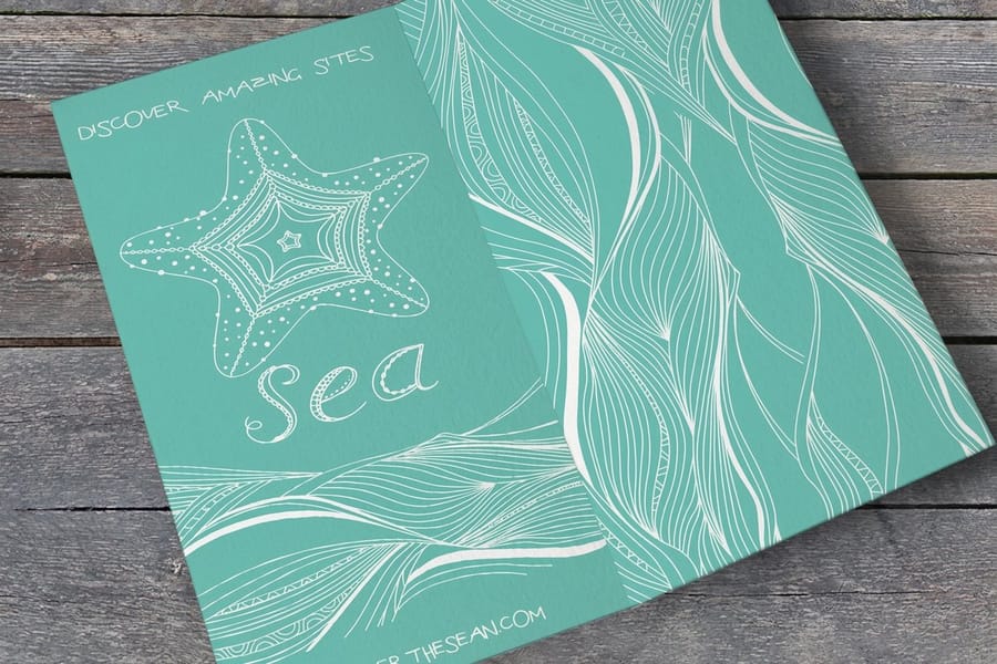
CMYK printing is full-color printing built from four process inks: cyan, magenta, yellow, and key, where key is the black plate. The press lays those four inks down as tiny halftone dots on white paper, and your eye blends the dots into a full-color image. Four plates, one printed sheet, whether the job is a brochure, a flyer, a business card, or a postcard.
It works by subtraction rather than by light. Cyan ink subtracts red light, magenta subtracts green, yellow subtracts blue, and whatever bounces back off the white paper is the color you see. A screen does the opposite, firing red, green, and blue light straight at your eye. That single difference is the whole reason a press runs CMYK while a monitor runs RGB: pigment takes light away, pixels add it.
Two working rules fall out of that. Build print files in CMYK from the first click so nothing converts behind your back at the press, and leave small text on 100 percent K so the edges stay razor sharp instead of depending on three inks lining up. The sections below cover why RGB inks do not exist, what each letter of CMYK does, which colors shift on conversion, and how to convert a file safely before you upload it.
Why don’t printers just use RGB inks?
The honest answer is that ink cannot do what a screen does. Your monitor makes color with light. It fires red, green, and blue at your eye, and when all three run at full strength you get white. That is an additive system, because you are adding light together. It only works because the screen is a lamp.
Paper is not a lamp. A printed sheet has no light of its own, so a press works the opposite way. Each layer of ink absorbs part of the light bouncing off the white paper and reflects the rest back to you. Cyan ink subtracts red light, magenta subtracts green, yellow subtracts blue. Stack them and you take light away rather than add it, which is why print runs on a subtractive model. An RGB ink would have to emit light to behave like a pixel, and no pigment does that.
So the question is not really why presses avoid RGB. It is that RGB describes glowing light and printing lays down pigment, and those are two different physical events. If you want the full head-to-head, our CMYK vs RGB guide walks through when each mode belongs in your workflow.
What CMYK actually stands for
CMYK is four inks: cyan, magenta, yellow, and key. Key is the black plate. Together they are called process inks because a press combines them in tiny halftone dots to process a full-color image out of just four colors.
Here is the part that trips people up. If ink is subtractive and you overlap cyan, magenta, and yellow at full strength, you should land on black. On paper you land on a muddy, warm brown instead, because real inks are not chemically perfect. That is exactly why the K exists. A dedicated black plate prints true black, keeps text crisp, and deepens shadows without asking three inks to pile up and soak the sheet. It also saves ink, since one black layer beats three colored ones for anything dark.
Think of C, M, and Y as the painters that mix your hues and K as the editor that adds contrast and clean edges. On a full-color piece like a brochure, all four plates fire together, and the black is what makes the headline snap against a photo.
Why the CMYK color model matches how ink behaves

A color model is just a set of instructions for building color. RGB tells a screen how much light to emit. CMYK tells a press how much of each ink to lay down, expressed as a percentage from 0 to 100. A rich navy might read C100 M80 Y20 K10, which is a recipe the machine can actually mix.
That percentage system matters because a press does not paint smooth washes. It prints microscopic dots, and by varying how big and how dense those dots are, it fakes continuous tone. More cyan dots in an area means more red light absorbed, so that patch looks bluer. Standing back, your eye blends the dots into a solid color. CMYK is the language that maps a design value to a dot pattern the hardware can hit.
It also plays nicely with spot color when a job needs an exact brand match. Process inks cover the broad range, and a spot color can be added when a logo demands a precise, repeatable hue. When you already know your brand Pantone, our Pantone to CMYK guide shows how to translate it cleanly.
Where RGB and CMYK disagree: the gamut gap

Every color system can only reach so far. That reachable range is called its gamut, and RGB simply has a bigger one than CMYK. A backlit screen can throw a neon green or an electric blue that glows. Four inks on paper cannot glow, so those extreme tones land a notch calmer once printed.
This is the single biggest source of reprint anxiety, and it is completely avoidable. The shift is predictable. Deep, saturated blues can drift a little purple. Bright greens soften. Vivid oranges and hot pinks lose a touch of punch. Muted tones, skin tones, and most brand palettes convert almost invisibly. The trick is to look at the conversion before you order, not after the box arrives.
You can see the gap on your own screen in about a minute. Open the same file twice, once as your RGB working version and once soft-proofed to a CMYK profile such as SWOP for coated stock, and set the two side by side. The swatches that move are the ones worth fixing. A red built from magenta and yellow stays honest, a screen-bright cyan-green calms down, and a neon with no ink equivalent snaps to the closest printable neighbor. Nudge those few values yourself and the press has nothing left to decide.
If a color absolutely must be exact, that is the moment to reach for a spot ink or a two-color spot job, or to pick a design that lives inside the process range from the start. A quick round of free paper samples also shows how ink density reads on the stock you plan to use, since the same CMYK values sit darker on uncoated stock than on coated.
Is it important to convert my file to CMYK?

Yes, and doing it yourself is the difference between a proof you approved and a surprise you did not. If you upload an RGB file, a conversion still happens. It just happens automatically at the press, using default settings, with nobody watching how each bright color falls. You lose the chance to catch and fix a shift before it prints.
Convert on your own machine and you stay in control. You see the greens soften and the blues settle, you nudge anything that bothers you, and you sign off on the exact result. There is no guesswork left for the equipment to do. For most jobs the change is small, but on a photo-heavy piece or a bold brand color it is the step that keeps the printed sheet honest.
Color is one piece of a print-ready file. The other pieces are bleed and trim so nothing gets cut off, and enough image resolution so photos stay sharp. Handle all three and your file lands right the first time.
How to convert your file to CMYK

The whole conversion takes a few minutes once you know the order of operations. Work through these five steps and you will hand the press a file that prints the color you signed off on.
- Set the document color mode to CMYK. In Photoshop use Image, then Mode, then CMYK Color. In Illustrator or InDesign use File, then Document Color Mode, then CMYK. Start a new print file in CMYK whenever you can so nothing converts late.
- Assign a print color profile. Pick a working CMYK profile such as U.S. Web Coated (SWOP) v2 for coated stock. It tells your software how ink behaves on paper so the on-screen preview tracks the printed result.
- Soft-proof and fix the shifts. Turn on the CMYK preview and look for colors that dull. Nudge bright RGB values back into range by hand rather than accepting whatever the automatic clamp produces.
- Rebuild solid black as rich black. For large dark areas set the black to roughly C40 M30 Y30 K100 so it prints deep instead of flat gray. Keep small body text on 100 percent K only for crisp edges.
- Export a press-ready CMYK PDF. Save as PDF/X with the same CMYK profile embedded, bleed included, and no live RGB objects. That single file is what the press reads and reproduces.
Not opening a design app at all? Our online designer builds artwork in the browser and hands off print-ready output for you, and the right file type guide covers why a press-ready PDF beats a JPEG or PNG every time.
What CMYK looks like on real print jobs

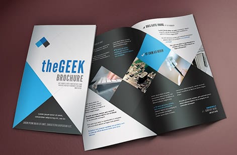
All of this stops being abstract the moment you order something full color. A brochure leans hard on CMYK because it is mostly photos and color blocks, so a clean conversion is what keeps a product shot looking like the product. A flyer lives or dies on a bold headline color reading the same on paper as it did on your screen.
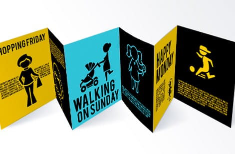
Even small pieces play by the same rules. Business cards use rich black for a deep, premium background, and postcards in a mailing need every card in the run to match the last. Whatever the format, the press mixes the same four inks, so a CMYK file behaves consistently across your whole set of marketing materials.
Getting print-ready color right the first time
A few habits keep color predictable on every order. Build print files in CMYK from the first click. Embed a working profile like SWOP for coated stock so your preview matches the press, which is the heart of good CMYK file setup. Rebuild large black areas as rich black and leave small text on 100 percent K so edges stay razor sharp.
Run one last pass before you upload. Confirm that every placed photo and logo is CMYK too, not just the document, because a stray RGB image converts at the press even when the page around it is clean. Keep any spot ink on its own named plate so it is not silently rebuilt out of four process inks, and flatten transparency on export so nothing shifts in the rip.
When the color really has to be nailed, prove it against the paper, not just the screen. Order free samples to feel how ink sits on different stocks, and lean on print-ready templates that already carry CMYK color, bleed, and safe zones. If a term trips you up along the way, the printing terms glossary keeps a plain-language definition close.
Do that groundwork and the file you upload is the sheet that ships. No last-minute conversion, no color you did not choose, just clean process color across your whole print run at 4OVER4.COM. Browse the full guide library for the rest of the print-prep basics.
Wally explains CMYK
Four inks, one color you can actually print
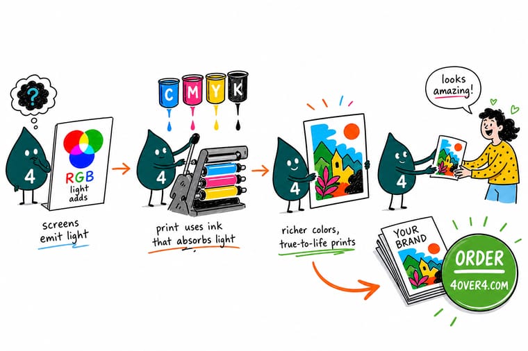
Wally thinks of a press as a painter with four buckets: cyan, magenta, yellow, and black. Your screen glows with light and can show colors no bucket can mix, so the trick is to convert your file to CMYK before you order and preview the small shift yourself. Do that once and the brochure, flyer, or card that ships matches the proof, no last-second surprises. Send print-ready CMYK and let 4OVER4 handle the ink.
Order full-color brochures →Specs and pricing
Put CMYK to work on a full-color brochure
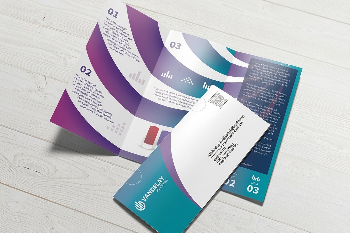
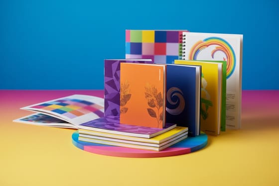
Brochures are the classic CMYK job, all photos and color blocks, so here is what a standard 4OVER4.COM brochure gives you with live specs and price-per-unit straight from the configurator.

| Quantity | Price Per Unit | Total |
|---|---|---|
| 50 | $1.14 | $57.11 |
| 100 | 82.4¢ | $82.38 |
| 200 | 53.3¢ | $106.55 |
| 300 | 41.0¢ | $123.02 |
| 400 | 34.9¢ | $139.49 |
| 500 | 31.2¢ | $155.97 |
| 600 | 26.7¢ | $160.36 |
| 700 | 23.5¢ | $164.75 |
Print it
Full-color print that leans on CMYK


See it in use
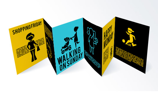
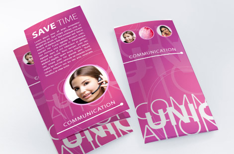
Real full-color brochure work, printed in-house





Explore more
Where to go next




By the numbers
Full-color printing you can count on at 4OVER4
Quick Answers
CMYK printing quick answers
What does CMYK stand for?
Cyan, magenta, yellow, and key, where key is the black plate that prints true black, keeps small text crisp, and deepens shadows without piling three inks onto the sheet.
Why does printing use CMYK instead of RGB?
Ink on paper subtracts light while a screen emits it, so a press builds color from four subtractive process inks in halftone dots rather than from three colors of light.
What happens if I send an RGB file?
It still gets converted, just automatically at the press on default settings, so deep blues can drift purple, bright greens soften, and vivid oranges and hot pinks lose punch with nobody watching.
How do I convert my file to CMYK?
Set the document color mode to CMYK, assign a print profile such as SWOP for coated stock, soft-proof the shift, rebuild large blacks as rich black while leaving small text on 100 percent K, then export a press-ready PDF.
When should I use spot color instead of CMYK?
When one brand color has to match exactly, because a two-color spot job prints that ink straight from the can instead of rebuilding it out of four process inks.
Common Questions
Common questions about CMYK printing
Why do printers use CMYK instead of RGB?
Screens and presses build color in opposite ways. A monitor emits red, green, and blue light and adds those beams together, so an all-on pixel looks white. A press does the reverse: it lays cyan, magenta, yellow, and black ink on white paper, and each layer absorbs part of the light bouncing back to your eye. Ink cannot glow, it can only subtract, so the print world runs on the subtractive CMYK model rather than the additive RGB one.
What does CMYK stand for, and why is the K black?
CMYK is cyan, magenta, yellow, and key. Key is the black plate, and it earns a separate letter because mixing cyan, magenta, and yellow alone gives a muddy brown rather than a true black. A dedicated black ink prints crisp text, clean lines, and deep shadows, and it uses less ink than stacking three colors to fake a dark tone.
Will my colors look different in print than on my screen?
Slightly, and that is normal. Backlit screens can display vivid tones that no ink can match, especially neon greens, electric blues, and hot pinks. Those colors settle a shade calmer on paper. Working in CMYK and previewing the conversion before you order lets you see and approve the shift yourself instead of being caught off guard by the printed sheet.
How do I convert my file to CMYK?
In Photoshop choose Image, then Mode, then CMYK Color. In Illustrator or InDesign use File, then Document Color Mode, then CMYK. Assign a print profile such as U.S. Web Coated (SWOP) v2, adjust any colors that dulled, then export a press-ready PDF with that profile embedded. Building the file in CMYK from the start is even better because nothing has to convert at the last moment.
Do I still need to convert if I upload a PDF?
Yes, ideally. A PDF can hold RGB objects inside it, and letting an automatic conversion happen at the press means the software, not you, decides how each bright color lands. Convert to CMYK yourself, review the result, and export a PDF/X file so the color you approve is the color that prints.
Is CMYK better than RGB for printing?
For anything printed with process inks, yes. RGB is the right space for screens, phones, and web graphics because those devices emit light. Presses apply ink, so CMYK is the space that actually describes what the machine can produce. Use RGB where light is the medium and CMYK where ink is.
What is rich black and when should I use it?
Rich black adds cyan, magenta, and yellow underneath the black plate, for example C40 M30 Y30 K100, so large dark areas print deep and even instead of looking washed out. Use it for backgrounds and big blocks, but keep small text and thin lines on 100 percent K alone so the edges stay sharp and do not blur from ink misregistration.
Get Started
Ready to print in true CMYK color?
Upload a press-ready CMYK file, pick your stock and fold, and we print full color that matches the proof you approved.
Legal Disclaimer
Gold Standard guarantees apply to all standard orders placed through 4over4.com. Price match requires verifiable proof of a competitor's published price for an equivalent product with matching specifications and turnaround time. Satisfaction guarantee covers manufacturing defects and print quality issues. Contact support with order number and documentation. On-time delivery rate based on tracked orders 1999 to 2026. Individual results may vary based on shipping carrier performance.
