
What Is RGB Black and Why Black Prints Muddy


Your black looks flawless on screen and lands gray on paper. The reason is that a screen makes black from light and a press makes it from ink, and a default conversion hands the press one plate of ink to cover ground that four inks should be covering. Here is what RGB black really is, why it turns muddy, and the rich-black fix professionals use, with the exact values to type into your file before you export it.
RGB black is screen black made of light, R0 G0 B0. A press prints CMYK ink, so a default conversion rebuilds it as one plate of 100% K, which prints gray. The fix is rich black: C60 M40 Y40 K100. That single K plate is why the muddy look happens: one pass of black ink leaves paper showing through, so the black looks flat and gray across large solids while the same file looked perfect on your monitor. The professional answer is two blacks in one file. Keep small text, thin rules and barcodes at 100% K, where a single plate cannot misregister against itself, and build big black areas as a rich black such as C60 M40 Y40 K100 so the solid prints deep and even. Set both by hand instead of trusting an automatic pass, and the black you approved on screen is the black that comes off the press.
Start here
RGB black vs rich black in one paragraph
RGB black is the black on your screen, made of light. A press prints with CMYK ink, so it cannot use that black directly. Default settings turn it into a single black plate (100% K), which is perfect for small text but reads flat and gray across large solids. Rebuild those large areas as a rich black, such as C60 M40 Y40 K100, keep fine type at 100% K, and stay under roughly 300% total ink. Do that and the deep black you approved on screen is the black that prints.
Your black looks perfect on screen, then prints gray
You design something with a bold black background, it looks flawless on your monitor, and then the printed piece arrives looking flat and slightly gray. Nothing is defective. What you are seeing is the gap between how a screen makes black and how a press makes black, and it trips up experienced designers just as often as beginners.
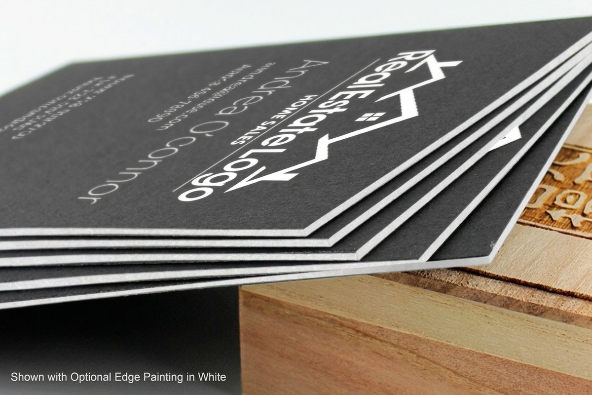
The short version: your screen builds black from light and a press builds it from ink, so the two are not the same color, only the same name. Get the translation wrong and even premium stock looks cheap. Get it right and a heavy black on a set of black business cards reads as deep and expensive as you imagined it.
This guide explains what RGB black actually is, why it turns muddy in print, and the simple fix that professionals use every day. It pairs closely with our overview of CMYK versus RGB for print and the field notes in print quality troubleshooting.
What is RGB black?
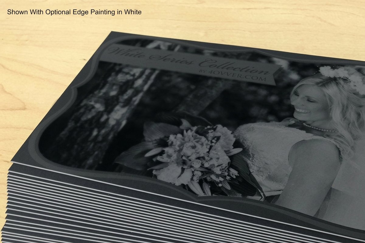
RGB black is the black your display produces, written as R0, G0, B0. Screens are made of tiny red, green, and blue lights, and they create every color by mixing those three. White is all of them at full strength, and black is all of them switched off. In other words, RGB black is not a substance at all. It is the absence of light.
Paper does not glow, so ink has to do the job the light was doing. A press works in CMYK: cyan, magenta, yellow, and a black plate called K. To print your R0, G0, B0, the software first converts that light-based value into an ink recipe. That conversion is invisible, automatic, and the single most common place a rich on-screen black quietly loses its depth. If you want the theory behind why paper uses these four inks, why printing uses CMYK lays it out, and best color profile for printing covers the settings that govern the handoff.
The takeaway is simple. What you call black on screen is a value, not a mix of ink, and until you decide how that value becomes ink, the press will decide for you. That same rule shapes the deep blacks on black postcards and on every dark design you send to print.
Why RGB black prints muddy
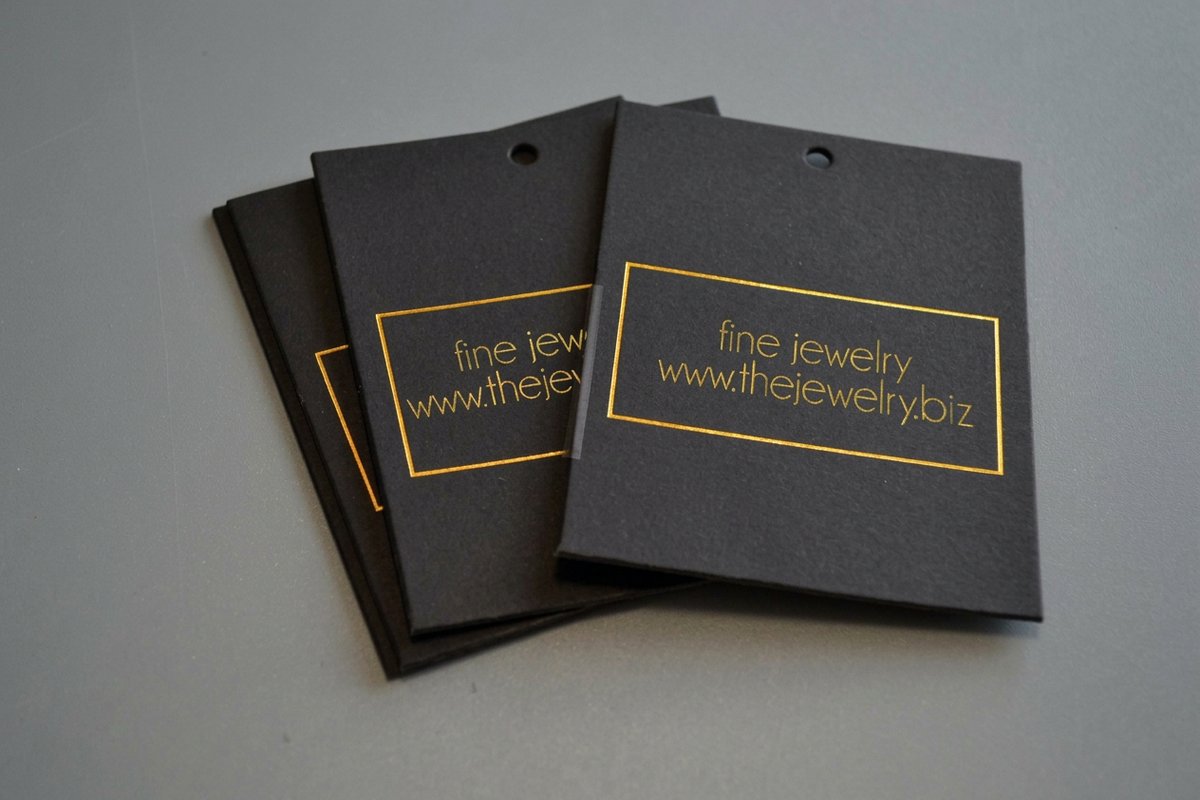
When a standard profile converts R0, G0, B0 to CMYK, it usually lands on plain 100% K, a single plate of black ink. For a line of text that is exactly right. Across a large solid, though, one layer of black ink cannot physically lay down enough pigment to read as true black, so the fill looks thin, blotchy, and gray. That washed, charcoal look is what people mean by a muddy black.
A second failure mode is worse. Some conversions scatter the black into a heavy, uneven four-color mix that leans warm or cool depending on the profile, so your neutral black picks up a brown or blue cast. And because coated and uncoated stocks absorb ink differently, the same file can read richer on one paper and grayer on another. This is why black business cards depend on both the right build and the right stock, and why ordering free paper samples before you commit is time well spent.
Finish matters too. A matte solid scatters light and looks softer, while a gloss or liquid laminate coating reflects it and reads deeper. None of that saves a black that was built weak in the first place, so the real fix happens in the file, before the paper ever enters the press.
100% K black vs rich black: when to use each

There are two right answers, and knowing which to use where is the whole game. A 100% K black is a single plate of pure black ink. It is crisp, predictable, and perfect for small text, thin lines, and anything with fine detail, because only one plate has to line up. A rich black adds cyan, magenta, and yellow underneath that black to build a denser, more saturated result for large areas.
Use 100% K for body copy, captions, hairline rules, small logos, and barcodes. Use rich black for full-bleed black backgrounds, big panels, and any large solid where you want real depth. The term itself is worth knowing precisely, and you can check it against our printing terms glossary so the language you send to your printer matches theirs.
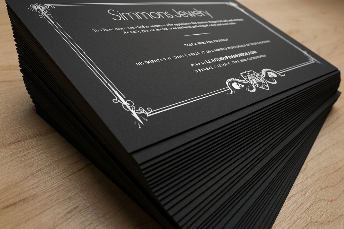
Mixing the two in one file is not a compromise, it is the professional default. A set of black hangtags might carry a rich black field behind 100% K text and a 100% K barcode, all on the same piece. Each element uses the build that keeps it looking its best.
Black swatches compared, as printed
Descriptions only get you so far, so here are the three blacks side by side, in the order most files go wrong. Left is what a default RGB to CMYK conversion hands the press, middle is a clean single plate of 100% K, right is a rich black built as C60 M40 Y40 K100. Your monitor can only approximate the printed result, which is exactly the problem this guide is about, so treat the strip as a map and the free paper samples as the territory.
| Swatch | What it is | Build | How it prints |
|---|---|---|---|
| Default converted RGB black | R0 G0 B0 converted to K100 only | Flat and gray across a large solid, blotchy where coverage thins out | |
| 100% K black | C0 M0 Y0 K100 | Crisp and predictable at small sizes, correct for text, rules and barcodes | |
| Rich black | C60 M40 Y40 K100 | Deep, even and saturated across full-bleed panels and big solids |
The first and second swatches carry the same amount of black ink. The difference between them is only where they are used: put K100 behind a full-bleed panel and it reads as the muddy first swatch, put it under 6pt type and it reads as the crisp second one. The third swatch is the one to reach for whenever the black area is bigger than your thumb.
How to build a rich black that stays deep
A rich black keeps the full 100% K plate and adds a controlled amount of the other three inks beneath it. A dependable, neutral starting point is C60 M40 Y40 K100. The black does the work while the cyan, magenta, and yellow add density and even out the coverage, so the solid reads as a true, deep black rather than a gray one.
You can steer the temperature. For a cooler, more contemporary black, use C60 M0 Y0 K100. For a warmer black that flatters skin tones and photography, use C0 M40 Y40 K100. All three sit comfortably within press limits and print cleanly. If your design uses a specific brand black, treat it like a color decision, and read what spot color printing is to see when a dedicated ink beats a mix.
Set these values by hand rather than trusting an automatic pass. Our step-by-step on converting RGB to CMYK shows exactly where to define them, and because 4OVER4 prints many jobs on plant-based soy inks, a well-built rich black holds its depth while staying kinder to the environment.
Keep small text and thin lines on a single black plate

Rich black is wonderful for solids and dangerous for small type. Because a rich black stacks four plates, any tiny shift in registration on press leaves a faint colored halo around fine letters and hairlines, and suddenly your crisp caption looks fuzzy. The fix is to leave all small text, thin rules, and delicate detail at a clean 100% K.
One plate cannot misregister against itself, so 100% K stays sharp no matter what. This is why the smallest, most detailed elements on business cards should always be single-plate black, even when the background behind them is a lush rich black. The contrast between a rich field and crisp 100% K text is a hallmark of a file that was prepared with care.
While you are separating your blacks, confirm the rest of the file is press-ready. Give small type a little breathing room from the trim, and if bleed and safety margins are new territory, what bleed is and why every file needs it will keep your edges clean.
Watch your total ink, and never use registration black

It is tempting to think more ink means a deeper black, so people reach for registration black, C100 M100 Y100 K100. Do not. That is a full 400% of ink flooding the paper, and it does not print blacker. It smears, takes far too long to dry, sets off onto the sheet behind it, and can crack on folds. Registration black exists to line up printing plates, not to fill a design.
Most commercial presses prefer to stay near 300% total ink, and many prepress teams target 240% to 300% for reliable drying. A rich black of C60 M40 Y40 K100 lands right around 240%, which is why it prints deep without causing trouble. If you are ever unsure, that is exactly the kind of thing 4OVER4 checks for, as our 30-point pro review explains.
Heavier stocks and large solids handle ink better than thin ones, so a deep black on a framed print behaves differently than the same fill on a lightweight sheet. When you keep total coverage in range, the black stays rich, the piece dries on schedule, and nothing offsets in the stack.
Sending print-ready files that hold their black

Bring it all together in the file and the press will reward you. Work in CMYK, set small text and fine detail to 100% K, rebuild large black areas as a rich black such as C60 M40 Y40 K100, and keep your total ink under about 300%. Do that and the black you approved on screen is the black that comes off the press. If the CMYK part still feels arbitrary, why printing uses CMYK instead of RGB explains what the four plates are actually doing under your black.
A quick preflight before you export saves the most heartache: confirm the document is CMYK, check that your blacks are the values you intended and not stray tints, and flatten or preserve them so nothing shifts on the way out. Our guide to what preflight is in printing lists what a printer checks before a file goes to plate, so you can catch a 100% K background or a 320% total-ink solid at your desk instead of on press. The full RGB to CMYK conversion guide walks through each setting, and bleed and trim covers the geometry so your solids reach the edge cleanly.
No design software handy? Our online designer keeps you in print-ready color from the start, and free paper samples let you feel how deep your black will read before you order. When the file is right, configure your black business cards and watch the price update live as you choose size, stock, and finish.
Wally explains black
Screen black is light, print black is ink
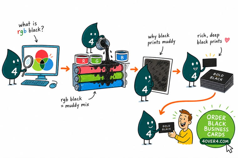
Wally likes to say the muddy-black problem is really a translation problem. Your screen builds black from light, the press builds it from ink, and the trick is telling the press exactly how to rebuild it. Keep small text on a single black plate so it stays sharp, load big solids with a rich black like C60 M40 Y40 K100, and stay under the ink limit. Get that right and 4OVER4 prints the deep, even black you pictured.
Print in deep rich black →Infographic
Screen black vs print black, and the rich-black fix
One frame that shows why the same black reads three different ways, plus the exact rich-black recipes to keep on hand. Save it before your next dark design goes to print.
Same design, three outcomes. RGB black is a screen value, 100% K prints crisp on text but flat on solids, and a rich black rebuilds large areas with real depth while staying under press ink limits.
Specs and pricing
Black business card specs and live pricing
A black-heavy design is where rich black earns its keep. Here are the live specs and price-per-unit for black business cards at 4OVER4.COM, straight from the configurator.
| Quantity | Price Per Unit | Total |
|---|---|---|
| 50 | 81.2¢ | $40.62 |
| 100 | 75.8¢ | $75.78 |
| 200 | 56.6¢ | $113.11 |
| 300 | 51.3¢ | $153.77 |
| 400 | 42.4¢ | $169.69 |
| 500 | 36.2¢ | $181.22 |
| 600 | 32.2¢ | $193.30 |
| 700 | 29.2¢ | $204.29 |
Print it deep
Products that live or die by their black

See it in use
Real black-ink work, printed in-house


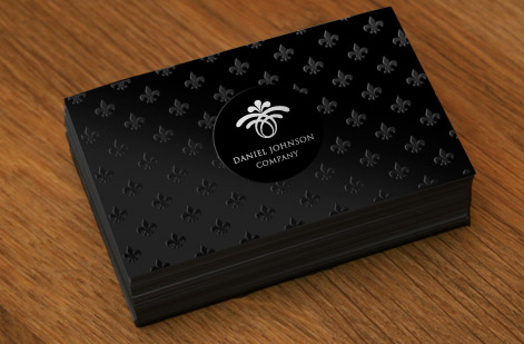
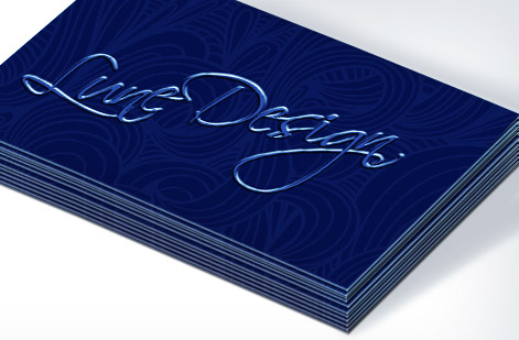


Explore more
Where to go next






By the numbers
Color you can count on at 4OVER4
Common Questions
Common questions about RGB black and rich black
What is RGB black?
RGB black is the pure black you see on a screen, written as R0, G0, B0. Displays build color by adding red, green, and blue light, and black is what you get when all three are switched off. It is a black made of darkness rather than a black made of ink, which is why it cannot travel to paper unchanged. A press has to translate that RGB value into CMYK ink first, and how it does that decides whether your black lands deep or muddy.
Why does RGB black print muddy?
When an RGB black is converted to CMYK, most default profiles turn it into a plain 100% K, a single plate of black ink. On small text that is perfect, but across a large solid, one plate of ink simply cannot lay down enough pigment to read as true black, so the area looks flat, uneven, and slightly gray. Poorly managed conversions can also scatter the black into an unpredictable four-color mix that shifts warm or cool. Either way the on-screen richness is lost in translation.
What is the best rich black formula for printing?
A dependable, neutral rich black is C60 M40 Y40 K100. The 100% black plate does the heavy lifting while the cyan, magenta, and yellow underneath add density and even out the coverage. If you want a cooler, more modern black, drop to C60 M0 Y0 K100. For a warmer black that flatters photography, use C0 M40 Y40 K100. All three stay well under the ink limits a commercial press can handle.
Should I use 100% K or rich black?
Use both, in the right places. Keep body copy, small text, thin rules, and barcodes at 100% K so they stay razor sharp and immune to misregistration. Switch to rich black for large solid fills, background panels, and any big area where you want a deep, luxurious black. Mixing the two on the same file is normal and expected, and it is exactly what separates a professional print file from an amateur one.
Why does black text look gray when printed?
Almost always because it printed as a light or screened black rather than a solid one, or because the black was built from a tint instead of 100% K. Check that your black text is set to a true 100% K and not to a percentage like 80%, and confirm your export did not knock it down during the RGB to CMYK conversion. On coated stocks black also reads deeper than on uncoated, so the same ink can look richer or grayer depending on the paper.
What total ink coverage should I stay under?
Most commercial sheetfed presses like to stay around 300% total area coverage, and many prepress teams target the 240% to 300% range to keep drying reliable and avoid set-off. That is why registration black (C100 M100 Y100 K100, a full 400%) is a mistake for design fills. A rich black such as C60 M40 Y40 K100 lands near 240%, giving you a deep result with room to spare.
How do I convert RGB black to CMYK the right way?
Set your document to CMYK before you finalize the artwork, choose a print-ready profile, and then define your blacks by hand rather than trusting an automatic conversion. Set small text to 100% K and rebuild large black areas as a rich black. Our walkthrough on converting RGB to CMYK in Photoshop and Illustrator covers the exact steps, and ordering free paper samples first lets you judge how deep your black will actually read on the stock you plan to use.
What CMYK values should I use instead of RGB black?
For large solids, use the neutral rich black C60 M40 Y40 K100, which totals 240% ink. Use C60 M0 Y0 K100 for a cooler black or on uncoated stock, and C0 M40 Y40 K100 for a warmer black behind photography and skin tones. For small text, thin rules and barcodes, use C0 M0 Y0 K100 on its own. Keep total ink under about 300%, and type the values in by hand rather than letting an automatic conversion pick them for you.
Why does my black print gray?
Because a default RGB to CMYK conversion turns R0 G0 B0 into a single plate of 100% K. One pass of black ink over a large area lets the paper show through, so the solid reads flat and gray next to the black you saw on screen. Nothing is broken with the press or the file, the black is simply too thin for the area it has to cover. Rebuild large areas as a rich black such as C60 M40 Y40 K100 and the same artwork prints deep and even.
Should I use rich black on small text?
No. A rich black stacks four plates, and any small registration shift on press leaves a faint colored halo around fine letters and hairlines, which reads as fuzzy type. Leave small text, thin rules and barcodes at 100% K, a single plate that cannot misregister against itself, and save the rich black for the field behind them. Both blacks in one file is the professional default, not a compromise.
Get Started
Ready to print a black that actually looks black?
Build your file with a rich black, bring it to 4OVER4.COM, and print it on the size, stock, and finish that makes it shine. Adjust every option and watch your price update live.
Legal Disclaimer
Gold Standard guarantees apply to all standard orders placed through 4over4.com. Price match requires verifiable proof of a competitor's published price for an equivalent product with matching specifications and turnaround time. Satisfaction guarantee covers manufacturing defects and print quality issues. Contact support with order number and documentation. On-time delivery rate based on tracked orders 1999 to 2026. Individual results may vary based on shipping carrier performance.
