
2-Color Printing Using Pantone or Spot Color Inks


Emma is our prepress and print production voice, built from the knowledge of our production team, with over 20 years in printing.
Two inks, mixed to an exact Pantone recipe, printed as clean solid color. A mixed Pantone hits an exact value every run, which a four-color build only approximates.
Two-color printing uses exactly two ink colors, almost always pre-mixed Pantone spot inks, instead of the four process inks in CMYK. Each ink prints as one solid, repeatable tone, so your exact brand color matches on every run. It is ideal for logos, type, and flat graphics, but not for photographs. At 4OVER4.COM the spot inks on offer are PMS 877 Silver and PMS 872 Gold on metallic ink business cards.
Quick tips
Quick tips for two-color printing
Design in two named Pantone swatches so every element lands on one of two plates, and confirm both inks against a physical Pantone book on your real stock. On our menu the spot inks are PMS 877 Silver and PMS 872 Gold on metallic ink business cards, and every other card prints in CMYK.
What is two-color printing
Two-color printing uses exactly two ink colors to reproduce a design, rather than the four process inks in full-color CMYK. In almost every case those two colors are pre-mixed Pantone spot inks, each one loaded onto its own station on the press and laid down as a single solid tone. The result is clean, saturated, and repeatable, which is why studios have relied on it for logos and stationery for decades.
Think of it as choosing two paint cans instead of blending everything from a four-color set. Because each ink is mixed to a fixed recipe before it prints, the color you approve is the color you get on every sheet. That predictability is the whole point, and it is what separates spot-color work from process printing. If you want the deeper background on process color, our guide on CMYK vs RGB for printing explains where each model fits.
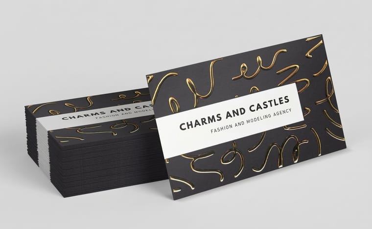
On the 4OVER4.COM business card lineup, true spot ink means PMS 877 Silver or PMS 872 Gold on metallic ink cards, while foil treatments behave like a second color on the sheet. Classic cards print in CMYK, so a two-color layout there is built from process inks.
Advantages of two-color printing
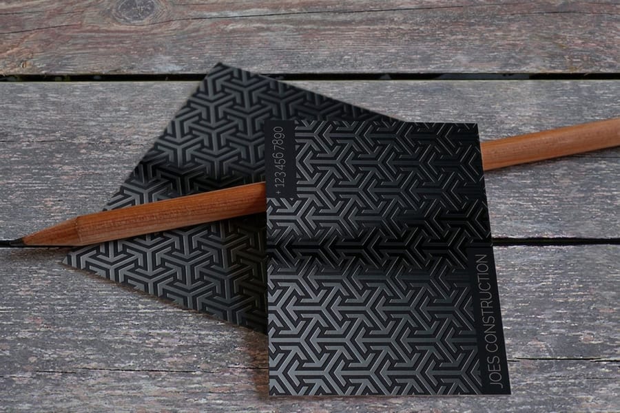
The headline advantage is color accuracy. A Pantone spot ink is mixed to a set formula, so your exact brand color prints identically on the first card and on a reorder six months later. CMYK simulates color with tiny dots, which can drift between runs and presses. Spot ink does not drift. Our metallic ink cards show it in practice: they print PMS 877 Silver or PMS 872 Gold on 16pt Gloss Cover, either as the only ink (1/0 or 1/1) or on top of a CMYK layer (5/0 or 5/5), and 500 cards cost $126.32.
- Brand consistency that survives reorders, different stocks, and different jobs.
- Crisp, solid coverage in flat areas, with none of the dot pattern you can see in process fills.
- Special inks that CMYK simply cannot make, including metallics, fluorescents, and pastels.
On our menu, the metallic route runs through metallic ink business cards and foil business cards.
Spot inks explained
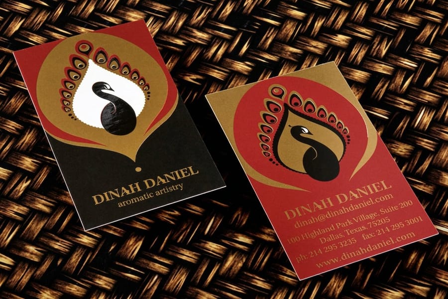
A spot ink is one ink, mixed to a fixed Pantone recipe in the bucket before the run starts, then printed from its own plate as a solid, even color. A process ink is one of the four CMYK colors, and a full-color image is assembled from screens of tiny dots of those four that your eye blends together on the sheet. Put plainly: a spot ink is the color, a process ink is an ingredient.
Because a spot ink arrives already finished, it does not rely on dot size, screen angle, or tight registration to look right. A flat block of it stays flat, thin type in it stays crisp instead of picking up a fringe of the other plate, and the same ink number comes back the same on a reprint later in the year. Confirm that number in a Pantone Solid Coated or Solid Uncoated book on the stock you will actually print, because coated and uncoated paper pull the same ink in different directions. Our Pantone versus CMYK color matching guide covers what shifts and how far.
Metallic spot inks carry real metallic flake in the ink itself, so a silver or a gold reads like metal instead of the flat gray or mustard a four-color build gives you. Fluorescent spot inks carry pigment that sits outside the CMYK gamut entirely, which is how a hot pink or a signal orange stays loud on paper. Pastels behave the same way, holding a soft, even tint that a light CMYK screen turns speckled. None of the three can be faked with process inks, and that is the clearest reason to spend a plate.
So when is a spot ink worth it? Spend the plate when the color has to be exact on every reorder, when it is a metallic, fluorescent, or pastel that CMYK cannot mix, or when the quantity is high enough that the one-time mixing and setup spreads thin across the run. Skip it when the second color is decorative, the run is short and digital, or the design already needs photographs, since the mixing step is a cost full-color printing never pays. If you want the metal look without managing separations yourself, foil business cards get you there with a stamped foil instead of a mixed ink.
Disadvantages of two-color printing
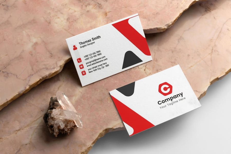
Two-color printing is a specialist, not a generalist. Its limits are as clear as its strengths.
It cannot print photographs. Two flat inks have no way to reproduce the millions of tones in a photo or a smooth full-color gradient. If your design leans on imagery, full-color CMYK is the right call, and you can compare the trade-offs in our best color profile for printing guide.
It asks more of your file. Every element has to sit on one of two named spot plates. A stray RGB logo or a drop shadow can quietly add a third color and break the job, so the setup is less forgiving than clicking print on a full-color file.
It is not always cheaper. On short digital runs, mixing custom spot inks adds a setup step that full-color printing skips, so two-color usually pays off at higher quantities rather than tiny batches. Match the method to the job and it rewards you.
Pantone versus CMYK conversion
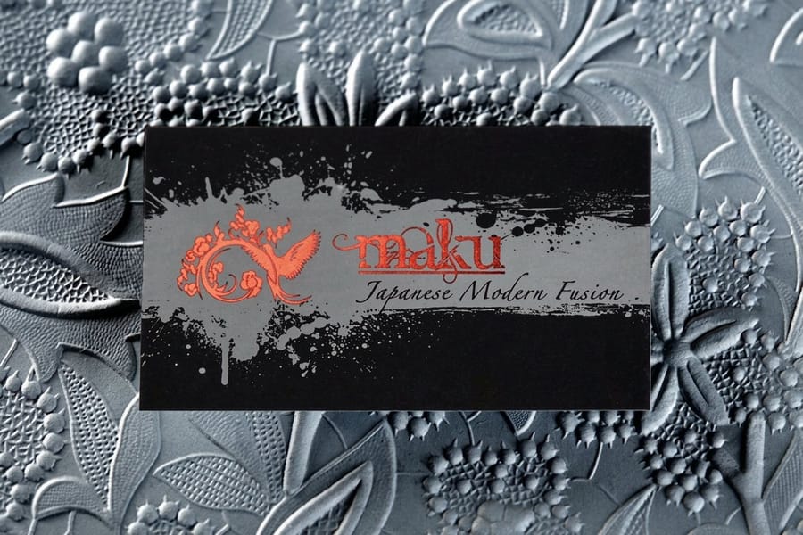
Can you convert a Pantone color to CMYK and skip spot ink? You can convert, but the match is rarely perfect. Rebuilding a mixed ink from four process colors shifts it, and vivid oranges, deep blues, and any metallic drift the most.
The diagram in the quick tips section shows the idea: two named spot inks stay separate on their own plates and combine into one clean two-color print, exactly the color you specified. A CMYK conversion instead approximates each ink with a screen of four process colors, which is why the same brand blue can look one way on screen and another off the press.
The practical rule is simple. When precise color matters, print it as a spot ink. When you need photographs or dozens of colors, print CMYK. For the on-screen side of that story, our CMYK vs RGB guide is the companion read, and logo design best practices covers building marks that translate cleanly into two colors.
How to choose the right two-color setup
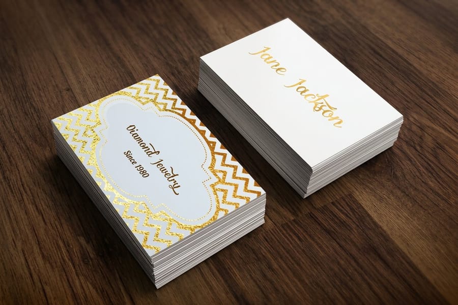
Choosing well starts with your brand, not the press. Pick a dominant ink for text and structure, then a single accent ink for the logo or the moments you want to pop. Two colors used with restraint look more designed than four colors used carelessly.
The same ink looks brighter on a coated sheet and softer on an uncoated one, so one design printed on an uncoated classic card and on the silk laminated stock of a metallic foil card reads differently in the hand.
Then match the method to the artwork. Logos, type, and flat shapes are made for two-color. Photos and rich color scenes are not. If you are undecided, order free paper samples and see the inks on real stock before you commit, or browse the full marketing materials range to keep every piece on one palette.
Other options for two-color effects
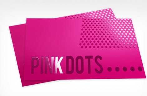
Two ink colors is the textbook definition, but the two-color feeling shows up in several finishes where a second treatment behaves like a spot color on the sheet.
- Spot color plus black, the classic economical combo: one brand ink carries the identity and black handles body text.
- Duotone, where a single photograph is printed in two inks for a stylized, editorial look instead of full color.
- Foil as the second color, seen on foil business cards, where metallic foil reads as a bold accent against a single printed ink.
- Spot UV as a tonal layer, used on spot UV business cards, adding a glossy second layer over the printed card.
These techniques stretch a two-color budget into something that feels premium. For a fully metallic route, holographic business cards push the second-color idea even further. Browse the business card design gallery to see how real customers combine two treatments without tipping into full color.
What two-color printing costs and how prices are set
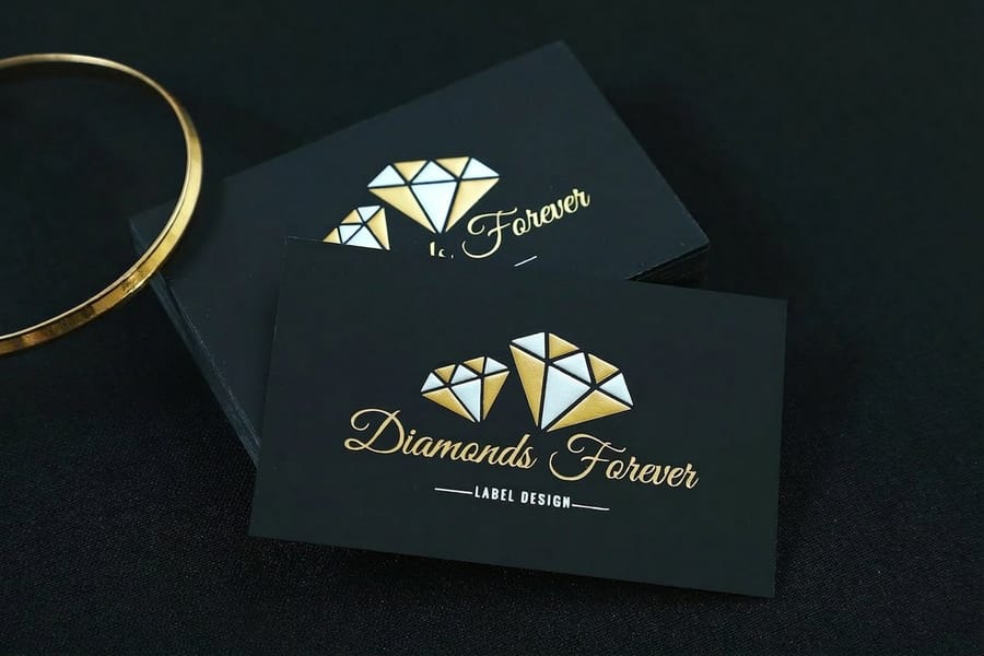
Two-color pricing moves on four levers: quantity, stock, size, and ink type. You can see the volume lever on our metallic ink cards: 500 cost $126.32 and 1,000 cost $159.28, so the per card price drops from about $0.25 to about $0.16 when you double the run.
There is no single sticker price, only the price for your exact configuration.
The honest way to compare is to see live numbers. Every 4OVER4.COM product page shows price-per-quantity straight from the configurator, so you can watch the per-card cost fall as the quantity climbs. Check the specs and pricing for foil business cards below, and if you are weighing where to print at all, our where to print business cards guide lays out the options.
Tips to get started with your two-color project
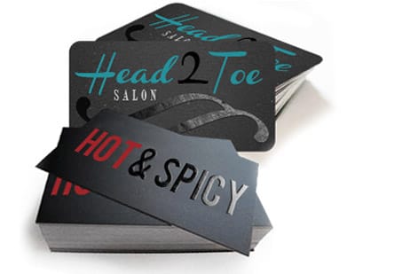
To set up a two-color job, follow these five steps and the file will separate cleanly the first time.
- Pick your two Pantone colors. Choose one dominant ink for text and structure, plus one accent ink for your logo or highlights, and look both up in the Pantone book that matches your stock.
- Decide which ink earns the spot plate. Give the plate to the ink that must match on every reprint, usually the logo color. A purely decorative second color on a short run can stay a process build.
- Build the art in spot swatches. Create two named Pantone swatches in your design tool and assign every element to one of them. Delete any stray CMYK or RGB colors so nothing sneaks onto a third plate.
- Keep the artwork flat and vector. Two-color work sings when it is clean vector shapes and type. Avoid gradients across both inks and skip photographic imagery that needs full color.
- Proof in two-color separations. Turn on separations preview and confirm you see only two plates. Check that overlaps and knockouts read the way you intend before you upload.
- Order what the menu offers. At 4OVER4.COM, metallic ink business cards print PMS 877 Silver or PMS 872 Gold, alone or over CMYK. For any other pair of colors, build the design in CMYK on classic cards and expect a close process match, not a mixed ink.
Business cards are the perfect canvas to try it, because the layout is small, graphic, and brand-led. Reach for metallic ink when you want a real PMS second color that shimmers, or build a flat two-color layout on a classic card in the online designer. The guide hub covers the file steps for each.
Wally explains two-color
Two inks, mixed once, matched forever
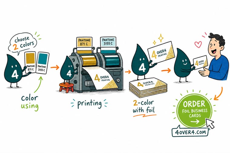
Wally treats spot ink like a recipe: mix your brand color exactly once and every card prints the same shade, first run to reorder. Two colors keep logos crisp and budgets tight, while CMYK is for photos. Pick two Pantone inks, keep the art flat and graphic, and let 4OVER4 press it clean, right down to a foil accent that reads like a second color.
Order foil business cards →
Specs and pricing
Foil business card specs and live pricing
Foil is a two-color trick in real life: a single printed ink plus a metallic foil accent. Foil business cards run 500 for $222.13, which is $0.44 each, on 16 Point Silk Laminated or 14pt Uncoated Cover, in seven foil colors from gold and silver to rose gold and blue, on the front, the back or both, with a 9 business day turnaround. Live specs and price-per-unit are below.

| Quantity | Price Per Unit | Total |
|---|---|---|
| 500 | 44.4¢ | $222.13 |
| 1,000 | 26.9¢ | $269.14 |
| 2,500 | 20.2¢ | $504.19 |
| 5,000 | 19.7¢ | $986.04 |
| 10,000 | 16.4¢ | $1,644.19 |
| 15,000 | 14.4¢ | $2,161.30 |
| 20,000 | 13.5¢ | $2,701.94 |
| 25,000 | 13.0¢ | $3,242.54 |
Print it
Order two-color and spot-color business cards at 4OVER4
Spot UV business cards add a clear gloss layer to one or both sides of a 2 by 3.5 inch card on 14pt or 16pt gloss or 16pt silk laminated stock, 500 for $76.88. Classic cards start at 100 for $17.57 and print in CMYK on 74 stocks. Metallic foil cards stamp one of seven foil colors next to your printed ink, 500 for $222.13.
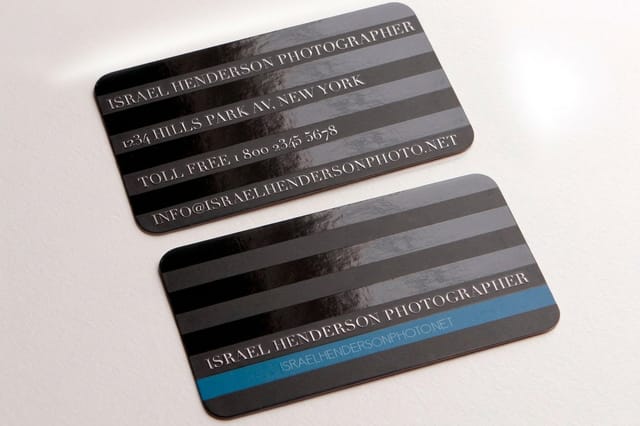

See it in use
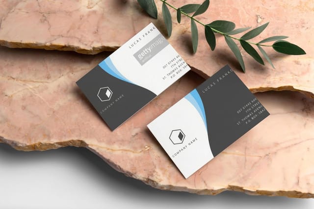
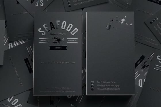
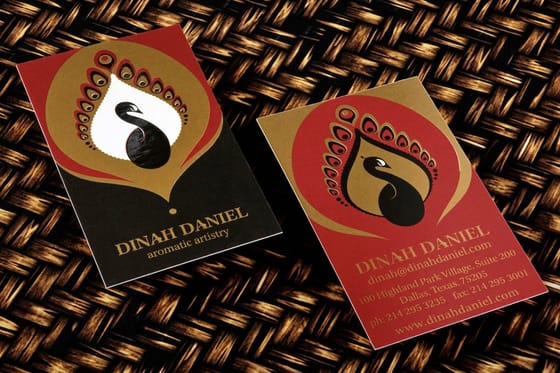
Spot-ink cards we ran for customers









Explore more
Where to go next


By the numbers
Metallic ink at $0.25 a card in 500s
Common Questions
Common questions about two-color printing
What is two color printing?
Two-color printing uses exactly two ink colors to print a design instead of the four process inks used in full-color CMYK. The two inks are almost always pre-mixed Pantone spot colors, so each one prints as a single, solid, consistent tone. It is a classic choice for logos, stationery, and clean graphic layouts where you want strong, repeatable brand color without building every shade from four process inks.
What are the advantages of two color printing?
The biggest advantage is color accuracy. Because Pantone spot inks are mixed to a fixed recipe, your exact brand color prints the same on every sheet and every reorder. Two-color work also produces crisp, saturated flat areas that CMYK screens can struggle to match, It is efficient, consistent, and gives artwork a deliberate, designed look.
What are the disadvantages of two color printing?
Two colors cannot reproduce full-color photography or complex gradients, so it is the wrong tool for image-heavy designs. It also asks more of the file setup, since every element has to live on one of two spot plates. On very short digital runs, full-color printing is often cheaper because it needs no custom ink mixing. The method rewards clean, graphic art and asks for more care when a design really wanted four colors.
What does two color printing cost and how are prices set?
Price depends on quantity, stock and size. On our menu, metallic ink business cards with PMS 877 Silver or PMS 872 Gold cost $126.32 for 500 and $159.28 for 1,000, so the price per card falls as the run grows. At 4OVER4.COM you can see live pricing per quantity on each product page before you order, with no surprises at checkout.
Can you convert a Pantone color to CMYK?
Yes, most Pantone colors have a CMYK equivalent, but the conversion is rarely exact. Bright oranges, deep blues, and metallics in particular shift when they are rebuilt from four process inks. If matching a precise brand color matters, print it as a spot ink rather than a CMYK build. Our guide on best color profiles and the difference between CMYK and RGB explains why the same file can look different across screens and presses.
How do I set up a file for two color spot printing?
Work in a vector tool, create two named Pantone swatches, and assign every object, stroke, and block of type to one of the two swatches. Remove all other colors so nothing lands on a third plate, then use the separations preview to confirm only two plates render. Export a press-ready PDF with spot colors preserved.
What is the difference between a spot ink and a process ink?
A process ink is one of the four CMYK colors, and every shade in a full-color job is built from overlapping screens of those four, so the color you see is really tiny dots your eye blends on the paper. A spot ink is already the finished color in the bucket and prints solid from one plate, so the tone does not depend on dot size, screen angle, or registration. A two-color job runs two spot plates instead of four process plates.
Get Started
Order metallic ink business cards from $126.32 for 500
Pick PMS 877 Silver or PMS 872 Gold, print it alone or over full color on 16pt Gloss Cover, and get the same metallic tone on every reorder.
Legal Disclaimer
Gold Standard guarantees apply to all standard orders placed through 4over4.com. Price match requires verifiable proof of a competitor's published price for an equivalent product with matching specifications and turnaround time. Satisfaction guarantee covers manufacturing defects and print quality issues. Contact support with order number and documentation.
