
Business Card Inspiration


Ideas you can actually order. This is a curated gallery of business card designs across bold stocks, custom shapes, tactile finishes, and specialty formats, each one linking straight to the exact card that prints it. Find the direction that fits your brand, then make it yours with a free online proof before it runs.
The best business card inspiration starts with one strong idea. A bold stock, a custom shape, a spot UV shine, or a lenticular tilt each makes a card memorable. Pick one direction, keep the rest simple, and 4OVER4 prints it on real stock, trusted by 150,000+ businesses and 10,000+ reviews.
Where good ideas come from
What actually makes a card memorable
A business card gets a couple of seconds and a couple of square inches to make an impression. The cards people keep spend that on one clear idea, a shape, a finish, a color, a dimensional trick, and let everything else stay quiet so it lands. Inspiration is not about cramming in every trend. It is about picking the single move that fits your brand and executing it cleanly on stock that feels as good as it looks.
The direction follows the brand and the use. A premium, high-end feel comes fastest from a black card that reads as expensive on contact. A card that needs a second look breaks the rectangle with a circular cut. A card built to be unforgettable moves as it tilts with 3D lenticular printing, while a card meant to keep working ends up as a magnet or a sticker. Browse every option with live pricing in the business cards catalog.
You do not need a design team to get there. Start from a free template or type your brand into the free Online Designer, then pick one strong direction and keep the rest simple. If you want a finish applied by hand, 4OVER4 printing services cover lamination, spot UV, foil, and specialty stocks, and every order ships with a free online proof so you can confirm the design before it prints. Here is a closer look at the four directions that carry an idea best.
Start here
Three cards to spark your design
A seeded pick from the formats that turn heads, each with live pricing pulled straight from the configurator. Start with one of these, or browse the full lineup further down.
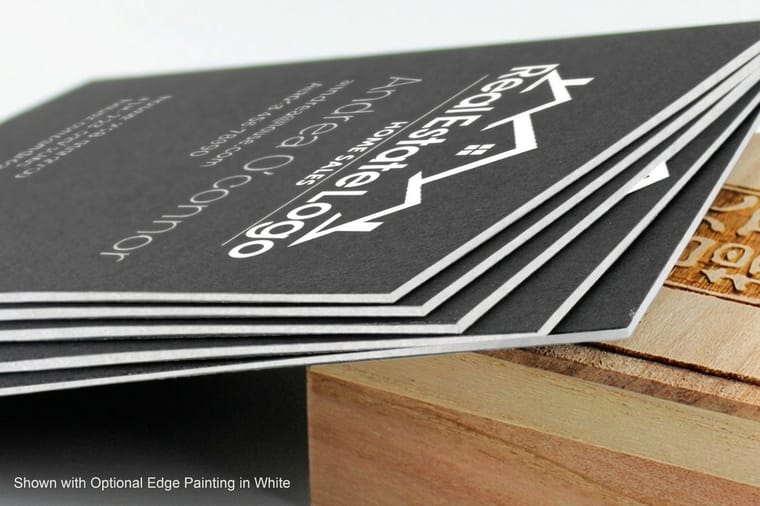
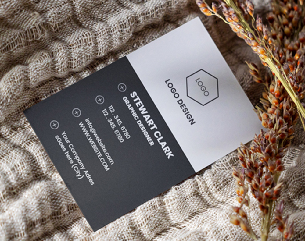
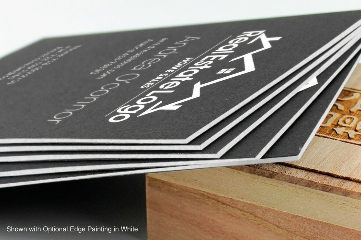 Black Business Cards Deep black stock makes a simple layout feel expensive before anyone reads a single word.
 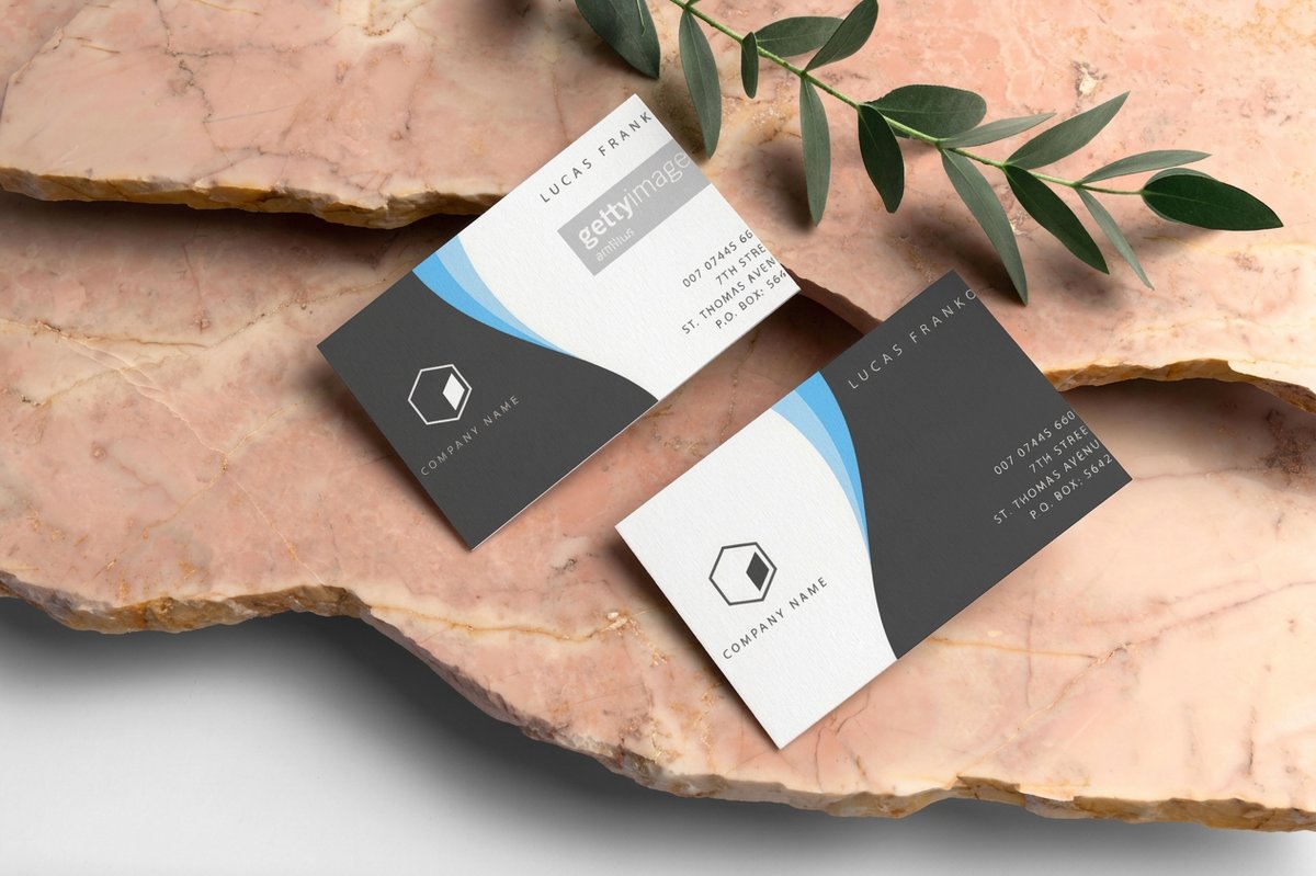 Classic Business Cards A clean, affordable canvas that lets strong type and a good logo carry the whole design.
 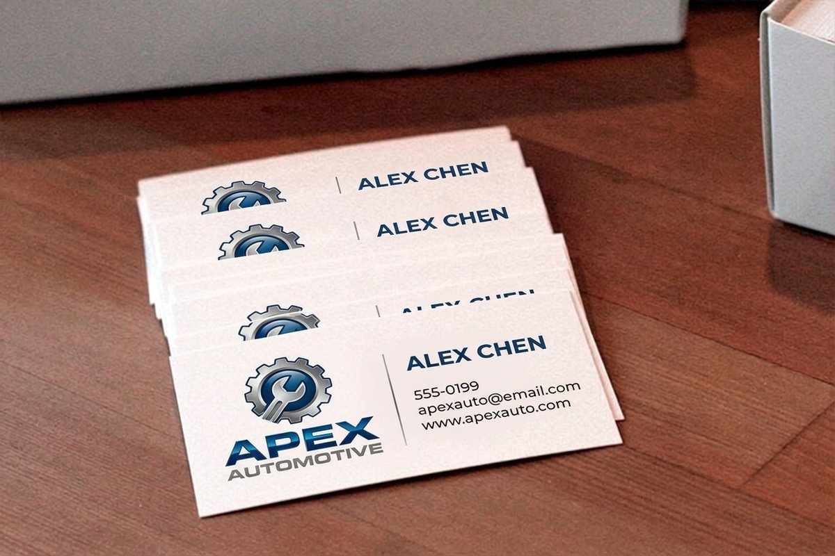 Automotive Business Cards Bold, high-contrast layouts built for shops, detailers, and anyone who sells on the road.
 The directions
Four ways to make a card stand out
Every memorable card leans on one of these moves. Go dark for an instant premium feel, break the rectangle with a custom shape, add a finish people feel before they read, or make the card move and stick around. Pick the one that fits your brand, commit to it, and keep the rest of the layout calm so the idea has room to land. If your card needs a shape of its own, circle cards and die-cut options can cut it to fit the mark.
Go Dark and Dramatic
Deep black or richly colored stock turns a plain layout into something that feels high-end on contact. Add one bright accent for the name or logo and let the rest breathe. It is the fastest way to read as premium without a single special finish.
Break the Rectangle
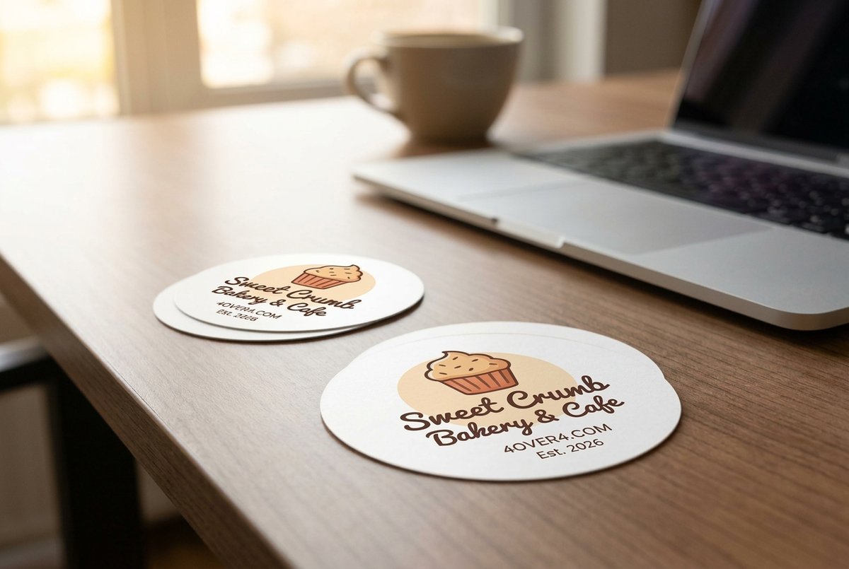
A rounded, circular, or fully die-cut card stops the eye simply by not looking like every other card in the stack. Shape it to your logo or an object your brand owns and the card becomes the mark itself.
Add a Finish That Catches Light
A spot UV gloss over a matte base, a soft-touch coat, or a foil-style shine gives the card a texture people feel before they read it. Reserve the finish for one element so it reads as intentional, not busy.
Make It Move or Stick
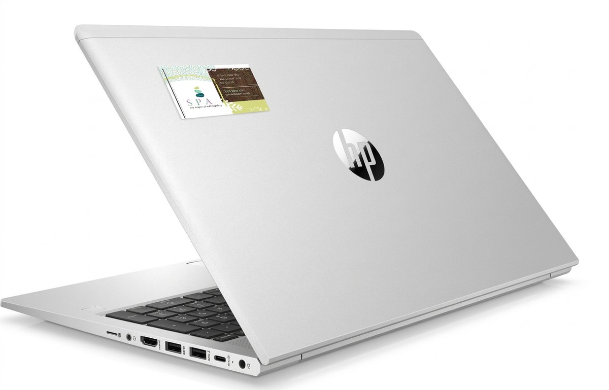
Go dimensional with a lenticular card that shifts as it tilts, or make the card outlast the moment as a magnet or sticker. Each one earns a spot people keep instead of a card that ends up in the bin.

Find your direction
Which design direction fits your brand?
The right card is the one that matches what you sell and how the card gets used. Start from the impression you want to leave in a glance, then pick the direction that gets you there without crowding your name off the card.
A card that feels premium in the hand
Dark stockBlack stock reads as high-end instantly and makes even a simple layout look considered and expensive.
A shape that breaks the rectangle
Custom shapeA circular or die-cut card gets noticed simply by not looking like everything else in the stack.
A card that moves when you tilt it
LenticularLenticular printing shifts the art as the card turns, the kind of wow a flat card can never match.
A card people actually keep
Sticks aroundMagnet cards live on the fridge and stickers travel on laptops, so your brand keeps working long after the handoff.
A creative canvas for makers
ArtistArtist cards treat the card as part of the portfolio, room to let your own work set the tone.
I went with black stock and one foil-look accent and people at the fair kept asking to keep the card. It looks like ten times what it cost. 4OVER4 printed it razor sharp.
The lineup
Cards built to turn a design idea into print
These are the cards behind the inspiration above, with live pricing, specs, and customer reviews. Mix a bold stock with a finish, a shape with a specialty format, and see how each one prints. With 25+ years in printing, 4OVER4 knows how to make a small card do big work.
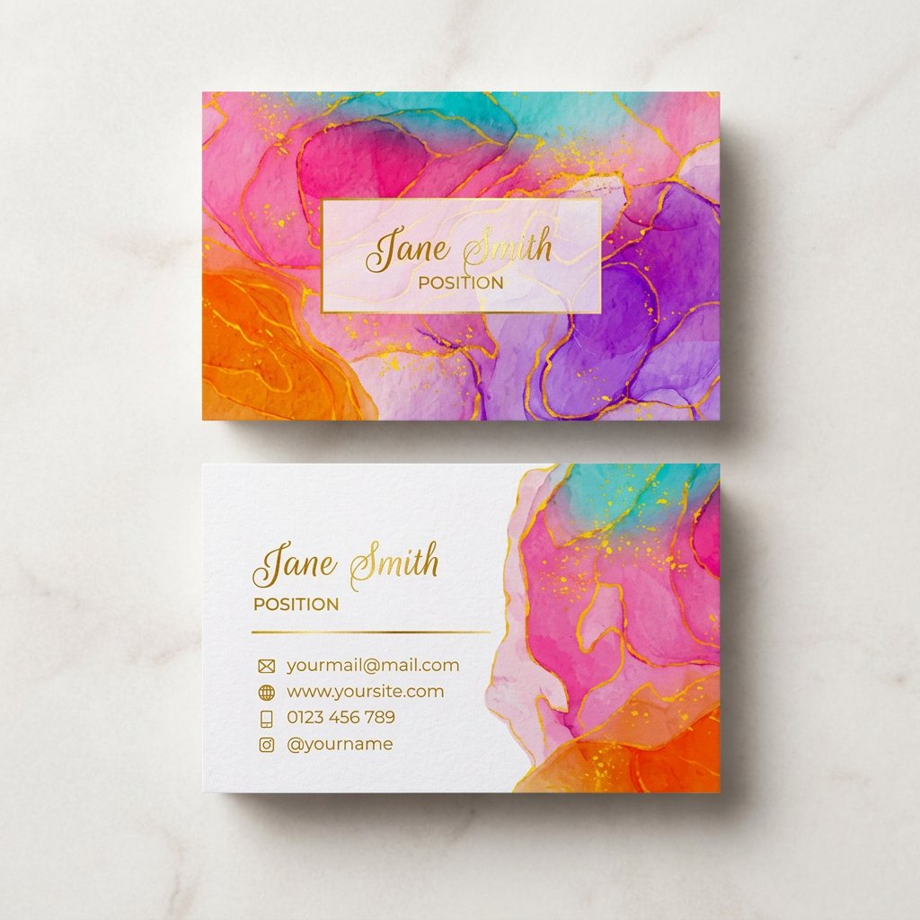
Specs & price
Stocks, options, and live pricing
These are the real configurator specs and prices behind the standout cards, from a dramatic black stock to a circular cut. Every option below pulls straight from the live product configurator.
| Quantity | Price Per Unit | Total |
|---|---|---|
| 50 | 81.2¢ | $40.62 |
| 100 | 75.8¢ | $75.78 |
| 200 | 56.6¢ | $113.11 |
| 300 | 51.3¢ | $153.77 |
| 400 | 42.4¢ | $169.69 |
| 500 | 36.2¢ | $181.22 |
| Quantity | Price Per Unit | Total |
|---|---|---|
| 500 | 15.4¢ | $76.88 |
| 1,000 | 8.96¢ | $89.63 |
| 2,500 | 5.36¢ | $133.98 |
| 5,000 | 4.30¢ | $214.84 |
| 10,000 | 3.43¢ | $342.67 |
| 15,000 | 3.32¢ | $497.53 |
Side by side
Every card, compared
Line up the most popular business cards on price, turnaround, and rating so the trade-offs are clear before you commit to a direction. Weigh a premium stock against a specialty finish at a glance.
 free business cards | 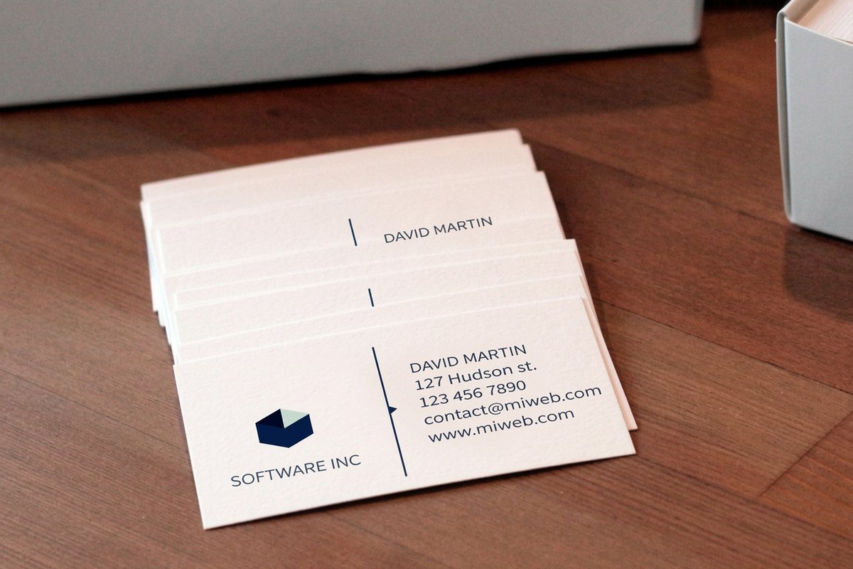 Standard Business Cards |  3D Lenticular Business Cards | 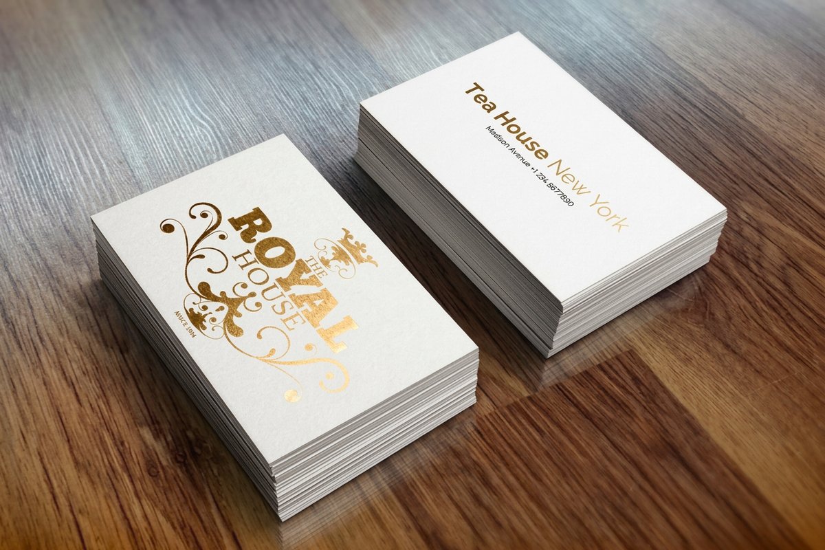 Metallic Foil Business Cards |  Mini Cards |  Premium Prestige Business Cards | 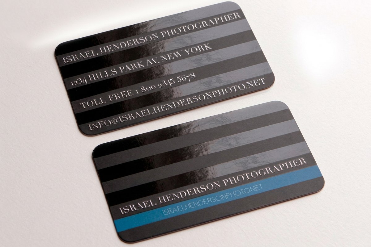 Spot UV Business Cards | |
|---|---|---|---|---|---|---|---|
| Min price | Free | $17.57 | $690.88 | $222.13 | $17.57 | $36.62 | $76.88 |
| Paper / stock | 14pt Gloss Cover | 14pt Gloss Cover | 31pt Lenticular Lens | 16 Point Silk Laminated | 14pt Gloss Cover | 32pt UltraWhite Uncoated Cover | 14pt Gloss Cover |
| Finish | - | Standard Finish | - | - | Standard Finish | Standard Finish | - |
| Size | 2" x 3.5" | 2" x 3.5" | 2" x 3.5" - Vertical | 2" x 3.5" | 2" x 2" | 2" x 3.5" | 2" x 3.5" |
| Default qty | 200 | 100 | 500 | 500 | 100 | 50 | 500 |
| Turnaround | 5 business days | 3 business days | 22 business days | 7 business days | 3 business days | 5 business days | 5 business days |
| Rating | |||||||
| View & customize | View & customize | View & customize | View & customize | View & customize | View & customize | View & customize |
At a glance
Directions, starting prices, and the vibe
A quick scan of the cards that carry a design idea well, the starting price for each, and the impression each one leaves, so you can shortlist a direction before you open the configurator.
| Card | Starting price | Best for | The vibe |
|---|---|---|---|
| Black Business Cards | $40.62 | A premium, high-end feel | Dark and dramatic |
| Circle Business Cards | $26.37 | Breaking the rectangle | Playful and modern |
| 3D Lenticular Business Cards | $690.88 | A card that moves | Unforgettable |
| Artist Business Cards | $17.57 | Makers and creatives | Expressive |
| Classic Business Cards | $17.57 | Strong type and a good logo | Clean and timeless |
| Business Card Magnets | $19.68 | A card that stays put | Practical and sticky |
| Business Card Stickers | $10.76 | Brand on everything | Fun and shareable |
Who it fits
Whose brand a standout card serves best
A memorable card is a fit anywhere the card itself is part of the pitch. It works hardest for the people who sell craft, taste, or a personal brand, where a card that looks and feels considered says something a plain rectangle never could.
Designers and creatives
Your card is a portfolio piece before it is contact info. A bold finish, an unusual shape, or a lenticular tilt signals the craft you sell better than any tagline.
Shops, trades, and detailers
High-contrast layouts and durable stock survive the glovebox and the toolbox. A card built to be handled still looks sharp on the tenth pass.
Salons, spas, and beauty
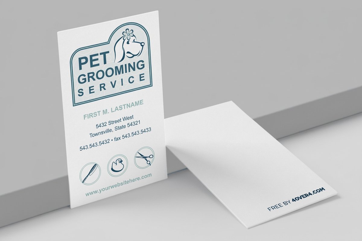
A soft-touch coat or a rounded cut matches the experience you sell. The card feels like the service before the client books it.
Startups and founders
A memorable card buys you a second conversation at events. One strong idea, cleanly executed, is worth more than a logo dump.
Events and hospitality
Cards that get handed out fast need to earn a keep on sight. A die-cut shape or a spot UV shine makes the difference between saved and tossed.
Realtors and agents
A premium card reads as a premium agent. Pair a clean, confident layout with a stock that feels like the homes you list.
Wally helps you pick one bold idea
Great cards commit to a single move
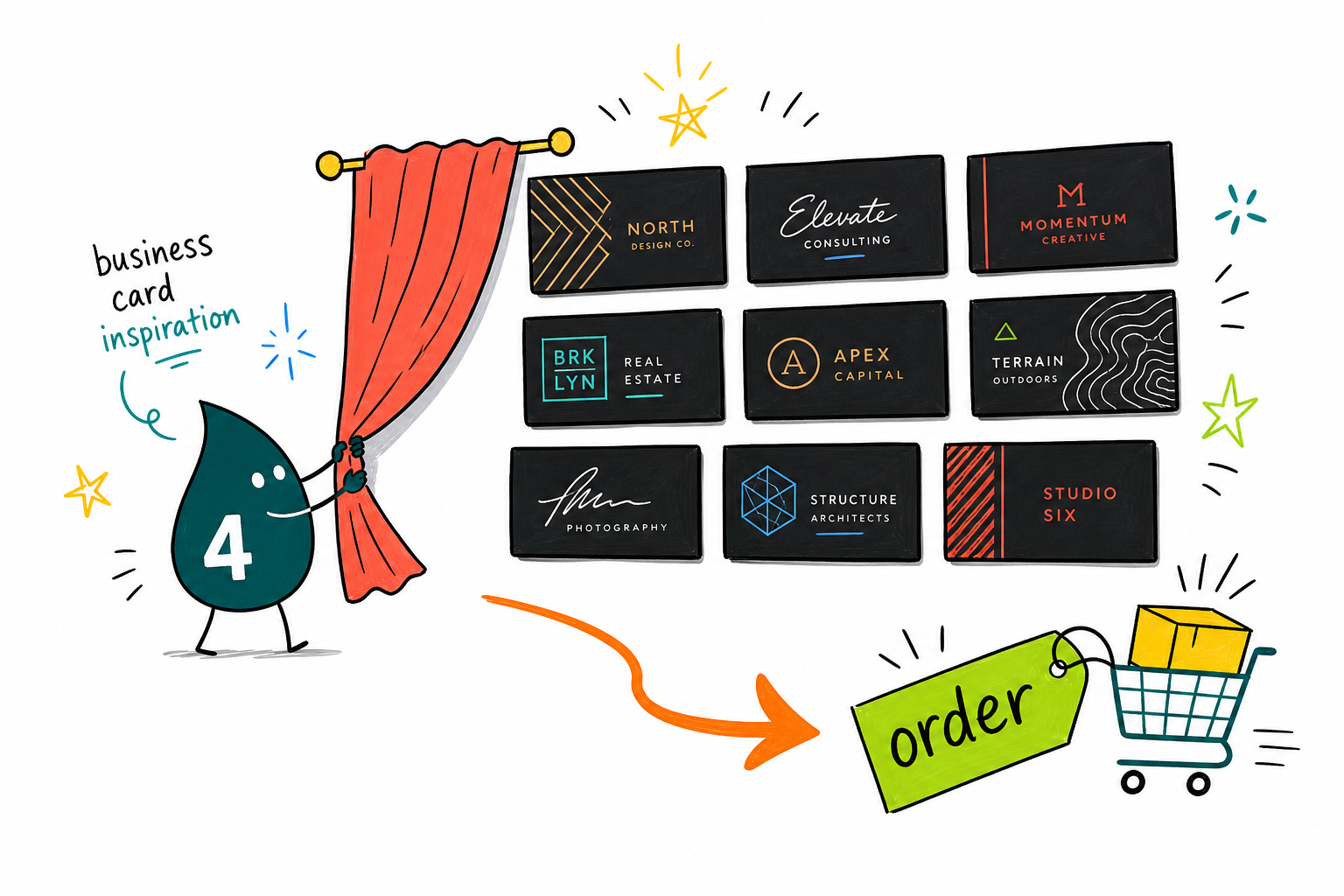
The cards people keep do one thing well: a dark premium stock, a spot UV shine, a circular cut, or a lenticular tilt. Choose the one direction that fits your brand, keep the rest of the layout calm, and let the idea frame your name. Upload your design, pick a stock, and the free proof confirms it before it prints.
Design a standout business card →The circle cut was the whole idea for my studio brand. It stands out in a stack of rectangles and clients remember it. The proof let me nail the layout before it printed.
Turn the idea into a card
How to design a card that still reads clean
A great idea only lands if the execution respects the basics. Here is how to choose the move, build for the finish or the shape, and keep your details legible so the card gets remembered for the right reasons.
Start from one strong idea
The best cards commit to a single move rather than crowding in every trend. Decide what you want a stranger to remember, a shape, a finish, a color, then build the layout to serve it. For more directions, browse the <a href="/article/30-most-amazing-business-cards-design">30 most amazing business card designs</a>.
Let the finish do the talking
A spot UV gloss or a soft-touch coat gives a card texture people feel before they read it. Reserve the finish for one element so it lands as intentional. The <a href="/guide/best-business-card-finish-matte-glossy-or-soft-touch">guide to matte, glossy, and soft touch</a> walks through which finish fits which brand.
Respect the shape and the bleed
A custom or circular cut only works if the artwork is built for it. Keep important elements away from the edge and inside the safe zone. The <a href="/guide/business-card-shapes-a-complete-guide">complete guide to business card shapes</a> covers how to design for a cut that lands clean.
Match the stock to the impression
Weight is felt, not seen. A thicker stock reads as premium the moment a card is picked up, so choose the paper with the same care as the design. The <a href="/guide/business-card-thickness-chart-your-guide-to-paper-weights">thickness chart</a> shows how each weight feels in the hand.
Keep the details legible
A creative card still has to pass the arm-length test. Hold contrast, size the type honestly, and use the back for the details that need room. See <a href="/article/what-to-put-on-the-back-of-a-business-card">what to put on the back of a card</a> for the balance.
Ordered the lenticular cards on a whim and they are the best marketing I have ever handed out. The art moves when you tilt it and nobody throws it away.
Start fast
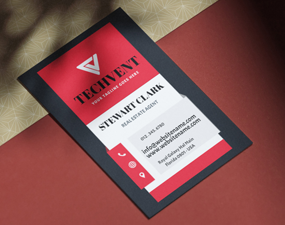
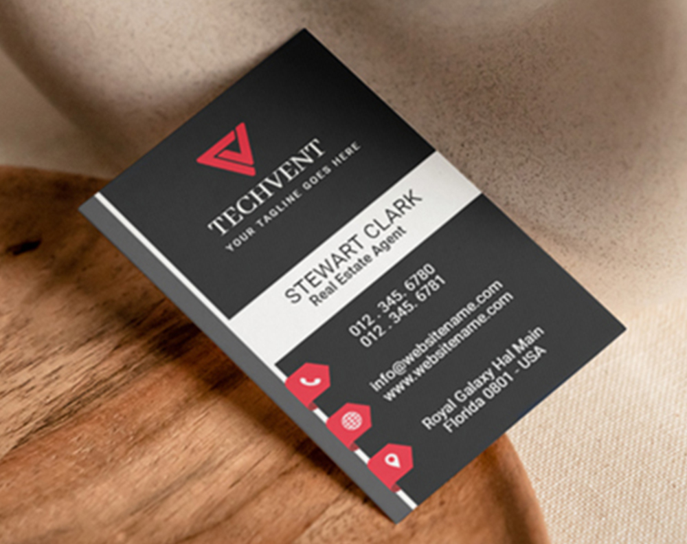
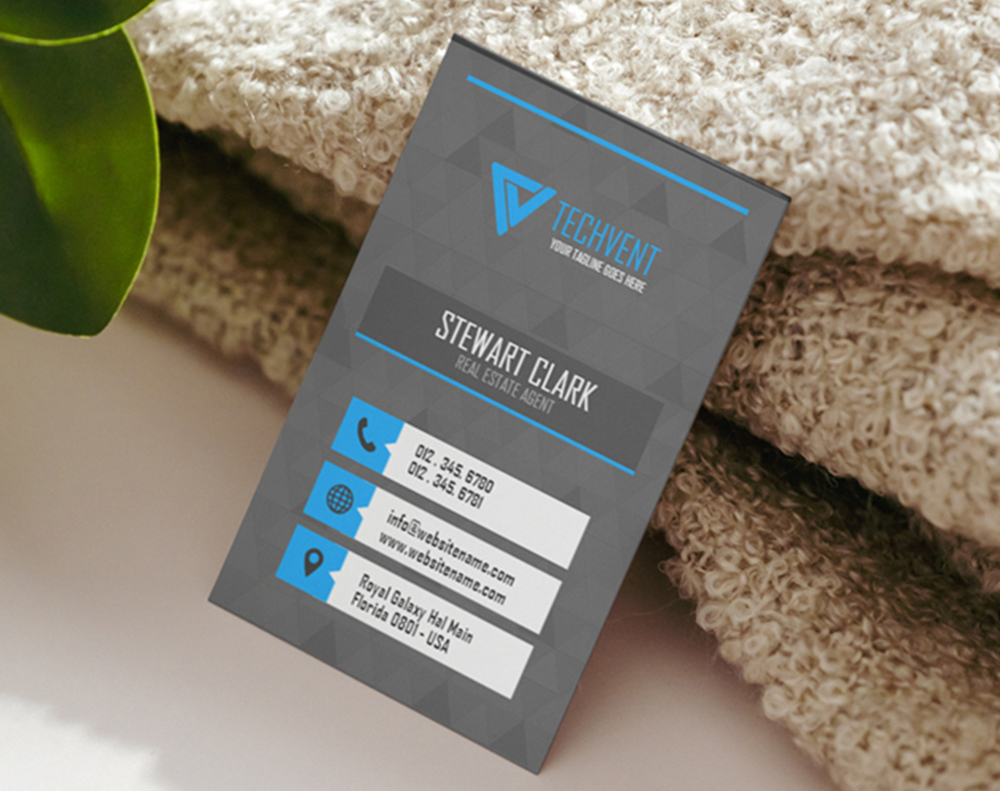
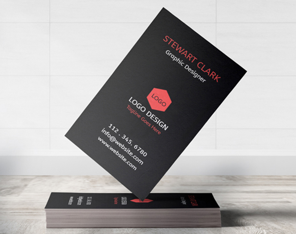
Free business card templates
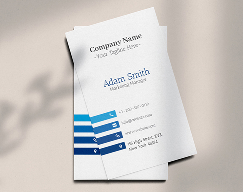
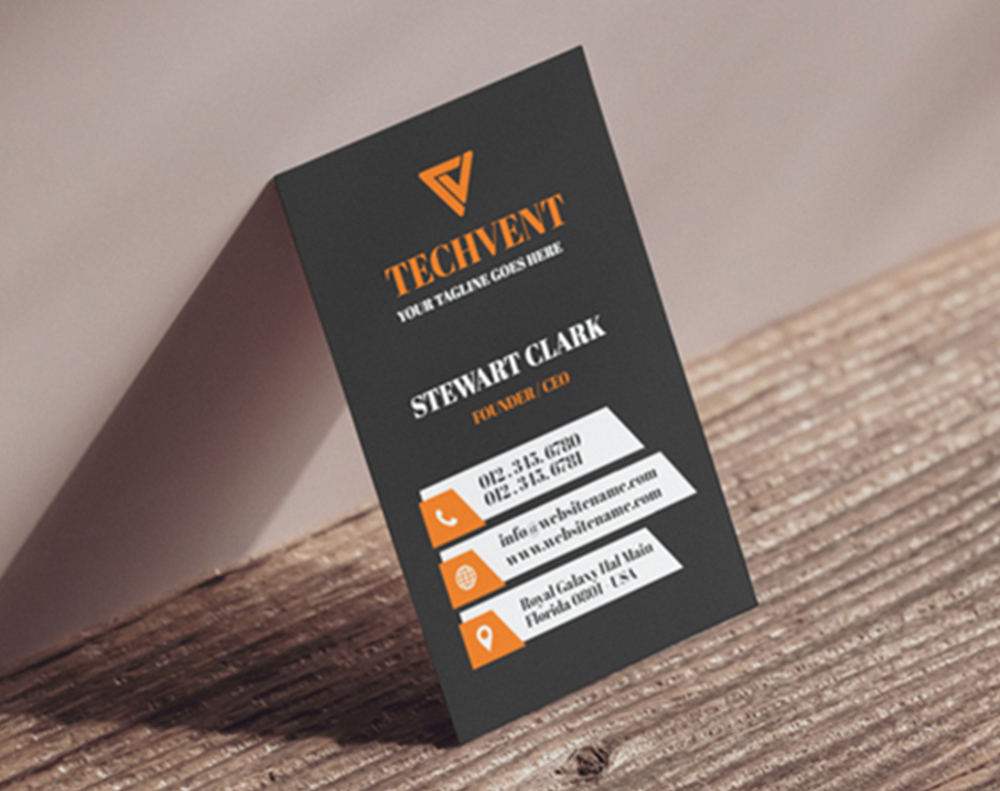
Need a head start? Open a ready-to-customize template in the designer, drop in your brand and one strong idea, and you will see a free proof before anything prints.

Myth vs fact
What to know before you get creative
Four myths about designing a standout business card, set straight, so you spend on the idea that lands and skip the ones that only look like they will.
Standout finishes are only for big brands.
A spot UV accent or a soft-touch coat costs far less than most people assume, and a small run makes it accessible to a solo founder. The finish is a design decision, not a budget tier.
A creative card looks unprofessional.
Creative and professional are not opposites. A bold idea, cleanly executed on quality stock, reads as more considered than a generic card, not less. The craft is in the restraint, not the noise.
Inspiration means copying whatever is trending.
The cards worth keeping start from the brand, not the feed. Borrow a technique, then bend it to what you actually do, so the card looks like you rather than this year template.
You need a designer to pull off a bold card.
You can start from a free template or the online designer, swap in your brand, and preview the result before printing. A strong idea and a good stock carry a card further than a big design budget.
By the numbers
Why brands print their ideas with 4OVER4
Real results
What customers say about their standout cards
I went with black stock and one foil-look accent and people at the fair kept asking to keep the card. It looks like ten times what it cost. 4OVER4 printed it razor sharp.
The circle cut was the whole idea for my studio brand. It stands out in a stack of rectangles and clients remember it. The proof let me nail the layout before it printed.
Ordered the lenticular cards on a whim and they are the best marketing I have ever handed out. The art moves when you tilt it and nobody throws it away.
Spot UV over a matte back gave my cards a texture people notice immediately. Small detail, huge difference. Colors came out exactly like the proof.
I put my brand on sticker cards and now they are on laptops all over the co-working space. Free advertising that started with one order.
As an artist my card had to feel like my work, and the artist stock let it. It reads as part of the portfolio, not a boring afterthought.
Upside & trade-offs
What a standout card does well, and what to weigh
The honest pros and cons of chasing a bold design, so you know where the idea earns its keep and where it needs a little discipline before you commit.
Where a standout card wins
- A distinctive card earns a second look and a second conversation, especially at crowded events
- One well-chosen finish or shape signals the quality of what you sell before you say a word
- Specialty formats like magnets and stickers keep working long after the handoff
- A bold, confident design is remembered where a generic template is filed and forgotten
What to weigh first
- Chasing every trend at once flattens the card, so a strong design commits to one idea
- Specialty finishes and shapes can cost more than a flat card, which is worth weighing against the run size
- A creative layout that buries the contact details defeats the point, so legibility comes first
- A dramatic stock or finish should still fit the brand, or it reads as novelty instead of craft
The inspiration handbook
From an idea to a card in hand
Three decisions turn inspiration into a card people keep: the one idea you commit to, the stock and finish that carry it, and the layout that lets it lead. Here is the whole picture, so the card looks as good as the concept in your head.
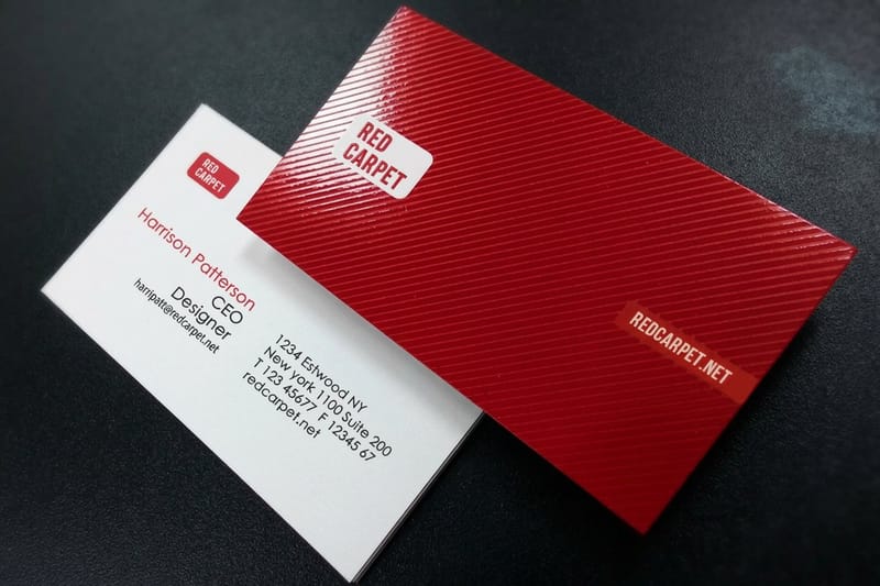
Everything starts with the idea, not the template. Decide the single thing you want a stranger to remember, then let it drive the whole card. A premium feel points to a heavier or darker stock, a playful brand points to a shape, and a card that has to be unforgettable points to a finish that catches light or art that moves. Once the idea is set, the article on the 30 most amazing card designs is a good place to borrow a technique, and the note on what your card colors mean helps you pick a palette that says the right thing.
Then choose the finish that carries it. A spot UV gloss over a matte base, a soft-touch coat, or a foil-style shine each add a texture people feel before they read, so reserve the finish for one element and let it read as intentional. The guide to matte, glossy, and soft touch walks through which finish suits which brand, and pairing it with the right weight from the thickness chart makes the card feel as considered as it looks.
Shape, stock, and legibility
Build for the cut, and keep it readable

A shape only works if the artwork is built for it. A circular card or a custom die-cut needs important elements pulled away from the edge and inside the safe zone, so nothing you care about gets trimmed. The complete guide to business card shapes covers how to design for a clean cut, and if you want the whole card to be the mark, a die-cut outline shaped to your logo turns the shape into the brand.
Legibility is the part inspiration tends to forget. The boldest stock and the loveliest finish still have to pass the arm-length test, so hold strong contrast, size the type honestly, and move anything that needs room to the back of the card. The note on what to put on the back helps you split the load, and building the file correctly the first time keeps the print matching your screen.
A great card rarely travels alone. Once you land a direction, let it carry across the rest of your print so the brand reads as one piece, and the same ideas translate to flyers, postcards, and stationery. To keep exploring, browse the full business cards catalog, start from a free template, or read up on custom 3D lenticular cards before you commit to your standout.

Trusted by
Cards businesses rely on
Explore more
Related cards, guides, and design ideas
Category Shop business cards Every stock, shape, and finish with live pricing and free proofs. 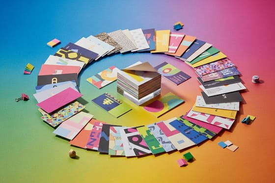 Article 30 amazing card designs A gallery of standout business card designs to spark your own.
 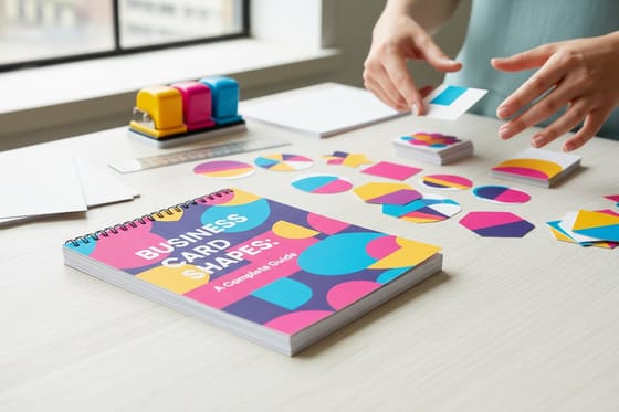 Guide Business card shapes How to design for rounded, circular, and fully custom cuts.
 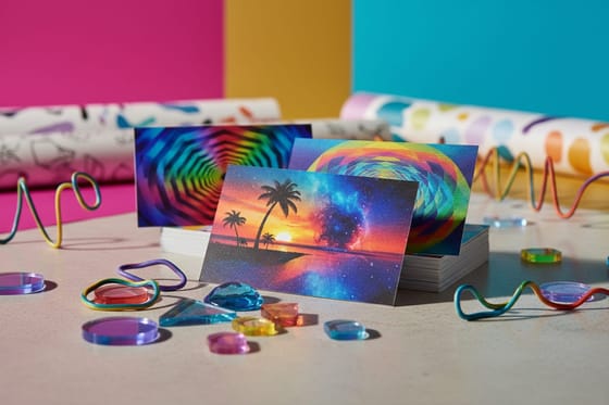 Article 3D lenticular ideas Cards that move as they tilt, and how to design one.
 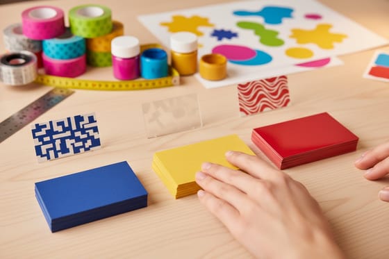 Guide Choosing a finish Matte, glossy, or soft touch, and which fits your brand.
 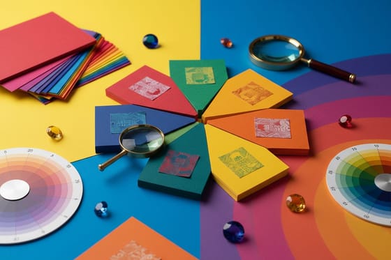 Article What your colors say The meaning behind the colors on your business card. Product Black business cards Deep black stock that reads as premium on contact.
  Guide Free templates guide Start from a template and make it your own in minutes. FAQ Printing questions Answers on stock, finishes, sizing, and turnaround.
 Questions, answered
Common questions about business card design
Finding ideas, choosing finishes, custom shapes, and staying readable, straight answers. For definitions of any print term, see the printing terms glossary, or browse the full 4OVER4 FAQ library.
Where do I find good business card inspiration?
Start with real cards rather than mockups. The gallery above shows finishes, shapes, and stocks you can actually order, and each direction links to the product that prints it. For deeper idea sets, browse the 30 most amazing business card designs or explore the full business cards catalog to see every format side by side.
What finishes make a business card stand out?
A spot UV gloss over a matte base, a soft-touch coat, and a foil-style shine are the finishes that get noticed first, because people feel them before they read them. Deep black or colored stock reads as premium on its own. The guide to matte, glossy, and soft touch covers which finish suits which brand, and spot UV cards are built for exactly this.
Do unusual shapes cost a lot more?
Not as much as most people expect. A rounded-corner or circular cut is a modest step up from a flat rectangle, and the payoff in memorability is large. Fully custom shapes cost a little more because of the die, but a small run keeps it accessible. See the complete guide to business card shapes, then compare live pricing on circle business cards.
How do I keep a creative card readable?
Let the idea frame the details instead of hiding them. Hold strong contrast between text and background, size the type so it reads at arm length, and move anything that needs room to the back. A bold finish or shape should draw the eye to your name, not compete with it. Our note on what to put on the back of a card helps you split the load.
Can I make an eye-catching card without a designer?
Yes. Open the free 4OVER4 Online Designer, or start from a free template and swap in your brand and colors. Pick one strong direction, keep the rest simple, and the free online proof shows you the finished design before anything prints. A good stock and one clear idea do most of the work.
Do you have templates I can start from?
Yes. 4OVER4 offers free, ready-to-customize business card templates you can open in the designer and adapt to your brand. Browse them in the templates section below, or explore more design directions across the business cards catalog. For definitions of any print term, see the printing terms glossary.
Get Started
Ready to print a card people remember?
Pick one bold idea, start from a free template or the online designer, and we will print it sharp on real stock with a free online proof before anything runs.
Legal Disclaimer
Gold Standard guarantees apply to all standard orders placed through 4over4.com. Price match requires verifiable proof of a competitor's published price for an equivalent product with matching specifications and turnaround time. Satisfaction guarantee covers manufacturing defects and print quality issues. Contact support with order number and documentation. On-time delivery rate based on tracked orders 1999 to 2026. Individual results may vary based on shipping carrier performance.
