
Graphic Design Terms Every Designer and Print Buyer Should Know


Five groups, plain definitions, and the practical consequence of each one. Written for the moment a designer and a print buyer are using the same word to mean two different things.
The graphic design terms worth learning first split into five groups: layout basics such as hierarchy and white space, file types such as vector and raster, page geometry such as bleed, trim and safety, color such as CMYK, RGB and Pantone, and production such as stock, coating and proof. Almost every reprint traces back to five of those: bleed, safety, vector, CMYK and proof. Each table below gives the definition and the consequence of ignoring it, because a definition alone has never saved a job.
Quick answer
The five words behind most reprints
If you only learn five terms, learn bleed, safety, vector, CMYK and proof. Bleed is artwork pushed past the cut so no white edge appears. Safety is the inner boundary that keeps text from being trimmed off. Vector is artwork stored as math, so it scales without falling apart. CMYK is the ink set a press can actually reproduce, which is narrower than your monitor. A proof is the sample you approve, and only a printed one tells you anything real about color. The diagram below shows the first three of those on a single business card.
Design Basics: The Words in Every Brief
These are the terms a client hears in a design review and nods along to. They describe how a layout is organised rather than how it gets printed, and they are the ones most often used loosely.
| Term | What it means | Where it matters |
|---|---|---|
| Hierarchy | The order in which elements are noticed, controlled by size, weight, color and position. | If a reader sees the phone number before the company name, the hierarchy is broken regardless of how nice it looks. |
| White space | Empty area around and between elements. It does not have to be white. | The cheapest way to make a small piece look expensive. Crowded cards read as budget cards. |
| Grid | An invisible framework of columns and margins that everything aligns to. | Keeps a multi-page piece feeling like one document instead of a stack of separate designs. |
| Contrast | Measurable difference between two elements, in tone, size, color or shape. | Low contrast between text and background survives a monitor and dies on uncoated paper. |
| Mockup | A realistic visual of the design applied to the real object. | Sells the idea to a client. It is a presentation image, never a print file. |
| Brand identity | The full system: logo, color palette, typefaces, imagery style and rules for using them. | A logo alone is not an identity. Without the rules, the next designer rebuilds everything. |
Balance sits behind most of these, and it is the one worth studying properly rather than absorbing by osmosis. Our guide to balance in graphic design works through symmetric and asymmetric layouts on real pieces. If you are building a first identity with nothing in place yet, start instead with design for small businesses, which puts the terms in the order you will actually need them.
Image and File Types: Vector, Raster, and What to Send
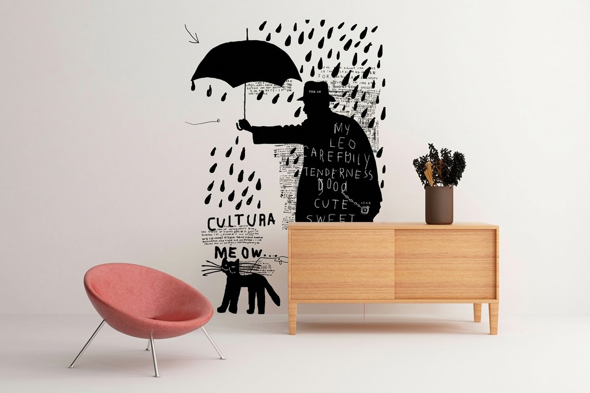
This is the group that causes the most back and forth with a printer, and almost all of it comes down to one distinction. Vector art is stored as coordinates and curves, so software redraws it at whatever size you ask for. Raster art is a fixed grid of colored squares, so enlarging it means guessing at squares that were never captured.
| Format | Vector or raster | Send it for |
|---|---|---|
| AI, EPS, SVG | Vector | Logos, icons and type-based marks. Scales from a business card to a wall with no loss. |
| PSD, TIFF | Raster, layered or uncompressed | Photo work in progress. Large files, but nothing is thrown away. |
| JPEG | Raster, lossy | Final photographs. Each resave degrades it further, so keep an original. |
| PNG | Raster, lossless with transparency | Screen use. It has no CMYK mode, which is why printers rarely want one. |
| PDF or PDF/X | Either, or both together | The actual handoff. Fonts embedded, bleed included, colors converted. |
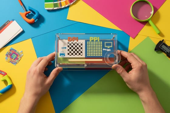
Resolution belongs to raster art only, and the two abbreviations get swapped constantly. PPI counts pixels in the file. DPI counts dots the press or printer puts on paper. What a printer means by asking for 300 DPI is 300 pixels per inch at the finished size, which is not the same as 300 PPI in the source file if you scaled the image up in the layout. DPI vs PPI takes that apart with the arithmetic.
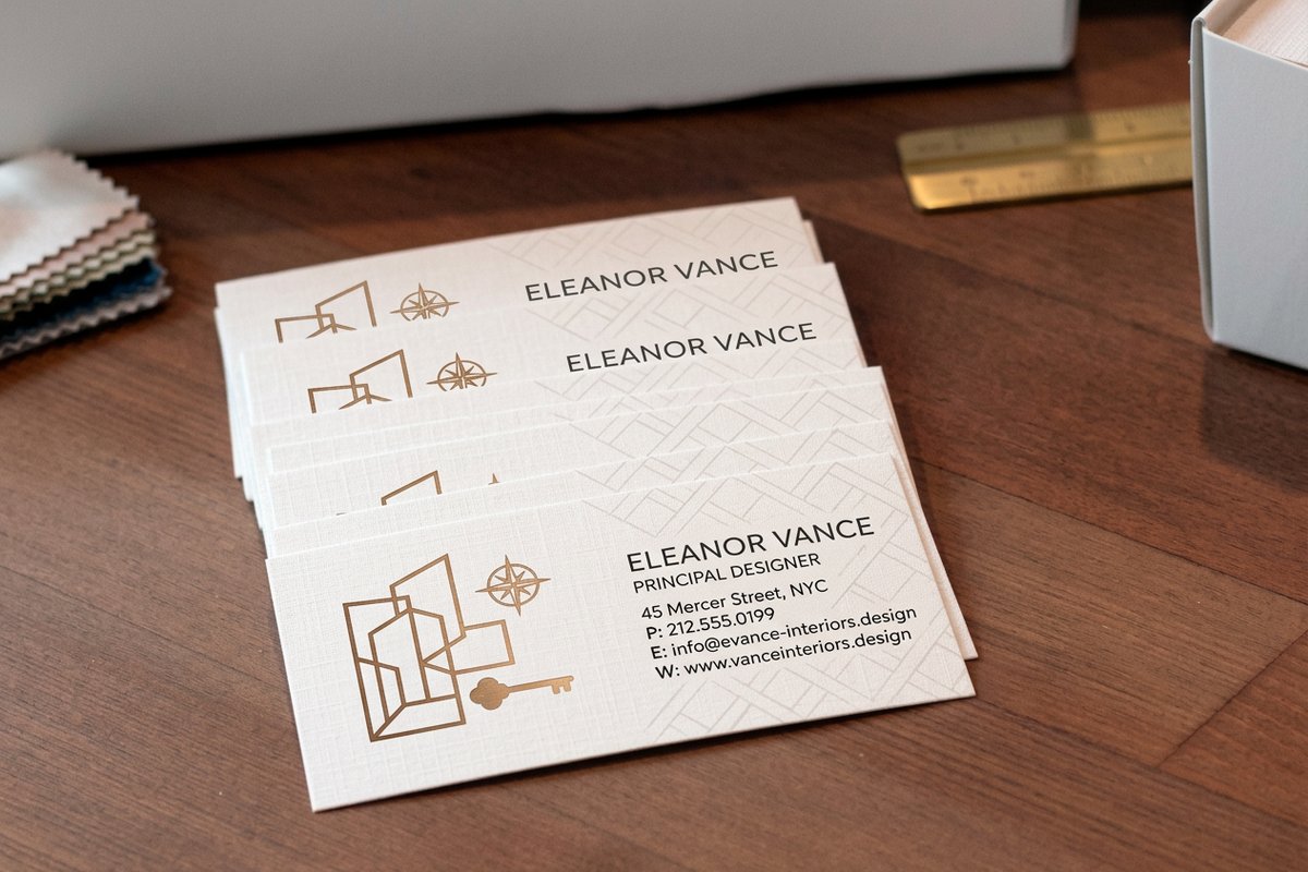
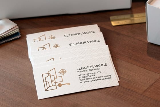
Scale changes the answer too. A held piece such as interior design business cards wants 300 PPI at final size. A wall graphic read from six feet away is fine at 100 to 150 PPI at full size, and pushing it to 300 just produces a file nobody can open.
Layout and Type: Bleed, Trim, Safety, Kerning, Leading
These terms describe the geometry of the file itself. Get them wrong and the piece still prints, which is the problem: nothing errors out, it just arrives with a white sliver down one edge or a phone number sliced in half.
| Term | What it means | What goes wrong without it |
|---|---|---|
| Bleed | Artwork extended 0.125 in past the cut line on every side. | An unprinted white hairline on some pieces in the box, never all of them. |
| Trim | The finished size, where the blade lands. | Nothing, if bleed and safety are respected. It is the reference for both. |
| Safety | An inner boundary 0.125 in inside the trim for all live text. | Clipped descenders and half a URL, on the pieces where the blade drifted inward. |
| Crop marks | Thin lines outside the trim showing the cutter where to cut. | Rarely fatal now, since most presses read the PDF trim box, but still expected. |
| Kerning | Space between two specific letters. | Gaps in a logo wordmark, most visibly after a capital A, V or W. |
| Tracking | Space applied evenly across a run of text. | All-caps set with default tracking reads cramped at small sizes. |
| Leading | Vertical space from one baseline to the next. | Tight leading on long lines makes a paragraph hard to follow back to the left. |
The one that catches out even experienced designers is what happens on a folded piece. A panel that folds inward has to be slightly narrower than its neighbours, because paper has thickness and the inner panel needs somewhere to go. On a standard trifold that difference is usually about 1/16 of an inch, and ignoring it produces a fold that will not close flat.
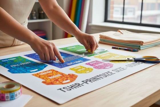
Starting from a correctly built file removes most of this. Our blank template library ships each product at the right trim with bleed and safety already drawn, and the t-shirt print size guide covers the same geometry where there is no trim line at all, only a garment.
Color: CMYK, RGB, Pantone, Gamut and Rich Black
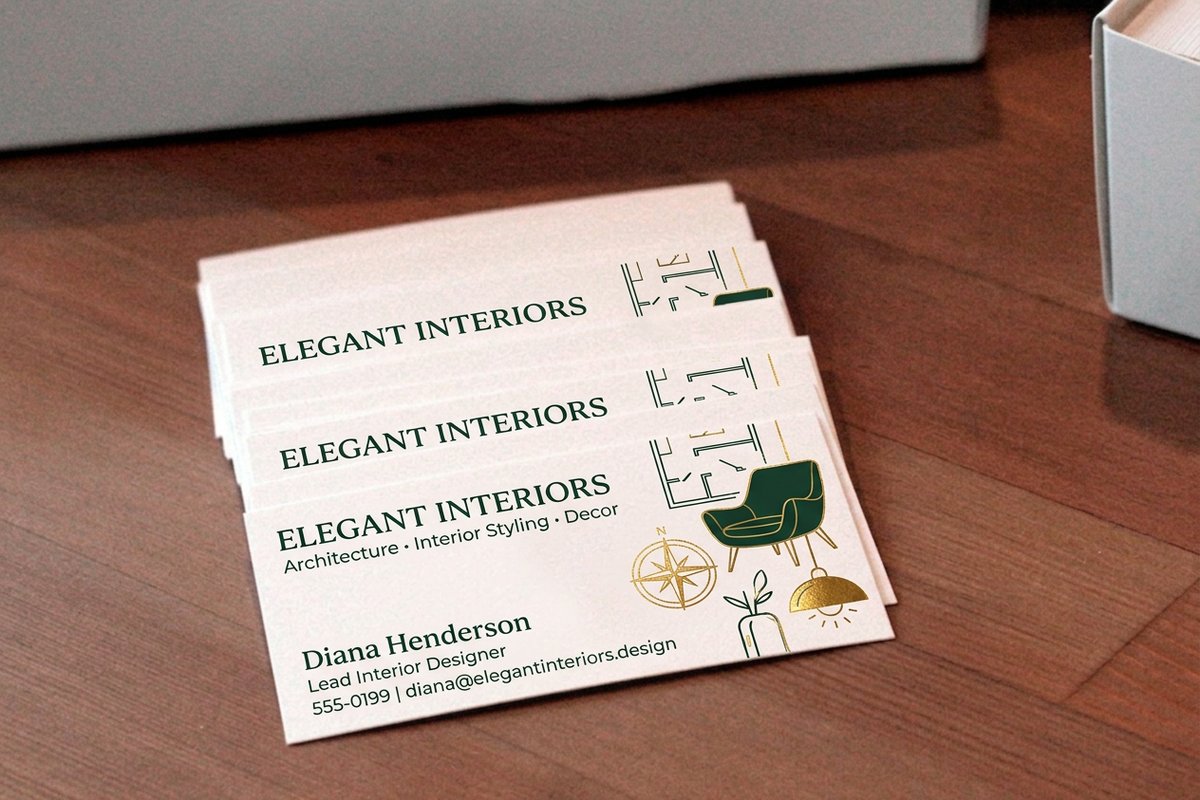
Color is where a design most often disappoints on delivery, and the reason is physical rather than a mistake anyone made. A screen adds light. A press subtracts it with ink. Those two systems do not reach the same colors.
| Term | What it means | The catch |
|---|---|---|
| RGB | Red, green and blue light, used by every screen. | Wider gamut than ink. Send an RGB file to press and something else converts it, not you. |
| CMYK | Cyan, magenta, yellow and black process inks. | The printable set. Convert deliberately and look at the result before you approve it. |
| Pantone or spot | A pre-mixed ink matched to a numbered swatch. | Exact and consistent, but it is an extra ink on press, so it costs more than process color. |
| Gamut | The range of colors a system can reproduce. | Out-of-gamut screen colors are silently pulled to the nearest printable neighbour. |
| Rich black | Black ink with C, M and Y beneath it, often 60/40/40/100. | Deep on large panels. On small type the four inks misregister and fringe. |
| Overprint | Printing one ink on top of another instead of knocking it out. | Set on white objects by accident, they vanish entirely on the printed sheet. |
Paper changes the answer as much as the ink does. The same CMYK build looks noticeably brighter on coated stock, because the coating keeps ink sitting on the surface, and duller on uncoated, because the fibres absorb it and spread it slightly. That spread is called dot gain, and it is why an uncoated job often needs its shadows opened up a little to avoid closing into solid black.
If a brand color has to be right rather than close, say so before the job runs. Ordering free paper samples first tells you what your stock will do to it, which is a faster answer than a reprint.
Print Production: Stock, Coating, Imposition and Proofs
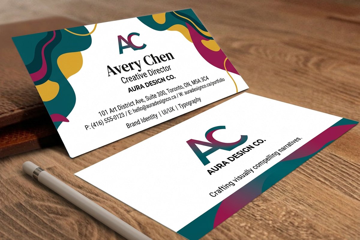
This last group belongs to the printer, and knowing it changes what you can ask for. It also stops the two most common misreadings: assuming turnaround includes shipping, and assuming a proof is about color when it is a PDF.
| Term | What it means | What to ask |
|---|---|---|
| Stock | The paper, described by weight in points or pounds. | 14pt or 16pt for cards. 16pt is noticeably more rigid in the hand. |
| Coating | Gloss, matte, soft touch or none, applied over the ink. | Can you write on it. Gloss and soft touch resist pen; uncoated takes it happily. |
| Imposition | Arranging many pieces on one press sheet for efficient printing. | Nothing, usually. It is why odd sizes sometimes cost more than standard ones. |
| Gang run | Several customer jobs printed together on one sheet. | It is how online printing gets cheap. Color tolerance is slightly wider than a dedicated run. |
| Proof | The sample you approve. Soft proof is a PDF, hard proof is a print. | Which kind. Only a hard proof tells you anything trustworthy about color. |
| Turnaround | Production time from approved file to leaving the plant. | Whether shipping days are included. Usually they are not. |
Two words trip people up because they mean something different on each side of the counter. Weight to a designer is how bold a typeface is; weight to a printer is how thick the paper is. Composition to a designer is how a layout is arranged; imposition to a printer is how the pieces are arranged on the press sheet. When either word appears in an email thread with a printer, it is worth one clarifying sentence.
Where all of it lands is a real order. Graphic designer business cards start at $17.57 and are a fair place to test stock and coating choices at low cost, and if you want the full printing side of the vocabulary in one place, the printing terms glossary continues where this page stops. For proof that the terms translate into finished work, the graphic design print portfolios roundup is worth an hour.
Wally explains the jargon
Three lines on a card, and two kinds of artwork
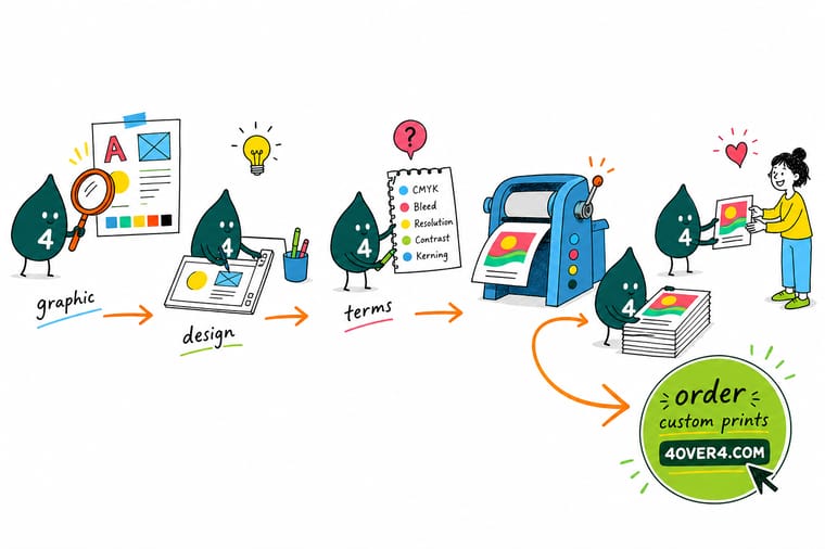
Wally draws three boxes on one card. The outer dashed line is the bleed, where the background has to keep going. The solid line is the trim, where the blade lands. The inner dashed line is the safety, where the phone number stays so it never gets cut in half. Then he holds up two files: the logo is vector, so it can go on a wall, and the photo is raster, so blowing it up just makes the squares bigger. Everything else in the glossary hangs off those two ideas.
Order graphic designer business cards →Specs and pricing
Put the vocabulary to work on a real order
Sizes, stocks, coatings and starting prices pulled live from the 4OVER4.COM configurator, so the terms above turn into choices you can actually make.
Print it
Products designers order most
Explore more
Where to go next



By the numbers
Printing that backs up the vocabulary
Common Questions
Your design terminology questions, answered
What is the difference between bleed and safety margin?
Bleed is artwork extended past the cut line, usually 0.125 inches on each side, so that any background reaching the edge of the piece still covers it after trimming. Safety margin is the opposite direction: it pulls type and logos 0.125 inches inside the cut line so they never get clipped. Both exist for the same reason, which is that a guillotine cuts a whole stack at once and the blade lands slightly differently on the top sheet than on the bottom one. A file with a background that stops exactly at the trim line will show a white hairline on some pieces in the box.
Do I need vector artwork for everything?
No. You need vector for logos, type and any flat graphic that has to work at multiple sizes, because vector is stored as coordinates and curves rather than pixels and re-renders sharp at any scale. Photographs are raster by nature and cannot be made vector in any useful way. The practical rule is vector for the logo, high-resolution raster for the photo, and both placed in the same layout file.
What resolution should I supply for print?
Roughly 300 PPI at the size the image will actually print, for anything held in the hand. A photo that is 300 PPI in Photoshop but placed at 400 percent in the layout is really 75 PPI on paper. Large format is the exception: a wall graphic or banner is viewed from several feet away, so 100 to 150 PPI at full size is normally plenty and files at 300 PPI become unmanageably large for no visible gain.
Why does my design look different when printed than on screen?
A monitor makes color by emitting red, green and blue light. A press makes color by laying down cyan, magenta, yellow and black ink that absorbs light. The RGB gamut is larger, so the most saturated screen colors have no exact ink equivalent and get pulled toward the nearest printable version. Neon greens, vivid oranges and deep royal blues shift the most. If a specific color has to be exact, ask for a Pantone spot ink or ask for a printed proof rather than judging from the screen.
What does a printer mean by a proof?
A proof is the sample you approve before the full run. A soft proof is a PDF showing how your file was interpreted, which catches missing bleed, wrong page size and broken fonts but tells you almost nothing reliable about color. A hard proof is a physical print, which is the only version that shows real color on real stock. Approving a proof also transfers responsibility: once you sign off, mistakes visible on the proof are yours, not the printer's.
What is rich black and when should I use it?
Rich black is black ink with cyan, magenta and yellow underneath it, commonly around 60 cyan, 40 magenta, 40 yellow and 100 black. Plain 100 percent black alone prints as a slightly washed dark grey across a large area. Use rich black for large solid panels and reverse-out designs. Do not use it for small body type, because four inks have to register perfectly on top of each other and any tiny shift shows as a colored fringe around the letters.
Get Started
Ready to send a file that prints right the first time?
Start from a template with bleed and safety already drawn, pick your stock and coating, and we handle the rest. Free file review on every order.
Legal Disclaimer
Gold Standard guarantees apply to all standard orders placed through 4over4.com. Price match requires verifiable proof of a competitor's published price for an equivalent product with matching specifications and turnaround time. Satisfaction guarantee covers manufacturing defects and print quality issues. Contact support with order number and documentation. On-time delivery rate based on tracked orders 1999 to 2026. Individual results may vary based on shipping carrier performance.
