
Balance in Graphic Design Guide


Sofia is our design and templates voice, built from the knowledge of our production team, with over 20 years in printing.
Balance in graphic design examples start with the printed piece: a centered logo on a business card, one bold photo against a column of type on a poster, a seal spun around its center. Balance is the distribution of visual weight that keeps a layout from tipping over, so learn the four types, see how each one feels, and use them to build designs that read clean on screen and in print.
Balance in graphic design is the even distribution of visual weight across a layout so no single element overwhelms the rest. Weight comes from size, color, contrast, and position. The three main types are symmetrical (mirrored halves), asymmetrical (unequal parts that still even out), and radial (weight arranged around a center), with mosaic balance as a fourth for dense, evenly packed layouts. Balance is felt more than measured, and a balanced design reads clearer and prints cleaner.
Quick tips
Quick tips for balancing any design
Rank your elements, then weigh the sides. Decide what the eye should see first, assign visual weight to match, and squint at the layout to catch whichever corner still pulls too hard. Treat negative space as a real element, align everything to a shared grid, and proof the design at its true printed size. Do that and the same balanced layout looks deliberate on a business card, a flyer, or a full-size poster from 4OVER4.COM.
Examples
Balance in graphic design examples on printed pieces
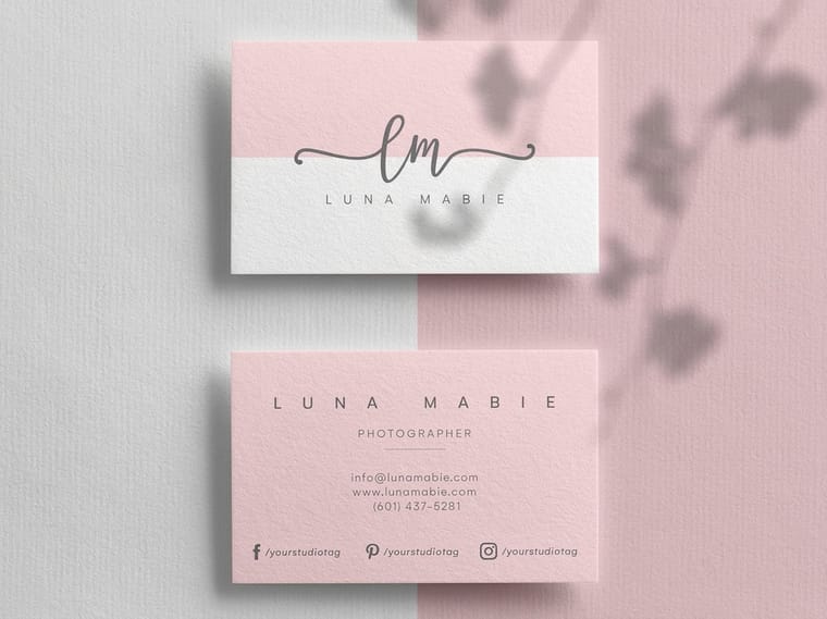
Each type of balance has a printed piece it suits best. Symmetrical balance fits a centered premium business card at 2 x 3.5 inches, with the logo on the middle line and the name stacked under it. Asymmetrical balance fits an 18 x 24 inch poster, where one large photo on the left holds against a narrow column of type on the right. Radial balance fits a 2 x 2 inch square card or a round seal, because the center sits the same distance from every edge. Mosaic balance fits the cover of an 8.5 x 11 inch brochure tiled with one repeated motif.
What is balance in graphic design?
Balance is the way visual weight is spread across a design, whether the frame is a 2 x 3.5 inch business card or an 18 x 24 inch poster. Every element you place carries weight, and that weight comes from more than size. A saturated red block feels heavier than a pale gray one. A sharp headline pulls harder than a soft caption. An object near the edge tugs more than one near the center. Balance is the moment when all of that weight settles and the page stops leaning.
One part that gets skipped: balance is perceived, not calculated. You almost never reach for a ruler. You scan the layout, feel where your eye gets stuck, and nudge things until the pull evens out. Perceived balance is what your audience reacts to in the first second, long before they read a word.
Balance works with the other principles of composition. It leans on contrast, hierarchy, alignment, and rhythm, which is why it helps to read it next to the whole set in our guide to the principles of design. Once the weight sits right, contrast and hierarchy have room to work.
Why balance matters in design
An unbalanced design feels wrong before anyone can explain why. Put a heavy logo in the top left corner of a 2 x 3.5 inch card with nothing opposite it, and the eye keeps sliding to that corner, the empty side feels abandoned, and the whole card reads as unfinished. That instinctive discomfort is the fastest way to lose a reader who was giving you two seconds of attention.
Balance also decides where people look and in what order. When weight is arranged with intent, you can steer the eye to the logo first, the offer second, the fine print last. The same instinct scales up into a whole brand, which is why balanced layouts sit behind a strong brand identity and the consistency behind good branding for a small business.
And balance is practical. A settled composition survives the jump from screen to print, holds up when it is scaled from a business card to a poster, and leaves clean margins where a design needs them. Get the weight right and the piece looks deliberate at every size you print it.
The four types of balance
Designers usually sort balance into four families. You will build almost everything from the first three, with the fourth showing up when a layout gets dense on purpose. In print, symmetry suits a centered business card, asymmetry an 18 x 24 inch poster, radial a 2 x 2 inch square card, and mosaic a patterned brochure cover.
- Symmetrical balance mirrors elements across a central axis for a formal, orderly feel.
- Asymmetrical balance trades unequal parts that still even out, for energy and a clear focal point.
- Radial balance arranges everything around a center, pulling the eye inward like a wheel.
- Mosaic balance spreads weight so evenly across a busy field that no single spot wins.
Each family sends a different signal, so pick the one that carries the mood you are after. The sections below cover when to reach for each.
Symmetrical balance

Symmetrical balance mirrors the two halves of a layout across a central line. Center a logo, stack the text under it, and let the margins match on both sides, and you have the most recognizable form of formal balance. This is sometimes called reflective or bilateral symmetry, and it reads instantly as stable and trustworthy.
It is the natural choice when the message is dignity and order. Wedding invitations, law firm stationery, certificates, and classic business cards lean on it because the audience expects composure, not surprise. A centered premium business card feels considered before a single word is read.
The one risk is flatness. Perfect mirroring can tip into static, so designers keep it alive with a touch of contrast, a hint of texture, or one small element that breaks the mirror on purpose. For a deeper look at how far you can push formal design, the gallery in the creative business card design ideas article is full of symmetrical layouts that still feel fresh.
Asymmetrical balance
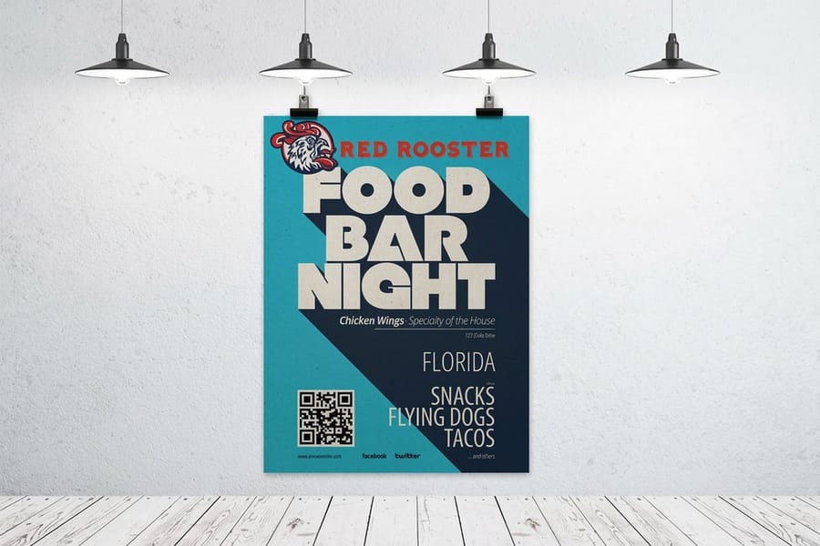
In asymmetrical balance the two sides do not match, yet the page still feels even because the weights are tuned against each other. On an 18 x 24 inch poster, a single large photograph on the left can hold its own against a tight column of small type on the right. The sides differ, but the pull is equal.
This is informal balance, and it feels modern and editorial. It gives you a strong focal point and a natural reading path, which is why it dominates magazine spreads, lifestyle brands, and any poster that needs to grab a room. It also pairs well with restraint, so it is a favorite in minimalist brand design, where a few well-weighted elements do all the work.
The trick is to weigh things by feel. A small patch of vivid color can offset a large block of muted gray. A short bold headline can counter a wide field of empty space. Squint at the layout: if one side keeps winning, add weight to the other side or take some away from the heavy one until the tension resolves.
Radial balance
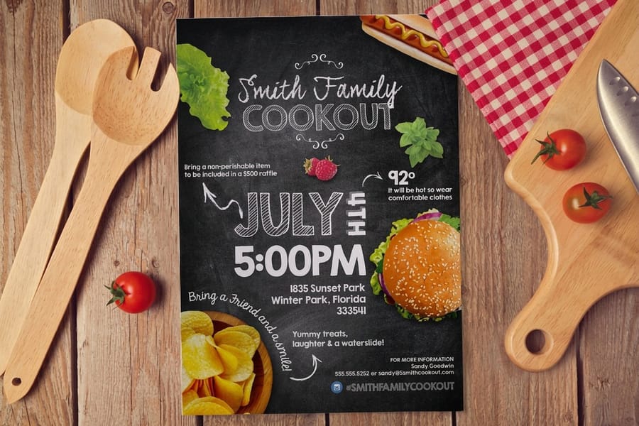
Radial balance arranges elements around a central point so everything radiates outward, like spokes on a wheel or petals on a flower. The center becomes the anchor, and the eye is pulled straight to it before it travels out along the arms. It is the most dynamic form of balance and the one that most obviously controls where people look first. A 2 x 2 inch square business card suits it, because the center sits the same distance from all four edges.
Reach for it when you want a single, unmissable focal point. Badges, seals, event ticket layouts, festival flyers, and circular packaging all use radial structure to put the headline act dead center. It also carries a sense of energy and motion, which suits launches, celebrations, and anything that should feel like an event.
Because radial designs concentrate so much weight in the middle, the surrounding space has to stay disciplined. Keep the arms even, give the center room, and resist crowding the edges, or the wheel starts to wobble.
Mosaic and crystallographic balance
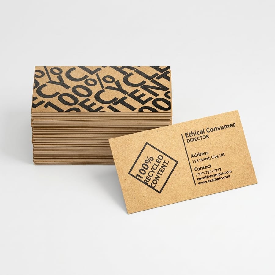
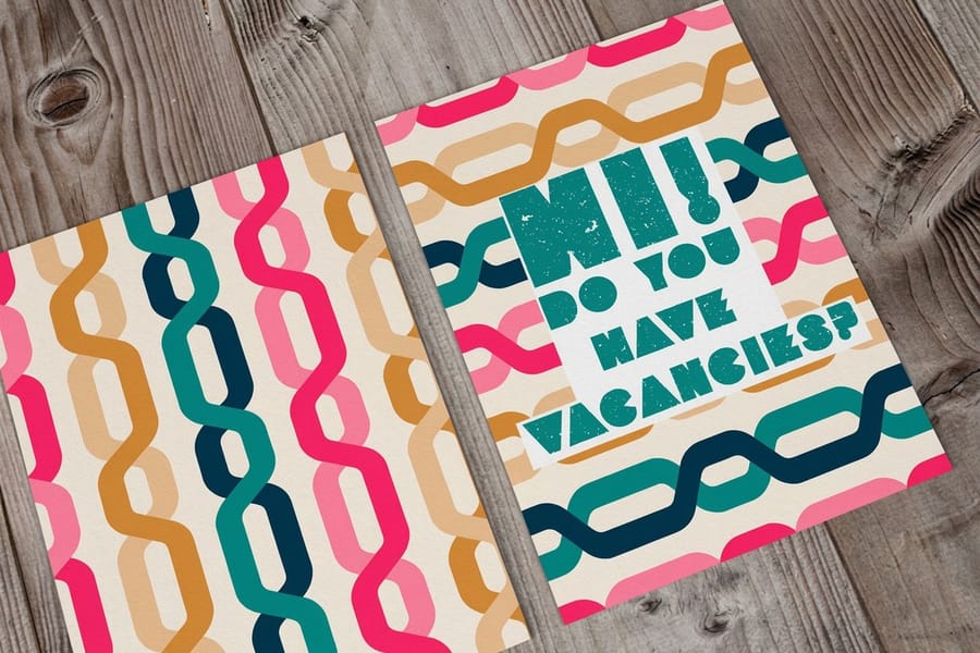
The fourth type is easy to miss because it looks, at a glance, like chaos. Mosaic balance, also called crystallographic balance, spreads visual weight so evenly across a dense field that no single point takes over. Think of a wall of concert posters, a patterned wrapping paper, or an 8.5 x 11 inch brochure cover tiled with one repeated motif. There is no obvious focal point, yet the whole thing feels balanced because the busyness is uniform.
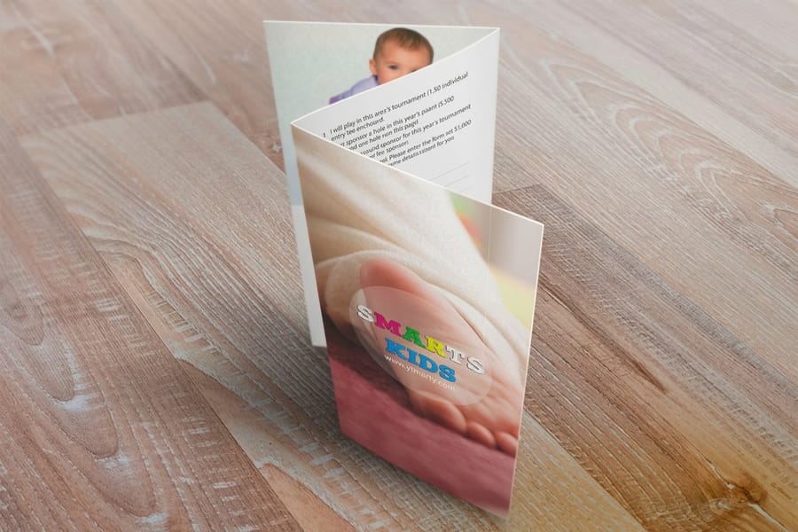
Used well, mosaic balance creates energy and texture. A repeated motif across a brochure cover or the inside spread of a company brochure can feel rich rather than cluttered, precisely because the density is consistent edge to edge. The eye relaxes into the pattern instead of hunting for a hierarchy that is not there.
The failure mode is real, though. Even weight is not the same as no thought. Mosaic balance works only when the spacing, scale, and contrast stay controlled across the whole field. The moment one element grows louder than the rest, the illusion breaks and the design reads as a mess.
Balance and alignment work together
Balance decides how much weight sits where. Alignment decides how the edges relate. They are different jobs, and a design needs both. On a 2 x 3.5 inch card, the name, title and phone number usually share one left edge while the logo balances them on the right. You can balance the weights of a layout perfectly and still have it feel sloppy if the elements do not line up to shared edges and a consistent grid.
Alignment is the invisible scaffolding under balanced work. A clean baseline grid, matched margins, and elements snapped to the same left or center line give the eye a set of anchors, and those anchors are what let asymmetrical weight feel intentional instead of accidental. It is the same discipline behind tidy letterhead layout and behind the key principles of logo design, where a mark has to stay balanced and precisely aligned at every size.
A simple habit ties them together: place your elements for balance, then run a straight edge, real or on screen, down the layout and fix anything that drifts off the grid. Following logo design best practices, the two moves reinforce each other, and the result looks engineered rather than arranged.
How to achieve balance in your own design
Balance is a skill you can practice, not a talent you are born with. This is the routine designers run, whether they are laying out a card or a full campaign.
- Start with a grid. Columns and consistent margins give weight somewhere to sit and make every later decision easier. A tool like the online designer or a ready design template hands you that structure for free.
- Rank your elements first. Decide what should be seen first, second, and last, then assign weight to match that order before you worry about the sides.
- Weigh the sides by squinting. Blur your eyes at the layout. Whichever area still pulls hardest is too heavy, so add weight elsewhere or lighten that spot.
- Treat negative space as a real element. Empty room steadies a busy corner. Do not rush to fill it. A generous margin is often the fix.
- Check the color and contrast weight. Confirm your palette behaves in print, since a color that pops on screen can shift heavier or lighter once it is on paper. Our guides to CMYK versus RGB and DPI versus PPI keep those surprises out of the final print.
- Proof it small. View the design at the size it will actually be used. A layout that balances on a monitor can crowd on a postcard, so test at true scale before you order.
Run those six moves and balance stops being guesswork. Then set up the print: build the card at its real size (2 x 3.5, 2 x 2 square or 1.5 x 3.5 slim), pick the stock from 14pt Gloss Cover to 16pt Uncoated with Soft Touch or 14pt White Linen, and choose the free online proof or the next day hardcopy proof to check the weight on paper before the run.
Wally explains balance
A settled layout is a design that reads at a glance
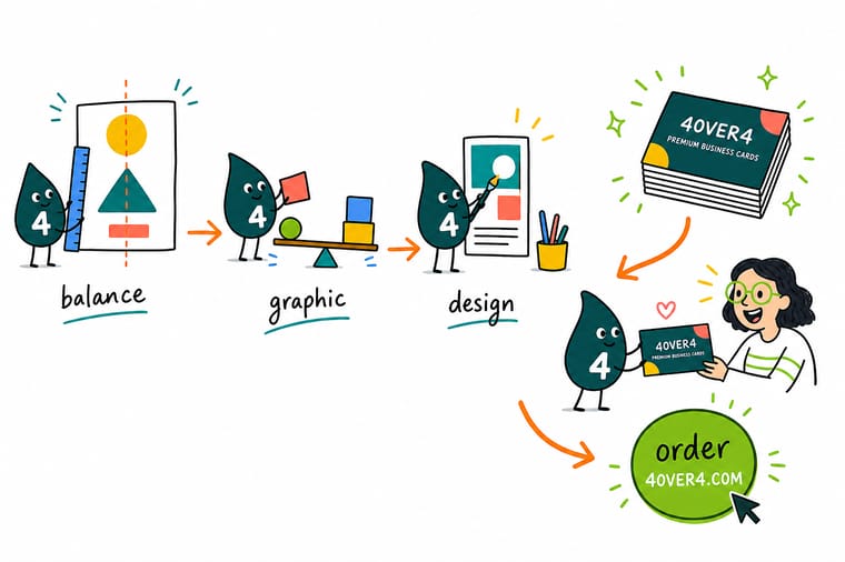
Wally thinks of a page like a set of scales. Every logo, headline, and photo has weight, and balance is the moment the scales stop tipping. You do not measure it, you feel it: squint, notice what pulls your eye, and shift weight until it sits level. Symmetry is only one way to get there. Once your layout is balanced, put it on paper that shows it off, printed sharp and shipped fast at 4OVER4.
Print your design →
Specs and pricing
Print your balanced layout on a premium card
A business card tests balance in a 2 x 3.5 inch frame, with logo, name, and details sharing one small face. Premium cards run 100 for $17.57, which is $0.18 each, in four sizes including a 2 x 2 square and a 1.5 x 3.5 slim, on 74 stocks from 13pt to 80pt, including 14pt Gloss Cover and 14pt White Linen, with live specs and per-unit pricing below.

| Quantity | Price Per Unit | Total |
|---|---|---|
| 100 | 17.6¢ | $17.57 |
| 200 | 11.5¢ | $23.07 |
| 300 | 9.15¢ | $27.46 |
| 400 | 7.96¢ | $31.86 |
| 500 | 7.25¢ | $36.26 |
| 600 | 6.77¢ | $40.64 |
| 700 | 6.43¢ | $45.04 |
| 800 | 6.18¢ | $49.43 |
Print it
Put balance to work in print
Standard business cards start at 100 for $17.57, brochures at 50 for $57.11 in sizes from 5.5 x 8.5 to 11 x 25.5 inches, and flyers run from 4.25 x 5.5 up to 11 x 25.5 inches. All three print in 3 business days.



See it in use
Layouts we printed at 3.5 by 2 inches








Explore more
Where to go next



By the numbers
Cards, flyers and brochures from one file
Common Questions
Common questions about balance in graphic design
What are the types of balance in graphic design?
There are four you will meet again and again. Symmetrical (formal) balance mirrors elements across a central axis. Asymmetrical (informal) balance offsets a large element with several smaller ones so the sides feel even without matching. Radial balance arranges everything around a central point, like spokes on a wheel. Mosaic (crystallographic) balance spreads weight so evenly across a busy field that no single spot dominates. Most real layouts lean on one of these and borrow from the others.
What is balance in graphic design?
Balance is the way visual weight is distributed across a design so it feels stable rather than lopsided. Weight comes from size, color, contrast, texture, and where an element sits on the page. When the heavy parts and the empty parts settle against each other, the eye reads the layout as calm and intentional. When they do not, the design feels like it is about to slide off the page.
Symmetrical or asymmetrical, which suits my layout?
Match the balance to the feeling you want. Symmetrical balance signals tradition, trust, and formality, so it suits law firms, banks, and wedding stationery. Asymmetrical balance feels modern and energetic and gives you room to build a strong focal point, which works for editorial layouts and lifestyle brands. Radial balance draws the eye inward and suits badges, event tickets, and packaging. Start with the mood, then pick the structure that carries it.
Does balance always mean symmetry?
No, and that is the most useful thing to learn. Symmetry is one route to balance, but a design can be perfectly balanced and completely asymmetrical. A single bold headline on the left can hold its own against a cluster of small captions on the right when the weights are tuned. Symmetry is one tool for reaching balance.
What does it cost to print a well-balanced design?
The layout work is free once you know the principles, and 4OVER4.COM keeps the printing accessible too. Premium business cards start at $17.57 for 100, standard flyers and brochures at $57.11, and full-size posters at $108.75, with live per-unit pricing that drops as your quantity climbs. You design the balance, and the configurator handles the math on price.
What sizes, stocks, and finishes can I print a balanced design on?
A balanced composition holds up across formats. At 4OVER4.COM you can put the same layout on a 3.5 by 2 inch premium business card, a folded brochure, a marketing flyer, or a large-format poster. Across the whole catalog 4OVER4.COM runs more than 60 paper stocks with matte, gloss, soft-touch, and specialty finishes, and the premium business card alone offers 14 of them. Check the live specs panel on this page to see exactly what a made-to-order card offers.
Get Started
Order 100 cards at $0.18 and test the layout
Bring your layout to a premium business card, a flyer, or a poster. We print it sharp on your choice of stock and finish, and ship it fast.
Legal Disclaimer
Gold Standard guarantees apply to all standard orders placed through 4over4.com. Price match requires verifiable proof of a competitor's published price for an equivalent product with matching specifications and turnaround time. Satisfaction guarantee covers manufacturing defects and print quality issues. Contact support with order number and documentation.
