
DPI vs. PPI for Graphic Designers


Sofia is our design and templates voice, built from the knowledge of our production team, with over 20 years in printing.
One is a property of your file, the other is a property of the press. Get the difference straight, build to 300 PPI at final size, and your posters and cards print sharp the first time.
PPI (pixels per inch) describes your digital image, and DPI (dots per inch) describes how the press prints it. They are used interchangeably in day-to-day design, but only one is yours to set. For sharp print, build the artwork to land near 300 PPI at its final size, work in CMYK, and add bleed. The press turns those pixels into ink dots, so the more real pixels you supply, the crisper the finished piece.
Quick tips
The short answer for busy designers
PPI is your file, DPI is the print. Set your document to the finished size, aim for 300 PPI at that size for anything held in the hand, and let viewing distance give posters and banners headroom to print lighter. Keep logos and type as vectors, work in CMYK, and add bleed. Never enlarge a small raster to fit, because that spreads the pixels you have thinner instead of adding new ones. 4OVER4.COM designers who nail resolution up front skip the reprint queue entirely.
What DPI actually measures

DPI stands for dots per inch, and it belongs to the printer, not to your file. A press builds an image by spraying or stamping thousands of tiny ink dots onto paper, and the DPI figure tells you how tightly those dots are packed. A device running at 1200 DPI lays four times as many dots across an inch as one running at 300, which is why commercial output looks smoother than a desktop inkjet.
One part trips up a lot of designers: you almost never set DPI yourself. It is an output characteristic of the machine and the print method, decided on the production floor, not a slider in your design app. When someone asks you to "send it at 300 DPI," what they actually need is an image with enough pixels to feed the press cleanly. That is a PPI request wearing a DPI costume, and the two get conflated constantly.
If you want the deeper mechanics of how output resolution translates into visible sharpness, our guide to DPI settings for print quality walks through the numbers product by product. For a fast definition you can bookmark, the printing terms glossary keeps it to a sentence.
What PPI actually measures
PPI stands for pixels per inch, and this one is entirely yours. It describes how many pixels live inside one inch of your image at the size you place it. A raster file is a grid of colored squares, and PPI is simply how finely that grid is chopped. More pixels per inch means more detail the press has to work with.
The catch that makes PPI feel slippery is that it changes the moment you resize. Take a photo that is 3,000 pixels wide. Drop it into a layout at 10 inches and it sits at 300 PPI, which is gorgeous. Stretch that same photo to 20 inches and you have not added a single pixel, so it now spreads to 150 PPI and softens. The pixel count never moved. Only the inches did. That relationship between pixels and final size is the whole game in PPI for graphic design.
Because PPI is the number you control, it is also the number to check first when a proof comes back soft. Building your art in the browser keeps this honest, since the 4OVER4.COM online designer lays everything out at the true finished size. For a full tour of resolution from capture to print, see our image resolution for printing guide.
DPI vs. PPI: the real difference, print versus digital

Strip away the acronyms and the split is simple. PPI is digital. DPI is physical. PPI lives inside the file on your screen, measured in glowing pixels. DPI lives on the paper coming off the press, measured in ink dots. Your artwork starts life in PPI and ends life in DPI, and the press is the bridge between the two. In practice a 2 by 3.5 inch business card at 300 PPI needs a file of 600 by 1,050 pixels before bleed, and how many ink dots land per inch is the press's job, not yours.
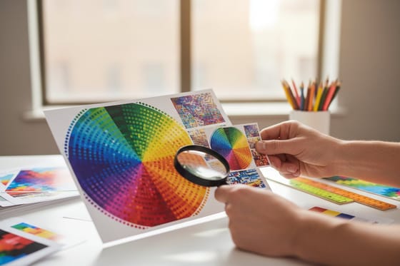
Think of the press as a translator. It reads the pixels in your file and rebuilds each one as a small cluster of overlapping dots, arranged in the fine rosette pattern that halftone printing uses to fake continuous tone. When you hand it plenty of pixels, those dot clusters have room to resolve into crisp edges and smooth gradients. When you hand it a thin, low-PPI file, the press still does its job faithfully, so it prints the softness you gave it. The machine is never the weak link. The pixel count usually is.
This is also why a design can look flawless on a monitor and disappoint on paper. Screens and presses speak different resolution languages, and the same mismatch drives the color surprises covered in our CMYK vs. RGB guide. For a designer's deeper look at the print-versus-web split, understanding image resolution in print versus web is the companion read.
Why the mix-up burns designers
Confusing the two terms is harmless in a studio chat. Confusing the underlying concept costs money. The classic reprint story goes like this: a designer pulls a logo or hero image straight off a website, where it lived happily at 72 PPI, drops it into a poster layout, exports, and approves. On screen it looks fine. On the printed sheet the edges are fuzzy and the type is mushy, because a web-resolution file never carried enough pixels for arm-length printing.
The fix is to think in pixels at final size before you ever open the export dialog. Ask one question: does this image have roughly the finished width in inches multiplied by 300 pixels? A 12-inch-wide poster wants around 3,600 pixels across. If the source cannot deliver that, no export setting will rescue it, and enlarging only spreads the shortage thinner.
Flat brand elements dodge the problem entirely when they are built as vectors, which redraw perfectly at any size. That is why logos and wordmarks belong in vector form, a habit reinforced in our logo design best practices. When you do work with raster art, choosing the right export format protects the pixels you have, and choosing the right file type for printing lays out which format to reach for.
The print-ready resolution checklist
Run every file through this short list before you send it, and low-resolution reprints stop happening. None of it takes more than a minute once it becomes habit.
- Set the canvas to final print size. Build the document at the exact finished dimensions so PPI is measured against real inches, not a guess.
- Hit 300 PPI for anything held up close. Business cards, postcards, and greeting cards read at reading distance, so aim for 300 PPI at that final size.
- Add bleed and keep type inside the safe zone. Extend the background past the trim so the cut never exposes a white edge. Our bleed and trim guide shows the exact margins.
- Work in CMYK, not RGB. Design in the color space the press uses so nothing shifts on paper.
- Keep logos and type as vectors. Vector art stays razor sharp at any scale and never pixelates.
- Flatten and export to a print format. A press-ready PDF preserves resolution, fonts and bleed in one file.
Color is the other half of a clean proof. Once resolution is locked, lining up brand color with a print color profile and, for spot brand hues, running a Pantone to CMYK conversion keeps the finished piece on brand.
How to choose resolution by product and viewing distance

There is no single correct PPI, because the eye resolves less detail the farther it stands. Resolution should scale with viewing distance, not with habit. That plays out differently across the products designers order most.
- Business cards, postcards, greeting cards: held at reading distance, so build them at 300 PPI. Detail and small type have nowhere to hide.
- Standard wall posters: read from a few feet away, so 150 to 200 PPI at final size prints clean and keeps file sizes sane.
- Large-format posters and banners: seen from across a room, so 100 PPI, sometimes less, is plenty. A ten-foot banner at 300 PPI would be an unworkable file for no visible gain.
The practical move is to design at 300 PPI when the source allows it and let distance hand you the safety margin. If you are laying out wall art, our how to make posters guide covers size and setup, and you can compare finishes across the full poster printing range. For mailers and rack pieces, how to make postcards and the postcard printing lineup use the same resolution logic at a smaller scale. To go from a phone photo to a framed print, read how to turn your photos into custom wall art.
Resizing without wrecking the file
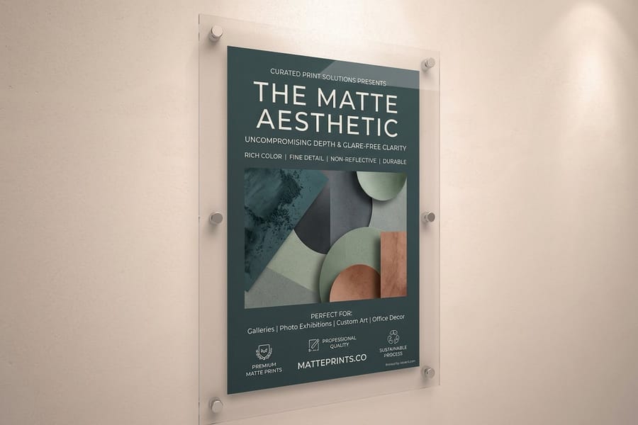
The most expensive myth in resolution is that you can enlarge your way to sharpness. Upscaling a raster image tells the software to guess new pixels between the ones you already have. Modern interpolation and AI upscalers are clever, but they invent detail rather than recover it, and on a press that guesswork reads as softness or a faint plastic smear.
The reliable path runs the other direction. Start bigger than you need and scale down. Shrinking an image packs existing pixels tighter, which raises PPI and looks fantastic. So capture or source art at generous dimensions, then reduce to fit the layout. When a piece is pure shapes and text, skip raster entirely and build it in vector, where scale simply stops mattering.
Knowing which format holds resolution and which throws it away is half the battle, and the terms behind it live in the printing terms glossary. When your art has to stay raster, choosing the right file type for printing spells out the trade-offs between the common export formats.
Resolution mistakes that trigger reprints

Most low-resolution disasters come from the same handful of habits. Spot them in your own workflow and the reprint pile empties out.
Pulling images off the web. On-screen graphics are optimized to load fast, not to print sharp. Treat anything downloaded from a browser as unusable for print until you confirm the pixel count.
Enlarging small photos to fit. If a source image is too small, dragging its corner does not fix it. It spreads the shortage across more inches. Find a larger original instead.
Designing on a canvas that is not final size. Build at half scale and your 300 PPI is really 150. Always set the document to the true finished dimensions.
Rasterizing type and logos. The moment a wordmark becomes pixels it inherits a resolution ceiling. Keep brand marks as vectors so they print crisp at any size.
Forgetting bleed. Resolution can be perfect and the piece still fails at the cutter if the background does not run past the trim.
Building a matched set of pieces? Keeping resolution consistent across a whole kit is easier when everything ships from one place, which is what the 4OVER4.COM marketing materials range is built for. Want to feel the stock before you commit the file? Order free paper samples and check how your detail lands on the exact sheet you will print on.
Wally explains resolution
Feed the press enough pixels and it does the rest
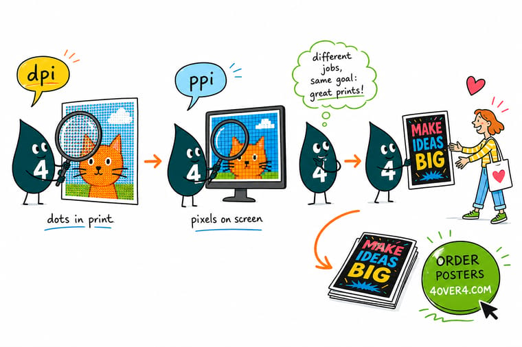
Wally thinks of it like this: PPI is how much detail you pack into the file, and DPI is how finely the press paints it back out in ink. Give the press plenty of real pixels at the final size and every edge lands crisp. Starve it with a web-sized image and it faithfully prints the blur. Build to 300 PPI, keep your logo as vector, and let 4OVER4 turn your art into posters and cards that read sharp from any distance.
Order posters →
Specs and pricing
Poster specs and live pricing
Standard posters come in six sizes from 11 by 17 to 22 by 28 inches on nine stocks, from 100# gloss text to 15pt synthetic, from 50 posters in 5 business days. An 18 by 24 inch poster at 150 PPI needs a 2,700 by 3,600 pixel file. Sizes, stocks, and price-per-unit come straight from the configurator. Resolution is on you, the rest is on us.

| Quantity | Price Per Unit | Total |
|---|---|---|
| 50 | $2.18 | $108.75 |
| 100 | $1.64 | $163.67 |
| 200 | $1.01 | $202.11 |
| 300 | 80.2¢ | $240.55 |
| 400 | 69.7¢ | $278.99 |
| 500 | 63.5¢ | $317.44 |
| 600 | 55.8¢ | $335.02 |
| 700 | 50.4¢ | $352.59 |
Print it
Posters and cards, ready for your high-res files
Graphic designer business cards come in four sizes from 100 cards in 3 business days, and oversized postcards in 5.5 by 8.5 up to 6 by 11 inches. A 6 by 9 inch card at 300 PPI is an 1,800 by 2,700 pixel file before bleed.


See it in use
Files we printed at full resolution
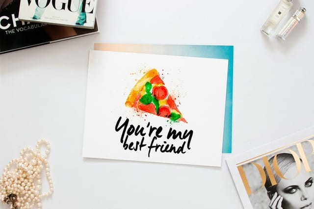
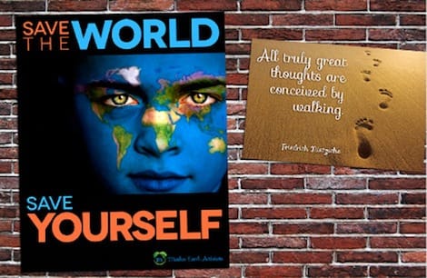
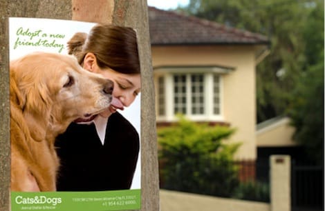
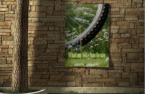
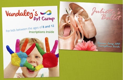
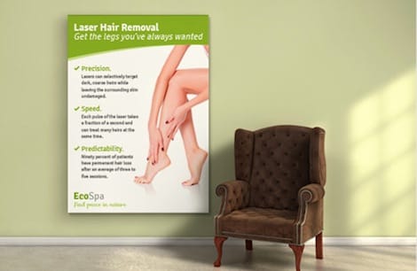
Customer posters and cards built at their print size, not stretched afterward. A 24 by 36 inch poster at 150 PPI starts as a 3,600 by 5,400 pixel file.




Explore more
Where to go next


By the numbers
Cards at 300 PPI, posters at 150
Common Questions
Common questions about DPI and PPI
What is the difference between DPI and PPI?
PPI (pixels per inch) measures how many pixels sit in one inch of a digital image, so it describes the file itself. DPI (dots per inch) measures how many ink dots a printing device lays down across one inch of paper, so it describes the output. In everyday design talk the two words get swapped, and for most print work that is harmless. The distinction matters when you are troubleshooting: if a file looks soft, the fix is almost always the image PPI, not the press DPI.
What is PPI in graphic design?
In graphic design, PPI is the resolution built into a raster image at a given size. A 3,000 by 3,000 pixel photo placed at 10 inches wide prints at 300 PPI, and the same photo stretched to 20 inches drops to 150 PPI. Because PPI depends on the size you place the image at, it is not a fixed number you set once. It is the relationship between your pixel count and your final print dimensions, and it is the single value that decides whether an image reads sharp on paper.
How far away will someone stand from this print?
Start from how close the piece is viewed. Business cards, postcards, and greeting cards are held at reading distance, so aim for 300 PPI at final size. Standard posters that hang on a wall are read from a few feet away and look clean at 150 to 200 PPI. Large-format posters and banners seen across a room can drop to 100 PPI or lower without anyone noticing. When you are unsure, design at 300 PPI and let the viewing distance give you headroom rather than guessing low.
Why does my file look sharp on screen but blurry when printed?
Screens display at a much lower pixel density than a press prints at, so a 72 or 96 PPI web image can look perfect on a monitor and fall apart on paper. The press has more room to resolve than the screen showed you, and it faithfully reproduces every soft edge the low-resolution file contained. Rebuild the artwork from a higher-resolution source, or recreate flat elements like logos and type as vectors, which stay razor sharp at any size.
What does high-resolution poster and card printing cost, and how is price set?
Price is driven by product, size, paper stock, finish, quantity, and turnaround, not by the resolution of your file. Standard Posters at 4OVER4.COM start around $108.75 and drop in per-unit cost as the run grows, while graphic designer business cards start near $17.57. The live specs and price table further down this page pull real numbers straight from the configurator, so you can see how each choice moves the total before you order.
What sizes, stocks, and finishes are available for print?
At 4OVER4.COM you can print across more than 60 paper stocks with matte, gloss, silk, soft touch, and specialty finishes, in sizes from a business card up to large-format posters. Posters run from tabletop sizes to wall-filling formats, and cards come in standard, oversized, square, and die-cut shapes. Whatever the size, the resolution rule holds: build the file to hit a clean PPI at the finished dimensions and the finish you choose will show off crisp detail.
Is 300 DPI always required for printing?
No. 300 is a reliable default for pieces read up close, but it is a floor for arm-length viewing, not a universal law. A trade-show banner viewed from across a hall prints beautifully at 100 PPI because the eye cannot resolve individual dots at that distance. Match the resolution to how the finished piece is actually seen, and you save file size and processing time without losing any visible sharpness.
Get Started
Order 100 graphic designer business cards from $17.57
Set your file to final size, hit 300 PPI, and we print posters and cards with detail that holds up in the hand and across the room.
Legal Disclaimer
Gold Standard guarantees apply to all standard orders placed through 4over4.com. Price match requires verifiable proof of a competitor's published price for an equivalent product with matching specifications and turnaround time. Satisfaction guarantee covers manufacturing defects and print quality issues. Contact support with order number and documentation.
