
Graphic Design for Small Businesses Made Simple


Sofia is our design and templates voice, built from the knowledge of our production team, with over 20 years in printing.
You do not need an art degree or an agency budget to look professional. Settle a simple brand, design each piece for where it lives, and start with the business cards from $17.57, flyers from $39.54, and postcards from $16.48 that do the real work. A brand folder with two fonts and three colors saves more time than any tool.
To start graphic design for a small business, lock a simple brand identity first: one logo, two or three colors, and a font or two. Design each piece for how it will be used, keep layouts clean with clear hierarchy and white space, and set print files up in CMYK at 300 dpi. Begin with the essentials most owners reach for first, business cards, flyers, and postcards, then hire a designer once your brand outgrows templates.
Start here
Two fonts, three colors, one folder
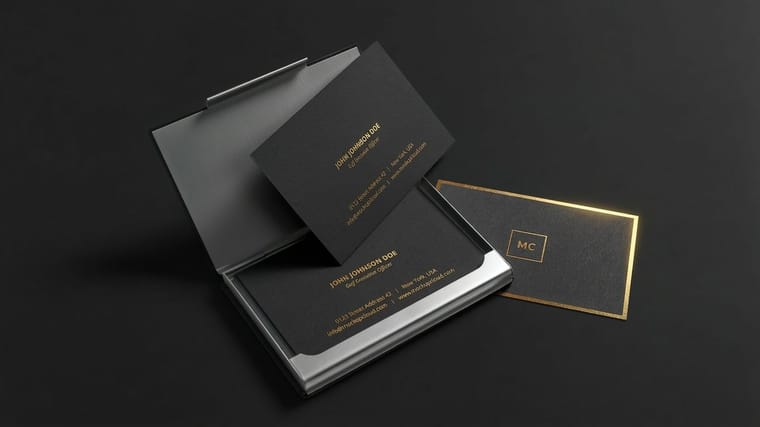
Decide your brand once, then reuse it everywhere. Pick a simple logo, two or three colors, and a font or two, and save them in one folder. Design each piece for its home: clean and clear for the eye, and CMYK at 300 dpi for print. Begin with business cards, flyers, and postcards, template the everyday pieces, and hire a designer for the foundation your reputation depends on. 4OVER4.COM prints the whole set so it all matches.
Define your brand identity first
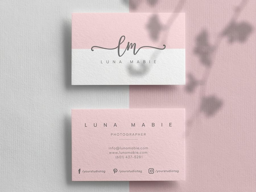
Before you open a single design tool, decide what your business looks like. Brand identity is not a mood or a vibe, it is a short list of concrete decisions: one logo, a palette of two or three colors, one or two typefaces, and a way of speaking that sounds like you. Every card, flyer, and post you make later simply inherits those choices. Get them right once and the rest of your design life gets a lot easier.
Your logo does the heaviest lifting, so give it room to be simple. A mark that reads clearly at the size of a coffee stamp will also read on a storefront sign, and the reverse is rarely true. Our guide to logo design best practices covers how to keep a mark print-ready, and if you enjoy the backstory, these facts about famous logos are a quick reminder that the strongest ones are almost always the plainest.
Color and type come next, and restraint wins. Pick a primary color that feels like your business, one or two supporting shades, and a neutral. For type, one font for headlines and one for body copy is plenty. Save the exact values, the logo files, and the fonts in a single folder so you never guess again. If you want a running start, 4OVER4.COM offers free design templates that already respect this kind of structure.
Understand what works before you design anything
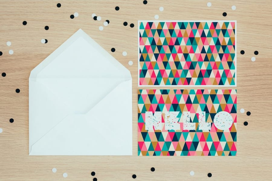
Great small business design rarely starts with a blank canvas. It starts with looking. Count the words on their 3.5 by 2 inch cards and the white space on their 8.5 by 11 flyers. Spend an afternoon studying the businesses you admire and the ones you compete with, and pay attention to the boring stuff: how much white space they leave, how few words they use on a card, how the same color shows up in three different places. Patterns emerge fast, and those patterns are the shared grammar customers already understand.
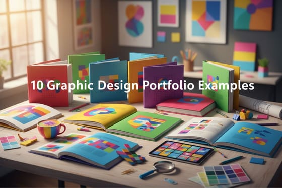
Build a simple swipe file while you look. Screenshot the cards, flyers, and postcards that stop you, and note why each one worked. You are not copying, you are learning the moves. For a shortcut, the collection of standout business card designs and these graphic design portfolio examples are a fast way to fill that file with strong references.
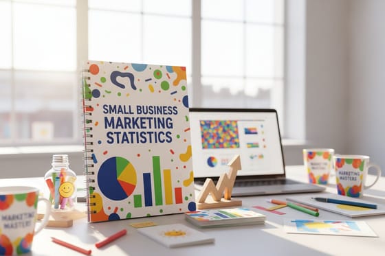
Then ground it in reality. Knowing which formats and channels earn attention keeps you from designing something beautiful that nobody sees. The small business marketing data we track shows where limited budgets tend to pay off, so you can design for the pieces that actually reach people instead of the ones that only look good in a portfolio.
Design essentials: keep it simple
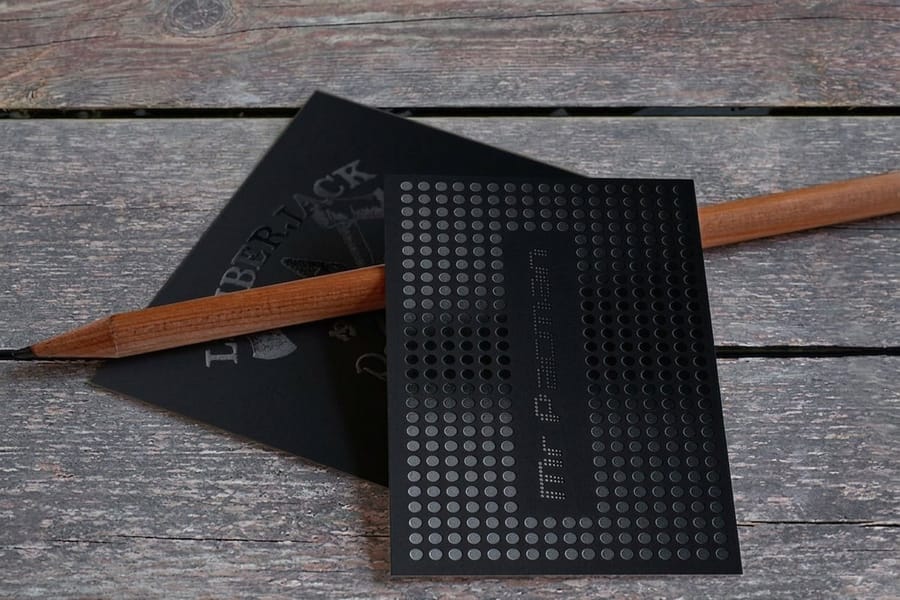
The most common mistake small business owners make is trying to say everything at once. A card crammed with five services, three phone numbers, a tagline, and a background photo says nothing at all. Give each piece one job. A business card exists to be remembered and to make you reachable. A flyer exists to earn a single next step. Decide the one thing, then cut whatever does not serve it. For flyers that keep to one job, see 12 small business flyer examples that get calls. If one line has to stay on the card, pick a tagline for business card use from our roundup of short slogans.
Three habits carry most of the load. Use clear hierarchy so the eye knows what to read first, second, and third. Give elements room to breathe with real white space instead of filling every corner. And keep everything aligned to an invisible grid so the layout feels calm and intentional. None of this requires talent, only patience.
Contrast is the finishing touch. Dark text on a light field, or the reverse, always beats a clever color pairing that fights itself. If your card carries social handles, place them where they support the message rather than crowd it, the way our guide to business cards with social media icons lays out. When you are ready to arrange it all, the 4OVER4.COM online designer lets you build the layout in the browser and keep everything snapped to a grid.
Design for print vs. digital
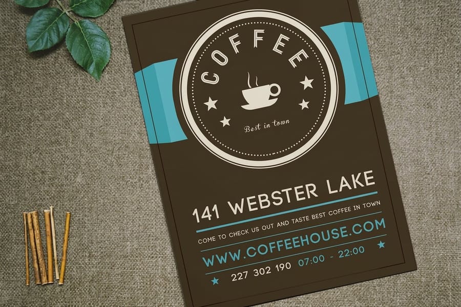
A design that looks perfect on your laptop can print muddy and dark, and the reason is that screens and paper are two different worlds. Screens make color with glowing light in RGB, so everything looks brighter than it really is. Paper makes color with ink in CMYK, which cannot reach those same glowing tones. Design in the wrong mode and you approve a vivid blue on screen that lands flat and grayish on the card.
The fix is a short checklist. Set your file to CMYK, keep photos at 300 dpi at final size, add about an eighth of an inch of bleed so trimming never leaves a white sliver, and hold important text safely inside the edges. Our plain-language walkthrough of CMYK versus RGB and the deeper best color profile for printing guide cover the color side, while the standard print sizes reference keeps your dimensions honest.
One more decision lives only in the physical world: finish. A matte coat is calm and easy to write on, a gloss coat makes color pop and photos snap. The matte versus gloss comparison helps you match the surface to the piece, and if you want to see and feel the difference before you commit, order free paper samples and hold them in your hand.
The print pieces every small business designs first
You do not need to design everything on day one. You need the handful of pieces that put your brand in front of a real person. Start here, in roughly this order, and let need pull the rest.
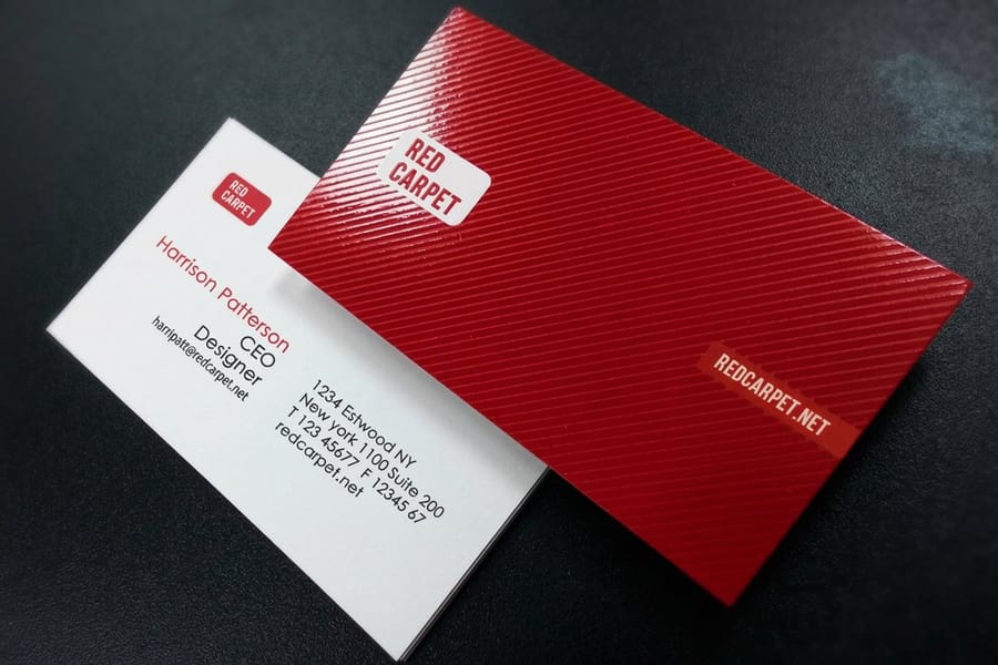
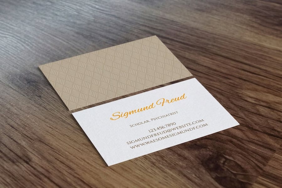
- Business cards. The most personal piece you own, handed over in the exact moment someone wants to remember you. If you are deciding where to have them made, our guide on where to print business cards weighs the options.
- Flyers. One clear message, one call to action, built to earn attention on a wall or counter. The walkthrough on how to design flyers keeps the layout focused and readable.
- Postcards. Your brand delivered straight to a mailbox, with no envelope to open. See how to make postcards from design through mailing.
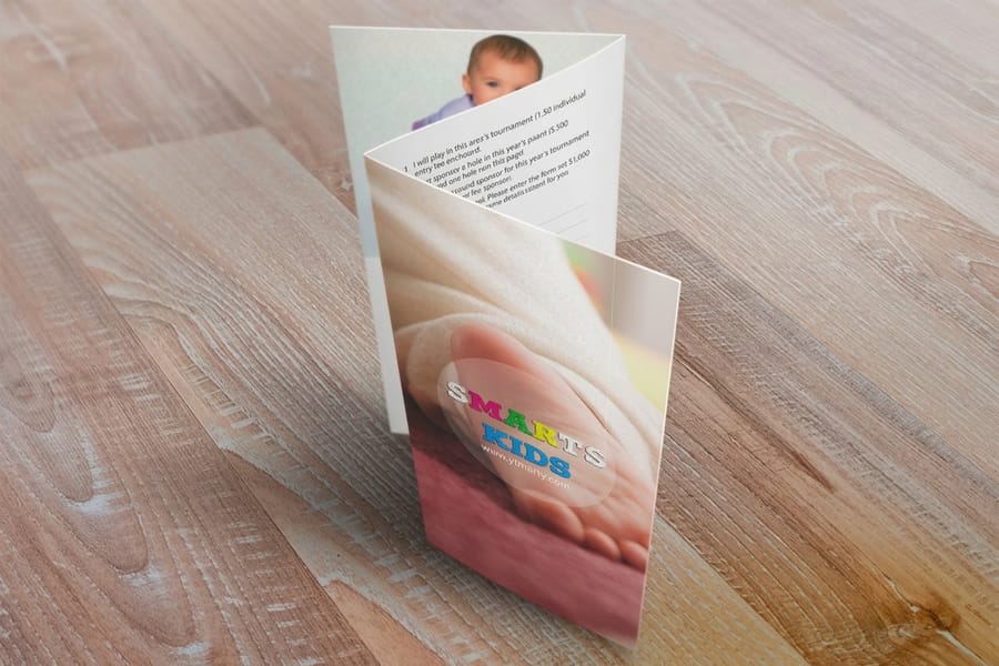
- Brochures. The right choice when you have a story that needs a few panels to tell. Start with what a brochure is, then how to fold one so the reveal lands the way you intend.
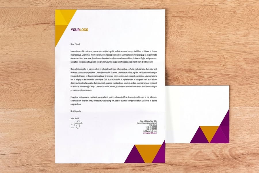
- Letterhead. The quiet piece that makes an invoice or a quote look like it came from a real business, covered in what a letterhead is.
Ordering as a set keeps everything consistent and usually cheaper per piece. The 4OVER4.COM business basics collection bundles the essentials, and the brochures and flyers categories let you configure each piece with live specs and pricing.
The graphics every small business needs
Print is half the job. The other half is the small pile of graphics that has to exist before anything can be printed, because every piece above is assembled from the same files. Build these eight, keep them in one folder, and you stop redesigning your business every time somebody asks you for artwork.
- Logo. The one file everything else is built from. Draw it in vector so it holds up at 2 inches on a card and at 8 feet on a banner, and save a one color version for anything printed in a single ink.
- Business card. 3.5 x 2 inches, and the only graphic you hand over while the person is looking at you. 16pt gloss feels crisp in the hand, 14pt matte or uncoated takes a pen for a note on the back. Our guide on where to print business cards weighs who should make them, and these standout business card designs are a fast layout reference.
- Flyer. 8.5 x 11 inches on 100# Gloss Text is the everyday sheet: one message, one next step, cheap enough to hand out by the hundred. How to design flyers keeps the hierarchy tight, and the flyers category prices the run before you commit.
- Signage. Window lettering, an A-frame, a banner over the door. Design it to be read at 20 feet by somebody walking past in three seconds: one line, one big weight of type, hours or phone underneath. If it needs a second sentence, it is a flyer, not a sign.
- Packaging label. The graphic that turns a plain box, jar or mailer into your product. Keep the logo inside the safe area, hold photos at 300 dpi at final size, and add about an eighth of an inch of bleed so the cut never clips your edge.
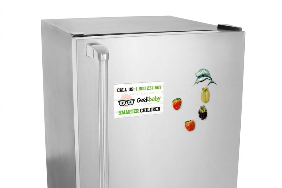
- Vehicle graphic. A magnet or decal on the door of a van earns impressions every day it is parked. Three lines at most, what you do, how to reach you, and your logo, all at a contrast that still reads across two lanes at a stoplight.
- Social template. One square layout and one vertical layout in your palette and your two typefaces, so a week of posts looks like the same business. Keep these in RGB for screen and leave the print versions in CMYK so nothing shifts on press.
- Presentation folder. The piece that carries a quote to a meeting and keeps the loose paper together. What goes inside is already covered: what a letterhead is for the quote, what a brochure is for the story, and how to fold one so the panels open in the order you wrote them.
Design them once against one palette and two typefaces and the print side gets easy, because every piece takes the same files. The 4OVER4.COM business basics collection and the brochures category both build from them, and if you are deciding what to make first, the small business marketing data we track shows where a limited budget tends to pay back.
What small business design costs and how prices are set
Design cost is mostly a question of who does the work. On one end, templates and browser tools are free, and you only pay to print. In the middle sits a freelancer, who charges per project, so a logo might run anywhere from a couple hundred dollars to a few thousand depending on their experience and the scope. On the far end, an agency costs the most because you are buying strategy and a full system, not a single file. None of these is the right answer for everyone, they are simply different trade-offs of money, time, and polish. The print side is the fixed part: 100 standard business cards start at $17.57, 50 postcards at $16.48 and 50 flyers at $39.54.
Printing, by contrast, is priced in a way you can predict. Five levers set the number: how many you order, the size, the paper stock, any special finish, and how fast you need it. The first lever is the friendliest, because ordering more at once drops your cost per piece, which is exactly why our bulk discounts exist. Rather than guess, you can watch the price move in real time by adjusting a real product below.
Two habits protect the budget. Approve a free proof before any full run so a small typo never becomes an expensive reprint, and set a sane budget up front using the small business marketing budget benchmarks we track. Spend where it shows, save where it does not, and let the printing itself be the part you never have to worry about.
Templates, tools, or a designer: how to choose
The honest answer to do-it-yourself versus hire-a-pro is that most businesses do both, just for different things. Use a template or a browser tool for the pieces you remake often and the ones where a small imperfection costs you nothing. Reach for a professional on the pieces that are hard to change later or that carry your reputation. In practice, template the 3.5 by 2 inch cards, the 8.5 by 11 flyers and the postcards you reprint, and pay a designer for the logo and the color system.
Templates and the 4OVER4.COM tools are the fastest path for cards, flyers, postcards, and magnets. You start from a layout that already respects hierarchy and margins, drop in your brand, and print. Browse the design templates library or build from scratch in the online designer, and lean on our free design templates when you want a proven starting point rather than an empty page.
Save a professional for the foundation. Your logo, your color system, and the one campaign that has to land are worth paying for, because everything else copies from them. If you are still finding your feet as a solo operator, these self-promotion ideas show how far a little consistency and a few well-made pieces can carry you before you ever hire out.
When to hire a designer
There is a moment when doing it yourself starts to cost more than it saves. A few signs make it obvious. Your pieces no longer match each other, and the mismatch is starting to look careless. You are spending hours wrestling with software instead of running your business. You are about to commit to something permanent, like a sign or a full rebrand, where a weak design lingers for years. Any one of those is a reasonable cue to bring in a pro. A quick test: lay your card, flyer and postcard side by side, and if the logo, the two typefaces and the palette do not match across all three, the brand has outgrown the templates.
Hiring well is its own small skill. Come with a clear brief, examples from your swipe file and the brand folder you built earlier, and the work comes back sharper with fewer rounds. It helps to see what a real print system looks like when it comes together: this real estate team's brand build and this restaurant rebrand both show a single identity carried cleanly across every printed piece.
Whichever way you go, the printing does not have to be the anxious part. Every 4OVER4.COM order is backed by our satisfaction guarantee, so you can hand off a file and know a crisp, color-accurate result is coming back.
Before you print
Size and stock for the first three pieces
Build each file in CMYK at 300 dpi with about an eighth of an inch of bleed, keep the text inside the edges, and approve a free proof before the full run.
| Piece | Size | Stock | Starts at |
|---|---|---|---|
| Business card | 3.5 by 2 in | 16pt gloss for a crisp feel, 14pt matte or uncoated to write on | 100 for $17.57 |
| Flyer | 8.5 by 11 in, or 4.25 by 5.5 up to 11 by 25.5 | 100# gloss text for the everyday sheet | 50 for $39.54 |
| Postcard | 4 by 6 in, or 2.5 by 2.5 up to 6 by 11 | 14pt to 24pt cover | 50 for $16.48 |
Wally explains small business design
A brand is a few good decisions, repeated everywhere
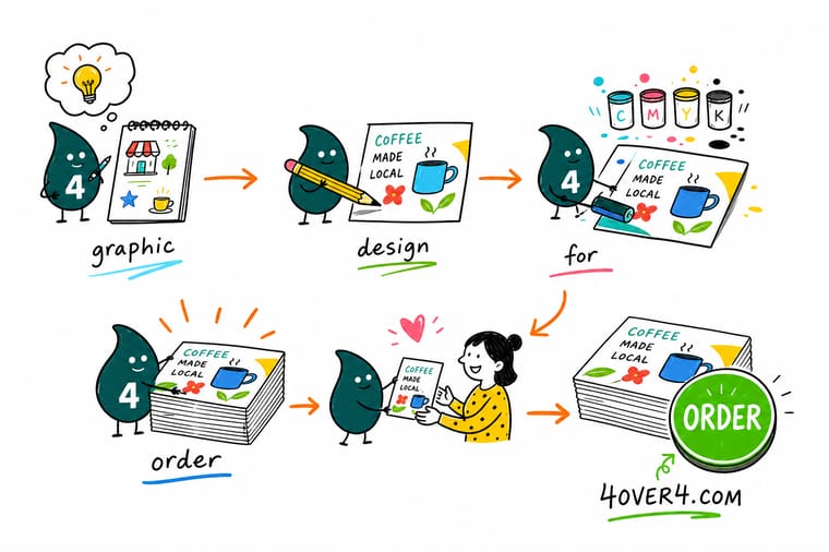
Wally treats a brand like a recipe card: one logo, a couple of colors, a font or two, written down once and followed every time. That repetition is what makes a two-person shop read like an established name. Start simple, print the essentials, and keep every piece pulling from the same short list. When you are ready to put a design on paper, 4OVER4.COM prints it crisp, in true color, and matching across the whole set.
Order custom postcards →
Specs and pricing
Custom postcard specs and pricing
Postcards are the piece where design meets a real budget fastest, so here is a concrete example. These are live specs and price-per-unit for custom postcards at 4OVER4.COM, straight from the configurator, so you can watch cost move as you change quantity and stock. Postcards come in 14 sizes from 2.5 by 2.5 to 6 by 11 inches on 14pt to 26pt cover, from 50 for $16.48, with 3 business days of standard production.
| Quantity | Price Per Unit | Total |
|---|---|---|
| 50 | 33.0¢ | $16.48 |
| 100 | 24.2¢ | $24.16 |
| 200 | 15.9¢ | $31.86 |
| 300 | 12.8¢ | $38.45 |
| 400 | 11.3¢ | $45.04 |
| 500 | 10.3¢ | $51.62 |
| 600 | 9.89¢ | $59.31 |
| 700 | 9.57¢ | $67.00 |
Print it
Design these next for your small business
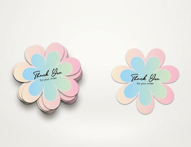
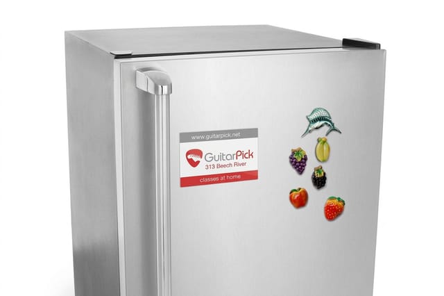
Die-cut stickers start at 25 for $93.37, cut to the outline of your logo. Magnets start at 25 for $19.68 on 17pt or 35pt indoor magnet stock, and posters start at 50 for $108.75 from 11 by 17 to 22 by 28 inches.

See it in use
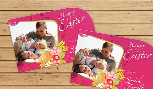
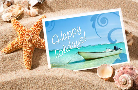
Real small business print, made in-house
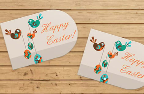
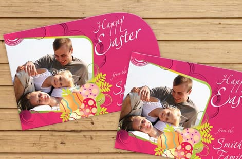
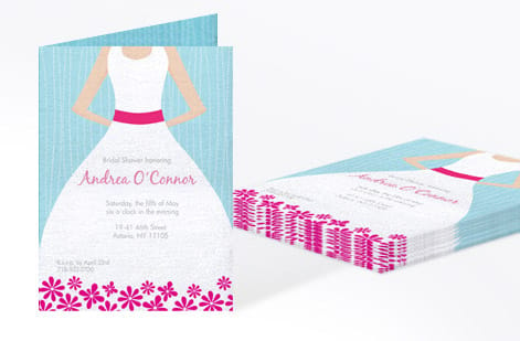
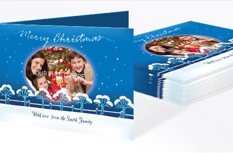

Explore more
Where to go next




By the numbers
Postcards at $0.33, stickers at $3.73
Common Questions
Common questions about small business design
What does graphic design for a small business actually cover?
Graphics for your business are the visual system that makes you recognizable and easy to trust, plus every place that system shows up. The system itself is small: your logo, your colors, and your typefaces. Everything after that is built from them, which means business cards, flyers, postcards, signage, packaging, social graphics, and your website all pulling the same palette and the same two typefaces. Good small business design is not about looking expensive. It is about looking consistent, so a customer who saw your flyer on Monday recognizes your storefront on Friday. In practice that means choosing the system once, keeping the logo in vector with a one color version for single ink jobs, and holding the print files in CMYK at 300 dpi so what you approve on screen is what comes off the press.
Do I need to hire a designer, or can I do it myself?
Both are valid, and most owners start with do-it-yourself. Free templates and the 4OVER4.COM online designer let you build clean cards, flyers, and postcards without touching Photoshop. Hire a professional when the stakes rise: a logo you will use for years, a rebrand, or a campaign where a weak design costs you real money. A reasonable path is to template the everyday pieces and pay a pro for the logo and brand foundation everything else copies from.
How much does small business graphic design cost, and how are prices set?
It ranges from free to several thousand dollars depending on who does the work. Templates and browser design tools cost nothing beyond printing. Freelancers price per project, and a logo commonly lands anywhere from a couple hundred to a few thousand dollars based on their experience. Agencies charge the most because you are buying strategy, not just a file. Printing is priced separately and predictably: quantity, size, paper stock, finish, and turnaround set the number, which is why ordering more at once lowers your cost per piece.
What file settings do I need so my design prints correctly?
Work in CMYK, not RGB, so the colors you approve on screen match the ink on paper. Keep photos and artwork at 300 dpi at final size, add about an eighth of an inch of bleed on every edge, and keep important text away from the trim line. If that sounds like a lot, our free proofs let you catch problems before a full run, and the guide on CMYK versus RGB walks through the color side in plain language.
What graphics does a small business actually need?
Eight, and nothing more to start. A logo in vector with a one color version, a 3.5 x 2 inch business card, an 8.5 x 11 flyer, signage that reads at 20 feet, a packaging label, a vehicle magnet or decal, one square and one vertical social template, and a presentation folder for the quote and the brochure. Everything else you will ever need is a variation on those eight. Build them against one palette and two typefaces so a card, a flyer and a storefront sign read as the same business, and keep the print versions in CMYK at 300 dpi with about an eighth of an inch of bleed so any of them can go on press without a redesign.
Where do I get graphics for my business if I cannot design?
Three routes, and most owners end up using all three. Start from a template in the 4OVER4.COM online designer, which already carries the correct trim, bleed and safe area for the size you picked, so the file prints right even if you have never opened a design program. Hire a freelancer for the pieces you will live with for years, mainly the logo and the color and type choices, then reuse those yourself on everything else. Or hand a printer a finished file and let the free proof catch the problems before a full run. Whichever route you take, ask for the logo in vector plus a flat 300 dpi version, because those two files are what every card, flyer, sign and label gets built from later.
Which print pieces should a new business design first?
Start with the three that get handed to a real person: business cards, flyers, and postcards. A card makes you memorable in conversation, a flyer earns attention on a wall or counter, and a postcard puts your brand directly in a mailbox. Once those feel solid and consistent, expand into brochures, letterhead, stickers, and signage as the need shows up rather than all at once.
How do I keep my brand looking consistent across everything?
Write down the rules and reuse them. Save your exact color values, your logo files, and your one or two chosen fonts in a single folder, and pull from that folder every time you make something new. Consistency is less about talent and more about discipline: the same blue, the same logo spacing, and the same voice on every piece is what makes a small business look far bigger than it is.
Get Started
Order 50 postcards from $16.48 and start there
Bring your logo and colors, pick a piece, and we print a crisp, color-accurate result that matches everything else you make.
Legal Disclaimer
Gold Standard guarantees apply to all standard orders placed through 4over4.com. Price match requires verifiable proof of a competitor's published price for an equivalent product with matching specifications and turnaround time. Satisfaction guarantee covers manufacturing defects and print quality issues. Contact support with order number and documentation.
