
How to Create a Captivating Rack Card Design


A rack card lives in a slot that hides two thirds of it, so the design has to win a three-second scan from the top down. Here is how to build one that gets picked up, from the first idea to the print-ready file.
To create a captivating rack card, design for the top third first, because that is the only part visible in the rack. Speak to one audience with one goal, use a bold color scheme and big legible type, anchor the middle with a single strong image, and close with a clear call to action and a QR code. Then set the file to 4" x 9" or 3.5" x 8.5" with full bleed, and print it on a premium coated stock so it stands out and survives the pull.
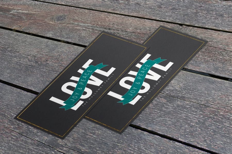
Quick tips
Quick tips for a rack card that gets picked up
Design the top third to win the rack, then design the rest to close the read. Speak to one audience with one clear goal, pick a bold two-color scheme with real white space, set big legible type, and finish with a single call to action and a QR code. Build the file to 4" x 9" or 3.5" x 8.5" with full bleed, and print on a premium coated stock. 4OVER4.COM customers who follow this get rack cards that stand out and stay pristine.
What a rack card actually is
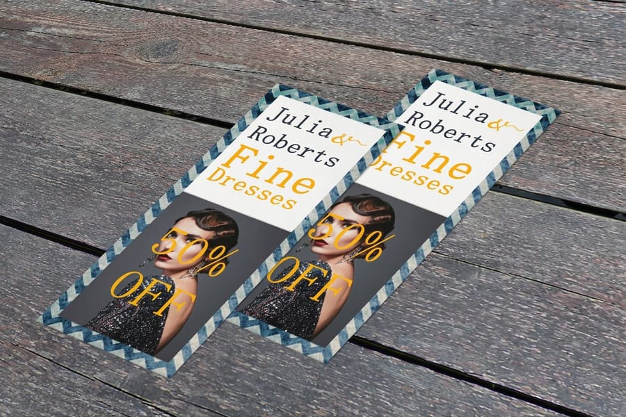
A rack card is a tall, slim marketing card, usually 4" x 9" or 3.5" x 8.5", built to sit in a display holder where people browse. You have seen them in hotel lobbies, tourist welcome centers, salon counters, and real estate offices. If you want the full background on formats and uses, our guide to what rack cards are lays it out, and this page picks up where design begins.
The shape is the whole point. A rack card is vertical because the rack is vertical, and that changes how you lay out every element. Your logo and headline belong at the very top, a single strong image anchors the middle, and the call to action closes the bottom. Think of it as three stacked zones rather than a flat page you fill edge to edge.
Rack cards pair naturally with the rest of a print campaign. Many businesses run them alongside marketing materials like brochures and flyers so the brand reads the same wherever a customer meets it.
Which businesses win with rack cards
Rack cards earn their keep anywhere foot traffic browses a display. Tourism boards and attractions lean on them heavily, which is why a great travel brochure and rack card look sells destinations so well. Hotels stock them for local tours and dining. Real estate agents hand them out at open houses, the same way they use real estate business cards to stay top of mind.
Service businesses love them too. Salons and spas list menus of treatments, gyms promote membership offers, and clinics explain a single service in plain language. Nonprofits use them the way they use buckslips for fundraising, turning a quick pick-up into a donation or a sign-up.
The common thread is a browsing moment. Wherever someone is already standing, waiting, or deciding, a rack card meets them with one clear message. Before you design, name the exact place your card will live, because that setting shapes the tone, the offer, and the artwork.
Why a captivating design is the whole game

Here is the hard truth: your rack card is almost never alone. It shares a wall with ten or twenty competitors, all fighting for the same glance. A visitor scans the whole rack in about three seconds and pulls the one card that catches the eye first. Design is not decoration here. It is the difference between getting picked up and getting ignored.
That scan rewards clarity, not clutter. A single dominant color, one focal image, and a headline that states a benefit will beat a busy card crammed with everything you offer. The goal is to answer one question fast: what is this, and why should I care?
Want proof of what works? The 4OVER4.COM rack card showcase is full of real customer designs that win the scan, and rack card design inspiration breaks down the layouts behind them. Study a few before you open your design tool.
Start with one audience and one goal
Great rack cards feel like they were made for one person. Weak ones try to talk to everybody and land with nobody. Before you touch a color or a font, answer two questions. Who is standing at this rack, and what single action do you want them to take?
Research your audience honestly. A card in a hotel lobby speaks to a traveler with an evening free. A card at a dental office speaks to a nervous patient who wants reassurance. The tone, the photo, and even the offer should change to fit that reader. When you know them, the design decisions get easier because you are no longer guessing.
- Name the reader in one sentence, for example "a first-time visitor who wants a quick, affordable tour."
- Pick one goal, such as book now, scan for a coupon, or call for a quote. Not three goals. One.
- Write the promise that reader cares about most, then make that the headline.
If you want a running start, the free design templates library gives you rack-card layouts already sized and structured, so you can focus on the message instead of the margins.
Design for the top third first

This is the rule that separates rack cards from every other flat print piece. In a display rack, the slot covers the bottom two thirds of the card. Only the top few inches show until someone pulls it. So the top third has to do all the recruiting on its own.
Load that visible zone with your logo, a benefit-led headline, and enough color to stand out from the cards beside it. If your best offer is buried in the middle of the card, nobody in the rack will ever see it. Treat the top like a tiny billboard whose only job is to earn the pull.
Once the card is in a hand, the middle and bottom take over. That is where the supporting image, the details, and the call to action live. Design the top to win the rack, and the rest to close the read.
Choose a color scheme that stops the scan
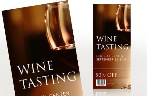
Color is your loudest tool in a crowded rack. Pick one dominant color that carries the card and a second accent for the call to action, then let white space do the rest. Cards that use five competing colors read as noise from a distance, while a confident two-color scheme reads as a brand.
Lean on contrast. Dark text on a light panel, or light text on a saturated block, is far easier to catch from arm's length than mid-tone on mid-tone. Color also carries meaning, and it is worth knowing what different colors signal before you commit, so the mood matches the message.
One technical note that saves reprints: printers work in CMYK, not the RGB you see on screen. Bright screen blues and greens can shift when printed, so it helps to understand CMYK versus RGB and design in the print color mode from the start. The color you approve on screen should be the color that lands in the rack.
Typography and hierarchy that read from a rack
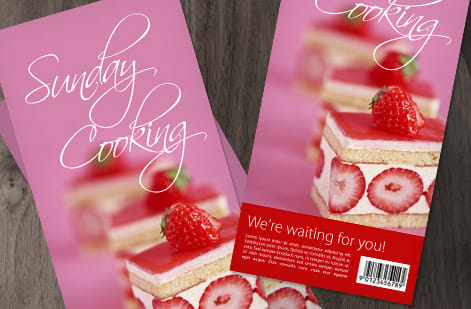
People read rack cards from a step away, not from reading distance, so legibility beats cleverness every time. Set a big, confident headline, a clear subhead, and body copy that stays comfortably readable. If you have to squint on your own screen, it will vanish in the rack.
Build a real hierarchy so the eye knows where to go: headline first, one supporting line second, details third, call to action last. Limit yourself to two typefaces, one for headlines and one for body, and let size and weight carry the emphasis. The spacing between letters and lines matters as much as the font choice, which is exactly why leading, kerning, and tracking are worth understanding before you finalize.
Sizing is a common trap. The same reasoning behind the right font size on a business card applies here, only scaled up, because a rack card is read from farther away. When in doubt, go one step larger than feels necessary.
Write copy and a call to action worth the pick-up
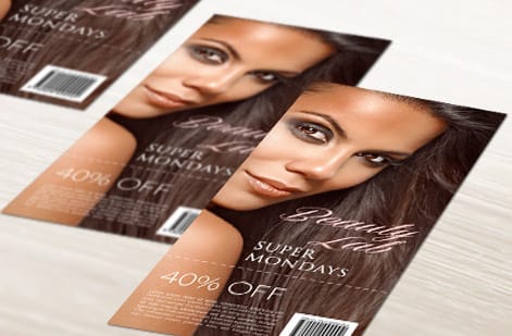
Once a card is in someone's hand, your words have to close the deal fast. Keep the body copy tight, scannable, and focused on the reader's benefit, not a list of everything you do. Short sentences, a couple of bullet points, and a single strong promise beat dense paragraphs every time.
Then make the next step impossible to miss. A clear call to action, a limited-time offer, and a QR code turn interest into action right there at the rack. QR codes are especially strong on print because they bridge straight to a booking page or a coupon, and the same tactics in using QR codes on flyers, brochures, and postcards map cleanly onto rack cards.
Be honest about where that action lands. A code that opens the booking page for the exact offer on the card converts; a code that dumps someone on a homepage does not. Set the phone number large enough to read while the card is still in the rack, and skip the long URL nobody retypes. If you are still weighing this format against a brochure or a flyer, what rack cards are covers where the format earns its keep, and once the layout is settled you can print rack cards in either standard size.
Give people one obvious action. Book, scan, call, or visit, but pick a single one and make it the loudest thing on the lower half of the card.
Rack card design examples
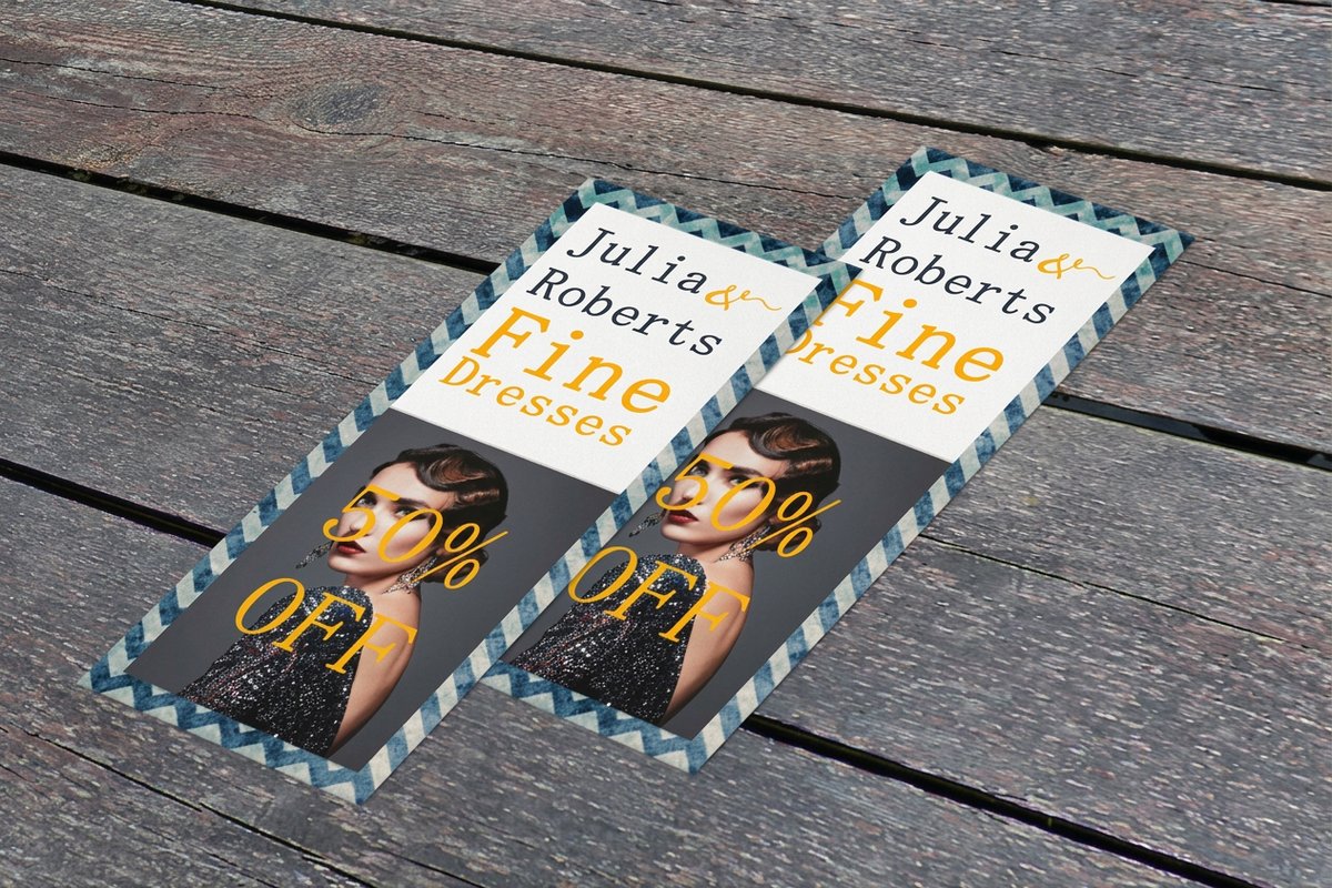
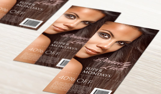
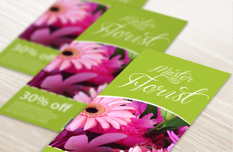
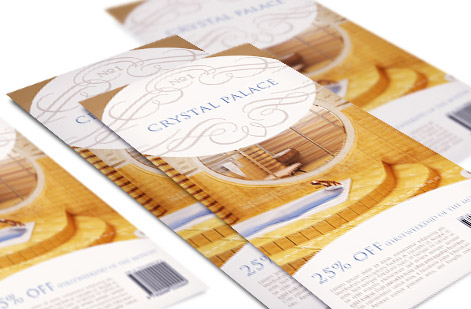
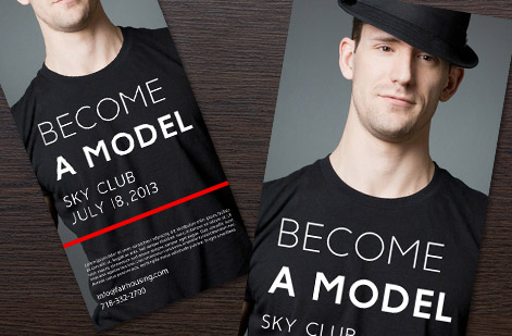
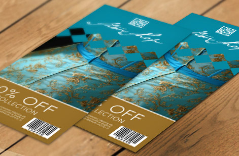
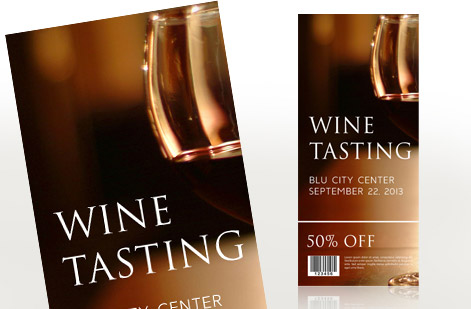
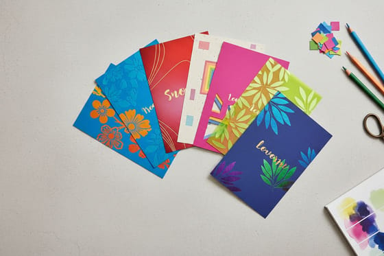
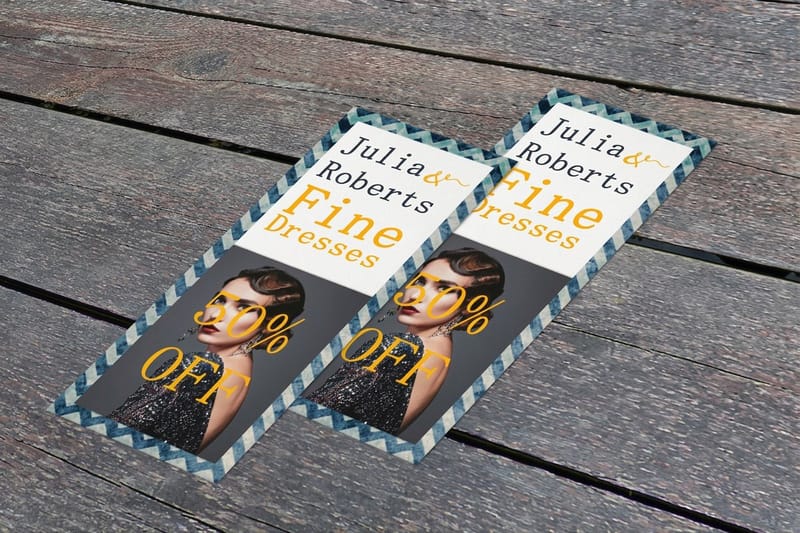
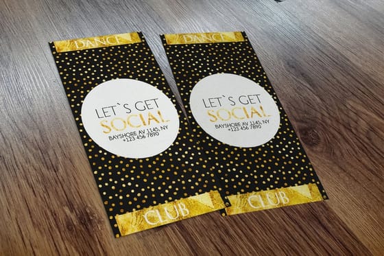
Six rack cards we printed, and the one move each of them makes that keeps it from being skipped. Copy the technique in the caption, not the layout.
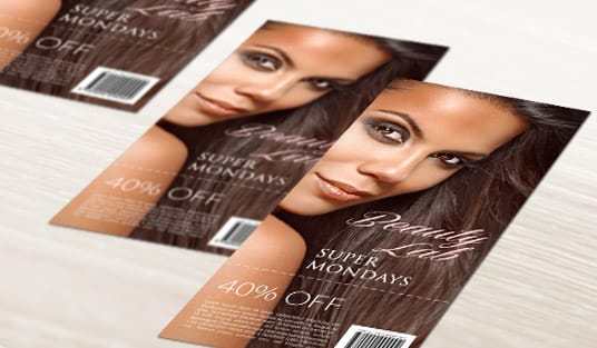
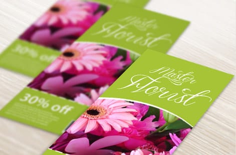
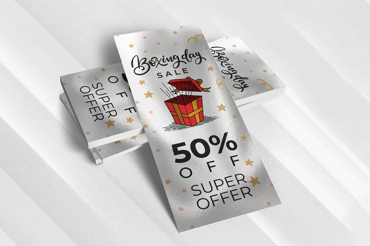
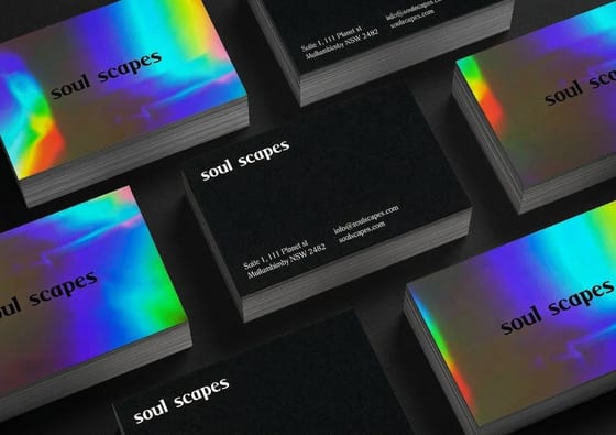
Notice what none of them do: no paragraph of history, no eight service bullets, no two competing calls to action. If you want the shimmer that catches overhead rack lighting, metallic rack cards put a reflective base under the same artwork, and more printed pieces are collected in custom rack card printing options and design ideas.
Set up the file: size, bleed, stock, and finish
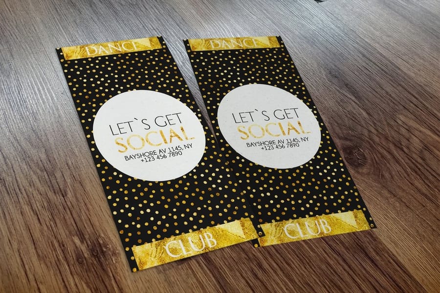
A captivating design only stays captivating if the file is built for print. Set your document to the exact rack card size, 4" x 9" or 3.5" x 8.5", and add full bleed so background color runs cleanly to the trimmed edge. Keep every headline, logo, and phone number inside the safe zone so nothing important gets cut. If bleed and safe zones are new to you, bleed and trim explained and the printing terms glossary clear it up quickly.
Stock and finish shape how the card feels in the hand and how long it survives being pulled, read, and pocketed. Standard rack cards give you 15 paper types across coated, uncoated, and linen stocks, with a Standard Finish or a High Gloss UV Coating, plus optional rounded corners. A heavier coated stock reads as premium, and the paper stocks explained guide helps you match the feel to your brand. For a shimmer that catches rack lighting, metallic rack cards add a reflective base under the ink.
When the artwork is ready, build it in the online designer or upload print-ready files, then order the full quantity you need in one run. It costs far less per card than reprinting, and it keeps every card in your campaign identical.
Rack card size and bleed chart
These are the numbers to build the file with before you draw anything. 4OVER4 prints rack cards at 4" x 9" and 3.5" x 8.5". The third row, 3.67" x 8.5", is the older brochure-rack size cut three across an 8.5" x 11" sheet, and you still meet it in tourism and hotel racks: design that job at 3.5" x 8.5", which drops into the same slot. Add 0.125" of bleed on every edge, keep live text 0.125" inside the trim, and build raster art at 300 DPI.
| Rack card size | Document size (trim) | Size with bleed | Safe zone for text | Pixels at 300 DPI (with bleed) |
|---|---|---|---|---|
| 3.5" x 8.5" standard | 3.5" x 8.5" | 3.75" x 8.75" | 3.25" x 8.25" | 1125 x 2625 px |
| 4" x 9" standard | 4" x 9" | 4.25" x 9.25" | 3.75" x 8.75" | 1275 x 2775 px |
| 3.67" x 8.5" legacy rack size | 3.67" x 8.5" | 3.92" x 8.75" | 3.42" x 8.25" | 1176 x 2625 px |
Which one to choose: 4" x 9" buys you half an inch more headline width and the extra height that clears a deep rack lip, and it slides into a #10 envelope if the same card also gets mailed. 3.5" x 8.5" nests tighter on the press sheet, so it is the cheaper card per piece on a long run, and it fits narrow slot racks and reception-desk holders. Set the page vertical in both cases, and print both sides unless the back of the card will face a wall.
Two traps kill more rack card files than anything else. A background that stops at the trim line leaves a white hairline after cutting, so pull every colored field out to the bleed edge. And a border thinner than 0.25" reads as crooked, because trim can shift a hair from card to card, so either go thick or drop the border. The full walkthrough is in bleed and trim explained, and you can order either size in the rack cards product page once the file matches this chart.
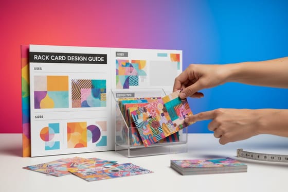
Wally explains rack card design
Win the top third and you win the rack
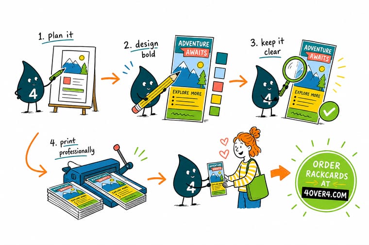
Wally thinks of a rack card like a face in a crowd: only the top shows above the slot, so that is where your logo, headline, and hook have to live. Keep it to one audience and one ask, give it a bold color and big type, then close with a QR code people can scan on the spot. When the design is dialed in, print it on a premium coated stock at 4OVER4 so it stands out and survives every pull.
Order rack cards →Specs and pricing
Standard rack card specs and pricing
Once your design is ready, here is what a made-to-order rack card gives you at 4OVER4.COM, with live specs and price-per-unit straight from the configurator.
| Quantity | Price Per Unit | Total |
|---|---|---|
| 50 | 85.7¢ | $42.84 |
| 100 | 60.4¢ | $60.42 |
| 200 | 31.2¢ | $62.40 |
| 300 | 25.5¢ | $76.45 |
| 400 | 22.6¢ | $90.51 |
| 500 | 20.9¢ | $104.57 |
| 600 | 20.5¢ | $123.02 |
| 700 | 20.2¢ | $141.47 |
Print it
Order rack cards and display print at 4OVER4
See it in use
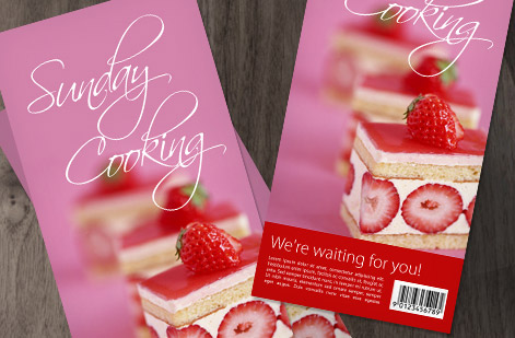
Real rack card work, printed in-house

Explore more
Where to go next

By the numbers
Printing you can count on at 4OVER4
Common Questions
Common questions about rack card design
What size should I make my rack card design?
The two standard rack card sizes at 4OVER4.COM are 4" x 9" and 3.5" x 8.5". Both fit the display racks you see in hotel lobbies, welcome centers, and reception desks, so your artwork drops straight into a real holder without trimming or guesswork. Design tall and vertical, and keep the most important message in the top third because that is the part visible above the rack slot.
What is the standard rack card size?
The two standard sizes 4OVER4.COM prints are 4" x 9" and 3.5" x 8.5", both vertical. Build the document at the trim size, add 0.125" of bleed on every edge and keep live text 0.125" inside the trim: that gives 3.75" x 8.75" with bleed on the 3.5" x 8.5" card and 4.25" x 9.25" with bleed on the 4" x 9" card, or 1125 x 2625 px and 1275 x 2775 px at 300 DPI. You will also run into a legacy 3.67" x 8.5" brochure-rack size, cut three across an 8.5" x 11" sheet; design that job at 3.5" x 8.5", which drops into the same slot. Pick 4" x 9" when you want more headline width and height above the rack lip, or when the card also gets mailed in a #10 envelope.
How much of a rack card is visible in a display rack?
Plan for the top third and nothing more. On a 9 inch card that is roughly the top 3 inches, because the pocket lip of the holder covers the bottom and tiered racks stack cards so each one overlaps the card behind it. Put the logo, the headline and the one image that sells the offer in that band, then save the body copy, the map, the hours and the QR code for the lower half a reader only sees after pulling the card out. A colored band down the outer edge keeps you recognizable when the card is half covered. The cheapest test: print one, slide it into a real holder and look at it from six feet away.
Why does a captivating rack card design actually matter?
A rack card almost never travels alone. It shares a wall with a dozen competitors, and a reader gives the whole rack a three-second scan before deciding what to pull. A captivating design wins that scan with a bold focal point, a clear headline, and color that stands out from the neighbors. A dull card gets skipped no matter how good the offer inside is, which is why design is the whole game here.
How do I create my own rack card from scratch?
Start with one audience and one goal, then sketch the top third first since that is what shows in the rack. Choose a color scheme that pops, set a big legible headline, add a single strong image, and finish with a clear call to action. You can build the file in the 4OVER4.COM online designer, start from a free rack card template, or upload print-ready art. Set the document to your chosen size with full bleed, then keep text inside the safe zone.
How much do custom rack cards cost and how is the price set?
Standard rack cards at 4OVER4.COM start at $42.84. Your final price is driven by a few choices: the quantity you order, the size (4" x 9" or 3.5" x 8.5"), the paper stock, the finish, and add-ons like rounded corners or a high-gloss UV coating. Larger runs bring the per-card cost down sharply, so ordering the full quantity you need in one go is almost always cheaper than reprinting later.
What paper stocks and finishes can I choose for rack cards?
Standard rack cards offer 15 paper types spanning coated, uncoated, linen, and specialty stocks, with a Standard Finish or a High Gloss UV Coating, plus optional rounded corners. If you want a metallic shimmer that catches the light in a rack, Metallic Rackcards add a reflective base under your ink. A heavier coated stock feels premium in the hand and survives being pulled, read, and pocketed on the go.
How do I make my rack card stand out in a crowded display?
Fight for the visible zone. Put your logo and a benefit-led headline in the top third, use one dominant color instead of five competing ones, and leave real white space so the eye has somewhere to rest. A vertical photo that reads from a distance, a short punchy line, and a finish that reflects the light all help your card win the pull. Browse the 4OVER4.COM rack card showcase to see how real customers solve this.
Get Started
Ready to print your rack card design?
Pick your size, drop in your artwork or start from a free template, and we print vivid, premium rack cards that stand out in any display.
Legal Disclaimer
Gold Standard guarantees apply to all standard orders placed through 4over4.com. Price match requires verifiable proof of a competitor's published price for an equivalent product with matching specifications and turnaround time. Satisfaction guarantee covers manufacturing defects and print quality issues. Contact support with order number and documentation. On-time delivery rate based on tracked orders 1999 to 2026. Individual results may vary based on shipping carrier performance.
