
Glossy vs. Matte Cardstock and Which Finish Is Better for Your Prints


Same card, same artwork, two very different results. The coating decides how light hits the page, which decides how your print reads in the hand. Here is when to choose glossy, when to choose matte, and how to be sure before you print.
Choose glossy cardstock when the image is the message, and matte when the words are. Glossy deepens color and makes photos pop but can glare and resists pen ink. Matte cuts glare, keeps small type crisp, hides fingerprints, and takes writing cleanly. On the same stock they usually cost the same, so finish is a look decision. When you are torn, order free samples and decide with the real stock in hand.

Start here
Matte vs glossy cardstock in one paragraph
Glossy cardstock reflects light to deepen color and make photos pop. Matte cardstock scatters light to cut glare, keep text crisp, and give a soft, premium feel. Glossy shows fingerprints and resists pen ink, while matte hides handling and takes writing cleanly. On the same stock the two usually cost the same, so the choice is about the job your piece has to do. The infographic further down sums the whole comparison up at a glance.
Why the finish decides how your print gets read

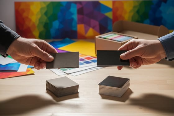
Pick up two cards printed with the exact same artwork, one glossy and one matte, and your hand notices the difference before your eyes do. One catches the light and feels slick. The other reads soft and quiet. Nothing about the design moved. The coating changed, and the coating is doing quiet work on how the whole piece lands.
That is the real question behind glossy versus matte cardstock. You are not choosing a color or a weight. You are choosing how light behaves on the page, and light is what decides whether photos snap, whether small type stays legible, and whether a fingerprint shows up an hour later. Get the finish right and even a simple business card looks deliberate. Get it wrong and premium stock can still feel off.
This guide walks both finishes through the jobs cardstock actually does, from photo-led marketing to text-heavy handouts, and ends with a simple way to decide. If you would rather feel the coatings before you read another word, order free paper samples and let the stock make the case in your hand.
Glossy and matte cardstock: what each one actually is

Start with what they share. Both are cardstock, a heavier, sturdier paper than the text weight used for letters and flyers, measured by thickness and weight rather than feel. If you want the full breakdown of weights and grades, our guide on cardstock vs paper stock covers the materials in depth. The finish sits on top of that base as a coating.
Glossy cardstock carries a shiny, reflective coat. It seals the surface, deepens contrast, and makes color and photography look richer and more saturated. Light bounces off it, which is exactly why a photo appears to have more depth on gloss than on any flat sheet.
Matte cardstock carries a flat, non-reflective coat. It scatters light instead of bouncing it, so the surface reads soft and even. Colors look a touch more muted and refined, small type stays crisp, and the sheet has a smooth, understated hand. For a wider tour of how coatings behave, our matte vs gloss paper finish comparison is a useful companion, and the printing terms glossary defines every finish name you will meet along the way.
Matte photo paper vs cardstock: what is the difference
Matte photo paper is a thin, heavily coated sheet built to hold photographic detail, while cardstock is a thick, rigid board built to be handled. Photo paper gives a finer image on a sheet that stays in a frame or an album, and cardstock gives a piece stiff enough to stand, mail or hand over.
The coating is doing different work in each case. Photo paper carries a receptive layer that keeps the ink sitting on the surface, which is how it holds gradation in skin tones and shadow detail. Cardstock carries its coating over a much heavier base, so the coating controls shine and protects the print while the board underneath does the real job of staying flat in a wallet, a mailbox or a card holder.
Choose by what happens to the print after it leaves your hands. A print that goes behind glass, into an album or onto a wall wants photo paper, because nothing is going to bend it and the detail is the whole point. Anything that gets mailed, stacked, scored, folded or passed across a counter wants cardstock: photo paper creases the first time someone slides it into a bag, and it will not stand up on its own. Photo paper also stays soft at the edges, while cardstock takes a clean trim and rounded corners without fraying.
If you want the photographic look on a piece that still has to survive handling, glossy cardstock is the middle ground. The reflective coat gives you most of the depth and saturation people associate with a photo print, on a board heavy enough for a business card, a postcard or a thank you card. For the weights and grades behind that choice, our guide on cardstock vs paper stock lays out the materials, and free paper samples settle it faster than any description.
Glossy cardstock: when shine works in your favor

Gloss is the finish for color and imagery. The reflective coat deepens blacks, brightens saturated hues, and adds a sense of depth to photographs that a flat sheet cannot match. If your piece lives or dies on how good a product photo looks, gloss usually wins the first glance.
It also protects. The sealed surface resists moisture and light scuffing better than an uncoated sheet, which helps cards and handouts survive a wallet, a bag, or a busy event table. That durability is part of why glossy business cards, product postcards, and photo-forward marketing lean this way.
The trade-offs are real, though. Gloss reflects light, so under a lamp or in a display window it can throw a highlight straight across your text. It shows fingerprints, especially on dark designs. And it resists pen ink, so writing on it smears. If your design is mostly photography and color, none of that matters. If it is mostly words or gets handled a lot, keep reading.
Matte cardstock: the calm, readable, writable choice

Matte is the finish for text, touch, and restraint. Because it scatters light rather than reflecting it, glare disappears and fine type stays legible from any angle, in any lighting. That makes it the natural pick for anything a reader has to work through, from a spec-heavy handout to the inside pages of a booklet.
It also feels premium in a quieter way. The smooth, flat surface reads as considered and understated, which is why so many modern brands default to it. Matte hides fingerprints and handling marks, so pieces that get passed around stay looking clean. And crucially, matte takes pen ink, so a card people write on, sign, or fill in behaves exactly as you would hope.
The one thing matte gives up is punch. Deep photography looks slightly softer than it would on gloss, and heavily saturated color reads a touch more muted. For most text-led and touch-first work that is a fair trade, and often the point. Everything in our matte printing collection is built around exactly this soft, glare-free look.
Glossy vs matte cardstock, head to head
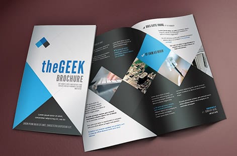
Here is the short version, laid out so you can scan it. Neither finish is better in the abstract. Each wins on different jobs, and the right call depends on what your piece has to do once it leaves the press.
| What matters | Glossy cardstock | Matte cardstock |
|---|---|---|
| Color and photos | Richer, deeper, more contrast | Softer, more muted, refined |
| Text readability | Can glare on small type | Crisp and glare-free |
| Feel in the hand | Slick and polished | Smooth and understated |
| Fingerprints | Shows them, especially on dark art | Hides handling marks |
| Writing with a pen | Resists ink, tends to smear | Takes ink cleanly |
| Best for | Photo cards, product flyers, vivid color | Text-heavy pieces, dark designs, writable cards |
If a single line has to decide it: reach for gloss when the image is the message, and matte when the words are. For the same question narrowed to a specific format, our guides on matte vs glossy business cards and matte vs glossy brochures go deeper on each.
How the finish call changes by product

The same physics play out differently depending on what you are printing. Here is how the choice tends to shake out across the products people ask about most.
Business cards. Bold, image-led, or single-color cards look sharp on gloss. Detail-dense or dark cards, and any card people write on, do better on matte. If you want the finish to feel exceptional, our note on choosing the right cardstock for business cards pairs stock and finish together.
Postcards. A photo-front promo postcard shines on gloss, while the message side stays writable if you keep it matte or uncoated. See postcards vs greeting cards for where each format fits.
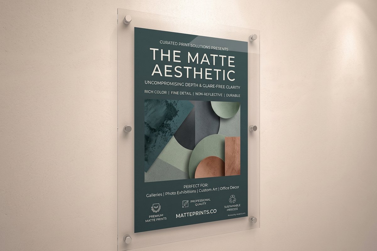
Brochures, flyers, and posters. Covers and image spreads pop on gloss, but text-heavy interiors read easier on matte. Large matte posters beat glare on a wall or in a window, which is why signage so often goes flat.
Booklets, catalogs, and invitations. Long reads favor matte for comfort, while a luxe invitation might use a gloss accent or a specialty coat for contrast. Labels split the same way, and matte labels keep product copy legible without a shiny reflection fighting the eye.
Beyond matte and gloss: the specialty finishes

Matte and gloss are the two poles, but they are not the only options, and knowing the rest helps you decide. Soft touch sits in the matte family and adds a velvety, suede-like feel that reads even more premium than a standard flat coat. Our explainers on soft touch business cards and soft touch lamination show exactly how it differs.
Uncoated stock has no finish at all, which makes it the most writable and the most natural to the touch, at the cost of the color depth a coating provides. And liquid laminate or UV coating pushes gloss even further for maximum shine and protection, covered in our guide to liquid laminate for paper and digital prints.
The point is not to master every coating. It is to know that the matte-versus-glossy question sits on a spectrum, and that 4OVER4.COM stocks the full range so you can dial in exactly the feel your piece needs.
A simple way to choose your finish

You can settle this in three quick questions. Answer them in order and the finish usually picks itself.
1. Is the piece led by images or by words? If a photo or a bold color is the whole point, lean glossy. If people have to read paragraphs, specs, or fine print, lean matte.
2. Will anyone need to write on it, or handle it a lot? Cards that get signed, filled in, or passed hand to hand want matte, which takes ink and hides fingerprints. Display pieces admired at arm's length can carry gloss.
3. Where will it live? Bright rooms, sunlight, and display windows all favor matte to beat glare. A print held close, in controlled light, can show off gloss safely.
When two answers pull in different directions, do not guess on screen, because a monitor makes everything look glossy and shifts your colors on top of it. Our CMYK vs RGB guide explains that color shift, and the fix for the finish question is even simpler: order free paper samples and decide with the real stock in front of you.
What it costs to print, and how pricing works
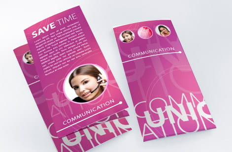
Good news on budget: on the same stock, glossy and matte usually sit at the same base price, so finish is a look decision, not a cost one. What actually moves your total is quantity, size, and paper weight. More pieces lower the unit price, larger formats and heavier stock add a little, and specialty coats like soft touch or UV carry a small premium.
You never have to estimate. Set your options in the product configurator and the price updates live as you adjust quantity, size, stock, and finish, so you can compare a matte run against a glossy one in seconds. Print with soy-based inks for color that stays sharp on either coating, and design straight in the browser with our online designer or a ready-made template.
When the finish is chosen and the file is ready, ordering is the easy part. Pick your product, set your finish, watch the number, and send it to print. If you are still on the fence between coatings, samples cost nothing and settle the question for good.
Wally explains the finish
Same artwork, two different first impressions
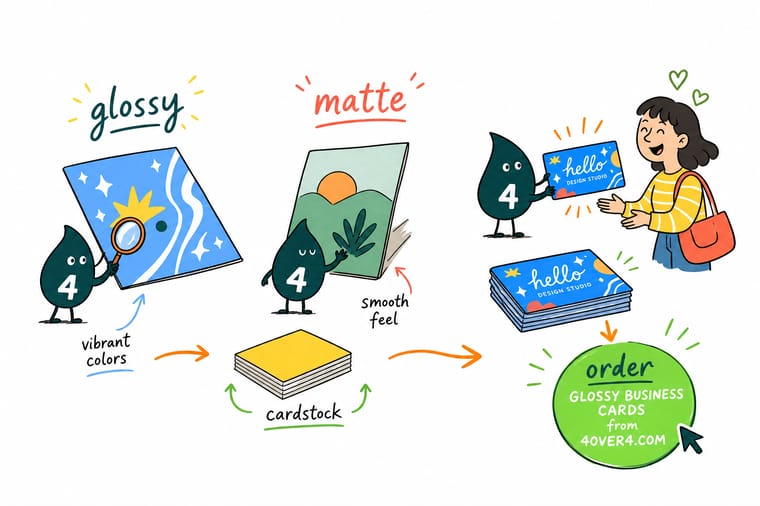
Wally puts it simply: glossy makes light bounce, so color and photos jump off the page, while matte lets light settle, so text stays crisp and fingerprints disappear. Ask one question first, is my piece led by images or by words, and the finish nearly picks itself. When you cannot decide, hold both on real stock. Then let 4OVER4 print it exactly the way it should feel.
Order free paper samples →Infographic
Glossy vs matte cardstock at a glance
One frame, the whole decision. Save it, share it, and use it as a quick checklist the next time you set a finish on a card, postcard, or brochure.
Neither finish wins in the abstract. Match the coating to the job: gloss when the image carries the piece, matte when the words do.
Specs and pricing
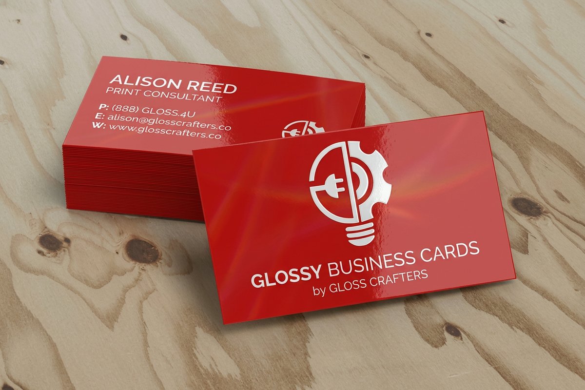
Glossy business card specs and live pricing
When the finish is chosen, the rest comes down to size, stock, and quantity. Here are the live specs and price-per-unit for glossy business cards at 4OVER4.COM, straight from the configurator, so you can see how finish and options price out.
| Quantity | Price Per Unit | Total |
|---|---|---|
| 50 | 74.5¢ | $37.24 |
| 100 | 63.1¢ | $63.15 |
| 200 | 44.2¢ | $88.40 |
| 300 | 33.7¢ | $101.04 |
| 400 | 28.4¢ | $113.67 |
| 500 | 25.3¢ | $126.30 |
| 600 | 22.3¢ | $133.88 |
| 700 | 20.2¢ | $141.46 |
Print it
Print your finish at 4OVER4

See it in use
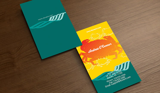
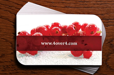
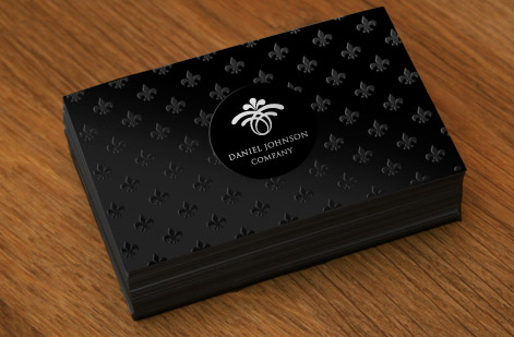
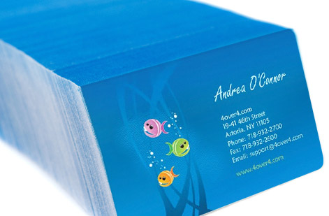
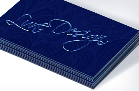
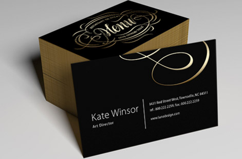
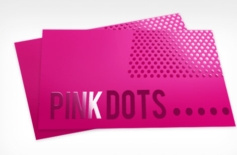
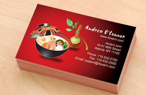
Real finished cards, printed in-house
Explore more
Where to go next




By the numbers
Printing you can count on at 4OVER4
Common Questions
Common questions about matte vs glossy cardstock
Is matte photo paper the same as cardstock?
No. Matte photo paper is a thin sheet with a heavy coating made to hold photographic detail, and cardstock is a thick, rigid board made to be handled. Photo paper suits a print that goes into a frame or an album. Cardstock suits a piece that gets mailed, stacked or handed across a counter, because it stays flat and takes a fold, a score or rounded corners without creasing.
Can you print photos on cardstock?
Yes, and glossy cardstock is the finish that gets closest to a photo print. The reflective coat deepens blacks and lifts saturated color, so product shots and portraits keep their depth on a board heavy enough to mail or hand over. Matte cardstock prints photos well too, just softer and less contrasty, and it is the better pick when small type sits over the image or someone has to write on the card.
What is the difference between glossy and matte cardstock?
Both are the same base card. The difference is the coating on top. Glossy cardstock carries a shiny, reflective coat that bounces light, deepens color, and makes photos pop. Matte cardstock carries a flat, non-reflective coat that softens the surface, cuts glare, and gives a smooth, understated feel. Nothing about the artwork changes. Only the way light behaves on the finished sheet changes, and that is enough to shift how the whole piece reads.
Is glossy or matte better for business cards?
It depends on the job the card has to do. Glossy business cards make logos and brand colors look vivid and are great when the card is mostly image or a bold single color. Matte business cards keep dense contact details easy to read, hide fingerprints on dark designs, and let people write a note on the back. For a full head-to-head on cards specifically, see our guide on matte vs glossy business cards.
Which finish is easier to read?
Matte, in most cases. A glossy surface can throw a highlight straight back at the reader under a lamp or in sunlight, and that glare lands right on your small print. Matte scatters light instead of reflecting it, so fine type and long paragraphs stay legible from any angle. If your piece is text-heavy, like a brochure interior or a spec sheet, matte is the calmer read.
Can you write on glossy or matte cardstock?
Matte takes pen ink cleanly, so a ballpoint or gel pen dries and stays put. Glossy resists most inks because the sealed coat gives the pen nothing to grab, and writing tends to smear or bead up. If people need to jot an appointment time, sign a card, or fill in a field, choose matte or an uncoated stock.
Does matte or glossy show fingerprints more?
Glossy shows them more, especially on dark or saturated designs where every smudge catches the light. Matte hides handling marks because there is no reflective layer to reveal them. For anything that gets passed hand to hand, like a card or a menu, matte keeps the piece looking clean longer.
Is soft touch the same as matte?
Not quite. Soft touch is a matte-family finish, but it adds a velvety, almost suede-like feel on top of the flat look. It reads even more premium than standard matte and is popular for luxury cards and packaging. Our explainer on soft touch laminated cards walks through how it differs from a plain matte coat.
How do I choose between matte and glossy for my project?
Start with the content. Image-led and color-critical work leans glossy. Text-heavy, writable, or touch-first work leans matte. Then factor the environment: bright light or a display window favors matte to beat glare, while a print that will be held close and admired can carry gloss. When you are torn, order free paper samples and decide with the real stock in your hand.
What does it cost to print, and how is pricing set?
Price scales with a few simple levers: quantity, size, paper weight, and finish. More pieces lower the unit price, heavier stock and specialty coatings add a little, and the number updates live as you set each option in the 4OVER4.COM configurator. Glossy and matte typically sit at the same base price on the same stock, so finish is usually a look decision, not a budget one.
Get Started
Ready to lock in your finish and print?
Set your finish, size, and stock at 4OVER4.COM and watch the price update live. Glossy or matte, your artwork prints exactly the way you want it to feel.
Legal Disclaimer
Gold Standard guarantees apply to all standard orders placed through 4over4.com. Price match requires verifiable proof of a competitor's published price for an equivalent product with matching specifications and turnaround time. Satisfaction guarantee covers manufacturing defects and print quality issues. Contact support with order number and documentation. On-time delivery rate based on tracked orders 1999 to 2026. Individual results may vary based on shipping carrier performance.
