
Typographic Business Cards That Actually Work in 2026


What Makes Type Read Clean on a Business Card
A business card is the smallest brochure you will ever print, and on a 3.5 by 2 inch rectangle the type is the design. Choose good fonts for business cards and the card feels considered before anyone reads a word. Choose the wrong ones and even a beautiful logo cannot save it. Type is where cheap and premium separate.
The trap most people fall into is thinking the font has to be interesting. It does not. It has to be legible at arm's length, hold up when it is printed at 8 or 9 points, and get out of the way of the name and number that actually matter. The best typographic cards look effortless precisely because the type is doing a job, not showing off.
4OVER4.COM has printed 10 billion+ cards for 150,000+ businesses since 1999, and the cards that people keep almost always share three traits: one clear focal point, breathing room around the type, and a stock that flatters the ink. This guide walks through the fonts worth trusting, how to pair them without clashing, and the finishes that make crisp type feel expensive.
Contrast, hierarchy, and space do the heavy lifting
Before you audition a single typeface, decide what a stranger should read first. Usually that is the name, then the role, then the phone or handle. Set that order with size, weight, and spacing, and the eye follows it automatically. A card with three competing focal points reads as noise no matter how nice the font is.
Shop the range
Business cards printing
Every stock, shape, and finish, ready to carry your type.
Good Fonts for Business Cards
Best Fonts to Start From
There is no single best font, but there is a shortlist that almost never lets you down. These faces are legible small, print sharp, and carry a professional tone without trying too hard. Pick one as your anchor and you are already ahead of most cards in the room.
- Neutral sans for clarity. Helvetica Neue, Inter, Avenir, and Proxima Nova stay crisp at tiny sizes and suit tech, finance, and anything modern.
- Geometric sans for personality. Futura and Gill Sans add character while staying clean, a good fit for design, architecture, and lifestyle brands.
- Classic serifs for authority. Garamond, Caslon, and Baskerville read as established and trustworthy, ideal for law, consulting, and hospitality.
- High-contrast serifs for luxury. Didot and Playfair Display feel editorial and premium, but keep them large so the thin strokes survive the print.
- Slab serifs for confidence. Rockwell and Archer land with weight and warmth, strong choices for trades, coffee, and craft brands.
Whatever you pick, license a font you can actually embed, and avoid ultra-thin weights for contact details. A hairline weight that looks elegant on screen can break up or fade when it is printed at 7 points, especially on a textured stock.
Print picks
Three stocks that flatter good type
Live prices, ready to customize with your font pairing and details.
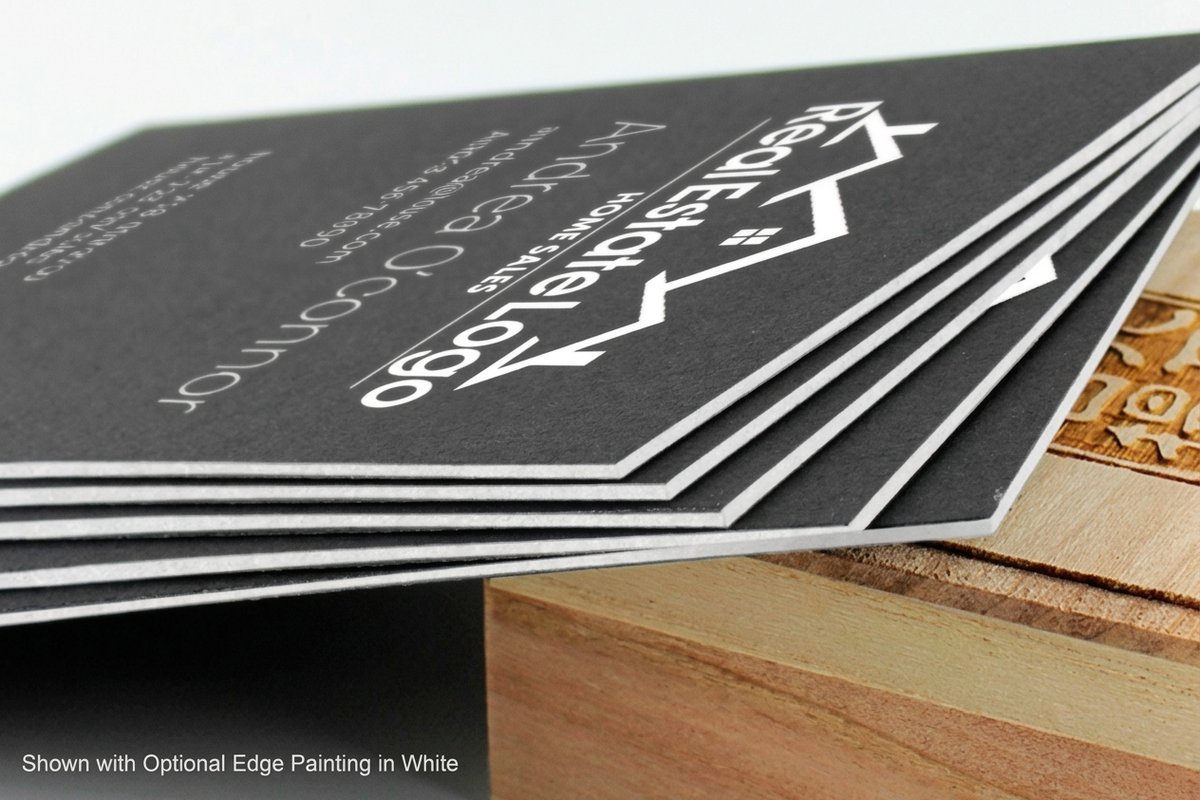
Black Business Cards From $40.62 Reverse type to bright ink on a deep matte stock for maximum contrast. 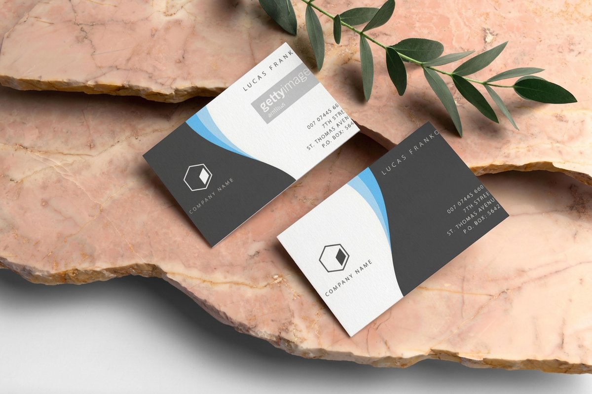 Classic Business Cards From $17.57 The clean canvas that lets a good font pairing carry the whole card.
 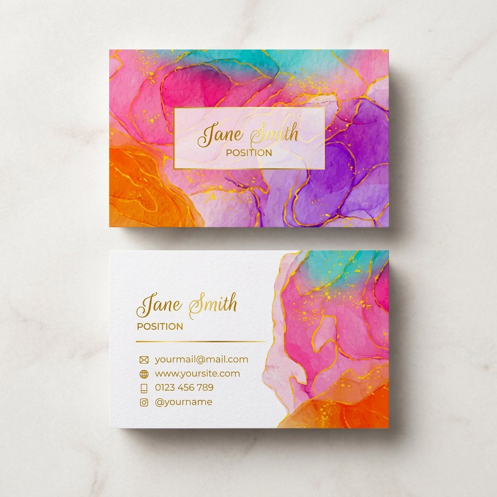 Artist Business Cards From $17.57 Room to be expressive when the type itself is the identity. Classic Business Cards From $17.57 Plain stock that puts all the attention on your type.
 Pairing Fonts Like a Designer
Pairing Tips That Never Fail
The fastest way to look amateur is to reach for a third font. Two is the ceiling for a business card, and often one family with two weights is plenty. Pair for contrast, not similarity: a distinctive display face for the name, and a quiet neutral for the address block underneath it.
- Contrast the roles, not the mood. A serif name over a sans detail block works because the jobs differ. Two loud display fonts fight for the same attention.
- Match the x-height. When your two fonts share a similar lowercase height, the card feels intentional instead of accidental.
- Let weight build the hierarchy. Bold the name, regular the role, light or small-caps the details. You rarely need a second typeface to separate levels.
- Use one family as a safe default. A superfamily like a sans with a matching serif companion is designed to pair, so you cannot really get it wrong.
- Track your all-caps. Capital letters need extra letter-spacing to breathe. Set them solid and they read as a wall.
If you would rather not build the file from scratch, 4OVER4.COM has a free online Designer and template library with layouts already balanced for the cut and bleed lines, so you drop your name in and the spacing holds. It is the quickest way to test two pairings side by side before you commit a stock to them.
Design it faster
Free online Designer and templates
Balanced layouts inside the cut and bleed lines, so you can test two font pairings side by side before you print.
Finishes That Make the Type Pop
Finishes That Make Type Pop
Type is not only a font choice. Print finishing turns a good pairing into something people notice by touch. The right finish adds a second layer of hierarchy, letting one word or the logotype step forward while everything else stays flat and quiet.
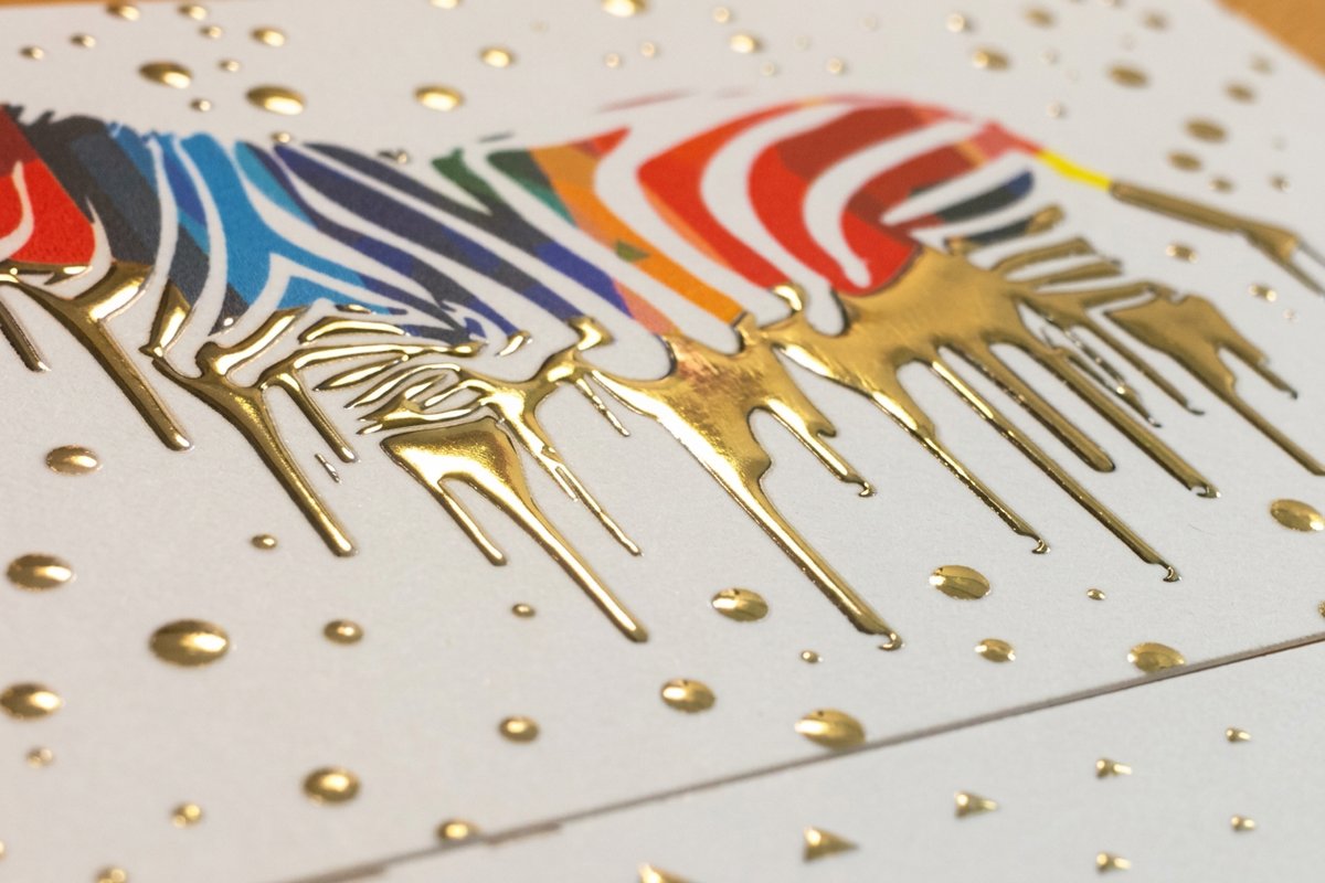
- Foil. Metallic type catches light and signals premium instantly. Raised Foil Business Cards lift the letters off the surface, and the foil stamping service applies it in gold, silver, copper, or rose.
- Letterpress. A deep impression you can feel with a fingertip. Letterpress Business Cards give a name real presence, though very thin serifs can fill in, so nudge the weight up slightly.
- Spot UV. A glossy coating on matte stock so type shifts as the card tilts. Spot UV Business Cards make a single word or logo shine without any color change.
- Suede. A soft-touch surface that makes crisp ink read even sharper by contrast. Suede Business Cards feel expensive the moment they leave your pocket.
A note that saves reprints: heavier finishes reward heavier type. Hairline strokes that look delicate on screen can plug up under foil or letterpress, so bump thin weights a notch and keep counters open.
Make it pop
Raised foil business cards
Metallic type that lifts off the surface and catches the light, applied in gold, silver, copper, or rose.
Sizing, Hierarchy, and Legibility
Once the fonts and finish are settled, the last mile is sizing. This is where most DIY cards quietly fall apart, because type that looks fine zoomed in on a laptop turns muddy at actual card size. Set your sizes for the hand, not the screen.
- Name. Usually 9 to 12 points, the clear anchor of the card.
- Role and company. A step down at 7 to 9 points, present but subordinate.
- Contact details. Rarely below 7 points, and never in a hairline weight, so a phone number stays scannable.
- Margins. Keep type at least an eighth of an inch from every edge so nothing gets trimmed on the cut.
Proof at 100 percent before you order, and if you can, print a plain paper mock at true size and hold it. What reads clean in your hand will read clean in a client's. The live specs below show the stock, sizes, and turnaround so you can match the finish to the type with real numbers.
Quantity and price
Classic business card pricing and specs
Real configurator numbers. The more you order, the lower the per-card cost drops.
| Quantity | Price Per Unit | Total |
|---|---|---|
| 100 | 17.6¢ | $17.57 |
| 200 | 11.5¢ | $23.07 |
| 300 | 9.15¢ | $27.46 |
| 400 | 7.96¢ | $31.86 |
| 500 | 7.25¢ | $36.26 |
| 600 | 6.77¢ | $40.64 |
Compare the Finishes Side by Side
When you are weighing foil against letterpress against a clean matte, it helps to see stock, size, quantity, turnaround, and the from-price lined up together rather than clicking between tabs. The comparison below pulls the most ordered business card options so you can pick the surface that flatters your type and your budget in one look.
Compare finishes
Popular business cards, side by side
Stock, finish, size, quantity, turnaround, and from-price across our most ordered business cards.
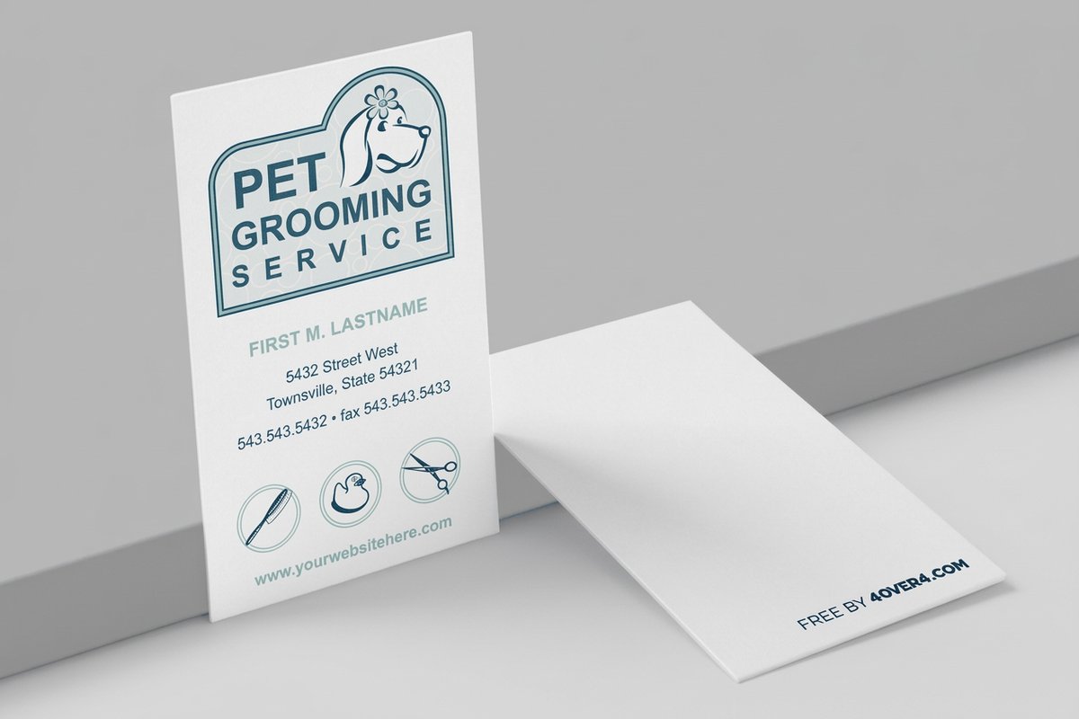 free business cards | 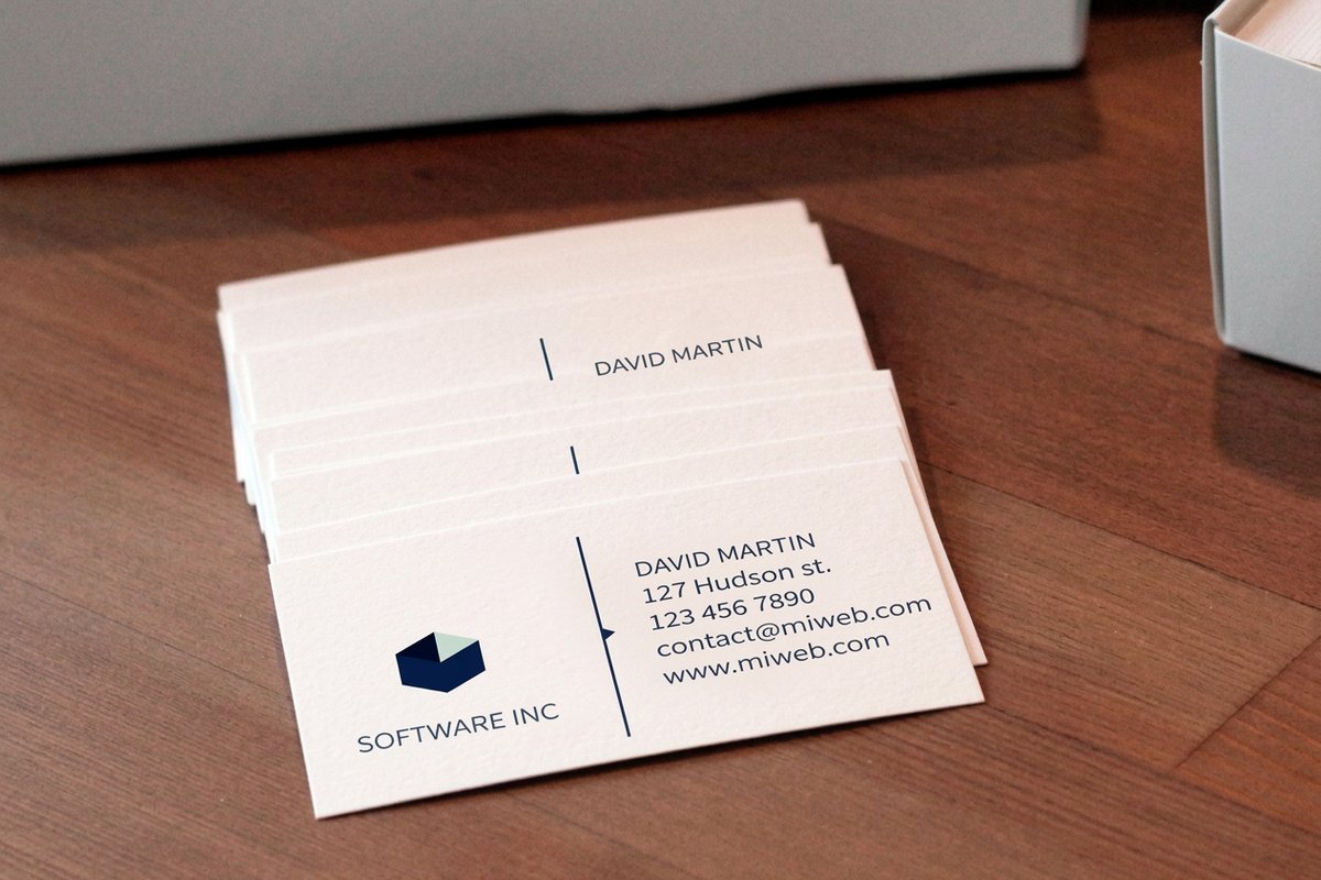 Standard Business Cards |  3D Lenticular Business Cards | 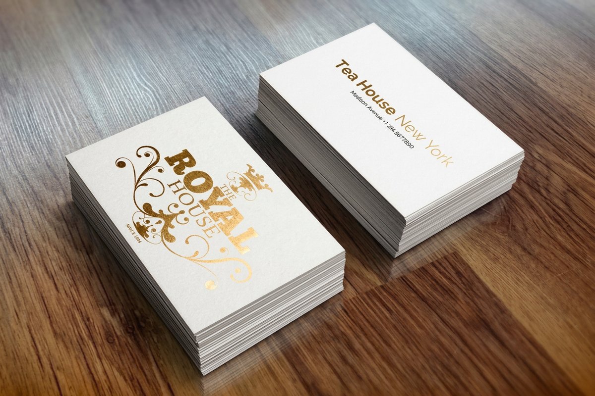 Metallic Foil Business Cards | |
|---|---|---|---|---|
| Min price | Free | $17.57 | $690.88 | $222.13 |
| Paper / stock | 14pt Gloss Cover | 14pt Gloss Cover | 31pt Lenticular Lens | 16 Point Silk Laminated |
| Finish | - | Standard Finish | - | - |
| Size | 2" x 3.5" | 2" x 3.5" | 2" x 3.5" - Vertical | 2" x 3.5" |
| Default qty | 200 | 100 | 500 | 500 |
| Turnaround | 5 business days | 3 business days | 22 business days | 7 business days |
| Rating | ||||
| View & customize | View & customize | View & customize | View & customize |
Print Typographic Cards That Actually Work
Good typography on a business card is not about the trendiest font. It is about a clear reading order, a restrained pairing, and a finish that gives the important word a little more weight than the rest. Get those three right and the card does its job long after the conversation ends.
Start from a clean stock like Classic Business Cards, reach for Black Business Cards when you want reverse type with maximum contrast, or go expressive with Artist Business Cards when the type is the identity. Browse the full range in business card printing, then print it sharp with 4OVER4.COM, as fast as same day when a launch will not wait.
Wally sizes up your type
Pick two fonts, set the hierarchy, choose a finish
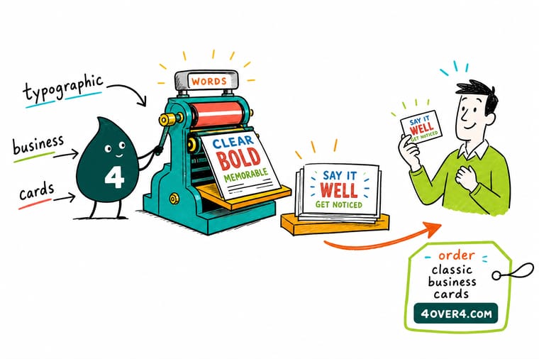
A card works when the type does. Anchor it with one clear name, pair a distinctive face with a quiet workhorse, and build the order with size and weight instead of a third font. Then let the finish add the last layer, foil for shine, letterpress for depth, spot UV for gloss, suede for soft contrast. 4OVER4.COM prints it razor sharp so the smallest line still reads at arm's length.
Design your typographic cards →When type carries the whole card
Explore more
More ways to sharpen your cards
Related pages across 4OVER4.COM, one card each, so you can keep exploring type, finishes, and design.
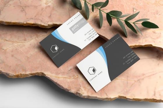 Article Business Postcards vs Business Cards, Which One Wins More Customers Business postcards vs business cards compared on cost, mailing reach, design space, and follow up power, so yo
  Shop Business Cards Printing Browse every stock, shape, and finish in one place.
 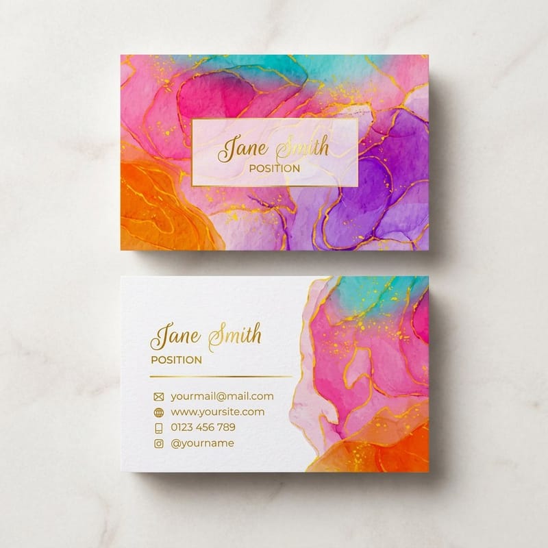 Product Artist Business Cards Expressive stock for when the type is the identity.
 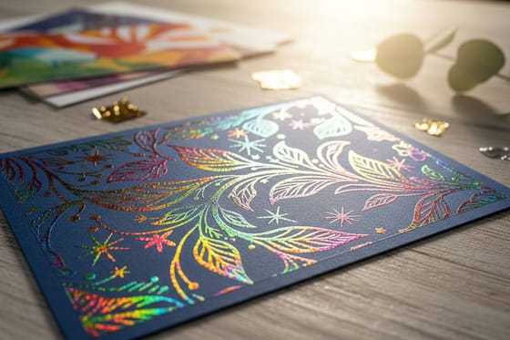 Service Foil Stamping Add metallic type in gold, silver, copper, or rose.
 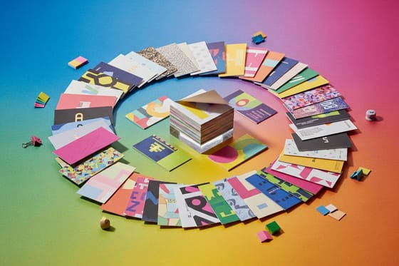 Article Amazing Card Design Inspiration Standout typographic cards to steal ideas from.
  Article Design Trends and Ideas What type and layout look like for 2026.
 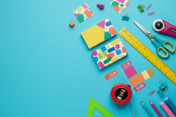 Article Card Size and Dimensions Exact measurements so your type never trims off.
  Guide Painted Edge Business Cards A color edge that frames a clean type block.
  Showcase Cards That List Your Services Real layouts that fit more type without clutter.
  Statistics Small Business Benchmarks Data that shapes how brands invest in print.
 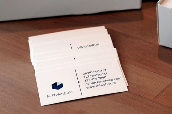 Alternative 4OVER4 vs Vistaprint How the two compare for typographic cards.
  Guides All Printing Guides Step-by-step how-tos across every product.
 Ready to print type that actually works?
Pick your pairing, choose a finish from foil to letterpress, and 4OVER4.COM prints it sharp, as fast as same day.
Business card font questions, sorted
What are good fonts for business cards?
The safest choices are legible at small sizes and print sharp. Neutral sans faces like Helvetica Neue, Inter, and Avenir suit modern brands; classic serifs like Garamond, Caslon, and Baskerville read as established and trustworthy; and slab serifs like Rockwell add confident warmth. Avoid ultra-thin weights for contact details, since a hairline can fade or fill in at 7 points. Pick one anchor font and you are already ahead of most cards. For a deeper look at layouts, see these amazing business card designs.
How do I choose the right font for my business card?
Start from your brand tone, then pair for contrast. Use a distinctive face for the name and a quiet neutral for the details, keep it to two fonts at most, and match their x-heights so the card feels intentional. Build the hierarchy with size and weight rather than a third typeface. When you are unsure, a single superfamily that ships with matching sans and serif companions is nearly impossible to get wrong.
How much do typographic business cards cost?
Classic Business Cards from 4OVER4.COM start at $17.57, and Black Business Cards start at $40.62, with the per-card price dropping as the quantity climbs. The final price depends on the stock, finish, and quantity. Specialty finishes like foil, letterpress, spot UV, and suede run higher than a standard matte, but each adds a layer of hierarchy to your type. Ordering in larger runs brings the per-card cost down fast. See the full breakdown in this business card cost guide.
What sizes, stocks, and finishes work best for typographic cards?
Standard cards run 3.5 by 2 inches, and 4OVER4.COM prints them on premium stocks with foil, letterpress, spot UV, and suede finishes. Keep the name around 9 to 12 points, contact details at 7 points or larger, and all type at least an eighth of an inch from the edge. Heavier finishes reward slightly heavier type, so bump thin weights up before you order. For exact measurements, check this size and dimensions guide.
How long does printing and shipping take?
Turnaround depends on the product and finish, and 4OVER4.COM ships at 99.8% on-time. Order with a few days of lead for the smoothest run, especially for foil and letterpress, which add a finishing step. In a hurry? Same-day options produce and ship qualifying orders the same day, so a last-minute reprint still lands in time. Check the exact turnaround on each product page before you check out.
