
14 Back of Business Card Design Ideas Worth Stealing


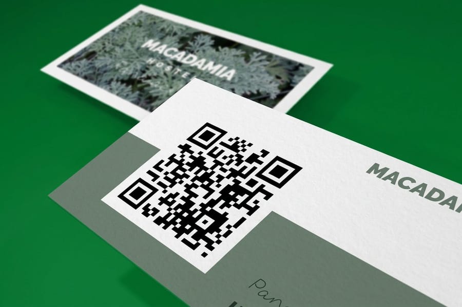
Give the back of the card one job: retrieval, proof or retention. A QR code aimed at one specific page, a full bleed photograph of finished work, or an offer and a stamp grid on an uncoated surface a pen can mark. The backs that fail are the ones trying to do all three at once.
Card back layouts at a glance
| Card back layout | Who it suits | What the print file needs | Finish that supports it |
|---|---|---|---|
| QR to one specific page | Booking, portfolio, menu | Vector code, 0.8 in minimum, high contrast | Matte or uncoated back |
| Full bleed photograph | Photographers, interiors, food | One image, bleed on all four sides | Gloss or silk laminate |
| Coupon or first visit offer | Salons, cafes, trades | Offer, expiry, redemption line | Uncoated so staff can mark it |
| Loyalty stamp grid | Coffee, barbers, car washes | Six to ten boxes, 0.3 in square | Uncoated, 14pt or heavier |
| Appointment panel | Dentists, clinics, groomers | Ruled lines with generous leading | Writable uncoated only |
| Spot gloss pattern | Studios, agencies, luxury | Separate 100% K mask layer | Spot UV over soft touch |
| Foil or metallic accent | Jewellery, events, real estate | Vector only, no gradients | Foil on the reverse alone |
| Blank by design | Consultants, architects | No artwork, texture does the work | Kraft, linen or suede stock |
The finish column matters more than it looks. A gloss back repels ballpoint ink, so anything meant to be written on or stamped has to be specified uncoated before the run. You can set the coating per side when you configure a business card order.
Why the back of the card does the real work

The front of a business card is a settled argument. Name, role, company, one way to reach you, a logo that sits where the eye lands first. There is very little room left to be interesting and very little reason to try. The back is where the decisions are still open, and most cards waste it entirely.
That waste is the odd part, because the back is close to free. Printing the second side of a sheet that is already on press adds a fraction of what a second piece of print would cost, and the trimming, the stock and the packing are identical. A blank reverse is 7 square inches of paid-for surface handed back unused.
The useful way to think about the back is as the answer to whatever the person is thinking about half a second after they take the card. Sometimes that is where do I find this again, which is a QR code. Sometimes it is what does this person actually do, which is one line of copy. Sometimes it is why should I keep this instead of dropping it in a drawer, which is an offer, a stamp grid or simply a surface that feels good in the hand. Our comparison of matte, glossy and soft touch finishes covers how much that last part is worth.
The three questions the back should answer
Before choosing a layout, decide which of three jobs the reverse is doing. Retrieval gets the person back to you: a QR code, a short URL, a handle. Proof shows what you make: a photograph, a plan, a finished room, a plate. Retention gives them a reason to keep the card: a discount, a stamp grid, an appointment slot, a reference chart.
Pick one. A back that tries to do all three ends up as a small grey block of everything, which is functionally the same as leaving it blank but looks worse. If you genuinely need two jobs, a second card for the second audience is cleaner than a crowded reverse.
What the print file needs before you get clever
Build the back at 300 DPI in CMYK at 3.5 x 2 inches, add 0.125 inch of bleed on all four sides, and keep anything you care about at least 0.125 inch inside the trim line. Cards are cut in stacks, so the knife moves slightly through the lift and a border that measures perfectly in the file will look uneven across the box.
Solid dark backs deserve a second look. A rich black mixed for print, rather than 100% K on its own, keeps a full bleed reverse from going flat and grey, and reversed-out white type on that background needs a little more weight than it does on white. If you would rather not fight any of this, the sized blank templates already carry the bleed, the trim and the safe area.
The 14 ideas worth stealing
These are 14 backs that earn their place, grouped by the job they do. Most cost nothing beyond the second side of the press run. A few of them ask for a specific stock or finish, and those are flagged.
Steal freely, but steal one at a time. The best card backs read in about a second, which only happens when there is a single idea on the surface. If the outline of the card is the idea rather than what is printed on the reverse, that is a different exercise and 20 custom shaped card ideas covers it properly.
Retrieval: getting them back to you
1. A QR code that lands on one specific thing. Point it at the booking page, the portfolio, the menu, the exact thing the conversation was about. A code that dumps someone on a homepage teaches people not to scan your codes. Build it as vector, print it no smaller than 0.8 inch square, and leave a clear quiet zone around it. Our free design tool handles the placement if you would rather not do it by hand.
2. One handle, printed big. If your work lives on one platform, put that handle across the back at a size you can read at arm’s length and nothing else. It is the most confident back on this list and it only works if the account is genuinely worth following.
3. A mini map or a single landmark. For a shop with an awkward entrance, a stripped-back map of three streets beats a full address. Photographers and interior studios often get more from a photo of the door than from a map.
4. A short vanity URL for one campaign. A readable path someone can type from memory is worth having next to the code, because a surprising number of people still type. It also gives you a clean way to count what the cards actually did.
Proof: showing the work
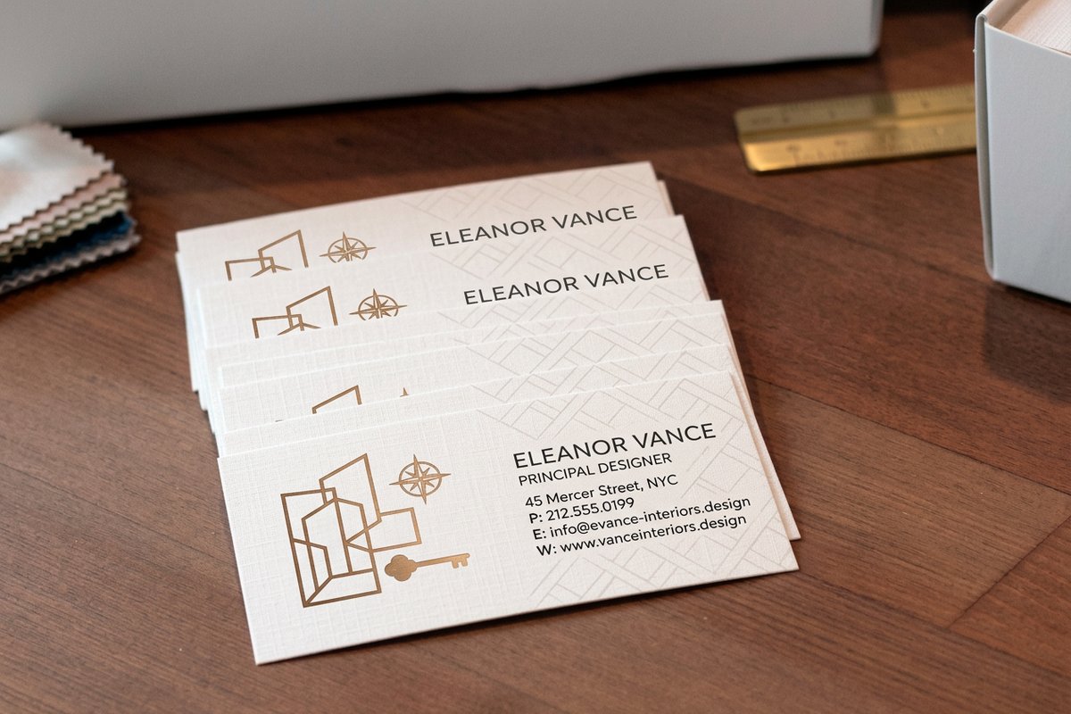
5. A full bleed photograph of one finished job. One image, edge to edge, no type. This is the strongest back available to anyone whose work is visual, and it is why interior design business cards at $17.57 so often run a completed room on the reverse.
6. A four up grid of small samples. Where one image cannot carry the range, four small ones can. Keep the gutters even and the crops consistent or the grid reads as clutter rather than a portfolio.
7. A before and after split. Trades, restorers, dentists and landscapers all have a story that a vertical split down the middle of the card tells instantly. Label the halves small, in the corner, and let the images argue.
8. A service list, set as a real list. Five lines, aligned, generous leading, no icons. It answers what do you actually do without a paragraph, and it is the right back for anyone whose job title is vague.
Retention: giving them a reason to keep it
9. A first visit offer with an expiry. An offer with a date on it converts far better than an open ended one, and it tells you which batch of cards did the work. Keep the redemption instruction to one sentence.
10. A loyalty stamp grid. Six to ten boxes, roughly 0.3 inch square, printed on an uncoated back so a stamp pad or a pen actually takes. This turns one card into the card and the loyalty scheme at once.
11. An appointment panel. Ruled lines for date and time, spaced widely enough for handwriting. Clinics and salons hand these out at the counter for the next visit, which means the card leaves with a job to do.
12. A reference chart people keep. A conversion table, a size chart, a care guide, a knot diagram. If the information is genuinely useful in the trade, the card stays on the noticeboard rather than in the bin.
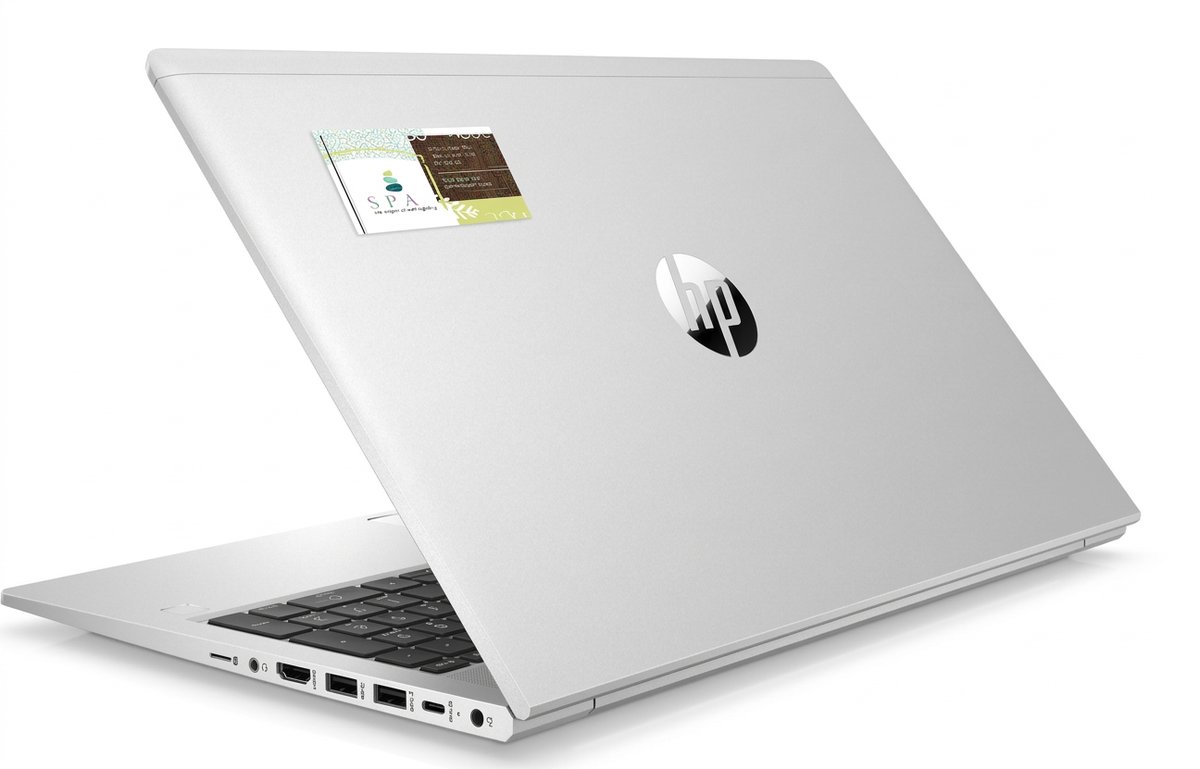
13. Move the whole card out of the wallet. A business card magnet at $19.68 lives on the fridge and a business card sticker at $10.76 goes on a laptop, a toolbox or the appliance you just serviced. Both keep the same layout you already designed.
14. Deliberately blank, on a stock worth touching. On kraft, linen or a soft touch laminate, an empty reverse reads as restraint rather than an oversight. It only works if the stock is doing the talking, so pick the paper first and check how stock and coating behave together before you commit.
Finishes that make someone turn the card over
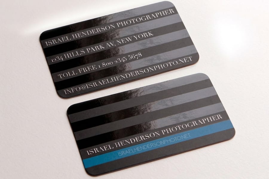
Three finishes change the back specifically, and each one needs something from the file that a plain CMYK job does not.
Spot gloss puts a clear varnish over selected areas of a matte card. It is invisible straight on and obvious the moment the card tilts, which makes it the finish that gets a card turned over and looked at twice. It needs its own layer in the file, drawn in 100% K, where black means varnish here and white means leave it alone. Patterns, oversized logo marks and a repeated brand shape all work well; small type does not.
Foil stamps real metal leaf into the stock and reads brighter than any printed metallic ink can. Supply it as clean vector with no gradients and no hairlines, and consider using it on the reverse only, where a single foiled mark on an otherwise plain back does more than foil on both sides. Our spot gloss walkthrough in Illustrator covers the same mask technique that foil files use.
Texture is the quietest of the three and the cheapest to specify, because it is just the stock. Kraft, linen, suede and uncoated cards all feel different in the hand, and all of them fight fine detail. Design the back for them accordingly: heavier weights, more space, fewer small elements.
What each finish costs you in the file
Spot gloss and foil both need a separate mask layer, and both punish thin strokes. Anything under about 1 point tends to fill in or break up. Texture costs nothing in setup but eats detail, so a design that relies on a delicate 6 point line will disappear on linen and hold perfectly on a silk laminate.
Whichever you choose, order a proof before the full run. A varnish pattern that looked bold on screen can read as a smudge on the actual stock, and that is a cheap thing to find out on one card rather than a thousand.
Card back pricing and specs at 4OVER4.COM
Printing the reverse does not change the way a card is quoted. Price moves with stock, size, finish and quantity, and the per unit cost drops as the run grows. The numbers below come straight from the live configurator for a photographic two sided card, which starts at $17.57 for 100. A card back that leaves the wallet is priced separately: business card magnets from $19.68 and business card stickers from $10.76.
Quantity and price
Two sided card pricing and specs
Live configurator numbers on a photographic card back, where the per unit cost drops as the run grows.
| Quantity | Price Per Unit | Total |
|---|---|---|
| 100 | 17.6¢ | $17.57 |
| 200 | 11.5¢ | $23.07 |
| 300 | 9.15¢ | $27.46 |
| 400 | 7.96¢ | $31.86 |
| 500 | 7.25¢ | $36.26 |
| 600 | 6.77¢ | $40.64 |
You can also earn coins on every order and redeem them against future printing, which takes some of the sting out of reprinting a card back you have improved.
Stock and coating on the reverse side
Stock and coating are chosen for the card, not for one side, so the back has to live with whatever the front needs. That is fine for photographs and codes, and it is the whole problem for anything handwritten. Gloss and laminated backs repel ballpoint and gel ink, which then smears instead of drying, so stamp grids and appointment panels have to be specified uncoated from the start. Matte sits between the two: it cuts glare and takes pencil, but it is still slower to dry a wet pen than a genuinely uncoated sheet.
Print it
A card back that leaves the wallet
The same layout on a sticker, ready for a laptop, a toolbox or the appliance you just serviced.
Weight matters on the back as much as the front. A 14pt or 16pt card holds a stamp grid without denting through to the other side, and a heavier uncoated stock is what makes a punched loyalty card feel like something worth carrying. If the back is carrying a full bleed photograph instead, a silk or gloss laminate keeps the colour saturated and stops the fingerprints that a matte dark card collects. There is a fuller comparison in our roundup of current card design trends.
Picking a card back for your industry
The right back changes with what happens in the thirty seconds after the card changes hands, so here is a breakdown by business type.
- Interior designers and architects. A full bleed photograph of one finished room on the reverse, printed on a silk laminate so the colour holds. The work sells better than any list of services.
- Cafes, barbers and salons. A loyalty stamp grid or a first visit offer on an uncoated back, so a stamp pad or a pen actually marks it. One card instead of two in the wallet.
- Trades and home services. Before and after on the back, plus a sticker version left on the appliance or the fuse box after the job, which is where the next call comes from.
- Clinics and practices. An appointment panel with ruled lines, handed over at the counter for the next visit. The card leaves with a date written on it.
- Consultants and studios. A blank reverse on kraft, linen or soft touch, or a single spot gloss mark. Restraint reads as confidence when the stock is good enough to carry it.
Templates and print-ready blanks
Setting up a second side by hand is where the small errors creep in, usually in the bleed or the safe area. 4OVER4.COM sizes its blanks to exact product specs, so a back you build inside the template lands where you expect it after trimming. Start from a design template if you want a layout to adapt, or a print ready blank if you already know what the back is doing. If the card is one of several pieces going to press together, the business basics collection keeps the cards, letterheads and envelopes on matching stock so the reverse of one matches the rest.
Start fast
Templates and print-ready blanks
Business card templates and exact size blanks with bleed, trim and safe area already marked on both sides.
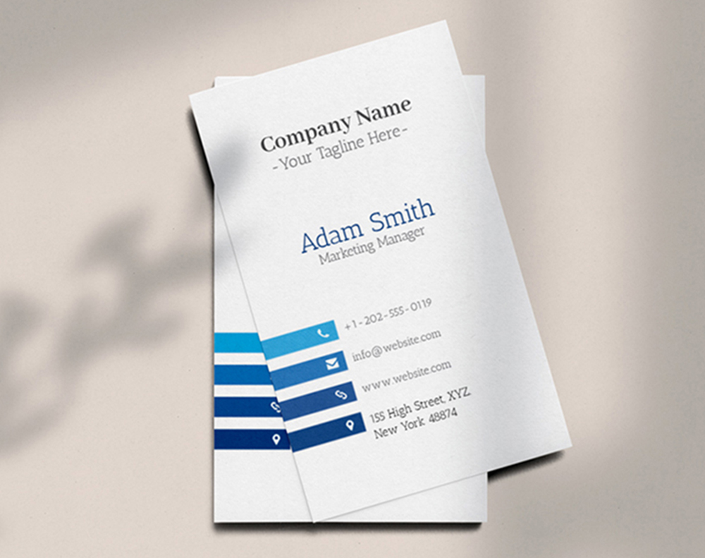

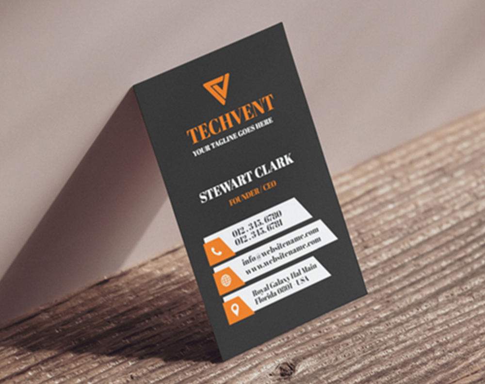
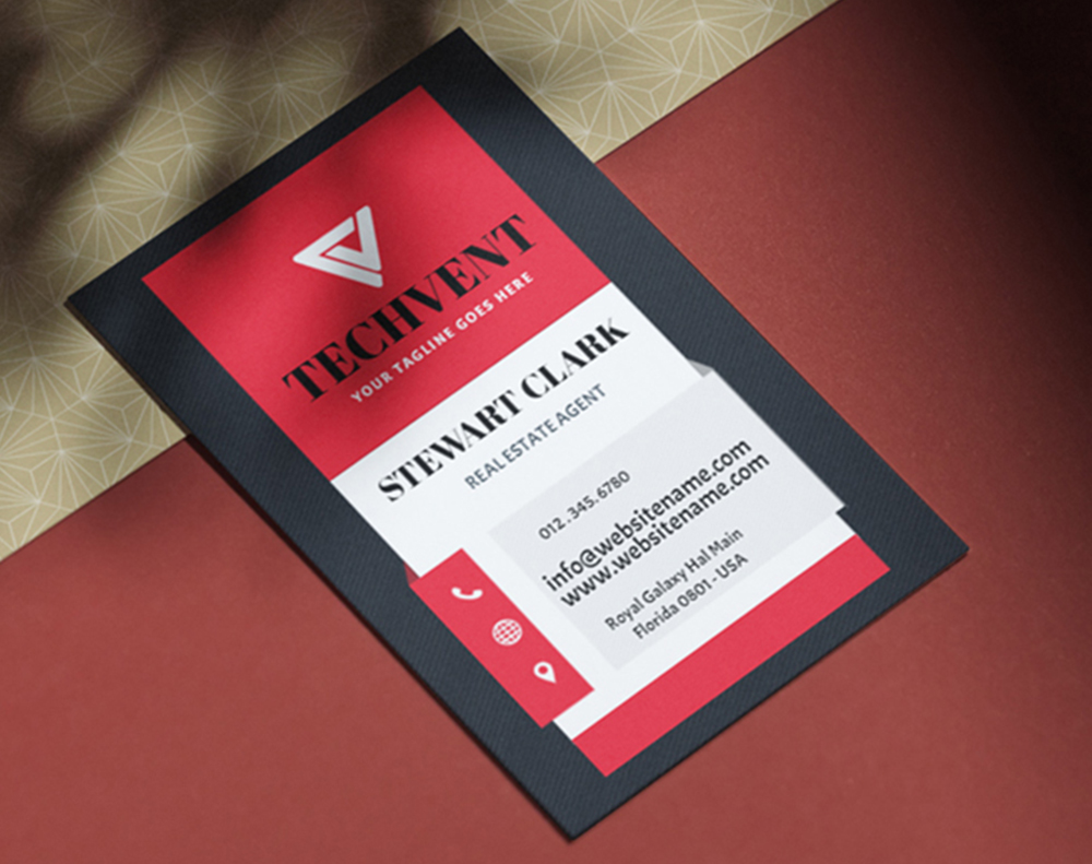
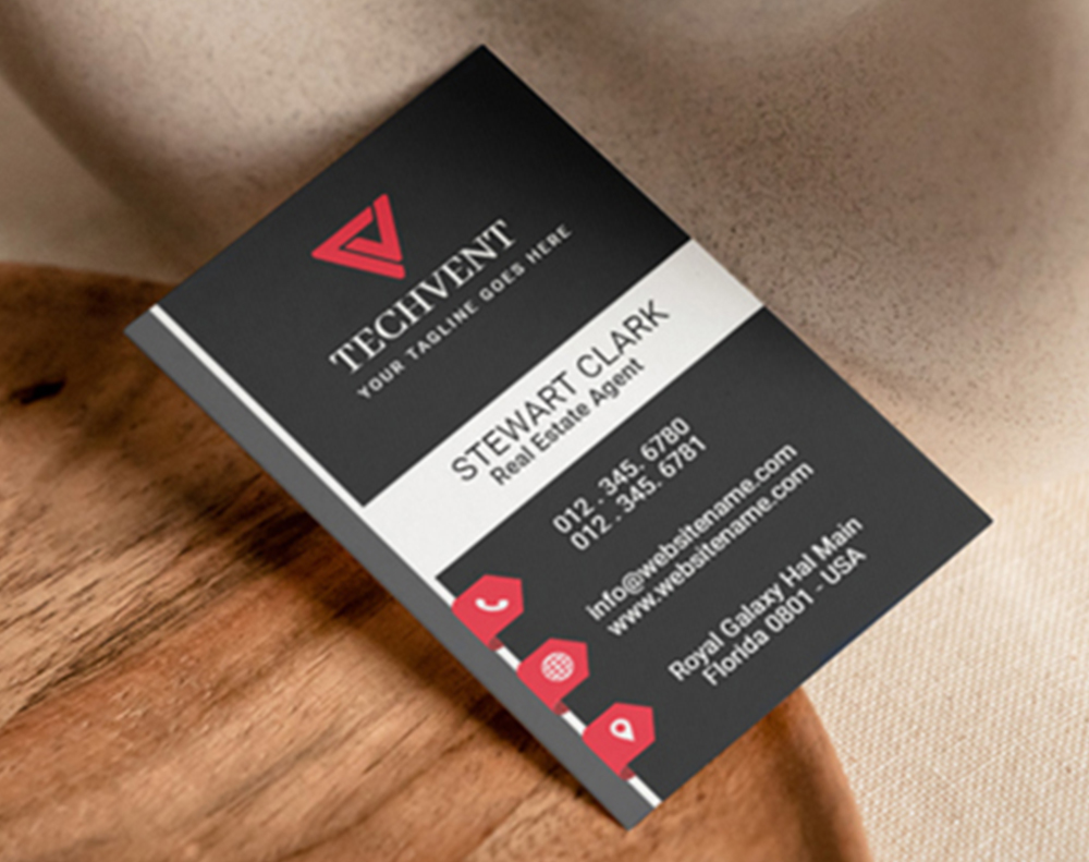
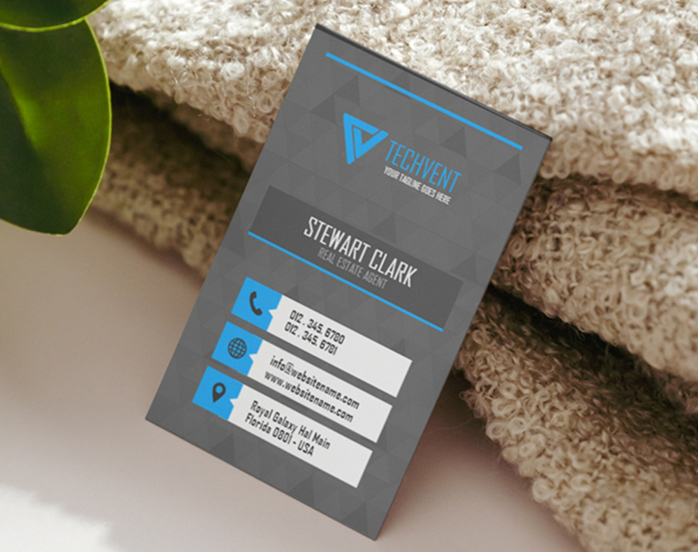
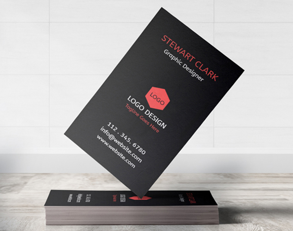
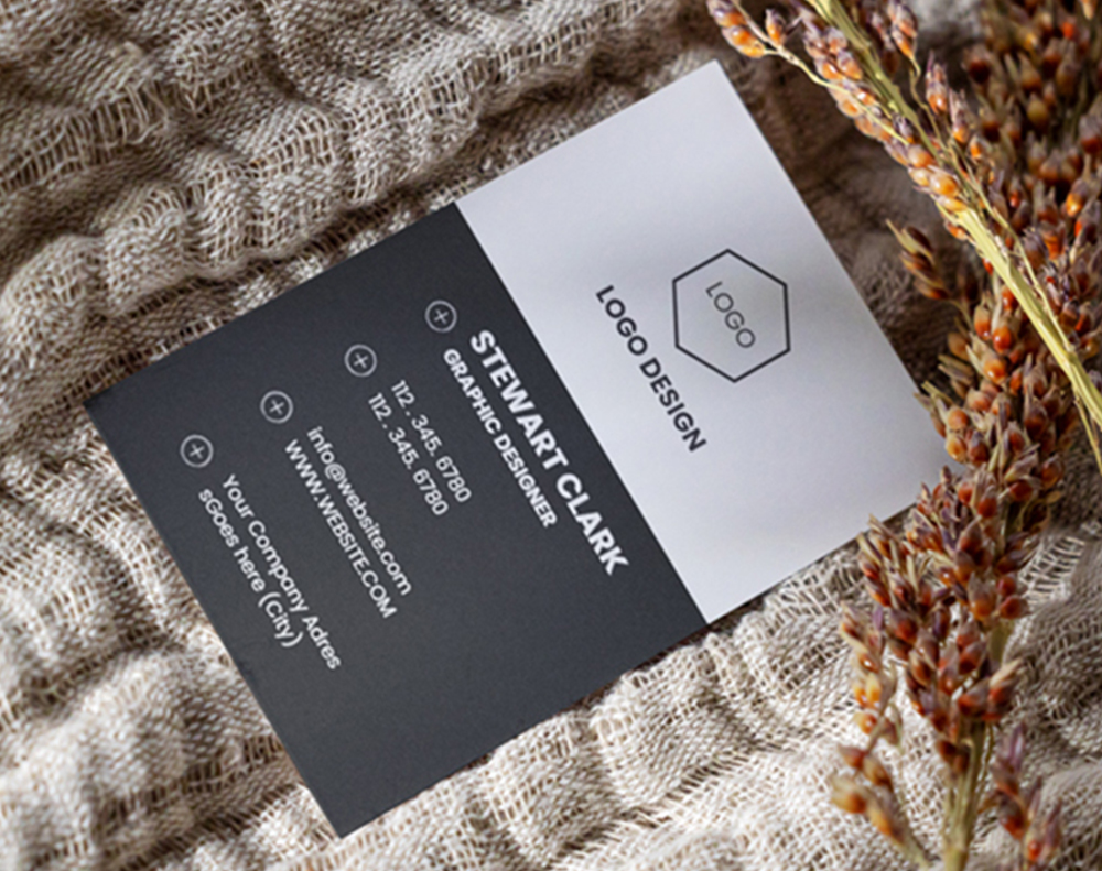
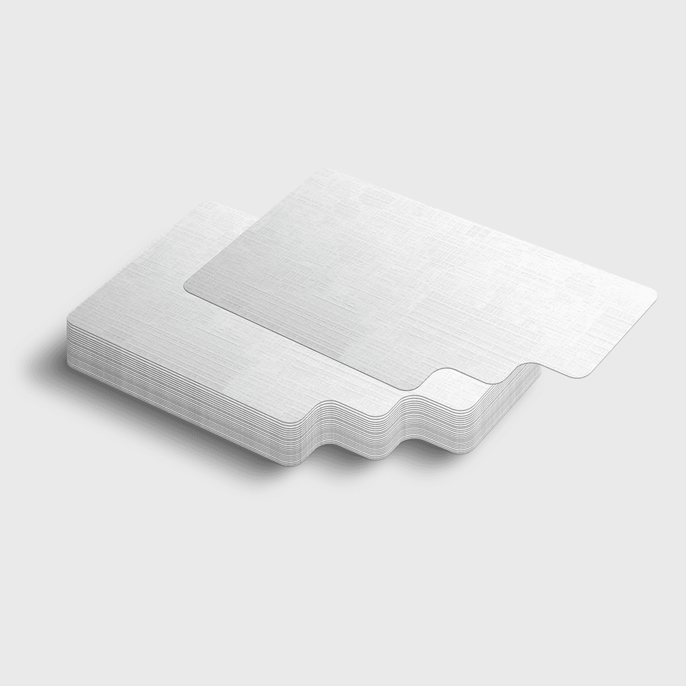
Wally turns the card over
Seven square inches you have already paid to print
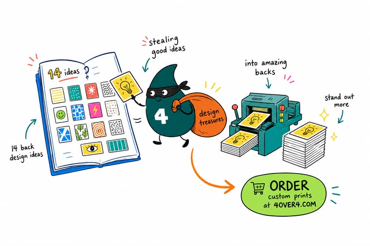
Give the reverse one job. A QR code aimed at a single page, a full bleed photo of finished work, or an offer and a stamp grid. Build it at 3.5 x 2 inches, 300 DPI, CMYK, with 0.125 inch bleed all round and live copy 0.125 inch inside the trim. Specify an uncoated back if anyone has to write on it, and 4OVER4.COM prints both sides on premium stock as fast as your deadline needs.
Print a two sided card →What to remember about card backs
Design tips that hold on any card back
- One job per back. Retrieval, proof or retention. A back that attempts all three becomes a small grey block of everything and gets read as nothing.
- Match the coating to the use. A gloss back looks sharper and takes no ink from a pen. If anyone has to write on the card, specify uncoated and check it before the run.
- Keep the code big and quiet. A QR under 0.8 inch square, or one printed tight against artwork, fails on older phone cameras. Give it room and give it contrast.
- Mix a rich black for full bleed. A reverse flooded with 100% K alone goes flat and slightly grey on press. A properly mixed rich black keeps the depth on a dark card back.
- Proof the finish, not just the colour. Spot gloss and foil behave differently on stock than they do on screen. One physical proof settles it before you commit the quantity.
Explore more
More ways to print and promote
Related products, categories and reading on 4OVER4.COM, one card each, so you can keep building the layout.
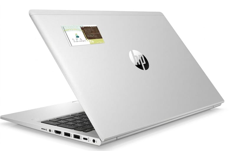 Product Business Card Stickers Your card layout on a sticker, from $10.76.
  Product Business Card Magnets A card back that lives on the fridge, from $19.68.
 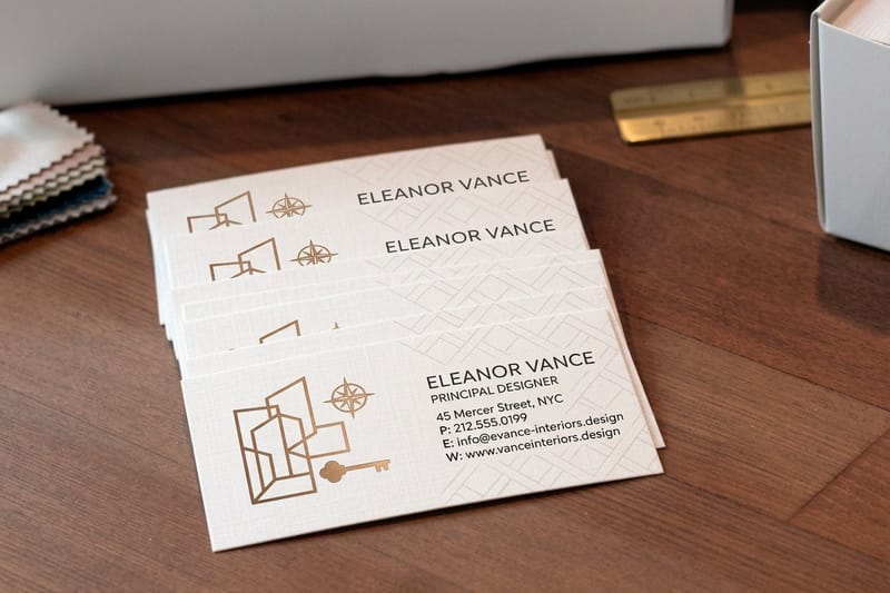 Product Interior Design Business Cards Full bleed room photography on the reverse, from $17.57.
  Category Business Card Printing Every stock, shape and finish in one place.
 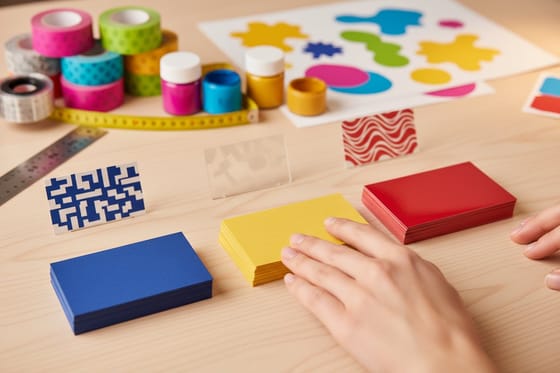 Guide Matte, Glossy or Soft Touch How each finish behaves on a printed card back.
 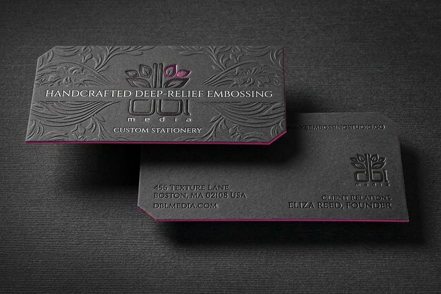 Guide Card Stock and Coating Which weights and coatings hold an effect.
  Guide The Free Card Design Tool Lay out both sides in the browser, no software.
 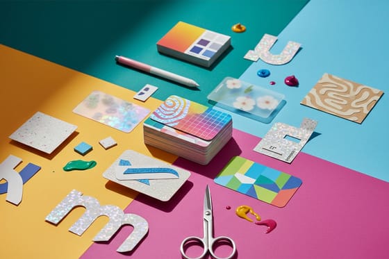 Article Card Design Trends and Ideas What is showing up on cards right now.
 Ready to print the other side?
Pick your stock, set the coating per side, drop in your artwork or a free template, and 4OVER4.COM prints both sides sharp on premium stock.
Common questions about business card backs
Should a business card be printed on both sides?
Almost always, yes. The second side of a sheet that is already on press costs a fraction of what a separate piece of print would cost, because the stock, the setup and the cutting are identical either way. Leaving the reverse blank hands back 7 square inches of surface you have already paid for. The only case where a blank back is the right call is when the stock is doing the talking, such as kraft, linen or a soft touch laminate, and the empty side reads as deliberate restraint rather than an oversight.
What should you put on the back of a business card?
Pick one job and commit to it. Retrieval gets the person back to you, which means a QR code pointing at one specific page, a handle printed large, or a short URL someone can type from memory. Proof shows what you make, which means a full bleed photograph, a four up grid of samples, or a before and after split. Retention gives them a reason to keep the card, which means an offer with an expiry, a loyalty stamp grid, an appointment panel or a reference chart worth pinning up. Backs that attempt all three at once become a small block of grey text that nobody reads.
Can you write on the back of a printed business card?
Only if you specify the right coating. A gloss or laminated back repels ballpoint and gel ink, which smears rather than dries, so appointment panels and loyalty stamp grids need an uncoated or writable back. This is the single most common regret on a card back: the design works, the finish looks sharp, and then the receptionist cannot write the next appointment on it. If the card has to be marked at a counter, print the reverse uncoated on 14pt or heavier and test one with the pen your staff actually use.
How do you set up a spot gloss or foil effect on the card back?
Both need their own layer in the artwork file, drawn in 100% K, where the black areas mark where the varnish or the foil goes and everything else is left alone. Keep strokes above roughly 1 point, avoid gradients entirely in foil artwork, and leave small type out of the effect because it tends to fill in or break up. Patterns, oversized logo marks and a repeated brand shape are what these finishes are for. Order a proof before the full run, because a varnish pattern that reads as bold on screen can look like a smudge on the actual stock.
What size and resolution should the back artwork be?
A US business card trims to 3.5 x 2 inches. Build the back at that size at 300 DPI in CMYK, add 0.125 inch of bleed on all four sides, and keep any type, logos or borders at least 0.125 inch inside the trim line. Cards are cut in stacks, so the blade drifts a little through the lift and a thin border that measures perfectly in the file will look uneven across the finished box. If you would rather not set the file up by hand, the blank template library at 4OVER4.COM already carries the bleed, trim and safe area marked for every card size.
