
How to Design a Poster in 8 Steps


Great posters are not lucky, they are decided. Start with the goal and the audience, build one clear message, size it to the room, and finish with a print-ready file. Here is the eight-step routine, from blank page to the press.
To design a poster, work in eight steps: define the goal and audience, settle on one message with a clear hierarchy, choose a size that fits the viewing distance, build a single focal point, set type for legibility, work color and contrast in CMYK, add one call to action with the key details, then prep a print-ready file and proof it. One message, one focal point, one action, sized for where people will actually stand.

The 8 steps
How to design a poster, start to finish
Design a poster in eight moves: define the goal and audience, settle on one message, choose a size that fits the viewing distance, build a single focal point, set type for legibility, work color and contrast in CMYK, add one call to action with the key details, then prep a print-ready file and proof it. Each step narrows the choices for the next, so the poster comes together instead of fighting itself. 4OVER4.COM customers who plan the message before the layout get posters that read from across a room.
Why poster design is really about one decision
A poster gets roughly three seconds. Someone walks past, glances, and either keeps moving or stops. Good poster design is the craft of winning those three seconds, and almost all of it comes down to one early decision: what is this poster for, and who is it talking to.
Get that right and the rest falls into place. Get it wrong and no amount of pretty type will save it. That is why this guide runs the design first and the printing second. If you want the print-and-order side in depth, the how to make posters guide covers file setup and materials, and you can browse finished work in custom poster printing or the wider posters and wall art collection for a feel of what lands.
Below are the eight steps I use, in order, from a blank page to a print-ready file. You can build the whole thing by hand in your design tool of choice, or start faster with the browser-based online designer that sets the size and bleed for you.
Step 1: Define the goal and the audience

Before a single element goes on the page, answer four questions. They take five minutes and they decide everything.
- Brand personality. Is this loud and playful, or calm and premium? The tone sets your fonts, your color, and how much white space you leave.
- Goal and location. Sell a ticket, announce a sale, fill a class. A poster in a crowded subway car has to shout, while one in a boutique window can whisper.
- Audience. Design for the person who will actually read it. Students, commuters, and collectors do not respond to the same visual language.
- The one message. If a viewer remembers a single line, what should it be? Everything else supports that line.
Write these down where you can see them. When you get stuck later on whether a headline is too big or a color is too bright, the answer is almost always sitting in this list. A quick way to pressure-test the direction is to read real feedback in the poster printing customer reviews and notice what people actually praise.
Step 2: Settle on one message and a clear hierarchy
A poster is not a brochure. It cannot explain, it can only announce. So pick the one thing that matters and make it unmissable, then let a strict hierarchy carry the eye from there.
Think in three tiers. The headline is what a stranger reads from across the room. The focal image earns the glance and sets the mood. The key details (date, place, price, who) reward the person who steps closer. Finally, one call to action tells them what to do next. If two things fight to be the biggest, both lose.
A useful test: shrink your design to a thumbnail. If you can still tell what the poster is about at that size, the hierarchy works. If it turns to mush, one element needs to get much bigger and the rest needs to get out of its way.
Step 3: Choose a size that fits the viewing distance
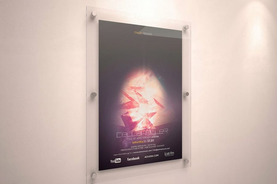
Size is a design choice, not an afterthought. It decides how big your type can be and how far away the poster still works, so set it before you commit to a layout.
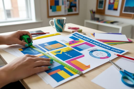
As a rough map: 11 by 17 for a wall people read up close, 18 by 24 for a busy corridor or a store counter, and 24 by 36 or 27 by 40 to own a room, a storefront, or a stage. When in doubt, go one size larger than feels comfortable, because a poster that is too small simply gets ignored. For the full breakdown, the poster sizes and dimensions guide and the poster sizes in inches reference cover every standard.
Orientation matters too. Portrait suits headlines and single figures, while landscape gives room for a wide scene or a row of details. If you are going really big for a trade show wall or a street display, large format printing keeps the file crisp at scale.
Step 4: Build a single, undeniable focal point
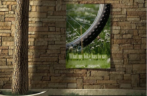
Every strong poster has one image or graphic that does the emotional work. It might be a photo, an illustration, a bold piece of typography, or a single striking shape. Whatever it is, give it room and let it dominate.
Resist the urge to fill the space. Empty area is not wasted, it is what makes the focal point read as important. Crop tight, push the subject off-center for tension, and keep competing details small and quiet around it. A poster with one clear hero beats a poster with five nice pictures every time.
Sourcing the art matters as much as placing it. Use high-resolution images, and if you are building a full campaign, pull matching visuals across your flyers and other pieces so the poster feels like part of a set. The design templates library is a fast starting point when you do not have custom art ready.
Step 5: Set type for legibility, not decoration

Type is where most posters are won or lost. The goal is not clever, it is readable from a distance and instantly clear about what matters most.
- Two fonts, maximum. One display face for the headline, one clean face for everything else. More than two starts to look accidental.
- Size for the room. Allow about one inch of letter height for every ten feet of viewing distance, so a poster read from thirty feet needs a headline several inches tall.
- Contrast is everything. Dark type on a light field, or light type on a dark field. Avoid placing text over a busy patch of the image unless you add a solid or gradient behind it.
- Keep copy short. A handful of words in the headline, a short block of details, and nothing that needs squinting.
If a term like leading, kerning, or bleed trips you up, the printing terms glossary explains the vocabulary in plain language so the print stage holds no surprises.
Step 6: Work color and contrast to your brand
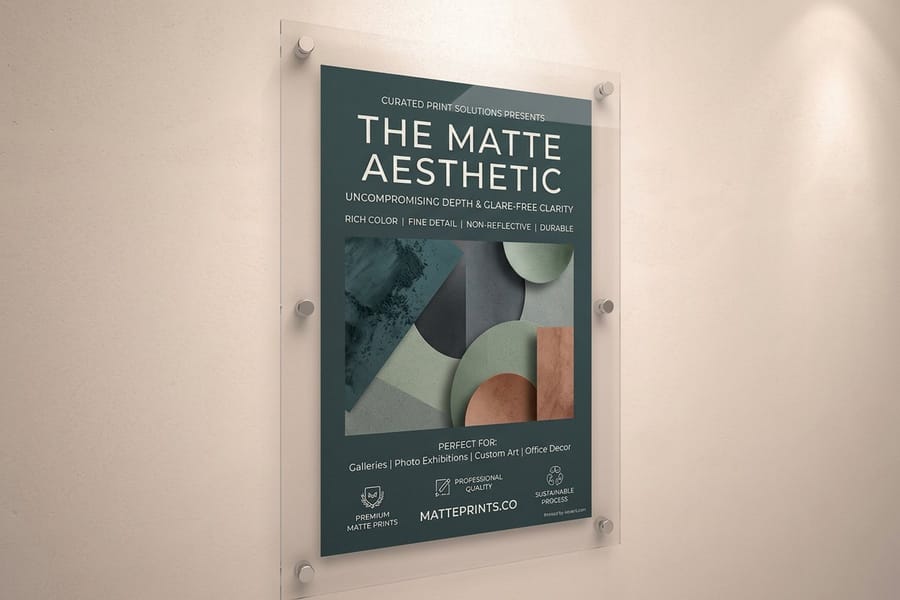
Color sets the mood before anyone reads a word. Pull two or three colors from your brand palette, choose one to dominate, and use a second as an accent for the call to action. A tight palette looks intentional, while a rainbow looks nervous.
One catch trips up almost every first-time poster: screens glow in RGB, but posters print in CMYK. Bright screen blues, hot pinks, and neon greens can dull or shift on paper. Design in CMYK from the start, or at least preview it, so the printed piece matches what you approved.
Finish plays into color too. A gloss stock makes photos pop and saturates color, while a matte stock cuts glare and keeps text crisp under bright light. If the exact color is mission-critical, order free paper samples and proof it on the real stock before you commit to a full run.
Step 7: Add one call to action and the practical details
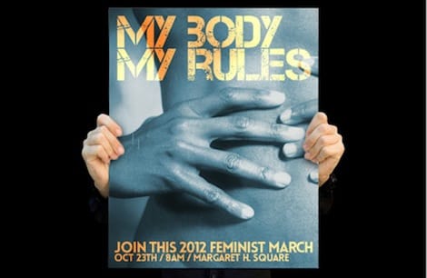
A beautiful poster that forgets to tell people what to do next is a wasted print. Decide on the single action you want (buy a ticket, visit a site, show up on a date) and make that call to action impossible to miss.
Group the practical details in one tidy block near the bottom: date, time, location, price, and a short web address or a QR code that jumps straight to the next step. Keep this block secondary to the headline in size, but make sure it is still readable from a step or two away. One clear instruction beats three competing ones.
If the poster is one piece of a bigger push, echo that same call to action across your marketing materials and signs and banners so the whole campaign points people to the same place.
Step 8: Prep a print-ready file and proof it
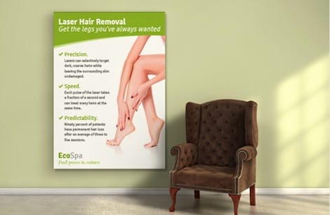
The design is done, but it is not finished until the file is built for the press. This last step is what separates a crisp print from a soft, off-color surprise.
- Full print size. Build the file at the final dimensions, not scaled down.
- 150 DPI or higher at that size, with 300 DPI ideal when the artwork allows.
- CMYK color mode so what you approve is what prints.
- Bleed and safe margins so nothing important sits on the trim line.
- Fonts outlined and exported as a high-resolution PDF.
Then proof it. Zoom to full size on screen, or order a single printed proof before a big run. When the file is ready, you can send it straight to poster printing, configure a run on standard posters, or read where to print posters if you are weighing your options. For street-scale work, the MUPI poster and 3D poster breakdowns show how far the format can go.
Print, then place it where it works

Design and print are only worth it if the poster actually gets seen. Placement is the quiet final step. Hang it at eye level where your audience naturally pauses, and make sure the light hits it without washing it out or throwing glare across the finish.
How you mount it matters for both looks and lifespan. The hang posters without a frame and put a poster on a wall guides cover clean, damage-free options, and a wood poster hanger gives a finished, gallery-style edge in seconds.
If you are printing for a specific city or venue, local turnaround helps. 4OVER4.COM runs same-day options and ships nationwide, and our New York poster printing service is a good example of getting large runs out the door fast.
Poster design mistakes that quietly kill a print
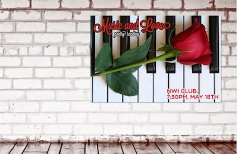
Most weak posters are not badly drawn, they are badly decided. Avoid these and you are ahead of most of the wall.
Cramming in everything. When every element is important, nothing is. Cut copy until only the essential message and details remain.
Tiny type. A headline that looks fine on your laptop can vanish across a room. Size for the real viewing distance, not the screen.
Low-resolution art. An image that looks sharp at thumbnail size can turn to mush at 24 by 36. Always check the artwork at full print scale.
Ignoring CMYK. Approving bright RGB color and being shocked by the printed result is the most common first-timer regret. Design and proof in CMYK.
No clear next step. A poster with no call to action is just decoration. Tell people exactly what to do and where to go. When the design is dialed in, browse fresh formats in daily deals and see finished work in the poster showcase.
Wally explains poster design
One message, one focal point, one action
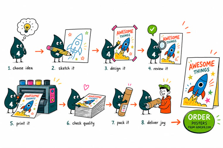
Wally designs every poster back to front: he decides what it must do and who it talks to first, then builds one loud headline, one focal image, and one clear call to action around that. Everything else gets smaller or gets cut. Sketch the message before you sweat the layout, size the type for the far wall, keep it CMYK, and your poster reads from across the room. When the file is ready, print it sharp on the right stock at 4OVER4.
Order custom posters →Specs and pricing
Custom poster specs and pricing
Once the design is print-ready, here is what a standard poster gives you at 4OVER4.COM, with live specs and price-per-unit straight from the configurator so you can see how size, stock, and quantity move the total.
| Quantity | Price Per Unit | Total |
|---|---|---|
| 50 | $2.18 | $108.75 |
| 100 | $1.64 | $163.67 |
| 200 | $1.01 | $202.11 |
| 300 | 80.2¢ | $240.55 |
| 400 | 69.7¢ | $278.99 |
| 500 | 63.5¢ | $317.44 |
| 600 | 55.8¢ | $335.02 |
| 700 | 50.4¢ | $352.59 |
Print it
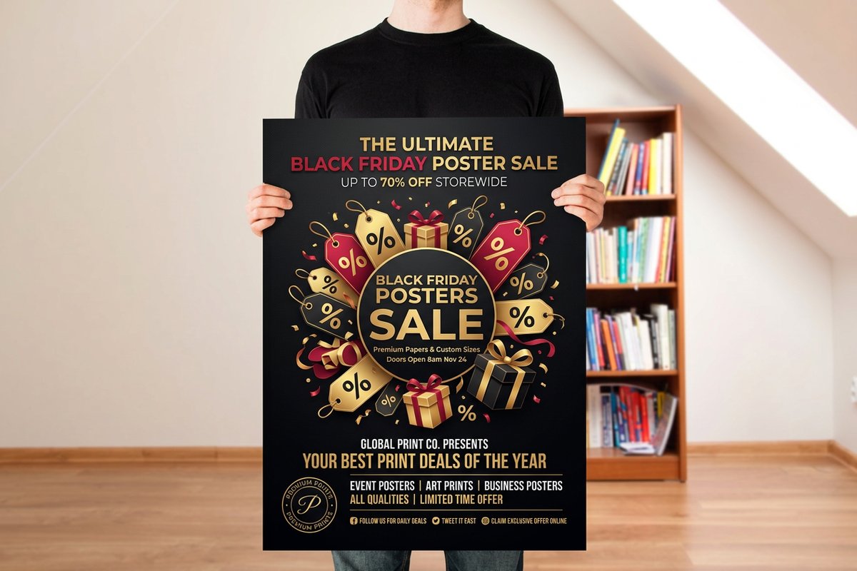
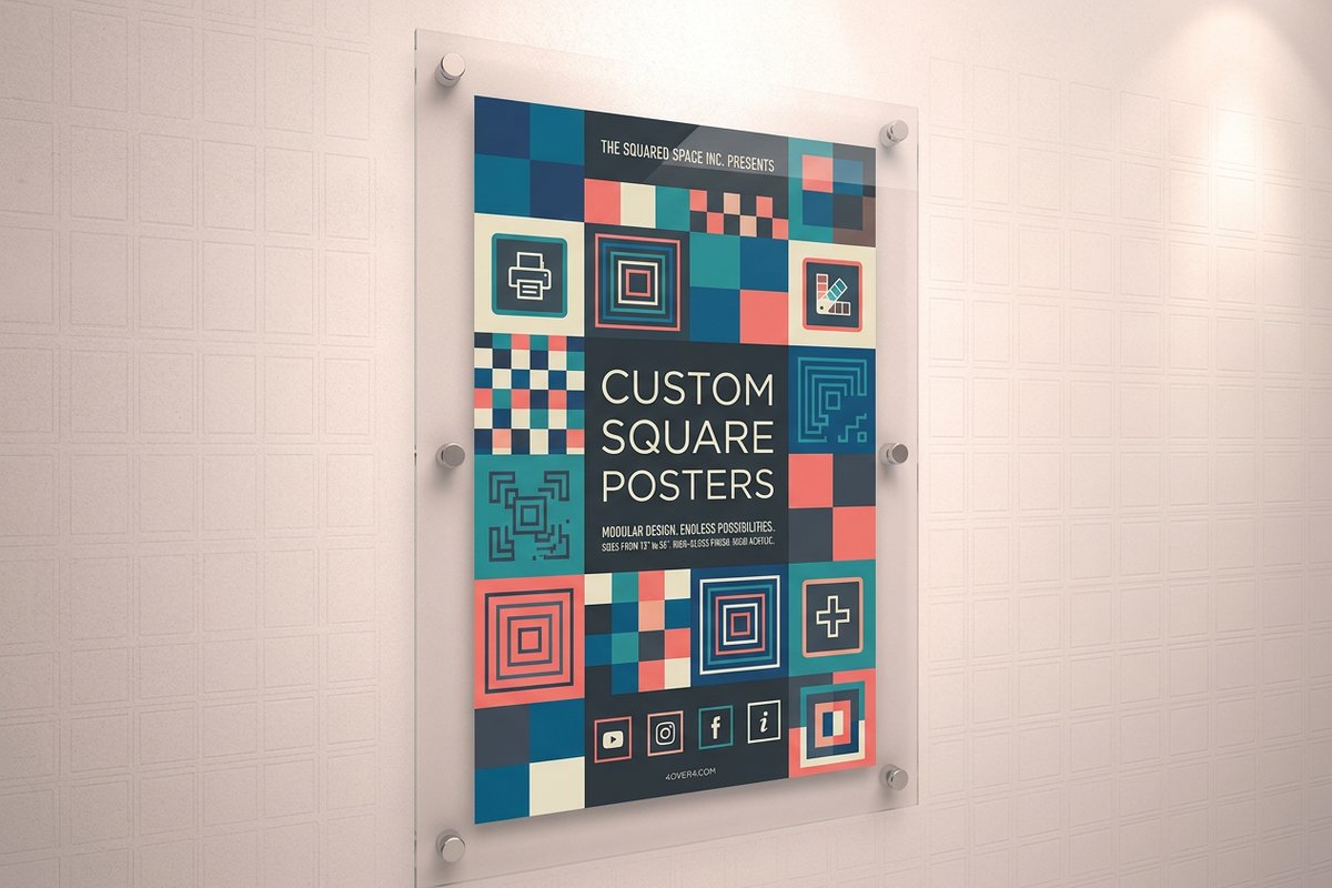
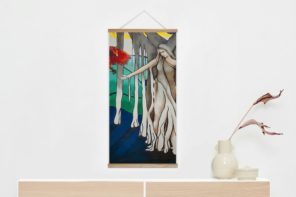
Popular poster formats to print your design on
See it in use
Real poster work, printed in-house

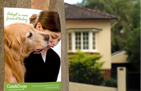
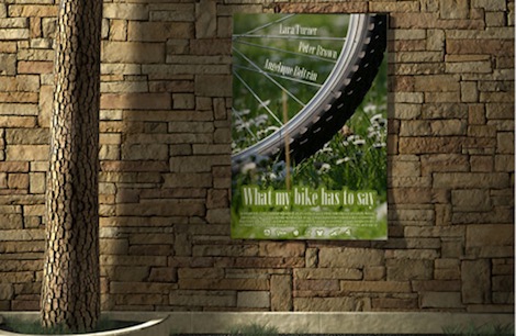

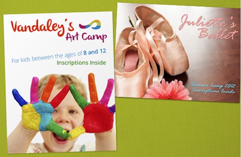
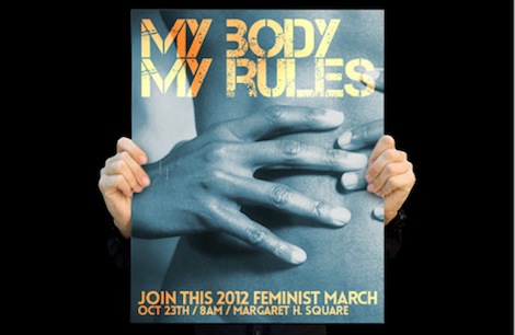

Explore more
Where to go next

By the numbers
Printing you can count on at 4OVER4
Common Questions
Common questions about designing a poster
How do I start designing a poster?
Start before you touch a design tool. Write down the one action you want people to take, who you are talking to, and where the poster will hang. A concert flyer for students in a busy hallway and a gallery announcement for collectors in a quiet lobby call for completely different type, color, and pacing. Once the goal, the audience, and the location are clear, every layout decision has an answer to point back to.
What are the actual steps to design a poster?
The short version is eight steps: define the goal and audience, settle on one message, choose a size that fits the viewing distance, build a single focal point, set type for legibility, work color and contrast to your brand, add a clear call to action with the practical details, then prep a print-ready file and proof it. Each step narrows the choices for the next one, so the poster comes together instead of fighting itself.
What size should I design my poster at?
Match the size to how far away people will read it. For a wall someone stands close to, 11 by 17 or 18 by 24 works well. To command a room, a storefront, or a stage backdrop, step up to 24 by 36 or 27 by 40. Design the file at the final print dimensions from the start so nothing has to be stretched later, and if you are unsure, the 4OVER4.COM poster sizes guide walks through every standard measurement.
Which fonts and colors work best on a poster?
Pick one display font for the headline and one clean, readable font for supporting lines, and stop there. Two type families is plenty. For color, pull from your brand palette, keep strong contrast between text and background, and remember the file prints in CMYK, so bright screen blues and neons can shift on paper. Proof a printed sample if the color is critical to the design.
How do I make sure my poster prints sharp?
Design in CMYK at 150 DPI or higher at the full print size, with 300 DPI ideal when your artwork can carry it. Add a bleed so nothing important sits on the trim edge, convert fonts to outlines, and export a high-resolution PDF. Large posters are viewed from a distance, so 150 DPI reads crisp while keeping the file manageable, but always check the artwork at actual size before you send it.
How much does it cost to print a poster and how is pricing set?
Poster pricing at 4OVER4.COM is driven by size, paper stock, finish, quantity, and turnaround, and the price per unit drops as the quantity climbs. Standard posters start around $108.75 for a run, and the configurator shows live pricing the moment you pick your options, so you can see exactly how each choice moves the total before you order.
Get Started
Ready to print your poster design?
Pick your size and stock, drop in your print-ready artwork or build it in the browser, and we print a crisp, color-accurate poster that reads from across the room.
Legal Disclaimer
Gold Standard guarantees apply to all standard orders placed through 4over4.com. Price match requires verifiable proof of a competitor's published price for an equivalent product with matching specifications and turnaround time. Satisfaction guarantee covers manufacturing defects and print quality issues. Contact support with order number and documentation. On-time delivery rate based on tracked orders 1999 to 2026. Individual results may vary based on shipping carrier performance.
