
The 7 Types of Logos and Which One Your Brand Should Use


Seven logo types, what each one costs you later, and the smallest size each still reads at in print. Written from the side of the counter where logos either reproduce or do not.
The seven types are the wordmark, the lettermark or monogram, the pictorial mark, the abstract mark, the mascot, the combination mark and the emblem. Which one fits comes down to three things: how much recognition your name already carries, whether the mark ever has to work without the name beside it, and the smallest place it will be printed. Most small businesses should build a combination mark, because it gives you a lockup to use now and a standalone symbol to use once people know it.

Quick answer
The name picks the type, the press sets the size
Seven types: wordmark, lettermark, pictorial mark, abstract mark, mascot, combination mark and emblem. A short distinctive name can carry a wordmark. A long one gets reduced to initials. A mark that has to work with no name beside it has to be a symbol, and a symbol is empty until years of exposure fill it. Then the press has a say: whatever is smallest inside the mark, a hairline rule or a 5 point motto, decides how small the whole logo can go.
What Makes a Logo Work Before You Pick a Type
Type comes second. A mark has to survive being shrunk, stripped of color, and printed by a process that cannot hold a hairline, and most logos that fail in production fail on one of those three before anyone argues about whether they should have been a wordmark.
The test we run at the counter is simple. Print it at one inch wide in solid black. If you can still tell what it is, it will work on a business card, a pen, an embroidered polo and a browser tab. If it closes up, the drawing carries detail the press cannot resolve, and no stock or finish will rescue it.
Two numbers set that floor. Type stops reading reliably below about 6 point, and a rule thinner than 0.5 point starts dropping out in places or filling in on absorbent uncoated stock. Every logo has a smallest element somewhere inside it, and that element decides the smallest size the whole mark can be used at. A lettermark has no small element at all, which is why it holds up on a quarter inch foil stamp. An emblem with a founding year set in 5 point type around a border does not.
The third thing to settle early is a one-color version. Foil stamping, embroidery, deboss, and printing onto a dark or kraft substrate all take exactly one color. If your logo only exists as a four-color gradient, someone will invent that one-color version under deadline pressure and it will not be you. The six principles of logo design cover the drawing side of this in more depth.
1. Wordmark, or Logotype

A wordmark is the company name itself, set in a typeface chosen or drawn so that the name becomes the mark. There is no symbol. Google, Coca-Cola and FedEx all work this way.
It suits a short, distinctive name, and it does one thing no symbol can: it teaches people what you are called every single time they see it. For a business under two years old that is worth a great deal, because you are still buying name recognition and a wordmark spends every impression on that job.
Where it fails is length and blandness. Four words set in a line shrink to nothing on a card, and a generic name in a nice font is still a generic name. There is also a real production catch. A wordmark is only as small as its thinnest stroke, so a delicate high-contrast serif or a light weight sets your floor higher than you expect. We usually see a wordmark hold together down to about three quarters of an inch on standard business cards, which start at $17.57 per box, and start breaking below that.
If you want the name to be the whole logo, spend the money on custom letterforms rather than a licensed font. Check the licence either way before it goes on packaging, and read whether Google Fonts are free for commercial use if that is where the type came from.
2. Lettermark, or Monogram
A lettermark reduces the name to its initials and draws those as the mark. HBO, IBM and NASA are lettermarks, and each of them shortened a name that would have been unusable at length.
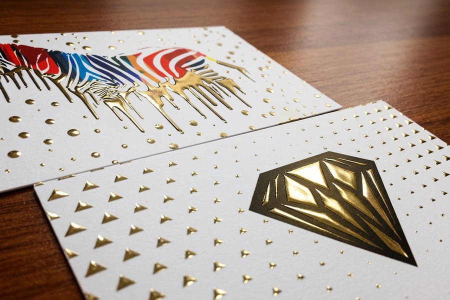
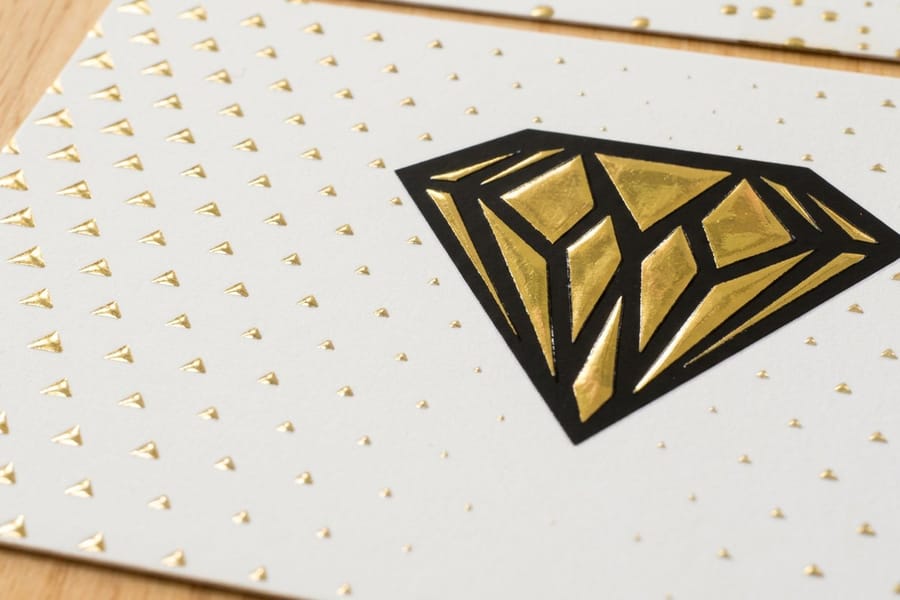
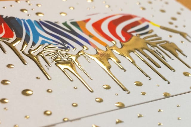
This is the fix for a long name, a three-word name, or a founder-partnership name that reads like a law firm. It is also the most print-friendly of the seven types by a wide margin. Two or three letterforms have no fine internal detail, so the mark stays legible at a quarter inch, which is roughly where a foil stamp or an embroidered chest logo lands. If you plan to put your mark on raised foil business cards, currently from $86.78, initials will reproduce more cleanly than any other type.
The cost is meaning. Initials tell a stranger nothing, so a lettermark on its own needs the full name printed near it on anything a new customer sees first: the card, the invoice, the storefront. The brands that got away with bare initials spent decades getting there.
3. Abstract Mark

An abstract mark is a geometric form that does not depict anything literal. The Chase octagon and the Pepsi globe are abstract marks. Nothing in the shape says banking or soda, which is exactly the point.
The advantage is ownership. A picture of a house on a real estate logo sits in a crowded field of houses, but a form nobody has drawn before belongs to you alone, and it carries no accidental meaning into a new product line or a new country. Abstract marks also compress well, because a good one is usually two or three shapes with no fine detail, so it survives down to roughly a third of an inch.
The catch is the one people underestimate. An abstract mark is empty until you fill it, and you fill it with years of consistent exposure. A five-person firm that adopts a bare abstract symbol has bought a beautiful shape that means nothing to any customer yet, and it will keep meaning nothing until the marketing budget makes it mean something. Pair it with the name for the first few years.
One production note: gradients. Abstract marks attract them, and a gradient has no honest one-color version. If yours has one, draw the flat version at the same time, and keep it on file for foil, embroidery and anything on kraft. Our guide to brand color pairings that print well is a better starting point than picking two colors on screen.
4. Pictorial Mark
A pictorial mark is a recognizable object drawn simply: the Apple apple, the Twitter bird, the Shell shell. It reads instantly, it crosses languages, and it is the easiest of the symbol types for people to describe to each other, which matters more than designers usually admit.
Two risks come with it. The first is the category cliché, where every competitor picks the same obvious object and you end up with the eleventh gear, tooth or house in your market. The second is that the object can trap you. A company named after a bird that later moves into services still has a bird, and redrawing it costs every printed asset you own.
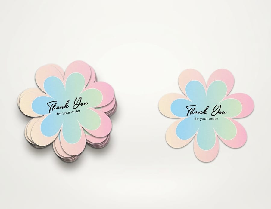
Pictorial marks print well when they are drawn as a silhouette rather than an illustration. Solid shapes down to about four tenths of an inch, no internal hairlines, no rendered shading. Because they read as a shape, they are the best fit for a cut contour, which is why they work so well on die-cut stickers from $93.37, where the cut line follows the mark itself. Stickers are also the cheapest live test of whether your symbol works alone: hand out five hundred with no name on them and see whether anyone knows whose they are.
5. Mascot Logo
A mascot is a character that stands in for the brand. Sports teams, breakfast cereals, pest control and family restaurants all use them, and they work because a face invites a relationship that a geometric shape cannot.
They are also the most expensive type to own properly. A mascot needs poses, expressions and a consistent style guide, or it drifts into three different characters within a year across three different vendors. And they date. A character drawn in the visual style of its decade looks like that decade forever, which is fine for a nostalgia brand and a problem for a technology company.
In production, a mascot is the hardest of the seven. It carries facial detail, outlines and usually full color, which means it needs about an inch and a quarter of width before the face resolves, and it needs a simplified one-color version drawn deliberately for embroidery and foil. Where a mascot earns its keep is anything printed large and in full color: stickers, packaging, signage, and giveaway pieces where the character is the reason someone keeps it. On a small chest embroidery, expect to use the wordmark instead.
6. Combination Mark
A combination mark pairs a symbol with the name in a fixed lockup. It is the most common logo type in use, and for most businesses it is the right answer, because it gives you two assets from one drawing.
Early on you use the lockup everywhere, so every impression teaches the name and the symbol together. Later, once people connect the two, you start using the symbol alone on an avatar, an app icon or a sticker, and you have not had to redesign anything to get there. That progression is why a new company should almost never launch with a bare symbol.
Build two lockups, not one. A horizontal version for letterheads, email signatures and the top of a website, and a stacked version for a square space, a narrow banner or a compact card. The horizontal one is usually what falls apart first, because a wide lockup shrinks to fit and drags the name below the readable size with it.
The floor sits around one and one tenth inches for a typical combination mark, set by the name rather than the symbol. If your card design keeps forcing the logo smaller than that, the fix is the stacked lockup or a different card shape, not a smaller logo. If you are running more than one brand on a single card, our guide to cards with multiple logos covers the hierarchy problem that creates.
7. Emblem
An emblem puts the name inside the shape. Crests, badges, seals and the classic Starbucks and Harley-Davidson marks all work this way, and the type and the symbol cannot be separated without destroying the logo.
It reads as heritage and authority, which is why universities, breweries, government bodies and anything trading on craft keep choosing it. It also makes a single, self-contained object that looks finished on a bottle, a patch or a door.
The price is flexibility. An emblem cannot be stretched into a horizontal signature, and it usually cannot be simplified without becoming a different logo. Worse, emblems attract small text: a founding year, a location, a Latin motto set in 5 point around a border. That text is what fails first. Below about an inch, the ring type closes up and the border rules fill in, and on uncoated stock it happens sooner because the ink spreads into the fibers.
If you are set on an emblem, commission a reduced version at the same time as the primary, with the outer text removed and the strokes thickened, and treat one inch as the changeover point. It is the same discipline behind any tight-registration job, and our notes on resolution for printing explain where the detail limit actually comes from.
How to Choose the Right Type for Your Brand
Three inputs decide it: how much recognition your name already carries, whether the mark ever has to appear without the name, and the smallest place it will be printed. Run them in that order and the field usually narrows to two types.
| If this is true of you | Start with | Why it fits | The catch to plan for |
|---|---|---|---|
| Short, distinctive name, new business | Wordmark | Every impression teaches the name, which is the asset you are short of. | Thin letterforms set a high size floor. Test at 0.75 in before you commit. |
| Long or multi-word name | Lettermark | Initials fit where the full name never will, and reproduce down to 0.25 in. | Initials mean nothing alone. Print the full name beside them for years. |
| Crowded category, want to own the shape | Abstract mark | No competitor owns it and it carries no accidental meaning abroad. | It is empty until marketing fills it. Pair it with the name early. |
| Clear literal object, consumer facing | Pictorial mark | Instant read, easy to describe, ideal for a cut contour on stickers. | Category clichés, and the object can trap you if the business shifts. |
| Food, sport, family or local services | Mascot | A face builds warmth and gives you a character to run campaigns around. | Needs 1.25 in of width and a separate one-color version for embroidery. |
| Anything else, most small businesses | Combination mark | One drawing gives you a lockup now and a standalone symbol later. | Build horizontal and stacked lockups, or the wide one will get squeezed. |
| Heritage, craft, institutional | Emblem | Self-contained and authoritative on a bottle, a patch or a door. | Rigid shape and small ring type. Draw a reduced version for under 1 in. |
Read the last column before the second. The types differ far less in how they look than in what they cost you later, and the later cost is almost always reproduction: a version you did not draw, needed by a vendor on a Thursday.
One more filter worth applying. List the five places your logo will appear most often over the next year. If four of them are small, dark or single color, the type that wins is whichever one survives that list, not whichever one looked best in the presentation. A brand refresh checklist is the place to work through the rest of the system once the mark is settled.
Printing Your Logo Across Materials
Once the type is decided, the logo becomes a production file, and a few habits keep it from being redrawn badly under pressure.
- Supply vector with fonts outlined. AI, EPS or PDF. A vector mark scales from a lapel pin to a trade show banner and holds a clean edge on a die cut or a foil stamp. See choosing the right file type for printing, and how to convert text to shapes in Illustrator for the outlining step.
- Keep a one-color master. Foil, embroidery, deboss and printing on kraft or dark stock all take exactly one color. Draw that version yourself rather than letting a vendor flatten a gradient.
- Specify brand color as a spot color. A CMYK build shifts between substrates and between jobs. A Pantone reference holds. Our notes on the best color profile for printing cover the conversion.
- Respect the floor. Nothing inside the mark below 6 pt type or a 0.5 pt rule. If the reduced version needs the tagline removed, remove it.
- Set clear space once. A margin equal to the height of one letterform in the name, applied everywhere. It is what keeps the logo from touching a trim edge on a card.
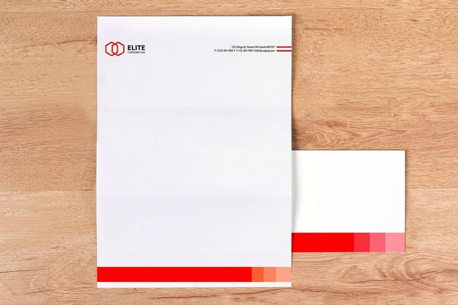
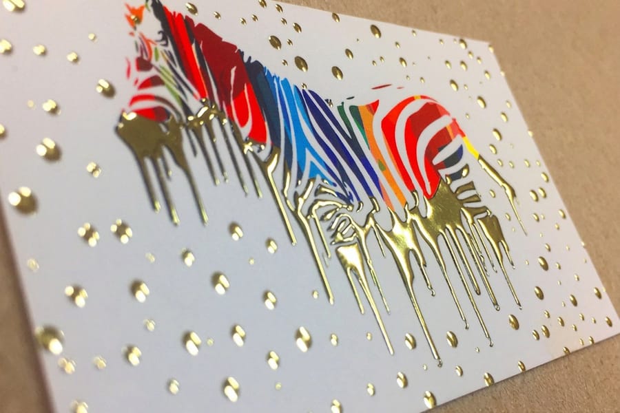
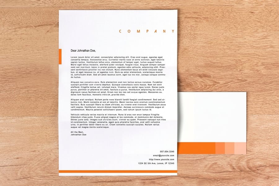
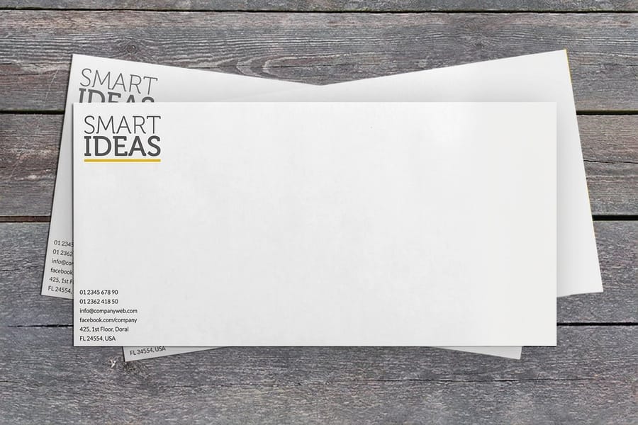
Where each type lands well: a lettermark or a simple pictorial mark on raised foil business cards, where a stamped quarter-inch mark reads as deliberate. A combination mark on standard letterheads, from $99.95, and on printed envelopes, from $142.99, where the horizontal lockup has room to breathe. A mascot or a full-color pictorial mark on die-cut stickers, printed large enough for the detail to show. And the everyday workhorse for all seven is standard business cards at $17.57, which is also the cheapest way to see your logo in ink before you commit it to signage.
If you want to lay it out at the correct trim before ordering, pull a correctly sized file from the blank template library, or start from a layout in our design template library. Choosing the finish is a separate decision worth making on purpose, and matte, gloss or soft touch changes how a dark logo reads more than most people expect.
Wally sorts the seven
Name first, symbol second, press last
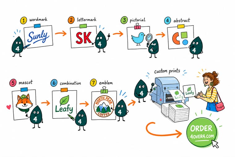
Wally lines up all seven and asks two questions. Can a stranger read your name from it, and can he print it at one inch in black ink. A wordmark passes the first and struggles with the second. A monogram passes the second and fails the first. A combination mark passes both, which is why he hands it to most people who walk in. Then he checks the smallest thing inside the drawing, because that is what decides the size, not the logo as a whole.
Print your logo on business cards →Specs and pricing
Where a logo lands first, with live options and prices
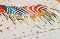
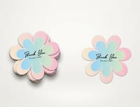
The three pieces most brands print before anything else, with the sizes, stocks and finishes straight from the 4OVER4.COM configurator.

Print it
Put the mark in ink and see how it holds

Explore more
Where to go next




By the numbers
Brand printing you can count on at 4OVER4
Common Questions
Your logo type questions, answered
What are the 7 types of logos?
Wordmark, lettermark, pictorial mark, abstract mark, mascot, combination mark and emblem. A wordmark sets the full name as the logo. A lettermark reduces it to initials. A pictorial mark is a recognizable object. An abstract mark is a geometric form with no literal subject. A mascot is a character. A combination mark locks a symbol beside or above the name. An emblem places the name inside the shape so the two cannot be separated.
Which logo type is best for a small business?
A combination mark, in almost every case. It gives you a lockup for a letterhead or an invoice and a standalone symbol for a sticker, an app icon or a social avatar, from one drawing. A bare abstract or pictorial mark only works after people already connect it to you, and a new business has not bought that recognition yet. Start combined, and split the symbol off later once it carries the name on its own.
What is the difference between a wordmark and a lettermark?
A wordmark sets the whole name, a lettermark sets only the initials. The choice is usually forced by length. Two syllables set in a distinctive face read cleanly on a business card. Four words do not, so the initials get drawn instead. The trade-off is that a lettermark says nothing about who you are, so it needs the full name printed nearby on anything a stranger sees first.
Do I need more than one version of my logo?
Yes, and three is the usual minimum. You need the primary lockup, a stacked or compact version for narrow spaces, and a single-color version for foil stamping, embroidery and anything printed on a dark or colored substrate. A fourth is worth drawing if your mark carries fine detail: a simplified version for sizes below about half an inch, with the hairlines thickened and the smallest text removed.
What file format should I send the printer for my logo?
Vector, with fonts converted to outlines. AI, EPS or PDF all work. A vector file scales from a lapel pin to a trade show banner with no loss, and it lets us hold a clean edge on a die cut or a foil stamp. A JPG or PNG is fixed at whatever pixel size it was saved at and softens the moment it is enlarged. If vector is all you have in the wrong colors, send it anyway and see our guide to choosing the right file type for printing before you convert anything.
Why does my logo look different printed than on screen?
A screen makes color with light and a press makes it with ink, so the bright saturated end of RGB has no CMYK equivalent. Electric blues, hot oranges and neon greens are the usual casualties, and they land duller on paper than they looked in the browser. If your brand color has to match across every job, specify it as a Pantone spot color rather than a CMYK build. Coating changes it too: the same ink reads richer on gloss than on uncoated stock.
Get Started
Ready to see your logo in ink?
Send us the vector file, pick a stock and a finish, and we print the mark at the size you actually chose it for.
Legal Disclaimer
Gold Standard guarantees apply to all standard orders placed through 4over4.com. Price match requires verifiable proof of a competitor's published price for an equivalent product with matching specifications and turnaround time. Satisfaction guarantee covers manufacturing defects and print quality issues. Contact support with order number and documentation. On-time delivery rate based on tracked orders 1999 to 2026. Individual results may vary based on shipping carrier performance.
