
10 Best Color Combinations for Branding and Print That Actually Work


The right two colors can make a brand feel confident, trustworthy, or premium before a single word is read. Ten pairings below carry their hex codes, along with the 60-30-10 rule, the pairs to avoid, and what changes when they hit paper.
The best color combinations for branding pair colors with intentional contrast and a clear dominant-to-accent balance. Use the 60-30-10 rule: 60 percent dominant color, 30 percent secondary, 10 percent accent. Proven pairings like navy and white, black and gold, or teal and coral read as professional. Then convert to CMYK and check a printed sample so the colors look right on paper, not just on screen.
Start here
Two colors, one neutral, one accent
The best color combinations for branding pair colors with intentional contrast and a clear dominant-to-accent balance, guided by the 60-30-10 rule. Ten proven pairings, from navy and white to black and gold to teal and coral, read as professional across print. Then the printer's step matters: convert to CMYK and check a sample so the colors look right on paper. The color-harmony wheel below shows how the pairings relate.
Why color combinations matter for a brand
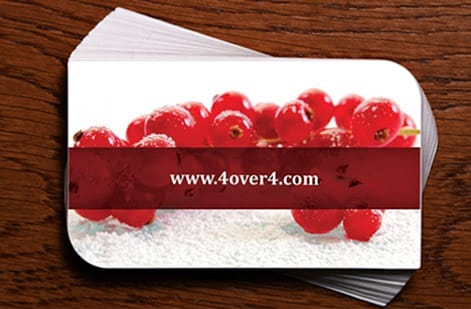
Before anyone reads your name or your tagline, they have already reacted to your colors. A palette sets the emotional tone of a brand in an instant: navy and white feel trustworthy and established, black and gold feel premium, warm pairings feel friendly and approachable. Color is the fastest, most emotional signal a brand sends.
That speed is exactly why the combination matters so much. The right pairing makes a brand feel coherent and intentional across everything it touches, from a business card to a flyer to a storefront sign. The wrong one makes even careful design feel slightly off, without the viewer knowing why.
This guide gives you ten proven pairings with hex codes, the simple rule that keeps any palette balanced, the combinations to avoid, and, crucially, how to keep your colors true when they move from screen to paper. The color-harmony wheel above shows how the pairings relate on the color wheel.
How to find colors that go together

Finding colors that work together is less guesswork than it looks, because color theory gives you a map. On the color wheel, complementary colors sit directly opposite each other and give bold, high-energy contrast. Analogous colors sit next to each other and give a calm, cohesive feel. Choosing between them is really choosing a mood.
Once you have a harmony type, the 60-30-10 rule keeps it balanced. Use one dominant color for about 60 percent of a design, a secondary for 30, and an accent for the final 10 percent, saved for highlights and calls to action. This hierarchy is the single biggest reason professional palettes feel intentional rather than chaotic, and it works whether you build from scratch or start from a proven pairing.
The rule matters because the most common palette mistake is giving several colors equal weight, which makes a design feel busy and unresolved. Establish a clear dominant color and the rest falls into place, the same principle that guides a clean flyer layout.
10 best color combinations that work

Ten pairings below reliably read as professional in print. Treat each as a starting point and adjust the exact hex values to your brand. Navy and white (#1B2A4A / #FFFFFF) is the classic trustworthy pairing. Black and gold (#0A0A0A / #C9A227) reads premium and luxurious. Teal and coral (#0E8388 / #FF6B6B) feels modern and energetic.
Forest green and cream (#2C5F2D / #F5F0E1) is natural and calm; charcoal and orange (#333333 / #F26430) is confident and bold; burgundy and blush (#6E1423 / #F4C2C2) is refined and warm. Royal blue and yellow (#1E3A8A / #FBBF24) is high-energy and optimistic, while slate gray and mint (#4A5568 / #A7F3D0) feels fresh and professional.
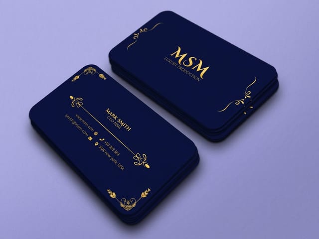
Plum and soft pink (#5B2A4A / #F7D6E0) is elegant and creative, and timeless black and white (#000000 / #FFFFFF) never fails when you want pure clarity. Each of these balances harmony with enough contrast to stay legible, and each prints beautifully on business cards and premium stocks once it is converted to CMYK.
Color combinations to avoid

Knowing what to avoid is half the skill. The first trap is pairing two highly saturated complementary colors at equal intensity, like pure red and green. They can appear to vibrate along their shared edge, straining the eye and making text hard to read. The fix is to mute one color or let a neutral separate them.
The second is low-contrast neighbors, two similar mid-tone colors placed together. They look muddy and undercut legibility, especially for text on a colored background. Clashing warm and cool combinations without a neutral to anchor them feel unresolved, and relying on color alone to signal meaning leaves out readers with color vision differences.
The common cure for all of these is contrast and a strong neutral. When a pairing feels off, add black, white or gray to ground it and increase the contrast until the design reads cleanly at a glance. That is the same legibility discipline that keeps a flyer readable from across a room.
Getting print-accurate color

This is the section most palette guides skip, and it is where a printer earns its keep. A palette that glows on your monitor can shift the moment it prints, because screens make color with red-green-blue light while presses make it with cyan, magenta, yellow, and black ink. Those systems do not cover the same range.
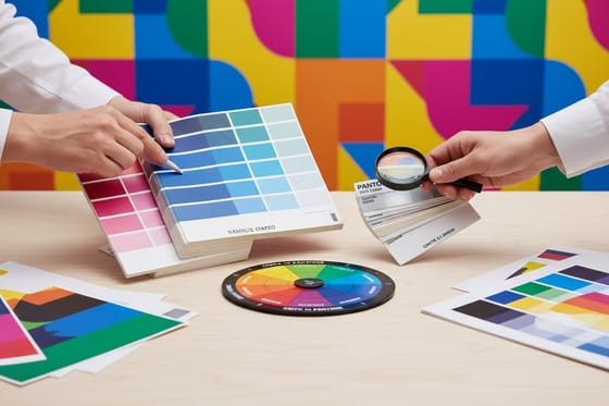
Design in CMYK from the start so your preview reflects the ink, and convert any RGB assets before you export. Watch the colors that shift most, bright blues can drift toward purple, and vivid greens and oranges tend to lose punch. For a color your brand truly depends on, note the reference and consider a spot color to hold it exactly across every job.
The single most reliable step is to check a printed proof on your actual stock, since paper, coating, and ink all affect the final look. Our guides on CMYK versus RGB and matching Pantone to CMYK cover the technical steps in full.
Apply your palette to print
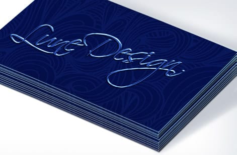
A palette only earns its value when it shows up consistently across everything you print. Once you have chosen your pairing and balanced it with the 60-30-10 rule, apply it the same way on every piece so the brand reads as one, from your business cards to your flyers to your signage.
Keep the dominant, secondary, and accent roles fixed across pieces, use the same converted CMYK values everywhere, and let the accent color carry your calls to action so it stays meaningful. Consistency is what turns a nice palette into a recognizable brand.
When you are ready to print, use the live specs and pricing panel below to choose the stock and finish that make your colors sing, and browse the full range in our business card printing collection. A matte or gloss coating can noticeably change how a palette reads, which is one more reason to check a sample first.
Wally keeps your colors true from screen to paper
Pick the pairing, balance it, then prove it on stock
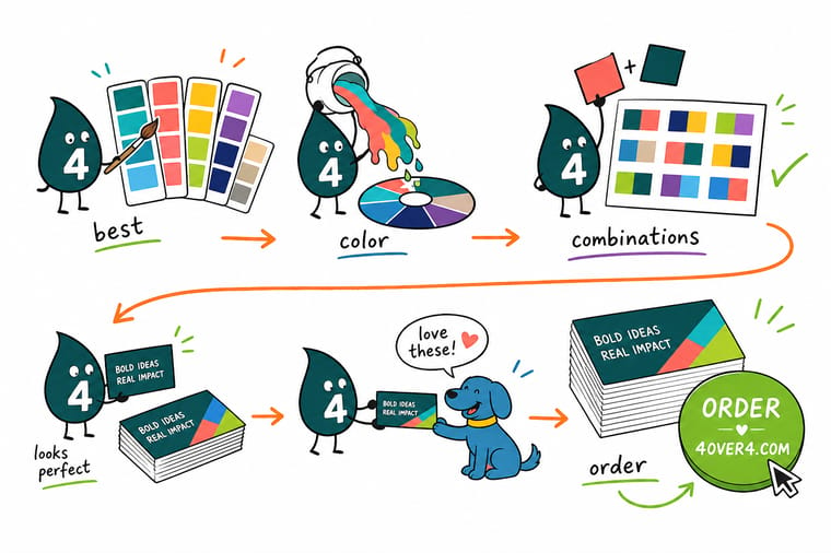
Wally starts from the mood, picks a proven pairing, and balances it 60-30-10 so it never feels busy. Then he does the part most guides forget: he converts the palette to CMYK, watches the blues and oranges that like to shift, and checks a printed proof on the real stock. A color that glows on screen can dull on paper, so Wally proves it before the full run. True-to-brand color, printed at 4OVER4.
Print your brand colors →Quick reference
At a glance
Contrast, harmony type, neutral anchor, color space and proof. Those five settle a palette.
| Element | Get it to | Why it matters |
|---|---|---|
| Balance | 60-30-10 rule | One dominant color at 60 percent, a secondary at 30, and an accent at 10 keeps a palette intentional and calm. |
| Contrast | High enough to read | Pairings need enough contrast to stay legible; equal-weight, low-contrast colors fight each other. |
| Harmony type | Complementary or analogous | Opposite colors give bold contrast; neighboring colors give a calm, cohesive feel. Pick to match the brand mood. |
| Neutrals | Anchor with black, white, gray | A strong neutral grounds a bold accent and keeps a two-color scheme from feeling loud. |
| Print color | Convert to CMYK | Screens use RGB; presses use CMYK. Convert before export so bright screen colors do not dull unexpectedly. |
| Proof | Order a printed sample | A printed proof on your actual stock is the only way to confirm the palette looks right on paper. |
Step by step
Step by step
- Start from the mood you want Decide what the brand should feel like first: trustworthy, premium, energetic, calm. Color communicates emotion before words, so let the desired impression guide the palette rather than personal favorites.
- Apply the 60-30-10 rule Choose a dominant color for about 60 percent of your designs, a secondary for 30, and an accent for 10. This ratio is the backbone of palettes that feel intentional instead of scattered.
- Pick a proven pairing Use one of the ten combinations below as a starting point, adjusting the exact hex values to your brand. Proven pairings save you from reinventing color theory from scratch.
- Check contrast and legibility Confirm your text stays readable on your background colors and that the pairing has enough contrast to work at a glance. Low-contrast combinations look muddy in print.
- Convert to CMYK for print Move your palette from RGB to CMYK before exporting, and watch the colors that shift most, bright blues, greens, and oranges, so nothing dulls unexpectedly on paper.
- Order a printed sample Before committing to a full run, print a proof or order a sample on your actual stock. A printed reference is the only reliable way to confirm your colors look right off-screen.
Specs and pricing
"Business card specs and live pricing"
"Once your palette is set, size, stock and finish are what is left. Standard business cards run 100 for $17.57, which is $0.18 each."

| Quantity | Price Per Unit | Total |
|---|---|---|
| 100 | 17.6¢ | $17.57 |
| 200 | 11.5¢ | $23.07 |
| 300 | 9.15¢ | $27.46 |
| 400 | 7.96¢ | $31.86 |
| 500 | 7.25¢ | $36.26 |
| 600 | 6.77¢ | $40.64 |
| 700 | 6.43¢ | $45.04 |
| 800 | 6.18¢ | $49.43 |
Print it
Print your palette true to color


See it in use
Brand palettes, printed true to color








Explore more
Where to go next




By the numbers
Where a hex code becomes a CMYK build
Common Questions
Common questions
Why do color combinations matter for branding?
Because color communicates before a single word is read. A palette sets the emotional tone of a brand instantly: navy and white read as trustworthy and established, black and gold read as premium, and warm pairings feel friendly and approachable. The right combination makes a brand feel coherent and intentional across everything it touches, from a business card to a storefront sign. The wrong one makes even good design feel off. Choosing colors deliberately, tied to the impression you want to leave, is one of the highest-leverage decisions in branding.
How do I find colors that go together?
The reliable method combines a little color theory with a balancing rule. On the color wheel, complementary colors sit opposite each other for bold contrast, while analogous colors sit next to each other for a calm, cohesive feel. Pick a harmony type that matches your brand mood, then apply the 60-30-10 rule: one dominant color for 60 percent of your designs, a secondary for 30, and an accent for 10. That ratio is what keeps a palette feeling intentional rather than chaotic, and it works whether you start from a proven pairing or build your own.
What is the 60-30-10 rule?
It is a simple ratio for balancing a palette so it feels professional. Sixty percent of your design uses a dominant color, usually a neutral or your main brand color, thirty percent uses a secondary color, and ten percent uses an accent for highlights and calls to action. The rule prevents the common mistake of giving two or three colors equal weight, which makes designs feel busy and unresolved. By establishing a clear hierarchy, the 60-30-10 rule gives even a bold palette a sense of calm and intention.
What are the best color combinations for print?
Ten pairings reliably read as professional: navy and white, black and gold, teal and coral, forest green and cream, charcoal and orange, burgundy and blush, royal blue and yellow, slate gray and mint, plum and soft pink, and classic black and white. Each balances harmony with enough contrast to stay legible in print. The key is to treat these as starting points, adjust the exact hex values to your brand, apply the 60-30-10 balance, and always confirm them on paper, since a combination that looks great on screen can shift once it is printed in CMYK.
Which color combinations should I avoid?
Avoid pairings that fight the eye or muddy your message. Two highly saturated complementary colors of equal intensity, like pure red and green, can appear to vibrate and strain the eye. Low-contrast neighbors, such as two similar mid-tone colors, look muddy and hurt legibility, especially for text. Clashing warm and cool combinations without a neutral to anchor them feel unresolved. And relying on color alone to convey meaning ignores readers with color vision differences. When in doubt, add a strong neutral and increase contrast until the pairing reads cleanly.
How do I make sure my brand colors print accurately?
Design in CMYK rather than RGB so your on-screen preview reflects process-ink output, and convert any RGB assets before you export. Watch the colors that shift most in conversion, especially vivid blues, greens, and oranges, which can dull on paper. For a color your brand depends on, note the reference and confirm it against a printed sample rather than trusting a monitor. The single most reliable step is to order a printed proof or sample on your actual stock, since paper, coating, and ink all affect the final look. Our guide on converting RGB to CMYK covers the technical steps in detail.
Get Started
Order 100 premium business cards and check the build
Convert your colors to CMYK, check a sample, and print your brand palette on cards, flyers, and more at 4OVER4.COM. Adjust size, stock, and finish in the configurator and watch your price update live.
Legal Disclaimer
Gold Standard guarantees apply to all standard orders placed through 4over4.com. Price match requires verifiable proof of a competitor's published price for an equivalent product with matching specifications and turnaround time. Satisfaction guarantee covers manufacturing defects and print quality issues. Contact support with order number and documentation. On-time delivery rate based on tracked orders 1999 to 2026. Individual results may vary based on shipping carrier performance.
