
6 Key Principles of Logo Design


Sofia is our design and templates voice, built from the knowledge of our production team, with over 20 years in printing.
A logo is not a drawing you like, it is a tool that has to work everywhere your brand appears. These six principles are the checklist that turns a nice mark into one that prints clean on a business card and a banner alike. Check each one the way it shows up on press: half an inch tall on a card, black only on letterhead, and large on a yard sign.
The 6 key principles of logo design are simplicity, originality, versatility, scalability, balance and proportion, and timelessness. Simplicity keeps the mark instantly readable, originality makes it unmistakably yours, versatility lets it work in one color or reversed, scalability keeps it sharp from a favicon to a billboard, balance makes it feel settled, and timelessness keeps it from dating. A logo that clears all six is ready to carry your brand across every printed piece.
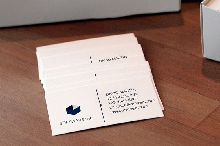
Quick tips
Where to start with the six principles
Fix simplicity and scalability first, because they decide whether the mark is usable at all. Then print a proof at business card size, which is where weak marks fail first.
What are the principles of logo design?

The principles of logo design are the practical rules a mark has to pass before it can stand in for your business everywhere it shows up. A logo is not decoration. It is a working tool that has to reproduce cleanly at the size of a favicon, print in a single color, reverse out of a dark background, and still look current years from now. The six principles below are the shared checklist designers use to judge whether a mark is actually doing that job. Our logo design checklist splits the same test across each stage of the design process.
Think of them as a gate, not a ranking. A logo that is beautiful but unreadable at small sizes fails. One that is clever but looks like three competitors fails too. The strongest marks clear all six at once, and that is what lets them carry a brand from a business card to a yard sign without breaking.
This guide walks through each principle with plain examples, then shows how to apply them step by step and put the finished mark on the printed pieces where it earns its keep. If you want the condensed field version, our best practices for logo design checklist pairs neatly with this page.
Principle 1: Simplicity

Simplicity is the first principle because it makes every other one easier. The logos you can draw from memory, the ones you recognize from across a parking lot, are almost always the simplest. A simple mark is faster to recognize, cheaper to print, and far more likely to survive being shrunk, reversed, or stamped in a single color.
The test is subtraction. Keep removing elements until taking away one more would break the idea. Drop the extra gradient, the third color, the tiny tagline that disappears at small sizes. What is left should still say who you are. A busy logo is not more professional, it is just harder to read on a business card where the mark might only be half an inch tall.
Simplicity also protects your budget. A clean, high-contrast mark reproduces the same across matte, gloss, and soft touch stocks, so your brand looks consistent no matter which finish you choose at 4OVER4.COM business card printing.
Principle 2: Originality
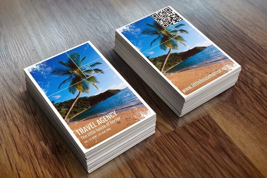
Originality is what makes a logo yours and no one else's. A mark can be simple and still be forgettable if it looks like every other option in your category. The goal is not to be strange for the sake of it, but to be distinct enough that a customer connects the mark to you specifically, not to the three competitors who all used the same swoosh.
Find originality by studying the field first. Line up the logos in your industry and notice the shared clichés, the same leaf for anything eco, the same rooftop for anything home services. Then deliberately steer away from them. A small, honest point of difference beats a loud gimmick that dates within a season.
Originality is also a legal safeguard. A mark that leans too close to an existing brand invites confusion and worse. When your logo is genuinely your own, it prints with confidence across every marketing materials piece you produce, and it builds recognition that compounds instead of borrowing someone else's.
Principle 3: Versatility
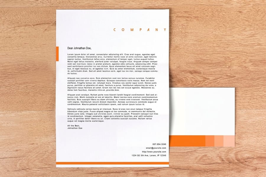
Versatility means one mark that works everywhere without a redesign. Your logo has to sit on a white business card and reverse out of a dark website header. It has to print in full color on a brochure and in a single flat color when the budget or the process only allows one. A versatile logo does all of that from the same core artwork.
Build versatility in from the start by designing a mark that holds up in three forms: solid black, solid white on a dark field, and a single flat brand color. If your logo needs a drop shadow, an outline, or a specific background to read, it is not versatile yet. Strip those crutches away and refine the shape until it stands on its own.
- One color for stamps, embossing, and single-color print runs.
- Reversed for dark headers, packaging, and foil on colored stock.
- Full color for the hero moments where you have the room and the budget.
A versatile logo keeps your brand consistent whether it lands on letterhead, a postcard, or a sign or banner. That consistency is what customers read as reliability.
Principle 4: Scalability

Scalability is versatility across sizes. The same logo has to be legible as a tiny favicon in a browser tab and as a huge graphic on a yard sign or vinyl banner. Marks fail scalability in two directions: fine details clog and disappear when shrunk, or thin lines look weak and spindly when blown up large.
The fix is to test at both extremes early. Shrink your draft to the size it will sit on a business card and check that every element still reads. Then scale it up to poster size and make sure the weights still feel intentional. Vector artwork is essential here, because it stays crisp at any size where a low-resolution raster file would turn to mush.
Scalability is also why simplicity pays off again. A mark with fewer, bolder shapes holds its identity across the whole range, which is exactly what you need when your logo has to work from a stamp to signage. If you are unsure how resolution affects large print, our color mode guide covers the print-side details.
Principle 5: Balance and proportion
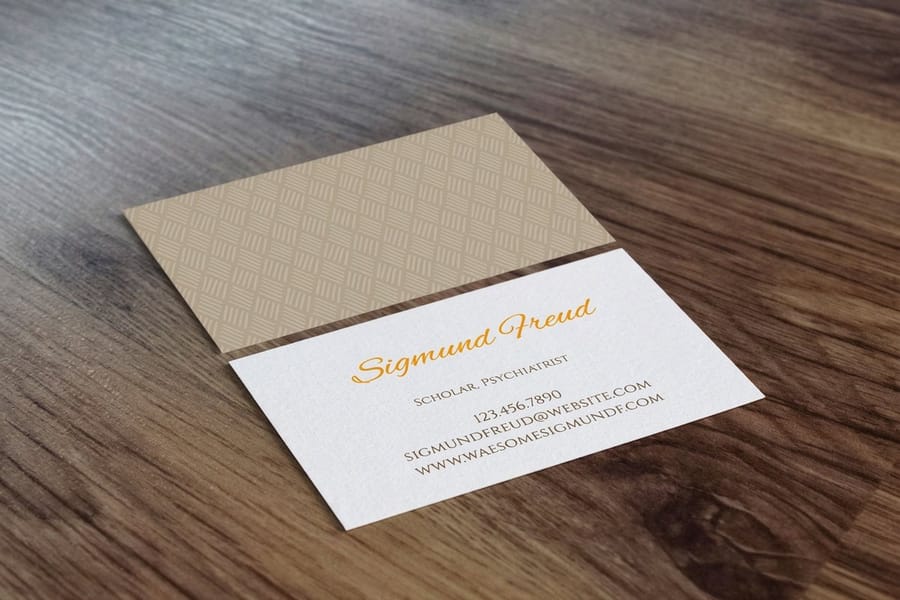
Balance is the sense that a logo sits comfortably, that no element is crowding another, that the weight is distributed so the eye settles instead of snagging. Proportion is the relationship between the parts, the size of the icon against the wordmark, the space around the whole thing.
Get there with alignment and consistent spacing. Give the mark room to breathe with clear space around it, and keep the relationships between elements consistent so the logo feels like one object, not a few pieces parked near each other. Optical alignment matters more than mathematical alignment here, because the eye judges by feel.
Balance is what makes a logo look finished rather than drafted. When it is right, the mark reads as calm and confident on a business card or across a pocket folder. For a deeper look at restraint, see our minimalist brand identity guide.
Principle 6: Timelessness
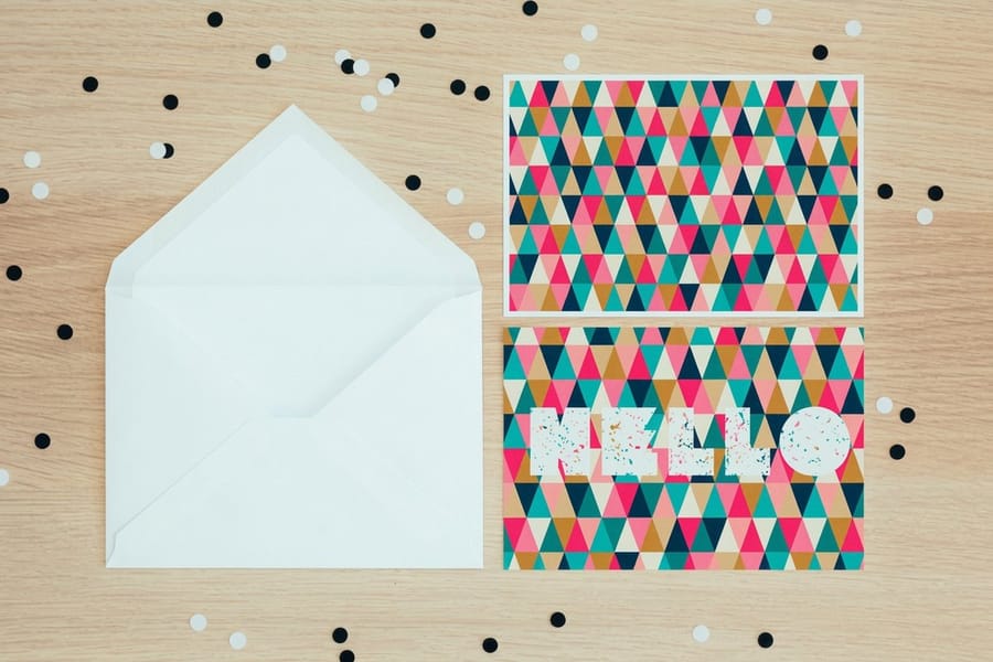
Timelessness is the principle that protects your investment. A logo tied to a passing trend looks fresh for a year and dated for the next ten. The marks that last are built on simple, well-proportioned forms rather than the effect of the moment, so they age slowly and stay recognizable through every reprint.
Chase timelessness by avoiding fashionable gimmicks: the gradient of the season, the trendy typeface everyone is using this year, the visual joke that stops being funny fast. None of that means boring. It means choosing forms and type that have proven they hold up, then letting your originality come from the idea rather than the trend.
A timeless logo saves real money over time. You reprint business cards, letterhead, and signage for years without a costly rebrand, and every printed piece keeps building the same recognition instead of resetting it. That is the whole point of getting the six principles right before you commit the mark to print.
How to apply the six principles, step by step
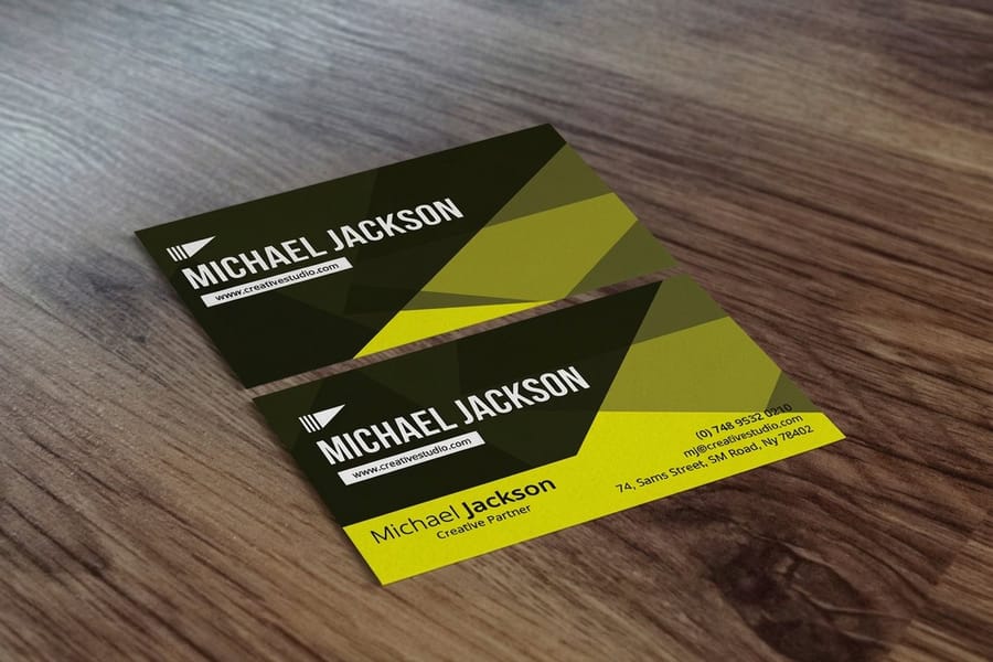
Principles are only useful when you turn them into a routine. One order of operations runs your logo through all six before it ever reaches a printer.
- Start with a single idea. Write the one thing your business stands for in a few words, then design toward that idea alone. A logo that tries to say everything ends up saying nothing, so pick the core message and let simplicity do the rest.
- Sketch in black and white first. Work in one color before you touch a palette. If the mark reads clearly in plain black on white, it will read anywhere. Color is the last decision, not the first, and it keeps you honest about balance and proportion.
- Test it small, then test it large. Shrink the logo to the size it will sit on a business card, then blow it up to signage scale. If details vanish at small sizes or feel thin when large, refine the shapes until it holds up at both ends.
- Check it in one color and reversed. View the mark in solid black, in solid white on a dark field, and as a single flat color. A versatile logo works in all three without an outline or a drop shadow to prop it up.
- Compare it against the field. Line your draft up next to competitors in your category. If it blends in, push it toward originality until it is unmistakably yours, not a near copy of the same three ideas everyone else used.
- Put it on a real printed piece. Order a proof or a short run of business cards and hold the logo in your hand. Screens flatter a mark, but paper tells the truth about weight, contrast, and how the ink sits, so finish the design on print.
Work through those steps and your mark will have been judged on simplicity, scalability, versatility, originality, and balance in turn, then finished on a real printed piece to confirm timelessness in the hand. If you would rather lay it out directly, the free online designer and our free design templates let you test a mark on a live card in minutes.
Where your logo lives: putting it on print
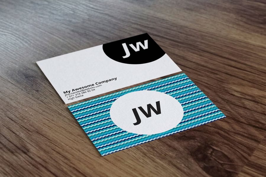
A logo is only a drawing until it lands in a customer's hand. The six principles exist so the mark reproduces cleanly on the pieces people actually hold and see. That is why the last step of good logo design is always a real print. Each piece asks for a different version of the mark.
- Standard business cards in 2 x 3.5, 2 x 2, 1.5 x 3.5 or 2.125 x 3.375 inches: send the full color mark and check it at half an inch tall. 100 start at $17.57 in 3 business days.
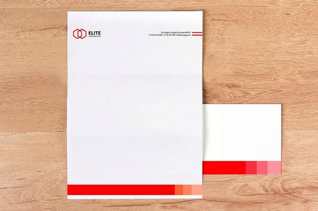
- Letterheads at 8.5 x 11 inches: send a black only version for a 1/0 or 1/1 run, or full color for 4/0. 50 start at $99.95 in 5 business days.
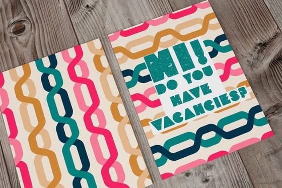
- Standard postcards in 14 sizes from 2.5 x 2.5 to 6 x 11 inches: send full color plus a reversed version for a dark photo back. 50 start at $16.48 in 3 business days.
Start with the touchpoints that do the most work. Your business cards are the first handshake, your letterhead carries the mark into every document, and your postcards put it in the mailbox. From there, add the pocket folders, brochures, and signage your industry leans on. A logo that passed all six principles will look at home on every one.
Pick the stock and finish that flatters your mark. A simple, high-contrast logo can carry a bold soft touch or raised foil beautifully, while a busier mark reads best clean and matte. See real examples in the business card styles and finishes gallery, then order the piece that puts your finished logo to work.
Wally explains logo design
Six rules that turn a nice mark into a working brand
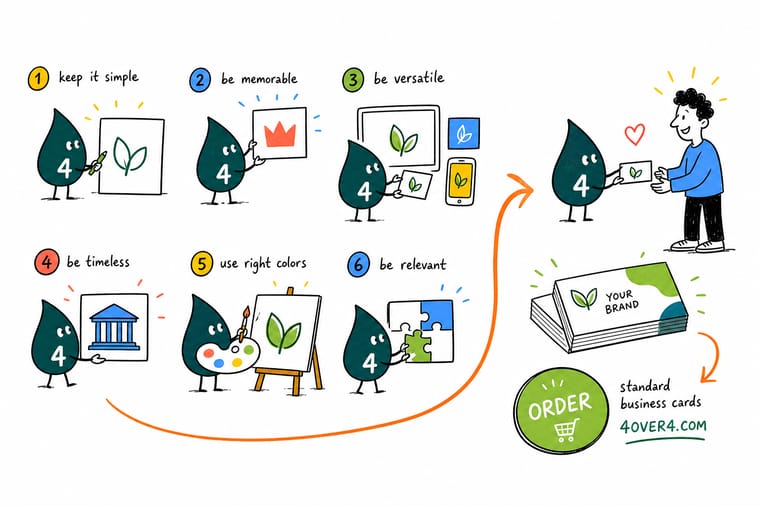
Wally sketches every logo in plain black first, then shrinks it to card size and blows it up to banner size to see if it still holds. Simple, original, versatile, scalable, balanced, and timeless is the whole checklist. Get those six right and the same mark reads clean everywhere, from a stamp to a storefront. When it passes, put it on a real card and hold it in your hand at 4OVER4.
Order business cards →%22%2F%3E%3Ccircle%20cx%3D%2243%22%20cy%3D%221%22%20r%3D%2218%22%20fill%3D%22%23f59e0b%22%20opacity%3D%220.15%22%2F%3E%3Ccircle%20cx%3D%2240%22%20cy%3D%2250%22%20r%3D%225%22%20fill%3D%22%23f59e0b%22%20opacity%3D%220.1%22%2F%3E%3Crect%20x%3D%2273%22%20y%3D%22-7%22%20width%3D%2228%22%20height%3D%2210%22%20rx%3D%224%22%20fill%3D%22%23f59e0b%22%20opacity%3D%220.08%22%20transform%3D%22rotate(8%2080%2030)%22%2F%3E%3C%2Fsvg%3E)
Specs and pricing
Print your logo on business cards: specs and pricing
Standard business cards come in four sizes, from the classic 2 by 3.5 inches to 2 by 2 square, on stocks from 13pt Uncoated to 80pt UltraWhite Uncoated Cover, including 24pt Ultra Thick Gloss Cover, 14pt White Linen and 16pt Uncoated with Soft Touch. 100 cards start at $17.57 with a 3 business day turnaround, and a free online proof lets you check the logo before it prints. Live specs and price-per-unit are below.

| Quantity | Price Per Unit | Total |
|---|---|---|
| 100 | 17.6¢ | $17.57 |
| 200 | 11.5¢ | $23.07 |
| 300 | 9.15¢ | $27.46 |
| 400 | 7.96¢ | $31.86 |
| 500 | 7.25¢ | $36.26 |
| 600 | 6.77¢ | $40.64 |
| 700 | 6.43¢ | $45.04 |
| 800 | 6.18¢ | $49.43 |
Print it
Put your finished logo to work at 4OVER4
Start with the three pieces that test the mark hardest. Business cards shrink it to its smallest size, letterheads on 24# Royal Laid or 70# Uncoated Text can run it in black ink only, and postcards print it next to a full color photo in sizes up to 6 by 11 inches.


See it in use
Logos we put on customer cards









Explore more
Where to go next



By the numbers
The press behind your finished logo
Common Questions
Common questions about the principles of logo design
What are the 6 key principles of logo design?
Simplicity, originality, versatility, scalability, balance and proportion, and timelessness. Treat them as a gate: a mark that fails one, say a detail that vanishes at card size, is not ready for print however good it looks on screen.
What are principles of logo design, in plain terms?
A logo has to survive four jobs: print tiny, print in one color, reverse out of a dark background, and still look current in five years. The principles are the checks for those jobs, so a mark that only looks good on the artboard does not pass.
Which principle do I fix first when a logo is not working?
Start with simplicity and scalability, because those two decide whether the logo is even usable. A simple mark is easier to remember and cheaper to print, and a scalable one holds up on both a business card and a storefront sign. From there, weight the rest to your industry: a trade business that lives on yard signs and vehicle magnets leans hard on versatility, while a premium brand leans on timelessness and balance. Sketch in black and white first, test it small, then test it in one color to see which principles your draft is failing.
What does putting a logo on print cost, and how are prices set?
There is no flat fee for a logo on print because the cost sits in the pieces you produce, not the design itself. At 4OVER4.COM, every product is priced by quantity, size, paper stock, and finish, and the figure updates live in the configurator as you pick those options. Higher quantities lower the price per unit, and premium stocks add to it. As one example, standard business cards start at $17.57 for 100 and cost $36.26 for 500.
What sizes, stocks, and finishes are available for printing a logo on business cards?
Standard business cards print at 2 x 3.5, 2 x 2, 1.5 x 3.5 or 2.125 x 3.375 inches or a custom size, on 73 stocks from 13pt to 80pt, including linen, kraft, soft touch and metallic pearl, with a Standard or High Gloss UV finish. Spot UV and foil sit on their own card products. Each surface changes how the mark reads, so a simple, high-contrast logo tends to hold up best across all of them. Every available combination is shown on the product configurator, and the live specs widget on this page lists what is on offer for business cards.
Should a logo be designed in color or black and white first?
Black and white first, always. Designing a logo in a single flat color forces the shapes to do the work instead of leaning on a gradient or a clever palette to hide a weak form. If the mark reads clearly in solid black on white and reversed to white on black, it will survive a one-color print job, a fax, an embossed card, and a foil stamp. Add color only once the black and white version is strong, and keep the palette small so it stays cheap and consistent to reproduce across every printed piece.
Get Started
Order 100 cards at $0.18 each and test the mark
Pick your size, stock, and finish, drop in your finished mark, and we print business cards that make your logo read exactly how you designed it.
Legal Disclaimer
Gold Standard guarantees apply to all standard orders placed through 4over4.com. Price match requires verifiable proof of a competitor's published price for an equivalent product with matching specifications and turnaround time. Satisfaction guarantee covers manufacturing defects and print quality issues. Contact support with order number and documentation.
