
How to Choose the Right Font for Your Logo


Your logo font speaks before the words do. Here are four tips for choosing the typeface that matches your brand, then printing it sharp on the cards and stationery clients hold.
Choose a logo font by matching a type family to your brand feel: serif for trusted, sans-serif for modern, script for elegant, display for bold. Then set the weight, meet your industry expectations, pair a plain second font if needed, and test it at business-card size to be sure it prints sharp.
Start here
The four logo font families
Serif, sans-serif, script, and display are the four families that cover almost every logo. Each sends a different signal before a word is read. The diagram below shows them side by side with the brand feel each one carries, so you can match the type to your identity.
Font families and the feel they send
A logo font does its most important work before anyone reads a word. In the split second someone sees your name, the shape of the letters has already told them whether your brand feels traditional or modern, refined or bold. Choosing the right typeface is really about choosing the right first impression.
Four families cover the vast majority of logos. Serif fonts, with small strokes at the ends of each letter, read trusted, classic, and established, which is why law firms and banks reach for them. Sans-serif fonts drop those strokes for a clean, modern, approachable feel, the default for tech and minimal brands. Script fonts flow like handwriting and read elegant and personal, perfect for beauty and boutiques. Display fonts are bold and characterful, built to grab attention.
Start by naming how your brand should feel, then match that feeling to a family. That single decision does more to shape your identity than almost anything else, and it carries all the way through to how your logo looks printed on a business card. A strong logo design begins here.
Weight and style: the personality dials
Once you have a family, weight and style are the dials that tune the personality. Weight is simply the thickness of the strokes, and it changes everything. A heavy bold weight feels confident, strong, and grounded, while a light or thin weight feels refined, delicate, and premium. The same word can read as a bank or a boutique depending only on the weight you pick.
Style layers on top. Italics add movement and a sense of energy, all caps add authority and structure, and lowercase feels friendlier and more relaxed. Two brands can use the exact same typeface and feel completely different because one chose bold uppercase and the other chose light lowercase.
Play with these deliberately rather than accepting the default. Try your name in a few weights and cases and notice how the mood shifts. This is where a logo stops being generic and starts feeling specifically yours, and it is worth getting right before it lands on your letterhead and every other piece.
Meeting your industry expectations

Every industry carries visual expectations, and your font either meets them or breaks them. Finance and law lean toward serifs and restraint because they signal stability. Tech and startups lean toward clean sans-serifs because they signal modernity. Beauty and weddings lean toward scripts because they signal elegance. Entertainment and sports lean toward bold display type because they signal energy.
You have two valid moves, and both work as long as they are intentional. You can meet the norms of your field to feel instantly credible and at home in your category, which is the safe, effective default. Or you can break them deliberately to stand out, like a wine brand using a stark modern sans-serif, provided the choice is purposeful and still legible.
What you want to avoid is sending the wrong signal by accident. A heavy novelty font on a wealth-management brand, or a delicate script on a rugged workwear label, quietly undermines trust. Study how respected brands in your space present themselves, then decide consciously whether to join them or contrast with them.
Pairing fonts without the clash
Many logos need more than one font, usually a main mark plus a tagline or supporting text. The reliable rule for pairing is contrast, not competition: combine one expressive font with one plain one so they play distinct roles instead of fighting for attention.
If your main logo font is a characterful script or a bold display face, set any tagline in a simple, neutral sans-serif that stays out of its way. If your main font is already clean and understated, you have a little more room to add a slightly more distinctive companion. Either way, one font should clearly lead and carry the personality while the other supports.
The failure mode is two strong, competing fonts in the same lockup, which almost always looks busy and unresolved. When in doubt, make the pairing boring on purpose: a striking primary font and a quiet, workmanlike secondary one reads as polished and intentional every time.
Technical checks: make it print sharp

A logo font that looks stunning on a large screen can fall apart the moment it is printed small, so the final tips are technical. Your logo will live at business-card scale, in a letterhead footer, and sometimes as an embossed or foil mark, and those are the sizes that expose a weak font choice.
Shrink your logo to card size and read every letter. Very thin strokes can disappear, tightly spaced letters can merge, and intricate script flourishes can turn to mud. If it does not hold up small, either pick a sturdier weight or simplify the mark. Keep the type as vector artwork so it stays razor-sharp at any size, and when you prepare files, outline or embed the fonts so they never substitute.
Then prove it on paper. Order a card or run a sample so you can judge the font on the real stock before committing to a full run. A logo that reads crisp in the hand on an actual printed card is a logo that will work everywhere else. When it passes that test, you are ready to roll it out.
Print your logo sharp with 4OVER4
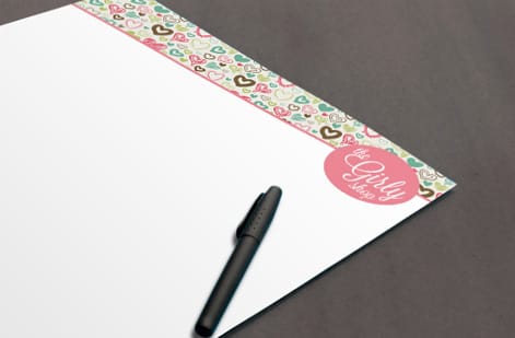
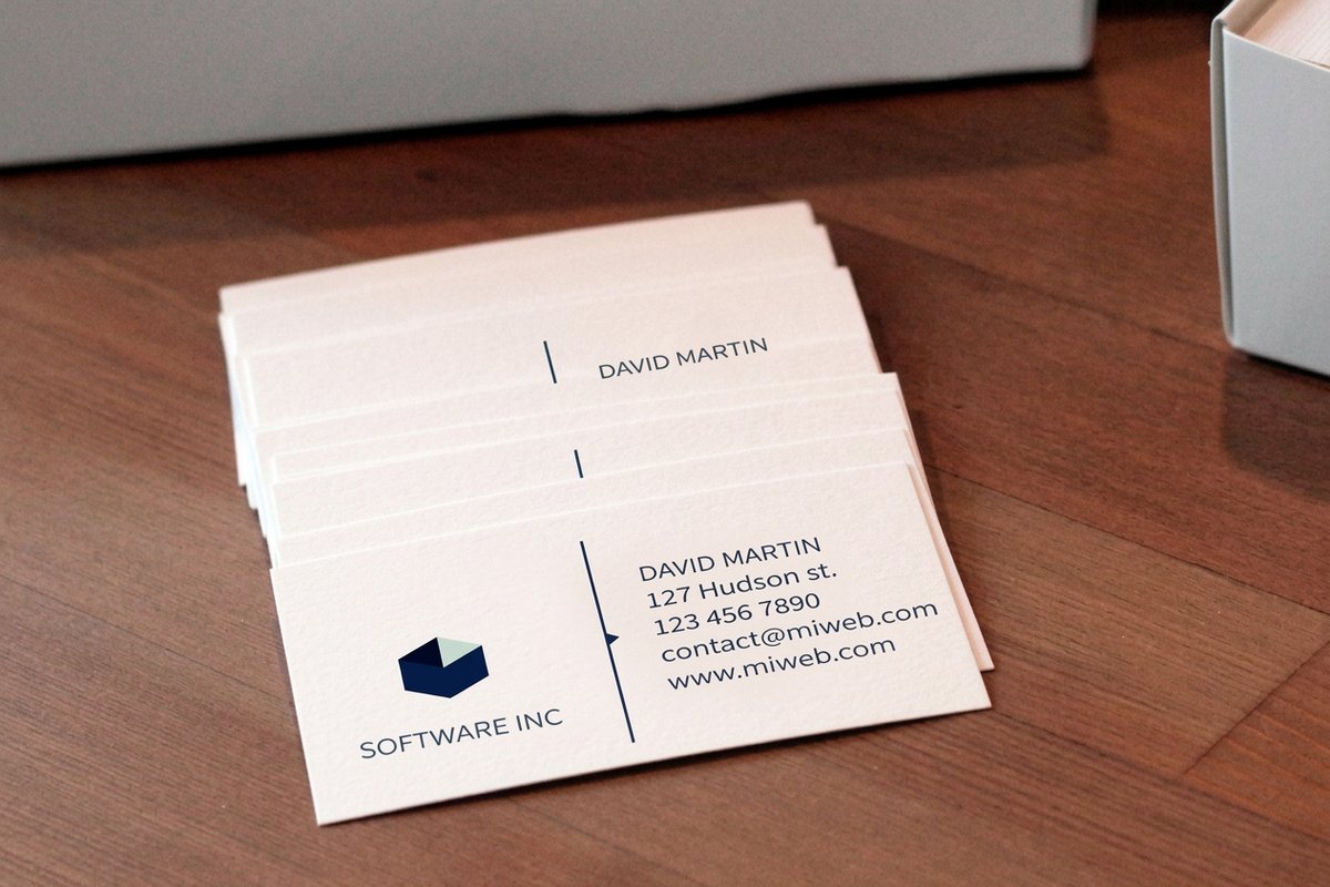
The moment of truth for any logo font is seeing it printed, and that is where the right choice pays off. A well-chosen typeface, set at the right weight and tested at small size, lands crisp and confident on the pieces clients actually hold.
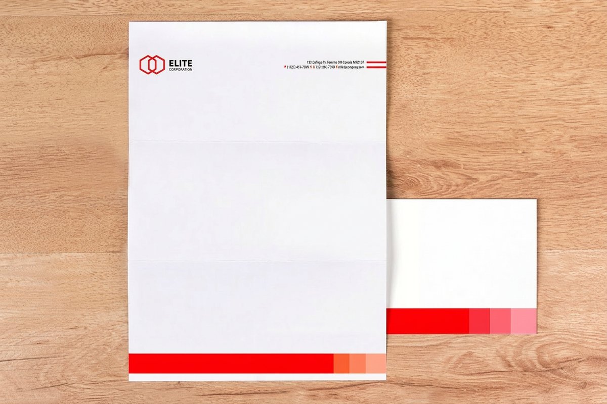
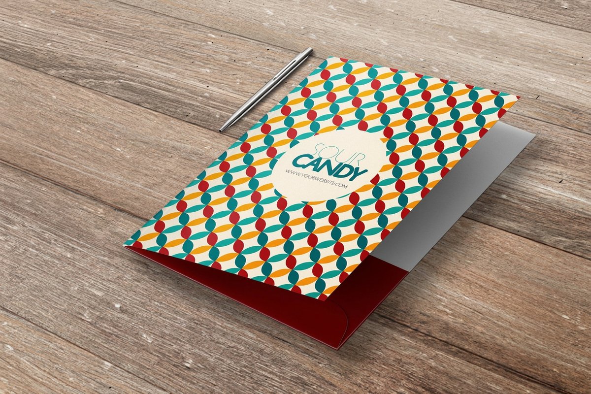
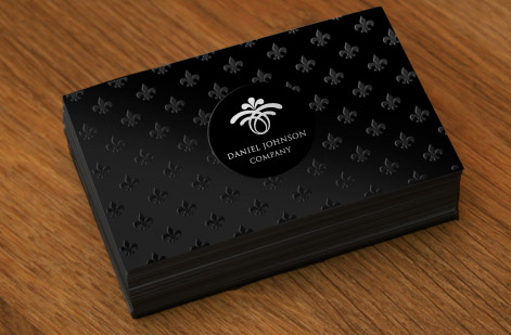
Start with a business card, since it is the smallest, most demanding surface and the fastest way to confirm your font reads clean. From there, carry the same logo onto letterhead and presentation folders so the whole brand stays consistent. Finishes like foil and embossing can make a strong logo font feel unmistakably premium.
Use the live specs and pricing panel below to choose the stock and finish, and watch the price update as you go. Order a proof first to see your logo font on real paper, then print the full set once it reads exactly the way you want.
Wally reads the font before the name
Pick the feel, then prove it at card size
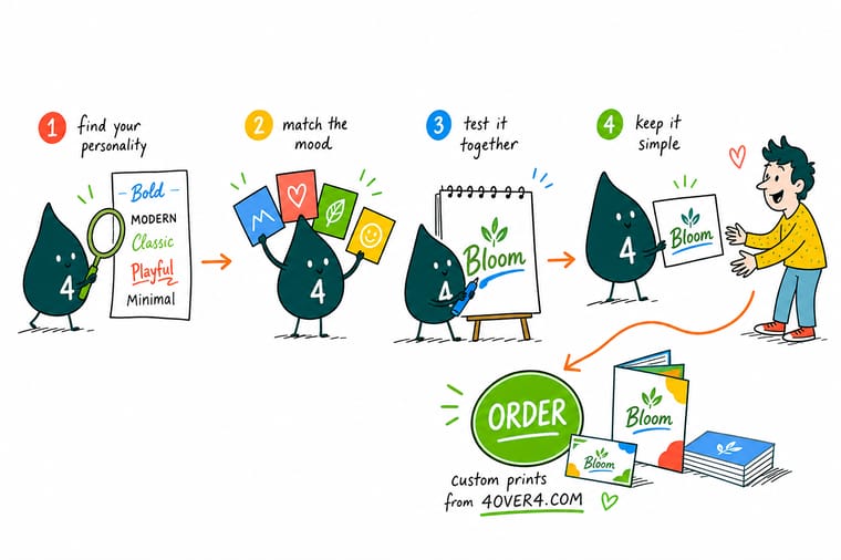
Wally chooses a logo font the way a client sees it: feel first. Serif for trusted, sans-serif for modern, script for elegant, display for bold, then he tunes the weight and meets the industry norms. His last move is the honest one, shrink it to card size and print a proof. If every letter reads crisp in hand, 4OVER4 rolls the logo out across cards, letterhead, and folders.
Print your logo on a card →Quick reference
The logo font decisions, at a glance
A fast map from each type family and choice to the brand feel it carries, so you can pick with intent rather than by instinct alone.
| Choice | Feels like | Best for |
|---|---|---|
| Serif | Trusted, classic, established | The small strokes at letter ends feel traditional and credible. Strong for law, finance, and heritage brands. |
| Sans-serif | Modern, clean, approachable | No end strokes, so it reads crisp and current. The default for tech, startups, and minimal brands. |
| Script | Elegant, personal, expressive | Flowing, handwritten shapes feel warm and premium. Suited to beauty, weddings, and boutique labels. |
| Display | Bold, loud, high-impact | Distinctive, heavy, characterful type made to grab attention. Great for entertainment, sports, and youth brands. |
| Weight | Bold for strength, light for refinement | The thickness of the strokes shifts the mood from confident and grounded to delicate and upscale. |
| Pairing | One expressive plus one plain | Combine a characterful font with a simple, neutral second font so they contrast instead of competing. |
Step by step
Choose and print your logo font in 7 steps
- Name your brand personality Write down three words for how your brand should feel, such as trusted, modern, or playful. The font you choose has to deliver those words at a glance.
- Pick a type family that fits Match the feel to a family: serif for classic and credible, sans-serif for modern and clean, script for elegant and personal, display for bold and loud.
- Set the weight and style Choose a weight that matches the tone, bold for strength, light for refinement, and decide on any italics or caps that reinforce the personality.
- Check it against your industry Look at how respected brands in your field present themselves. Meet the norms to build trust, or break them deliberately to stand out, but do it on purpose.
- Pair a second font if needed If your logo needs a tagline or supporting text, pair the main font with a plain, neutral one so they contrast cleanly instead of clashing.
- Test it at small print size Shrink the logo to business-card scale and check every letter still reads. Thin strokes and tight details are where fonts fail in print.
- Print a proof and commit Order a card or run a sample so you can judge the font on real stock. Once it reads crisp in hand, lock it in across your brand.
Specs and pricing
Business card specs and live pricing
The card is the truest test of a logo font. Here are the live specs and price-per-order for business cards at 4OVER4.COM, straight from the configurator.
| Quantity | Price Per Unit | Total |
|---|---|---|
| 100 | 17.6¢ | $17.57 |
| 200 | 11.5¢ | $23.07 |
| 300 | 9.15¢ | $27.46 |
| 400 | 7.96¢ | $31.86 |
| 500 | 7.25¢ | $36.26 |
| 600 | 6.77¢ | $40.64 |
| 700 | 6.43¢ | $45.04 |
| 800 | 6.18¢ | $49.43 |
Print it
Print your logo across the brand
See it in use
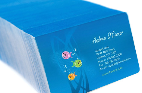
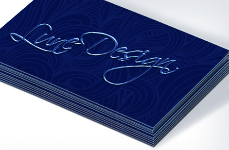
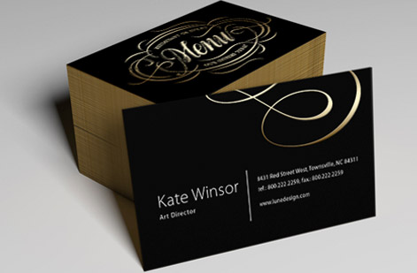
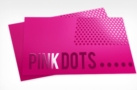
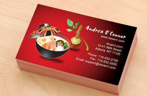
Real logo typography, printed in-house
Explore more
Where to go next


By the numbers
Brand printing you can count on at 4OVER4
Common Questions
Common questions about choosing a logo font
What are the basic font types and their brand associations?
There are four families to know. Serif fonts have small strokes at the ends of each letter and feel traditional, credible, and established, which is why law firms, banks, and heritage brands favor them. Sans-serif fonts drop those strokes for a clean, modern, approachable look, making them the default for tech and minimal brands. Script fonts mimic flowing handwriting and read elegant, personal, and premium, suiting beauty, weddings, and boutiques. Display fonts are bold, distinctive, and high-impact, built to grab attention for entertainment, sports, and youth-focused brands. Each family sends a signal before a single word is read.
How do font weight and style affect a logo?
Weight is the thickness of the strokes, and it changes the whole personality of a logo. A heavy bold weight feels confident, strong, and grounded, while a light or thin weight feels refined, delicate, and premium. Style choices layer on top: italics add movement and energy, all caps add authority and structure, and lowercase feels friendlier and more relaxed. Two brands can use the exact same typeface and feel completely different simply because one chose a bold uppercase treatment and the other chose a light lowercase one. These small decisions are where a logo gets its specific character.
How do I choose a font for a logo that fits my industry?
Start by studying how respected brands in your field present themselves, because every industry carries visual expectations that signal trust. Finance and law lean toward serifs and restraint, tech leans toward clean sans-serifs, beauty and weddings lean toward scripts, and entertainment leans toward bold display type. You have two valid moves: meet those norms to feel instantly credible and at home in your category, or break them deliberately to stand out, provided the break is intentional and still legible. What you want to avoid is accidentally sending the wrong signal, like a heavy novelty font on a wealth-management brand.
How do I combine or pair fonts in a logo?
The safest rule is to pair one expressive font with one plain one so they contrast rather than compete. If your main logo font is a characterful script or display face, set any tagline or supporting text in a simple, neutral sans-serif. If your main font is already clean, you have more room to add a slightly more distinctive companion. The goal is a clear hierarchy: one font leads and carries the personality, the other supports and stays out of its way. Two strong, competing fonts in the same logo almost always look busy and unresolved.
Why does a logo font need to be tested in print?
A logo lives at many sizes, and the smallest, most demanding one is usually print: a business card, a letterhead footer, or an embossed mark. A font with thin strokes or intricate details can look elegant on a large screen and then turn muddy or break up when it is printed small on paper. Testing in print catches this before it becomes a costly problem. The reliable habit is to shrink the logo to card scale, order a proof or a sample, and confirm every letter still reads crisply on the actual stock. If it holds up small and printed, it will hold up everywhere.
What does it cost to print business cards and stationery with my logo, and how are prices set?
Pricing scales with quantity, size, paper stock, and finish. A standard run of business cards on a normal stock is the most affordable option, while a heavier stock, a foil-stamped logo, or an embossed finish raises the price and the perceived quality. Letterhead and folders are configured separately with the same levers. You set each option and the price updates live, so you can see exactly how a premium stock or a special finish changes the number. Printing a proof first is a small cost that confirms your chosen logo font reads sharp before you commit to a full run.
Get Started
Ready to see your logo font printed sharp?
Choose the stock and finish at 4OVER4.COM and watch the price update live. Order a proof to judge your logo font on real paper, then print cards, letterhead, and folders that all match.
Legal Disclaimer
Gold Standard guarantees apply to all standard orders placed through 4over4.com. Price match requires verifiable proof of a competitor's published price for an equivalent product with matching specifications and turnaround time. Satisfaction guarantee covers manufacturing defects and print quality issues. Contact support with order number and documentation. On-time delivery rate based on tracked orders 1999 to 2026. Individual results may vary based on shipping carrier performance.
