
Embossed Vs Debossed Explained Raised And Recessed Print


Embossing and debossing both press texture into paper, but in opposite directions. Here is how raised and recessed finishes look, feel, and photograph, plus which stocks and projects suit each.
Debossed means the design is pressed down into a recessed impression, while embossed means it is pressed up into a raised relief. Both come from the same process, a metal die pressed into the sheet under heat and pressure, so both are finishes you feel before you read them. Debossing creates a clean sunken imprint that feels understated and modern, and it leaves the surface flat, so cards and folders stack without rocking. Embossing catches light and draws a finger to a raised logo, throwing a highlight across the face of the mark and a shadow beside it. Neither one needs ink: left blind, the impression alone carries the design, and you can also add color or foil into the recess or onto the relief when you want more contrast. Both need a heavier stock to hold the shape, since a thin sheet flattens back out under the die or shows the impression through the reverse, and the right choice depends on the look and feel you want.
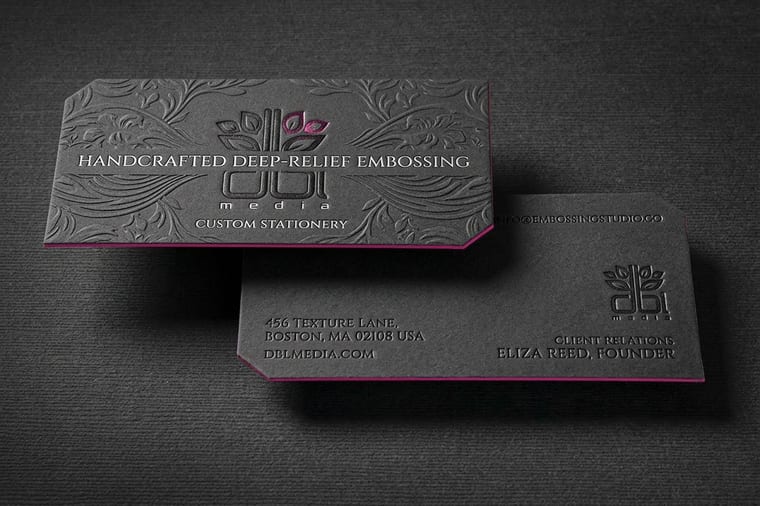
Embossed: the raised, tactile finish
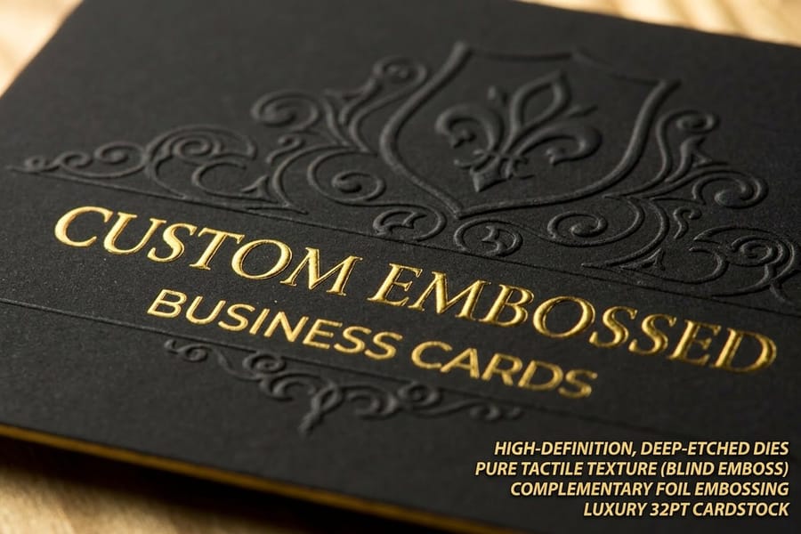
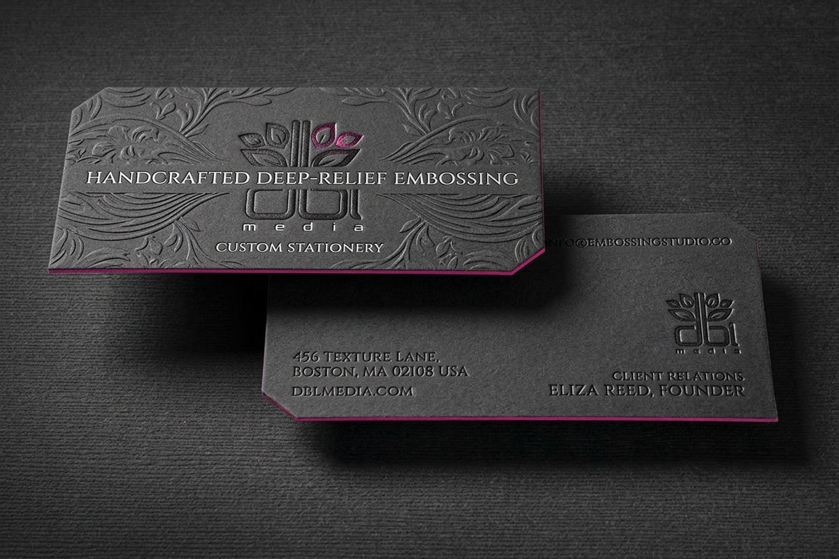
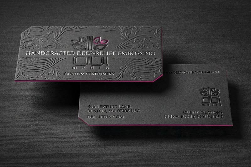
Embossing presses your design up off the surface of the paper into a raised relief. Run a finger across an embossed logo and you feel it stand proud of the sheet, and tilt the card and you watch light and shadow play across the raised shape. That physical and visual presence is why embossing reads instantly as crafted and premium, a finish you notice with your hands before your eyes even focus on it.
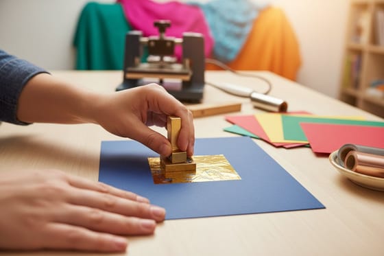
Because the effect is the texture itself, embossing does not need ink, and a blind emboss with no color at all can be strikingly elegant, letting the raised shape catch the light alone. You can also combine it with ink or foil for extra contrast, which is where a raised foil logo gets its rich, catch-the-light quality. Embossing suits logos, monograms, and short type on premium pieces meant to feel luxurious, and our embossed business cards are the classic showcase for it.
Debossed: the recessed, understated finish
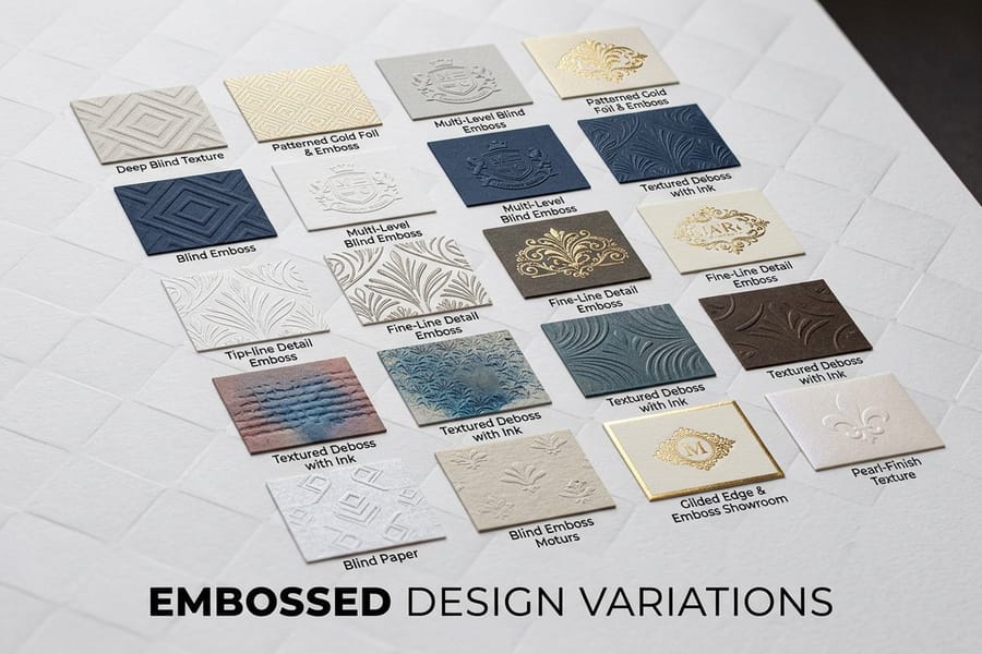
Debossing does the opposite of embossing: it presses your design down into the paper, leaving a clean, recessed impression. Where embossing reaches up toward you, debossing sinks in, creating a subtle sunken mark that feels modern, quiet, and confident. It is the finish for brands that want to signal quality without shouting, a mark you discover by touch rather than one that announces itself across a room.
Because the impression is recessed, debossing photographs and feels calmer than embossing, catching less light and reading as understated. Like embossing it can be blind for a tonal, texture-only effect, or filled with ink or foil so the sunken shape carries color. Debossing works beautifully on thick, soft cover stocks where the impression sits deep and clean, and it suits presentation folders, invitations, and cards for brands with a minimal, refined identity. Both finishes live in our embossing collection.
How to choose between them

The choice comes down to the impression you want to leave, literally and figuratively. Reach for embossing when you want the mark to feel bold, luxurious, and tactile, drawing a finger and the eye to a raised logo, which suits high-end and traditional brands. Reach for debossing when you want a clean, modern, restrained mark that rewards a closer look, which suits minimal and contemporary identities. Neither is better; they simply say different things.
Two practical factors apply to both. First, stock: a heavier cover stock takes and holds either impression cleanly, while a thin sheet flattens the effect or shows it through the back. Second, artwork: bold, simple logos, monograms, and type press far better than fine lines or small detail, which can get lost or crush. Whichever you choose, order a sample to feel the finish on the real stock, since these are tactile effects that a screen cannot convey. Consider our embossed presentation folders and embossed invitations for larger canvases.
Combining with foil, ink, and stock
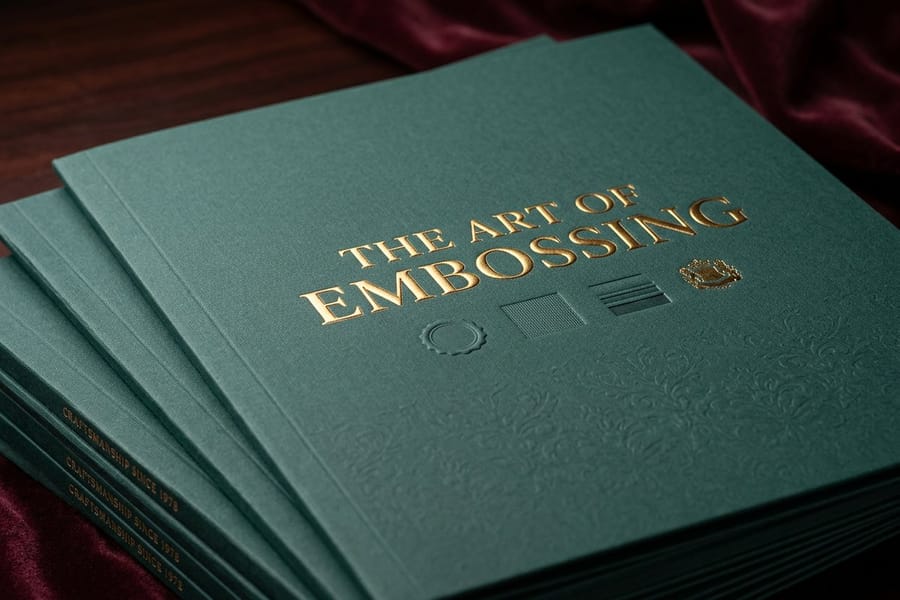
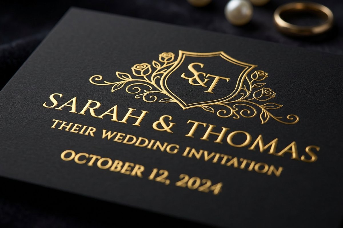
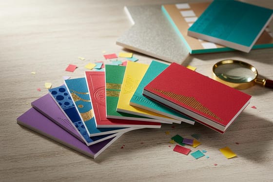
Embossing and debossing are often at their best in combination. Pair either finish with foil and the raised or recessed shape carries a metallic shine that shifts as the piece moves, which is how the most memorable business cards get their high-end look. Fill an impression with ink and the shape carries brand color while keeping its texture. Or leave it blind, no color at all, for the most understated, tonal effect that relies purely on light and touch.
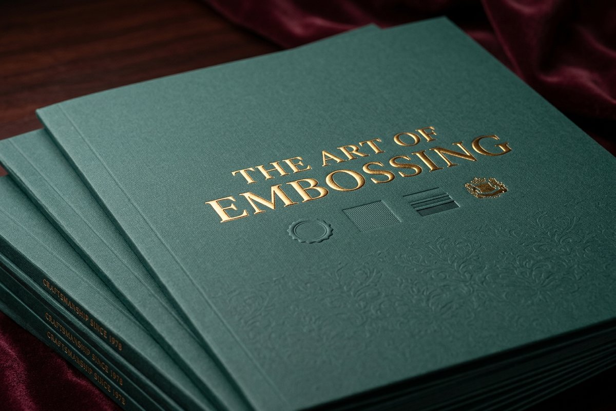
Stock ties it all together. The heavier and softer the cover stock, the deeper and cleaner the impression, so premium projects lean into thick stocks that show these finishes off. For the file, keep the embossed or debossed element as a clean vector, avoid fine detail that will not press well, and consider how any added foil or ink registers to the impression. When you are ready, use the live specs and pricing panel below to configure your product and finish, and order a sample to feel it before the full run. Our guide on foil stamping covers the foil side in depth.
Wally presses it up or down on purpose
Raised for bold, recessed for quiet, heavy stock for both
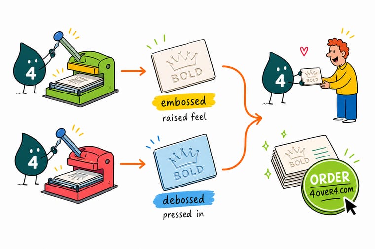
Wally knows the trick is direction: embossing lifts the logo up so it catches light and a fingertip, debossing sinks it in for a clean, modern, quiet mark. Both want a heavy cover stock and a bold, simple shape, and both can go blind or carry foil. Feel a sample first, since a screen cannot show texture, and 4OVER4 presses it exactly the way you want.
Order embossed cards →Quick reference
The key details, at a glance
| Detail | What to know | Why it matters |
|---|---|---|
| Embossed | Raised relief | Design pressed up off the surface, catching light and touch. |
| Debossed | Recessed impression | Design pressed down into the paper for a clean sunken mark. |
| Feel | Tactile, ink-optional | Both create texture you can feel, with or without color or foil. |
| Light | Highlight vs quiet | Embossing plays with light; debossing reads calm and subtle. |
| Stock | Heavy cover stock | A thick stock takes and holds the impression cleanly. |
| Artwork | Bold, simple shapes | Clean logos and type emboss better than fine detail. |
| Best for | Logos, monograms, type | Marks and lettering are the classic use for both finishes. |
Step by step
How to do it in 7 steps
- Understand the two directionsEmbossed pushes the design up into a raised relief, debossed presses it down into a recessed impression, opposite effects from the same idea.
- Decide the feel you wantChoose raised embossing for a luxury, crafted feel that catches light, or debossing for a clean, quiet, modern imprint.
- Pick the element to treatSelect a logo, monogram, or short piece of type, since bold, simple shapes hold the impression best.
- Choose a heavier stockSelect a thick cover stock that takes and keeps the impression, since thin sheets flatten or show through.
- Consider adding foil or inkDecide whether to combine the finish with color or foil for extra contrast, or leave it blind for a subtle, tonal effect.
- Set up clean artworkKeep the embossed or debossed element as a clean vector and avoid fine detail that will not press cleanly.
- Order and feel a sampleConfigure your product with the finish, order a sample to feel the impression, then run the full order.
Specs and pricing
Live specs and pricing
Once your design is ready, the print decisions come down to size, stock, and finish. Here are the live specs and price per unit at 4OVER4.COM, straight from the configurator.
| Quantity | Price Per Unit | Total |
|---|---|---|
| 250 | $1.01 | $251.36 |
| 500 | 65.4¢ | $327.15 |
| 1,000 | 37.8¢ | $377.68 |
| 2,000 | 36.6¢ | $731.35 |
Order it
Bring your project to 4OVER4
Explore more
Where to go next


By the numbers
Printing you can count on at 4OVER4
Common Questions
Common questions
What is the difference between embossed and debossed?
Embossed and debossed are opposite finishes made the same way, by pressing a die into paper. Embossing raises the design up off the surface into a relief you can feel and see catch the light, while debossing presses the design down into the paper for a clean, recessed impression. Neither requires ink, since the effect is the texture itself, though both can be combined with color or foil. Embossing reads as crafted and luxurious, debossing as understated and modern.
How do I choose between embossed and debossed?
Choose by the impression you want to leave. Embossing is bold and tactile, drawing a finger and the eye to a raised logo, which suits luxury brands and pieces meant to feel premium in the hand. Debossing is quieter, creating a clean sunken mark that feels modern and restrained. Also consider the stock and the element, since both finishes want a heavier cover stock and a bold, simple logo, monogram, or piece of type rather than fine detail that will not press cleanly.
What do embossed and debossed finishes cost and how are prices set?
Both are specialty finishes priced on top of the base product, and the cost scales with the product, the stock, whether you add foil or ink, and the quantity. A heavier stock and a foil combination cost more than a simple blind impression, while a larger run lowers the unit price. You set the options in the 4OVER4 configurator and the total updates live, so you can compare an embossed card against a debossed one before committing.
What stocks and products work best for embossing and debossing?
Both finishes want a heavier cover stock, because a thick sheet takes and holds the impression cleanly while a thin one flattens or shows the shape through the back. Classic products include business cards, presentation folders, wedding invitations, and greeting cards, where a raised or recessed logo or monogram adds a tactile mark of quality. Order free samples to feel the impression on the real stock before you commit to a full run.
How long do embossed or debossed products take to print and ship?
Turnaround depends on the product, the stock, whether foil or ink is added, and the quantity, and the product page shows the current production time for your configuration. Specialty finishes can add a little time over standard printing. You can add expedited shipping to meet a deadline, and ordering a sample first to confirm the impression avoids a reprint on a large run.
Get Started
Ready to get it printed right the first time?
Set your options below and watch the price update live as you choose size, stock, and quantity, then place your order with 4OVER4.COM.
Legal Disclaimer
Gold Standard guarantees apply to all standard orders placed through 4over4.com. Price match requires verifiable proof of a competitor's published price for an equivalent product with matching specifications and turnaround time. Satisfaction guarantee covers manufacturing defects and print quality issues. Contact support with order number and documentation. On-time delivery rate based on tracked orders 1999 to 2026. Individual results may vary based on shipping carrier performance.
