
Business Card Content to Include in 2026


Business card content that makes the right first impression
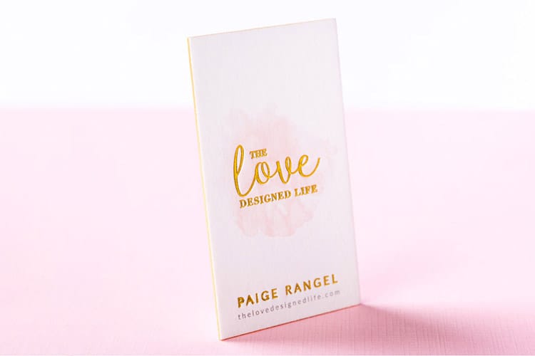
A business card content guide comes down to one decision, what earns a spot on a 3.5 by 2 inch card and what does not. 4OVER4.COM has printed 10 billion cards for more than 150,000 businesses since 1999, and the most common mistake we see is cramming too much onto that small space. The right details, placed well, turn a small card into a real networking tool.
Think about the last card someone handed you. Did you glance at it and instantly know what the person does, or did you squint at tiny text wedged between three phone numbers and a paragraph long tagline? That gap is the difference between a card with purpose and a card with clutter. Your card is often the first physical thing a prospect holds from your brand, so it shapes their impression before you ever follow up.
The must-have elements on every business card
Business card content splits into two buckets, the information people need and the information that builds trust. You want both without letting either overwhelm the card. Your name should be the largest text after your company name, with your job title right below it. Keep the title clear, since Marketing Director works and Chief Visionary Happiness Officer does not.
Here is the whole checklist in one place. Required on every card: your full name, your job title, your company name, your logo, one phone number, one email address, and your website. Optional, and only when it earns the space: one social handle, a QR code, a single line describing what you do, and a street address, which belongs on the card only if customers actually come to you. Eleven items look like a lot until you remember the card is 3.5 by 2 inches, which is why the optional half is where you cut first.
Your logo anchors the card, so keep it clean, high resolution, and sized to share space with your details rather than swallow them. A good rule is to let the logo take up no more than a quarter of the front. Then give people one phone number and one email address. Listing your cell, office line, fax, and two inboxes only creates decision fatigue, so pick the number you actually answer and the email you actually check.
Website, social, and when to add your address
Your website belongs on every card, and you can drop the http and www to save space so the URL reads clean. For social, pick one or two platforms where you are genuinely active. A real estate agent might list Instagram and LinkedIn, while a B2B consultant usually needs LinkedIn alone. Five icons nobody follows only add noise to a small surface.
A physical address earns its place only when clients actually visit you. If you run a storefront, salon, or office, include it. If you work from home or fully remote, skip it or list a city and state like Austin, TX so people know your general area without a full street address. Every element on the card should earn its spot, and white space is what keeps the important parts readable.
Start here
Standard business cards, ready to brand
Preset sizes and stocks, the fastest way to put clean content on a card.
Optional content that sets your card apart
Once the essentials are covered, you have room for elements that make a card memorable. None of these are required, but the right one turns a card someone pockets into a card someone keeps. For layout ideas that balance text with white space, browse the 4OVER4.COM Design Templates built for every field.
- A tagline or value proposition. Keep it under 8 words and say what you do or stand for. Making homes beautiful since 2010 works for an interior designer, and Your partner in digital growth works for an agency. Skip vague lines like excellence in everything, which say nothing.
- A QR code. A small code on the back can link to your portfolio, booking page, or a special landing page. Pair it with a short reason to scan, like Scan to book a free consultation, so people know why to pull out their phone.
- Certifications or credentials. If you are a CPA, licensed contractor, or board-certified physician, add the abbreviation after your name. Jane Smith, CPA reads as instant credibility and takes up almost no room.
How to describe yourself on a business card
This is where people overthink it. Your card is not a resume or a bio page. It is a quick-reference tool that answers one question, who is this and how do I reach them. Lead with what you do rather than who you are, since Graphic Designer tells someone what to hire you for and Creative Thinker does not.
If your role spans several areas, pick the one that generates the most business. Someone who does web design, SEO, and copywriting can go with Digital Marketing Consultant to cover all three without listing each. Keep the full service menu off the front, since a clean front with your name, title, contact, and logo reads far better than visual noise. 4OVER4.COM prints double-sided on Artist Business Cards and standard products, so use that second side for a short list of your core services.
Quantity and price
Standard card pricing and specs
Real configurator numbers, where the more you order the lower the per-card cost drops.
| Quantity | Price Per Unit | Total |
|---|---|---|
| 100 | 17.6¢ | $17.57 |
| 200 | 11.5¢ | $23.07 |
| 300 | 9.15¢ | $27.46 |
| 400 | 7.96¢ | $31.86 |
| 500 | 7.25¢ | $36.26 |
| 600 | 6.77¢ | $40.64 |
Colors, fonts, and design choices that communicate your brand
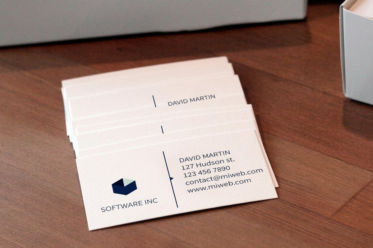
Your card content is not only words. The colors, fonts, paper stock, and finish communicate as much as the text. Red signals energy and passion, which suits food, entertainment, and fitness. Blue reads as trust and calm, which is why finance, healthcare, and tech lean on it. Black feels luxurious and authoritative, so Black Business Cards deliver that bold, high-contrast look. Green connects to wellness and growth, and gold or metallic accents add a premium feel. Pick two or three colors that match your existing palette.
Stick to one or two fonts. A sans-serif like Helvetica or Montserrat reads clean and modern, while a serif like Garamond feels traditional and established. Pairing a serif name with sans-serif details creates hierarchy without chaos. Keep body text at 8pt and your name at 10 to 12pt so it stays legible in dim networking rooms. The stock matters just as much, since a thick, textured card says you invest in quality, and options like 30Mil Clear Plastic Cards make an unforgettable impression.
Common mistakes that weaken your business card content
Knowing what to include is half the battle, and knowing what to avoid is the other half. These are the slips 4OVER4.COM sees most often when customers upload a first draft. The Online Designer even flags low-resolution images before you go to print, which saves an expensive reprint.
- Too much information. If the card looks like a miniature flyer, you have gone too far. Cut the second phone number, move the mission statement to your website, and put any long service list on the back or drop it. White space is what makes the important content readable.
- Low-resolution logos. A pixelated logo is worse than no logo. Keep your logo at 300 DPI at print size, and use vector files (AI, EPS, SVG) so it scales without going blurry.
- No clear hierarchy. When everything is the same size, nothing stands out. Name first, title and company next, contact details smaller but still legible, so the eye moves down the card naturally.
- A personal email for business. John Smith, CEO followed by johnnyboy92 at a free mailbox undercuts the whole card. If you are printing cards, use a domain-based email.
And here is what to leave off, because every line you cut buys white space for the lines that matter.
- Your full service menu. A card is 3.5 by 2 inches, not a brochure. Name the one thing you want to be called about and let your website carry the rest.
- A second phone number. Two numbers make the reader choose, and a reader who has to choose does neither. Print the line you answer.
- Type below 7pt. Body text belongs at 8pt and your name at 10 to 12pt. Anything under 7pt disappears in a dim networking room and can close up on press.
- Stock clip art. A generic handshake or swoosh reads as a template you bought. Use your own logo, or use nothing and let the type carry the card.
- A second email address. One inbox you check beats two you split, and the extra line only crowds the card.
Compare formats
Popular business cards, side by side
Stock, finish, quantity, turnaround, and from-price across our most-ordered cards.
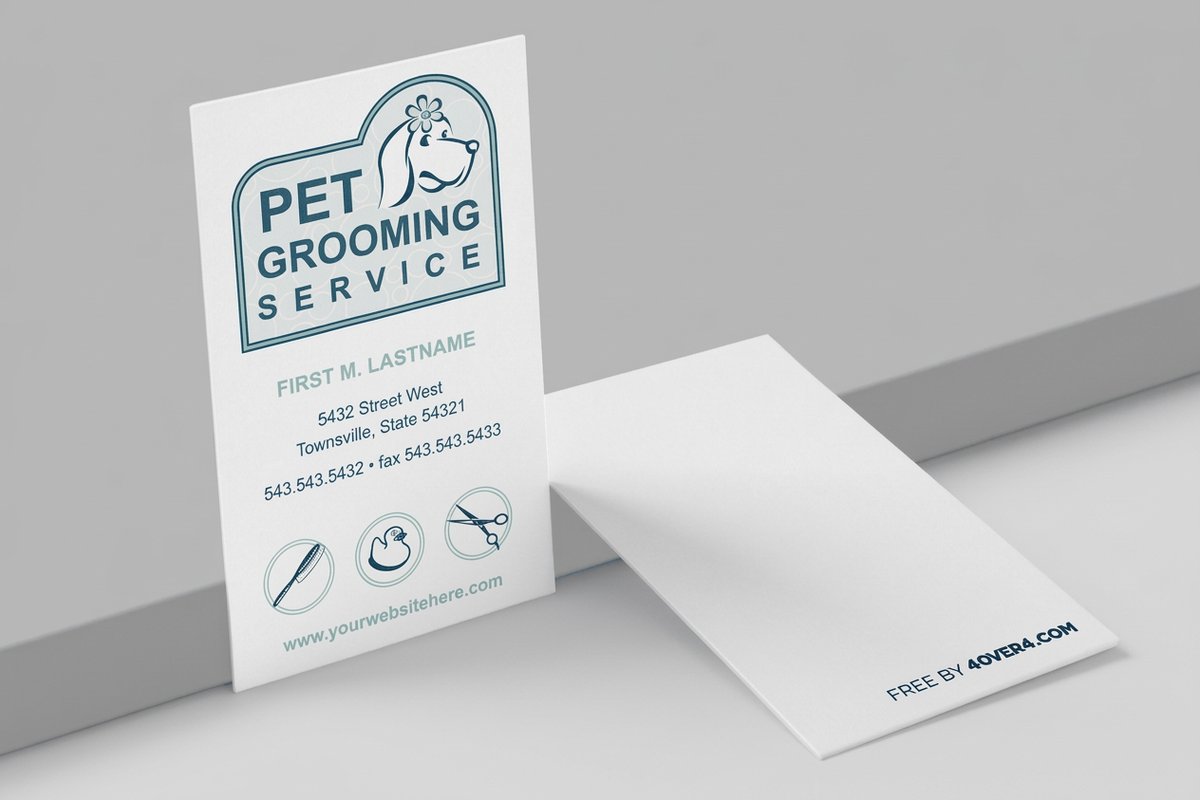 free business cards | Standard Business Cards |  3D Lenticular Business Cards | 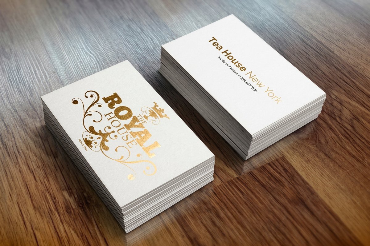 Metallic Foil Business Cards | |
|---|---|---|---|---|
| Min price | Free | $17.57 | $690.88 | $222.13 |
| Paper / stock | 14pt Gloss Cover | 14pt Gloss Cover | 31pt Lenticular Lens | 16 Point Silk Laminated |
| Finish | - | Standard Finish | - | - |
| Size | 2" x 3.5" | 2" x 3.5" | 2" x 3.5" - Vertical | 2" x 3.5" |
| Default qty | 200 | 100 | 500 | 500 |
| Turnaround | 5 business days | 3 business days | 22 business days | 7 business days |
| Rating | ||||
| View & customize | View & customize | View & customize | View & customize |
Industry-specific business card content tips
Different fields have different priorities, so tailor the content to your audience. For promotional branding beyond cards, explore these Logo Sticker Design Ideas that complement a small business card strategy.
- Real estate agents. Include a headshot, brokerage name, license number where your state requires it, and your primary service area. A QR code to your current listings is a smart add. Skip the generic Your Dream Home Awaits line every agent already uses.
- Creative professionals. Let the card itself show your style through a unique shape, bold palette, or unusual finish. Keep text minimal, name, title, website, and email, and let your portfolio do the heavy lifting.
- Healthcare providers. Credentials after your name are non-negotiable. Add your practice name, specialty, office address, and phone, then keep the design calm and clean with blues, greens, and whites that reinforce trust.
- Small business owners. Your card has to say what the business does in under three seconds. A clear tagline, your logo, and a website URL are the essentials, and a QR code to your shop helps if you sell products.
Start fast
Templates and print-ready blanks
Card templates and exact-size blanks so your content lands inside the cut line.





Grab ready blanks for 3D Lenticular Business Cards or Black Business Cards to start with exact cut lines.
Front vs back, how to split your business card content
A double-sided card gives you twice the real estate, so use it on purpose. The front holds your name, title, company and logo, phone, email, and website, and nothing more. That keeps it clean and scannable.
The back is your flex space. Options include a short list of services, a QR code, a tagline, a map to your location, social handles, or a special offer. It can also be a design statement, since a bold color, a full-bleed image, or an interesting pattern makes the card feel premium and gives people a reason to flip it over.
Choosing the right card format for your content
Not every card is the same size or shape, and the format decides how much content fits and how it gets arranged.
- Standard, 3.5 by 2 inches. The classic that fits any wallet and cardholder, best for straightforward professional cards.
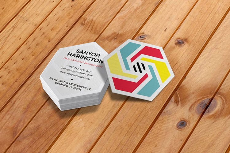
- Square, 2.5 by 2.5 inches. Stands out in a stack of standard cards and suits creative brands with square logos.
- Oversized or folded. More room for a mini menu, price list, or appointment calendar when you truly need it.
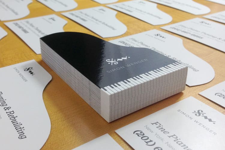
- Die-cut custom shapes. Maximum impact, where a guitar shape for a music teacher or a house shape for a realtor becomes part of the brand.
Before you commit to a format, order Free Samples from 4OVER4.COM to feel the paper stocks and see the print quality in person. Holding the real product beats guessing every time.
Wally keeps your card clean and readable
One name, one number, one email, and room to breathe
A great business card says one thing fast, who you are and how to reach you. Keep your name the biggest text, give people one phone and one email, and save the services list and QR code for the back. Pick a stock that feels like quality, proofread twice, and 4OVER4.COM prints it sharp.
Configure standard cards →What to remember about business card content
Freelancer and entrepreneur checklist
- Concise contact information. Display your address, email, and phone clearly in a professional typeface and a readable size so people can reach you without effort.
- Highlight what you do. Say what sets you apart, whether that is social media management, graphic design, or another niche, and the value you bring to clients.
- Showcase your portfolio. If space allows, add a link to your online portfolio so prospects can explore your work and build trust on their own.
- Use color and design wisely. Match colors to your brand and keep the layout clean with real white space instead of overcrowding the card.
- Invite further engagement. Point people to LinkedIn or another active platform so the relationship keeps going after the handoff.
Explore more
More ways to design and print your cards
Every related page type on 4OVER4.COM, one card each, so you can keep exploring business card printing.
 Shop Business Cards Printing Browse every business card format in one place.
  Product Standard Business Cards The workhorse card in preset sizes and stocks.
 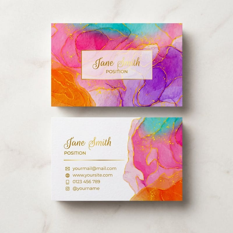 Product Artist Business Cards Double-sided cards with room for your work.
 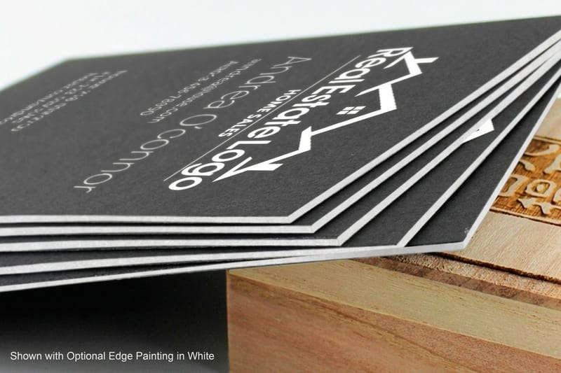 Product Black Business Cards Bold, high-contrast cards that feel premium.
  Product 30Mil Clear Plastic Cards An unforgettable see-through card for trade shows.
  Article Logo Sticker Design Ideas Branding that complements your card strategy. Samples Free Samples Feel the stocks and finishes before you commit.
  Templates Blank Templates Print-ready blanks sized to exact card specs.
 Ready to build a card worth keeping?
Keep the front clean, put the extras on the back, pick a stock that feels like quality, and 4OVER4.COM prints it sharp, as fast as same day.
Business card content questions, answered
What are the best practices for business card content?
Keep the card focused on essentials, your name, title, one phone number, one email, website, and logo. Use the back for secondary content like a services list or a QR code, and keep a clear hierarchy so the eye moves from your name to your contact details. Proofread everything before printing. Read more in our Printing Articles library.
How do I choose the right business card content?
Start with your industry and audience. A corporate professional needs credentials and a direct phone line, while a creative freelancer needs a portfolio link and minimal text. Ask what the recipient needs to know in three seconds, and that becomes your front-side content. Everything else goes on the back or gets cut.
What makes business card content effective for marketing?
Effective cards focus on clarity and one clear action. Add a specific prompt like Scan for a free quote with a QR code, or Book at janedoe.com. Pair strong content with premium materials, since 30Mil White Plastic Cards feel high-end and get kept longer than standard paper, which extends your reach.
How much should I budget for business card content?
The content itself costs only your time. Printing varies by paper stock, finish, and quantity, from budget-friendly 14pt cards to premium 32pt ultra-thick stock. Most professionals spend between $30 and $80 for 250 to 500 cards, and thicker stock with a clean design pays back in stronger first impressions.
