
The Best Colors for Business Cards


What Color Actually Signals on a Business Card
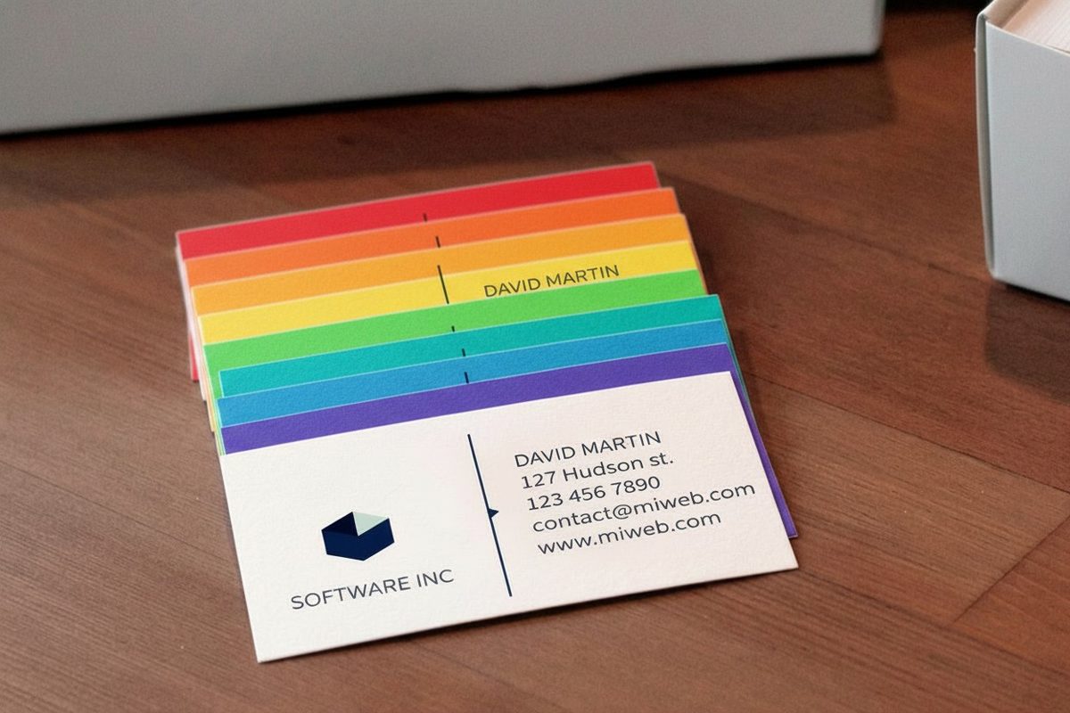
The best colors for a business card are the ones your field already trusts: navy and charcoal for finance and law, medical blue or sage for health, warm terracotta and mustard for food, muted blush for beauty, and black with one bright accent for creative work. A card is handed over in the two or three seconds before anyone reads a word on it, and in that gap color is doing the talking. It sets the mood, hints at the price bracket, and tells the person whether you are steady, creative, premium, or fun. Pick the palette on purpose and the card works for you before the conversation starts.
Color has three parts worth knowing. Hue is the color itself, red or blue or green. Value is how light or dark it runs, from a pale tint to a deep shade. Saturation is how pure or muted it is, a vivid teal against a dusty sage. Change any one of those and the same hue can feel bold, calm, cheap, or expensive.
Then there is the association we all carry. Blue reads as trust and stability, which is why so many business cards for banks and clinics lean on it. Green reads as growth and health. Black reads as luxury and authority. None of this is a rule you must obey, but it is the current you are swimming with or against, so it pays to know which way it runs.
Warm colors pull forward
Reds, oranges, and yellows feel energetic and close. They grab attention fast and suit brands that want to feel friendly, urgent, or appetizing. Used at full strength they can shout, so many designers dial the saturation back for a warmer, more grown up read.
Cool colors settle down
Blues, greens, and purples feel calm and professional. They recede a little, which reads as composure and control. This is the safe ground for anyone selling trust, from a law office to a software team.
Neutrals carry the weight
Black, white, gray, and cream are not the absence of color, they are the frame. A single accent against a deep neutral almost always looks more expensive than five colors fighting for space. When in doubt, subtract.
Color by industry, at a glance
| Industry | Lead color | Accent | Ground |
|---|---|---|---|
| Creative agencies and studios | One vivid accent on black | Electric coral, magenta or electric blue | Black or off white |
| Health, pharma and wellness | Medical blue or sage green | A darker neutral for the text | Generous white space |
| Hospitality and food | Terracotta, mustard or burgundy | An optional metallic | Black or deep forest green |
| Finance, law and professional services | Navy, charcoal or forest green | One restrained foil or spot detail | Ivory or gray |
| Online retail and ecommerce | Your exact brand colors | Whatever the site already uses | A stock that keeps them saturated |
| Salon, beauty and spa | Blush, nude, lavender or dusty teal | Rose gold or gold | Soft neutral or soft touch stock |
Shop the range
Business cards printing
Every stock, finish, and format, so your palette lands exactly as designed.
Creative Agencies and Studios
A creative studio has permission the rest of us do not. The card is a portfolio piece, so it can take a risk that a bank never could. Bold, unexpected pairings signal confidence and taste, and a card that plays it too safe can quietly undersell the work.
Reach for a saturated color the field does not expect, an electric coral, a deep chartreuse, a hot magenta, then ground it with a heavy neutral so it reads as intentional rather than loud. The feeling you want is fresh and self assured. To see how the palette behaves on different surfaces, compare a few finishes below and pick the one that flatters your brightest ink.
- Recommended palette. One vivid accent (coral, electric blue, or magenta) on a black or off white ground.
- Why it works. The contrast reads as design skill, and the restraint around it keeps the card from looking chaotic.
- The feeling. Confident, modern, and clearly run by people who think about how things look.
If you want the color to feel like a material and not just ink, transparent stock is a strong move. See how a bright accent floats on Clear Business Cards, or how it snaps against solid dark stock instead.
Print picks
Three business card formats that flatter color
Live prices, ready to customize with your palette and logo.
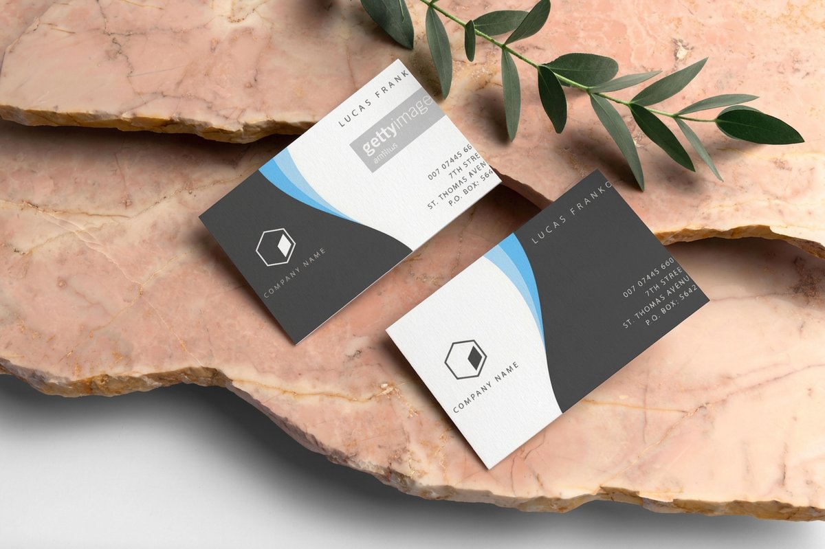 Classic Business Cards From $17.57 Full color on a clean everyday stock, the safest home for any palette you choose.
 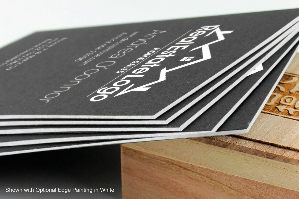 Black Business Cards From $40.62 Ink laid on solid black stock, where bright accents and foil read loudest.
  Clear Business Cards From $125.22 Transparent plastic that turns white space into a color of its own.
 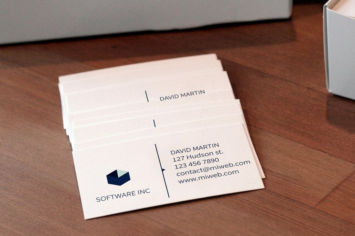 Standard Business Cards From $17.57 The everyday workhorse, 303 ordered and counting.
 Health, Pharma, and Wellness
Healthcare cards carry a quiet promise, that you are careful, clean, and safe to trust with a body. Color does a lot of that work. Blues and greens dominate the field for good reason, and going too far outside that lane can read as unserious in a setting where seriousness is the point.
A calm medical blue paired with plenty of white space reads as clinical and reassuring. A soft sage or eucalyptus green leans toward wellness, spa, and natural health. Both benefit from a clean, legible layout and a stock that stays crisp, so a smooth matte or a bright white gloss usually wins here.
- Recommended palette. Medical blue or sage green with generous white, plus a darker neutral for the text.
- Why it works. Cool tones read as calm and controlled, and white space signals cleanliness and care.
- The feeling. Trustworthy, hygienic, and steady, exactly what a patient wants to feel.
Because trust is the whole game, keep the color count low and the contrast high enough to read at arm's length. Anyone unsure how a screen color will shift on paper should read our guide to CMYK versus RGB before sending files.
Hospitality and Food
Restaurants, cafes, hotels, and caterers are selling an appetite and a mood. Warm colors do the heavy lifting because they read as inviting and, in the case of reds and oranges, genuinely appetizing. This is one of the few fields where a hot, saturated palette is the professional choice, not the risky one.
A deep terracotta, a warm mustard, or a rich burgundy signals comfort and quality. For a more upscale room, pair a warm accent with black or a deep forest green and add a metallic touch so the card feels like the place it represents. Texture matters here too, so a soft touch or a kraft stock can make a warm palette feel handmade.
- Recommended palette. A warm anchor (terracotta, mustard, burgundy) with a deep neutral and an optional metallic accent.
- Why it works. Warm tones read as welcoming and appetizing, and the neutral keeps it from feeling cheap.
- The feeling. Inviting, flavorful, and a little indulgent.
Warm accents look richest on dark stock, which is why Black Business Cards are a favorite for cafes and fine dining. If you want a foil edge to that warmth, browse the design templates and start from a layout built for it.
Finance, Law, and Professional Services
Money and legal advice run on trust, so these cards should feel solid before they feel stylish. Navy, deep charcoal, forest green, and burgundy are the workhorses. They read as established, discreet, and unlikely to gamble with your account, which is precisely the message.
The move here is restraint. One serious color, a clean neutral, and a legible typeface will beat anything flashy. If you want a signal of quality without a signal of extravagance, add a single foil or spot detail rather than a second bright color. See the real configurator numbers below before you decide how far to take the finish.
- Recommended palette. Navy, charcoal, or forest green with an ivory or gray neutral and a restrained accent.
- Why it works. Deep cool tones read as stable and established, and the discipline signals judgment.
- The feeling. Credible, discreet, and worth the fee.
For a card that has to look established from the first glance, Standard Business Cards on a heavier stock hold deep colors cleanly. Not sure a term on the order page? The glossary spells out stocks, coatings, and finishes in plain language.
Quantity and price
Business card pricing and specs
Real configurator numbers. The more you order, the lower the per-card cost drops.
| Quantity | Price Per Unit | Total |
|---|---|---|
| 100 | 17.6¢ | $17.57 |
| 200 | 11.5¢ | $23.07 |
| 300 | 9.15¢ | $27.46 |
| 400 | 7.96¢ | $31.86 |
| 500 | 7.25¢ | $36.26 |
| 600 | 6.77¢ | $40.64 |
Online Retail and Ecommerce
An online brand lives on a screen, so the card is one of the rare moments the brand becomes a physical thing you can hold. The color has one job, to match the site so exactly that the card feels like the store arrived in your hand. Consistency is the whole strategy.
Pull the palette straight from your brand colors and resist the urge to invent a new one for print. Bright, saturated brand colors that pop on screen can lose punch on standard paper, so a premium or specialty stock keeps them vivid. A transparent or high gloss finish can also recover the glow a matte stock would mute.
- Recommended palette. Your exact brand colors, matched to the site, on a stock that keeps them saturated.
- Why it works. A card that mirrors the store builds recognition and reads as one coherent brand.
- The feeling. Familiar, current, and joined up from screen to hand.
To keep a bright brand color from going dull on paper, a premium specialty stock is worth the step up. See how a saturated accent holds on clear plastic in the finish panel below, then request free samples to check the color in your own hands before a full run.
Premium finish
Clear business cards
Transparent plastic that keeps a bright brand color vivid and turns white space into a color of its own.
Salon, Beauty, and Spa
Beauty and grooming brands sell a feeling of care and a little escape, so the palette should feel considered and calm. Soft, muted tones do this well, a blush pink, a warm nude, a dusty lavender, or a muted teal, usually paired with a metallic for a hint of luxury.
Saturation is the dial that matters most here. Push these hues too bright and the card reads as a toy store, so keep them soft and let a rose gold or gold accent carry the shine. A soft touch stock adds a tactile note that fits the industry perfectly, since the whole business is about how things feel.
- Recommended palette. A muted pastel (blush, nude, lavender, or dusty teal) with a rose gold or gold metallic accent.
- Why it works. Low saturation reads as refined and calming, and the metallic adds quiet luxury.
- The feeling. Soft, indulgent, and self assured.
If you would rather build the palette on screen and see it live, the free online designer lets you set your exact colors and preview them before you order.
Build it on screen
Free online designer
Set your exact colors, drop in your logo, and preview the palette on the card before you order a single piece.
Color Combinations That Print Clean
Once you have a lead color, the pairing decides whether the card feels sharp or muddy. A few reliable structures keep you out of trouble. Complementary pairs (opposites like blue and orange) create the most contrast and pop. Analogous pairs (neighbors like blue and teal) feel calm and harmonious. And a single accent on a neutral almost never fails.
Two cautions carry over from screen to paper. First, contrast is legibility. Light gray text on white might look elegant on a monitor and vanish on a card, so keep text and background far apart in value. Second, print is CMYK, not RGB, so the most electric screen colors, certain neon greens and blues, cannot be reproduced exactly in standard process ink. If a specific brand color is non negotiable, ask about a spot color or check the color against a printed proof.
- Navy and warm gold. Deep, trustworthy, and quietly premium. A finance and law favorite.
- Charcoal and a single bright accent. Modern and confident, and the accent color does all the talking.
- Blush and rose gold. Soft, refined, and made for beauty and lifestyle brands.
Compare the popular business card options side by side to see how each palette behaves on different stocks and finishes before you commit.
The 12 best business card color combinations
Each pair below is named, shown as the two inks side by side with their hex codes, and captioned with who it suits. Take the hex values as a starting point and confirm the exact build against a printed proof before a long run.
Navy and warm gold
#16294A + #C8A24A
Finance, law and anyone who needs to look established before they look stylish.
Charcoal and electric coral
#33383D + #FF5A47
Design studios and agencies that want one loud note held inside a quiet frame.
Blush and rose gold
#E8C4C0 + #B76E79
Salons, spas and lifestyle brands where softness is the whole message.
Medical blue and white
#2A6FB0 + #FFFFFF
Clinics, dental practices and pharma, where clean reads as careful.
Sage green and cream
#9BB59A + #F4F1EA
Wellness, natural health and anything that wants to feel unhurried.
Terracotta and cream
#C05A3E + #F4F1EA
Cafes, bakeries and caterers going for warm rather than loud.
Burgundy and gold
#6E1F2B + #C8A24A
Fine dining, wine and hotels, where the card should feel like the room.
Forest green and ivory
#1F3D2E + #F2EDE3
Law firms, accountants and consultancies that want depth without navy.
Black and silver
#111111 + #C7CBD1
Luxury, tech and photography, where restraint is the flex.
Dusty lavender and charcoal
#B9A7C4 + #33383D
Therapists, coaches and boutique services that want calm with a spine.
Mustard and deep teal
#D9A521 + #134E4A
Food trucks, markets and independent retail that need to be seen at a distance.
Off white and near black
#F4F1EA + #0F1115
Architects, editors and anyone whose work should be the only color on the card.
Finish changes how every one of these lands. A soft touch business card mutes a bright pair into something quieter and more expensive, a silk laminated business card keeps deep colors even and stops fingerprints showing on a dark ground, and a spot UV business card puts gloss on one element so a single accent color catches the light while the rest stays flat.
Compare finishes
Popular business cards, side by side
Stock, finish, size, quantity, turnaround, and from-price across our most ordered business cards.
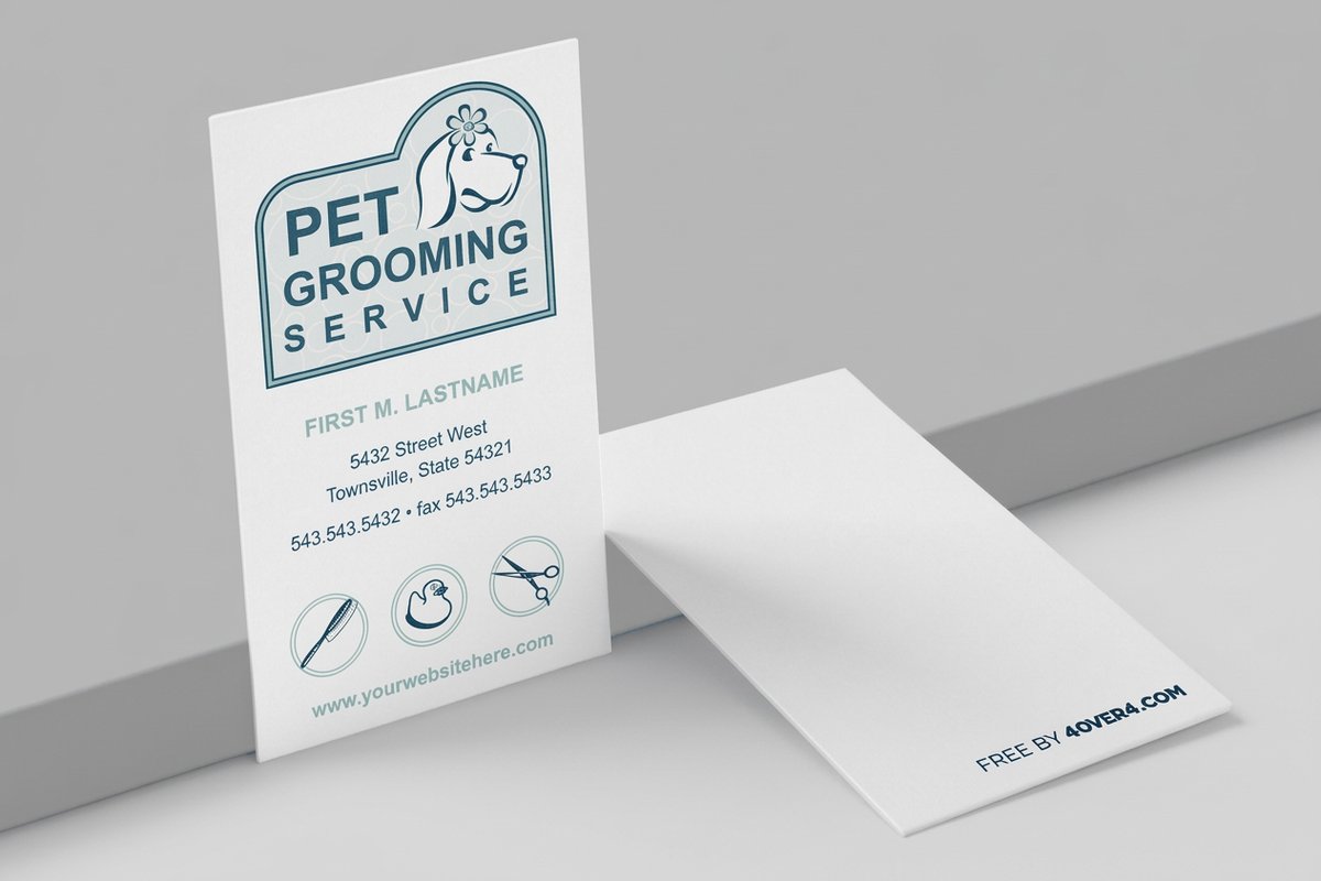 free business cards | Standard Business Cards |  3D Lenticular Business Cards | 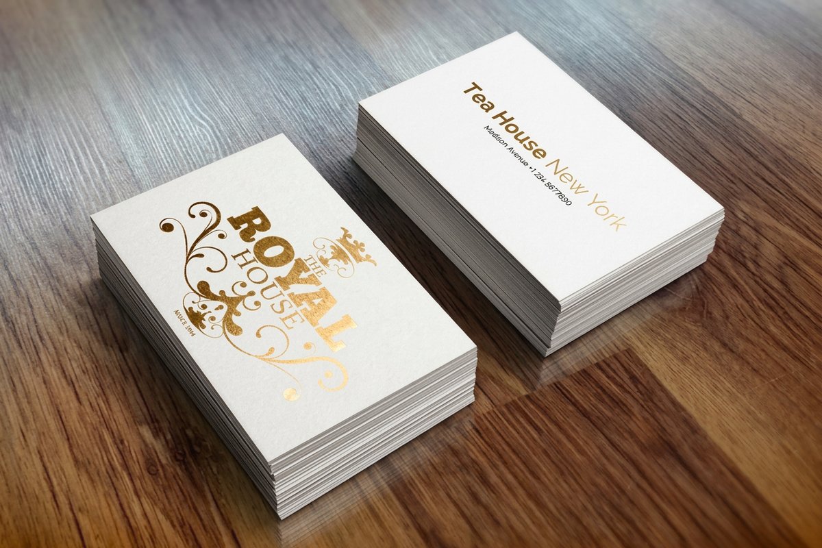 Metallic Foil Business Cards | |
|---|---|---|---|---|
| Min price | Free | $17.57 | $690.88 | $222.13 |
| Paper / stock | 14pt Gloss Cover | 14pt Gloss Cover | 31pt Lenticular Lens | 16 Point Silk Laminated |
| Finish | - | Standard Finish | - | - |
| Size | 2" x 3.5" | 2" x 3.5" | 2" x 3.5" - Vertical | 2" x 3.5" |
| Default qty | 200 | 100 | 500 | 500 |
| Turnaround | 5 business days | 3 business days | 22 business days | 7 business days |
| Rating | ||||
| View & customize | View & customize | View & customize | View & customize |
Getting the Color Right on Press and Ordering
Your palette is chosen. Now the file has to carry it to the press without a surprise. Build the artwork in CMYK from the start so nothing shifts on conversion, keep rich blacks to a proper build rather than four solid channels, and give the design enough contrast to survive a slightly darker or lighter run.
Start from a print ready layout in the design templates library, drop your colors and logo in, and let the file keep pace with your brand. Building from scratch? A blank card template lines your art up inside the cut and bleed lines automatically. To lock the logo before you color it, our notes on logo design pair well with this step, and the full library of printing guides covers files, stocks, and finishing.
Match the color to the stock
- Bright, saturated brands. High gloss or a premium stock keeps vivid colors from going flat.
- Deep, moody palettes. Soft touch or a heavy uncoated stock makes dark tones feel rich and expensive.
- Metallic and foil accents. Best on dark or neutral grounds where the shine has room to catch the light.
- Color as a material. Clear plastic turns your white space into a color of its own.
Start fast
Card templates and print-ready blanks
Free layouts plus exact-size blanks so your colors and logo land inside the cut line.
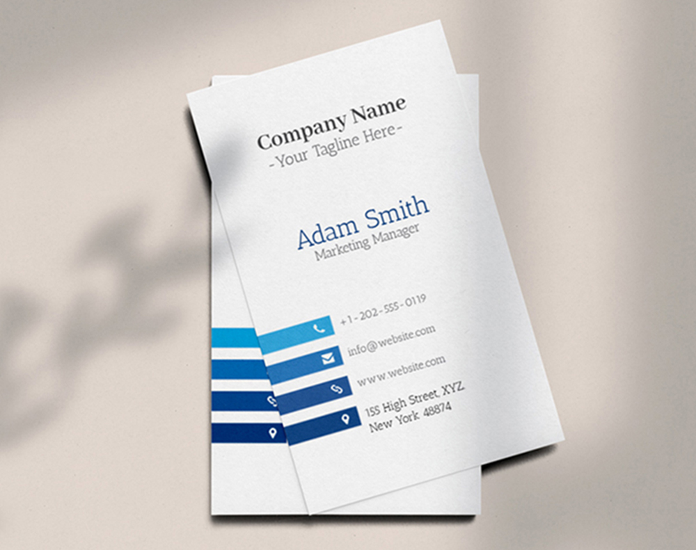

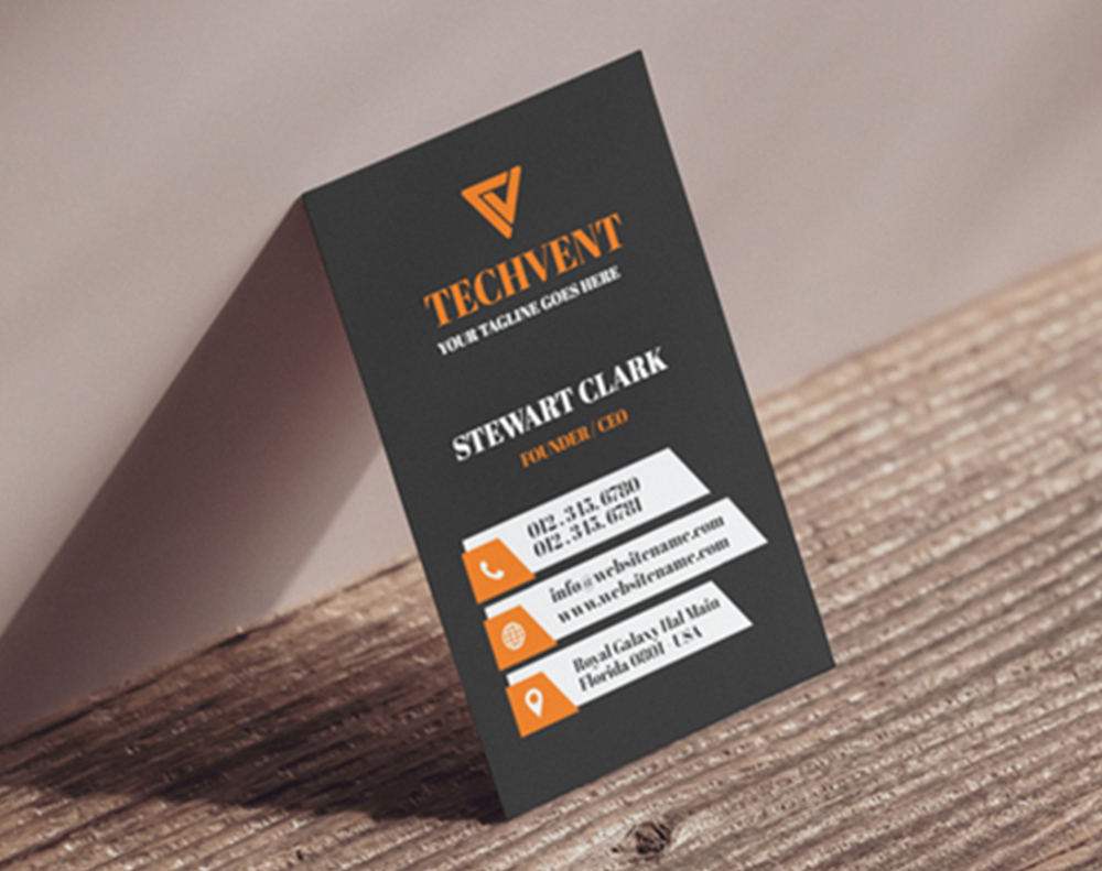
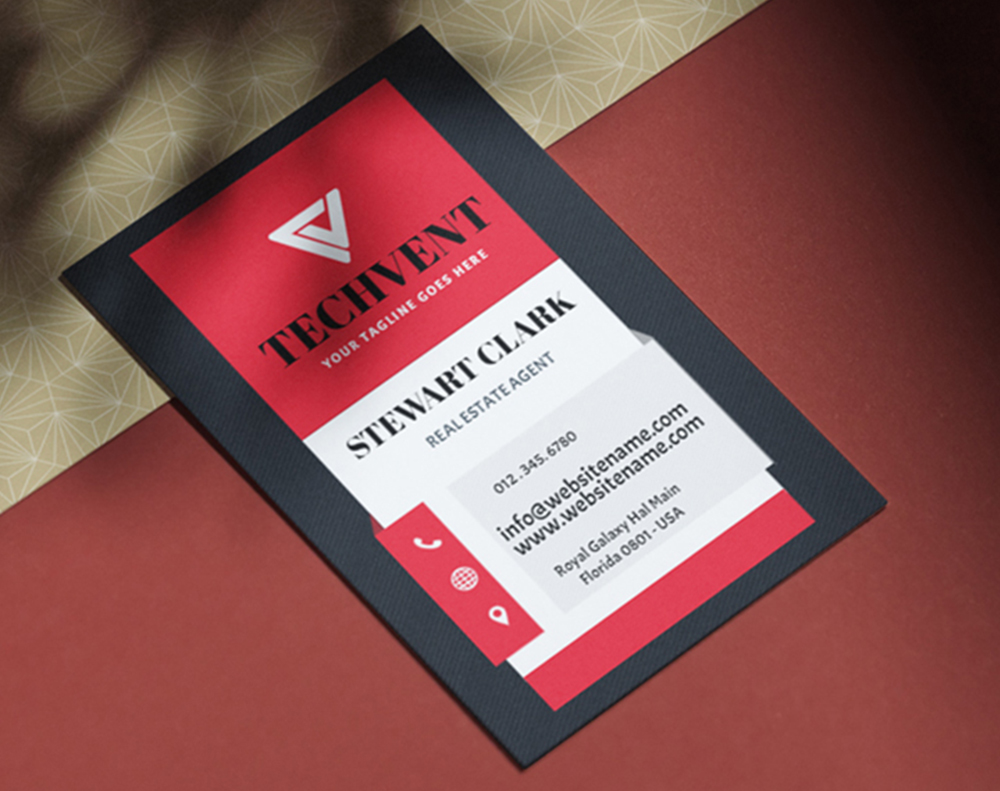
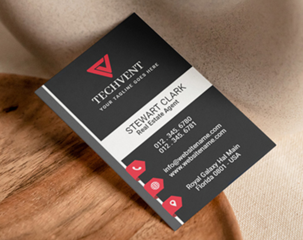
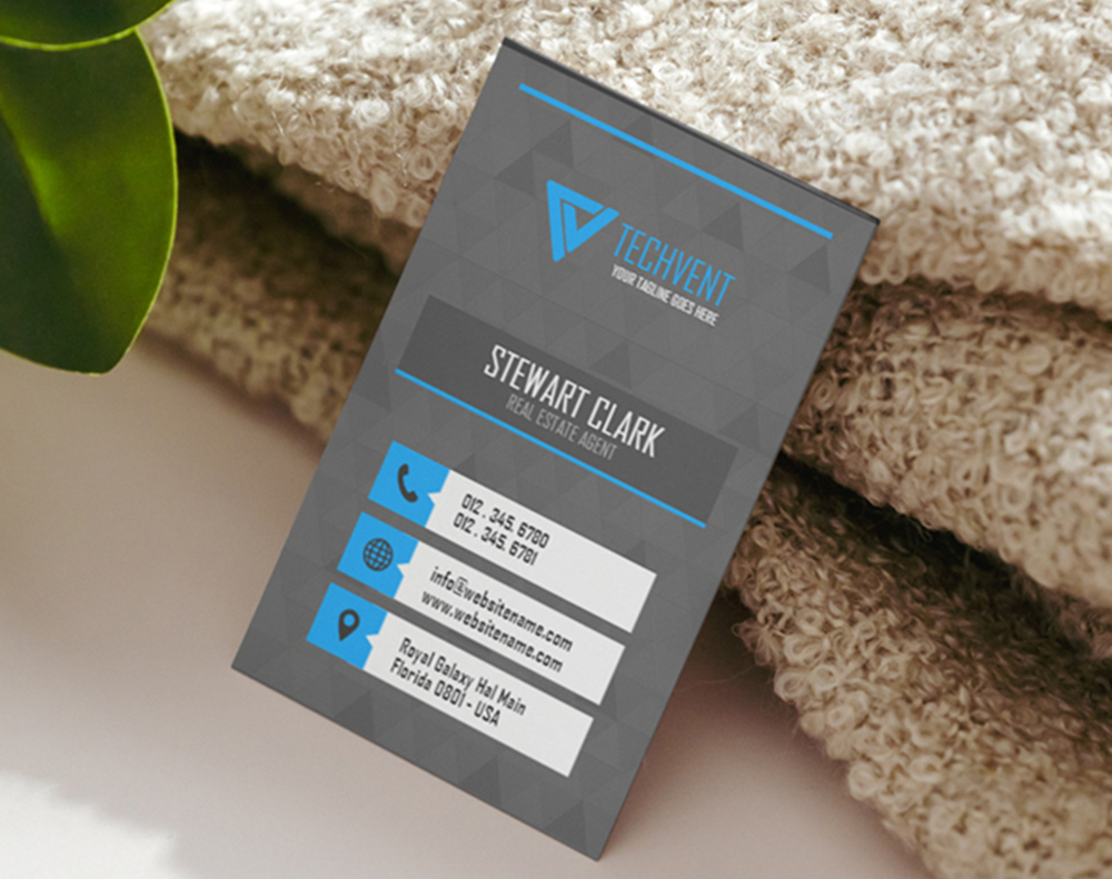
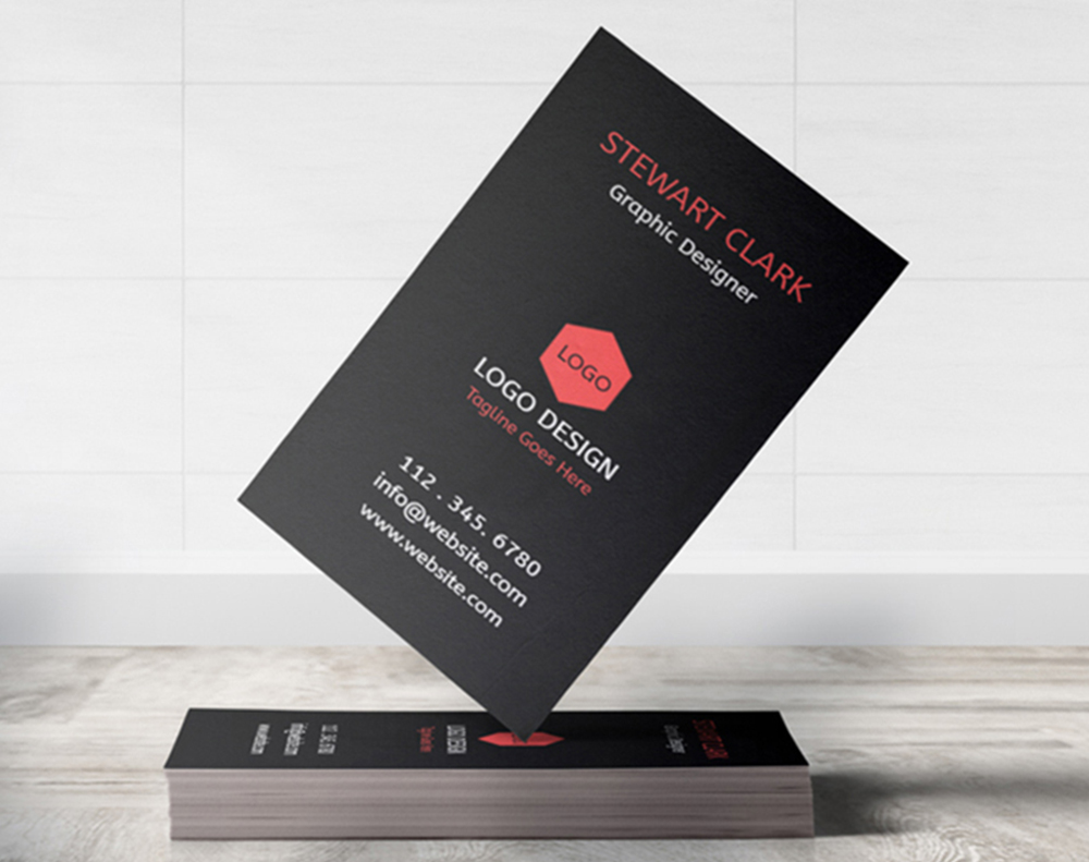
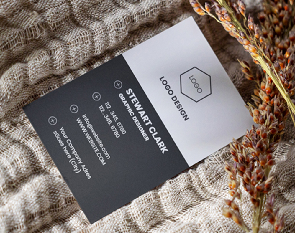





Wally helps you pick a color that fits your brand
The right palette first, then the right stock to print it on
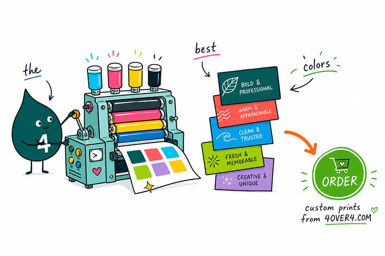
Not sure which color to choose? Start from your industry, blue and green for trust, warm tones for food, deep neutrals for premium, then dial the saturation to the feeling you want. Build the file in CMYK so nothing shifts on press, and pick a stock that flatters the palette, gloss to keep it bright, soft touch to make it rich. 4OVER4.COM prints it with G7 certified color so the card looks as good as it reads.
Design business cards →Choosing colors that match your brand and read well
Explore more
More ways to get your color right in print
Related pages across 4OVER4.COM, one card each, so you can keep exploring color and cards.
Category Business Cards Printing Every stock, finish, and format for the palette you pick. 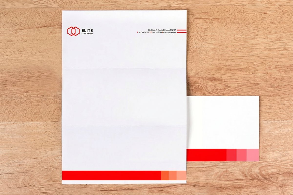 Hub Shop Business Stationery Cards, letterheads, and the rest of the stationery range.
  Product Clear Business Cards Transparent plastic that turns white space into color.
  Guide CMYK vs RGB for Printing Why a screen color shifts once it hits paper.
 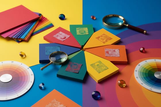 Article What Your Card Color Means The meaning behind each business card color.
 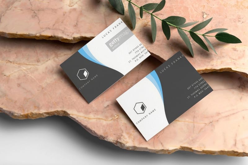 Showcase Print Showcase Real customer designs and finish ideas.
  Templates Design Templates Print ready layouts to drop your colors into.
 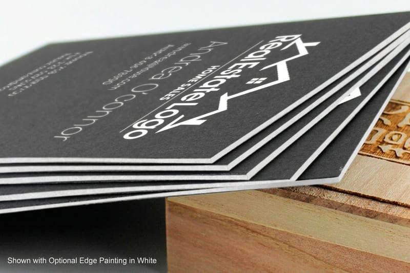 FAQs Printing FAQs Answers on stocks, color, files, and turnaround.
  Benefit Free Online Designer Set your exact colors and preview before you order.
 Ready to put your color on a card people keep?
Pick your palette, choose a stock from gloss to soft touch to clear, add your logo, and 4OVER4.COM prints it sharp with a 110% price match.
Color questions before you send cards to print
What business card color looks most professional?
Navy on an ivory or gray ground is the safest professional read, with charcoal and forest green close behind. All three are deep, cool and low in saturation, which is what makes a card look established rather than eager. Keep it to one serious color plus a neutral, hold the text at high contrast so it reads at arm's length, and if you want a signal of quality add a single foil or spot detail instead of a second bright color. Black is the other professional answer, but it reads as premium and authoritative rather than steady, so it suits luxury and creative work more than a bank.
What is the best color for a business card?
There is no single best color, only the best color for your industry and the feeling you want to trigger. Blue and green read as trustworthy and calm, which suits health and professional services. Warm reds and oranges feel inviting and appetizing, which suits food and hospitality. Black reads as premium and authoritative. Start from what your field expects, then choose whether to meet it or stand out on purpose. For a deeper look at meaning, see what your card color means.
How many colors should a business card have?
Fewer than you think. A single accent color on a neutral ground almost always looks more expensive than a busy multi color layout. Two colors plus a neutral is a safe, professional ceiling for most brands. The more colors you add, the harder they compete for attention and the cheaper the card can start to look. When in doubt, subtract a color rather than add one.
Why do my business card colors look different when printed?
Screens use RGB light while print uses CMYK ink, so the two do not map perfectly. The most electric screen colors, certain neon greens and blues, simply cannot be reproduced exactly in standard process ink and will print a little muted. Build your file in CMYK from the start, and if a specific brand color is critical, ask about a spot color or check it against a printed proof. Our guide to CMYK versus RGB walks through the details.
What color business card looks the most premium?
Deep, restrained palettes read as the most premium. A single accent, often a metallic like gold or rose gold, against black, navy, or charcoal signals luxury without shouting. The stock matters as much as the color, so a soft touch or heavy uncoated finish makes a dark palette feel rich in the hand. Black Business Cards and clear plastic stocks are popular for exactly this reason.
How much does it cost to print full color business cards?
Classic Business Cards from 4OVER4.COM start at $17.57, Black Business Cards start at $40.62, and Clear Business Cards start at $125.22, so there is a color and finish for most budgets. Price depends on the stock, finish, and quantity, and full color printing does not cost more than a single color at these tiers. Ordering more brings the per card cost down quickly, and a 110% price match keeps the total competitive.
