
What Is Material Design and How Its Principles Work in Print


Google built Material Design as a shared system for layout, type, color, elevation, and motion. Each part does one job, Material 3 changed several of them, and only some of those rules make a printed piece look better.
Material Design is Google's open design system, built on a material metaphor in which interface surfaces have thickness and elevation, plus a role-based type scale, tonal color palettes generated from one source color, an 8dp spacing grid, informative motion, a documented component library, and WCAG contrast targets. For print, the grid, the type scale, the tonal palette, and the whitespace all transfer directly, while shadow and motion have to be replaced by finishes such as spot UV, soft touch, and foil.
Quick tips
The short version of Material Design, and what it means on paper
Material Design is a system, not a look. Surfaces behave like physical material with real elevation, type comes from five defined roles rather than a list of sizes, color is a tonal palette generated from one source hue, and every spacing value is a multiple of eight. Motion explains what happened, components are documented once, and contrast targets are built into the palette. Carry the grid, the type scale, the single source color, and the whitespace onto paper. Replace shadow and motion with spot UV, soft touch, foil, and embossing, and convert the palette to CMYK before you commit.
What Material Design Is and Where It Came From
Material Design is Google's design system. Google introduced it in 2014, at a moment when its own products looked like they had been made by strangers to one another, and the goal was blunt: give every team one documented vocabulary for layout, typography, color, motion, and components so that a calendar, a mail client, and a mapping app could feel like relatives.
The word system matters more than the word design. A style is a look you copy. A system is a set of rules that keeps producing coherent results after the person who wrote them has left the project. Material Design ships as documentation, a component library, a color generator, and a set of measurable constraints. That is why it spread far past Google and became the default reference point for anyone building an interface.
It is worth being clear about what this page is for. Material Design was written for screens, and most of its rules assume a backlit display and a finger. But the thinking underneath it, that a design system is a set of constraints rather than a mood board, is exactly the thinking that produces a strong printed identity. That is the crossover this guide is really about, and it starts from the same place as our practical graphic design layout principles.
The Material Metaphor, Surfaces, Elevation, and Shadow
The founding idea is that interface surfaces behave like a physical material. Not a specific one, not paper and not glass, but something with consistent properties: it has thickness, it occupies a real position in space, it cannot pass through another sheet, and it casts a shadow.
Those properties give the system a way to express hierarchy without decoration. A menu that opens above the page is not styled differently, it is simply higher. A dialog interrupts because it sits at the top of the stack. Elevation is measured in density independent pixels, and shadow is the visual read-out of that measurement, softer and wider the further a surface rises.
This is the part designers most often misunderstand as a style. The drop shadow is not the point. The point is that depth is a system with rules, so two designers working on different screens will place a card at the same height and get the same shadow without coordinating. That is the difference between a design language and a set of preferences.
Hold on to the concept, because it has a direct physical analogue in print, and we come back to it later.
The Type Scale and the Case for Roboto
Material Design shipped with its own typeface. Roboto is a neutral grotesque sans with open apertures and tight, even spacing, drawn to stay legible at small sizes on dense displays. It is deliberately unremarkable, which is the correct brief for a system typeface that has to carry someone else's brand.
The more useful contribution is the type scale. Material 3 does not hand you a list of point sizes. It hands you a set of roles, each with a large, medium, and small variant:
- Display for the largest, most expressive statements, used sparingly.
- Headline for the top of a screen or a major section.
- Title for smaller groupings and card headers.
- Body for running text, which carries the page.
- Label for buttons, tabs, and small interface text.
Fifteen defined slots, and nothing else. When a designer wants a heading a little bigger, the answer is to move up a role, not to invent a size. That constraint is what keeps a large product from accumulating forty near-identical text styles, and it is the single easiest Material idea to carry into a print system. If you are choosing the typeface itself, our comparison of serif versus sans serif is the right starting point.
The Color System, Tonal Palettes, and Material You
Material 2 gave you a primary color, a secondary accent, and a fixed set of swatches. Material 3 replaced that with something considerably smarter: a generated tonal palette.
You provide one source color. The system derives a ramp of tones from it, numbered from 0, black, to 100, white, and then assigns those tones to semantic roles: primary, on-primary, primary container, on-primary container, surface, on-surface, and so on. You never pick a hex value for a button label. You use the role, and the role is guaranteed to sit at a legible tone against whatever it is placed on.
Material You, launched in 2021 with Material 3, took the same machinery and pointed it at the user. Android extracts a source color from the wallpaper and regenerates the entire system palette from it, so the interface picks up the person's own choices while every contrast relationship holds. It is dynamic theming with the accessibility guarantees baked in.
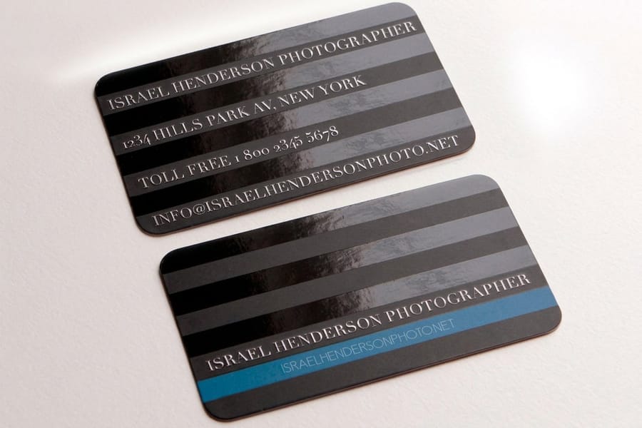
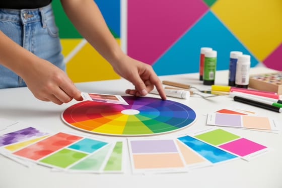
For a print designer, the transferable part is the method, not the technology. Choose one source color, derive a disciplined ramp of tones from it, and assign each tone a job rather than reaching for a new color every time a new element appears. Our guide to choosing a brand color palette walks the same process for a printed identity.
The 8dp Grid and the Rhythm of Spacing

If you take one measurable thing from Material Design, take this one. Every spacing value is a multiple of 8. Padding, margins, gaps, component heights, all of it. A 4dp step exists for small details such as icon padding, and that is the only exception.
The reason it works is not mathematical elegance. It is that a single base unit removes an entire category of decisions. Nobody has to judge whether a gap should be 13 or 15 pixels, because neither is available. Elements land on the same rhythm across screens built by people who never spoke to each other, and the result reads as composed rather than assembled.
Alongside the spacing unit sits a responsive layout grid of columns, gutters, and margins that changes column count by screen size. The columns flex, the gutters and margins stay on the same unit, and the content keeps its rhythm across a phone, a tablet, and a desktop.
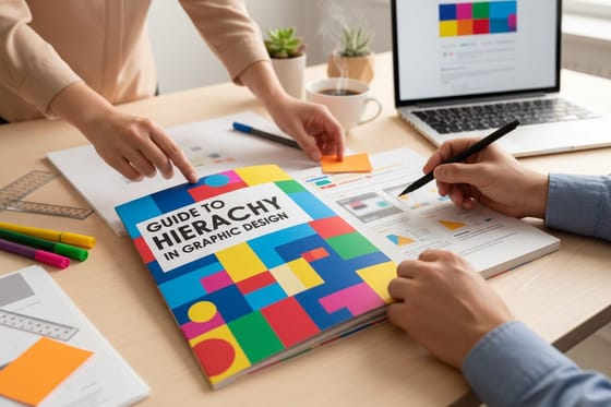
This is the idea that survives the jump to paper completely intact. Pick a base unit, 4mm or a quarter inch works well, and derive every margin, gutter, and block of vertical space from it. A brochure whose spacing all descends from one number looks deliberate in a way that is difficult to explain and impossible to miss. The same instinct runs through our guide to hierarchy in graphic design and to balance in graphic design.
Motion, Components, and Accessible Contrast
Three more pillars finish the system.
Motion. In Material Design, animation is informative rather than decorative. Transitions show where a thing came from and where it went, so a card that expands into a detail view grows out of its own position instead of cutting to a new screen. Durations are short, easing is asymmetric, and elements that belong together move together. Motion is the system explaining itself.
Components. Buttons, cards, chips, navigation bars, dialogs, snackbars, sheets, each documented with its anatomy, its states, its measurements, and its accessibility behavior. The library is the point at which a design system becomes a shared asset rather than a document nobody reads: a designer and an engineer refer to the same specification.
Accessibility and contrast. Material follows the Web Content Accessibility Guidelines, which set a minimum contrast ratio of 4.5 to 1 for body text and 3 to 1 for large text and meaningful non-text elements. Because the Material 3 color roles are generated from tonal values, on-primary over primary already clears the threshold. Accessibility stops being a review step and becomes a property of the palette. 4OVER4.COM keeps its own accessibility commitment for the same reason: it works better when it is built in rather than checked afterwards.
Material 3 Versus Material 2, What Actually Changed
The two versions are often discussed as a visual refresh. The real change was philosophical: Material 2 told you what to look like, Material 3 tells you how to decide.
- Color. Fixed palettes and accent swatches gave way to generated tonal palettes and semantic roles, with dynamic theming through Material You.
- Elevation. Material 2 leaned on drop shadow. Material 3 mostly uses a tinted surface, where a higher surface takes on more of the primary color, with shadow reduced to a supporting cue.
- Shape. Corner radii became larger and more varied, and shape turned into an expressive token rather than a constant.
- Typography. The old list of thirteen numbered styles became five roles with three sizes each, organized by purpose.
- Components. Many were redrawn to be less obviously Google and more able to carry an outside brand.
The direction of travel is worth noting, because it mirrors what happens to any maturing design system. It starts prescriptive, because consistency is the urgent problem, and it becomes parametric once consistency is solved and the new problem is expressing difference. A print identity ages the same way.
What a Print Designer Can Take From Material Design
Here is the part that earns this page its place on a printing site. Four Material ideas transfer to paper almost unchanged, and one transfers by translation.
A strict grid. Choose one base unit and derive every margin, gutter, column, and vertical gap from it. On a business card, a quarter inch base with a quarter inch safe margin gives you a layout that never looks crowded. On a brochure, it produces panels that line up across a fold. This is the highest-return idea in the entire system, and the one most often skipped.
A real type scale. Define five roles, not fifteen sizes: display, headline, title, body, label. Give each a size, a weight, and a leading value, then refuse to invent anything outside the set. A stationery suite built this way holds together across a card, a letterhead, a folder, and a brochure without anyone maintaining it.
A restrained tonal palette. Start from one source color and derive tints and shades of it rather than adding new hues. Then convert deliberately to CMYK, because a screen palette does not survive the trip on its own. Our guides to CMYK versus RGB and matching Pantone to CMYK cover that conversion, and Pantone PMS spot color printing is how you lock an exact brand color when the CMYK approximation is not close enough.
Generous whitespace. Material treats empty space as structure rather than waste, and print rewards that even more than screens do, because a reader cannot scroll past a cramped card. The same restraint drives our guide to minimal brand identity.
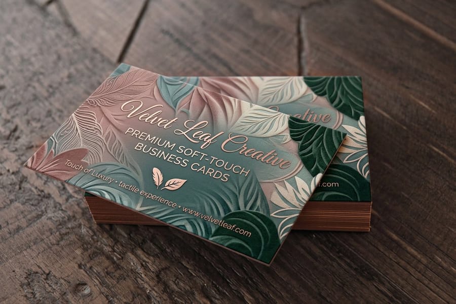
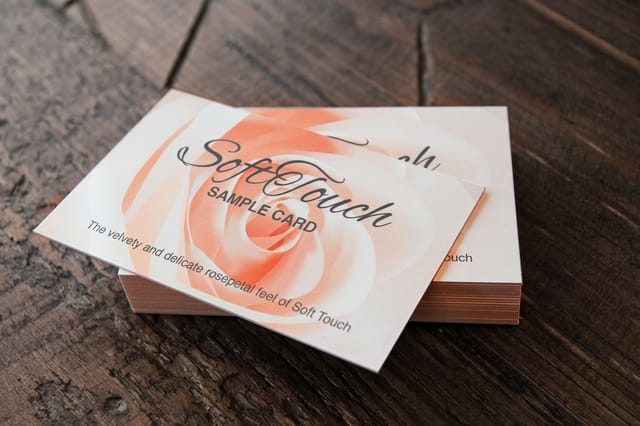
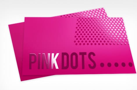
Elevation, translated. This is the interesting one. On screen, layering is expressed with shadow. On paper, it is expressed physically: spot UV raises a gloss panel above a matte field, soft touch lamination changes how a surface feels under a thumb, foil catches light at an angle, and embossing gives a shape actual height. Our overview of print finishing techniques is effectively the elevation chapter for paper. Used with the same discipline Material applies to shadow, one raised element per piece, they signal hierarchy rather than shouting.
What Does Not Survive the Jump From Screen to Paper
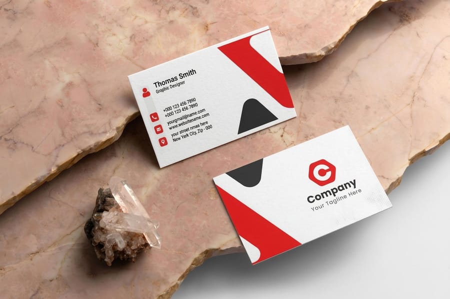
Copying Material Design onto a printed piece without editing is how you end up with something that looks like a screenshot of an app. Three things do not make the trip.
Drop shadows. A soft shadow on screen is light behaving correctly. Printed, it becomes a gray gradient sitting on a white sheet, and on uncoated stock the ink spreads into the fiber and it reads as a smudge. If you want a card to feel raised, raise it with a finish. If you must suggest depth in flat ink, use a hard offset in a solid tone rather than a soft blur.
Motion. There is no equivalent. A brochure has sequence instead, which is a genuinely different craft: what a reader sees on the cover, what the first fold reveals, what waits inside. Sequence can do some of the same explanatory work motion does, but it has to be designed as sequence, not imported as animation.
RGB brand palettes. A tonal palette generated on screen lives in RGB, and RGB reaches colors that CMYK inks cannot. The vivid mid-tones of a generated ramp are exactly the ones that flatten in conversion, and a pair of adjacent tones that looked distinct on a monitor can collapse into the same printed value. Convert early, proof, and adjust the ramp rather than accepting whatever the automatic conversion produces. Our guide to the best color profile for printing covers the profiles to work in.
One more caution about paper itself. Contrast ratios calculated for a backlit screen assume a light source behind the color. An uncoated sheet scatters light and lowers apparent contrast, so pale gray body text that passed a screen audit can be genuinely difficult to read in a printed report. Order free paper samples and look at your palette on the actual stock before you commit a run to it.
Printing a Material Inspired Identity
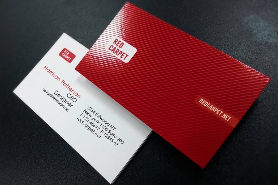
What does a system-minded identity look like once it is on paper? Roughly this. One base unit governs every margin and gutter across the whole suite. Five type roles, applied consistently, so a card and a folder are visibly related. One source color, converted deliberately to CMYK, with tints of it doing the work that extra hues would otherwise do. Whitespace treated as structure. And exactly one physical layer of emphasis per piece, standing in for elevation.
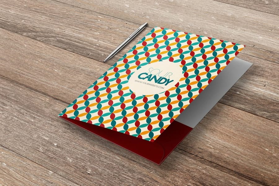
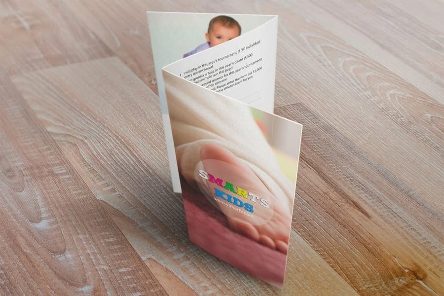
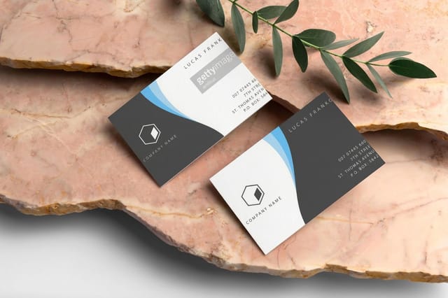
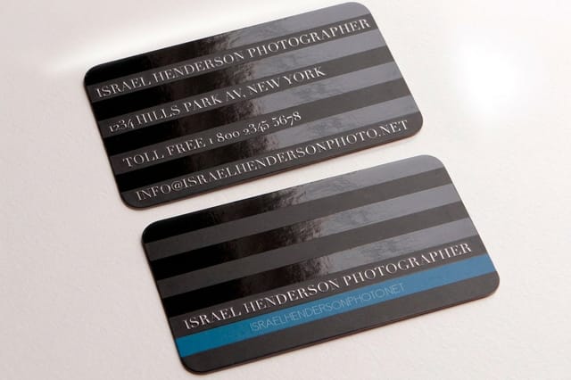
The pieces themselves follow the same logic. Classic business cards are where the grid and the type scale get their first test, because there is nowhere to hide on a 3.5 by 2 inch rectangle. Soft touch business cards and spot UV business cards add the tactile layer. Silk laminated presentation folders carry the system into a client meeting, and our guide to pocket folders and branding covers how they hold a kit together. Brochures and posters are where the grid stops being theoretical, since a fold or a wall makes every misalignment visible.
If you would rather start from a structure than a blank page, download a free blank template with the trim, bleed, and safe zone already drawn, browse the design template library, or build the piece directly in the 4OVER4.COM online designer. See finished work in the business card gallery, then print the set across marketing materials that all speak the same language.
Wally explains Material Design in print
Keep the grid, swap the shadow for a finish
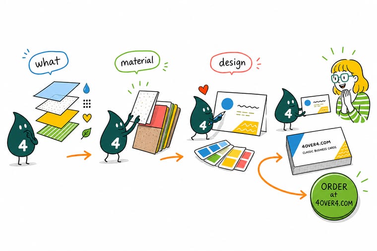
Wally likes Material Design for the boring reasons: one base unit, five type roles, one source color. Those three constraints do most of the work, and they work just as well on a business card as on a screen. What he leaves behind is the drop shadow, because paper has no light source, and the animation, because paper does not move. On a printed piece, spot UV, soft touch, and foil carry the layering instead, and 4OVER4 prints all three.
Print your brand system →Specs and pricing
The pieces a print design system runs on
A system is only real once it is printed on something. Compare a card, a folder, and a brochure side by side with live configuration options and starting prices straight from the 4OVER4.COM configurator.

Print it
Print the whole system, not one piece of it

See it in use
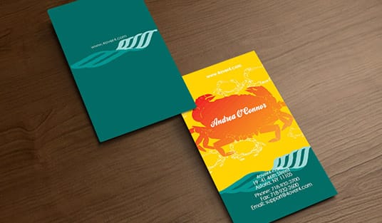
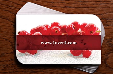
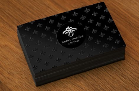
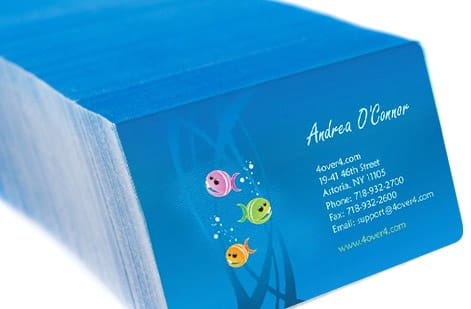
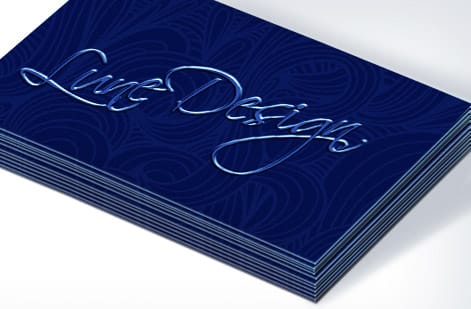
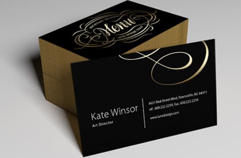
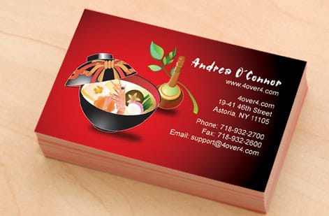
Brand work we printed on classic card stock
Explore more
Where to go next

By the numbers
Elevation, but in stock and finish
Common Questions
Material Design questions, answered
What is Material Design in simple terms?
Material Design is the open design system published by Google: a documented set of rules and ready-made components covering layout, typography, color, elevation, motion, and accessibility. Instead of every team inventing its own buttons and spacing, they build from a shared vocabulary. The founding idea is the material metaphor, which treats interface surfaces as sheets of a physical material that have thickness, occupy real positions in space, and cast shadow according to how high they sit.
What is the difference between Material 3 and Material 2?
Material 2 was prescriptive: a fixed palette, heavier shadows, and components that looked recognisably Google wherever they appeared. Material 3, introduced with Material You, made the system adaptive. Color now comes from generated tonal palettes rather than fixed swatches, elevation leans on tinted surfaces instead of deep shadow, shapes are rounder and more varied, and the type scale is organized into display, headline, title, body, and label roles. The rules stayed, but the look became something a brand can own.
What is the 8dp grid in Material Design?
The 8dp grid is a spacing rule where padding, margins, and component dimensions are all multiples of eight density independent pixels, with a 4dp increment reserved for small details such as icon padding. Because every measurement comes from one number, elements align across screens without anyone eyeballing them. The same discipline works on paper: pick a base unit, such as 4mm or a quarter inch, and derive every margin and gutter from it.
Can Material Design principles be used for print design?
Yes, and the ones that transfer are the structural ones. A strict modular grid, a type scale with a small number of defined roles, a restrained tonal palette built from a single source color, and generous whitespace all make printed pieces look more considered. What does not transfer is anything that depends on light or time: drop shadows read as smudges on paper, and motion has no equivalent at all. In print, physical finishing does the job that elevation and animation do on screen.
What font does Material Design use?
Roboto is the default typeface of Material Design, drawn as a neutral grotesque sans with fairly open apertures and tight, even spacing so it stays legible at small sizes on dense screens. Material 3 pairs it with a role-based type scale rather than a list of point sizes. Roboto is not mandatory, and the system is explicitly built to accept a brand typeface, as long as you keep the same disciplined set of roles rather than adding new sizes ad hoc.
What contrast ratio does Material Design require?
Material Design follows the Web Content Accessibility Guidelines, which set a minimum contrast ratio of 4.5 to 1 for body text and 3 to 1 for large text and meaningful non-text elements. The Material 3 color system is built so that each role, such as on-primary sitting over primary, already clears those thresholds. Print has no formal equivalent, but the same targets are a sensible floor, and paper adds its own variables: uncoated stock scatters light and lowers apparent contrast, so pale gray type that passes on screen can disappear on the page.
Get Started
50 soft touch business cards cost $40.28, or 81 cents each
Pick your stock and finish, upload artwork built on one grid and one palette, and we print a card, folder, and brochure set that all speak the same language.
Legal Disclaimer
Gold Standard guarantees apply to all standard orders placed through 4over4.com. Price match requires verifiable proof of a competitor's published price for an equivalent product with matching specifications and turnaround time. Satisfaction guarantee covers manufacturing defects and print quality issues. Contact support with order number and documentation. On-time delivery rate based on tracked orders 1999 to 2026. Individual results may vary based on shipping carrier performance.