
Minimal Brand Identity Design and the Art of Less


Fewer choices, made with more care. Here is how to build a minimal identity and print it on the pieces it lives on first: business cards, postcards and a banner, with the size, stock and finish for each.
Minimal brand identity design strips your brand down to its most powerful elements: a focused logo, a restrained palette of two to three colors, clean typography, and intentional white space. A minimal approach does not mean less impact. It means every design choice carries more weight.
Quick tips
Quick tips for a minimal brand identity
Seven moves, in the order they pay off. Each one cuts something away, and the last one writes the cuts down so nothing creeps back in.
- Write the one idea in a sentence. If you cannot say what the brand stands for in a line, the logo will end up carrying the confusion for you.
- Draw a mark that survives one color and one inch. Test it in black on white at business card size before you test it anywhere else.
- Cut the palette hard. One does the work, the others support, and you keep CMYK values for print alongside hex for screen.
- Pick one typeface and two weights. Hierarchy comes from size and weight, not from a second family.
- Let the space do the talking. See white space is a design decision, and remove anything that survives removal.
- Study identities that already hold. The minimalist brand design examples show what each rule looks like once it is printed.
- Prove it on stock, then write it down. Order the card first, see translating your minimal identity to print, then lock the rules in a brand guidelines document so nothing drifts.
Watch it printed
See standard business cards on the press, in 167 seconds
Why stripping your brand back makes it stronger
Minimal brand identity design takes as much work as a busy one, spent on making every element earn its place. Each element left on the page carries a specific message. On a 2 x 3.5 inch business card, a logo, a short palette, one typeface and the space between them are all that fit, and once you remove the extras, what is left hits harder.
This guide walks you through the principles, the practical steps, and the common pitfalls of building a minimal brand identity. You will learn how to choose typography that speaks volumes on its own, why white space is a design tool rather than wasted real estate, and how to translate your minimal identity onto physical print materials.
Start with your core message
Before you touch a design tool, get clear on what your brand stands for. Write it in one sentence, short enough to fit on one line under your name on a card. If you cannot, your brand identity will reflect that confusion no matter how clean the design looks.
Minimal brand identity design forces you to make hard choices. You cannot hide behind busy layouts or decorative flourishes. Your core values, your audience, and your differentiator need to be crystal clear before you start designing. Think of a minimal brand like a well-edited essay, where every word, or in this case every visual element, justifies its existence.
Ask yourself three questions. What do we do? Who do we do it for? Why should they care? Your answers become the foundation for every design decision that follows, whether you sketch by hand or rough it out in the online designer.
Minimal creator branding, the kit a solo creator needs
A creator brand lives in small squares and wide strips, so the kit is different from a company's. Build these six pieces from one mark, one accent color and one typeface, and the channel reads as a brand.
- Avatar. The mark alone, in a circle, readable at 40 pixels. Initials or a single shape beat a wordmark here.
- Channel banner. The name, a one-line promise and the upload schedule, sized for the safe area every platform crops to.
- Thumbnail template. One type style, one color block, one image treatment, saved as a file you reuse for every video.
- Watermark. The mark in a single color at low opacity for the corner of clips and photos.
- Link page. Same color, same type, same mark, so the click from a profile does not feel like a different brand.
- A card. Meetups, brand deals and conventions still end in a handshake, and a clean business card with the handle and a QR code is the offline version of the profile.
Keep the palette to the accent plus black and white, and set the CMYK values beside the hex codes so the printed card matches the screen.
The logo: simple does not mean easy
A minimal logo uses clean lines, limited shapes, and restrained detail. Think of the Apple apple, or the Nike swoosh. These marks work because they are instantly recognizable at any size, from a billboard to a business card.
Your logo should function in one color. If it falls apart without gradients, shadows, or multiple colors, it is not minimal enough. Test it in black on white, white on black, and at the size of a postage stamp. If it still reads clearly, you have a solid starting point.
Wordmarks, which are logos made entirely of type, are a popular choice for minimal brands. They work especially well when paired with a distinctive typeface. Do not confuse simple with generic, because a minimal logo still needs personality. It just communicates that personality through restraint rather than excess.
Choosing a color palette that breathes
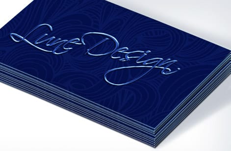
A minimal palette is two or three colors, and sometimes one primary color plus black and white.
The fewer colors you use, the more each one matters. A single bold accent against a neutral background creates instant recognition. Think of the Tiffany robin-egg blue or the Spotify green. These brands own their color because they do not dilute it with a dozen others.
When you select your palette, consider contrast. Minimal design leans heavily on the relationship between elements and the space around them. High contrast, such as dark type on light backgrounds or the reverse, keeps things readable and sharp. Muted, low-contrast combinations can feel sophisticated but risk becoming invisible, especially in print.
Test your colors on actual printed materials. Screen colors and print colors behave differently. 4OVER4.COM offers free samples so you can see exactly how your chosen palette translates to paper before you commit to a full order.
Typography as the backbone of minimal design
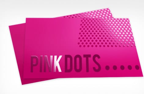
In a minimal brand identity, typography does most of the heavy lifting. When you strip away decorative elements, your typeface becomes the primary vehicle for personality and tone.
Stick to one or two typefaces at most. A sans-serif for headlines paired with a complementary serif for body text is a classic combination. Or go all in on a single versatile type family with enough weights, from light through bold, to create visual hierarchy without adding a second font.
Pay attention to letter spacing, line height, and paragraph spacing. These micro-decisions are what separate amateur minimalism from professional minimalism. Generous line height, roughly 1.4 to 1.6 times the font size, gives text room to breathe. Tight, cramped text undermines the entire minimal philosophy.
Your typography needs to work across every touchpoint, from your website to your business cards to the flyers that actually get noticed. Consistency is what builds recognition.
White space is a design decision, not empty space
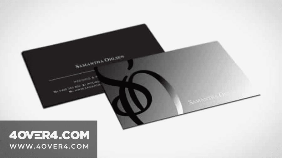
Blank areas tempt you to fill them. Leave them. On a 2 x 3.5 inch card, hold the type block to about a third of the card, as the examples below do, and let the rest carry the stock.
White space, also called negative space, is one of the most powerful tools in minimal design. It directs attention. It creates breathing room. It signals confidence, because your brand does not need to shout to be heard.
On a business card, generous margins and restrained content placement make the card feel premium. On a flyer, strategic white space draws the eye exactly where you want it. On packaging, it communicates sophistication.
The rule is straightforward. If an element does not serve a clear purpose, remove it. Every icon, line, shape, and text block needs to justify its presence. If you can take something away and the design still communicates the same message, take it away.
Minimalist brand design examples worth studying
Rules are easier to follow once you have seen them hold. Six patterns worth copying, shown beside cards from our customer showcase. Each is built from a mark, a short palette and a stock choice, and on our cards the heavier uncoated stocks, such as 18pt Uncoated Cover and 32pt UltraWhite Uncoated Cover, carry them well. Read each as a whole: the logo, the two colors around it, and the paper it sits on are one decision, not three.
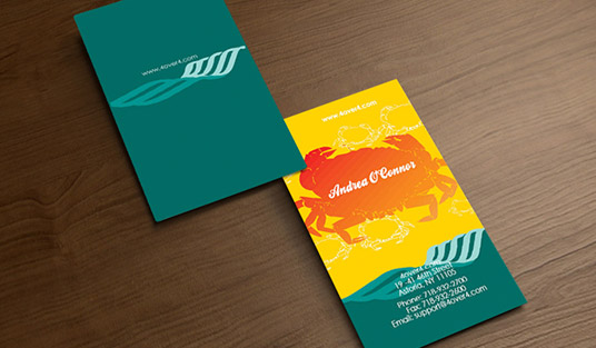
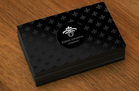
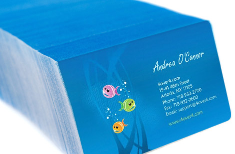
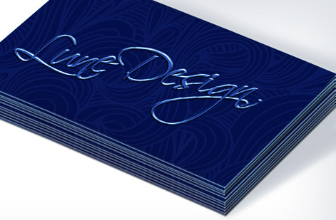
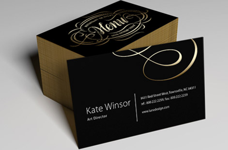

Look at what none of them do. No second typeface, no stroke around the logo, no gradient, no drop shadow, and no icon repeated as a pattern. Every one of those would be defensible on its own, and every one of them would cost the identity its calm.
Translating your minimal identity to print

A minimal brand identity shines on physical materials when it is done right. The paper stock, the finish, and the printing technique all become part of the design language.
For minimal brands, paper choice matters more than usual. A thick, uncoated stock with a subtle texture adds tactile richness that compensates for visual simplicity. A smooth, matte finish feels modern and clean. The paper itself becomes a design element. Here are print applications worth planning for your minimal brand identity:
- Business cards. A clean wordmark on heavyweight stock with ample white space makes a lasting first impression, and standard business cards on a thicker uncoated stock give the mark the weight it needs.
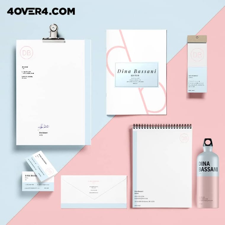
- Letterhead and envelopes. Consistent branding across correspondence reinforces professionalism, so keep the same margin and mark size across the business stationery set.
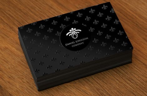
- Stickers and labels. A single-color mark on a plain circle seals a box or a bag without adding noise, and these logo sticker ideas show restrained uses worth copying.
- Signage and banners. Minimal design translates beautifully to large format, including 2 sided blockout banners for events and storefronts.
- Promotional items. Even custom magnets can carry your minimal aesthetic when designed with restraint.
Weight and texture add dimension without adding clutter. A 16pt uncoated card with soft touch, or a 32pt UltraWhite uncoated card, lets a one-color logo stand on its own.
Choosing stock, size and finish for a minimal set

Three pieces carry a minimal brand from the start, and each one comes down to a size, a stock and a finish. Here is how we would set them up.
- Business cards. 2 x 3.5 inches on 18pt or 32pt uncoated cover, 14pt white linen or 110 lb Strathmore bright white wove, left bare. Standard business cards are $17.57 for 100 on 14pt Gloss Cover, and these heavier stocks cost more.
- Postcards. 4 x 6 or 5 x 7 inches, two of 14 sizes, on 16pt uncoated with soft touch or 18pt uncoated cover. $16.48 buys 50 at the smallest size, 2.5 x 2.5, and larger sizes cost more.
- 2 sided blockout banners. 2 x 3 to 4 x 10 feet on 15 oz blackout vinyl, so neither side shows through, with optional grommets or pole pockets, $108.75 for one at the smallest size.
Print one color on the back of the card, or leave it blank, and keep the same margin and mark size on all three.
Building a brand guidelines document
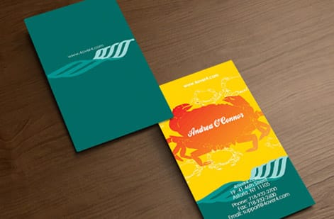
Once you have defined your minimal identity, document it. A brand guidelines document keeps things consistent across every touchpoint and every person who touches your brand.
Your guidelines should include logo usage rules such as minimum size, clear space requirements, and approved color variations, your exact color codes in CMYK for print plus RGB and hex for digital, your typography specifications, and examples of correct and incorrect usage. For minimal brands, the incorrect examples matter just as much, because they show what happens when someone adds too much.
Keep the guidelines document itself minimal. Practice what you preach, since a 50 page brand book contradicts a brand built on simplicity. For more resources and guides on design and printing, visit the guide hub at 4OVER4.COM.
Using templates to maintain consistency
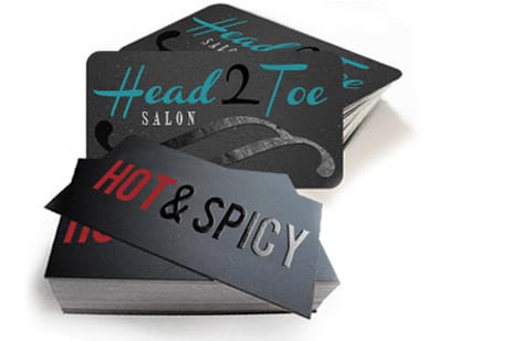
A template keeps a minimal brand identity consistent across materials. It locks in your spacing, typography, and layout decisions so every piece looks intentional. Build three masters, a 2 x 3.5 inch card, a 4 x 6 inch postcard and the banner size you hang most, each with the same margin and the same mark size.
4OVER4.COM provides blank templates that give you the correct dimensions and bleed areas for any print product. Start with these, then apply your brand guidelines to create master layouts you can reuse. For a cohesive set across campaigns, extend the same system to your wider marketing materials so nothing drifts off brand between projects.
Pitfalls that undermine your minimal brand identity
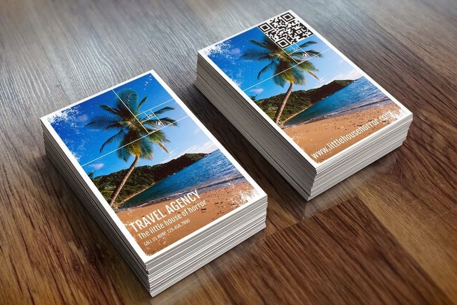
The biggest mistake is confusing minimal with boring. A minimal brand identity still needs personality, warmth, and character. It just expresses those qualities through fewer, more intentional elements. Five errors undo a minimal identity more than any others:
- Too many fonts. Adding a third or fourth typeface for variety destroys the cohesion you worked to build.
- Inconsistent application. Your website looks minimal, but your business card is crammed with info, phone numbers, social handles, and a QR code.
- Choosing cheap paper. Minimal design on flimsy stock feels incomplete rather than intentional, because paper quality fills the space that decoration would normally occupy.
- Skipping the brand guidelines. Without documented rules, your minimal identity drifts toward clutter within months.
- Ignoring hierarchy. When everything is the same size and weight, nothing stands out. Minimal does not mean uniform.
Avoid these traps and your brand stays clean, recognizable, and professional across every printed piece and digital touchpoint.
Print products that bring minimal brands to life
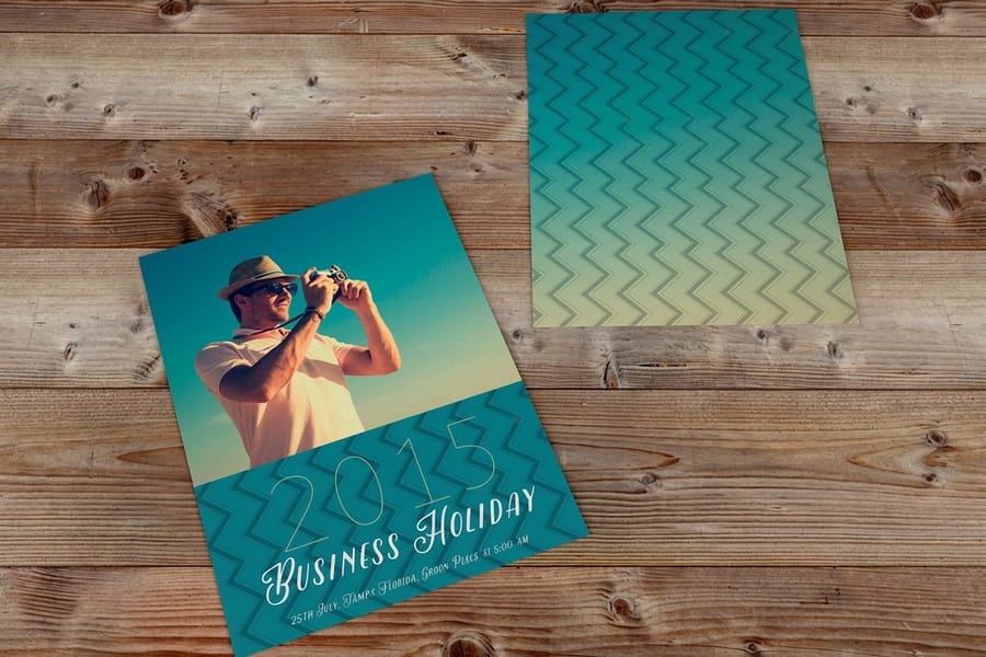
Ready to see your minimal brand identity on real, physical materials? Start with the essentials. 4OVER4.COM offers free business cards so you can test your minimal design on actual paper stock before you place a larger order. It is the fastest way to see if your typography, spacing, and color translate from screen to hand.
Once you have nailed the look, expand to standard business cards, postcards, and packaging.
Wally explains minimal branding
Less to say, more that lands
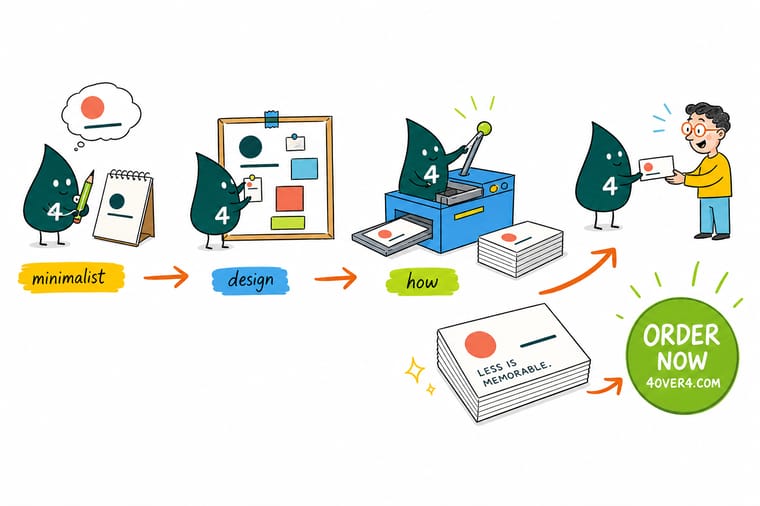
Wally treats a minimal brand like a well-edited sentence: cut every element that does not earn its place, and the few that remain hit harder. One logo, two colors, one strong typeface, and room to breathe are usually the whole recipe. When it is time to make it real, print it on premium stock at 4OVER4 so the paper carries the same confidence as the design.
Print your business cards →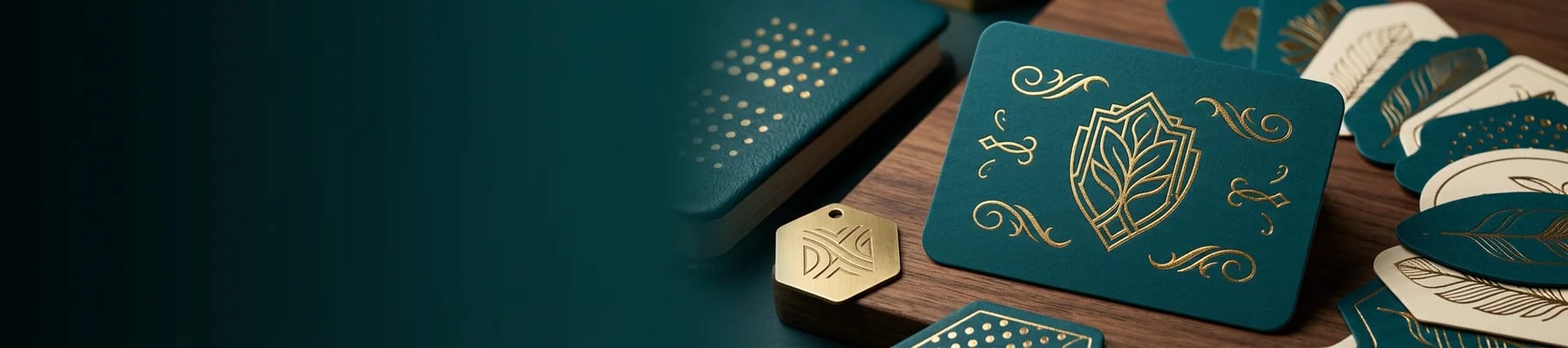
Specs and pricing
Standard business card specs and pricing
Here is what Standard Business Cards give a minimal brand, with live specs and per unit prices from the configurator.

| Quantity | Price Per Unit | Total |
|---|---|---|
| 100 | 17.6¢ | $17.57 |
| 200 | 11.5¢ | $23.07 |
| 300 | 9.15¢ | $27.46 |
| 400 | 7.96¢ | $31.86 |
| 500 | 7.25¢ | $36.26 |
| 600 | 6.77¢ | $40.64 |
| 700 | 6.43¢ | $45.04 |
| 800 | 6.18¢ | $49.43 |
Print it
Print your minimal brand at 4OVER4



See it in use
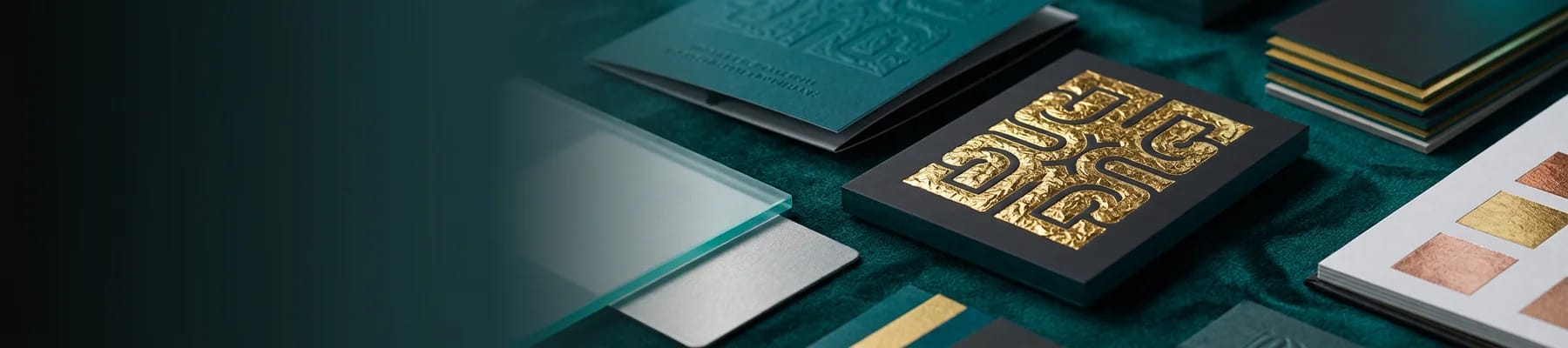
Business cards from our customer showcase








Explore more
Where to go next




By the numbers
Paper types that suit a stripped back card
Common Questions
Your questions about minimal brand identity, answered
Is $500 too much for a logo design?
No. Logo prices range widely, and $500 can buy a considered mark with a couple of revision rounds and vector files. Logo generators cost far less but hand you a mark other people can also generate. For a minimal identity the money goes into the restraint and the file quality, so ask for the vector EPS or SVG and a one-color version.
Who are some famous minimalism designers?
Dieter Rams, whose ten principles of good design shaped Braun and later Apple. Massimo Vignelli, who set the New York subway map and the American Airlines wordmark in a few typefaces. Paul Rand, who drew the IBM and ABC marks. Kenya Hara, art director of Muji. And Jony Ive, whose Apple hardware made restraint a mass-market taste. Study one identity from each and the rules on this page come to life.
What goes in a minimalist branding kit?
A primary logo, a mark-only version and a one-color version, all as vector files. The palette with hex and CMYK values. One or two typefaces with the sizes and weights you use. A few templates, such as a social post, a thumbnail and a business card. And a one-page guide that says the minimum size, the clear space and what not to add. Keep the kit as small as the brand.
Does a minimal brand identity work for every industry?
It works for most, and it is especially effective for tech companies, luxury brands, professional services, wellness brands, and creative studios. Industries that rely on trust and sophistication benefit the most. If your audience values clarity and professionalism, minimal brand identity design is a strong fit.
What paper stock works best for minimal brand materials?
Thick uncoated stocks with a natural texture, such as our 18pt and 32pt uncoated covers or 14pt white linen. Matte finishes also work well. Avoid glossy finishes unless your brand leans modern and tech-forward, because gloss can feel at odds with the understated minimal aesthetic.
Can I create a minimal brand identity on a budget?
Yes. Fewer elements mean fewer design hours and fewer files to manage. Start with a clean wordmark and apply it the same way everywhere. 4OVER4.COM has printed over 10 billion cards, and some of the most striking ones use the simplest designs.
How do I keep my minimal brand consistent across all materials?
Create a brand guidelines document. Include your logo rules, exact color codes in CMYK for print and hex for digital, typography specs, and spacing requirements. Share it with anyone who creates materials for your brand. Templates help too, because they lock in your layout decisions so every piece stays on brand.
Get Started
Ready to print your minimal brand?
Pick your stock, drop in your wordmark, and we print clean, premium cards that make restrained design feel rich.
Legal Disclaimer
Gold Standard guarantees apply to all standard orders placed through 4over4.com. Price match requires verifiable proof of a competitor's published price for an equivalent product with matching specifications and turnaround time. Satisfaction guarantee covers manufacturing defects and print quality issues. Contact support with order number and documentation.
