
How to Match Pantone to CMYK Color


Emma is our prepress and print production voice, built from the knowledge of our production team, with over 20 years in printing.
Your brand color lives as a Pantone code, but full-color presses print in CMYK. The Color Bridge exists because four inks cannot reach every mixed one, and it tells you how close you will get.
To match Pantone to CMYK, run the spot color through the Pantone Color Bridge (or your design app’s built-in conversion) to get its closest process build, then set the whole file to CMYK. Match the coated or uncoated reference to your paper, expect bright oranges, greens and blues to shift slightly since they sit outside the CMYK gamut, and always confirm the color on a printed proof rather than your screen. Save the final CMYK values to reuse them on every order.
Jump to the Pantone to CMYK values chart for the coated builds and the five moves that convert any PMS code, whatever stock it is landing on.
Quick answer
The short version of Pantone-to-CMYK matching
Convert with a bridge, match the paper, and prove it on press. Pull the exact PMS code from your brand guide, run it through the Pantone Color Bridge for its closest CMYK build, and choose the coated or uncoated value that matches your stock. Set the whole file to CMYK, expect the most vivid colors to soften a little, and approve the final result on a printed proof rather than your monitor. Save those CMYK values so every 4OVER4.COM order lands on the same brand color.
What Pantone (PMS) actually is
Think of Pantone, the Pantone Matching System, as a shared vocabulary for color. Every shade has a code, and that code means the exact same thing to a designer in Brooklyn and a press operator across the country. When your brand guide says PMS 185 C, nobody has to interpret it. The ink is already mixed to that recipe before it ever touches paper.
That is the whole appeal for brand work. A logo printed with a spot Pantone ink is a single, solid color laid down in one pass, so it looks identical on this order and the next one and the one after that. If you want the backstory on how a small ink company ended up naming the colors half the design world speaks in, the history behind Pantone colors is a good detour.
One catch sends most people to this page: the presses that print your everyday full-color business cards and brochures do not run 2,000 different pre-mixed inks. They run four. So a Pantone color almost always has to be translated before it can print, and that translation is what the rest of this guide is about.
Why Pantone and CMYK do not see color the same way
The two systems reach color from opposite directions. A Pantone ink is one color, pre-blended in a bucket. CMYK builds color the way a screen builds an image, by laying down tiny dots of cyan, magenta, yellow and black and letting your eye blend them into a shade. Take PMS 185 C, the red in the chart below: on a spot job the press prints it from one can of ink, while the process build of C0 M91 Y76 K0 lays magenta and yellow dots side by side with no cyan or black at all. Stand close to a printed photo and you can see the dots. Step back and they become a smooth color.
Because CMYK mixes from only four inks, it can only reach so far. Picture the full rainbow of colors a human eye can see as a big shape. Pantone spot inks cover a wide slice of it, and CMYK covers a smaller slice inside. When a brand color lands inside that smaller slice, the conversion is clean. When it lands outside, the CMYK version comes out a little quieter, and no amount of tweaking fully closes the gap. This is the same reason a glowing color on your monitor can disappoint in print, which the CMYK vs RGB guide unpacks in detail.
None of this is a flaw in the printing. It is just physics: solid ink and optical dot-blends are different tools. PMS 021 C shows it best: its build of C0 M72 Y100 K0 already runs yellow at full strength, so the press has no ink left to push the orange any brighter. Knowing that upfront is what keeps a Pantone-to-CMYK conversion from feeling like a surprise.
How to convert a Pantone color to CMYK, step by step
The reliable method is short and repeatable. Follow it in order and you will get the closest honest match every time.
- Start with the exact PMS code. Pull it from your brand guide, not from a screenshot of your logo. A JPG of the logo has already been squeezed into someone else’s color space.
- Pick coated or uncoated first. Match the reference to the paper you will actually print on. The value for PMS 185 C is not the same as PMS 185 U.
- Read the build from the Pantone Color Bridge. The Bridge exists for exactly this job: it shows each spot color beside its recommended CMYK equivalent. Use it instead of eyeballing values in the Color panel.
- Apply the CMYK numbers to your swatch and set the whole document to CMYK color mode before you export.
- Confirm with a proof. A printed proof or a free sample tells you the truth your monitor cannot. Approve the color on paper, then run the job.
That last step is the one people skip and regret. Monitors are backlit and every screen is calibrated a little differently, so the color you approve on glass is a preview, never a promise. If your artwork is a logo headed for a card, the business card logo prep guide walks through the file side of this the same way.
Converting Pantone to CMYK in Illustrator and InDesign
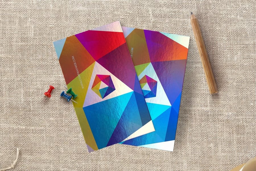
In Adobe Illustrator, open the Swatches panel, double-click your Pantone swatch, and switch the Color Mode from Spot to CMYK. Illustrator shows the process build it will use. For the most trustworthy number, load the Pantone+ Color Bridge library from the Swatch Libraries menu rather than the solid-coated one, because the Bridge is tuned to display the best CMYK equivalent for each spot color.
InDesign follows the same path: Window, then Swatches, double-click the color, and change Color Type to Process and Color Mode to CMYK. CorelDRAW and Affinity users have an equivalent conversion in their palette tools. Whichever app you use, do the whole document in CMYK from the start so you are never mixing a stray RGB or spot object into a process file.
One habit saves a lot of grief: after converting, note the final C, M, Y and K values somewhere permanent. If a term in the panel trips you up, the printing terms glossary explains process, spot and overprint. And if you would rather skip the software entirely, our online designer lets you type your CMYK values straight into a template.
A Pantone-to-CMYK values chart to start from
These are approximate CMYK builds for a handful of common Pantone colors. Every code below carries a C, so these are the coated references: right for a gloss or silk card, and a light starting point for uncoated stock, which soaks up ink and usually needs a heavier build to land in the same place. Treat them as a starting point, not gospel: the exact number depends on your Pantone library version and, crucially, on your paper. Always confirm against a current Color Bridge and a printed proof.
Convert any PMS number, not just the ones on this list
The list is deliberately short, because a printed chart of every Pantone build goes stale the moment the library is revised, and a wrong number costs you a reprint. Use the method instead. It works on any code, coated or uncoated:
- Load the Color Bridge library in Illustrator, InDesign or CorelDRAW rather than the solid coated one. Bridge exists for exactly this job: it shows the closest process build for each spot color.
- Pick the reference that matches your stock. C for coated, gloss and silk laminated jobs, U for uncoated. Reading a C value onto an uncoated card is the single most common reason a brand color prints flat.
- Write the four numbers into your brand kit next to the PMS code and the hex, then use those exact values on every file so the card, the flyer and the banner start from one recipe.
- Watch the out-of-gamut colors. Vivid oranges, greens and blues are the ones that land duller in process ink. If your brand lives there, decide up front whether to accept the shift or pay for a spot ink run.
- Proof it on the stock you are actually ordering and judge it under decent light, never on a monitor.
The same discipline is what keeps a reprint matching last year: to keep print color accurate across runs, save the build once and reprint from the same file instead of rebuilding the art.
Notice the greens and oranges: those are the colors most likely to drift, because they sit near the edge of what CMYK can reach. Reds, blues and black usually translate cleanly. If your brand color is one of the tricky ones and it has to be exact, that is the moment to weigh a true spot ink, covered in what is spot color printing.
Coated, uncoated, and why the same PMS shifts
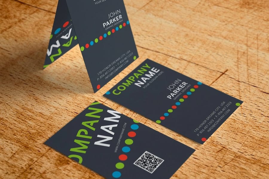
One PMS number has two CMYK builds because the paper does half the work. Coated stock holds the ink on the surface, uncoated stock drinks it in, so the same recipe reads brighter on one and softer on the other. That is why Pantone publishes separate coated and uncoated references, marked C and U, for the same spot color. Paper is not a neutral backdrop. It changes the color you see.
Coated stock and finishes like gloss or silk lamination hold ink up on the surface and bounce light back at you, so colors look brighter and more saturated. Uncoated stock drinks the ink in and scatters light, so the identical color reads softer and often needs a slightly heavier build to compensate. Order the same file on a glossy card and a natural uncoated card and you will see two versions of your brand color, both correct for their paper.
The practical rule: pick your stock and finish before you finalize the CMYK build, then match the conversion to that choice. A silk laminated business card and a raw uncoated card start from different numbers. Not sure how a stock will behave? Order a free paper sample and judge the color in your own hands before you commit a run.
Use this table as your Pantone to CMYK guide for the stocks behind the products on this page. Read the reference column first, then take the build for that letter from the Color Bridge.
| Stock | Pantone reference | Where it runs | Standard production |
|---|---|---|---|
| 16 Point Silk Laminated | C, coated | Silk laminated business cards, 2 x 3.5, 2 x 2, 1.5 x 3.5 or credit card size, 250 for $74.53 | 4 business days |
| 14pt Gloss Cover | C, coated | Premium business cards, from 100 for $17.57 | 3 business days |
| 14pt Uncoated Cover (30% PCW) | U, uncoated | Premium business cards, the same four card sizes as the gloss stock | 3 business days |
| 16pt Velvet Laminated Cover | C, coated | Raised spot UV business cards, 2 x 3.5, from 100 for $108.75 | 7 business days |
| 100# Gloss Text | C, coated | Event flyers, 5.5 x 8.5 to 11 x 25.5, from 50 for $57.11 | 3 business days |
| 70# Uncoated Text | U, uncoated | Event flyers, the same six flyer sizes | 3 business days |
Upload a print ready PDF set to CMYK with the four values from your brand kit typed into the swatch. On cards and flyers you can pick Free Online Proof in the proof options, so you see the file before it goes to press.
Keeping your brand color consistent across every print
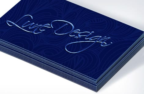
Consistency is a system, not luck. Once you have a CMYK build you trust, treat it like a locked asset.
- Write the values into your brand kit. Record the CMYK build next to the Pantone code and the hex, and use those exact numbers on every file, from cards to flyers to signage.
- Keep one master swatch. Build a shared swatch and drop it into each new document instead of retyping values and risking a typo.
- Design in CMYK from the first move. Starting in RGB and converting at the end invites surprises. The best color profile for printing guide covers which profile to set.
- Reprint from the same file. Rebuilding art from scratch is where color quietly drifts between runs.
When a color simply has to be exact across a huge campaign, that is the case for a real spot ink, sometimes paired with a metallic or foil pass. The foil file setup guide and two-color spot printing guide show when that investment pays off. For most everyday work, a locked CMYK build carries the brand faithfully.
What Pantone-accurate printing costs and how it is priced
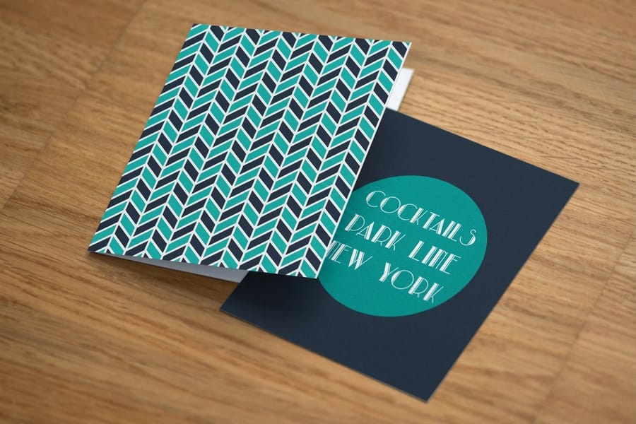
The good news for most buyers: converting Pantone to CMYK costs nothing extra. Full-color CMYK is the standard process behind almost every job here, so a converted brand color prints at the normal price of the product: 250 silk laminated cards for $74.53, 100 premium business cards from $17.57, or 50 event flyers from $57.11. There is no surcharge for the translation itself.
A true spot Pantone ink is the premium option, and it is priced differently because it is genuinely different work. It means a dedicated ink mixed to your exact recipe and an extra plate or run on press, so it is usually reserved for large quantities or brand colors that cannot bend. For a short run of cards, the CMYK build is almost always the smart call.
Beyond ink, price follows the usual levers: product, quantity, stock, size and finish. Larger runs bring the per-piece cost down, and finishes like lamination or spot UV add to it. You never have to estimate. Live pricing shows on the configurator before you order, and the specs panel below pulls real numbers straight from it. For a wider look at what drives a quote, common print quality problems is a useful companion read.
Wally explains color matching
One brand color, two color systems, one clean match
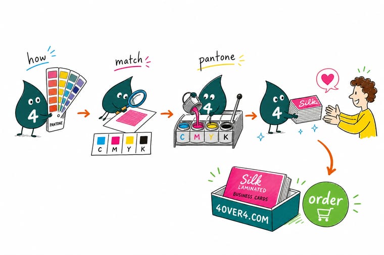
Wally thinks of it like translating a favorite song between two instruments: the melody carries over, but the exact timbre shifts a touch. A Pantone chip is one solid note, CMYK plays it back with four inks blended by your eye. Run the color through the Color Bridge, match the paper, prove it on press, and your brand color sings the same on every card. When a color has to be perfectly exact, that is Wally’s cue to reach for a real spot ink.
Order color-matched cards →
Specs and pricing
Silk laminated business card specs and pricing
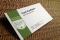
Coated finishes like silk lamination lift a converted CMYK build and keep brand color reading rich, so this card takes the C value of your Pantone. The stock is 16 point silk laminated in four sizes, 2 x 3.5, 2 x 2, 1.5 x 3.5 and credit card size, with spot UV on the front, back or both, and it prints in 4 business days. Silk laminated cards run 250 for $74.53, which is $0.30 each, and 500 for $87.15, with live specs and price-per-unit below.
| Quantity | Price Per Unit | Total |
|---|---|---|
| 250 | 29.8¢ | $74.53 |
| 500 | 17.4¢ | $87.15 |
| 1,000 | 11.2¢ | $112.41 |
| 2,500 | 9.04¢ | $226.11 |
| 5,000 | 5.53¢ | $276.63 |
| 10,000 | 5.53¢ | $553.25 |
| 15,000 | 5.47¢ | $819.78 |
| 20,000 | 5.49¢ | $1,097.66 |
Print it
Color-critical print, ready to order at 4OVER4
Premium business cards start at 100 for $17.57 and let you test one build on 14pt Gloss Cover against 14pt Uncoated. Raised spot UV cards print on 16pt Velvet Laminated Cover, 100 for $108.75, in 7 business days. Event flyers run from 50 for $57.11 on 100# gloss, silk/matte or 70# uncoated text, so a brand color can carry from the card to the flyer.

See it in use
Brand colors we converted and printed
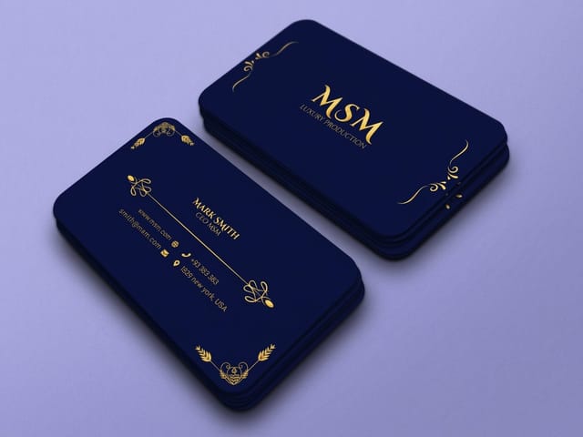
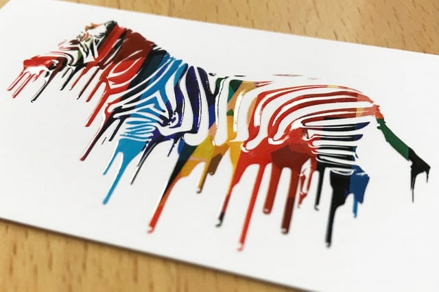
These are customer cards from our NYC plant. Look at the solid color fields beside the foil and spot UV: a flat field on coated card stock is where a CMYK build shows whether it held the brand color.









Explore more
Where to go next




By the numbers
The press that converts your Pantone build
Common Questions
Common questions about matching Pantone to CMYK
What is Pantone (PMS)?
Pantone, short for the Pantone Matching System, is a standardized library of pre-mixed spot inks. Each color has a code, like PMS 185 C, that means the same thing to any printer in the world. Instead of building the shade from process inks on press, the printer loads one ink that is already mixed to that exact recipe. That is why brands lean on Pantone for logos: it removes the guesswork and keeps a color identical from a business card in New York to a banner in Los Angeles.
What is Pantone in CMYK?
Pantone in CMYK means taking a spot Pantone color and rebuilding it out of the four process inks, cyan, magenta, yellow and black, that full-color digital and offset presses actually use. Most everyday printing, including full-color business cards and brochures, runs in CMYK, so a Pantone brand color has to be translated into a CMYK recipe before it can print. The conversion gets you close, but because CMYK mixes color from tiny dots rather than one solid ink, the match is an approximation rather than a perfect copy.
Can Pantone be converted exactly to CMYK?
Not exactly. A Pantone color is one solid pre-mixed ink, while a CMYK build simulates it with dots of four inks, and four process inks cover less of the visible range than the Pantone library does. Muted colors convert so closely that nobody notices, but vivid oranges, greens and blues land duller or slightly off-hue because they sit outside the CMYK gamut. If a brand color has to be exact, print it as a spot ink instead of converting it. If process is the right call, lock the CMYK values in your brand kit so at least it is the same shade on every job you order.
Why does my PMS color look different in CMYK than the swatch book?
Usually one of three things, in the order they bite. The paper: the chip in a swatch book is printed on its own stock, and your job is on yours, so a coated chip next to an uncoated card will never look identical. The reference: a coated (C) build sent to uncoated stock reads flat, so match C to coated and silk laminated jobs and U to uncoated before you blame the press. The gamut: if the color sits outside what four process inks can reach, the build is the closest approximation and not a copy. Judge the match on a printed proof of the exact stock you ordered, in decent light, never on a monitor.
How do I convert Pantone to CMYK in Illustrator?
Open your swatches, select the Pantone swatch, and change its color mode to CMYK in the Swatch Options or Color panel. Illustrator will show you the process build it is using. For a more reliable match, load the Pantone Color Bridge library instead of the solid-coated one, because the Bridge is designed specifically to show the closest CMYK equivalent for each spot color. InDesign and CorelDRAW work the same way. Whatever the values it hands you, confirm them against a printed proof before you commit a full run.
Why do my Pantone colors look different in CMYK?
Because the two systems mix color differently. A Pantone ink is a single, solid, pre-blended color, while CMYK simulates that color with an optical blend of four halftone dots. CMYK also covers a smaller range of colors, so the most vivid oranges, greens and blues fall outside what four process inks can hit. When a color sits outside that gamut, the CMYK build lands a little duller or slightly off-hue. It is not a mistake, it is the honest limit of process printing.
Do coated and uncoated stocks change the CMYK values?
Yes. Coated paper holds ink on the surface and reflects more light, so colors look brighter and the CMYK build is often more saturated. Uncoated paper absorbs ink and scatters light, so the same color reads softer and usually needs a different build to compensate. Pantone publishes separate coated (C) and uncoated (U) references for this reason. Always match your conversion to the stock you are actually ordering, and request a free sample if you want to feel the difference before you buy.
How far will my brand color shift on coated stock?
Start from the paper and the press. Pick the coated or uncoated Pantone reference that matches your stock, run the color through the Color Bridge for its process build, and check whether the color is inside the CMYK gamut. If it is, the standard bridge value is your answer. If it is a bright, out-of-gamut brand color that has to be exact, that is your cue to consider a true spot ink. When in doubt, a printed proof settles the question faster than any on-screen preview.
What does Pantone-accurate printing cost and how is it priced?
Full-color CMYK printing is the standard, most affordable option because it runs every job through the same four-ink process, and a Pantone-to-CMYK conversion adds nothing to that price. A true spot Pantone ink is a separate premium because it means a dedicated ink and an extra plate on press, so it is usually reserved for large runs or non-negotiable brand colors. At 4OVER4.COM, live pricing is set by product, quantity, stock and finish, and you can see the exact number on the configurator before you order.
Get Started
Order 100 raised spot UV cards at $1.09 each
Lock in your CMYK build, drop it into a template, and we print full-color cards and marketing pieces that stay on-brand order after order.
Legal Disclaimer
Gold Standard guarantees apply to all standard orders placed through 4over4.com. Price match requires verifiable proof of a competitor's published price for an equivalent product with matching specifications and turnaround time. Satisfaction guarantee covers manufacturing defects and print quality issues. Contact support with order number and documentation.
