
How to Choose Your Brand Color Palette


Emma is our prepress and print production voice, built from the knowledge of our production team, with over 20 years in printing.
Choose your brand color palette from inspiration, color psychology and the 60-30-10 rule, then take the print step most brands skip: lock each color as CMYK and Pantone and proof it on the cards, banners and packaging you will order.
A brand color palette is a small, fixed set of colors you use consistently across everything you make. Start with one lead color that fits your brand's personality, add one or two secondaries, an accent, and neutrals, balance them with the 60-30-10 rule, keep enough contrast to stay readable, then lock every color as CMYK and Pantone values so it prints the same every time.
Start here
The palette, from inspiration to ink
A brand color palette is the small, fixed set of colors you commit to and use everywhere. Choose one primary that carries the brand, support it with a secondary or two, an accent, and a few neutrals, then balance the mix with the 60-30-10 rule. Match the mood with color psychology, keep enough contrast to stay legible, and lock each color as CMYK and Pantone so it prints true. Get it right once and every piece from 4OVER4.COM stays effortlessly on brand.
Before you print
Turn the palette into a print order that matches
Write every core color down as a CMYK build and a Pantone number, then proof it on the stock you will actually order. A color that looks right on a monitor can shift on paper, and a gloss finish and a matte one change it again, so decide the finish with the palette, not after it.
Then run one small test per surface. White plastic cards show a palette on a smooth, bright face in UV gloss or silk matte. 2 sided blockout banners on 15oz vinyl show how the primary holds across a large flat field. Order free paper samples first if the palette leans on a pastel or a deep red that has to match.
Why your brand color palette is worth getting right

Before a customer reads your tagline or clicks a link, they have already reacted to your color. It is the fastest signal a brand sends, and once a person connects a color to you, they keep connecting it. That is why the same few colors show up on every touchpoint a strong brand owns, from the sign on the door to the corner of a business card.
A brand color palette is simply the small, fixed set of colors you commit to and use everywhere. Chosen well, it makes your work feel like it came from one place. Chosen carelessly, or changed on a whim, it makes even good design feel unsteady. Color is one of the cheapest, highest-impact decisions in the whole identity, which is why it belongs at the center of a strong brand identity.
This guide walks through choosing a palette from scratch: where to find inspiration, how color psychology steers the mood, how to structure primary, accent, and neutral colors with the 60-30-10 rule, and how to lock those colors so they print exactly as planned. If you are still shaping the mark itself, pair this with our notes on logo design best practices.
What a brand color palette actually is

A brand color palette is a structured set, not a random handful of favorites. Most palettes have four roles: a primary color that leads and appears most often, one or two secondary colors that support it, an accent used sparingly to draw the eye, and a set of neutrals (usually a near-black, a couple of greys, and an off-white) that carry your text and hold the empty space.
Three to five core colors is the sweet spot. Too few and the brand feels flat across different pieces, too many and nothing reads as ownable. Each color also needs defined values, not just a name: a hex code for screens, a CMYK build for four-color printing, and a Pantone (PMS) number for the times color has to match exactly. Our Pantone spot color printing makes that last one reliable, because a locked PMS ink prints the same shade on a card today and a banner next year.
Color is also where a brand meets material. The same blue looks one way on a glossy white plastic card and another on uncoated stock, so it helps to think about the surface as you choose. Keep the palette tight and documented, and every printed piece stays on brand without a second guess.
Start with color inspiration, then narrow it down

A blank palette is intimidating, so start by gathering, not deciding. Pull colors from anything that fits the feeling you want: a photograph, a landscape, a favorite package, the interior of a space your customers love. Save fifteen or twenty swatches with no commitment, then look for the two or three that keep pulling you back. That short list is your raw palette.
Look sideways at your category too. Note the colors competitors lean on so you can either fit the expected mood or break from it on purpose. A calm, pared-back direction can be its own kind of standout, which is the whole idea behind a minimal brand identity. And remember that color has to earn its keep on the shelf as well as the screen, the way it did in this food brand's shelf story.
As you narrow, keep sustainability in the frame if it matters to your brand, since your palette will end up as ink on paper thousands of times over. Printing those colors with soy-based inks keeps them sharp while treading lighter, so the values behind the brand hold up all the way to the finished piece.
Consider brand color psychology

Color carries meaning before a single word is read. It is not a rigid science, and culture and context shift it, but the broad associations are consistent enough to be useful. Blue reads as trustworthy and stable, which is why so much of tech and finance lives there, and a bright screen blue is one of the colors four inks struggle to match, so check its CMYK build on a printed proof before you commit. Red is energy and urgency, green leans toward health and growth, black signals premium weight, and yellow grabs attention but strains the eye as body text.
Match the feeling to the brand rather than to your personal taste. A children's brand and a law firm should not share a palette, even if you love the same colors for both. The reference table below sums up how each hue tends to land and where it works best, and for a print-specific take you can dig into what your business card colors say and the colors that sell on yard signs.
Structure the palette with the 60-30-10 rule
Picking colors is half the job. The other half is deciding how much of each to use, and the 60-30-10 rule is the shortcut that makes a palette feel calm and intentional. Give roughly 60% of any layout to your dominant color (often a neutral or a soft version of the primary), 30% to a secondary, and 10% to a sharp accent that lands only where you want the eye to go.
Assign roles clearly so the ratio has something to hold onto: the primary owns headers and large fields, the secondary handles supporting blocks and backgrounds, and the accent is reserved for buttons, prices, and the one thing that must be noticed. Neutrals do the quiet, essential work of carrying text and creating space between elements.
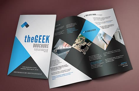
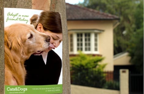
This structure is also what keeps a brand consistent across very different pieces. A postcard, a card, and a large banner can share the exact same palette and still feel balanced, because the ratio travels with them. If you are building the identity system alongside the palette, our logo design best practices cover how the mark and colors reinforce each other.
Make your colors survive the jump to print
Here is the step most palettes skip, and the reason a logo can look perfect on a laptop and wrong on the finished card. Screens make color with light (RGB) and mix it brighter than ink ever can. Presses make color with ink on paper (CMYK), and some vivid screen colors simply fall outside what four inks can reach. If you choose your palette purely by eye on a monitor, print will surprise you. Our guide on CMYK vs RGB and the notes on the best color profile for printing explain exactly why the shift happens.
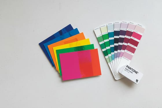
The fix is to define your brand colors in print terms from the start. Give each core color a CMYK build and, for the colors that must match every time, a Pantone number. When accuracy is critical (a signature brand color, a two-color job) a spot ink beats a CMYK approximation. See what spot color printing is and how two-color Pantone printing works, then use our Pantone to CMYK matching notes to translate cleanly.
Finally, proof before you commit to a full run. A physical proof or a set of free paper samples tells you how the ink sits on your chosen stock, which no screen can. Lock the values, keep them in a one-page brand sheet, and print with Pantone spot color whenever a color has to be unmistakably yours. If you need the deeper conversion workflow, our Pantone to CMYK matching guide has it.
Apply the palette across your kit (and what printing it costs)

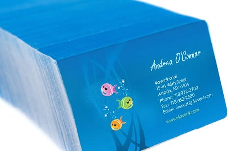
A palette only proves itself in use, so put it to work across a real kit. The same colors should carry your business cards, your banners, your logo stickers, and your packaging, each reinforcing the others. Small touches sell the consistency too, like painted-edge business cards that carry your accent color right to the edge of the stock.
Cost is easy to reason about once the design is set, because print price scales with a few simple levers: quantity (more pieces lower the unit price), size, paper stock, and finish. A box of premium 30mil white plastic cards starts around $226 and the per-card price drops as the quantity climbs, and you watch the number change live in the configurator as you adjust each option.
Use the specs and pricing panel below to see the exact combinations for your chosen product, and order a physical proof or free paper samples first so you can confirm your brand colors on real stock before the full run. Get the palette right once, document it, and every future order stays effortlessly on brand.
Wally explains brand color
Pick a few colors on purpose, then use them everywhere
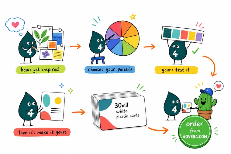
Wally keeps it simple: choose one lead color that fits your brand, add a supporting shade, one bright accent, and a couple of neutrals, then balance them with the 60-30-10 rule. The trick most people miss is the last step, locking those colors as CMYK and Pantone so the ink on the card matches the swatch on the screen. Set it once, and 4OVER4 prints it true every single time.
Print your brand colors →Color psychology reference
What each color tends to say
A quick reference for the mood each hue carries and where it earns its place in a brand. Use it as a starting point, then adjust for your audience and category. Eight rows run from red for sales and food to black for premium print and packaging, with neutrals as the space every palette needs.
| Color | What it signals | Works well for |
|---|---|---|
| Red | Energy, urgency, appetite | Sales, food, bold retail, calls to action |
| Orange | Friendly, affordable, playful | Youthful, approachable brands and deals |
| Yellow | Optimism, warmth, attention | Best as an accent, hard to read as text |
| Green | Growth, health, calm, money | Wellness, finance, eco and outdoor brands |
| Blue | Trust, stability, competence | Tech, healthcare, finance, the safe default |
| Purple | Luxury, creativity, wisdom | Beauty, premium and imaginative brands |
| Black | Sophistication, authority, weight | Premium print, packaging, high-end retail |
| Neutral | Space, clarity, simplicity | The breathing room every palette needs |

Infographic
How to build a brand color palette, at a glance
One frame, one system. Save it and use it as a checklist the next time you set colors for a card, a banner, or a whole brand kit.
A palette is a system: one primary leads, a secondary and accent support it, neutrals hold the space, and locked CMYK plus Pantone values keep it printing the same every time.
Specs and pricing
Plastic card specs and live pricing
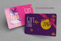
When your palette is set, the printing decisions come down to product, stock, and finish. Here are the live specs and price-per-unit for 30mil white plastic cards at 4OVER4.COM, a premium surface where brand color really pops. They print at 2.125 by 3.375 inches, credit card size, with a UV gloss or silk matte finish and optional foil, from 250 for $226.11 with 15 business days of production.
| Quantity | Price Per Unit | Total |
|---|---|---|
| 250 | 90.4¢ | $226.11 |
| 500 | 55.3¢ | $276.63 |
| 1,000 | 37.8¢ | $377.68 |
| 2,000 | 34.7¢ | $693.46 |
| 2,500 | 35.3¢ | $882.94 |
| 3,000 | 33.6¢ | $1,009.25 |
| 3,500 | 32.4¢ | $1,135.55 |
| 4,000 | 31.5¢ | $1,261.87 |
Print it
Put your palette into print at 4OVER4
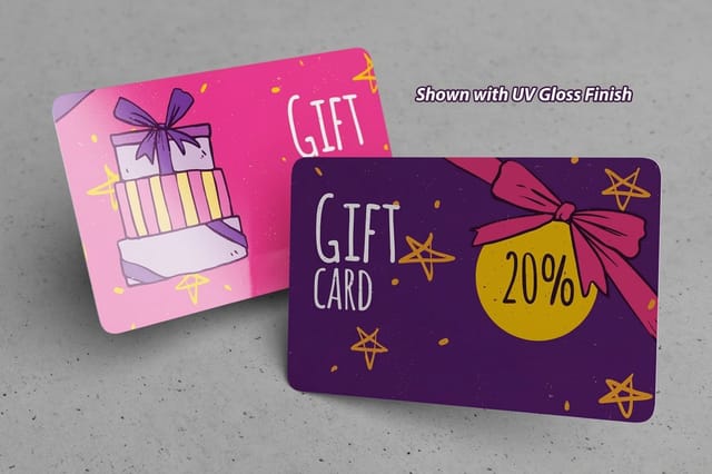
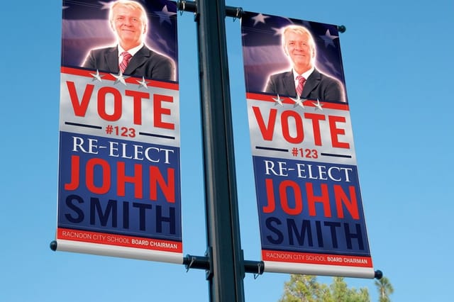
Test the palette across three surfaces: white plastic cards from $226.11 for 250, 3D lenticular business cards from 500 for $690.88 on a 31pt lens, and 2 sided blockout banners from $108.75 on 15oz vinyl, where large flat fields show any color shift first.

%22%2F%3E%3Ccircle%20cx%3D%2241%22%20cy%3D%2245%22%20r%3D%2226%22%20fill%3D%22%2314b8a6%22%20opacity%3D%220.15%22%2F%3E%3Ccircle%20cx%3D%2280%22%20cy%3D%2262%22%20r%3D%2226%22%20fill%3D%22%2314b8a6%22%20opacity%3D%220.1%22%2F%3E%3Crect%20x%3D%2271%22%20y%3D%2221%22%20width%3D%2226%22%20height%3D%2232%22%20rx%3D%224%22%20fill%3D%22%2314b8a6%22%20opacity%3D%220.08%22%20transform%3D%22rotate(6%2080%2030)%22%2F%3E%3C%2Fsvg%3E)
Explore more
Where to go next




By the numbers
Getting your exact shade onto paper
Common Questions
Common questions about brand color palettes
How many colors should a brand palette have?
Three to five core colors is the practical sweet spot. Most brands work best with a single primary, one or two secondaries, one accent used sparingly, and a small set of neutrals (a near-black, a gray or two, and an off-white) for text and space. Fewer colors than that can feel flat across different pieces, and more than five tends to dilute recognition so no single color reads as yours.
What is the 60-30-10 rule for color?
It is a proportion guide for how much of each color to use in a layout. Roughly 60% goes to your dominant color, 30% to a secondary, and 10% to a sharp accent that draws the eye to the most important element. Keeping to that ratio is the simplest way to make a palette feel balanced and intentional rather than busy.
How do I make sure my brand colors print correctly?
Define your colors in print terms, not just on screen. Give each core color a CMYK build and, for colors that must match exactly, a Pantone (PMS) number. Screens use RGB light and can show colors that four inks cannot reproduce, so choosing by monitor alone leads to surprises. Proof on your actual stock, or order free paper samples, before committing to a full run.
Should I use Pantone or CMYK for my brand colors?
Use both, for different jobs. CMYK (four-color process) is right for full-color work like photos and everyday printing. Pantone spot inks are for the colors that must be identical every time, such as a signature brand color or a clean two-color job, because a PMS ink is a premixed color rather than a build of four inks. Documenting both a CMYK value and a Pantone number for each core color keeps you covered on any product.
What colors work best for a brand?
There is no universal best, only the color that fits your brand and audience. Blue reads as trustworthy and stable, red as energetic and urgent, green as healthy and calm, black as premium and authoritative, and yellow as attention-grabbing but weak for body text. Match the emotional association to what your brand promises, then make sure your chosen shades hold enough contrast to stay readable in print.
How do I find color inspiration for my brand?
Gather before you decide. Pull swatches from photographs, landscapes, packaging, and spaces your customers love, and save fifteen or twenty with no commitment. Then look for the two or three that keep pulling you back. Study your category too, so you can either fit the expected mood or break from it deliberately, and let that short list become your raw palette.
What does it cost to print my brand colors?
Printing cost scales with quantity, size, paper stock, and finish, and the price updates live in the configurator as you set each option. A box of premium 30mil white plastic cards starts around $226 and the per-card price drops as quantity climbs. Add Pantone spot color when a shade has to match exactly, and order free paper samples first so you can confirm your colors on real stock before a full run.
Get Started
Print your palette on a 2-sided blockout banner from $108.75
Bring your brand colors to 4OVER4.COM and print them true on the product, stock, and finish you choose. Add Pantone spot color when a shade has to match exactly. A 2-sided blockout banner runs 4 business days.
Legal Disclaimer
Gold Standard guarantees apply to all standard orders placed through 4over4.com. Price match requires verifiable proof of a competitor's published price for an equivalent product with matching specifications and turnaround time. Satisfaction guarantee covers manufacturing defects and print quality issues. Contact support with order number and documentation.
