
Guide to Hierarchy in Graphic Design


Sofia is our design and templates voice, built from the knowledge of our production team, with over 20 years in printing.
Visual hierarchy is the order your eye moves in. Master the five levers that create it, size, contrast, typography, spacing and color, then put them to work on flyers and posters where a clear path from headline to call to action is what earns the response. The pieces that put it to work are club flyers from $16.48, business flyers from $57.11, postcards from $16.48 and posters from $108.75.
Hierarchy in graphic design is the deliberate ranking of elements so a viewer reads them in the order of their importance. Designers build it with five tools, size and scale, contrast, typography, spacing and color, arranging a page so the eye lands on one dominant element first and steps down to the call to action last. On a flyer, poster or postcard, that ordered path is what turns a two-second glance into a response.
Quick tips
Quick tips for stronger hierarchy on print
Pick one dominant element per page and let everything else support it. Open a real gap between headline and body size, spend contrast and your accent color only on what matters most, and give your winning element room to breathe. Design in CMYK so the color survives the press, keep important elements clear of trim and fold lines, and read the piece from a glance, not up close. 4OVER4.COM prints your layout exactly as designed, so the hierarchy you build holds on paper.
What is hierarchy in graphic design?
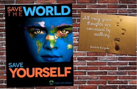
Visual hierarchy is the deliberate ranking of elements on a page so that a viewer reads them in the order of their importance. It is the quiet system underneath every good flyer, poster and postcard that decides what your eye lands on first, where it travels next, and what it saves for last. You rarely notice hierarchy when it is working. You feel it as a design that simply makes sense. On a 4 by 6 inch flyer that ranking comes down to three sizes, a 72 pt headline, a 24 pt offer and 11 pt body copy, as the worked example below shows.
Think of a page as a conversation with a stranger who is in a hurry. Hierarchy is you deciding what to say first. The headline speaks, then the supporting line, then the details, then the one thing you want them to do. Get that order right and the reader never has to hunt. Get it wrong and even beautiful artwork reads as a flat wall of stuff.
Designers build this order with a handful of tools rather than any single trick. Over the next sections we will walk through the five that do most of the work, then put them together on a real print layout. If you want the tools in your hands right away, the 4OVER4.COM online designer lets you test hierarchy on your own artwork before you commit to a print run.
Why visual hierarchy matters, especially in print
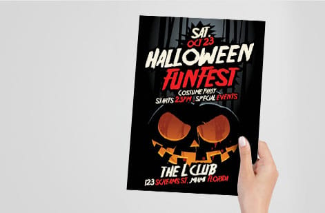
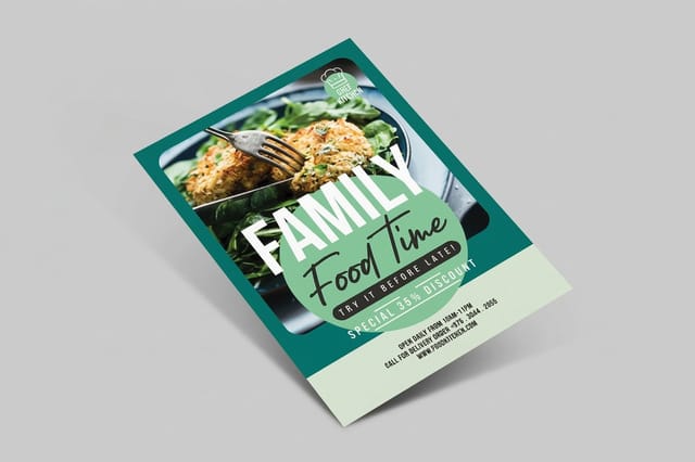
On a website, a confused visitor can scroll, search and click their way to what they need. A printed piece gets no such patience. A flyer pinned to a community board, a poster across a busy lobby, a postcard pulled from a stack of mail, each one earns a glance measured in a second or two. Hierarchy is how you win that glance. On the 4 by 6 inch club flyer later in this guide, the eye goes image, headline, offer, action in about two seconds.
When every element on a page shouts at the same volume, the brain hears silence. Nothing stands forward, so nothing gets read, and the piece becomes background texture. Strong hierarchy does the opposite. It hands the reader a path: here is the promise, here is the proof, here is the next step. That path is the whole reason marketing print exists.
This matters most when the goal is action. A well-ordered mailer is not decoration, it is a conversion route on paper, and the numbers back it up in our postcard ROI and response benchmarks. The design choices in this guide are the same ones that separate a piece people act on from one they set down and forget.
The core principles of hierarchy
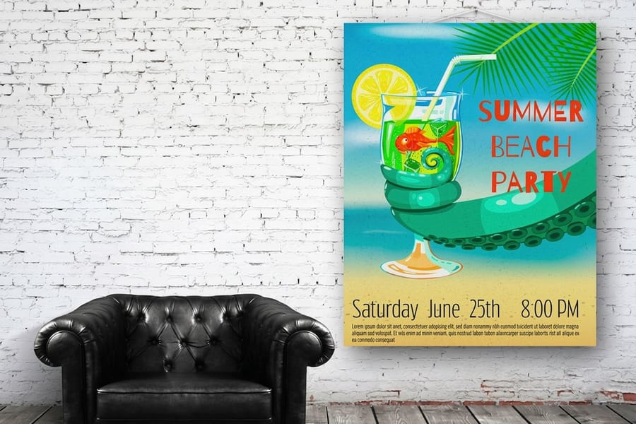
Hierarchy is not one skill, it is a small set of levers you learn to pull together. Size makes an element feel important. Contrast makes it jump forward. Typography ranks your words. Spacing frames what matters, and color points to the one action you want. Move a single element up in most of those scales and it becomes the front door to your entire layout. In numbers, that means a headline three to four times the body size, one accent color, and half an inch of empty space under the headline.
The diagram below shows the idea on a single flyer. Notice how your eye lands on the largest, boldest block first, steps down through the supporting line and body copy, and finishes on the button. That descent is hierarchy in motion.
A single flyer, read in order. The eye lands on the largest element first and finishes on the one action you want.
Keep this order in mind as we take each lever apart. None of them work in isolation, and the best print pieces stack two or three of them on the same element so the winner of the page is never in doubt.
Size and scale

Size is the bluntest and most reliable hierarchy tool you have. Bigger reads as more important, full stop. The largest element on a page becomes its entrance, so the first decision on any layout is simple: what is the one thing that earns the most space?
The trap is timidity. A headline only a little larger than the body copy looks like a mistake rather than a decision. Open a real gap. A headline at three to four times the size of your body text reads as unmistakably dominant, and the jump between levels is what makes the ranking legible at a glance. This is doubly true on a poster, which may be read from across a room where subtle size differences vanish entirely.
Scale also sets rhythm. Once your headline claims the top of the ladder, size your subhead, body and captions in clear steps down from it. Those steps are a type scale, and holding to one keeps a busy layout from turning into a shouting match. When you are ready to see how far scale can go, our poster sizes guide covers the formats that give a big idea room to breathe.
Contrast and weight
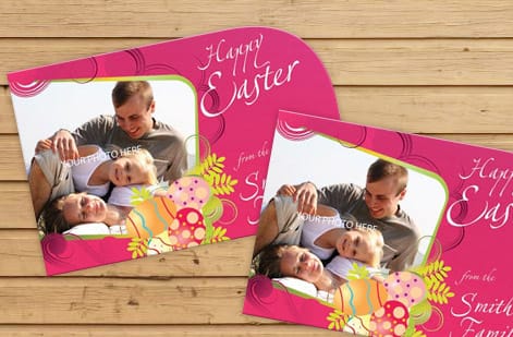
Contrast is difference, and difference is what the eye notices. A single bold word in a field of light text, a dark shape on a pale ground, a heavy weight beside a thin one, each pulls attention without needing to be large. Where size shouts, contrast points.
The most useful kind is weight contrast in type. Setting a key phrase in a heavy weight while the rest stays regular creates an instant focal point inside a paragraph, which is what an offer or a date needs when a reader cannot miss it. Tonal contrast does the same at the page level: reverse a headline out of a dark band and it separates cleanly from everything around it.
Contrast is powerful precisely because it is finite. If everything is bold, nothing is, and the effect collapses back into noise. Spend it on the one or two elements that matter most. The same discipline shows up in strong logo work, which is why the restraint in our minimalist brand identity guide reads as confident rather than empty.
Typography and type hierarchy
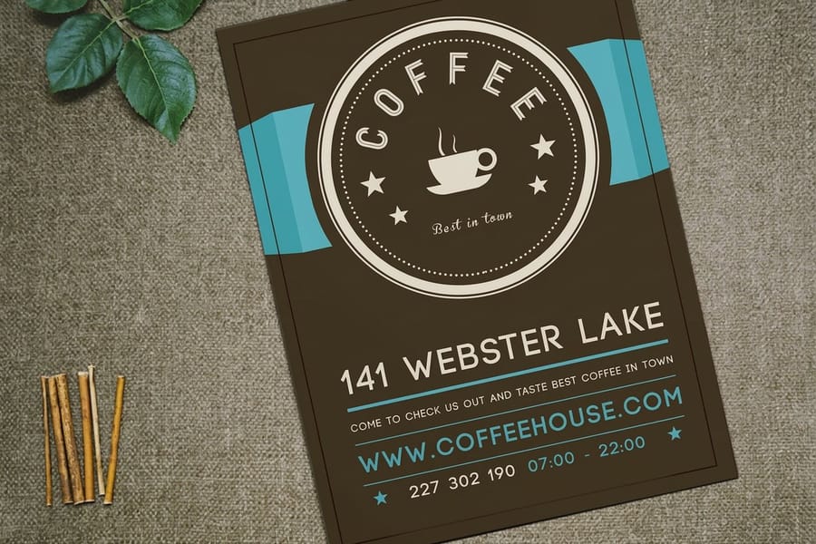
Type does a huge amount of hierarchy work on its own, because most of what a reader processes on a page is words. The classic move is a two-font system: a characterful display face for headlines paired with a clean, highly readable face for body copy. The contrast between the two makes the ranking obvious before anyone reads a single word.
- Weight separates a headline from a subhead faster than size alone. Bold, semibold and regular give you three clear rungs.
- Case is a lever too. All caps carries authority for short headlines but slows reading in long passages, so keep it brief.
- Alignment and measure matter. Left-aligned body text with a comfortable line length reads far easier than centered blocks, and easy reading is part of hierarchy.
Resist the urge to use more than two typefaces on one piece. A third font rarely adds clarity and usually adds mess. If you want to go deeper on pairing and personality, the fonts story in the history behind Arial and Helvetica is a good, opinionated place to start.
Spacing and whitespace
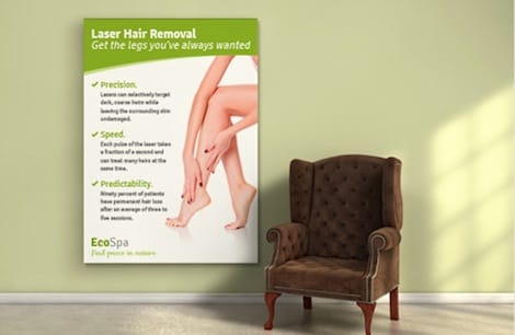
Whitespace is the most misunderstood tool in the set. It is not wasted room, it is a signal. Space around an element is what tells the eye that element is important, and crowding is the fastest way to flatten a strong headline into the wallpaper behind it. On the worked example flyer, that space is a 3 pica gap, half an inch, under a 72 pt headline.
Two kinds of space do the work. Macro space, the margins and gaps between big blocks, groups related things and separates unrelated ones so the reader can parse the page at a glance. Micro space, the leading between lines and the gaps between letters, sets the pace of reading and keeps dense copy from feeling like a wall. Both are hierarchy decisions, not afterthoughts.
On print you also have to respect the edge. Keep important elements clear of trim and fold lines so nothing gets cut or creased, a habit our brochure folding guide walks through in detail. Give your winning element room, protect it from the edges, and let the empty space do the pointing for you.
Color and hierarchy

Color is the tool that most directly steers attention, which is exactly why it is so easy to overuse. The reliable pattern is restraint: build the piece in a calm, mostly neutral palette, then reserve one accent color for the single element you want acted on. On the 4 by 6 inch worked example, that accent sits on the 24 pt offer line. That lone warm button on a cool page is almost impossible not to look at.
Warm hues like orange and red tend to advance toward the viewer, while cool blues and greens recede, so you can use temperature to layer a design front to back. Saturation ranks too. A vivid element outranks a muted one beside it, which is why a call to action usually deserves your most saturated color and your body copy does not.
The catch in print is that color has to survive the press. A hue that glows on a backlit screen can shift or dull once it is printed with ink, so design in the right color mode from the start. Our CMYK vs RGB guide and Pantone to CMYK matching keep the accent you chose looking the same on paper as it did on screen.
Imagery, and putting hierarchy to work
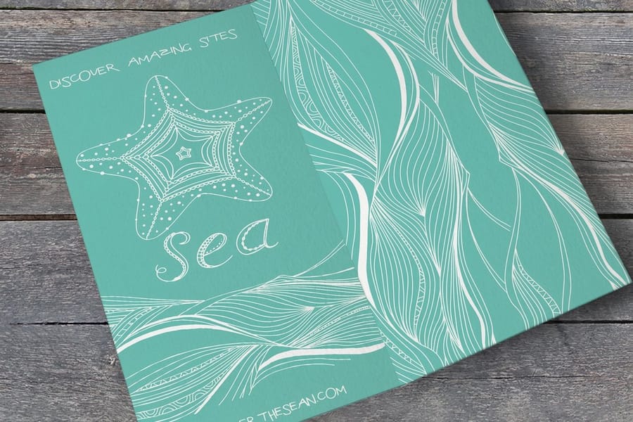
Imagery sits at the top of most hierarchies because the eye reaches a photograph before it reaches a word. A single strong hero image, given room and scale, can carry the first look all by itself, with the headline riding just beneath it. The danger is competition: several medium images at equal size cancel each other out, so pick one to lead and let the rest support.
Now stack the levers. Take a flyer with a hero image, a headline three times the body size, one offer set in a heavy weight, a generous margin around it, and a single orange button. Each choice is small. Together they build a path the eye follows without effort, from image to headline to offer to action. That is hierarchy doing its real job, which is moving a reader toward a decision.
When your layout is ready, the details of stock and finish decide how it lands in the hand. Browse the full range at marketing materials printing, or study finished layouts in our custom poster showcase to see these principles printed and in use.
A worked example: one flyer, three levels of hierarchy

Take a single 4 in by 6 in club flyer, built from a blank page to a file ready for press, with the numbers written down. The document is set up at 4.25 in by 6.25 in to carry a 0.125 in bleed on every side, with a 0.25 in safety margin holding all live text away from the trim. Inside that safe area, everything is ranked on three levels and nothing else is allowed.
Level one, the first look. The hero image runs full bleed across the top 3 in. The headline sits directly under it at 72 pt bold, leading pulled in tight to 66 pt so the two lines lock together as one shape rather than reading as two separate lines. Under the headline there is a 3 pica gap, half an inch of nothing, which is the single most valuable half inch on the flyer. That gap is what makes 72 pt read as dominant instead of merely large.
Level two, the reason to act. The offer line runs at 24 pt semibold, one third the size of the headline, which is far enough down the type scale to read as a different rank rather than a mistake. It is separated from the headline by that 3 pica gap and from the body copy below by 1 pica. It carries the accent color, and it is the only element on the flyer that does. On a Z pattern piece like this one it sits at the right of the second sweep, where the eye is already traveling.
Level three, the detail. Body copy runs 11 pt with 15 pt leading, roughly 135 percent, in two short paragraphs of no more than three lines each, left aligned so the rag stays soft. Below it, at the bottom right corner where the Z pattern ends, the call to action sits in a solid accent block: 18 pt bold, reversed out, with 1 pica of padding inside the block on all four sides so the type never touches the edge of its own color. Address, phone and the fine print run 8 pt, the quietest thing on the page, still inside that 0.25 in safety margin.
Count the levels on the printed proof, not on screen. Three sizes, 72, 24 and 11, plus one 18 pt button and one 8 pt footer. One image. One accent hue. One gap doing the heavy lifting. Read at arm length the eye goes image, headline, offer, action, in that order, every time, and it takes about two seconds. Set the same flyer with a 36 pt headline, an 18 pt offer and 14 pt body and the levels collapse into each other: the numbers are still different, but nothing looks different enough to lead. If you want to build this layout without opening a design application, the online designer holds the bleed and safety margins for you, and the custom postcard showcase shows the same three level structure printed on a heavier stock.
Before you print
Sizes, stocks and type levels for four print pieces
Set the size before the type scale, because the gaps between levels are measured against the sheet. Design in CMYK, add 0.125 in bleed on every side, and read the printed proof at arm length before the run.
| Piece | Size | Hierarchy at this size | Stock | Starts at |
|---|---|---|---|---|
| Club flyer | 4 by 6 in, built at 4.25 by 6.25 with 0.125 in bleed | 72 pt headline, 24 pt offer, 11 pt body, text 0.25 in inside the trim | 14pt to 24pt cover | 50 for $16.48 |
| Postcard | 4 by 6 in, or 2.5 by 2.5 up to 6 by 11 | One dominant element per side, one accent color | 14pt to 24pt cover | 50 for $16.48 |
| Business flyer | 8.5 by 11 in, or 5.5 by 8.5 up to 11 by 25.5 | Headline three to four times the body size | 100# gloss or silk text, or 70# uncoated | 50 for $57.11 |
| Poster | 11 by 17 up to 22 by 28 in | Size gaps wide enough to read from across a room | 100# gloss text to 14pt cover, or synthetic plastic | 50 for $108.75 |
Wally explains hierarchy
Make one thing win, and the whole page reads
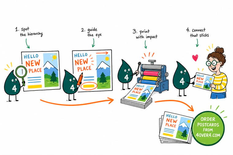
Wally treats a flyer like a staircase for the eyes: the biggest, boldest step at the top, the button at the bottom, and nothing fighting in between. Pick one element to win the first look, spend your contrast and accent color only on what matters, and let empty space point the way. When the layout is ready, print it at 4OVER4 and the hierarchy you built stays exactly where you put it.
Open the online designer →
Specs and pricing
Postcard specs and live pricing
A 4 by 6 inch postcard is a tight canvas that forces disciplined hierarchy: build it at 4.25 by 6.25 inches with 0.125 in bleed, keep live text 0.25 in inside the trim, and pick from 14 sizes up to 6 by 11 on 14pt to 26pt cover. Standard postcards run 50 for $16.48, which is $0.33 each, with live specs and per-unit pricing below.
| Quantity | Price Per Unit | Total |
|---|---|---|
| 50 | 33.0¢ | $16.48 |
| 100 | 24.2¢ | $24.16 |
| 200 | 15.9¢ | $31.86 |
| 300 | 12.8¢ | $38.45 |
| 400 | 11.3¢ | $45.04 |
| 500 | 10.3¢ | $51.62 |
| 600 | 9.89¢ | $59.31 |
| 700 | 9.57¢ | $67.00 |
Print it
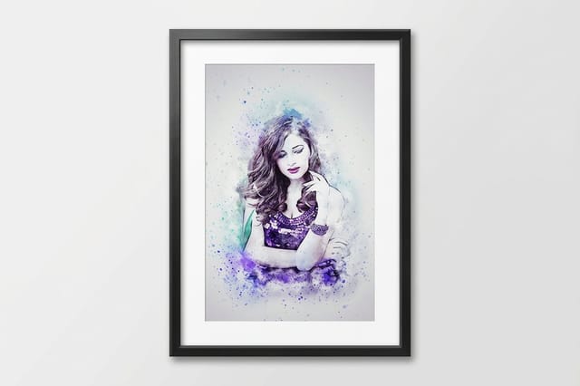
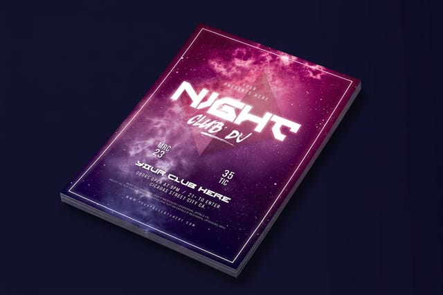
Print a layout built on real hierarchy
See it in use
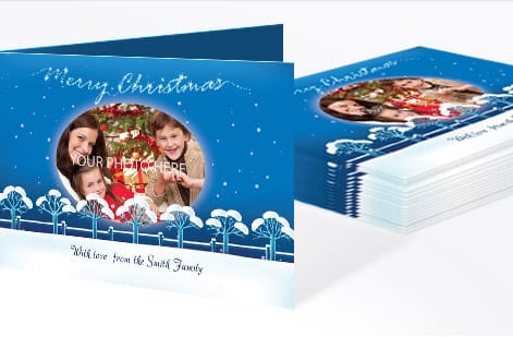
Real customer print, ordered by hierarchy





Explore more
Where to go next




By the numbers
Club flyers at $0.33, business flyers at $1.14
Common Questions
Common questions about visual hierarchy
What is visual hierarchy in graphic design?
Visual hierarchy is the arrangement of elements so a viewer perceives them in the order of their importance. Designers create it by varying size, contrast, typography, spacing and color, which guides the eye from the most important element (a headline or offer) down to the least important (fine print or a footer). Good hierarchy is invisible. The reader simply feels like the design makes sense.
Why does visual hierarchy matter, especially in print?
A screen visitor can scroll and hunt, but a printed flyer, poster or postcard gets a two-second glance. If nothing pulls the eye first, the whole piece reads as gray noise and the message is lost. Strong hierarchy uses that first glance to deliver the headline, then the offer, then the next step, which is the difference between a piece that gets acted on and one that gets recycled.
What are the core principles of visual hierarchy?
The five that carry most designs are size and scale (bigger reads as more important), contrast (a bright element on a quiet field jumps forward), typography (weight, case and font pairing rank your words), spacing (whitespace frames what matters), and color (a single accent hue draws the eye to your call to action). Reading patterns like the Z-pattern and F-pattern then help you place those elements where eyes naturally travel.
How many levels can one flyer actually carry?
Start from the one action you want. Everything else ranks below it. Make the headline or hero image the clear first stop, keep the supporting copy short and secondary, and give the call to action its own color and breathing room so it lands last and loudest. Our step-by-step walkthroughs on how to design flyers and how to make posters show the layout moves in practice.
What is the difference between hierarchy and layout?
Layout is where elements sit on the page. Hierarchy is the priority they carry once they are there. You can have a tidy, grid-aligned layout with no hierarchy at all, where everything is the same size and nothing stands out. Hierarchy is the layer on top of layout that decides what wins the first look, and it is what turns a neat arrangement into a design that communicates.
What are the levels of visual hierarchy?
Most printed pieces run on three levels, and it helps to name them before you set a single line of type. Level one is the dominant element that owns the two-second glance: a hero image or a headline at around three times the body size, and only one element is allowed to hold it. Level two is the supporting rank that gives a reason to keep looking: the offer, the subhead, the date or the price, set smaller but heavier, or carrying the one accent color. Level three is everything a reader only needs once they are already interested: body copy, terms, address and phone, usually 8 pt to 11 pt. Some layouts add a fourth level for legal fine print set smaller still. The test is simple. Point at one element per level on the printed proof. If you cannot, you have a layout and not a hierarchy yet.
What is the difference between visual hierarchy and layout?
Layout is the geometry of the page: trim size, margins, columns, gutters, and on a press file the 0.125 in bleed and the 0.25 in safety margin that keep artwork and live text safe through trimming. Visual hierarchy is the ranking you build inside that geometry, the decision about which element wins the first look and which one waits. In practice you set the layout first, because it is fixed by the product and the press, then you rank the content within it. The two also fail differently, which is the fastest way to tell them apart: a layout error prints wrong, with a phone number trimmed off or copy running into the fold. A hierarchy error prints perfectly, every mark exactly where the file put it, and the flyer still gets glanced at and dropped in the bin because nothing told the reader where to start.
Which fonts and sizes create strong hierarchy in print?
Contrast is what matters more than any specific font. Pair a heavier display face for headlines with a clean, readable face for body copy, and open a real gap between the sizes. A headline at three to four times the body size reads as clearly dominant, while a headline only slightly larger than the body looks like an accident. For color pairing in print, our CMYK vs RGB guide keeps those choices from shifting on press.
How much does it cost to print flyers, posters or postcards, and how is pricing set?
Price is driven by size, paper stock, quantity, coating and turnaround, so a small run of standard postcards starts low while large-format posters or specialty finishes cost more. Every product page at 4OVER4.COM shows live, per-unit pricing straight from the configurator, and the specs and price table on this page pulls those same numbers so you can see exactly what your design will cost to print.
Get Started
Print the layout where one element wins
Build your layout so one element wins, rank the rest, and we print a flyer, poster or postcard that reads exactly the way you designed it.
Legal Disclaimer
Gold Standard guarantees apply to all standard orders placed through 4over4.com. Price match requires verifiable proof of a competitor's published price for an equivalent product with matching specifications and turnaround time. Satisfaction guarantee covers manufacturing defects and print quality issues. Contact support with order number and documentation.
