
Graphic Design Layout Principles That Make Print Look Professional


Layout is how the eye moves through a page, and in print it has to work in one glance. Alignment to a shared grid is the one principle a reader notices only when it is missing.
The seven layout principles are balance, alignment, hierarchy, proximity, contrast, repetition, and white space. Start from a grid, set a clear hierarchy, group related elements, align everything, and protect white space. The same rules scale from a business card to a brochure.
Start here
Grid, hierarchy, grouping, space
Layout is the arrangement that decides how the eye moves through a page. Seven principles govern it: balance, alignment, hierarchy, proximity, contrast, repetition, and white space. Start from a grid, set a clear hierarchy, group related elements, align to shared edges, and protect breathing room. The blueprint below labels each principle on a real page.
What a layout is, and why it matters more in print
A layout is the arrangement of every element on a page: where the headline sits, how the images relate, which way the eye travels. It is not decoration. A strong layout is invisible; it simply makes the message clear and the piece feel finished. A weak one leaves the reader working to find what matters.
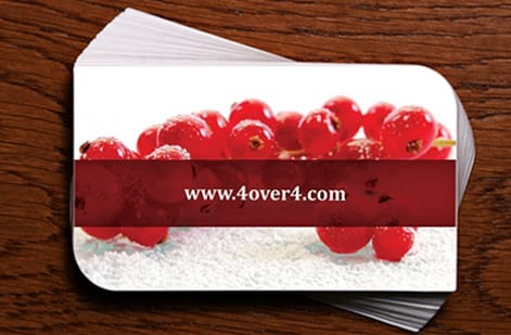
Layout matters even more in print than on screen, because a printed piece cannot scroll, expand, or reflow. A business card or a flyer has to communicate in a single glance, at a fixed size, in the reader’s hand. That constraint is a gift: it forces you to decide what is important and to build a layout that delivers it instantly.
This guide takes the abstract list of layout principles and makes it practical for print. We will cover balance, alignment, hierarchy, proximity, contrast, repetition, and white space, then apply them to real products and turn the result into a press-ready file. If you want to practice as you read, our free online design tool lets you try each idea on a real template.
The grid and alignment: the invisible backbone

Almost every professional layout sits on a grid, even when you cannot see it. A grid is a set of columns and consistent margins that give every element a place to sit. Align your text and images to those columns and shared edges, and the layout instantly reads as deliberate. Ignore the grid, and even good content looks scattered.
Alignment is the single most reliable way to make a design look intentional. Left edges that line up, baselines that share a rhythm, and images that snap to the same columns all signal a careful hand. The eye notices misalignment even when it cannot name it, so a stray element a few pixels off is enough to make a piece feel off.
Start every layout by building a simple grid and pulling in even margins from the trim. Then place elements onto it rather than floating them freely. This one habit does more for a beginner’s work than any other, and it scales from a card to a multi-panel brochure without change.
Hierarchy and balance: deciding what wins the eye
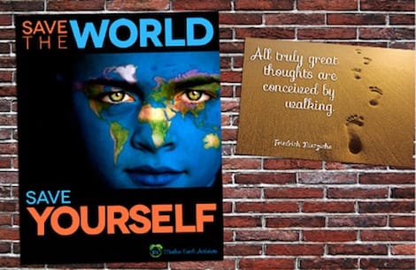
Hierarchy is how you tell the reader what to look at, and in what order. You build it with size, weight, color, contrast, and position: the biggest, boldest, highest-contrast element gets noticed first, and everything else steps down from there. Set a clear first, second, and third, and your message lands in a single glance instead of forcing the reader to hunt.
Balance is the partner to hierarchy. It is the distribution of visual weight across the page so no corner feels heavy and nothing tips over. A layout can be symmetrical, mirrored around a center line for a formal, stable feel, or asymmetrical, using contrast in size and space to create dynamic balance. Either works, as long as the weight feels resolved rather than accidental.
Together, hierarchy and balance turn a flat page into one the eye can read. Our guides on hierarchy and balance go deeper on each, with examples you can copy straight onto a print layout.
Proximity and white space: grouping and breathing room
Proximity is the principle that related elements belong close together, and unrelated ones need space between them. Group a heading with its paragraph, a caption with its image, a phone number with an email, and the reader understands the relationship without a single line or box. Scatter them, and the layout turns into a puzzle.
White space is the room you leave around and between those groups, and it is one of the most underused tools in design. Empty space is not wasted; it focuses attention, separates ideas, and signals quality. Generous margins and breathing room around a headline make a piece feel considered, while cramming every inch makes it feel cheap and hard to read.
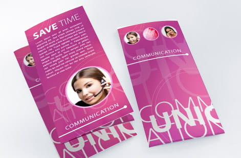
The two work as a pair: proximity clusters what belongs together, and white space keeps those clusters apart. On a folded piece this becomes essential, because each panel needs its own grouping and its own room. Our guide on brochure design shows how proximity and space carry a reader across multiple panels.
Contrast and repetition: emphasis and consistency
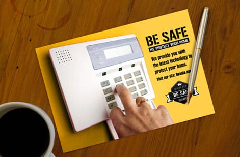
Contrast is difference, and difference is what draws the eye. A bold headline against light body text, a bright accent color against a neutral field, a large image beside small type: each contrast creates emphasis and improves legibility. The strongest contrast on a page should land on the thing you most want noticed, usually the call to action.
Repetition is the opposite force, and it creates unity. Reusing the same fonts, colors, spacing, and styles across a piece, and across an entire suite, ties everything into one coherent design. Repetition is what makes a business card, a flyer, and a brochure feel like they come from the same brand rather than three different ones.
Used together, contrast and repetition give a layout both energy and order: contrast provides the highlights, repetition provides the through-line. Consistent type and color are also the foundation of a strong, reproducible identity, which is why they overlap with logo design best practices.
Applying layout to cards, flyers, and brochures

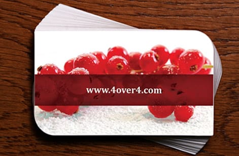
The payoff of these principles is that they scale to any product without changing. On a business card, hierarchy puts the name first, alignment keeps contact details in a tidy column, and white space keeps a small surface from feeling crowded. The whole design lives or dies on restraint.
On a flyer, hierarchy leads with the offer, contrast makes the call to action pop, and a grid organizes the supporting details so the reader moves from hook to action smoothly. On a brochure, repetition ties the panels together, proximity groups each topic, and balance keeps every spread feeling resolved as the piece opens.
The workflow is the same each time: start from a grid, set the hierarchy, group by proximity, align everything, then add contrast and protect the white space. Practice it on a real template in our online design tool, and browse finished work in our portfolio examples to see the principles in action.
Wally lays it out on a grid first
Hierarchy, alignment, and white space do the heavy lifting
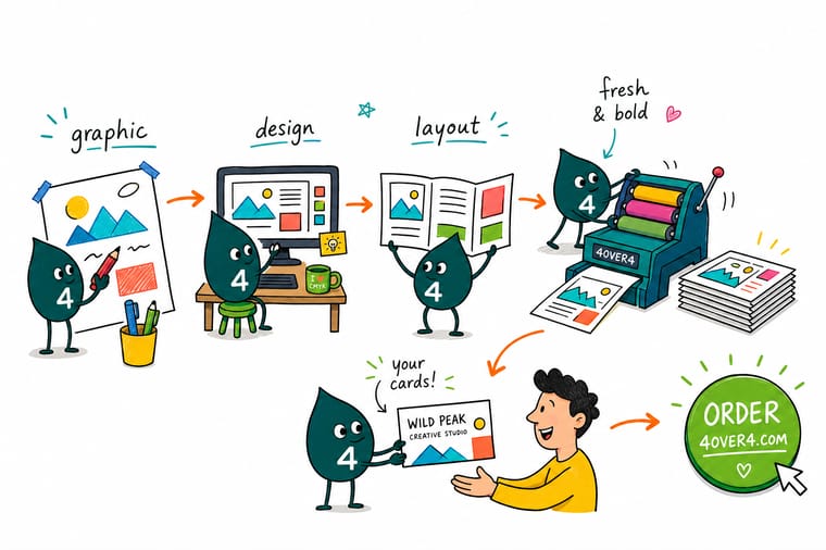
Wally never floats elements freely. He builds a grid, decides what the eye should see first, groups what belongs together, and aligns everything to shared edges. Then he lets contrast highlight the call to action and leaves white space to breathe. The same moves work on a card, a flyer, or a brochure, then he sets the file up to print clean.
Design it in the online tool →Quick reference
The seven layout principles, at a glance
Every strong print layout comes down to these seven. Apply them together and even a busy piece reads as calm, clear, and professional.
| Principle | Aim for | Why it matters |
|---|---|---|
| Balance | Even visual weight | Distributes elements so no corner feels heavy, giving the piece a stable, finished feel. |
| Alignment | Shared edges and a grid | Lining elements to a grid makes the layout read as deliberate rather than scattered. |
| Hierarchy | Clear first, second, third | Size and weight lead the eye to the message in the order you intend. |
| Proximity | Group related items | Placing related elements close together shows they belong, and separates what does not. |
| Contrast | Strong light and dark | Difference in color, size, or weight makes key elements pop and improves legibility. |
| Repetition | Consistent styles | Repeating fonts, colors, and spacing ties a multi-panel piece into one design. |
| White space | Room to breathe | Open space around elements focuses attention and signals a professional hand. |
Step by step
Build a print-ready layout in 7 steps
- Set a grid and margins first Before placing anything, build a simple column grid and pull consistent margins in from the trim. The grid gives every element a home and keeps the whole layout aligned.
- Decide the visual hierarchy Choose what the reader should see first, second, and third. Make the primary message the largest and boldest, and let supporting elements step down in size and weight.
- Group related elements by proximity Place related items close together and add space between unrelated groups. Proximity does the work of showing what belongs with what, no boxes required.
- Align everything to the grid Snap text and images to shared edges and columns. Consistent alignment is the single biggest difference between a layout that looks professional and one that looks thrown together.
- Build in contrast and white space Use strong contrast to make the key elements pop, and protect generous white space around them. Resist the urge to fill every inch.
- Repeat styles for consistency Reuse the same fonts, colors, and spacing across the piece, and across a suite, so everything reads as one design system.
- Check it at print size and set up the file View the layout at its true trim size, confirm nothing important sits near the edge, then add bleed and a safe margin before you export a press-ready PDF.
Specs and pricing
Business card specs and live pricing
Once your layout is set, size, stock and finish are what is left. Custom business cards run 100 for $17.57, which is $0.18 each.

| Quantity | Price Per Unit | Total |
|---|---|---|
| 100 | 17.6¢ | $17.57 |
| 200 | 11.5¢ | $23.07 |
| 300 | 9.15¢ | $27.46 |
| 400 | 7.96¢ | $31.86 |
| 500 | 7.25¢ | $36.26 |
| 600 | 6.77¢ | $40.64 |
| 700 | 6.43¢ | $45.04 |
| 800 | 6.18¢ | $49.43 |
Print it
Put your layout on real print at 4OVER4
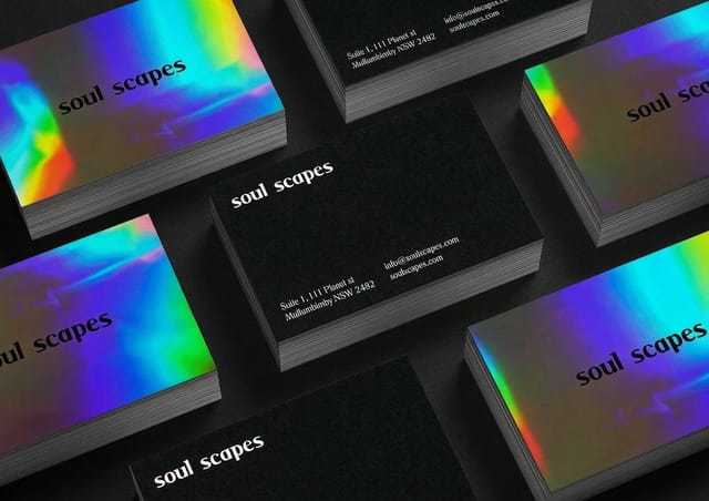


See it in use
Grids we printed at card and flyer scale








Explore more
Where to go next
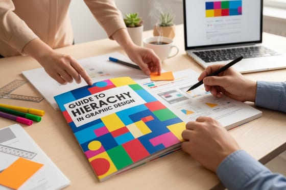




By the numbers
Sixty stocks a layout has to survive
Common Questions
Common questions about layout principles
What are the principles of layout in graphic design?
The core layout principles are balance, alignment, hierarchy, proximity, contrast, repetition, and white space. Balance distributes visual weight so the piece feels stable. Alignment lines elements to a shared grid so the layout looks deliberate. Hierarchy uses size, weight, and position to lead the eye to the most important message first. Proximity groups related elements so their relationship is clear. Contrast pulls key elements forward. Repetition ties everything together with consistent styles. And white space gives the design room to breathe. Together they turn a pile of elements into a layout that communicates clearly.
How is layout different from the elements of design?
The elements of design, such as line, shape, color, and type, are the raw ingredients you put on a page. Layout is how you arrange those ingredients so they communicate. You can have beautiful type and color and still produce a confusing piece if the layout has no hierarchy or alignment. Think of the elements as the words and the layout principles as the grammar: the principles govern how everything relates, where the eye goes, and what feels important. This guide focuses on that arrangement, applied specifically to print pieces you can hold.
What is visual hierarchy and how do I create it?
Visual hierarchy is the order in which a reader notices things on a page, and you create it deliberately with size, weight, color, contrast, and position. Make the single most important element, usually a headline or a name, the largest and boldest, then step supporting elements down so a clear first, second, and third emerge. Position matters too, because the eye tends to start at the top and at points of high contrast. On print, where there is no scrolling, a strong hierarchy is what lets someone grasp your message in a single glance. Our dedicated guide to hierarchy goes deeper.
Why does white space matter in a layout?
White space, the empty room around and between elements, is what gives a design clarity and a sense of quality. It is not wasted space; it is an active choice that focuses attention on what matters and keeps a layout from feeling cramped or cheap. Generous margins, breathing room around a headline, and gaps between groups all help the reader parse the page quickly. The most common amateur mistake is filling every inch, which forces the eye to fight for a place to land. Protecting white space is one of the fastest ways to make print look professional.
How do I apply these principles to a business card or flyer?
The same principles scale to any product; only the canvas changes. On a business card, hierarchy puts the name first, alignment keeps the contact details in a tidy column, and white space keeps it from looking crowded on a small surface. On a flyer, hierarchy leads with the offer, contrast makes the call to action pop, and a grid organizes the supporting information. On a brochure, repetition ties the panels together and proximity groups each topic. Start from a grid, set the hierarchy, then align and space everything to it, whatever you are designing.
How do I turn a good layout into a print-ready file?
Design at the final trim size so your proportions are true, then once the layout is set, add 0.125 inch of bleed on every edge for any art that touches the edge, and keep text and key elements inside a safe margin away from the cut. Work in CMYK color, place images at 300 DPI, and export a flattened, press-ready PDF. A strong layout can still be ruined by a file that crops a headline or shifts a color, so treat file setup as the final layout step. Our free online design tool bakes many of these rules in, and every order runs through a free file check.
Get Started
Order 50 flyers at $0.79 each and test the hierarchy
Practice these principles on a real template in the free online designer, then print your cards, flyers, and brochures at 4OVER4 with the price updating live as you choose.
Legal Disclaimer
Gold Standard guarantees apply to all standard orders placed through 4over4.com. Price match requires verifiable proof of a competitor's published price for an equivalent product with matching specifications and turnaround time. Satisfaction guarantee covers manufacturing defects and print quality issues. Contact support with order number and documentation. On-time delivery rate based on tracked orders 1999 to 2026. Individual results may vary based on shipping carrier performance.
