
RGB vs CMYK Color Modes Made Simple for Print-Ready Files


Emma is our prepress and print production voice, built from the knowledge of our production team, with over 20 years in printing.
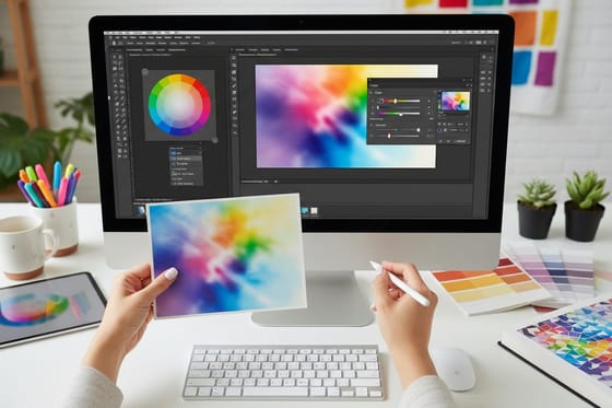
Converting between RGB and CMYK again and again to check colors does degrade a file, so keep an RGB master, convert once, and check print color with a soft proof. Screens mix light, presses mix ink, and the gap between them is where most color disappointment lives. The color mode question has a calm answer, built from the conversion steps, profile choices and black settings that keep a printed piece looking like the file you approved.
CMYK is the color mode used for printing. Presses build every image from cyan, magenta, yellow and black ink, so print files should be created and saved in CMYK with a profile that matches the press and the stock. RGB is a screen mode made of red, green and blue light, and it displays glowing colors that ink cannot reproduce. Convert to CMYK before the design is final, correct the areas that fall outside the ink gamut, and proof the result before the full run.
Start here
Where the two gamuts stop overlapping
RGB is made of light and CMYK is made of ink. Monitors emit red, green and blue and can glow far past what any press can mix, which is why a design that looks electric on screen can land flat on paper. Printing separates artwork into cyan, magenta, yellow and black, so building and saving in CMYK with the right profile keeps the decisions in your hands instead of leaving them to an automatic conversion nobody reviewed. Coated stock holds a wider gamut than uncoated, so the same file lands a little richer on a gloss card, and the profile you pick should match the stock you order.
Round trips
Converting back and forth to check color, and what it costs the file
Yes, repeated RGB to CMYK round trips wear an image down, because every pass into CMYK clips the colors ink cannot reach and the trip back to RGB cannot restore them. Check print color without touching the pixels. Keep the edited RGB file as the master, preview press color with a soft proof on a calibrated screen, then convert a copy to CMYK once, with perceptual intent for photos or relative colorimetric for flat brand colors. Fix the gamut warnings on that copy, export it at 300 dpi with the profile embedded, and confirm with a printed sample before the full run.
Why the color mode you save in decides how the print looks
You approve a design on a bright laptop, the blue is electric, the orange almost hums. The box arrives and the blue has gone flat and slightly purple. On a 2 x 3 ft blockout banner read from thirty feet away, that flat blue is the first thing a passer-by sees. Nothing broke. The file was built in the color mode your screen speaks, then handed to a press that speaks a different one, and the translation happened without you in the room.
Color mode is simply the recipe a file uses to describe color. Get it right at the start and a free business card or a wide format banner comes back looking like the file you approved. Get it wrong and you spend a reprint learning the difference. Our design templates ship in the print recipe already, and the visual summary below fits on one screen.
What is RGB color mode

RGB is additive color. A display holds millions of tiny elements that emit red, green and blue light, and your eye adds those beams together. Turn all three to full and you get white. Turn all three off and the pixel goes black. Every value lives on a 0 to 255 scale per channel, which is why designers talk about 255, 0, 0 for pure red.
Because RGB is made of light rather than pigment, it reaches colors that ink physically cannot mix. Electric cyan, laser green and glowing violet all sit comfortably inside sRGB and Adobe RGB. That range is a gift while you are retouching photographs, and it is exactly what causes disappointment later, because a press has no way to emit light back at you.
Keep RGB for anything that stays on a screen: web banners, social posts, email headers, slide decks and video. Even a print job benefits from RGB in the early stages, since editing a photograph in the wider space preserves more detail before you commit. The conversion walkthrough for Photoshop and Illustrator covers the handoff point in detail.
What is CMYK color mode

CMYK is subtractive color. The sheet starts white, and each layer of ink removes part of the light that would otherwise reflect back. Cyan absorbs red, magenta absorbs green, yellow absorbs blue, and black, the key plate, adds density and crisp type that the other three cannot deliver on their own.
Values are written as four ink percentages rather than light levels. A dependable print red is close to 0C 96M 90Y 0K, and a deep navy might read 100C 80M 20Y 20K. Those numbers are instructions to a press, not a description of a glow, which is why a CMYK file already looks slightly calmer on screen than its RGB twin. That calm is honesty, not a defect.
Total ink coverage is the limit that governs the whole system. Stack all four inks near full and you push past what the stock can absorb, which causes setoff, slow drying and muddy shadows. Our plain language explainer on what CMYK means in printing unpacks the four plates, and the calibration bar guide shows how press operators verify the result.
Which color mode is used for printing

CMYK is the color mode used for printing. Offset presses, digital presses and large format machines all separate your artwork into cyan, magenta, yellow and black before anything touches the substrate. If you supply RGB, that separation still happens, it just happens automatically with settings you never saw and cannot review.
Supplying CMYK moves the decision back to your desk. You choose how a hot pink becomes ink. You decide whether a sky keeps its gradient or bands. You catch the one heading that turns from vivid to dusty and you fix it before a plate exists. That is the whole argument, and it holds for a business card and for a fifteen foot banner equally.
There is one deliberate exception. Spot inks, mixed to a Pantone formula and run on their own unit, sit outside the four process colors and are used when a brand color has to match exactly across every job. Most work still runs process. If a logo depends on a spot ink, read how to match Pantone to CMYK color before you commit, and for a side by side on the core decision see CMYK vs RGB for printing.
The best color mode choice for printed images

Photographs deserve their own answer, because they carry the widest range of tones in any layout. The best color mode choice for printed images is CMYK at 300 dpi, converted with a profile that matches the press and the stock, after the retouching is finished rather than before.
The order matters. Curves, dodging, burning and noise reduction all behave better in the wider RGB space where there is more information to work with. Once the image is right, convert once. Then look specifically at the places that fall outside the ink gamut: deep blue skies, saturated foliage, bright reds on fabric, and skin in warm light. Those are the four zones that flatten first.
After conversion, do a quick repair pass. Lift the luminosity slightly on anything that lost punch, add local contrast where a gradient went soft, and check that shadows still separate instead of collapsing into a single black mass. If you work with brand colors that started as swatches rather than photographs, matching Pantone to CMYK for printing is the companion read.
How to convert a file to the right color mode step by step
The conversion itself takes a minute. Doing it in the right order is what protects your colors. Work through these steps once and the routine sticks.
- Decide the destination first. Screen only stays RGB. Anything printed becomes CMYK. A design that has to do both keeps two masters rather than one file that gets converted back and forth.
- Calibrate your display. An uncalibrated monitor makes every judgment that follows unreliable. A hardware calibrator is ideal, and even the built-in display profile is better than nothing.
- Finish the heavy editing in RGB. Retouching, compositing and tonal work all keep more headroom in the wider space.
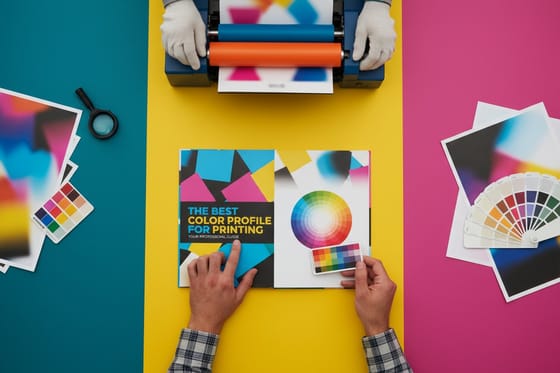
- Assign the correct destination profile. Pick the profile that matches the press and stock instead of accepting the default. Our guide to the best color profile for printing narrows the choice.
- Convert once, with relative colorimetric or perceptual intent. Perceptual protects gradients in photographs, relative colorimetric holds accuracy in flat brand colors.
- Inspect the out of gamut areas. Turn on the gamut warning and correct the flagged zones by hand rather than pushing global saturation.
- Rebuild your blacks. Large solid areas need a rich black, small type needs 100K only. The next section explains why.
- Convert spot colors deliberately. If a Pantone swatch is going to run as process, use the spot to CMYK method in Illustrator rather than letting the RIP guess.
- Export a PDF with the profile embedded. Include bleed, keep images at full resolution and do not let the export step re-convert your color.
- Proof it. Soft proof on the calibrated screen, then confirm with a printed sample before you commit to the full run.
Step by step, that is the entire discipline. Nine of the ten steps happen before you upload anything, which is exactly why color problems are cheap to prevent and expensive to discover.
Color profiles do the work the mode alone cannot
Saying a file is CMYK is like saying a recipe is in metric. Useful, but incomplete. An ICC profile is what tells the file how a specific press behaves on a specific substrate: how much ink it can hold, how dot gain spreads the halftones, how neutral the grays land.
Coated stock holds a tighter dot and a wider gamut than uncoated, which absorbs more ink and softens everything slightly. That is why the same file looks a little richer on a gloss card than on a natural uncoated sheet, and why a profile chosen for the wrong stock produces colors that are technically correct and visually wrong.
Embed the profile in the export rather than leaving it to chance. A PDF that carries its own color intent tells our prepress team exactly what you expected, which turns a possible dispute into a two second confirmation. When something does look off, the calibration bar on the press sheet is the shared reference that settles it.
Blacks, rich black, and the mistake almost everyone makes

Black is where RGB habits do the most visible damage. On screen there is one black. On press there are several, and choosing the wrong one shows up from across the room.
Set a large solid background to 100K only and it prints as a washed charcoal, because a single ink layer cannot block enough light. A rich black adds support underneath, commonly around 60C 40M 40Y 100K, and the result is the dense, expensive looking black you pictured. Reserve it for large areas and heavy display type.
Small text is the opposite case. Body copy set in rich black needs four plates to register perfectly, and any tiny shift produces colored fringes that make the type look blurry. Keep text under roughly 24 points at 100K only. That single rule saves more reprints than any other color decision, and it applies to a 2 sided blockout banner as much as to a card.
When a Pantone spot color earns its place

Some brand colors refuse to translate. A specific corporate blue or a metallic that has to look identical on packaging, signage and stationery is a job for a spot ink mixed to a Pantone formula and run on its own unit, not for a four color approximation.
Spot ink costs more and adds a press unit, so it makes sense when consistency across many jobs is worth more than the setup. For most marketing work, a carefully converted process build is close enough that no one holds the two side by side. The judgment call is about brand tolerance, not about print quality.
If you are converting a swatch rather than specifying an ink, do it consciously. Converting Pantone spot color to CMYK in Illustrator covers the mechanics, and matching Pantone to CMYK covers the eye work that follows.
How to choose the right color mode and what printing costs
The decision collapses into one question: does light produce this color, or does ink? Screens, video and anything viewed on a device stay in RGB. Paper, vinyl, fabric and rigid substrates go to CMYK, with a profile matched to the stock and a spot ink only where a brand demands an exact match. Keep separate masters for each destination instead of converting one file repeatedly, because every round trip loses a little saturation permanently.
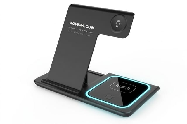
Cost is driven by quantity, size, stock, sides and finish rather than by how many colors appear in your artwork, since full color process is standard on our presses. Free business cards are priced from $0.00, a 2 sided blockout banner starts at $108.75, and a ready-made 3 in 1 foldable wireless charger starts at $15.00. Order free paper samples first if you want to see how your colors behave on a specific stock before committing to a run.
Wally explains color modes
Light glows, ink reflects, and that is the whole story
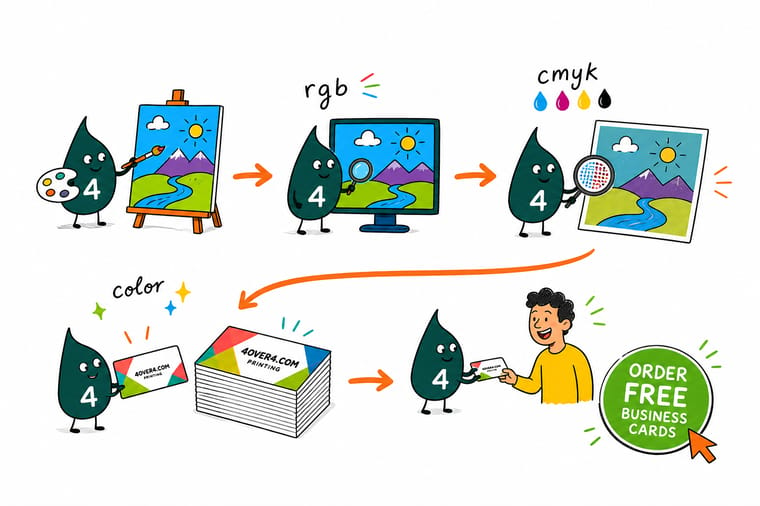
Wally thinks of RGB as a flashlight and CMYK as colored filters laid over white paper. A flashlight can blast a green no filter will ever match, so when a design leaves the screen he switches modes first, repairs the colors that flatten, keeps small type at 100K black, and only then sends the file to press.
Print your cards in full color →
Infographic
RGB vs CMYK at a glance
One frame, seven rules. Keep it beside you the next time a file has to leave the screen and land correctly on paper, vinyl or fabric. The rules run in working order: RGB for screens, CMYK for ink, the gamut gap, converting early, matching and embedding the profile, rich black for big solids with 100K type, and a soft proof checked against a printed sample.
No single rule saves a job on its own. The mode sets the language, the profile sets the dialect, and the proof confirms the press understood both before your full run begins.
Specs and pricing
Blockout banner specs and live pricing
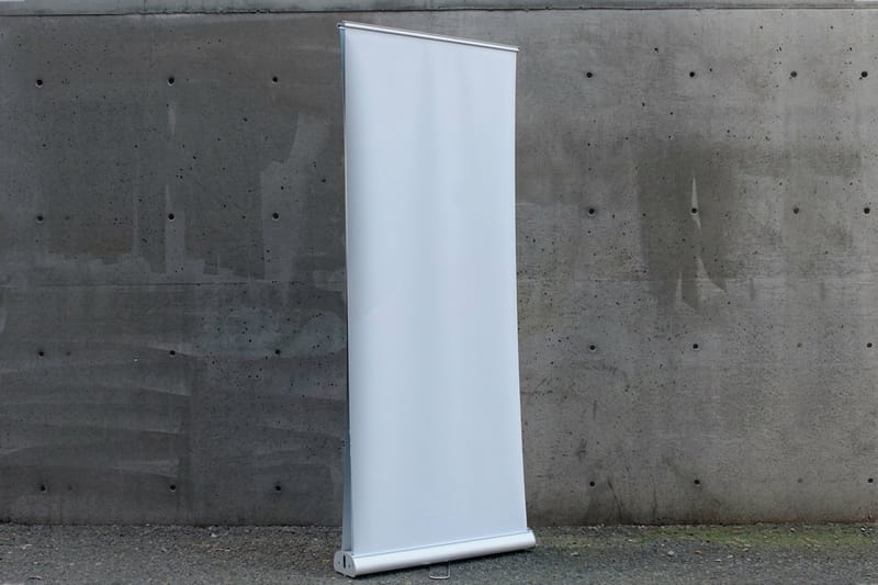
Large format is where color mode shows up fastest, because a flat blue still reads as flat from thirty feet away. Here are the specs and live pricing for our 2 sided blockout banners.

| Quantity | Price Per Unit | Total |
|---|---|---|
| 1 | $108.75 | $108.75 |
| 2 | $108.74 | $217.47 |
| 3 | $108.74 | $326.22 |
| 4 | $97.76 | $391.02 |
| 5 | $97.76 | $488.78 |
| 6 | $97.76 | $586.53 |
| 7 | $89.28 | $624.98 |
| 8 | $86.77 | $694.18 |
Print it
Put your CMYK files to work at 4OVER4


See it in use
Color as it came out on printed cards








%22%2F%3E%3Ccircle%20cx%3D%2247%22%20cy%3D%2220%22%20r%3D%2222%22%20fill%3D%22%23a78bfa%22%20opacity%3D%220.15%22%2F%3E%3Ccircle%20cx%3D%2254%22%20cy%3D%2227%22%20r%3D%22-3%22%20fill%3D%22%23a78bfa%22%20opacity%3D%220.1%22%2F%3E%3Crect%20x%3D%2277%22%20y%3D%22-9%22%20width%3D%2232%22%20height%3D%2220%22%20rx%3D%224%22%20fill%3D%22%23a78bfa%22%20opacity%3D%220.08%22%20transform%3D%22rotate(42%2080%2030)%22%2F%3E%3C%2Fsvg%3E)
Explore more
Where to go next



By the numbers
Color work measured across sixty paper types
Common Questions
Common questions about RGB and CMYK color modes
What is RGB color mode?
RGB is an additive color mode built from red, green and blue light. Every pixel on a phone, monitor or television mixes those three channels, and when all three run at full strength the result is white. Because RGB describes emitted light rather than ink, it can hit vivid neon tones that no press can reproduce. It is the right mode for web graphics, email, social posts and video, and the wrong mode for anything printed.
What is CMYK color mode?
CMYK is a subtractive color mode made from cyan, magenta, yellow and key black inks. Paper starts white, and each ink subtracts light from what bounces back to your eye. Values are expressed as ink percentages, so a strong print red might read 0C 96M 90Y 0K. Commercial presses, digital presses and most office printers all work this way, which makes CMYK the standard color space for files that will be produced on paper.
What color mode is used for printing?
CMYK is the color mode used for printing. Every file that runs on our presses is separated into cyan, magenta, yellow and black plates or toner channels, so supplying artwork already built in CMYK means you see on screen roughly what the press will deliver. Spot inks such as Pantone are the one exception, and they are usually specified alongside CMYK for logos that need an exact match.
What is the best color mode choice for printed images?
For printed photographs, CMYK at 300 dpi with a profile that matches the press and stock is the safe choice. Edit the photo in RGB while you still need wide adjustment latitude, then convert once the retouching is finished, check the saturated areas, and lift any skies or reds that flatten during the conversion.
Should I convert to CMYK myself or send RGB?
Ask where the file ends up. Screen only means RGB. Ink on a substrate means CMYK. A brand asset that has to serve both means keeping a master file in each mode rather than converting back and forth, because every round trip costs a little saturation and never gives it back.
Why do my printed colors look duller than on my monitor?
A backlit screen emits light while paper reflects it, so a monitor can display bright blues, greens and oranges that sit outside the CMYK gamut entirely. When those colors are separated into ink they land on the nearest printable neighbor. Calibrating your display, soft proofing with the right profile and choosing a coated stock all narrow the gap.
What does color printing cost and how are prices set?
Price is driven by quantity, size, stock, sides and finish rather than by how many colors you use, since full color CMYK is standard on our presses. Free business cards start at $0.00, a 2 sided blockout banner starts at $108.75, and larger runs cost less per piece. Live pricing updates as you configure each option.
Get Started
A 2 sided blockout banner costs $108.75 and prints in 4 business days
Send a CMYK file with the profile embedded and our prepress team reviews it before anything runs. Full color is standard on every product, from cards to banners.
Legal Disclaimer
Gold Standard guarantees apply to all standard orders placed through 4over4.com. Price match requires verifiable proof of a competitor's published price for an equivalent product with matching specifications and turnaround time. Satisfaction guarantee covers manufacturing defects and print quality issues. Contact support with order number and documentation.
