
Pantone PMS Spot Color Printing That Nails Your Brand Color


Emma is our prepress and print production voice, built from the knowledge of our production team, with over 20 years in printing.
Your brand lives on a specific color. Spot color printing reproduces that color from a premixed Pantone ink, matched to a number, so it prints the same on your first card and your ten-thousandth, instead of drifting the way blended CMYK can.
Pantone PMS spot color printing uses premixed inks matched to the Pantone Matching System, so a color prints exactly the same every time instead of being approximated from CMYK dots. You reference a PMS number from your brand guide, and that fixed formula reproduces the identical hue run after run. It also reaches colors process printing cannot hit cleanly, including vivid oranges, deep blues, metallics, and fluorescents, which is exactly why brands rely on it to protect their identity. For Pantone-matched labels, metallic ink stickers print PMS 877 silver or PMS 872 gold on semi-gloss label stock under a high gloss UV coat, from $108.75 for 500, and printed packaging tape runs one or two named PMS inks, such as PMS 286 or PMS 281 navy, on white or clear polypropylene.
What a spot color is
- Spot color printing lays down a premixed Pantone ink instead of building the color from CMYK dots, so a hue prints the same on every run.
- The Pantone Matching System reaches colors process printing cannot hit cleanly, including vivid oranges, deep blues, metallics, and fluorescents.
- Every Pantone color carries a number, like PMS 286 C or PMS 185 C, so your designer, your printer, and your team all reference one identical formula.
- Spot color is the ink, not a coating. Spot UV is a separate clear gloss technique, and the two are easy to mix up because they share the word "spot".
- Free proofs let you sign off on the color before the full run, and because the PMS formula is fixed, reorders match the first batch.
The idea in one look
Premixed ink, matched to a number
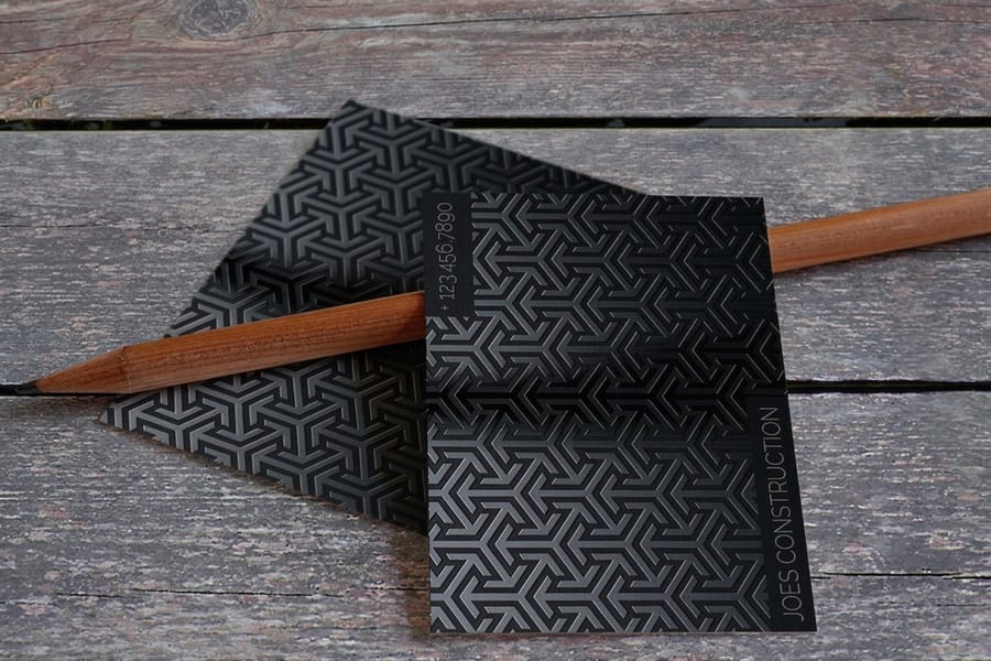
Most everyday printing is CMYK, where any color is built from tiny overlapping dots of cyan, magenta, yellow, and black. It is flexible and great for photos, but a hue mixed from dots can shift a little between presses, stocks, and runs. That is fine for a photograph. It is a problem when the color is your brand.
Spot color takes the other approach. Instead of assembling a color from dots, the press lays down a single ink that was mixed ahead of time to a precise recipe. The spot color printing guide covers the mechanics, but the short version is this: one ink, one solid, no dot pattern. The two-color Pantone approach pairs two of those inks for a sharp, budget-friendly brand look.
Pantone is the naming system that makes it repeatable. Each premixed color gets a number, like PMS 286 C, so a color is no longer a vague description that gets argued over. It is a formula anyone can look up and mix again, whether the job runs today or next spring.
How it works
From brand color to printed match
Getting an exact Pantone match is less about the press and more about how the job is specified. Four steps take you from your brand guide to a run you can trust and reorder.
Choose your Pantone colors
Pull the PMS numbers from your brand guide. If you only have a hex or CMYK value, the Pantone matching guides help you land on the closest solid color.
Build the file with named swatches
Define each color as a named Pantone spot swatch in your artwork rather than a CMYK build, so it stays a true, separable spot channel through prepress.
Approve a free proof
Review a proof before anything goes to the press. It is the cheapest moment to catch a color that reads a shade off from what you pictured.
Print, then reorder with confidence
The formula is locked to a number, so the run you print today and the one you print next year come out of the same recipe.
The payoff is control. A named Pantone swatch stays a true spot channel through prepress, the free proof lets you approve the color before ink hits paper, and the fixed formula means your fifth reorder looks like your first. If you need to bring a spot color back into a full-color layout, the Pantone to CMYK guide shows how to convert it without losing the hue. A franchise faces the same problem at every location, which our guide on How to Franchise Your Business Without Losing Control of the Brand takes on.
The options you control
Configure it, then approve the proof
Ink color, paper stock, and size all shape how a spot color reads on the finished piece. Printed envelopes show the choice plainly: black only, one PMS ink, black plus one PMS, two PMS inks, or full color, on five papers from white wove to royal linen, in 41 sizes, from 250 for $142.99.
Where exact color earns its keep
Where Pantone matching makes the biggest difference
Not every job needs a spot color. It pays off on flat, limited-palette pieces where one hue has to repeat across formats, such as a logo on a 2 x 3.5 inch card, a 9 x 12 inch folder and a 1.5 x 3.5 inch hang tag. Full-color photographs stay in CMYK.
Logos and brand identity
A logo color is a promise. Print it a shade off on the card and a shade off again on the folder, and people notice the mismatch even if they cannot name why. Spot color holds your exact hue across every touchpoint, which is why the printing features guide treats color accuracy as core to a brand kit, not a nice-to-have.
Packaging and retail
On a shelf, your color is doing the selling from a distance. Spot inks keep that shelf color consistent and let you hit tones CMYK muddies, including metallics and fluorescents. Pair it with a specialty finish like metallic WonderFoil for effects flat ink cannot reach.
Corporate stationery
Business cards, letterhead, and presentation folders that all share one exact brand color read as a set, not a pile of near-misses. That coherence is what makes a company look established the moment someone opens the folder.
Two-color and limited palettes
If a design lives on one, two, or three flat colors, spot printing is often cleaner and sharper than process. The two-color Pantone guide shows how far a tight palette can go without ever touching CMYK.
The Pantone system is built for exactly this: a shared, numbered language that removes guesswork from color.
Wally from 4OVER4 explains
Wally holds your color to the number
One premixed ink, one PMS code, the same result every run

Wally does not eyeball your brand color. He reads the PMS number off your guide, pulls the premixed ink to that recipe, and matches the printed chip to the swatch before the run goes ahead. Send the number, approve the proof, and the color you signed off on is the color you get, this order and the next.
Start a branded cardSpot color and process, side by side
Pantone or CMYK, and when to use each
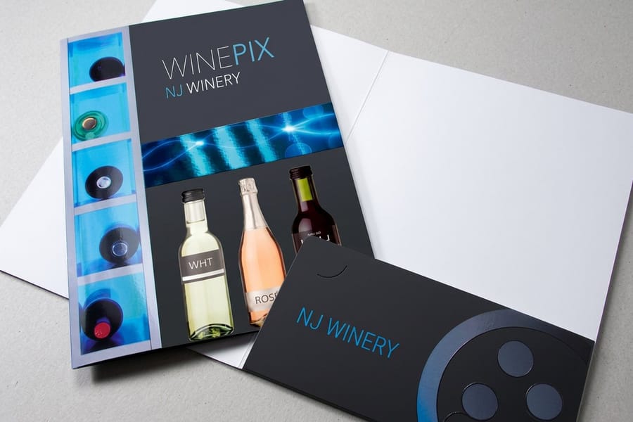
Spot color and CMYK are not rivals so much as tools for different jobs. CMYK is the right call for full-color photography and gradients, where you need thousands of shades and small variation is invisible. Spot color wins when a hue has to be exact, when the palette is flat and limited, or when the color simply sits outside what four process inks can reproduce. Before you pick the spot inks, our brand color guide sets out the ratios for a four color palette.
Plenty of real jobs use both on the same sheet. A brochure might print its photos in CMYK while a logo runs as a spot ink to protect the brand blue. Deciding which mode carries which element is a file-setup question, and the color profile guide and the CMYK versus RGB guide both help you plan it before you export.
When a spot color has to live inside a full-color layout, you convert it to its nearest process build. That is a controlled step, not a guess. The Pantone to CMYK matching guide walks through finding the closest match and knowing when a color is out of process reach.
Side by side
Premium branded pieces where color counts
These four pieces differ most on size and stock. The cards come in 2 x 3.5 inches on three stocks, the postcards run from 2 x 6 up to 9 x 12 inches on 16pt gloss cover, the silk laminated hang tags come with a drilled 1/8 inch hole, and the 9 x 12 inch folder carries Spot UV on the outside and the pockets. All four print in four-color process with Spot UV as the finish, not in PMS ink, and every entry price and spec below is live from the Instant Price Calculator.
| Spec |  Spot UV Business Cards Spot UV Business Cards |  Spot UV Postcards Spot UV Postcards | 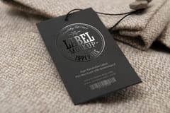 Silk Laminated Spot UV Hangtags Silk Laminated Spot UV Hangtags | 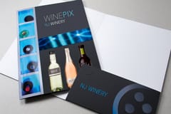 Spot UV Presentation Folders Spot UV Presentation Folders |
|---|---|---|---|---|
| Starts at | $76.88 | $190.02 | $123.66 | $2194.56 |
| Paper / stock | 3 paper types | 1 paper type | 1 paper type | 2 paper types |
| Finish | Spot UV Gloss | Spot UV Gloss | Spot UV Gloss | Spot UV Gloss |
| Size | 2" x 3.5" | 2" x 6" | 1.5" x 3.5" | 9" x 12" |
| Rating | ||||
| Order | View & customize | View & customize | View & customize | View & customize |
Clearing up the confusion
Spot color and Spot UV are not the same thing
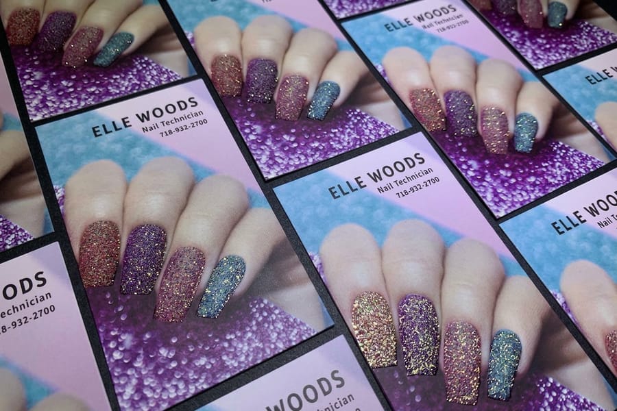
Because they share the word "spot," buyers mix these two up all the time, and the order form treats them as separate choices. Spot color is about ink. It is a premixed color used to reproduce an exact hue, the topic of this whole page. Spot UV is about finish. It is a clear, glossy coating applied to chosen areas of a piece to add shine and contrast, and it carries no color of its own. On spot UV business cards you choose where the gloss goes from five placements, from the front only to both sides, and on presentation folders it covers the outside and the pockets.
The Spot UV guide covers that coating in full. The useful thing to know here is that the two techniques work together, not against each other. A card can print your brand color as a spot ink and then get a Spot UV gloss over the logo, so the color is exact and the surface has depth.
That combination is exactly what the pieces in the Spot UV printing collection and the wider specialty printing collection are built for. The specialty printing overview lays out how foil, embossing, and gloss layer onto solid color work.
Print it in your color
Products worth locking to a Pantone
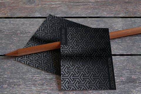
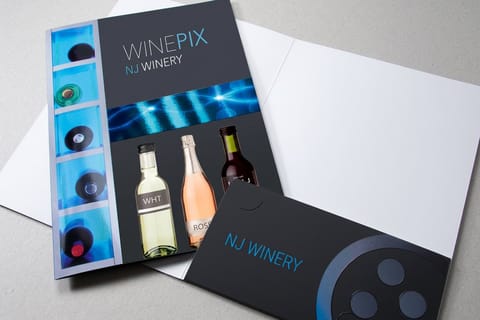
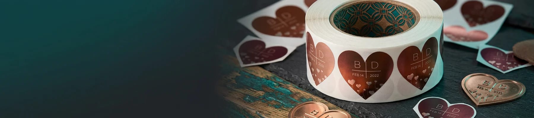
Three products list the PMS ink right in the calculator: printed envelopes take one or two PMS inks on the front, printed packaging tape takes up to two named inks on 2 or 3 inch rolls, and metallic ink stickers print PMS 877 silver or PMS 872 gold. Spot UV business cards, spot UV postcards, and presentation folders print in process color under a gloss layer. Browse the full flat and raised range in the Spot UV collection, and our story on raised Spot UV postcards shows the raised finish up close.
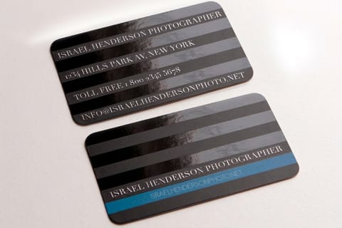
Want a color that flat ink cannot deliver? Add a specialty finish like metallic WonderFoil, or keep your ink eco-friendly and still sharp with soy-based inks. Unsure what a term means? The printing terms glossary defines spot color, PMS, and process printing.
Why print color-critical work here
Built to hold a color, run after run
4OVER4 has been printing since 1999, which is more than two decades of holding color steady across presses, stocks, and seasons. The presses run on G7 color profiling, checked with multi-day accuracy tests, so a hue on 14pt gloss this month matches the one on 16pt silk laminated next quarter. That is the everyday standard behind 10 billion cards and 150,000 businesses served.
Free proofs are the safeguard. You see the color before the full run commits, so a hue that reads a touch off never becomes a box of reprints. Approve it once, and the fixed Pantone formula carries that approval forward to every reorder.
Reliability rounds it out. A 99.8% on-time delivery rate and 82% of orders shipping early mean your color-matched pieces arrive when the campaign, the launch, or the trade show actually needs them, not after.
Guarantees
Every Free Print Backed by 4OVER4's 5 Guarantees
Free printing with full guarantees. No trade-offs.

Premium Quality Guarantee
Premium papers, professional-grade inks, and hands-on quality control on every print job.

110% Price Match Guarantee
Find the same product for less at a U.S. retail printer and we beat that price by 10%. Rules apply.

Rush Fee Back Guarantee
Well over 99% of deadlines met for nearly 30 years. If a paid rush misses its date, the rush fee comes back.

Responsive Customer Service Guarantee
Live support from 10AM to 6PM EST weekdays plus instant Live Chat responses.

100% Satisfaction Guarantee
Flawless finishing and printing on every order, or we make it right.
Our Story
Every PMS number on this page goes to a press floor in Queens that has been printing since 1999.
Partner With Innovators
They told us we were crazy. We don't want to be sane.
The Beginning
In 1999, Google was barely starting out. WiFi didn't exist. People were afraid of Y2K. And two best friends, second-generation immigrants and patent-holding engineers in Queens, New York, launched 4OVER4.COM as the second web-based printer in the entire United States.
The Innovation
4OVER4 was the first printer to introduce full-color printing with 24 to 48 hour turnaround. When the industry said it couldn't be done that fast, they did it anyway. No compromises, no excuses, just engineering.
25+ Years and Counting
Over 350 standard products. More than 6,000 possible combinations. 150,000+ businesses served, from solo freelancers to Google and the United Nations. A facility in Queens that still runs on soy inks and waterless presses, built that way from day one because it was the right thing to do.

Keep exploring
More on color and specialty print
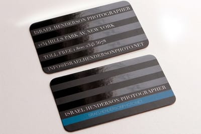 Guide What Is Spot Color Printing The plain-language rundown of premixed inks and why they matter.
 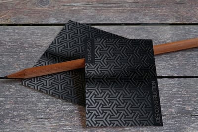 Guide Match Pantone to CMYK Convert a PMS color to a process build without losing the hue.
 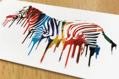 Guide 2-Color Pantone Printing Two spot inks, one sharp, budget-friendly brand look.
 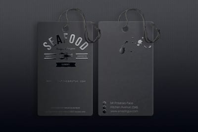 Article The History of Pantone How a numbered ink library became the global color standard.
 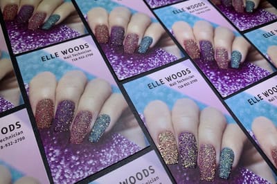 Article Business Card Color Meaning What your card color signals before anyone reads a word.
 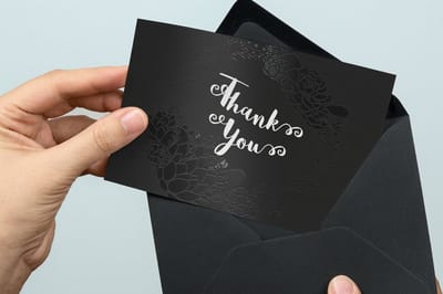 Guide Spot UV Printing Explained The clear gloss technique that spot color is often confused with.
 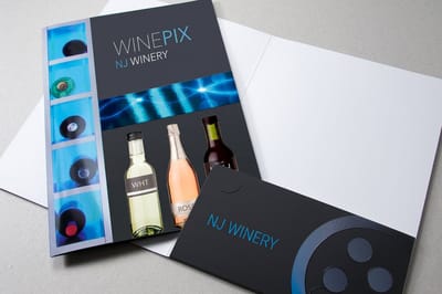 Guide Best Color Profile for Print Set up your file so colors land the way you intend.
 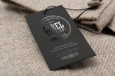 Service Metallic WonderFoil A specialty finish for effects flat ink cannot reach.
  Benefit Soy-Based Inks Plant-powered ink that prints sharp, clean color. Collection Spot UV Printing Collection Browse the premium branded pieces where color fidelity pays off.
 Common questions about Pantone spot color
Common questions about Pantone spot color
What is Pantone PMS spot color printing?
It is printing with a premixed ink matched to a specific Pantone Matching System color instead of building that color from cyan, magenta, yellow, and black dots. Because the ink is a fixed formula tied to a number, the color reproduces exactly the same on every run, which is why brands use it to protect logos and identity colors.
When should I use spot color instead of CMYK?
Reach for spot color when exact brand color matters, when your design uses only one, two, or three flat colors, or when you need a hue CMYK struggles with, like a vivid orange, a deep blue, a metallic, or a fluorescent. Full-color photographs still print best in CMYK, so many jobs combine the two.
Can any color be matched with a Pantone spot ink?
The Pantone solid library covers more than 1,800 colors, including shades outside the CMYK range. If a color falls inside what process printing can produce, you can also convert it. The Pantone to CMYK guides walk through finding the closest match either way.
Is spot color printing the same as Spot UV?
No. Spot color is a premixed ink used to reproduce an exact hue. Spot UV is a clear, glossy coating applied to select areas of a piece for contrast and shine. They share the word spot but do completely different jobs, and a single card can use both.
How do I set up my file for spot color?
Define each color as a named Pantone spot swatch in your design software, applied as a solid rather than a CMYK build, so prepress can keep it on its own channel. Send the PMS number along with the artwork and approve the proof before the run.
Will my brand color look the same on every reorder?
Yes. That consistency is the core reason spot color exists. Since the ink is mixed to a set Pantone formula, the batch you print today and the one you order months later come from the same recipe, so they match across time and across products.
Get Started
Get your brand color exactly right.
Bring your PMS number to a product that lists PMS ink, such as printed envelopes, packaging tape or metallic ink stickers, and approve a free proof before the full run.
Legal Disclaimer
Spot color and Pantone matching availability, ink options, sizes, and finishes vary by product and configuration through 4over4.com. Pantone and PMS refer to the Pantone Matching System color standard. Prices shown start from the lowest current configuration and update in the Instant Price Calculator. On-time delivery rate based on tracked orders 1999 to 2026. 150,000+ businesses served based on cumulative customer accounts. Color reproduction can be affected by substrate, coating, and screen calibration. Approve a printed proof for color-critical work.
