
Serif vs Sans Serif Fonts and Which One Fits Your Brand


Serifs are the little feet on letters, and dropping them changes everything. Each family carries its own mood, reads differently in print and on screen, and pairs with the other in a fixed way.
Serif fonts have small strokes at the ends of letters, sans serif fonts do not. Serifs feel traditional and trusted and guide the eye across long printed text. Sans serifs feel modern and clean and stay crisp at small sizes and on screens. Match the family to your brand personality, pair one of each for contrast, and keep type in a solid weight so it prints sharp.
Start here
What dropping the serifs changes
Serif fonts carry small strokes at the ends of their letters, sans serif fonts leave them off. That one difference gives serifs a traditional, trusted feel that suits long printed text, and gives sans serifs a modern, clean feel that stays sharp at small sizes and on screens. Choose the family that matches your brand personality, pair a serif and a sans serif for contrast, and keep type in a solid weight for clean print. The anatomy below shows the difference letter by letter.
What serif and sans serif actually mean
A serif is the small stroke, sometimes called a foot, at the end of a letter. It is a holdover from the way letters were once carved into stone and drawn with a pen. Fonts that keep those strokes are called serif fonts. Fonts that drop them are sans serif, from the French sans, meaning without.
That one feature is the whole distinction, and yet it changes how a typeface behaves and how it feels. Serifs add detail and rhythm to each letter, which is why so much printed body text uses them. Sans serifs pare the letter back to a clean shape, which is why they dominate screens, signage, and anything that has to read at a glance.
Everything else in this guide, mood, readability, pairing, and print, follows from that single difference. Once you can spot a serif, you can start choosing type with intent, whether you are setting a name on business cards or a heading on a letterhead.
The history and feel of each family

Serif fonts carry centuries of print behind them, from carved Roman capitals to the typefaces of early books and newspapers. That heritage is exactly why they feel the way they do: traditional, established, and trustworthy. A serif on a law firm card or a heritage brand signals experience and permanence without saying a word.
Sans serifs are the modern voice. They rose with twentieth-century design and now define the clean, confident look of technology and contemporary brands. A sans serif feels current, direct, and approachable, which is why startups and lifestyle brands reach for them so often.
Neither mood is universally right. The question is what your brand should feel like the instant someone reads its name. Warmth, craft, and legacy lean serif, while clarity, energy, and modernity lean sans serif, and your printed pieces, from cards to letterheads, are where that feeling lands first.
Readability in print versus on screen

Readability is not a fixed property of a font, it changes with the medium and the size. In long passages of printed text, the small serifs can help the eye move smoothly from one letter to the next, which is one reason books and newspapers so often set their body copy in a serif.
Sans serifs shine where detail becomes a liability. At tiny sizes, on labels, on packaging, and on screens, the clean shapes of a sans serif stay legible when fine serifs would blur or clog. That is why interfaces, road signs, and small print favor them.
For your own materials, judge readability where the type will actually live. Print a proof for anything printed and view it on screen for anything digital. A run of business cards or a printed letterhead is the real test of a body font, and our online design tool lets you preview type in place before you commit.
Matching font style to brand personality

The fastest way to choose is to translate personality into type. Write three words for how the brand should feel, then match them to a family. Trusted, editorial, and refined point to a serif. Modern, clean, and friendly point to a sans serif. Bold and grounded might call for a slab serif, while elegant and personal suggests a script used sparingly.
Guard against the common trap of picking a font because it looks nice in isolation. A typeface has to carry your name at the size people read it, on the materials they hold. A distinctive display font can work for a logo yet be unreadable as body text, so give each font the job it is actually good at.
Think about where the brand appears, too. If most touchpoints are printed, cards, stationery, packaging, weight your choice toward what reads well on paper. Consistency across every piece is what turns a font into a recognizable brand voice.
Pairing serif and sans serif for contrast
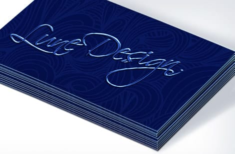
You rarely have to choose just one. Pairing a serif with a sans serif is one of the most dependable ways to build a small type system, because the two families contrast clearly instead of quietly clashing the way two similar fonts do.
The usual pattern gives one family the headline role and the other the body or supporting role. A serif headline over sans serif body text reads editorial and grounded. A sans serif headline over serif body text feels modern with a classic core. Either works, so long as the roles are consistent everywhere the brand appears.
Keep the system to two families. More than that and a design starts to feel noisy and uncertain. Two well-chosen fonts, held to their roles across your business cards, letterhead, and marketing pieces, give you variety and cohesion at the same time.
Print-safe font tips that keep type sharp
Screen forgiveness and press reality are not the same. A stroke that looks fine glowing on a monitor can thin out or break up when it is laid down in ink, so type needs a few print-safe habits. Set small text in a solid weight rather than a hairline, and be wary of ultra-thin display fonts at tiny sizes.
Keep fine and small type a true black built from the black plate alone, rather than a four-color mix, so edges stay crisp instead of fuzzy. Give text room to breathe with comfortable spacing, since cramped lines that survive on screen can turn muddy on paper. And leave a clear margin so no letters sit close enough to the trim to risk being clipped.
Finally, lock your fonts into the file. Outline or embed every typeface before you export so nothing gets substituted on press. Our guide on logo design best practices covers the same discipline for the mark that usually sits right beside your type.
Choosing for your cards and stationery

Bring it together and the decision is straightforward. Let your brand personality pick the primary family, add a contrasting second font for support, and test both at the real sizes your printed pieces will use. Then choose a smooth stock and a solid weight so the type reproduces cleanly.
Business cards and stationery are where a font choice becomes tangible, held in a hand and read up close, so it is worth getting right. Match the surface to the type, keep the system consistent, and every piece will feel like it belongs to the same brand.
Ready to put your fonts on paper? Use the live specs and pricing panel below to build your business cards, browse business card printing to compare stocks and finishes, or start from a layout in our design templates.
Wally weighs the feet against the clean lines
Serif or sans, pick the mood then print it
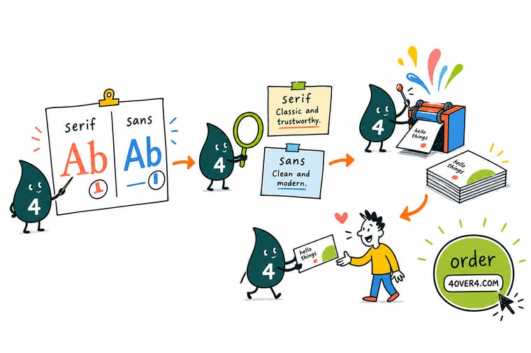
Wally starts with three words for the brand, lets them point to serif for trust or sans serif for modern, then pairs one of each so headlines and body contrast cleanly. He keeps small type in a solid weight so it prints sharp, outlines the fonts, and sends it off. Choose the type that says the right thing, and 4OVER4 prints it crisp on cards and stationery.
Print your business cards →Quick reference
Font families, at a glance
Each type family carries its own feel and its own best use. Match your brand personality to the right row.
| Family | Feel | Best for |
|---|---|---|
| Serif | Traditional, trusted | Law, finance, editorial, and heritage brands that want authority and warmth. |
| Sans serif | Modern, clean | Tech, startups, and any brand that wants a simple, approachable, contemporary look. |
| Slab serif | Bold, sturdy | Confident headlines and brands that want a strong, grounded presence. |
| Script | Elegant, personal | Invitations, boutiques, and accents, used sparingly and never for body text. |
| Monospace | Technical, precise | Tech and data brands, or a distinctive detail where a mechanical feel fits. |
Step by step
Choose your brand fonts in 7 steps
- Name your brand personality Write down three words that describe how the brand should feel, such as trusted, modern, or friendly. Those words point you toward serif or sans serif before you open a font menu.
- Pick a primary typeface Choose one family for your main role, headlines or the logotype. Let the personality words decide: warmth and heritage lean serif, clarity and modernity lean sans serif.
- Choose a supporting typeface Add a second font for the other role. The safe move is one serif and one sans serif so they contrast clearly rather than clashing.
- Test it at real sizes Set a headline, a subhead, and a paragraph, then view them at the actual sizes they will print. A font that dazzles large can fall apart small.
- Check readability in context Read your draft on screen and on a printed proof. Serifs often flow better in long printed passages, while sans serifs hold up at tiny sizes and on labels.
- Keep print-safe habits Set small text in a solid weight, avoid ultra-thin strokes that can break up on press, and keep fine type a true black rather than a four-color mix.
- Lock it into your files Outline or embed the fonts before you export so your typefaces travel with the file and print exactly as designed on your cards and stationery.
Infographic
Serif and sans serif, side by side
Same letters, one difference. The two families compare on look, mood, and best use.
Pairing a serif with a sans serif, one for headlines and one for body, gives most brands clear contrast without any clutter.
Specs and pricing
Business card specs and live pricing
Once your fonts are set, the print choices come down to size, stock, and finish. Here are the live specs and price per unit for standard business cards at 4OVER4.COM, straight from the configurator.

| Quantity | Price Per Unit | Total |
|---|---|---|
| 100 | 17.6¢ | $17.57 |
| 200 | 11.5¢ | $23.07 |
| 300 | 9.15¢ | $27.46 |
| 400 | 7.96¢ | $31.86 |
| 500 | 7.25¢ | $36.26 |
| 600 | 6.77¢ | $40.64 |
| 700 | 6.43¢ | $45.04 |
| 800 | 6.18¢ | $49.43 |
Print it
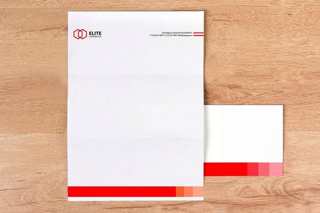
Put your fonts on paper at 4OVER4

See it in use
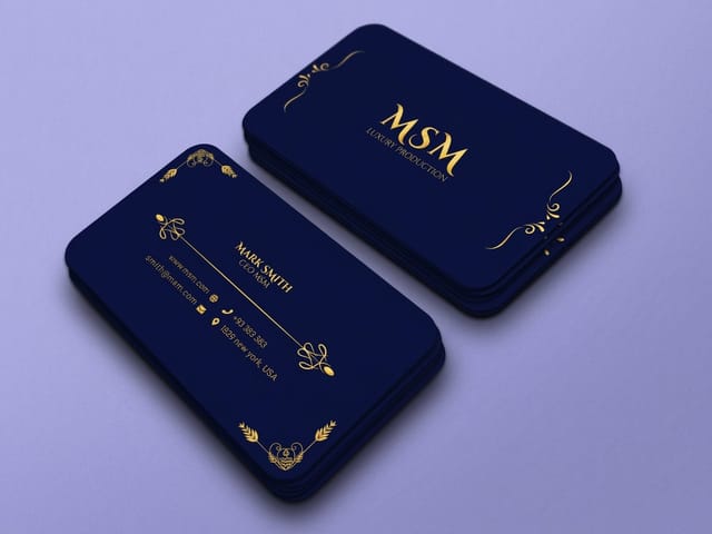
Business cards we have printed








Explore more
Where to go next




By the numbers
Where your type ends up in print
Common Questions
Common questions about serif and sans serif fonts
What is the difference between serif and sans serif fonts?
A serif is the small stroke or foot at the end of a letter, a leftover of how letters were once carved and penned. Serif fonts have them, sans serif fonts do not, since sans is French for without. That single feature drives everything else. Serifs give a typeface a traditional, editorial feel and help guide the eye along long lines of printed text. Sans serifs strip the letters back to clean geometric shapes that feel modern and stay crisp at small sizes and on screens. Neither is better in the abstract, they simply suit different jobs and moods.
Does my brand read better in a serif or a sans?
Start with personality, not aesthetics. Write down three words that capture how the brand should feel, then let them steer the choice. Trusted, established, and editorial lean serif, the family that carries authority and warmth. Modern, clean, and approachable lean sans serif, the family that feels current and clear. Pick one primary typeface for headlines or the logotype, add a supporting typeface for the other role, and test them at the real sizes your cards, letterhead, and materials will print. The right font is the one that says the right thing at the size people will actually read.
Does font choice affect what my printed materials cost?
The font itself does not change your print price, which is set by the product, size, paper stock, finish, and quantity, with larger runs lowering the unit price. What font choice affects is legibility and quality. A well-set typeface in a solid weight prints clean, while ultra-thin strokes or tiny four-color text can look fuzzy on press. You choose your product options in the configurator and the price updates live, so you can pick a premium stock that flatters your type without any surprise at checkout.
What sizes, stocks, and finishes work best for typography in print?
For crisp type, a smooth stock reproduces fine letterforms better than a heavily textured one, and a solid weight keeps small text sharp. Business cards, letterheads, and stationery come in a range of stocks and finishes, from classic matte to premium coated and specialty options, so you can match the surface to your typeface. Use the live specs and pricing panel below to see the current sizes, stocks, and finishes for standard business cards, then pick the surface that lets your fonts read at their best.
How long does it take to print business cards and stationery?
Turnaround depends on the product, finish, and quantity you choose, and the estimated production time appears in the configurator as you build the order. Standard cards on common stocks move quickly, while premium finishes add time. You can see the live turnaround and shipping options for your exact specification on the product page before checkout, so your timeline is clear from the start regardless of the fonts you set.
Can I mix serif and sans serif in one design?
Yes, and pairing the two is one of the most reliable ways to build a type system. The usual approach is to give one family the headline role and the other the body or supporting role, which creates clear contrast without the muddle of two similar fonts fighting each other. A serif headline over sans serif body text feels editorial and grounded, while a sans serif headline over serif body reads modern with a classic core. Keep it to two families, hold them consistent across every piece, and the contrast will look intentional rather than accidental.
Are serif fonts harder to read than sans serif?
Not inherently, it depends on the medium and the size. In long passages of printed body text, the small serifs can help the eye track from one letter to the next, which is why so many books and newspapers set their text in a serif. At very small sizes, on labels, or on screens, sans serifs often stay clearer because there are no fine details to blur or clog. The practical rule is to judge readability where the type will actually live, print a proof for print and view it on screen for screen, rather than assuming one family always wins.
Get Started
100 business cards cost $17.57, letterheads 50 for $99.95
Choose your type, pick the stock and finish that flatters it, and print business cards and stationery at 4OVER4.COM. Business cards ship in 3 business days, letterheads in 5.
Legal Disclaimer
Gold Standard guarantees apply to all standard orders placed through 4over4.com. Price match requires verifiable proof of a competitor's published price for an equivalent product with matching specifications and turnaround time. Satisfaction guarantee covers manufacturing defects and print quality issues. Contact support with order number and documentation. On-time delivery rate based on tracked orders 1999 to 2026. Individual results may vary based on shipping carrier performance.
