
Why Your Colors Look Dull in Print, RGB vs CMYK Explained


Emma is our prepress and print production voice, built from the knowledge of our production team, with over 20 years in printing.
The proof is usually right and the file is usually the problem. Some colors ink cannot reach, the cool end of the spectrum takes most of the hit, and a short checklist keeps the rest of your palette intact.
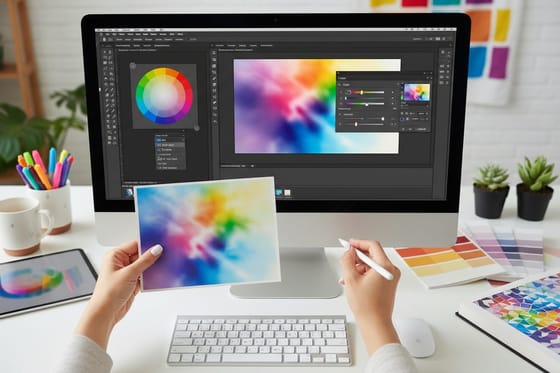
Your colors look dull because a screen builds color by adding light and a press builds it by layering ink that subtracts light, and ink simply cannot reach the most saturated greens, cyan-blues and violets. Those colors are rounded to the closest printable mix during the RGB to CMYK conversion, so the shift is expected rather than a fault. Reds, oranges, yellows and skin tones come through nearly unchanged. The fix is to design in CMYK, soft proof before you send, keep neons out of the palette, and build large blacks rich.
Quick answer
Ink cannot mix light, so the brightest colors get rounded off
A monitor makes green by firing green light at you. A press makes green by layering cyan and yellow ink, and each ink absorbs a little of what the other one is trying to reflect. Screen green #00FF00 comes back near C63 M0 Y100 K0. Saturated greens, cyan-blues and violets fall outside what four inks can mix, so the conversion moves them to the nearest color that exists on paper. Warm colors barely move. The chart below shows exactly where the ink stops and the screen keeps going.
Dull and washed out
Why CMYK looks dull and washed out beside your monitor
CMYK looks dull because four inks cover a smaller range of color than a monitor's red, green and blue light, and a printed sheet only reflects the light already in the room. Screen green #00FF00 lands near C63 M0 Y100 K0, and electric blue #0000FF prints as C100 M100 Y0 K0 and leans violet. Screen red #FF0000 prints as C0 M100 Y100 K0 and barely moves.
Washed out is a separate problem, and the stock usually causes it. Uncoated paper pulls ink into the fiber, the dots spread and deep colors lose punch. Coated stock such as the 100# gloss text our flyers start on, or the 14pt gloss cover on postcards, holds the ink on the surface. Keep total ink under roughly 300 percent on coated stock, and print 50 postcards from $16.48 to check the palette on real paper before a long run.
Light Adds Color, Ink Takes It Away

RGB is a light model. Your monitor is black until it fires red, green and blue subpixels at your eye, and firing all three at full power gives white. Turn everything off and you get black. Every color on that screen is made by adding light.
CMYK is the opposite. A sheet of paper is already white because it reflects nearly all the light hitting it. Cyan, magenta and yellow ink each absorb a slice of that light, and what bounces back to you is whatever is left. Print all three at full strength and you get a muddy dark brown, which is why black ink exists as a fourth unit. Every color on paper is made by subtracting light.
That difference has a hard consequence. A monitor can push a single channel to full brightness with nothing muting it, so screen green is about as pure as green gets. Ink has no such move. Green on paper is cyan and yellow layered together, and each of those inks absorbs a little of the wavelengths the other one is trying to reflect. The result is a good green, just never that green. The same logic explains why an RGB black turns muddy the moment it is separated into plates.
This is not a quality tier. A better press, a better paper and a better operator will not close that gap, because it is a property of pigment. What changes with quality is how close you get to the edge of what ink can do, and how consistently you sit there across a run of full color flyers or posters.
What Happened Between Your Screen and the Sheet
Three things happened, and only one of them is under your control.
Your file was converted. Somewhere between your desktop and our press, an RGB file became four ink channels. If you did the conversion, you chose the profile and the rendering intent. If you did not, our workflow applied a standard coated profile on your behalf and made every out-of-gamut decision without asking. Both paths produce a printable file. Only one of them lets you see the compromise before it is permanent.
Out-of-gamut colors were rounded. A color that ink cannot reach does not error out, it snaps to the nearest reachable one. Relative colorimetric intent moves only the colors that fall outside and leaves the rest exactly where they are, which is why a photo can look mostly right with one screaming green shrub gone flat. Perceptual intent compresses everything a little to keep the relationships between colors intact, which suits an image that is out of gamut all over.
The viewing conditions changed. A monitor at typical office brightness throws several hundred candelas per square meter straight at you. A printed sheet only reflects whatever light is in the room. Hold a print next to a screen showing the same file and the print will look darker even when every color in it is perfectly in gamut. Judge print under decent, neutral light, not against a glowing panel.
If you want the conversion to stop being a surprise, our walkthrough on converting RGB to CMYK in Photoshop and Illustrator covers the dialogs, and what proofing actually is explains where a proof sits in the schedule.
See the Difference, Swatch by Swatch

Five common screen colors show the shift better than any description. Each block pairs the sRGB value with the approximate process build that lands on coated stock such as 100# gloss text. The left half of each block is the sRGB value, the right half is roughly what comes back on paper.
Read those in order and the pattern is obvious: the cool end of the spectrum takes the damage and the warm end walks away. That is worth knowing before you choose a brand palette, because a logo built on screen green and electric blue will fight you on every printed piece you ever order, while the same logo in a warm palette never will. The pairings that hold up in print are chosen with exactly this in mind.
One honest caveat about the blocks above. You are reading them on a screen, so the right-hand halves are themselves screen approximations of ink. They show the direction and rough size of each shift, not a match. For a real comparison, put a printed piece in your hand.
The Colors That Shift the Most, and What to Do About Each
Six color families cover nearly every complaint that reaches our prepress desk, from screen green at #00FF00 to a 100K black that goes charcoal over a large solid. The last row is the good news: reds, oranges, yellows and skin tones.
| Color family | Why it fails | What lands on paper | What to do instead |
|---|---|---|---|
| Saturated green | No cyan and yellow mix reaches a single-channel screen green. | A leaf or grass green, noticeably calmer. | Pick a slightly deeper, less saturated green for the brand so screen and print agree. |
| Electric blue and violet | Needs cyan and magenta both near full, which is a very heavy build. | A dark indigo that reads purple under warm light. | Drop magenta to roughly 70 to 85 and add a little black. Purple cast gone, depth kept. |
| Bright turquoise | Cyan ink is the closest single pigment and still cannot match screen luminance. | A good turquoise that reads flatter beside the screen version. | Accept it, or run cyan as a spot ink if the color carries the brand. |
| Neon and fluorescent | Fluorescent pigment re-emits light. Process ink only absorbs it. | An ordinary bright pink, green or orange. | A fluorescent spot ink as a fifth unit, or a different design idea. |
| Large blacks and deep navy | 100K alone is one thin ink layer over a wide area. | Dark charcoal that shows streaks and roller marks. | Rich black, around C60 M40 Y40 K100. Keep 100K only for small text. |
| Reds, oranges, yellows, skin | Nothing fails. These sit well inside what ink can mix. | Very close to the screen, on coated stock. | Nothing. Build the design around this end of the spectrum where you can. |
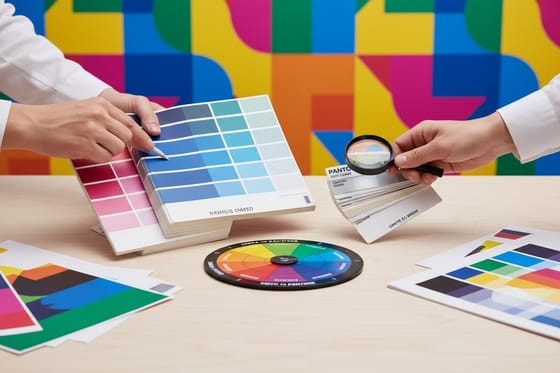
If a brand color is defined as a Pantone rather than an RGB value, the conversation is slightly different and often more hopeful, because a spot ink can be matched exactly when the budget allows. Our notes on matching Pantone to CMYK cover which spot colors convert cleanly and which ones never will, and two-color spot printing is worth a look when a single exact color matters more than photographic imagery.
How to Keep Your Colors Popping

You cannot widen the gamut, so the job is to spend it well. Five things do most of the work.
- Design in CMYK from the first click. Set the document to CMYK before you pick a single color. You will naturally choose colors that exist, and nothing has to be rescued later.
- Turn on soft proofing and leave it on. In Photoshop, View then Proof Setup then Custom, choose the coated profile, then toggle the preview with the proof colors shortcut. It is the only way to see the dull version while you still have time to fix it.
- Use contrast, not saturation. A color looks brighter next to a dark or neutral neighbor. A green that disappoints on white can look vivid against a rich black panel, and that is free.
- Build large blacks rich, small text plain. C60 M40 Y40 K100 for solids and panels. Straight 100K for anything under about 12 point, so a hair of misregistration cannot put a colored edge on your type. The full reasoning sits in our rich black recipe.
- Choose coated stock when color is the point. Gloss and matte coated hold saturation because the ink stays on the surface. Uncoated is a beautiful, tactile choice and it is the wrong choice for a photograph you need to sing. The same trade shows up hard on kraft, as our notes on color on kraft paper explain.
Watch total ink coverage while you do this. Stacking all four channels near full puts too much wet ink on the sheet, which slows drying and can offset onto the back of the sheet above it in the stack. Keep the total under roughly 300 percent on coated stock. If a color picker hands you C90 M90 Y90 K100, that is 370 percent and it needs rebuilding before it goes anywhere near a press.
One more habit costs nothing: put a color calibration bar in the margin of anything color-critical. It gives the press operator a reference and gives you something objective to point at if a reprint conversation ever happens.
Setting Up Your File in CMYK Before You Send It

The mechanics take about ten minutes once and become automatic after that.
- Illustrator and InDesign. Set File then Document Color Mode to CMYK at the start of a new file. On an existing file, switching the mode converts your swatches on the spot, so check every brand color afterward rather than assuming it survived.
- Photoshop. Use Edit then Convert to Profile rather than Image then Mode, because Convert to Profile lets you choose the rendering intent and keep black point compensation switched on. Relative colorimetric for most photographs. Perceptual when the image is saturated corner to corner.
- Check what fell outside. View then Gamut Warning in Photoshop grays out every pixel ink cannot reach. Run it before converting so you know which areas are about to move.
- Place linked images in the right mode. A CMYK layout with an RGB photo linked into it is still an RGB photo until output. Convert the images, not just the document.
- Flatten transparency and outline your type. Live effects re-render at output and can shift color at their edges. Outlined type and flattened artwork remove that variable.
- Export a PDF with the profile embedded. An embedded coated profile tells our workflow exactly what you were looking at when you approved it.
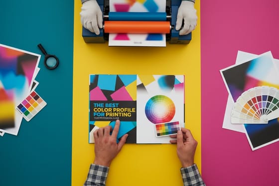
Start from a correctly sized layout rather than building one from scratch. Our blank template library has the trim, bleed and safety margins already set for every product, and the design template gallery gives you editable artwork if you would rather adjust something proven. If you want the whole file handoff in one place, the guide on converting files for print and the notes on choosing a color profile cover the two decisions that matter most.
Then order a small quantity first. A short run of postcards or standard business cards is a cheap way to see your palette on the exact stock before you commit to a thousand brochures. Compare the piece under the light where it will actually live, and browse the full range in postcard printing or poster printing once you know your colors hold.
Wally explains the dull print
Screens add light, ink takes it away
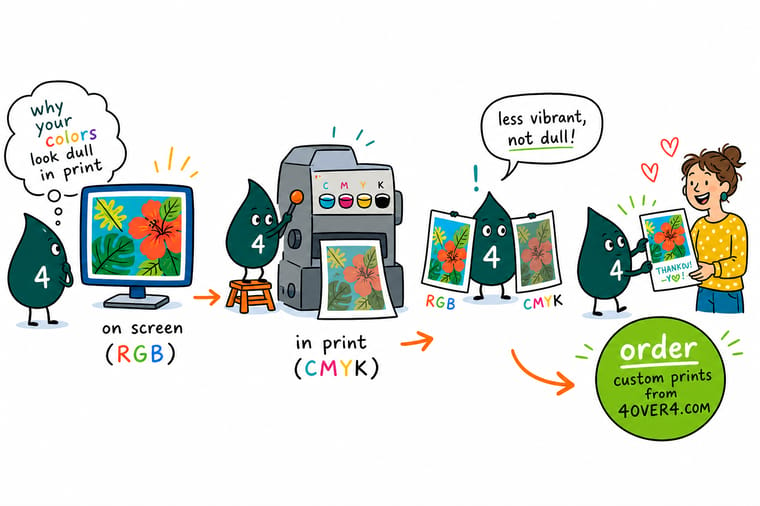
Wally's monitor makes green by firing green light straight at your eye. His press makes green by putting cyan on top of yellow, and each ink swallows a little of what the other is trying to reflect. So the screen green wins and the paper green comes second, every time, on every press. It is not a fault in the proof. Give Wally a warm palette and he matches it almost exactly. Give him a neon and he will hand you a spot ink quote instead.
Order full color flyers →
Specs and pricing
Stocks, coatings and starting prices for color-critical work
Coating decides how much saturation survives. Flyers start at $39.54 for 50 on 100# gloss text in seven sizes up to 11 by 17 inches, postcards at $16.48 for 50 on 14pt gloss cover with 22 paper types, and posters at $108.75 for 50 in sizes up to 27 by 40 inches. Compare the stocks in each card, live from the 4OVER4.COM configurator, before you commit a palette.



Print it
Print a short run and judge the color in your hand
Fifty postcards on 14pt gloss cover cost $16.48, the cheapest way to see a brand green or an electric blue on real stock before you order 500 flyers at $108.75.



%22%2F%3E%3Ccircle%20cx%3D%2249%22%20cy%3D%2220%22%20r%3D%2224%22%20fill%3D%22%232dd4bf%22%20opacity%3D%220.15%22%2F%3E%3Ccircle%20cx%3D%2254%22%20cy%3D%2227%22%20r%3D%22-3%22%20fill%3D%22%232dd4bf%22%20opacity%3D%220.1%22%2F%3E%3Crect%20x%3D%2279%22%20y%3D%22-9%22%20width%3D%2234%22%20height%3D%2220%22%20rx%3D%224%22%20fill%3D%22%232dd4bf%22%20opacity%3D%220.08%22%20transform%3D%22rotate(44%2080%2030)%22%2F%3E%3C%2Fsvg%3E)
Explore more
Where to go next
The conversion guide walks through the Photoshop and Illustrator dialogs, the rich black guide explains the C60 M40 Y40 K100 build, and the Pantone guide shows which spot colors convert cleanly to four inks.


By the numbers
Color you can repeat, order after order
Common Questions
Your RGB and CMYK questions, answered
Is a dull proof a printing mistake?
Almost never. A soft proof or a printed proof that looks flatter than your screen is usually the press showing you the honest limit of process ink. Check one thing before you worry: open the file, switch it to CMYK preview, and compare that to the proof. If they match, the proof is correct and the surprise came from the RGB file, not from the press. If the proof looks different from your own CMYK preview, that is worth a conversation, and it is usually a profile mismatch rather than a press fault.
Should I convert to CMYK myself or let the printer do it?
Convert it yourself if you care about the result, because the conversion happens either way and the only question is who gets to see it first. Send RGB and our workflow applies a standard profile with no chance for you to adjust a brand color that landed badly. Convert in Photoshop or Illustrator, look at what moved, and fix the two or three colors that matter before the file leaves your machine. The one exception: if you have no color management set up at all, a wrong profile applied twice is worse than leaving it, so send the RGB file and tell us the stock.
Which colors change the most between RGB and CMYK?
Pure screen green, electric blue and violet, bright turquoise, and anything fluorescent. Screen green at #00FF00 has no ink equivalent, so the press mixes cyan and yellow and lands near a leaf green. Electric blue needs cyan and magenta at full strength, which prints far darker and drifts toward purple. Reds, oranges, yellows, browns and skin tones survive the trip nearly intact, which is why a photograph often looks fine while a flat brand color beside it looks wrong.
Why does my black print gray or blotchy over a large area?
Because it is built from black ink alone. One hundred percent K over a big solid puts down a thin single layer that reads as dark charcoal, and it shows every roller streak. For large solids ask for a rich black, roughly C60 M40 Y40 K100, which adds density without going over the ink limit. Keep small type and thin rules at 100K only, since four plates stacked under 8 point text will show a color fringe if registration drifts by a hair.
Can you print a neon or fluorescent color?
Not with process ink. Fluorescent pigment works by converting invisible light into visible light, and cyan, magenta, yellow and black do nothing of the kind, so the closest CMYK build of a highlighter pink is a fairly ordinary bright pink. If a neon is essential to the brand, the route is a spot fluorescent ink printed as an extra unit, which changes the press setup and the price. Most brands get a better outcome by choosing a strong in-gamut color and letting stock and finishing carry the impact.
Why does the same file look different on gloss and uncoated stock?
Coating controls how much ink soaks in. On gloss coated stock the ink sits on a sealed surface, the dots stay tight, and color holds its saturation. On uncoated stock the fiber pulls ink in, dots spread, and the whole image reads lighter and softer, typically a noticeable step down in punch on deep colors. It is not a defect and it is not fixable in the file beyond building the artwork a little heavier. Order free samples of both stocks and judge them under the light where the piece will actually be seen.
Get Started
Want to see your palette on paper before the big run?
Pick your stock and coating, send a CMYK file, and print a short run first. Compare it under the light where the piece will actually be seen, then order the full quantity.
Legal Disclaimer
Gold Standard guarantees apply to all standard orders placed through 4over4.com. Price match requires verifiable proof of a competitor's published price for an equivalent product with matching specifications and turnaround time. Satisfaction guarantee covers manufacturing defects and print quality issues. Contact support with order number and documentation.
