
How Color Prints on Kraft Paper and Which Builds to Avoid


Emma is our prepress and print production voice, built from the knowledge of our production team, with over 20 years in printing.
Kraft is unbleached brown, and process ink is translucent. That changes every color in your file, leaves only some builds standing, and reaches a point where foil beats ink.
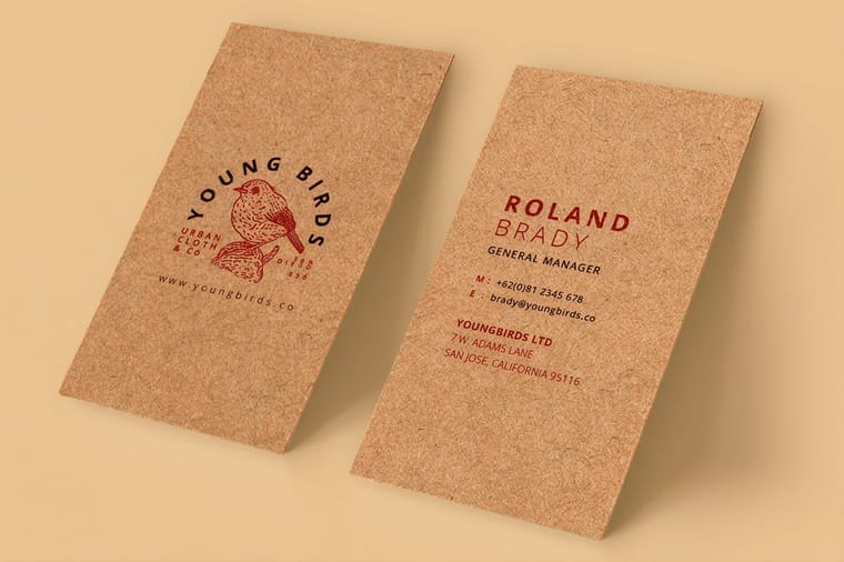
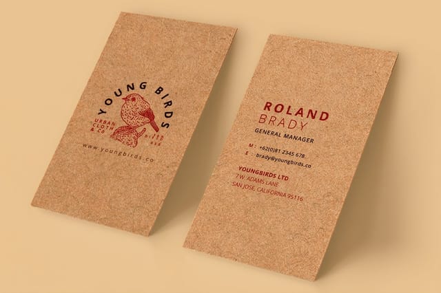
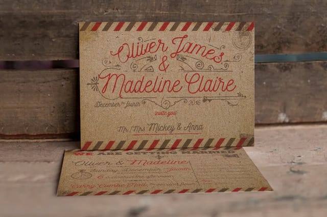
Kraft is an unbleached tan brown, and because CMYK inks are translucent, every color you print on it is that brown showing through a colored film. Colors land darker, warmer and lower in contrast than on white. There is no white ink in four color process, so anything white in your file prints as bare kraft. Dark saturated builds hold their identity, tints under about 30 percent do not, and true white or metallic needs foil rather than ink.
Quick answer
Brown is the base coat you never asked for
Kraft paper is unbleached pulp, so it stays a warm tan brown, and translucent process ink cannot hide it. Every kraft product on this page prints on 18pt Kraft Uncoated Cover, so the same brown sits under every design. Light travels through the ink film, reflects off brown fiber, and returns tinted. The heavier and darker your build, the less the brown matters. The lighter it is, the more the paper takes over, until a pale tint stops being a color at all and becomes a dull neutral. White is the extreme case, because white in a CMYK file is simply no ink.
What Color Kraft Is, and Why Ink Behaves Differently On It
Kraft gets its color from what the mill leaves in rather than what it puts on. The kraft pulping process keeps the fiber long and strong, and the brown lignin that a bleaching stage would remove stays in the sheet. That is the whole story: no dye, no coating, just unbleached pulp.
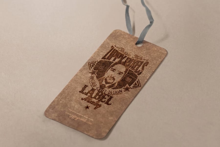
The shade lands in warm tan territory, close to a paper grocery bag, and it moves. Fiber source, recycled content and the specific run all nudge it lighter or grayer. Two orders placed months apart can differ enough to notice side by side, which is why nobody quotes kraft as a Pantone number. Our kraft color comes from 18pt Kraft Uncoated Cover made from 100 percent post-consumer waste, the one brown stock under every standard kraft product we print.
| Kraft product | Sizes | Starts at |
|---|---|---|
| Kraft business cards | 2 x 3.5 in and five other card sizes | 100 for $24.75 |
| Kraft postcards | 16 sizes from 2 x 4 to 6 x 11 in | 100 for $28.49 |
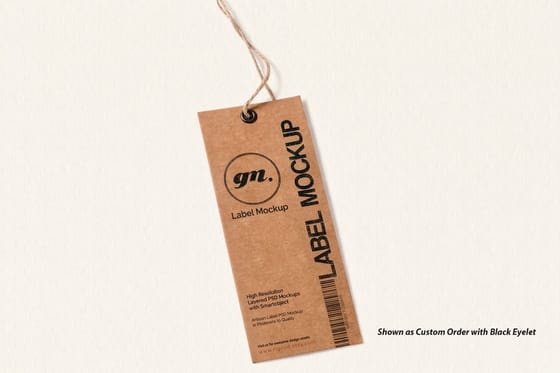
| Kraft hangtags | Eight sizes from 1.5 x 3.5 to 2 x 6 in | 100 for $57.96 |
| Kraft greeting cards | 10 x 7 in, folded to 5 x 7 | 100 for $193.15 |
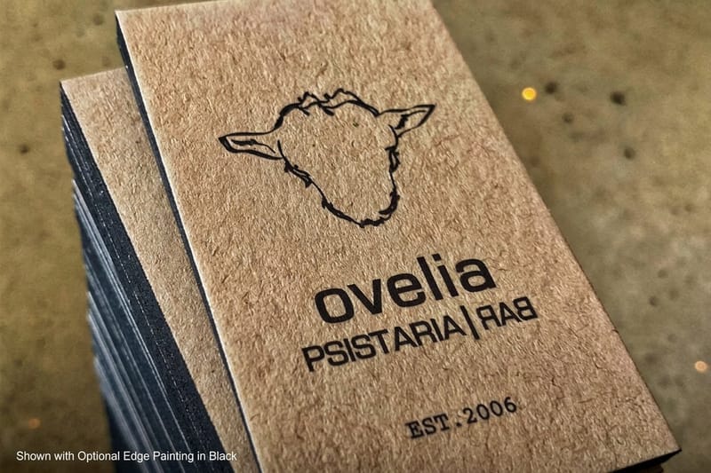
| Ultra thick kraft business cards | 32pt to 80pt kraft, three card sizes | 50 for $46.72 |
The four 18pt products print in full color on one side or both and take 5 business days of standard production, with a 2 day option; the ladder runs from 100 to 1,000 pieces, so a small first run lets you see the kraft color with your own artwork before a larger order.
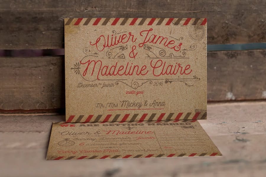
Now put ink on it. Process inks are made translucent on purpose so cyan over yellow makes green rather than a stripe of cyan hiding yellow. That transparency is exactly what causes the shift here. Light passes through the ink film, hits brown fiber, and comes back tinted brown. You are not printing a color on kraft, you are printing a filter over brown.
The practical consequence is simple and it decides most kraft design choices: the more ink you lay down, the less the brown matters, and the less ink you lay down, the more it dominates. If you want to compare the stock against a bleached white sheet before you commit, the kraft versus standard business cards comparison puts the two side by side, and kraft business cards start at $24.75 against $17.57 for standard business cards.
There Is No White Ink in CMYK, So White Prints as Brown
This is the single thing that surprises people most, and it is worth stating flatly. In four color process there are four inks: cyan, magenta, yellow and black. White is not one of them. White in your file means an area that receives no ink, which on kraft means bare brown.
So a logo built as white type in a colored box comes out as brown type in a colored box. A photo with a bright sky prints with a brown sky. A knockout highlight becomes a brown highlight. None of that is a printing fault, it is the file asking for something the process does not have.
Three ways to work with it rather than against it:
- Let kraft be your white. Design as if brown is the paper color it actually is. A one color or two color layout that leaves generous unprinted space looks deliberate and expensive on kraft, and it costs less ink than flooding the sheet.
- Flip the knockout. Where you would have used white type on a color, use dark type on bare kraft instead. It reads better and it holds detail better.
- Print the white as foil. When a mark genuinely has to be white, foil is the answer, covered further down this page.
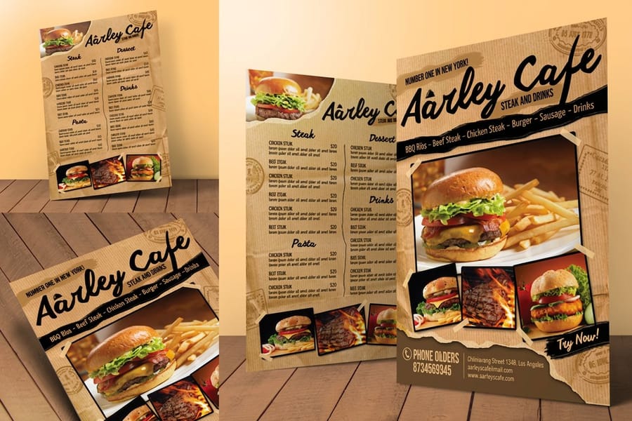
Photographs are the hardest case. An image with a wide bright range loses its top end entirely on kraft, because the highlights are the part carrying the least ink. Duotones and heavily contrasted single color treatments hold up far better, which is why kraft hangtags and kraft postcards nearly always look strongest with bold graphic artwork rather than full color photography. You can see both in real orders in the kraft hangtags and kraft postcards stories.
The Colors That Fail on Kraft and the Builds That Hold
Rank your palette by ink weight and you can predict almost everything. Heavy, saturated, dark builds keep their identity. Light tints hand most of their appearance over to the paper.
| Build | CMYK | What kraft does to it | Verdict |
|---|---|---|---|
| Warm red | 0 / 85 / 85 / 0 | Deepens toward a brick red, keeps full impact. | Use it, one of the best performers on kraft. |
| Deep blue | 100 / 60 / 0 / 0 | Shifts toward navy with a teal edge, stays legible. | Use it, expect darker than your proof. |
| Forest green | 90 / 30 / 90 / 20 | Brown reinforces the green rather than fighting it. | Use it, the most natural match for the stock. |
| Rich black | 60 / 40 / 40 / 100 | Prints denser than 100 percent K alone, sits at 240 percent coverage. | Use it for solids, and check it against your ink limit. |
| Process yellow | 0 / 0 / 100 / 0 | Yellow is the most transparent ink, so it reads mustard or olive. | Avoid as a primary, acceptable as a small accent. |
| Pastel tint | anything under 30 percent | Loses its hue and settles into a dull gray brown. | Avoid, there is not enough ink to overcome the base. |
The pattern in the third column is the lesson. Colors that already contain warmth or depth get help from the brown. Colors that depend on a bright base get destroyed by it. Pale blues, mint greens, blush pinks and light grays are the ones designers most often send in and most often regret.
Two adjustments cover most of it. Increase the saturation and the tonal contrast of your palette before you proof, since kraft will flatten both. Then simplify: a two color design on kraft usually beats a four color one, because it stops competing with the paper. If you want to understand what the numbers themselves mean before you rebuild the palette, our explanation of CMYK values for print is the place to start, and the rich black recipe guide covers the black question in full.
Texture, Absorption, and the Limit on Fine Detail

Kraft is uncoated, and uncoated changes how ink lands. On a coated sheet a clay layer seals the surface so ink stays on top and dots stay crisp. On kraft the ink soaks into the fiber and spreads a fraction as it does. That spread is dot gain, and on an uncoated stock it is measurably larger than on gloss.
What it means at your desk: fine lines come out slightly heavier than drawn, tight halftone screens fill in, and small delicate serifs lose their thin strokes. It is a small effect, not a catastrophe, but it sets real limits.
- Keep body type at 7 point or above, and prefer a face with even stroke weight over a high contrast serif.
- Keep rules and outlines at half a point or heavier. A hairline drawn at 0.1 point can either disappear or thicken unpredictably.
- Give reversed elements room. A thin unprinted gap between two dark shapes can close up as ink spreads into it.
- Avoid screens below about 15 percent, since they turn patchy against a textured fiber surface.
There is a payoff for the constraint. That same absorbent, slightly rough surface is what makes kraft feel like a material rather than a substrate, and it is why it reads as honest and unfussy in retail packaging and food service. Heavier kraft amplifies it: ultra thick kraft business cards start at $46.72 and carry noticeably more presence in the hand than the standard weight, and the ultra thick kraft business cards story shows how that weight looks in use. For the wider picture of how coating changes ink behavior, see the matte versus uncoated paper comparison and the overview of printing paper stocks.
When to Reach for White Foil Instead of Ink
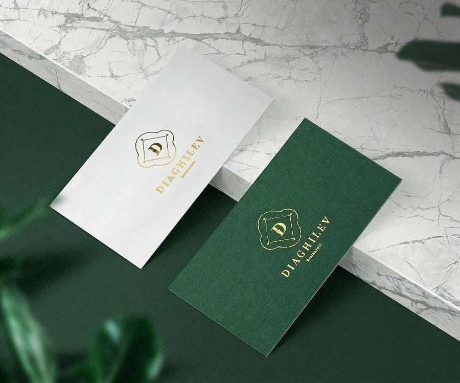
Foil solves the exact problem ink cannot. It is a pigmented or metallic film transferred onto the sheet with heat and a metal die, and it is opaque. Nothing beneath it shows through, so a white foil mark on kraft is genuinely white and a metallic one keeps its shine.
That opacity is the whole reason foil and kraft pair so well. The stock is dark and matte, the foil is bright and reflective, and the contrast does work that no CMYK build on brown can do. It is the standard answer for a logo that has to stay on brand on an unbleached sheet.
The trade-offs are real and worth saying plainly. Foil needs a die, so it costs more and adds a production step, which shows in the price: foil business cards start at $222.13 against $24.75 for a plain kraft card. Detail is limited too, because very fine strokes and small type do not release cleanly from the die, so foil artwork wants solid shapes at a reasonable weight. And it is a spot treatment by nature, useful for a mark or a line of type rather than a full color image.
Use it where the piece gets handled and looked at closely: a business card, a kraft greeting card, a hang tag on a product someone picks up in a shop. For everything else, a dark two color build on bare kraft costs far less and reads just as well. If you want the mechanics of the process before you decide, what foil stamping is covers it, and if a press in your workflow does offer an opaque white ink pass, the white ink spot color setup guide shows how that separation is built. Start your layout from a correctly sized file in the blank template library, and browse everything we run on this stock in the kraft printing collection.
Wally explains color on kraft
Your ink is a filter, the brown is the base
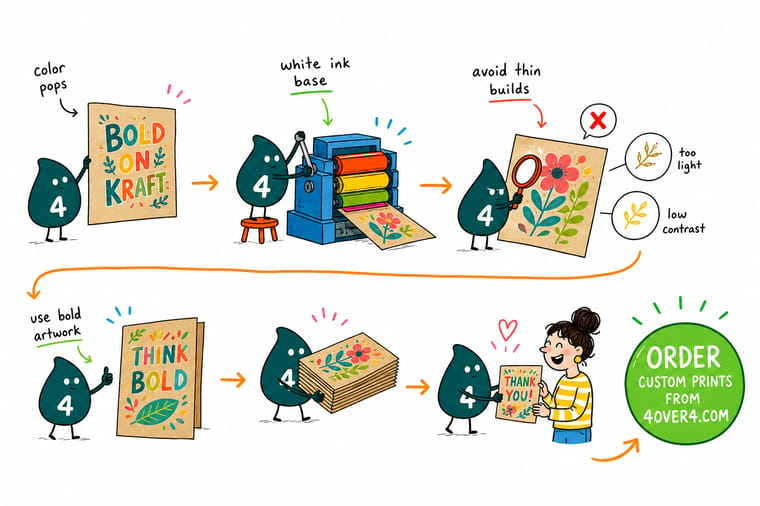
Wally holds a swatch of ink over brown kraft and shows you what the press will do. Deep red stays red. Deep blue stays blue. Yellow goes olive, a pastel tint goes muddy, and anything white in the file simply prints as bare paper, because there is no white ink in four color process. His rule of thumb is to give kraft the dark end of your palette and let the brown do the work everywhere else. When a mark truly has to be white or metallic, he reaches for foil, which sits on top of the sheet instead of mixing with it.
Shop the kraft printing collection →
Specs and pricing
Kraft products, sizes, and starting prices
Every kraft item here runs on 18pt Kraft Uncoated Cover, and each product page carries its own sizes and quantities.

Print it
Order kraft printed the way the stock wants
Kraft business cards start at 100 for $24.75, kraft postcards at 100 for $28.49 in 16 sizes, and kraft greeting cards at 100 for $193.15, folded to 5 by 7 inches. All three take 5 business days of standard production.


Explore more
Where to go next
Six next reads: kraft against standard cards, matte, gloss, linen and kraft stocks, the 60/40/40/100 rich black recipe, setting up a white ink layer, the kraft printing collection and our printing FAQs.



By the numbers
Kraft cards, postcards and tags on one brown stock
Common Questions
Your kraft color questions, answered
What color is kraft paper?
Kraft is an unbleached tan brown, roughly the shade of a paper grocery bag. On screen it lands near a warm mid brown in the region of #C2A17B, though that is an approximation rather than a target you can proof against. The color comes from lignin and residual pulp that a bleaching stage would normally strip out, and because the fiber source varies, one production run can be a shade lighter or grayer than the next. Treat it as a natural material with a range, not a spot color. If exact color consistency across two separate orders matters more than the look, print on a white stock and let the design carry the warmth instead.
Why do my colors look duller on kraft than on my screen?
Two things stack up. First, your monitor emits light while paper reflects it, so any print looks less luminous than the screen version. Second, and much bigger here, process inks are translucent, so the brown sheet shows through every ink film. A color that reads as bright on white is that same ink film over a brown base on kraft, which darkens it and pulls it warm. The practical fix is to design in the knowledge that kraft will do this: pick saturated, darker builds, raise your contrast, and stop expecting the pale end of your palette to survive.
Can you print white on kraft paper?
Not with standard CMYK printing, because white in a four color file simply means no ink. Some presses run an opaque white as an extra spot pass, which lays down a solid white layer before or instead of the process inks, and that is a separate setup with its own file requirements. The more common and more reliable route on kraft is white or metallic foil, which is an opaque film pressed onto the sheet with heat and a die. Foil sits on the surface, so the brown underneath cannot tint it.
Which colors should I avoid on kraft?
Anything pale, and anything that depends on white to work. Yellow is the worst single offender because yellow ink is the most transparent of the four, so it lands on brown and reads as mustard or olive. Light blues, mint greens, blush pinks and pale grays all drift toward a muddy neutral. Fine reversed type is a related trap: a thin white line between two printed areas prints as brown, and at small sizes it just closes up. Save the pale palette for a white stock and give kraft the deep end of your color range.
What CMYK values print well on kraft?
Builds with weight in them. A red around 0/85/85/0 still reads clearly as red. A deep blue around 100/60/0/0 shifts toward navy but keeps its identity. Forest greens around 90/30/90/20 hold well because the brown reinforces rather than fights the green. For solid black, a rich black of 60/40/40/100 gives a deeper result than 100 percent K alone, and its 240 percent total coverage stays inside what an uncoated sheet can absorb without setting off. Our guide on the rich black CMYK recipe walks through why that mix behaves the way it does.
Does kraft hold fine detail as well as coated stock?
No. Kraft is uncoated, so the ink soaks into the fiber instead of sitting on a sealed surface. Halftone dots spread a little, which is dot gain, and the result is that fine lines thicken slightly and tight screens fill in. Keep body type at 7 point or larger, keep rules at half a point or heavier, and avoid delicate serif faces at small sizes. Bold, simple artwork is not a compromise on kraft, it is what the stock is good at.
Get Started
Order 100 kraft business cards from $24.75
Pick your kraft product, build the artwork dark and simple, and we print a sheet where the brown is part of the design instead of a problem.
Legal Disclaimer
Gold Standard guarantees apply to all standard orders placed through 4over4.com. Price match requires verifiable proof of a competitor's published price for an equivalent product with matching specifications and turnaround time. Satisfaction guarantee covers manufacturing defects and print quality issues. Contact support with order number and documentation.
