
Neuromarketing Explained and How to Use It Without a Brain Scanner


The tools, the effects that survive outside the lab, and the split test you can run this month on a real audience.
Neuromarketing measures what a person's eyes, face, skin and brain do while they meet your marketing, instead of trusting what they say about it afterward. The instruments are expensive and each one answers a narrow question, but the useful half of the field costs nothing: anchoring, the decoy tier, loss framing, the peak-end rule, contrast and reading ease all come from behavioral research you can test yourself with two versions of one piece.
Quick answer
Measure the automatic decision, then design for it
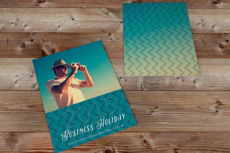
Almost every purchase is settled by a fast, automatic pass that never reads a word. Neuromarketing exists because a focus group only reports the slow pass afterward, and the two records rarely match. The scanners are the expensive end of the field. The end that pays for a small business is behavioral: set the anchor before the price, give people three tiers rather than two, frame a deadline as a loss, engineer the peak and the ending, and win the first second with contrast rather than copy.
What Neuromarketing Measures, and Where Each Tool Misleads

Four families of instruments do almost all the work, and each one answers a narrow question well and a broad question badly. Knowing which is which saves you from buying a study that cannot tell you what you wanted to know.
| Method | What it records | Good at | Where it misleads |
|---|---|---|---|
| fMRI | Blood flow through brain regions, second by second. | Deep responses such as reward and brand recall that people cannot report accurately. | Reverse inference. A region lighting up does not name an emotion, and the scanner is slow and costly. |
| EEG | Electrical activity at the scalp, at millisecond resolution. | Timing. Exactly when attention rises or falls across a video or a shelf. | Poor at locating anything inside the brain, and easily wrecked by movement or a clenched jaw. |
| Eye tracking | Where the gaze lands, in what order, and for how long. | Layout and packaging. Whether the price or the call to action is ever actually seen. | Looking is not liking. Confusion holds a gaze as firmly as interest does. |
| Facial coding and skin response | Micro-expressions and sweat-driven changes in skin conductance. | Cheap arousal readings, often over a plain webcam, at scale. | Arousal has no sign. A spike tells you something landed, not whether it was delight or irritation. |
Read the fourth column first. Most disappointing neuromarketing projects were sold on the third column and delivered the fourth. A study can tell you that shoppers never fixate on your price panel, which is genuinely actionable. It cannot tell you that a shade of blue increases loyalty, and any vendor promising that is selling a story.
There is one more limit that applies to all four. Samples are small, because scanner time and lab hours are expensive, and small samples produce effects that shrink when someone else tries to repeat them. Behavioural science has spent a decade learning that the hard way. Treat a published finding as a hypothesis worth testing on your own customers rather than a result you can inherit.
Six Effects That Move Almost Every Purchase
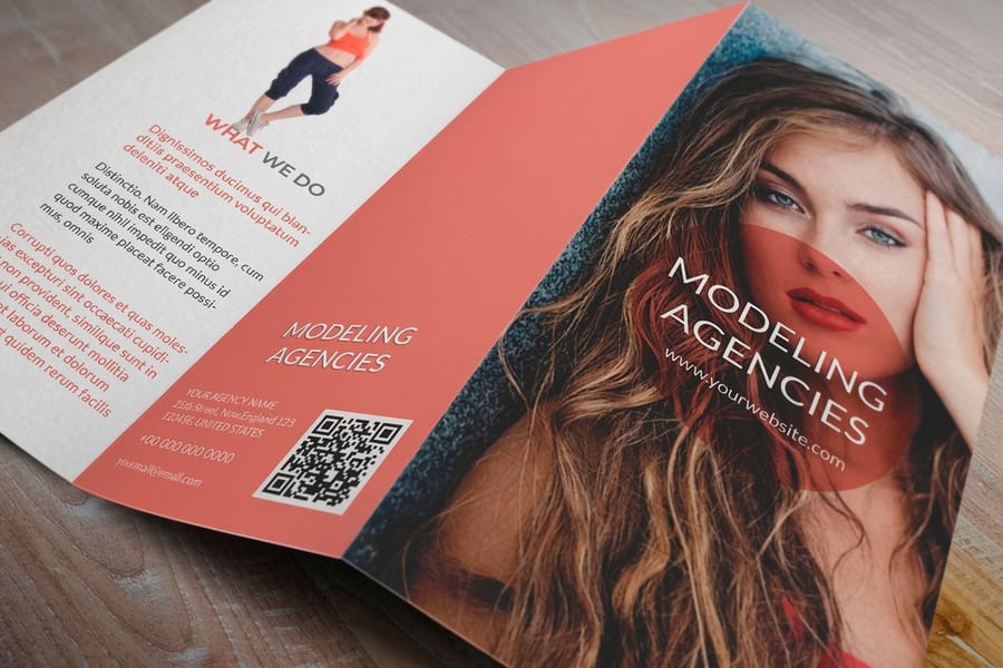
These came out of behavioral economics rather than brain imaging, which is why they are the practical half of the field. They are also the half you can act on before lunch.
- Anchoring. The first number seen sets the scale everything after it is judged against. Show the annual figure before the monthly one and the monthly one feels small. Show it the other way round and the annual feels heavy.
- The decoy. Dan Ariely made this famous with a magazine subscription page that offered web only, print only, and print plus web at the same price as print only. The middle option existed to make the bundle look obviously right, and it worked. Three tiers persuade in a way two tiers do not.
- Loss aversion. Losing something registers harder than gaining the same thing. That is why a deadline on a rate people already have outperforms an offer of a discount they never had.
- The peak-end rule. Kahneman found that people remember an experience by its most intense moment and its ending, not its average. Your unboxing and your last touchpoint carry more weight than the middle of the process.
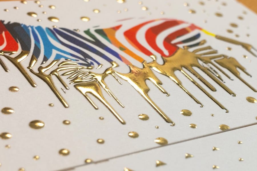
- The isolation effect. The item that differs from its neighbours is the item that is remembered. One card in a stack with a different finish gets picked up first, which is the entire mechanism behind a raised or foiled surface.
- Processing fluency. Material that is easier to read is judged more likely to be true and more likely to be acted on. Low contrast, cramped leading and a display face at body size all cost you credibility before the argument starts.
Notice that four of the six are decisions about layout and materials, not about words. That is the part most marketing plans skip. Our guide to hierarchy in graphic design covers the mechanics of deciding what gets seen first, and serif against sans serif is really an argument about fluency in disguise.
Where the Findings Meet Paper, Ink and Weight
Touch is the part of this field that a screen cannot borrow. Joann Peck and Suzanne Shu published work on mere touch showing that simply handling an object raises perceived ownership and what someone will pay for it, without any change to the object. A printed piece gets picked up. That is the whole advantage, and it is worth designing around.
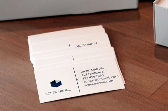
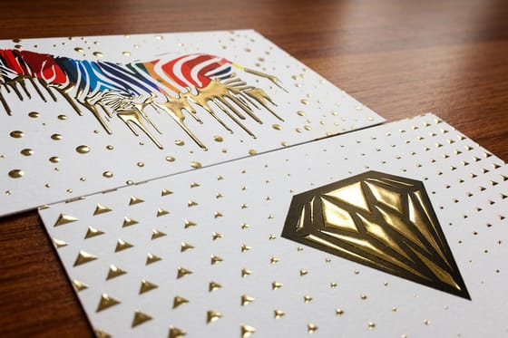
Weight and surface are the cheapest levers. A 16pt card feels considered in the hand where a 14pt card feels ordinary, and the difference costs a few dollars across a box. A raised or foiled element gives the fingertip somewhere to go, which is the isolation effect made physical rather than visual. Raised foil business cards start at $86.78 against $17.57 for standard business cards, so the honest framing is that you are buying handling time, not a better card. Order the foil for the fifty people whose desk you want to stay on, and print flat for the rest.
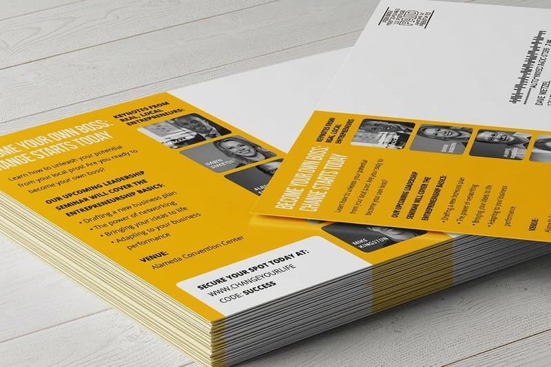
For anything mailed, contrast decides survival. A postcard is sorted over a recycling bin in about a second, and the diagram above shows the order that second runs in. Tonal separation first, then a face and whatever the face is looking at, then the biggest type, then the number. Standard postcards start at $16.48, which is low enough to run two genuinely different designs rather than two versions of the same one. Our walkthrough on sending direct mail postcards covers the addressing and postage side.
Sequence is where a brochure earns its $57.11 starting price. Panels arrive in a fixed order, so you can put the anchor on the panel before the price and the decoy tier beside the one you want chosen. A poster at $108.75 is the opposite job: one message, read at distance, where contrast is the only thing that matters and the guidance on colors for advertising signs applies directly. Browse the direct mail services collection when the test needs to reach a mailing list, or the custom printing collection when the format itself is the differentiator.
Running Your Own Version Without a Lab
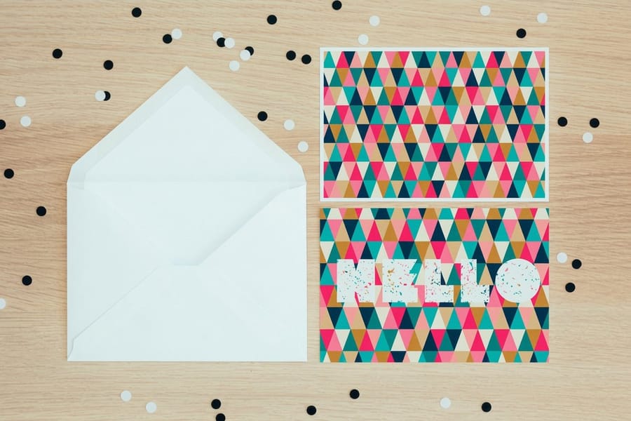
You do not need instruments to get most of the value. You need one variable, two versions, and enough audience that the result is not noise.
Start with the five second test, because it is free. Show a person the piece for five seconds, take it away, and ask what it was for and who it was from. If they cannot answer, the layout failed at stop one and no amount of copy work will fix it. The squint test is the same idea with a shorter loop: blur your eyes at the design and see what shape survives. Whatever survives is what the fast pass gets.
Then split something real. Print two postcard designs that differ in exactly one way, mail them to matched halves of the same list, and put a different code or landing URL on each. One variable is the rule people break most often, and a test that changes the image, the headline and the offer at once teaches you nothing about any of them. Give it enough volume that a handful of responses cannot flip the result, and give it a fixed end date so you are not tempted to stop the moment one version pulls ahead.
Two honest limits. Seasonality and list quality will swamp a small design effect, so run a holdout if you can afford one. And a winning version is a winner for that audience, that offer and that month, not forever. Retest the format when the offer changes. If you want the wider commercial context around these tests, the marketing strategy guides hub collects the campaign-level pieces, and advertising and marketing design covers the production decisions that sit underneath them.
Wally explains the first second
The eye decides before the reader does
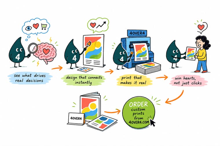
Wally holds up two postcards. One has a headline he spent all week on. The other has one dark shape against a pale field and a price you can read from the doorway. The second one gets picked up, every time, because the fast pass judges contrast and shape long before anyone reads a sentence. So Wally fixes the contrast first, writes the headline second, and then mails both versions to matched halves of the same list to find out which one he was wrong about.
Print two postcard versions →Specs and pricing
The formats these tests usually run on
Sizes, stock options and starting prices straight from the 4OVER4.COM configurator, for the three pieces that carry a test best.

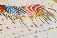

Print it
Put the theory in someone's hands

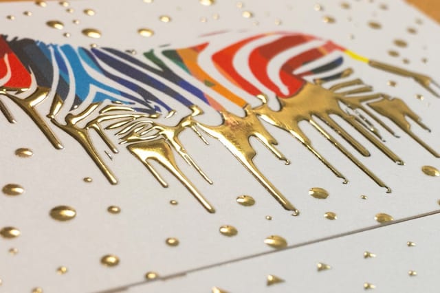

Explore more
Where to go next

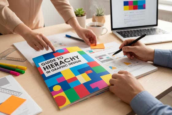
By the numbers
The print behind the test, from 4OVER4
Common Questions
Your neuromarketing questions, answered
What is neuromarketing in plain terms?
It is the practice of measuring what a person's body and brain do while they meet a piece of marketing, instead of asking them afterward what they thought of it. The tools range from expensive and clinical, like fMRI and EEG, to cheap and practical, like webcam eye tracking and reaction-time tests. The point is always the same: self-reported preference is a poor record of a decision that was mostly automatic, so measure the automatic part directly.
Do I need a lab or an agency to use any of this?
No, and for a small business the lab work is usually the wrong place to spend. The findings that matter most are behavioral, not neural: price anchoring, the decoy option, loss framing, the peak-end rule, contrast and reading ease. Every one of those can be tested with two versions of a mailer, a landing page, or a menu, split across a real audience. Spend on the split test, not the scanner.
Is neuromarketing manipulation?
The techniques are neutral and the application is not. Making a price easier to compare, a layout easier to scan, and a benefit easier to understand removes friction from a decision the customer already wanted to make. Manufacturing false scarcity, hiding the real price behind a decoy, or engineering regret is a different thing, and it costs you on the second purchase. The practical test: would you be comfortable if the customer could see exactly why you laid it out that way?
Does the Coke and Pepsi brain study prove branding beats taste?
It proves something narrower and more useful. In the 2004 study led by Read Montague, people in a blind taste test showed a pattern that favored Pepsi, but when they knew they were drinking Coke the preference and the brain response shifted. Branding did not change the liquid. It changed the experience of the liquid. The lesson for a small business is that packaging, print and presentation are part of the product experience rather than a wrapper around it.
Which colors actually make people buy?
None of them do it on their own, and the color-meaning charts that circulate online are mostly folklore. What holds up is contrast and appropriateness: an element that separates tonally from its background gets seen first, and a palette that fits the category is trusted faster than one that fights it. Green does not create trust in a nightclub flyer. If you want a starting point that survives contact with a press, our guide to color combinations for branding and print works in pairings rather than single-color meanings.
Why would printed marketing behave differently from digital?
Because it is a physical object that gets handled, and handling is not a neutral act. The work on mere touch found that holding something raises perceived ownership and willingness to pay, which is why a heavy card sits on a desk for weeks and an email does not. Print is also slower and harder to skip, so it is well suited to the parts of a decision that need a second pass. It is worse at anything that needs to change hourly, and that is a real limit rather than a small one.
Get Started
Raised foil cards run 100 for $86.78, or 87 cents each
Print two versions that differ in exactly one thing, mail them to matched halves of your list, and let the response rate settle the argument.
Legal Disclaimer
Gold Standard guarantees apply to all standard orders placed through 4over4.com. Price match requires verifiable proof of a competitor's published price for an equivalent product with matching specifications and turnaround time. Satisfaction guarantee covers manufacturing defects and print quality issues. Contact support with order number and documentation. On-time delivery rate based on tracked orders 1999 to 2026. Individual results may vary based on shipping carrier performance.
