
Advertising and Marketing Design That Prints the Way You Drew It


Marcus is our print marketing voice, built from the knowledge of our production team, with over 20 years in printing.
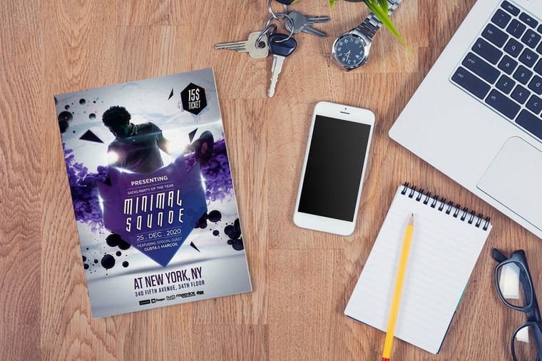
Advertising and marketing design for print, on flyers, posters, postcards and brochures, rests on one message, a hierarchy that delivers it, a brand spec short enough to reuse, and a file the cutter cannot ruin. Those four have to fit together on one real marketing piece.
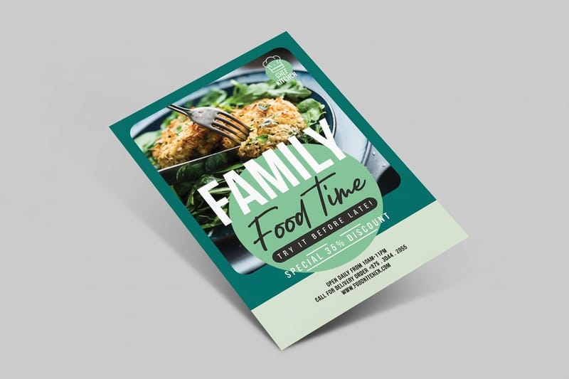
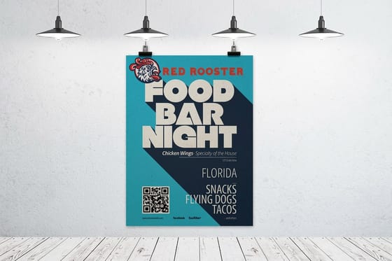
Effective print advertising design carries one message, ranks everything else beneath it with size and space, repeats a written brand spec across every piece, and ships in a file built with 0.125 inch bleed, 0.125 inch safety, CMYK color and 300 dpi images. Design and production are the same job. A layout nobody can misread still fails if the art stops at the trim line or the photo was pulled off a web page. Brands that pair flyers with posters build both from that one spec: the poster, from $108.75 for 50 in sizes up to 22 x 28 inches, carries the headline at a distance, and the flyer, from $39.54 for 50, carries the detail people take away.
Quick answer
One message, a clear ranking, and a file built for the cutter
Good marketing design is a decision about what to leave out, followed by a file that survives production. Choose the single claim the piece must land, make it the largest thing on the page, and let the rest support it at a visibly lower rank. Keep two typefaces, one accent color with its CMYK build, and fixed logo clear space so the flyer printed in March still matches the cards printed in January. Then build the artwork with 0.125 inch of bleed, keep type 0.125 inch inside the trim, work in CMYK, and place images at 300 dpi at final size.
Decide the One Message, Then Build the Hierarchy
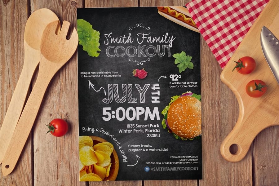
Most weak advertising design is not ugly. It is undecided. The piece carries a headline, three services, a testimonial, two phone numbers and a QR code, all competing at similar weight, and the reader resolves the competition by putting it down.
Start by writing the single sentence the piece exists to deliver. Then rank everything else against it: what the reader must see first, second, and only if they are already interested. That ranking becomes the layout. Size does most of the work, weight does the rest, and white space separates the groups so the eye knows where one idea ends.
Practical numbers help more than theory. On a flyer read at arm’s length, a headline of 30 to 48 point over 10 to 12 point body copy reads as a clear first and second. On a poster read across a room, the headline goes to 100 point or more and the body copy shrinks to one line, because nobody stands close enough to read a paragraph. On a business card, the name and the role are the hierarchy and everything else is support at 7 or 8 point.
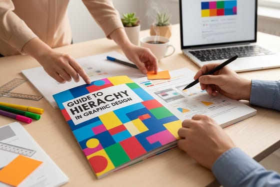
Test it the cheap way. Print the layout at final size on plain paper, pin it at the distance the real piece will be seen from, and look for three seconds. Whatever you read in those three seconds is your actual hierarchy, whatever you intended. Our guide to hierarchy in graphic design goes deeper on the mechanics, and white space is the part designers cut first and regret.
Brand Consistency Across Pieces Printed Weeks Apart

A campaign is rarely one file. The cards get ordered in January, the flyers in March, the brochure in June, and by then someone has rebuilt the logo from a screenshot and picked a blue that is close enough. Consistency is not a design instinct. It is a short written spec that survives being handed to a different person.
Four things are worth writing down and nothing else needs to be: the two typefaces and the weights you actually use, the accent color with its CMYK build and its Pantone reference, the minimum clear space around the logo expressed as a fraction of the logo width, and the stock you print on. The stock matters more than it sounds. The same ink looks warmer on an uncoated sheet and sharper on a gloss coating, so a card on 16pt gloss and a flyer on 70# Uncoated Text will not match even with identical files.
Keep the logo in vector form, and keep one version for light backgrounds and one for dark. Placing a PNG lifted from the website is a common way a logo arrives at 96 dpi and prints with soft edges on a brochure cover. If your colors have never been chosen with print in mind, these pairings hold their contrast after CMYK conversion, which is more than can be said for most palettes picked on a screen.
Getting the File Print-Ready Before You Upload It
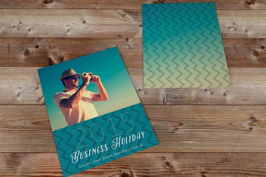
Design decisions and production decisions arrive at the same file. A layout that reads beautifully on screen still fails at the cutter if the art stops at the trim line, and a photo that looked sharp in the browser prints soft because it was always 72 dpi.
Four settings cover most of it. Build at 300 dpi measured at the size the image is placed, not the size it was downloaded. Work in CMYK so you see the conversion before the press does. Outline or embed every font, because a substituted font reflows the headline you spent an afternoon on. Reserve rich black for large solid areas and set small type in 100 percent black only, since four inks stacked under 8 point text register imperfectly and the letters look furry.
| Piece | Common trim size | Build size with bleed | What usually goes wrong |
|---|---|---|---|
| Business card | 3.5 x 2 in | 3.75 x 2.25 in | Contact text set too close to the edge and shaved on one side of the stack. |
| Postcard | 4 x 6 in | 4.25 x 6.25 in | Mailing side crowded, leaving no clear area for the address block and indicia. |
| Flyer | 8.5 x 11 in | 8.75 x 11.25 in | A web image stretched full page, sharp on screen and soft at 100 dpi on paper. |
| Brochure panel | 8.5 x 11 in, trifold | 8.75 x 11.25 in | Panels split evenly, so the tucked-in panel does not fold flat. |
| Poster | 18 x 24 in | 18.25 x 24.25 in | Body copy carried over from the flyer, unreadable at viewing distance. |
The trifold row is worth a second look, because it catches experienced designers. On a standard trifold the panel that folds inward has to be slightly narrower than the other two, usually by about 1/16 inch, or the fold bulges. Our bleed and safety checklist covers the geometry, converting RGB to CMYK covers the color half, and the blank template library gives you a correctly sized document so none of it has to be measured by hand.
Choosing the Format and Getting It Printed
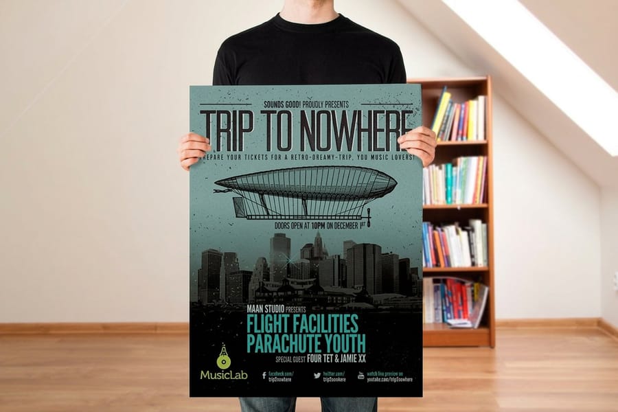
The format is a design decision, not an afterthought. It sets how much you can say, how the piece gets handed over, and what the campaign costs per person reached. A 4 x 6 postcard holds one offer and a deadline, an 8.5 x 11 flyer holds an event with its date and map, a half fold brochure splits several parts across panels, and an 18 x 24 poster holds one headline read from across a room.
| Format | Best for | Starts at | The catch |
|---|---|---|---|
| Postcards | Mailing a single offer with a deadline. | $16.48 | Postage often costs more than the printing, so the list matters more than the design. |
| Business cards | The handover after a conversation. | $17.57 | Not an advertising piece. It works only when someone already met you. |
| Flyers | Local reach, events, counters, handouts. | $39.54 | Short life. Design for one glance, not for filing. |
| Brochures | Explaining something with several parts. | $57.11 | Only read by people already interested. Poor cold-reach material. |
| Posters | Being seen from a distance, in one place, for weeks. | $108.75 | Reaches whoever walks past, which may not be your audience. |
If you do not have design software, our free online designer at 4OVER4.COM opens a correctly sized layout for whatever product you selected and keeps the bleed and safety guides visible while you work, which removes the two errors behind most reprints. Browse the design templates to start from a layout instead of a blank page. It is genuinely good for cards, flyers and postcards, and genuinely limited for multi-page brochure work, where InDesign is still faster.
When the artwork is ready, price the run at the quantity you will actually distribute rather than the one that looks cheapest per piece, since 5,000 flyers in a cupboard are more expensive than 1,000 handed out. Start with flyer printing for handouts or business card printing for the follow-up, and read flyer distribution practices before you commit to a quantity.
Wally explains marketing design
One message big, everything else smaller, art past the cut line
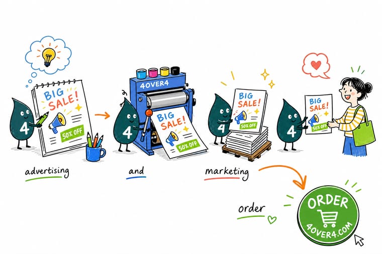
Wally writes the single sentence the piece has to deliver, then makes it the biggest thing on the page. The offer sits under it, the logo and the phone number sit under that, and anything that did not earn a rank gets cut. Then he pushes the background art a little past the trim line, pulls every word back inside the safety line, switches the file to CMYK and checks the photos are 300 dpi at the size they are actually placed. Same four moves on a card, a flyer, a brochure panel or a poster.
Print your marketing flyers →
Specs and pricing
Marketing formats, sizes, and starting prices
Flyers start at $39.54 for 50 in nine sizes from 4.25 x 5.5 to 11 x 25.5 inches, postcards at $16.48 for 50 in 14 sizes, and brochures at $57.11 for 50 flat or half folded. All three print in 3 business days, and the live options for each come from the 4OVER4.COM configurator.


Print it
Order the marketing materials the design was built for
Put the handout on 100# gloss text or 14pt cover flyers, the mailer on 14pt or 16pt postcards, and the explainer on 100# gloss or silk text brochures, each with the same two typefaces and accent color.




Explore more
Where to go next
Rank a layout by size and weight, set the bleed, cut and safety lines, pick color pairings that hold up in CMYK, and plan where the flyers go once they are printed.


By the numbers
From marketing file to finished ad, in one building
Common Questions
Your marketing design questions, answered
What is advertising and marketing design in print?
It is the craft of arranging one message, one visual and one action on a physical piece so a person understands it in the few seconds they hold it or walk past it. In practice it rests on three decisions: what the single message is, how the hierarchy makes that message read first, and whether the file is built so the press and the cutter reproduce what you drew. The design work and the production work are not separable. A layout that looks strong on screen and has type sitting on the trim line is not a finished design.
How big should the headline be on a flyer or poster?
Work from the reading distance rather than a rule. A flyer is read at roughly arm's length, so a headline around 30 to 48 point over 10 to 12 point body copy gives a clear break. A poster on a wall is read from several feet away, so the headline climbs to 100 point or more and the body copy gets cut to a line or two. The reliable test is to print the page at final size, pin it up at the distance it will actually be seen from, and check what you read first.
What bleed and safety margin do print files need?
At 4OVER4.COM, add 0.125 inch of bleed on every side and keep all text and logos at least 0.125 inch inside the trim. So a 4 by 6 inch postcard is built at 4.25 by 6.25 inches with the live area ending at 3.75 by 5.75 inches. The reason is mechanical: sheets are cut in stacks and the blade drifts slightly through the pile, so art that stops exactly at the trim line shows a white sliver on some pieces, and type on the line gets shaved on others.
Why does my brand color look different in print?
Because a monitor emits light and paper reflects it. RGB covers a wider range than CMYK ink can reproduce, and the colors it loses first are exactly the ones brands like: electric blue, bright green, hot orange. Convert the file to CMYK yourself and look at what changes, rather than letting the conversion happen after upload. If a specific color is non-negotiable across every piece, specify it as a Pantone spot color and note the closest CMYK build for the jobs that print four-color.
Can I design marketing materials without design software?
Yes. Our free online designer at 4OVER4.COM runs in the browser, starts from a correctly sized layout for the product you picked, and shows the bleed and safety guides while you work, which removes the two errors that cause most reprints. It has limits: heavy typographic control, complex image masking and multi-page brochure layouts are still faster in InDesign or Illustrator. Use the designer for cards, flyers and postcards, and download a blank template when you want to build the file yourself.
What resolution do images need for print?
300 dpi at the size the image is actually placed. That last part is where files fail. A 1200 by 800 pixel photo is 300 dpi at 4 by 2.7 inches and 100 dpi if you stretch it across an 11 by 17 inch poster, and scaling it up in Photoshop adds pixels without adding detail. Check the effective resolution in your layout software after placing and scaling, not the file size on disk. Vector logos are exempt because they redraw at any size.
Get Started
50 flyers cost $39.54, 50 posters $108.75
Pick the format, set the quantity to what you will actually hand out, and upload a file with bleed, safety and CMYK already sorted. We print and ship it.
Legal Disclaimer
Gold Standard guarantees apply to all standard orders placed through 4over4.com. Price match requires verifiable proof of a competitor's published price for an equivalent product with matching specifications and turnaround time. Satisfaction guarantee covers manufacturing defects and print quality issues. Contact support with order number and documentation.
