
The Best Colors for Advertising Signs That Maximize Visibility


A sign only works if people can read it from a distance, often while moving. The colors you choose decide that more than the design does. Black on yellow carries furthest, which is why road signs use it.
Pick colors for contrast, not decoration. The most readable advertising signs pair a dark element on a light ground or the reverse: black on yellow, black on white, white on blue, and white on red all read from far away. Keep to two or three colors, make text and background fight each other for contrast, and match the palette to your brand where you can.
Start here
Contrast first, brand second
Choose the pair with the strongest contrast your brand allows. Black on yellow, black on white, white on blue, and white on red carry furthest because text and background pull apart hard. Keep to two or three colors, reserve a bright accent for the one thing you want noticed, and stay consistent across signs so people learn your look. The pairings below show it in practice.
Navigating the Impactful World of Sign Colors
Color on a sign is not decoration, it is the readability engine. A person driving past has a second or two to catch your message, and the deciding factor is how hard the text separates from its background. Get the contrast right and the sign reads at a glance; get it wrong and even a great design disappears at distance.
That is why the best-known advertising signs lean on a small set of high-contrast pairings rather than trend colors. The goal is a background and a text color that fight each other, so the letters pop no matter the light. For the underlying color theory, our guides on CMYK versus RGB and spot color printing explain how colors reproduce on printed yard signs and aluminum signs.
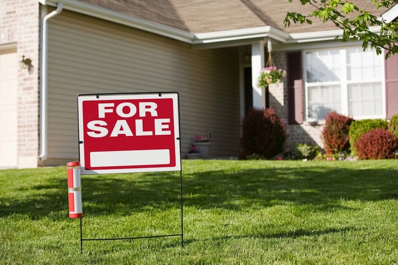
Real-world proof is everywhere in real estate, where sign color is a science. See the best colors for real estate yard signs for a category that lives or dies on roadside legibility.
Distance and Visibility: High Contrast Colors
The pairings that read from far away are consistent across decades of signage: black on yellow, black on white, white on blue, white on red, and yellow on black. Each puts a dark value against a light one, which is the contrast the eye resolves fastest. Black on yellow in particular is the classic high-visibility combination, which is why it shows up on warnings and roadside advertising alike.
Avoid low-contrast traps: red on green, blue on black, and any two colors of similar brightness blur together at distance, especially in bright sun or low light. If you are unsure, convert your palette to grayscale; if the text still stands out clearly, the contrast is strong enough. This matters most on large-format pieces like aluminum signs and coroplast signs meant to be seen from the road.
Size and font weight amplify contrast. Pair a high-contrast palette with bold, heavy lettering and generous spacing, and the message carries much farther. Our guide on how to make yard signs covers layout that works with color to maximize the read.
Consistency in Color: Building Trust and Recognition
Readable is step one; recognizable is step two. When every sign, flyer, and storefront uses the same colors, people begin to identify your brand before they even read the words. That consistency turns individual signs into a cumulative presence, so a customer who saw your sign across town recognizes your booth at an event instantly.
The trick is to reconcile brand colors with contrast rules. If your brand color is light, use it as the background with dark text; if it is dark, flip it. Reserve a single bright accent for the one element you most want noticed, a phone number, an arrow, a price. To keep printed color true to your brand across pieces, see matching Pantone to CMYK and the story behind standardized color in the history of Pantone.
Apply the same palette across every format, from property signs to banners, and you compound recognition over time. Browse the full range in signs and banners or rigid signs.
How to Choose the Right Colors for Your Sign
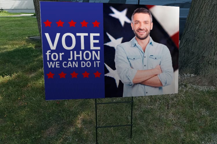
Start from where the sign will live. A roadside sign seen from a fast-moving car needs the strongest possible contrast and the fewest colors, while an indoor sign read up close can carry a slightly richer palette. Match the pairing to the viewing distance and the light the sign will sit in, since sun, shade, and dusk all change how colors read.
Then pick a hierarchy. Choose one background, one text color that maximizes contrast against it, and at most one accent for the single most important element. Resist adding more; every extra color slows the read. For signage that uses standoffs or mounting hardware, plan color and layout around the fixtures per our guide on how standoff signage works.
Finally, proof at distance. Print or preview the sign, step back, and check that the message reads from where your audience will actually see it. Use the specs and pricing panel below to build your sign, and pull design ideas from this look at high-visibility real estate signs.
What Advertising Signs Cost and How They Are Priced
Sign price scales with size, material, quantity, and finish. A small yard sign on coroplast costs far less than a large aluminum panel, and adding double-sided printing or premium finishes raises the number. Quantity works the other way: ordering a set of signs lowers the unit price, which matters for campaigns and multi-location rollouts.
You set each option in the configurator and the total updates live as you adjust size, material, and quantity, so you can compare a yard sign against a rigid aluminum sign before committing. Color choice does not change price, so you are free to pick the most readable palette without a cost penalty.
Use the live specs and pricing panel below to build your sign and watch the number move. When you order, your artwork runs through a free file check so the printed colors and layout match your design.
Wally makes the sign read from the road
Contrast first, palette tight, brand consistent
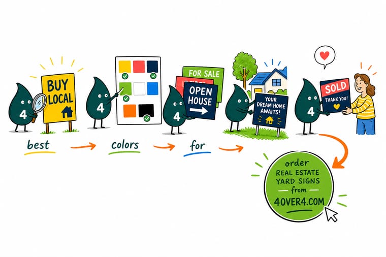
Wally does not pick colors he likes, he picks the pair that fights hardest: a dark value on a light ground or the reverse, so the message reads at a glance. He keeps it to two or three colors, saves one bright accent for the thing that matters, and stays consistent across every sign. Then 4OVER4 prints it so the colors carry.
Order yard signs →Quick reference
High-visibility color pairings at a glance
The pairings that read from a distance, and where each shines. Pick the one your brand allows with the strongest contrast.
Ranked by how fast the eye pulls the letters off the background: black on yellow first, then black on white, yellow on black, then white on blue. The swatch in each row shows the pairing at working weight so you can judge the contrast instead of picturing it, and the low contrast row is left in the table on purpose as the one to keep out of the artwork.
| Rank | Color pairing | Visibility | Why it matters |
|---|---|---|---|
| 1 | AaBlack text on yellow | Highest | The classic high-visibility combination; grabs attention fast, day or night. |
| 2 | AaBlack text on white | Very high | Clean and universally legible; a safe default for dense information. |
| 3 | AaWhite text on blue | Very high | Strong contrast with a trustworthy, professional feel for brands. |
| 4 | AaWhite text on red | High | Reads as urgent, which suits sales and call-to-action signs. |
| 5 | AaYellow text on black | High | Bold and modern; reverses the classic pair for a premium look. |
| Avoid | AaLow-contrast pairs to avoid | Poor | Red on green, blue on black, or similar-brightness colors blur at distance. |
Letter height
How far each letter height still reads
Contrast decides whether the message stays sharp, letter height decides whether it reaches the reader at all. The working rule of thumb is about 10 feet of readable distance for every inch of capital letter height, and a driver at 30 mph covers about 44 feet every second, so the third column is the time your sign is actually in view.
| Letter height | Readable distance | Time in view at 30 mph | Where it fits |
|---|---|---|---|
| 1 in | 10 ft | about 0.2 seconds | Counter cards and window notices read standing still |
| 2 in | 20 ft | about 0.5 seconds | Door signs, table tents, anything read on foot |
| 3 in | 30 ft | about 0.7 seconds | Body copy on a yard sign read from the sidewalk |
| 4 in | 40 ft | about 0.9 seconds | The headline on a yard sign planted at the curb |
| 6 in | 60 ft | about 1.4 seconds | Open house and directional signs on a slow street |
| 8 in | 80 ft | about 1.8 seconds | Parking lot entrances and storefront banners |
| 12 in | 120 ft | about 2.7 seconds | Roadside signs where traffic never slows down |
Read the two tables together. A 4 in headline in black on yellow is legible at the curb and stays legible when the light drops; the same headline in two colors of similar brightness goes soft well before 40 ft, which is the whole reason the ranking above starts where it starts.
Step by step
Pick sign colors that read far away in 6 steps
- Start from the viewing distance Roadside signs need maximum contrast and few colors; close-up signs can carry a little more.
- Pick a high-contrast pair Choose a dark-on-light or light-on-dark pairing so text and background pull apart hard.
- Limit to two or three colors Keep the palette tight so nothing competes with the message.
- Reserve one accent Use a single bright color for the one element you most want noticed.
- Reconcile with your brand Set the brand color as background or text, whichever keeps contrast strongest.
- Proof at distance Preview the sign, step back, and confirm it reads from where your audience will see it.
Infographic
The most readable sign color pairings
Four pairings that stay legible from far away, shown the way a sign actually appears. Contrast is what carries the message.
Not sure a palette has enough contrast? Convert it to grayscale. If the text still stands out clearly in black and white, it will read on the sign.
Specs and pricing
Yard sign specs and live pricing
Once your colors are set, size, material and quantity are what is left. Real estate yard signs print on 4mm White Coroplast in 4 business days.

| Quantity | Price Per Unit | Total |
|---|---|---|
| 1 | $29.89 | $29.89 |
Order it
Print signs people can read from the road

Explore more
Where to go next
By the numbers
Sign stocks that hold high contrast color
Common Questions
Common questions about sign colors
The short answers people want before they send artwork: which pairing wins, how many colors to use, and how big the letters have to be for the distance you are printing for. Every answer below is also marked up as FAQ data, so the ranked pairing answer and the letter height numbers can be pulled straight into search results.
What is the most visible color combination for a sign?
Black on yellow. The saturated yellow throws back the most light and solid black sits on it at the widest value gap, so the message holds in bright sun, at dusk, and from the far end of a parking lot. Ranked behind it: black on white, which reads almost as cleanly and looks more corporate; yellow on black, which owns the read at night and under headlights; and white on blue, the calmest of the four and the easiest to keep on brand. White on red comes next, strong for urgency but harder to hold over long lines of text. Whichever you pick, keep the sign to two or three colors, one background, one text color chosen for maximum contrast, and at most one bright accent for the phone number or the arrow.
How big do the letters need to be for people to read the sign?
Work from about 10 feet of readable distance for every inch of capital letter height: 3 in letters read at roughly 30 ft, 4 in at roughly 40 ft, 6 in at roughly 60 ft, 12 in at roughly 120 ft. Then judge the time in view rather than the distance, because a driver at 30 mph covers about 44 feet a second, so 60 ft of legibility is only about 1.4 seconds of reading and buys you a headline of a few words, not a paragraph. Size the top line for the distance you actually need, drop the second line one step smaller, and let the high-contrast pairing carry the rest.
What are the best colors for advertising signs?
The best colors are high-contrast pairings that separate text from background sharply: black on yellow, black on white, white on blue, and white on red all read clearly from a distance. Black on yellow is the classic high-visibility combination and grabs attention fastest, which is why it appears on warnings and roadside advertising. The exact best choice depends on your brand and where the sign will sit, but the rule is constant: pick the pair with the strongest contrast your brand allows.
Why does contrast matter more than color choice?
Because a sign is usually read quickly and from far away, often by someone moving, and the eye resolves the difference between light and dark values faster than it processes a particular hue. Two colors of similar brightness blur together at distance no matter how nice they look up close, while a dark value against a light one stays crisp. That is why choosing for contrast, rather than for a favorite color, is what actually makes a sign legible.
How many colors should a sign use?
Keep it to two or three. One background, one text color chosen for maximum contrast against it, and at most one bright accent for the single most important element, such as a phone number or an arrow. Adding more colors makes elements compete for attention and slows the read, which defeats the purpose of a sign meant to be understood at a glance. A tight palette reads faster and looks more professional.
Is black on yellow really the most visible?
It is one of the most visible combinations, which is why it is used for hazard and warning signage worldwide. The pure, saturated yellow background reflects a lot of light and the solid black text sits against it with very high contrast, so the message stays readable in bright sun, at dusk, and from a distance. For advertising, it is an excellent choice when your priority is being noticed, though white on blue or white on red also perform strongly with a different brand feel.
How do I use my brand colors and still stay readable?
Reconcile brand and contrast by assigning roles: if your brand color is light, make it the background with dark text; if it is dark, flip it and use light text. Reserve a single bright brand accent for the one element you most want people to notice. This keeps the sign on-brand while preserving the strong light-versus-dark contrast that makes it legible, so you build recognition without sacrificing readability. Using the same palette across every sign compounds that recognition over time.
Does color choice affect the price of a sign?
No. Sign price scales with size, material, quantity, and finish, not with the colors you print, so you are free to choose the most readable palette without any cost penalty. Full-color printing is standard, which means a high-contrast two-color design and a richer image cost the same to produce. That leaves you to optimize purely for legibility and brand, then control cost through size, material, and how many signs you order.
Get Started
Order property signs, printed in 4 business days
Print high-contrast advertising signs at 4OVER4.COM on the size and material your campaign needs. Take the highest ranked pairing your brand allows, size the headline for the distance you need, then adjust every option and watch your price update live.
Legal Disclaimer
Gold Standard guarantees apply to all standard orders placed through 4over4.com. Price match requires verifiable proof of a competitor's published price for an equivalent product with matching specifications and turnaround time. Satisfaction guarantee covers manufacturing defects and print quality issues. Contact support with order number and documentation. On-time delivery rate based on tracked orders 1999 to 2026. Individual results may vary based on shipping carrier performance.
