
How to Write a Logo Design Brief


Sofia is our design and templates voice, built from the knowledge of our production team, with over 20 years in printing.
A logo design brief is a short document that tells a designer who you are, where the mark will live, and what done looks like. Write it well and the first concepts land close, the revisions shrink, and your logo is ready to print the day it is approved. Name the first printed piece in the brief too, usually a 2 x 3.5 inch business card, and the stock and finish the mark has to survive, from 16pt silk laminated to a 32pt embossed card or a die-cut shape.
To write a logo design brief, answer six things in one to two pages: your business, your audience, your brand personality, the logo style you want, three to five references with the reason each works, and your deliverables, including a vector master and print-ready CMYK files. Lead with your business rather than your taste, be honest about budget and deadline, and you will get the right logo in fewer rounds.
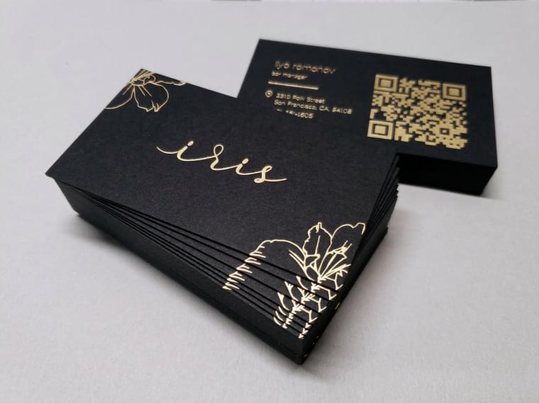
Quick tips
Quick tips for a brief that gets the right logo
Keep your logo design brief to one or two pages and lead with your business, not your favorite color. Say who you sell to, name the style you want, and hand over three references with the reason each one works. Be honest about budget and deadline, and always ask for a vector master plus print-ready CMYK files. A tight brief earns fewer revision rounds and a mark that drops straight onto your 4OVER4.COM business cards.
What a logo design brief actually is

A logo design brief is the short document you hand a designer before any sketching begins. It is not the logo, and it is not a contract. It is the map: a page or two that explains who you are, who you are trying to reach, where the mark will live, and what a finished job looks like to you. Get it right and a designer can move straight to good ideas instead of fishing for direction.
The difference between "make me a logo" and a real brief is the difference between a stranger guessing your taste and a professional building to a target. Most disappointing logos are not a skill problem. They are a briefing problem. The designer built exactly what was asked for, and what was asked for was vague. Before you write a word, it helps to know the shape of the finished journey, which our full guide on how to design a logo and the six key principles of logo design both lay out in detail.
A good brief answers six things: your business, your audience, your personality, your style, your references, and your deliverables. The rest of this page walks through each one, and ends with a fillable template you can copy straight into an email.
Why a written brief saves you rounds, money, and headaches
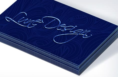
Revisions are where logo budgets balloon. Every round of "not quite, can we try again" costs time on both sides, and when the direction was never written down, those rounds multiply. A brief of nine short parts, from a one sentence summary of the business to the files you need back, front-loads the thinking so the first concepts land close, and the back-and-forth becomes fine-tuning rather than starting over.
There is a second payoff that only shows up later. When you brief three designers with the same document, their quotes and concepts become comparable, because they are all answering the same questions. Without a shared brief you are comparing apples to guesswork. If you want a sense of where those quotes tend to land, our breakdown of how much a logo costs maps the range from free tools to five-figure identity work.
A brief also protects the version of you that has to sign off. Approval is easier when the reasons are already on paper. You are not reacting to a shape you either like or do not, you are checking whether the shape does the job you defined. And if you would rather test directions yourself first, the 4OVER4.COM online designer lets you rough out a mark in the browser before you ever hire anyone.
Start with your business, not your favorite color
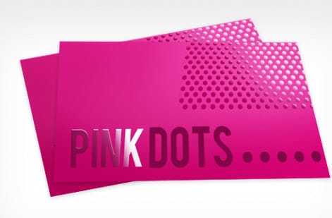
The most common briefing mistake is opening with taste. "I like blue and I want it to look modern" tells a designer almost nothing, because modern means ten different things and blue is a decision that should come last. Start instead with the facts only you know.
- What you do in one honest sentence, the way you would explain it to a neighbor rather than an investor.
- Who you sell to, described as real people. A wedding photographer briefing to brides speaks a different visual language than one shooting corporate events.
- Where the logo will live, from a business card to a storefront to an app icon. A mark that has to shrink to a favicon needs different bones than one that only ever prints large.
- Who your competitors are and, more usefully, what you want to look nothing like. Contrast is a gift to a designer.
This is the same groundwork that underpins a whole identity, which is why it is worth reading alongside our practical take on what branding really means for a small business. Once the context is clear, everything downstream, from your cards to your business stationery set, pulls in the same direction.
Pin down your brand personality
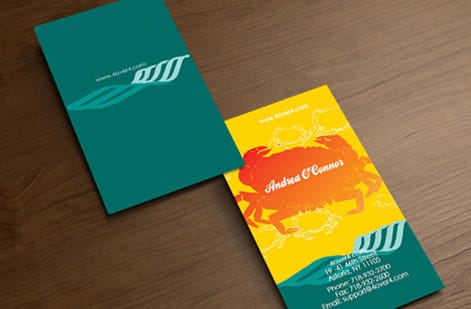
Personality is the part designers wish more clients wrote down, because it turns a vague "make it nice" into a direction they can draw toward. The fastest way to capture it is to place your brand on a few simple spectrums. Do not sit in the middle of every one. The middle is where forgettable logos come from.
Add three or four adjectives that describe how the brand should feel, and pin down what those words mean to you, since one person's "bold" is another's "loud." A line like "confident but warm, closer to a neighborhood bakery than a bank" gives a designer more to work with than a page of vague praise. If a minimal, quiet direction appeals to you, our guide on building a minimal brand identity shows how far restraint can carry a mark, and the wider strong brand identity guide ties personality to everything else you print.
Name the logo style you actually want
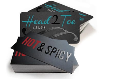
Designers group logos into a handful of families, and naming the one you lean toward gives your feedback a target. You do not have to commit forever, but a starting family narrows an infinite field to a workable one. These are the five you will hear most. Whichever family you lean toward, ask for it to hold up on a 2 x 3.5 inch business card, the first place most new marks print.
A wordmark sets your full name in a distinctive typeface, which suits brands with a memorable word. A lettermark shrinks that to initials, handy when the full name is long. A pictorial mark is a recognizable symbol, powerful once people know you but slower to build from scratch. A combination mark pairs a symbol with the name, the most flexible choice for a young business. An emblem locks text inside a badge, which reads as heritage and craft. Whichever family you name, the logo design best practices guide covers the craft rules that keep any of them sharp at small sizes.
Gather references the smart way
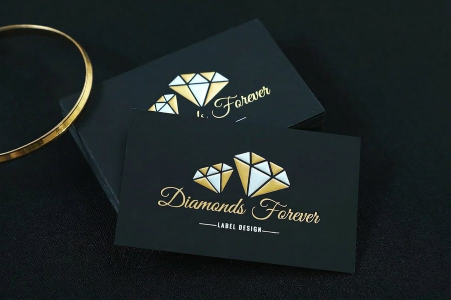
References are the single highest-value thing in a brief, and also the easiest to get wrong. The goal is not to find a logo you want copied. It is to show a designer the qualities you respond to so they can build something original that shares the same DNA.
Collect three to five examples, and next to each one write a single sentence on why it works for you. "I like this because the symbol still reads at thumbnail size" is useful. "I like this" is not. Mix in a couple of anti-references too, marks you actively dislike, because knowing what to avoid saves a whole round of revisions. Pull ideas from the wider world, not just your competitors, so you do not end up looking like the pack.
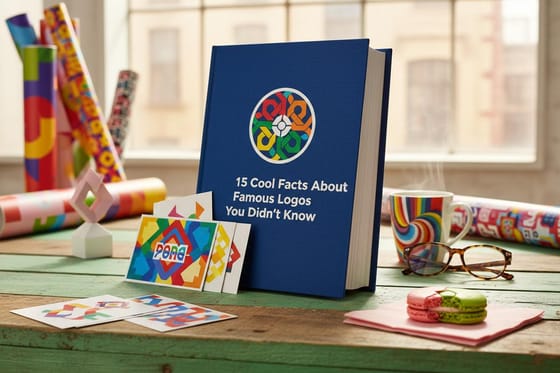
For raw material, browse real printed work in the 4OVER4.COM business card design showcase, skim the ready-made layouts in our design templates, and if you enjoy the lore, the 15 facts about logos piece is a fun way to sharpen your eye before you brief anyone.
The dos and don’ts of a brief that works
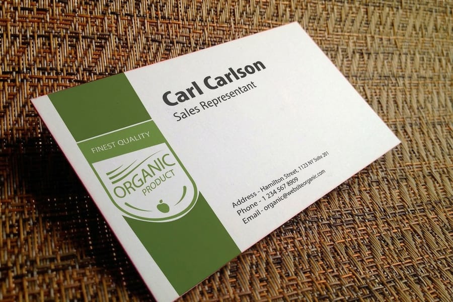
A brief can be too thin or too bossy, and both cause problems. These are the habits that separate a brief a designer thanks you for from one that ties their hands.
Do keep it to one or two pages, decide the things only you can decide, and describe feelings and functions rather than dictating shapes. Do state where the logo has to work, name your deliverables, and give a real deadline.
Do not design the logo in the brief. "A blue owl holding a pencil" is an instruction, not a direction, and it robs the designer of the very thinking you are paying for. Do not hide your budget, pack it with a dozen adjectives that cancel each other out, or leave out the practical constraints and then act surprised when the mark does not fit on a card. When you do reach the print stage, the prep matters, which is exactly what our guide on preparing a business card logo for printing is built to cover.
Be honest about timeline, budget, and deliverables
Money and dates are the parts people leave out to seem flexible, and leaving them out helps nobody. A designer needs your real budget to know whether to propose a quick wordmark or a full identity system, and a real deadline to plan the rounds. Vague on both is how projects drift.
Deliverables are the quiet make-or-break of a brief. Spell out exactly what you need handed over, because "the logo" is not a file, it is a set of them:
- A vector master in AI, EPS, or SVG, so the mark scales from a stamp to a storefront without blurring.
- Raster exports as high-resolution PNGs for screens and social profiles.
- A single-color version for one-ink jobs, embossing, and situations where full color is not an option.
- Print-ready CMYK artwork so the file drops straight onto physical products with no conversion surprises.
Name those in the brief and you avoid the classic trap of loving a logo you cannot actually use. For the money side, our how much a logo costs guide sets fair expectations, and any lingering questions are worth checking against our printing FAQs.
Make your brief print-ready from day one
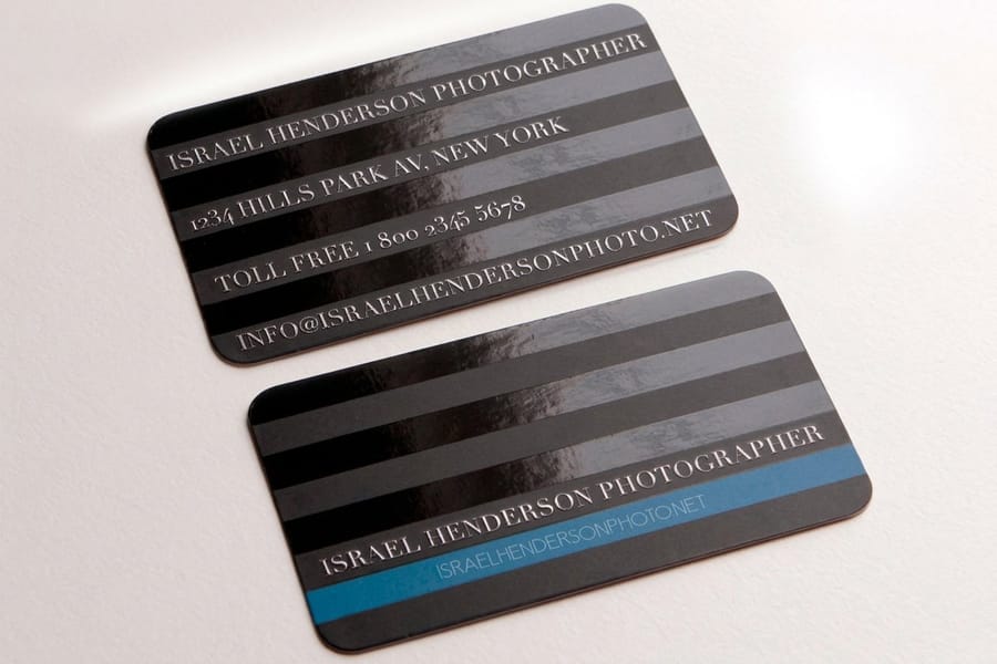
One detail most briefs miss is print. Thin lines and pale colors that pass on a screen can fail in ink, and the first real test of your new mark is almost always a business card, where fine lines, tiny type, and low-contrast color choices either hold up or fall apart at 3.5 by 2 inches.
So write the print reality into the brief. Ask for CMYK-safe colors rather than screen-only neon, a version that reads in a single ink, and enough clear space around the mark that it never crowds an edge. Ask, too, for the logo to be tested small, because a symbol that only works on a homepage banner is a symbol that has not finished the job. This is the same discipline that carries a mark across a whole set, from cards to business card printing to a matched custom stationery set and the fine points in our letterhead design tips. For the color line of the brief, our guide on cmyk label design for small business owners lists the logo color pairings that hold up in print.
A fillable logo design brief template you can copy
The fillable brief below pastes into an email or a document and fills in field by field. Answer each line in a sentence or two and you will have covered everything a designer needs, without writing an essay.
- Business summary: what you do, in one plain sentence.
- Audience: who buys from you, described as real people.
- Personality: three or four adjectives, each with a quick note on what it means to you.
- Style leaning: wordmark, lettermark, pictorial, combination, or emblem, and why.
- References: three to five examples, each with one line on what you like, plus a couple of anti-references.
- Where it lives: every place the mark must work, from favicon to storefront.
- Colors and avoid-list: any brand colors already in play, and shades to steer clear of.
- Deliverables: vector master, PNGs, single-color version, print-ready CMYK.
- Budget and deadline: your real numbers on both.
Prefer to copy rather than retype? Select the block below and paste it into an email, a Google Doc, or a Word file, then answer after each colon. It is the same nine fields in plain text, with the two lines people forget most, the avoid-list and who signs off, spelled out.
LOGO DESIGN BRIEF
Business name:
What we do, in one sentence:
Who buys from us:
Brand personality, three or four adjectives with a note on each:
Style leaning, wordmark / lettermark / pictorial / combination / emblem, and why:
References we like, three to five, one line each on what works:
Anti-references, and what puts us off:
Where the logo has to work, favicon to storefront:
Brand colors already in play:
Colors to avoid:
Deliverables, vector master / PNGs / single-color version / print-ready CMYK:
Budget:
Deadline:
Who approves the final mark:
Fill those nine lines and you are ahead of most people who commission a logo. If you would rather start from ready-made building blocks, our free design templates and the wider design templates library give you layouts to adapt, and the online designer lets you see your mark on a real card in minutes.
Example logo design brief, filled in
The same brief with every field answered, for a sample business we invented called Northline Coffee Roasters: two shops, small-batch roasting, beans sold by monthly subscription. It is not a real customer, it is a model of how much detail earns you the right logo in one or two rounds instead of five.
- Business summary: We roast single-origin coffee in small batches and sell it over the counter in two shops and by monthly subscription.
- Audience: Regulars who come in before work and know a washed coffee from a natural one, plus office managers who order beans for the break room and want the bag to look presentable on a shelf.
- Personality: Warm, meaning friendly counter staff and not a laboratory. Precise, because we print the roast date on every bag. Local, since the shops are named after the streets they sit on. Unfussy, so no crests and no coats of arms.
- Style leaning: Combination mark, a simple symbol next to the name. The symbol has to stand alone on a bag seal and an app avatar, while the full name carries the window and the van.
- References: The hardware store sign on our block, where every letter is cut from one weight of type. A flour bag whose symbol still reads at thumbnail size. A bike shop known by a shape alone. What they share: one idea each, no gradients. Anti-references: a cup with steam curls, and words wrapped in a rope circle.
- Where it lives: favicon, app avatar, business cards, bag seals, cup sleeves, window vinyl, the van door, and an embroidered apron patch.
- Colors and avoid-list: Already in play, a deep green on the current bags and a warm off-white. Avoid brown, because every roaster on the street is brown, and avoid neon.
- Deliverables: vector master as AI or EPS plus SVG, PNGs with transparent backgrounds for web and retina, a single-color version that survives a one-color stamp and an embroidery run, and print-ready CMYK art for the card printer.
- Budget and deadline: We give a real range instead of asking for a quote on nothing, and we tie the deadline to the new shop opening, with card and bag art approved early enough that printing and shipping still fit before the doors open. The figure is left out of this published example because your number is yours, but never leave it out of your own brief.
Read it back and notice what is missing: adjectives with nothing behind them, and colors picked because they look current. Every line either tells the designer what to draw or tells them where the mark has to survive. Print is where a mark either holds together or falls apart, so test what comes back on the thing customers actually hold: see how a logo design on business cards reads at card size, compare stocks and finishes in the business card styles and finishes gallery, and print a first set on custom business cards as soon as the vector files land.
Wally explains the brief
Brief the designer, not yourself
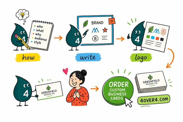
Wally thinks of a logo design brief like ordering print: the clearer the instructions, the closer the first proof lands. Tell the designer who you are, where the mark has to work, and which files you need, and you skip the endless what-about-this rounds. Then bring the finished logo home and let it earn its keep on a stack of custom business cards from 4OVER4.
Order business cards →%22%2F%3E%3Ccircle%20cx%3D%2241%22%20cy%3D%2249%22%20r%3D%2226%22%20fill%3D%22%2314b8a6%22%20opacity%3D%220.15%22%2F%3E%3Ccircle%20cx%3D%2278%22%20cy%3D%2258%22%20r%3D%2214%22%20fill%3D%22%2314b8a6%22%20opacity%3D%220.1%22%2F%3E%3Crect%20x%3D%2271%22%20y%3D%2228%22%20width%3D%2226%22%20height%3D%2234%22%20rx%3D%224%22%20fill%3D%22%2314b8a6%22%20opacity%3D%220.08%22%20transform%3D%22rotate(36%2080%2030)%22%2F%3E%3C%2Fsvg%3E)
Specs and pricing
Where your logo lands first: business card specs and pricing
Once your brief is written and the mark is approved, here is what a set of custom business cards gives you at 4OVER4.COM, with live specs and price-per-unit pulled straight from the configurator.

| Quantity | Price Per Unit | Total |
|---|---|---|
| 100 | 17.6¢ | $17.57 |
| 200 | 11.5¢ | $23.07 |
| 300 | 9.15¢ | $27.46 |
| 400 | 7.96¢ | $31.86 |
| 500 | 7.25¢ | $36.26 |
| 600 | 6.77¢ | $40.64 |
| 700 | 6.43¢ | $45.04 |
| 800 | 6.18¢ | $49.43 |
Print it
Put your finished logo to work
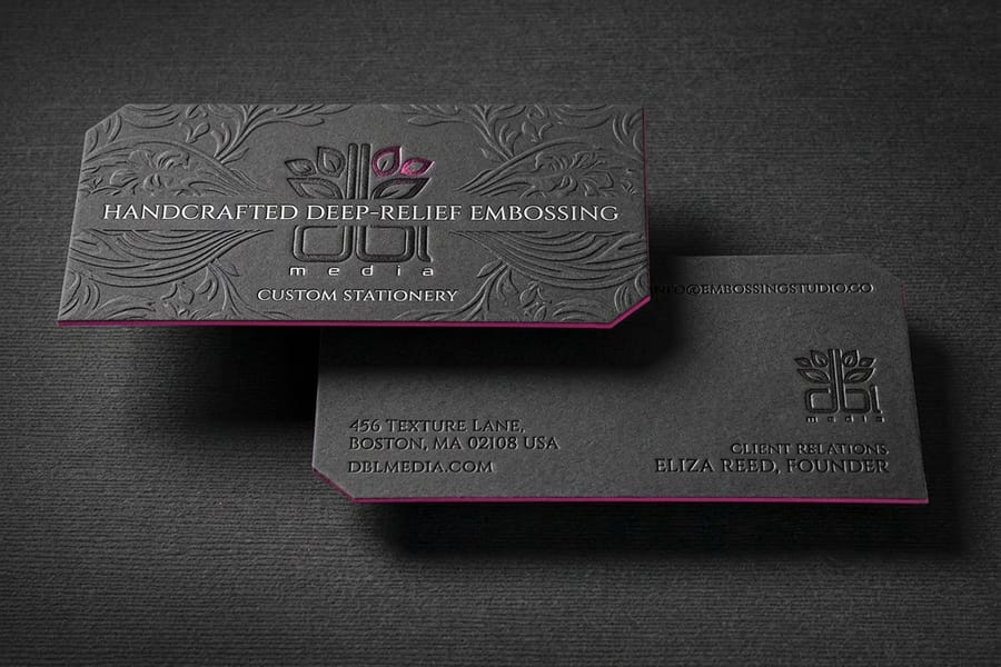
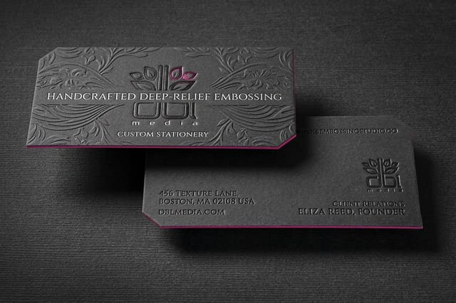
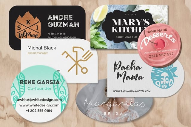
Test the new mark on silk laminated business cards on 16pt stock from 250, raise it on embossed business cards in 32pt or 48pt silk or velvet from 250, or cut the card to a shape with die-cut business cards from 100.
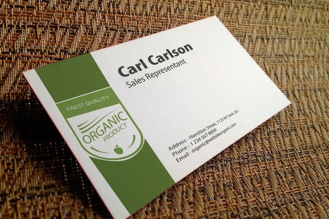
See it in use
Finished marks we printed at card size









Explore more
Where to go next



By the numbers
The print partner your new logo deserves
Common Questions
Common questions about logo design briefs
What is a logo design brief?
A logo design brief is a short written document, usually one to two pages, that tells a designer everything they need to create the right logo. It covers your business, your audience, the personality you want the mark to carry, the style you have in mind, and the practical details like budget, deadline, and the file formats you will need. Think of it less as a contract and more as a clear handshake before the work starts.
What should a logo design brief include?
Nine things, in this order: a one sentence summary of what your business does, a description of the people who buy from you, three or four personality adjectives with a note on what each one means to you, the style you lean toward (wordmark, lettermark, pictorial, combination, or emblem), three to five references plus a couple of anti-references, every place the mark has to work from favicon to storefront, the brand colors already in play and the shades to avoid, the deliverables (a vector master, PNGs, a single-color version, and print-ready CMYK art), and your real budget and deadline. Add one line most people forget: who approves the final mark, so sign-off does not stall in a group chat. The filled-in example brief further up this page shows all nine answered for a sample business.
How do you write the perfect logo design brief?
Start with your business and your audience, not your favorite color. Add three or four adjectives that describe the brand personality, name the logo style you lean toward, and attach three references with a sentence on why each one appeals to you. Then be honest about your timeline and budget, and spell out the deliverables, including a vector master and print-ready files. A brief that answers those questions plainly beats a long one full of vague adjectives.
What is a fillable logo design brief?
A fillable logo design brief is a template with labelled blank fields you complete instead of writing a document from scratch. Each section prompts you for one piece of information, such as business summary, audience, personality words, must-have references, and required file types. It keeps you from forgetting anything and gives every designer you approach the same structured information, which makes their quotes easier to compare.
What does a designer need from me before quoting?
Match the template to the size and formality of the project. A solo founder ordering a first batch of cards needs a lighter one-page brief, while a rebrand across packaging, signage, and stationery deserves a fuller version with sections for brand values and application mockups. Pick a template that includes a deliverables section and a place for references, since those two fields prevent the most expensive misunderstandings.
How much does a logo design brief cost?
The brief itself is free because you write it. What it changes is the cost of the logo. A vague request invites guesswork and extra revision rounds, and revisions are where budgets quietly grow. A tight brief lets a designer nail the direction sooner, so a well-written brief usually lowers the total you spend rather than adding to it. See our guide on how much a logo costs for real price ranges.
How long should a logo design brief be?
One to two pages is the sweet spot. Long enough to cover your business, audience, personality, style, references, and deliverables, short enough that a designer will actually read every line. If a section runs past a paragraph you are probably describing rather than deciding. Trim it to the choices only you can make and let the designer own the craft.
What files should I ask for in the brief?
Always request a vector master in AI, EPS, or SVG format, because vectors scale to any size without blurring. Add high-resolution PNGs for screens, a single-color version for stamps and one-ink jobs, and print-ready CMYK artwork for physical products. Naming these in the brief means your finished logo drops straight onto a business card or a sign with no last-minute file conversions.
Do I still need a brief if I design the logo myself?
Yes, and it is arguably more useful. Writing a brief forces you to decide who the brand is for and what it should feel like before you open a design tool, which stops you from chasing pretty shapes that do not fit the business. Even a half-page brief you write to yourself keeps a DIY logo focused and consistent across everything you print.
Get Started
Logo approved? Put it on something you can hand out.
Drop your new mark onto custom business cards, pick your stock and finish, and we print a crisp, brand-true set that shows the work paid off.
Legal Disclaimer
Gold Standard guarantees apply to all standard orders placed through 4over4.com. Price match requires verifiable proof of a competitor's published price for an equivalent product with matching specifications and turnaround time. Satisfaction guarantee covers manufacturing defects and print quality issues. Contact support with order number and documentation.
