
How to Design a Logo Step by Step, From Concept to Print-Ready File


Emma is our prepress and print production voice, built from the knowledge of our production team, with over 20 years in printing.
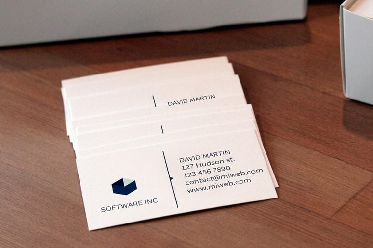
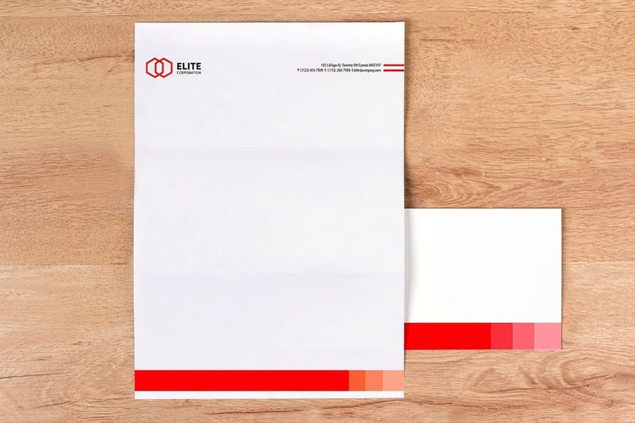
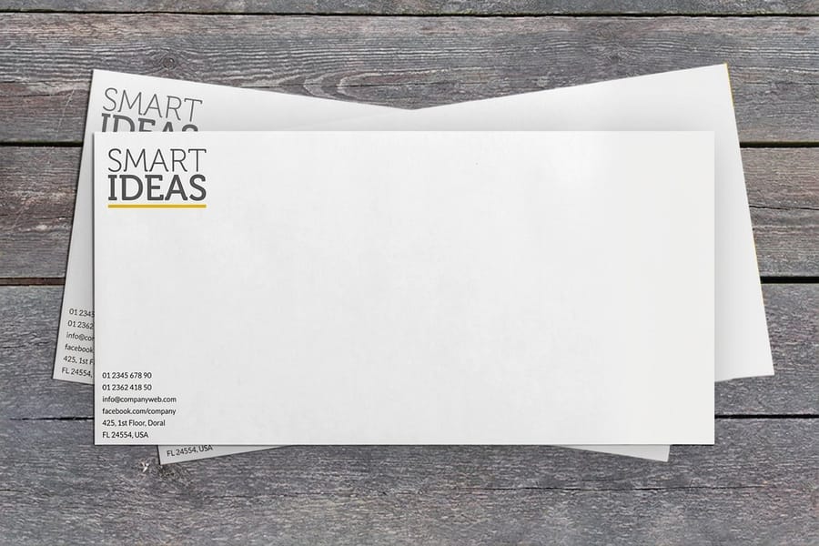
Six steps from a blank page to files a press can actually use, including the export stage most logo tutorials skip and the small proof run that tells you whether the mark works. That proof run tests the mark at the sizes it will live at: a 2 x 3.5 inch business card, an 8.5 x 11 inch letterhead, a #10 printed envelope and a die-cut sticker from 2 x 2 inches, with the stock to choose for each.
Designing a logo runs in six steps: research the business and its competitors, sketch thumbnails on paper, refine one concept by hand, rebuild it as vector paths with live type, set color and build the variation set, then export a print-ready file with outlined type in CMYK or a Pantone. The last step is the only irreversible one, so it produces a copy and the editable vector master stays in your archive. Judge the result on a printed card at about one inch wide, not on screen.
Quick answer
Paper first, vector second, CMYK last
The order matters because each step is cheaper to redo than the one after it. Rejecting an idea in pencil costs seconds. Redrawing bezier curves costs an afternoon. Discovering at the export stage that the mark relies on hairlines, or on a blue that does not exist in ink, costs a reprint. Work down the chain, keep the editable master, and let the export be the only file you ever regenerate.
Why a Logo Has to Survive Print, Not Just a Screen

A screen is forgiving. It glows, it holds any color you throw at it, and it will happily render a hairline stroke that no press can lay down. Paper is not forgiving, and paper is where most logos spend their working life.
Three things change the moment a mark goes to print. Color leaves the RGB gamut and gets rebuilt out of four inks, so the brightest blues and greens shift. Detail runs into the physical limit of ink spreading slightly into paper fiber, which closes up thin gaps. And scale becomes real: on a standard business card the mark is usually around an inch wide, while on a shipping box or a banner it is a foot or more, from the same file.
That is the whole reason the process below ends where most logo tutorials stop. A logo is finished when it exports cleanly to a press, not when it looks good on your monitor at 400 percent zoom.
Step 1: Research the Business Before You Draw Anything
Start with what the mark has to do, in writing. Who is the customer, what does the business sell, and what do the five closest competitors already look like. That last one matters most and gets skipped most: if every plumber in the county uses a blue droplet, a blue droplet makes you invisible rather than credible.
Write down the practical constraints too, because they narrow the design more than any mood board will. Will the mark be embroidered, foil stamped, or cut as a vinyl decal? Does it have to work in one color? Does it sit on a dark background anywhere? A design that must work as a single-color die-cut sticker silhouette cannot rely on a gradient or on shapes that only separate by hue.
Two hours here saves a week later. Our logo design brief guide lists the questions worth asking, and the six principles of logo design covers the standards to hold the result against once you have something to judge.
Step 2: Sketch on Paper, Because Rejecting Is the Job
Fill pages with small thumbnails, roughly the size of a postage stamp. Small forces you to draw the idea rather than the detail, and it is the honest test: if the concept does not read at thumbnail size in pencil, no amount of vector work will save it.
Work in silhouette. Pencil, no color, no type styling yet, just the shape. Try the obvious literal symbols early so you can get them out of your system, then push into the abstract, the monogram, the negative space idea, and the wordmark with one modified letter. Different types of logos suit different businesses, and sketching several types side by side tells you quickly which family fits.
The reason to stay on paper is speed of rejection. A pencil kills an idea in a second. The pen tool makes you invest twenty minutes in bezier curves before you find out the concept was mediocre, and by then you are attached to it. Draw far more than you need, then walk away and come back before you choose.
Step 3: Refine One Concept, Still by Hand
Pick the concept that kept reappearing, not the one that looks most finished. Then redraw it larger, several times, changing one thing per version: the proportion, the weight of the strokes, the angle, the amount of air inside the shape.
This is where the boring problems get solved cheaply. Is the mark balanced when you flip the page over and look at it backwards through the paper? Does the counter, the enclosed space in a letter or a shape, stay open when you thicken the stroke? Would it still read if you filled it in solid black? A shape that survives being reduced to a solid silhouette will survive foil, embroidery, and a rubber stamp.
Refine spacing here too, on paper, because you will otherwise fight it forever on screen. When the pencil version is right, you are only translating it in the next step, which is far faster than designing and drawing at the same time.
Step 4: Rebuild It in Vector and Choose the Type

Scan or photograph the sketch, drop it on a locked layer, and rebuild the shape as bezier paths. Rebuild rather than autotrace: a live trace of a pencil line gives you hundreds of anchor points and wobbly curves that show up as lumps at large sizes. Use as few anchor points as the shape allows, put them at the extremes of each curve, and keep handles horizontal or vertical wherever you can.
Then the type. Set the name in a few candidate typefaces at the real size it will print, not at 200 point. Check the license before you get attached, because many free fonts permit personal use but not trademark use, and outlining the letters later does not change what the license allows. Our guide on choosing logo fonts goes into which families hold up small.
Keep the text live at this stage. You will still be adjusting letter spacing, and outlined type cannot be edited. Two things to fix now: the optical spacing between letters, which almost never matches the default kerning, and the relationship between the mark and the wordmark, measured in the height of the type rather than in pixels so it scales predictably. Building the logo in Illustrator covers the tool-level steps in detail.
Step 5: Set Color, Then Build the Variation Set
Design the mark in black first and add color only once the shape works, otherwise color hides a weak silhouette. When you do add it, keep the palette to one or two colors plus a neutral. Every extra color is another thing to match across a website, a printed card, a vinyl sign and an embroidered shirt.
Pick colors that survive the trip to ink. Very bright RGB blues and greens have no direct CMYK equivalent, so they arrive duller and slightly shifted, and pure RGB blue is the classic offender because it prints closer to purple. If the color has to be consistent across vendors, specify a Pantone and note its CMYK build next to it. The CMYK and RGB conversion guide shows how to check before you commit, and logo color combinations covers pairings that hold up in both media.
Now build the variations, because they are part of the deliverable and not an afterthought:
- Primary lockup. Mark and wordmark in their intended arrangement, usually horizontal.
- Stacked version. For narrow spaces such as a square avatar or a stamp face.
- Mark alone. For favicons, app icons, and anywhere the name is already obvious.
- One-color version. Solid black, for foil, embossing, single-color stamps and faxable forms.
- Knockout version. White artwork, for dark backgrounds and for printing on colored stock.
The full variation set is what stops a colleague from stretching the horizontal version into a square in six months.
Step 6: Export a Print-Ready Logo File

This is the step the tutorials leave out, and it is the one that decides whether the printer can use your file. Work on a copy. Everything below is irreversible.
Convert the type to outlines so the shapes no longer depend on a font being installed. Convert the document color mode to CMYK, or assign the Pantone if the job is a spot color job, and check each swatch afterwards rather than trusting the conversion. Expand any strokes into filled shapes so a scaled logo keeps its intended line weight. Delete unused swatches, brushes and hidden layers. Then look at the artwork at final print size and confirm nothing is finer than about half a point, because thinner lines and gaps close up as ink spreads into the sheet.
| File | Color | Type | Use it for |
|---|---|---|---|
| Editable master | Original working color | Live, editable | Your archive. This one never goes out to anyone. |
| Print PDF or EPS | CMYK or Pantone | Outlined | Anything printed: cards, stationery, signage, packaging. |
| SVG | RGB | Outlined | Website, email templates, anywhere that renders vector. |
| Transparent PNG | RGB | Rasterized | Social profiles, slide decks, tools that reject vector. |
One more detail that catches people out on business cards. If the logo runs off the edge of the piece it needs bleed, meaning artwork extending an eighth of an inch past the trim, and it needs to stay an eighth of an inch clear of the trim on the inside. Bleed and trim explained covers the geometry, print resolution covers the raster side, and the blank template library gives you a correctly sized document to drop the finished mark into.
Testing the Logo on Real Printed Products
A logo passes or fails in your hand, not in a preview window. The cheapest real test is a short run of standard business cards, which start at $17.57 and put the mark at exactly the size most people will ever see it.
Look for four things on the printed card. Does the mark read from arm's length. Do the thin parts survive, or have gaps filled in. Does the color match what you expected from the CMYK build. And does the type hold together at its smallest, particularly a tagline or a web address under 7 point.
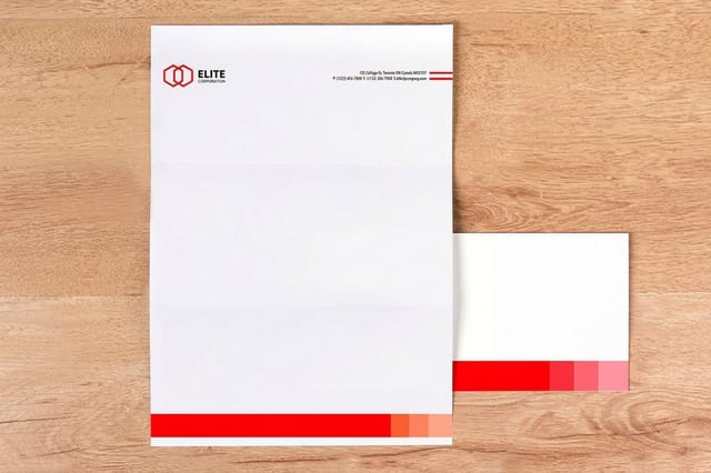
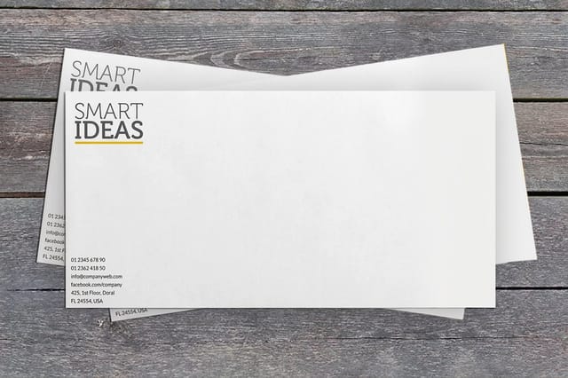
Then push it onto the pieces that stress it differently. Letterheads from $99.95 show whether the mark holds a page without a color background propping it up. Printed envelopes from $142.99 test it small, on a return address block, alongside an address. Die-cut stickers from $93.37 test the silhouette, since the cut line follows the outer shape and a mark with detached hairline elements cannot be cut as one piece. And raised foil business cards from $86.78 test the one-color version, because foil carries no gradients and no tonal shading at all.
You can drop the finished files straight into a layout in our online design templates, or set up the card yourself using the business card logo prep guide. Either way, order the small proof run before you order a thousand of anything.
Wally designs a logo
Pencil, then paths, then a file the press can hold
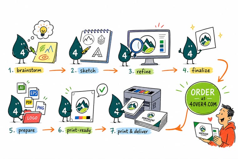
Wally fills a page with thumbnails the size of a stamp, because a pencil throws away a bad idea in a second and the pen tool takes twenty minutes to do the same job. He picks the one that keeps coming back, tightens it by hand, then rebuilds it as clean bezier paths with the type still live. Color comes last, in black first, then CMYK he has actually looked at. The export gets outlined type and a copy of the file, never the original. Then he prints a short run of cards to see whether the mark really works at an inch wide.
Print a proof run of business cards →
Specs and pricing
The products that test a finished logo
Sizes, stocks and starting prices straight from the 4OVER4.COM configurator, for the three pieces that put a new mark under the most pressure. Business cards run from 100 at 2 x 3.5 inches and smaller, letterheads from 50 at 8.5 x 11 inches on uncoated, Royal Laid or Royal Linen, and die-cut stickers from 25 in shapes cut to the mark from 2 x 2 up to 11 x 11 inches.

Print it
Put the new logo on paper
Standard business cards from 100, letterheads from 50 sheets, and #10 printed envelopes from 250 on white wove, Royal Laid or Royal Linen, printed in one or two spot colors or full color.


Explore more
Where to go next
Four guides, the card range and the FAQs: writing the logo brief, outlining type before export, the logo variations a brand needs, RGB to CMYK, business card stocks to test a mark on, and the printing FAQs.



By the numbers
Printing you can hand a new logo to
Common Questions
Your logo design questions, answered
What are the steps to design a logo?
Six. Research the business, its audience and the competing marks so you know what you are trying to be different from. Sketch thumbnails on paper until one idea keeps coming back. Refine that single concept by hand, fixing proportion and spacing. Rebuild it in vector software as bezier paths with live text. Set color, then build the variation set: full lockup, stacked, mark alone, one color, and a knockout for dark backgrounds. Finally export a print-ready file with the type outlined and the color converted to CMYK or a named Pantone. Keep the editable vector master untouched; the export is a copy.
Should I design a logo in Illustrator, Photoshop or Canva?
Illustrator or any vector editor, including Affinity Designer or Inkscape. Photoshop builds pixels, so a logo made there has a fixed resolution: it will look fine on a business card and fall apart on a banner. Canva is fine for laying out a flyer and poor for building a logo, because you cannot export true vector artwork from most of its logo output and you inherit template shapes other businesses are also using. If a logo already exists only as a PNG, it has to be redrawn as vector before it can be printed at size. Our guide on how to create a logo in Illustrator step by step covers the build itself.
What logo files should I have when the design is finished?
Four kinds. The editable vector master with live text, which never leaves your archive. A print vector, meaning a PDF or EPS with the type outlined and color set in CMYK or Pantone. An SVG for the website, because it stays sharp on any screen and stays small. And transparent PNGs at a few sizes for anything that will not take vector, such as a social profile or an email signature. Skip JPEG entirely for a logo: it has no transparency and it leaves compression noise around hard edges.
How big should a logo be for print?
Size is the wrong question for a vector logo, because it has no fixed size. What matters is the smallest size it has to work at. Set the artwork to the real print size, usually somewhere near one inch wide on a business card, and check that no stroke is under about half a point and no gap between shapes is thinner than that either. Anything finer closes up or drops out on press. If you only have a raster version, then size matters and you need 300 DPI at the final printed dimensions.
Can I use a downloaded font as my logo?
Only if its license permits commercial use, and outlining the type does not change that. Converting text to shapes removes the need to send the font file to the printer, but the license still governs whether you may use that typeface as a trademark. Many free fonts allow personal use only, and some allow commercial use but not logo or trademark use. Read the license before the mark is on a thousand cards, and keep a copy of it with the artwork.
Why does my logo look different once it is printed?
Almost always color mode. Screens mix light and print mixes ink, so the brightest RGB values have no ink equivalent. Pure RGB blue prints closer to a dull purple, and vivid greens and oranges lose the glow. Convert to CMYK yourself and look at the result rather than letting the conversion happen silently at the printer. If a brand color has to match across different products and different vendors, specify a Pantone and accept its CMYK equivalent as the process-print version. Our CMYK and RGB conversion guide walks through the safe way to do it.
How long should the whole process take?
The sketching is quick and the deciding is not. A single afternoon produces plenty of thumbnails; getting from a dozen promising thumbnails to one concept everybody agrees on is where the weeks go. Build in a pause between refining and going digital, because an idea that still looks good after a night away is usually the right one, and rebuilding vector artwork you have already abandoned is the expensive mistake.
Get Started
See the logo on 100 raised foil cards from $86.78
Upload the print-ready file, pick a stock, and order a short run of cards. An inch wide in your hand tells you more than any mockup.
Legal Disclaimer
Gold Standard guarantees apply to all standard orders placed through 4over4.com. Price match requires verifiable proof of a competitor's published price for an equivalent product with matching specifications and turnaround time. Satisfaction guarantee covers manufacturing defects and print quality issues. Contact support with order number and documentation.
