
10 Logo Color Combinations That Work for Small Businesses


Emma is our prepress and print production voice, built from the knowledge of our production team, with over 20 years in printing.
Ten logo color combinations for small businesses, with their approximate CMYK builds, what each one signals, and the checks that tell you whether a color will survive the trip from your screen to a printed sheet.
The logo color combinations that work for a small business are two colors plus a neutral, with a wide gap between light and dark, and both colors chosen as CMYK builds so ink can actually reach them. Navy with warm gold, deep teal with sand, charcoal with a signal red and forest green with cream are the most forgiving. The pairings that fail are the ones picked from a bright screen in RGB, or the ones where both colors sit at the same darkness and collapse into one gray when printed in black and white. The same rule holds for a CMYK label design: set both colors as CMYK builds such as C100 M72 Y0 K38 and check them on the label stock you order, since standard labels print full color on uncoated, semi-gloss, hi-gloss, white vinyl or clear stock, from 25 for $23.88.
Quick answer
Two colors, one neutral, and a build the press can hit
A logo palette is a contrast decision before it is a color decision. Pick one dark color and one light one so the mark still reads when it is reduced to grayscale, add a neutral for everything else, and choose both colors as CMYK builds rather than picking a hex code and converting afterwards. The wheel below shows the three relationships worth knowing, and what each one does once it is printed rather than displayed.
What Logo Color Actually Does for a Small Business
Color is the part of a logo people recall when they cannot recall the logo. Ask someone to describe a brand they saw once and you get a color and a rough shape, in that order, and almost never the typeface. For a small business that color has to repeat on a 2 x 3.5 inch business card, an 8.5 x 11 inch letterhead and a vinyl banner of 2 x 4 feet or larger.
For a small business that has a practical consequence. You are not competing on recognition budget, so the color has to do the identifying work across a handful of surfaces: a card, a sign, a van, an invoice. If your two colors are consistent on all four, you look bigger than you are. If the card is a rich navy and the banner came back a purplish blue because a different supplier converted the file, the effect goes the other way and customers cannot say why.
The second thing color does is sort you into a category before anyone reads a word. Deep green and cream reads as considered and slightly expensive. Bright red and white reads as fast and cheap, which is exactly right for a takeaway and exactly wrong for an accountant. That is not a rule to obey, it is a default to decide about on purpose.
The rest of this page is about making a choice that survives the trip from your screen to a printed sheet, because that is where most small-business palettes quietly fall apart. If you want the design fundamentals underneath the color, the six key principles of logo design cover the shape side of the same problem.
Color Psychology Without the Astrology
Color associations are real, but they are cultural conventions rather than laws, and they are much weaker than the industry likes to claim. Treat them as a starting shortlist, then test it on a run of 100 business cards at $17.57 before you commit.
The conventions that hold up across most of the market are simple. Blue reads as stable and safe, which is why it saturates finance, insurance, and anything medical, and which is also why a blue logo in those categories disappears into the crowd. Green splits two ways, either money or growing things, and the shade decides which. Red raises urgency and appetite. Black and off-white read as premium mostly because they suggest restraint. Yellow and orange read as friendly and cheap at the same time, and the two are hard to separate.
One half of that idea is far more useful than the other. In a crowded category, the association you want is often the one nobody in that category is using. If every competitor within twenty miles is navy blue, the strongest move available to a small business is warm terracotta, because being the only one people can describe beats being the correct color. Go look at the ten businesses you actually compete with, write down their colors, and then decide whether you want to belong or break the pattern.
One caution on saturation. Very bright, fully saturated hues signal budget rather than value in most categories, and they are also the hardest colors to reproduce consistently in ink. Pulling a color slightly darker and slightly less saturated usually makes it both more credible and more printable in one move.
10 Logo Color Combinations That Work and Print Cleanly

Each of these is two colors plus an implied neutral, and each one was picked because it converts to CMYK without a fight. The builds below are practical starting points, not sacred numbers. Ask for a printed proof before you lock them into a brand guide.
| Combination | Approximate CMYK build | Why the pair works | Print note |
|---|---|---|---|
| Navy and warm gold | C100 M72 Y0 K38 with C0 M25 Y95 K5 | A dark cool anchor against a warm light accent gives strong value contrast without shouting. | The most forgiving pair on this list. Both sit well inside CMYK and hold on uncoated stock. |
| Deep teal and sand | C90 M30 Y40 K15 with C5 M12 Y30 K0 | Reads as calm and considered. Common in wellness, design, and food without being generic. | Keep the sand above roughly 8 percent total ink or it vanishes into white paper. |
| Charcoal and signal red | C0 M0 Y0 K85 with C0 M90 Y80 K0 | Neutral body, one loud accent. Works when the mark is mostly type and the red is a single element. | Charcoal at 85K prints as a soft near-black on uncoated, which is usually flattering. |
| Forest green and cream | C85 M25 Y75 K12 with C2 M4 Y14 K0 | Traditional without being stuffy. Suits trades, landscaping, and anything that sells care. | Cream is close to the paper. Confirm it is visible on the stock you actually order. |
| Burgundy and blush | C25 M100 Y60 K25 with C0 M18 Y10 K0 | Same hue family at two very different values, which is the easiest kind of harmony to get right. | Burgundy needs a solid ink layer. It can look thin if it is reversed out at small sizes. |
| Slate blue and warm gray | C60 M40 Y20 K10 with C10 M10 Y15 K35 | Quiet and professional. Good default for services where you want to be trusted, not noticed. | Two mid values. Check the mark still reads when both are converted to grayscale. |
| Black and single-accent orange | C0 M0 Y0 K100 with C0 M60 Y100 K0 | Maximum contrast plus one energetic note. Reliable for tools, fitness, and logistics. | Use rich black only in large solids. Small type in rich black fills in and looks fuzzy. |
| Plum and soft gold | C50 M85 Y20 K10 with C5 M20 Y70 K0 | Distinctive without being loud, and rare enough that it is still available in most categories. | Plum is near the edge of CMYK. Expect it slightly duller than your screen shows. |
| Ink navy and coral | C100 M80 Y20 K20 with C0 M65 Y50 K0 | A near-complementary pair with the warm side pulled back so it does not vibrate. | Never let coral type sit directly on navy at small sizes. Put a white gap between them. |
| Olive and off-white | C40 M25 Y80 K25 with C3 M3 Y8 K0 | Earthy and quiet. Strong on kraft packaging and natural stocks where bright colors go muddy. | Olive shifts noticeably on kraft. Proof it on the actual material before approving. |
Read the last column before the first. Every pairing here is defensible on a screen. What separates them is how much room for error each one leaves once ink meets paper, and the safest pairs are always the ones with a wide gap between light and dark. Once you have a shortlist, print it. A run of standard business cards starts at $17.57, which is a cheap way to see two candidate palettes in your hand instead of arguing about them on a monitor.
How to Tell If a Color Will Print the Way You Expect
There are four checks, and they take about ten minutes once you know them.
Check the total ink. Add up the four CMYK numbers. A build over roughly 300 percent puts down more ink than the sheet can absorb comfortably, which shows up as slow drying, set-off between sheets, and a slightly soft edge on type. Rich blacks are the usual offender. A build like C60 M40 Y40 K100 totals 240 and behaves.
Check for a single dominant channel. Colors that lean on one or two channels reproduce more consistently than colors mixed from all four. C100 M72 Y0 K38 is stable because the yellow is not fighting anything. A muddy build with meaningful amounts of all four inks drifts the moment press conditions change.
Check it in grayscale. Convert both logo colors to grayscale and look at them side by side. If they collapse into similar greys, your logo depends entirely on hue, and it will fail on a photocopy, in a newspaper, on an engraved sign, and in a black-and-white ad. Fix that at the design stage by pushing one color darker.
Check it on the real stock. Uncoated paper absorbs more ink, so the same build reads softer and slightly darker than it does on gloss. Kraft and colored stocks shift everything warm because the paper itself is tinted, and there is no white ink underneath to stop that. Ordering the sheet you will actually use is the only version of this check that counts, and free samples let you feel the difference before you commit.
If your files come out of Illustrator or InDesign, the setup side is covered in our guide to creating commercial print-ready files, and the profile question is answered in choosing the best color profile for printing.
CMYK and RGB, and Why Your Logo Looks Duller on Paper

A screen makes color by adding light. Red, green and blue phosphors fire together and your eye reads the sum, so the brightest thing a screen can produce is all three at full power. Ink works backwards. Cyan, magenta, yellow and black sit on white paper and subtract light, and the brightest thing ink can produce is bare paper.
Those two systems do not cover the same set of colors. RGB can reach saturated blues, greens and oranges that no combination of four inks can mix. When the file converts, the press has to substitute the closest build it can reach, and the color you actually see is a step less vivid than the one you approved on a monitor. Nobody did anything wrong. The color was never printable.
This is why the order of operations matters more than any single setting. Choose your brand color as a CMYK build, then derive the hex value for the website from it. That direction always works, because everything CMYK can mix is inside what a screen can display. Reverse it and you are gambling on which hex codes happen to survive.
Two practical notes. First, a rich black and a flat 100K black are different colors on paper, and mixing them in one logo file gives you a mark where the type and the mark are visibly different blacks. Pick one. Second, convert deliberately rather than letting an export do it silently, and check the result before it goes anywhere. Our guides on which color mode to use for printing and reading CMYK values take that step apart in detail.
Carrying One Palette Across Cards, Stationery and Signs
A palette that only exists in a logo file is not a brand yet. The moment it has to appear on four different substrates, printed by four different processes, is when you find out whether the choice was sound.
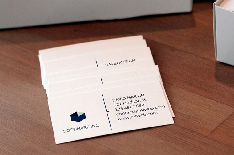
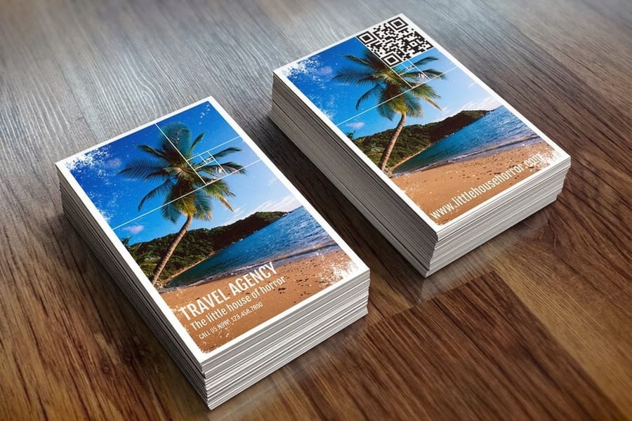
Business cards are the honest test, because they are small, they are held close, and both colors have to work at type sizes people can still read. They are also the cheapest place to be wrong. Standard business cards start at $17.57, so proofing two directions costs less than an hour of anyone's time. When the proof run has to arrive fast, same-day business cards offer the same stocks on a shorter production clock.
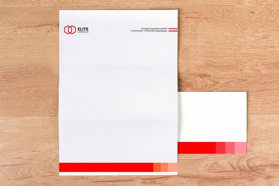
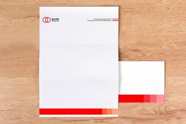
Stationery is where restraint pays. A letterhead that carries the full palette across the top competes with the letter, and a letter is the point. One color in the mark and a thin rule in the second is usually enough, and it keeps the sheet cheap to reprint. The law firm letterhead video shows a finished letterhead sheet. The same logic applies to printed envelopes, where a small mark in one color reads more confidently than a large one in two.
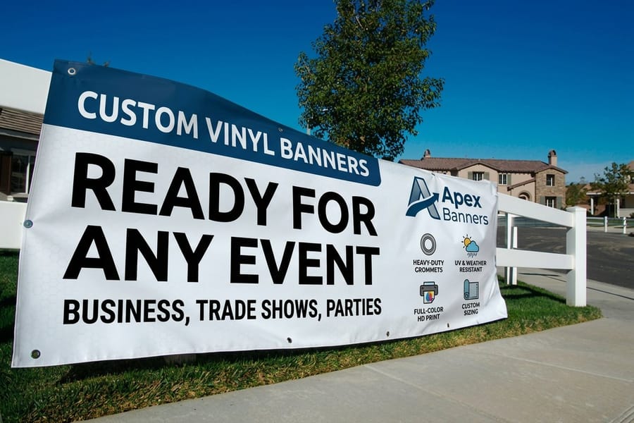
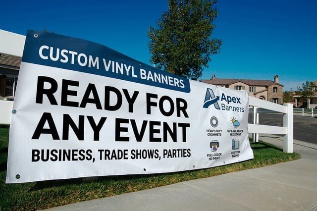
Large format changes the rules. On a vinyl banner read from thirty feet, hue matters less than the gap between light and dark, and a pairing that looked elegant on a card can turn into gray mush outdoors. Push contrast harder here than anywhere else, and keep the accent color for the elements that must be seen first. Our guide to color choices for advertising signs covers the visibility side.
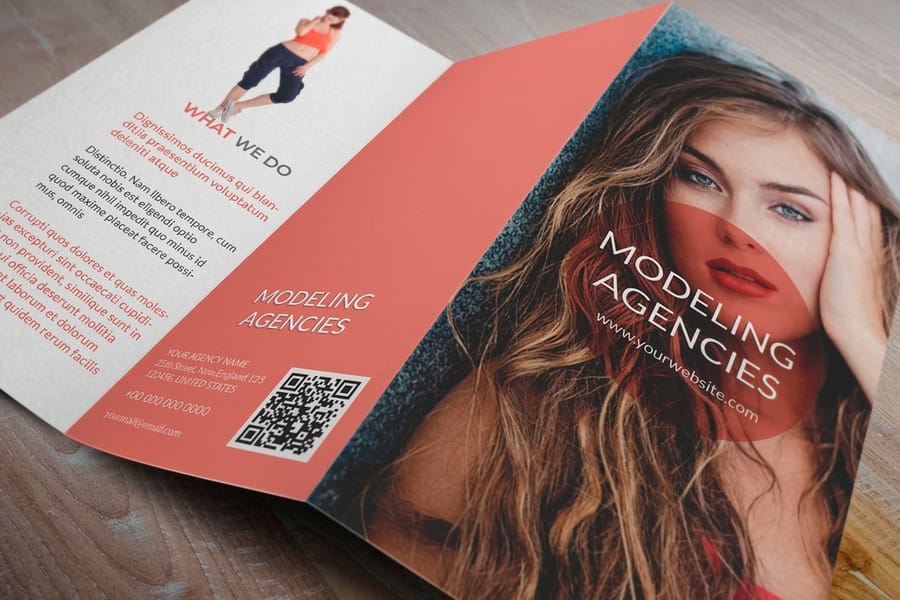
Brochures sit in between. There is room for the full palette across the panels, so the risk moves from too little color to too much. Give the accent one job per panel. Standard brochures start at $57.11, and you can see the whole range in the brochure printing category. For panel by panel color choices, how to choose a brochure color palette that prints true works through the brochure case. When you are ready to lay any of it out, the blank template library gives you correctly sized files, and the design template library gives you layouts you can recolor to your own palette.
Wally explains logo color
Pick the pair on the wheel, then prove it in ink
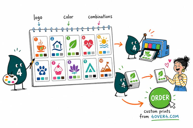
Wally picks two colors with a real gap between light and dark, keeps a neutral for everything else, and builds both in CMYK before anyone writes down a hex code. Then he prints a card and holds it next to the screen. If the two match, the palette is real. If the printed one looks flat, the color was made of light and ink was never going to reach it, so he pulls it darker and slightly less saturated and prints again.
Order standard business cards →
Specs and pricing
Where to test a palette first, and what it costs
Cards, brochures and banners each stress a palette differently. Standard business cards run 100 for $17.57 on gloss, uncoated, cream and kraft stocks in 3 business days. Brochures print flat or half folded from 5.5 x 8.5 to 11 x 25.5 inches, from 50 for $57.11. Vinyl banners run 23 sizes from 2 x 4 to 8 x 20 feet on 13oz or 15oz vinyl in 3 business days. These are the live configuration choices and starting prices from the 4OVER4.COM configurator.



Cards, letterhead and banners
Put your two colors in front of a customer


Color, CMYK and file guides
Where to go next


G7 color profiling
Color you can repeat, order after order
Common Questions
Your logo color questions, answered
What are the best logo color combinations for a small business?
The combinations that hold up are the ones built from two colors plus a neutral, where both colors sit inside the CMYK range. Navy with warm gold, deep teal with warm sand, charcoal with a single accent red, and forest green with cream all convert cleanly and stay readable at business-card size. What makes them work is not the hue, it is the contrast between the two values, one dark and one light. Two colors of similar darkness look fine on a big screen and turn into a single gray shape when someone prints your card in black and white.
Should my logo be in CMYK or RGB?
Keep both, and know which one goes where. RGB is for screens, websites, video, and anything backlit. CMYK is what an offset or digital press actually mixes, and it is what belongs in the file you send to a printer. The safe order is to choose your color as a CMYK build first, then note the RGB and hex equivalents for the web, because going that direction never surprises you. Going the other way, picking a bright hex code and converting later, is how logos come back duller than expected.
How many colors should a logo have?
One or two, with a third only if it earns its place. A single-color mark is the cheapest to print on anything, survives embroidery and engraving, and never has a registration problem. Two colors give you the contrast most brands want. At three colors you start paying for it in odd places: silkscreened merchandise is priced per color, a stamp or an etched sign has to be redrawn, and every new supplier is one more chance for the third color to land slightly off.
Why does my logo look different when it is printed?
Three reasons, usually in this order. The color was chosen on a bright screen in RGB and the press mixed the nearest CMYK build it could. The stock changed, so the same ink reads softer on uncoated paper than on coated. Or the file was still in RGB when it arrived and the conversion happened automatically with no one deciding what to protect. Our guide to converting files from RGB to CMYK covers the conversion step properly.
Do I need a Pantone color for my logo?
Only if the exact same color has to appear across processes that mix ink differently, which mostly means packaging, merchandise, and paint. For a small business printing cards, letterheads, brochures and banners, a well-chosen CMYK build gives you a consistent result at standard prices. Spot ink is a separate press unit, which is why it costs more. If your brand color happens to be one CMYK struggles with, a bright orange or a vivid violet, that is the case where spot ink genuinely earns the money, and two-color spot printing explains how the job runs.
Can I use a gradient in my logo?
You can, but build a flat version at the same time. Gradients render perfectly on screen and are the first thing to show banding on uncoated stock, on large-format vinyl, and in anything screen printed. A gradient also cannot be embroidered, engraved, or embossed. Keep the gradient for the website and the flat two-color version for everything with ink on it, and nobody outside the studio will notice the difference.
What does it cost to print a logo in full color?
Less than most people assume, because full color is the default on a digital or offset run rather than an upgrade. Standard business cards start at $17.57 at 4OVER4.COM and that price is for full-color printing, not one ink. Standard brochures start at $57.11 and vinyl banners start at $79.00. The cost only climbs when you ask for something a four-color press cannot do on its own, which is spot ink, foil, or a raised finish.
Get Started
Order 100 business cards from $17.57 and check the palette on paper
Pick your stock, upload the logo in CMYK, and we print cards that show you exactly what your two colors do on paper before they go on a sign.
Legal Disclaimer
Gold Standard guarantees apply to all standard orders placed through 4over4.com. Price match requires verifiable proof of a competitor's published price for an equivalent product with matching specifications and turnaround time. Satisfaction guarantee covers manufacturing defects and print quality issues. Contact support with order number and documentation.
