
How to Prepare a Business Card Logo for Printing


Emma is our prepress and print production voice, built from the knowledge of our production team, with over 20 years in printing.
Size your logo to the card, keep it vector or 300 DPI, convert to CMYK, and give it room to breathe. A raster logo under 300 DPI is the single most common reason a mark prints soft.
To prepare a business card logo for printing, supply it as a vector file (SVG, EPS, AI, or PDF) or a 300 DPI raster, size it to sit around 0.75 to 1.25 inches wide on a standard 3.5 by 2 inch card, convert the colors to CMYK, and leave clear space so nothing crowds it. Keep the logo inside the safe zone, at least 0.125 inches from the trim, and it prints crisp at any run size.
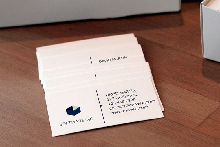
Quick tips
Quick tips for a print-ready business card logo
Supply your logo as a vector or a 300 DPI raster and size it to roughly 0.75 to 1.25 inches wide on a standard card. Convert the colors to CMYK, keep clear space around the mark, and hold it inside the safe zone at least 0.125 inches from the trim. For foil or spot UV, send a solid single-color version with no gradients. Do this once and 4OVER4.COM prints your logo crisp and true on every run.
Why preparing your logo the right way matters

Your logo is the one element on a business card that people recognize before they read a word. On a 2 by 3.5 inch card it sits at roughly 0.75 to 1.25 inches wide, so a vector file or a 300 DPI raster in CMYK is what keeps its edges and color true at that size. When it prints soft, pixelated, or a shade off, the card quietly undermines the brand you worked to build.
The good news is that a print-ready logo needs four things: the right size, enough resolution, the correct color mode, and a little clear space. Get those right once and the same file carries you from cards to signs to packaging. For inspiration on how a well-prepared mark looks on finished stock, browse the business card showcase, and if your logo itself needs work first, our logo design best practices guide is the place to start.
This guide walks through business card logo size, vector versus raster files, resolution, color, clear space, exporting a press-ready file, and the finishes that make a logo pop. For file setup across other formats, the full guide hub covers everything 4OVER4.COM prints.
What business card logo size to use

A standard business card gives you about 3.5 by 2 inches of space, and the logo has to share it with your name and contact details. There is no single correct number, but a mark that sits between 0.75 and 1.25 inches wide reads clearly on most layouts. A compact icon can go smaller, while a horizontal wordmark with longer text usually needs the wider end of that range.
Think in proportion, not just inches. The logo should be the largest branded element without swallowing the card, so leave room for your name at 10 to 12pt and your details at 8pt or above. If you are unsure how much room you really have, our business card size guide and the breakdown of standard versus custom sizes map out every dimension, including bleed and safe zone.
Those measurements fit together like this, so your logo lands inside the safe zone and never near the cut.
Position matters as much as size. A logo anchored in a top corner or centered above your name gives the eye a clear starting point, and it keeps the mark away from the trim edge where the cutter works.
Vector versus raster: the file decision

This is the single most important choice for a print-ready logo. Vector files (SVG, EPS, AI, PDF) are built from mathematical paths, so they scale from a business card to a billboard with perfectly sharp edges and no quality loss. Raster files (JPG, PNG, GIF) are made of fixed pixels, so they soften and blur the moment you enlarge them past their native size.
For a logo, always keep a vector master. If your designer built the logo in Illustrator or a similar tool, ask for the AI, EPS, or PDF source. That one file solves your resolution problem before it starts, because vectors do not have a DPI ceiling. The difference shows up most on fine lines, small text inside the logo, and curved edges, exactly the details that make a mark look professional.
If a vector simply is not available and all you have is a raster, the rules in the next section become critical. And if you would rather rebuild the layout cleanly from scratch, the online designer lets you place a print-ready logo and send it straight to print with the bleed already handled. For the deeper theory, our image resolution for printing guide explains why pixels and print do not always get along.
Resolution and DPI for a sharp logo
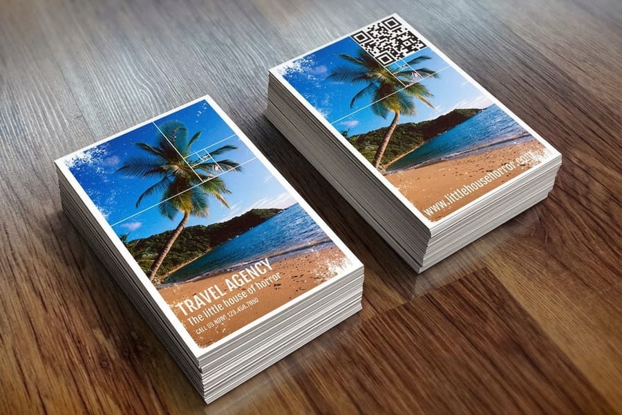
When you have to use a raster logo, resolution is everything. The print standard is 300 DPI at final size. That means the logo must contain 300 dots per inch at the exact dimensions it prints on the card, not at some larger size you plan to shrink.
The classic mistake is grabbing the logo from a website. Web images are saved at 72 DPI to load fast, so they carry roughly a quarter of the detail a press needs. Blown up to print size, a 72 DPI logo turns visibly soft, with jagged edges and fuzzy text. Enlarging a small file does not add detail, it just stretches the pixels you already have.
To check a raster logo, open it and confirm both the DPI and the pixel dimensions. A 1 inch logo at 300 DPI needs to be at least 300 by 300 pixels. If it falls short, go back to the source artwork or rebuild the mark. Our print resolution guide shows exactly how to read and set DPI, and if you started your card in our tools, the free business card design tool guide keeps everything at print quality automatically.
Getting the color right in CMYK
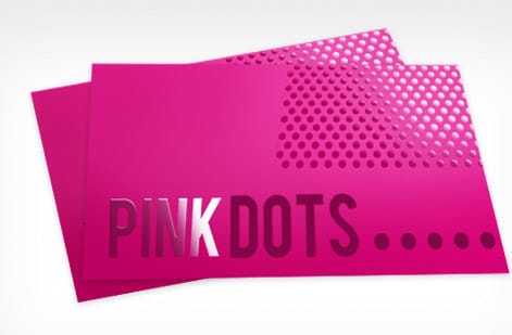
Screens glow in RGB, but presses print in CMYK, the four ink channels of cyan, magenta, yellow, and black. If you design in RGB and let the color convert at the last second, bright blues, greens, and oranges can drift toward duller, muddier tones on paper. Convert your logo to CMYK early and judge it in that mode so there are no surprises.
Record your brand colors as CMYK values, and note any exact Pantone spot color your brand uses. Spot color printing reproduces a specific hue more precisely than a CMYK build, which is why critical brand marks often run as a spot. Our CMYK vs RGB guide explains the conversion, Pantone to CMYK matching covers translating brand colors, and spot color printing shows when a dedicated ink is worth it.
One more detail: pure, rich blacks. For a solid black logo, a rich black build gives more depth than 100 percent K alone, while fine black text should stay single-channel black to keep edges crisp. If color accuracy is central to your brand, the best color profile for printing guide is worth a read before you export.
Clear space, placement, and the safe zone
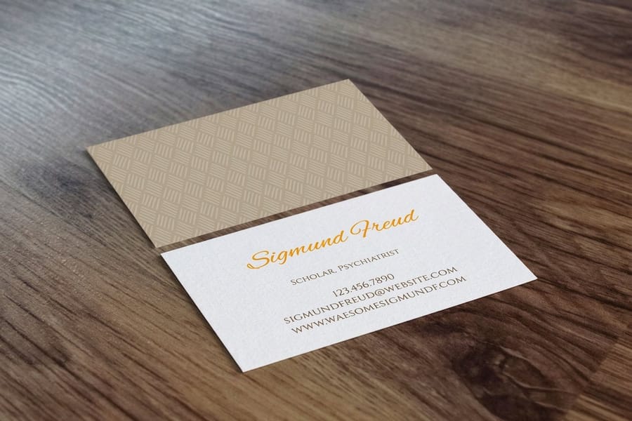
A logo needs room to breathe. Crowd it with text, a border, or the edge of the card and it loses impact and legibility. A reliable rule is to reserve clear space around the mark equal to the height of a key element in it, such as the cap height of the letters. Keep that margin empty on every side.
On a small card, clear space does double duty by keeping the logo away from the trim. Every card is designed with three lines: the bleed (the extra 0.125 inches that gets trimmed off), the trim (the final cut), and the safe zone (the inner margin where important elements belong). Keep your logo at least 0.125 inches inside the trim so the cutter never clips it. Our bleed and trim guide breaks these lines down in detail.
Placement is a design choice, but a few options rarely fail: a logo in a top corner, centered above your name, or paired with your name as a lockup. Whatever you choose, keep the alignment consistent with the rest of the card. For a tidy, professional structure, our guide to proper business card format covers how the logo, name, and details should sit together.
Exporting a press-ready logo and card
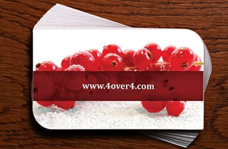
Once the logo is sized, high resolution, and in CMYK with clear space around it, exporting is the final step. For the logo itself, a vector PDF, EPS, or AI file is ideal. For the finished card, export the entire layout as a press-ready PDF at 300 DPI in CMYK, with the logo embedded and fonts either outlined or included so nothing shifts at the press.
Avoid sending a bare JPG or PNG of the whole card. Those formats compress the artwork, can shift color, and do not preserve crisp vector edges. A PDF locks your fonts, colors, and placement exactly as you built them. If you are handling several print pieces at once, the layout and file setup guides keep your entire kit consistent from card to mailer.
Not sure your file is right? Before a large run, request free samples to feel the stocks in person, and remember that most 4OVER4.COM orders get a free file review before they go to press. You can also build the card end to end in the online designer, which handles bleed and export for you.
Preparing a logo for foil, spot UV, and raised finishes
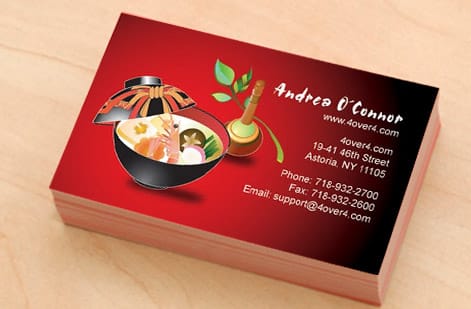
Special finishes are where a well-prepared logo really shines, and they have one shared requirement: a clean single-color mask. Foil, spot UV, and raised finishes are applied from a separate layer that tells the press exactly where to place the effect, so the logo in that layer should be solid, usually black, on a transparent or white background, with no gradients, soft shadows, or feathered edges in the treated area.
This is another reason vector art wins. A crisp vector path gives the sharpest possible foil line and the cleanest spot UV gloss, while a low-resolution raster leaves ragged edges that the finish only exaggerates. Keep the finished areas simple and bold so the effect reads at a glance across the whole run.
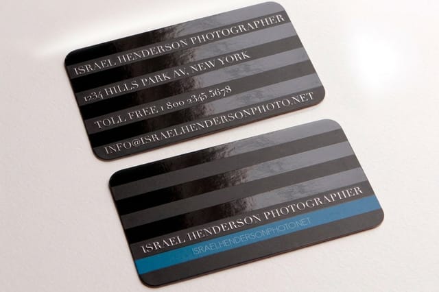
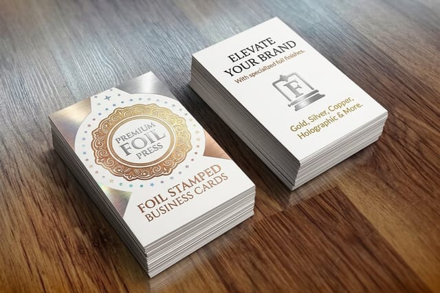
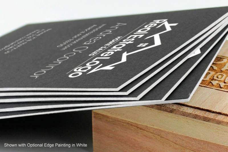
See the options on real stock. Explore business card printing for every finish, plan a matched set with the rest of your business stationery, or when a deadline is tight, same-day printing can get a clean logo on cards fast. Spot UV and foil cards each print your mark with a distinct texture that a flat card cannot match.
Logo prep mistakes that ruin the print
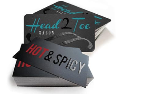
After helping 150,000 businesses print their cards, 4OVER4.COM has seen the same logo problems again and again. Avoid these and your first order is far more likely to land sharp.
- Using a low-resolution web logo. That 72 DPI PNG from your site prints fuzzy. Always go back to the vector or 300 DPI source.
- Stretching or squashing the mark. Resize proportionally only. A distorted logo reads as careless before anyone even notices why.
- Leaving the logo in RGB. Bright screen colors turn muddy on press. Convert to CMYK and check the color before you export.
- Placing the logo too close to the edge. Anything inside the bleed can get trimmed. Keep the mark inside the safe zone.
- Adding gradients to a foil or spot UV logo. Those finishes need a solid single-color shape, not a soft blend.
- Over-scaling the logo. A giant mark crowds out your name and details. Aim for balance, not dominance.
Clean, minimal marks survive small print best, which is why our guide to minimalist brand identity pairs so well with card design. For the bigger picture of what earns a spot on the card, see the top tips on what to include, and browse finished work in the showcase to see how a sharp logo carries a card.
Wally explains logo prep
A print-ready logo is half the battle for a great card
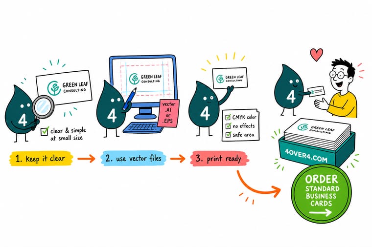
Wally treats your logo like the star of the card: give it a vector or 300 DPI file, dress it in CMYK, size it to about an inch, and leave a little space around it. Do that and it prints razor sharp every time, at any run size. Skip it and a soft, color-shifted mark drags the whole card down. Get the logo right, then let 4OVER4 print it clean on the stock and finish you choose.
Order business cards →
Specs and pricing
Standard business card specs and pricing
Once your logo is print-ready, here is what a fresh run of standard business cards gives you at 4OVER4.COM, with live specs and price-per-unit straight from the configurator. Standard cards print at 2 by 3.5, 2 by 2, 1.5 by 3.5 or 2.125 by 3.375 inches on stocks from 13pt uncoated up to 80pt UltraWhite, starting at $17.57 for 100.

| Quantity | Price Per Unit | Total |
|---|---|---|
| 100 | 17.6¢ | $17.57 |
| 200 | 11.5¢ | $23.07 |
| 300 | 9.15¢ | $27.46 |
| 400 | 7.96¢ | $31.86 |
| 500 | 7.25¢ | $36.26 |
| 600 | 6.77¢ | $40.64 |
| 700 | 6.43¢ | $45.04 |
| 800 | 6.18¢ | $49.43 |
Print it
Order business cards that show your logo off
Standard cards from $17.57 for 100, spot UV cards from 500 for $76.88 to gloss the mark alone, and foil stamped cards from 500 for $222.13 in gold, silver, copper, rose gold, red, black or blue foil.

See it in use
Marks we printed on customer stock









Explore more
Where to go next



By the numbers
Spot UV at 500 for $76.88, foil at 500 for $222.13
Common Questions
Common questions about preparing a business card logo
What size should a logo be on a business card?
On a standard 3.5 by 2 inch card, most logos read best between 0.75 and 1.25 inches wide. Wordmarks with long text sit closer to the wider end, while a compact icon can go smaller. The goal is a logo that is instantly recognizable without crowding your name and contact details. Print a test at actual size to judge it, because a mark that looks bold on screen can feel oversized in the hand.
What resolution does a business card logo need?
A raster logo needs at least 300 DPI at the size it prints. A logo saved from your website is typically 72 DPI, which looks fine on a screen but turns fuzzy and pixelated on paper. Either rebuild the logo as a vector, which is resolution independent, or export it from the original design file at 300 DPI. If all you have is a small low-resolution file, ask your designer for the source artwork before you send anything to print.
Should my logo be a vector or a JPG?
Vector, whenever possible. Vector formats like SVG, EPS, AI, and PDF are built from math rather than pixels, so they scale to any size with perfectly crisp edges. A JPG or PNG is made of fixed pixels and softens when it is enlarged, and JPG also adds compression artifacts around fine lines. Keep a vector master of your logo and only flatten to a raster when a specific tool requires it.
What color mode should my business card logo be in?
CMYK. Screens display color in RGB, but presses lay down cyan, magenta, yellow, and black ink, so working in CMYK from the start prevents surprises. Bright RGB blues and greens can shift to duller tones when they are converted late. If your brand uses an exact Pantone spot color, note that too, because spot color printing reproduces it more precisely than a CMYK build for critical brand marks.
Can I use my website logo for printed business cards?
Usually not as-is. Website logos are optimized for fast loading, which means low resolution and RGB color, and often a transparent PNG at 72 DPI. That file will look soft and color-shifted on a card. Go back to the original vector or high-resolution source and export a print version at 300 DPI in CMYK. If you cannot find the source file, our online designer lets you rebuild a clean, print-ready layout in the browser.
How much clear space should surround the logo?
A common rule of thumb is to keep clear space around the logo equal to the height of a key element in the mark, such as the cap height of the letters. On a small card that space also keeps the logo away from the trim edge. Keep the mark at least 0.125 inches inside the trim line so the cutter never clips it, and never let another element touch or overlap the logo.
What file format should I send my logo in for printing?
For the logo itself, a vector PDF, EPS, or AI file is ideal. For the finished card, export the whole layout as a press-ready PDF at 300 DPI in CMYK with the logo embedded and fonts outlined or included. PDF preserves your fonts, colors, and placement exactly as you built them, while JPG and PNG compress the artwork and can shift color during printing.
Can I print my logo in metallic foil or spot UV?
Yes, and a clean vector logo is exactly what those finishes need. Foil and spot UV are applied from a single-color mask, so supply the logo as solid black on a transparent or white background with no gradients or soft shadows in the area being treated. A crisp vector edge gives the sharpest foil line or UV gloss. Browse foil and spot UV business cards to see the effect on real stock.
Get Started
Put the finished mark on 500 spot UV cards for $76.88
Drop in your print-ready logo, pick your stock and finish, and we print crisp, true-to-color business cards that make the right first impression.
Legal Disclaimer
Gold Standard guarantees apply to all standard orders placed through 4over4.com. Price match requires verifiable proof of a competitor's published price for an equivalent product with matching specifications and turnaround time. Satisfaction guarantee covers manufacturing defects and print quality issues. Contact support with order number and documentation.
