
Letterhead Design Tips for Font Size, Style & Format


Emma is our prepress and print production voice, built from the knowledge of our production team, with over 20 years in printing.
Set the body copy at 10 to 12pt, size the header at 14 to 18pt, and keep the footer at 8 to 10pt. The header has to sit above the letter without competing with it, and type size is how you do that.
The right letterhead font size follows a three-tier hierarchy: set the letter body at 10 to 12pt (11pt is ideal), size the company name or header at 14 to 18pt so it leads the page, and drop the footer address and contact line to 8 to 10pt. Stick to one or two legible fonts, leave a one-inch margin, and keep the body zone open. That contrast is what makes a letterhead read clean and professional.
Quick tips
Quick tips for letterhead font size and format
Set your letterhead body copy at 10 to 12pt, size the company header at 14 to 18pt, and keep the footer contact line at 8 to 10pt. Use one or two legible fonts, hold a one-inch margin all around, and leave the body zone open for the letter. 4OVER4.COM customers who follow this simple hierarchy get letterheads that read clean and look professional every time.
Why letterhead font size and format matter
A letterhead is the first thing a recipient reads before they read your letter. Get the font size and layout right and the page feels professional, calm, and easy to scan. On an 8.5 x 11 inch sheet that means a company name at 14 to 18pt, body copy at 10 to 12pt, a footer line at 8 to 10pt and a one inch margin all around. Get it wrong, with a header that shouts or body copy too small to read, and the whole letter loses authority before a single word lands.
The rules are simple once you see them as a hierarchy: a large header at the top, comfortable body copy in the middle, and quiet contact details at the foot. This guide walks through the exact sizes, the best fonts, and how to set up a clean file for print. When you are ready to print, letterhead printing at 4OVER4.COM turns your file into crisp, professional stationery.
Need to match your letterhead to the rest of your brand? Our Online Designer lets you set type and layout in the browser, and the 6 key principles of logo design guide helps you get the logo lockup right before you size it into the header.
What font size should a letterhead be
The short answer first, then the reasoning.
- Body text: 10 to 12pt. This is the copy of the letter itself. 11pt is the safe default because it matches how a business letter is typed and stays readable in print.
- Header (company name / logo lockup): 14 to 18pt. The top of the page should clearly lead the eye. If your logo is an image rather than type, scale it to feel like a 16 to 20pt line of text.
- Footer (address, phone, email, website): 8 to 10pt. Supporting information sits in a smaller size so it frames the letter without competing with it.
The trick is contrast between the three tiers. If the header is only a point or two bigger than the body, the hierarchy collapses and the page looks flat. The diagram below shows the three zones and their sizes on a standard sheet.
These same size relationships scale down to smaller stationery too. If you also print cards, the article on what size font on a business card applies the identical thinking to a much smaller canvas.
Best fonts and styles for a letterhead
Font choice sets the tone. You want something legible at 11pt and appropriate for your industry.
Serif faces like Garamond, Georgia, and Times New Roman read as formal, established, and trustworthy. They suit law firms, financial services, and traditional brands. A law firm letterhead almost always pairs well with a classic serif.
Sans-serif faces like Helvetica, Lato, and Open Sans feel modern, clean, and approachable. They suit tech, design, and consumer brands. If your logo already uses a distinctive typeface, echo its style in the body rather than clashing with it.
The one rule that never bends: use one or two fonts, no more. Pair a header font with a body font, or use a single family in two weights. If you are still shaping the brand voice, the guide on best practices for logo design is a good companion.
Letterhead format: where everything goes
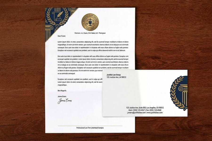
A letterhead has three horizontal zones, top to bottom.
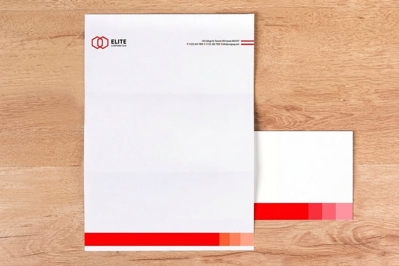
- The header holds your logo or company name, usually left-aligned or centered across the top. This is where your largest type lives.
- The body zone is intentionally left blank. This is where the letter is typed. Never fill it with graphics or watermarks that make text hard to read.
- The footer carries your address, phone, email, and website in small type, often above a thin rule that separates it from the letter.
Alignment matters as much as size. Pick left-aligned or centered and stay consistent between the header and footer so the page feels deliberate. A one-inch margin on all four sides keeps your content inside the safe print area and gives the letter room to breathe.
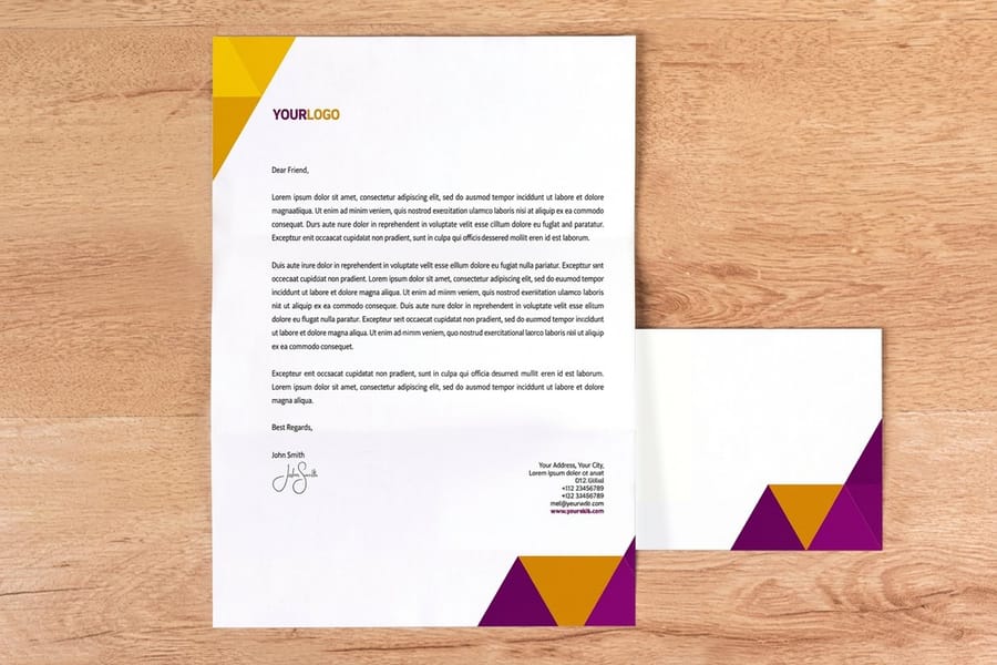
If your brand uses matched stationery, keep the same header treatment across your standard letterheads and your envelopes so every piece reads as one system.
What goes on a professional letterhead
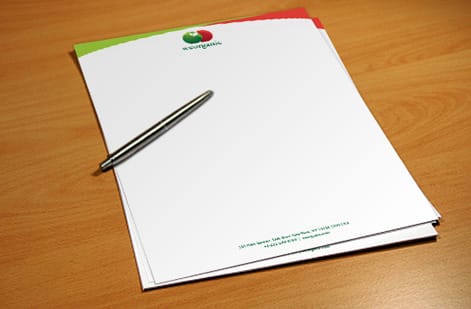
A clean letterhead includes only what the reader needs, nothing more.
- Logo or company name at the top, sized as the header.
- Contact block with street address, phone, email, and website, usually in the footer.
- An optional tagline or a single thin rule to organize the page.
What to leave off is just as important. Skip social handles crammed into the header, dense paragraphs of company history, or busy background patterns. Every extra element competes with the letter and dilutes the professional feel.
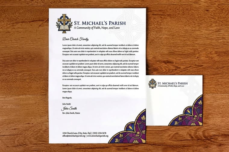
For regulated or formal correspondence, a church letterhead or a legal printing layout often adds a small registration or membership line to the footer, still in that quiet 8 to 10pt range. Explore finished examples in the 4OVER4.COM letterhead design showcase to see how brands balance these elements.
Standard letterhead size and stock
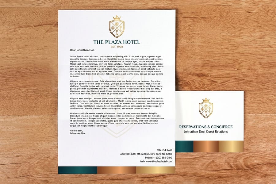
The standard letterhead size in the US is 8.5" x 11", the same as a sheet of standard printer paper and a match for a #10 business envelope. This keeps your letterhead compatible with office printers and mailing.
Paper stock shapes how the letterhead feels in hand. A lighter bond weight suits high-volume correspondence you run through an office printer, while a heavier premium stock signals importance for formal letters. 4OVER4.COM offers several stocks and weights across the letterhead range, plus specialty options if you want texture or a foil accent.
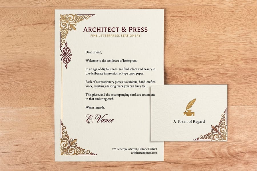
If your correspondence tends toward the upscale, a letterpress stationery or premium stock gives a tactile, high-end impression that inkjet paper cannot match. Browse the full range on the letterhead printing page to compare stocks side by side.
Setting up your letterhead file for print
A great design still needs a correct file. A few setup rules keep the print sharp and true to your screen.
- Work in CMYK, not RGB. Print uses CMYK inks, so designing in CMYK keeps colors from shifting. See CMYK vs RGB for the full explanation.
- Set images to 300 DPI. A logo that looks fine on screen can print fuzzy if it is low resolution. Use vector art for logos whenever possible.
- Add bleed if your design runs to the edge. Most letterheads do not bleed, but if a rule or color block touches the edge, extend it 0.125" past the trim.
- Keep type inside the safe margin. Hold your header, body zone, and footer at least 0.25" in from the trim so nothing gets cut.
Not sure your file is ready? The Online Designer handles size, margins, and color mode for you, so you can focus on the type hierarchy and let the setup take care of itself.
Common letterhead design mistakes to avoid
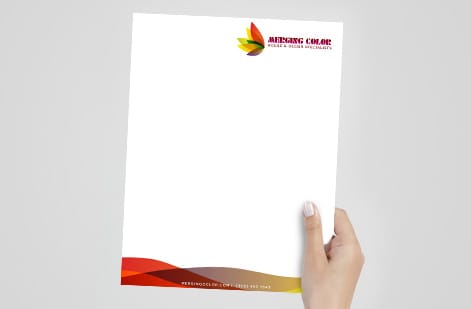
Even careful designers trip on these. Avoid them and your letterhead reads clean every time.
Body text too small. Anything under 10pt strains the reader. Keep the letter at 10 to 12pt no matter how much you want to fit.
A header that overpowers the page. A 30pt company name leaves no room for the letter. Lead with the header, do not let it dominate.
Too many fonts. Three or more typefaces make a page look amateur. One or two, chosen for legibility, is the rule.
Filling the body zone. Watermarks and background art behind the letter make the typed text hard to read. Keep the middle of the page open.
No margins. Type that runs to the edge feels cramped and risks getting trimmed. A one-inch margin keeps the page balanced and inside the safe zone.
Wally explains type sizing
Three sizes, one clean page
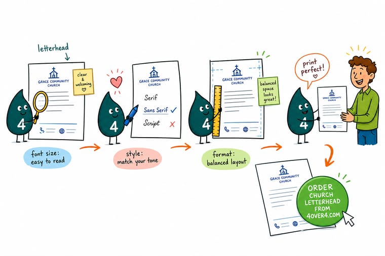
Wally sizes a letterhead like a signpost: the header is the big sign you read from across the room, the body is the message at reading distance, and the footer is the fine print you lean in for. Keep those three sizes clearly apart, one or two fonts, and a one-inch margin, and your letter always looks like it means business. When your layout is set, print it on premium stock at 4OVER4.
Order a custom letterhead →
Specs and pricing
Custom letterhead specs and pricing
Letterheads print at 8.5 x 11 inches on 70# uncoated text, 24# Royal Laid in bright white, natural white or gray, or 28# Royal Linen, in black or full color on one or both sides, from 50 sheets for $99.95 in 5 business days, with matching blank second sheets as an option. Once your type hierarchy is set, here is what a fresh, made-to-order letterhead gives you at 4OVER4.COM, with live specs and price-per-unit straight from the configurator.
| Quantity | Price Per Unit | Total |
|---|---|---|
| 50 | $2.00 | $99.95 |
| 100 | $1.05 | $105.44 |
| 200 | 58.2¢ | $116.43 |
| 300 | 43.6¢ | $130.72 |
| 400 | 34.9¢ | $139.49 |
| 500 | 29.4¢ | $147.18 |
| 600 | 25.4¢ | $152.68 |
| 700 | 22.6¢ | $158.17 |
Letters, letterhead and cards
Order letterheads and matched stationery at 4OVER4
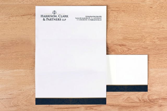
Printed letterhead orders
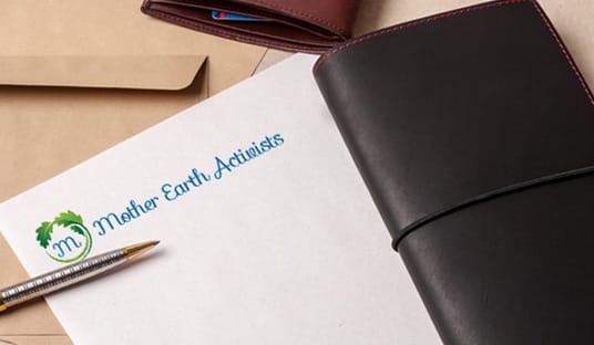
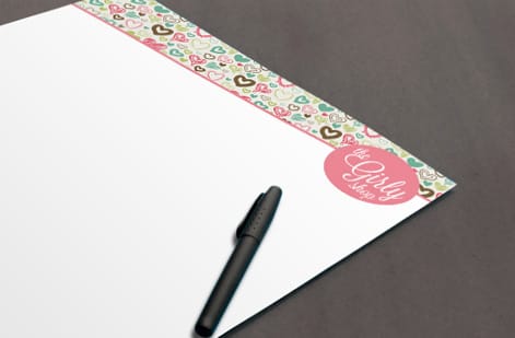
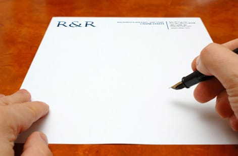
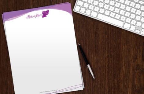
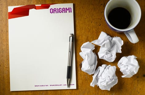
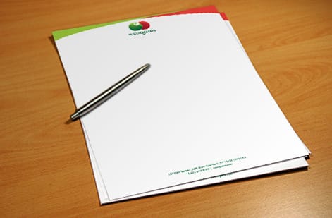
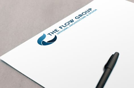
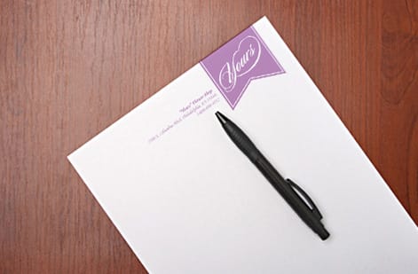
Letterheads we printed for firms and churches
Letterhead layout and paper guides
Where to go next


By the numbers
70# Uncoated Text up to 28# Royal Linen
Common Questions
Common questions about letterhead font size and design
What is the best letterhead font size?
Body text on a letterhead sits at 10 to 12pt, with 11pt being the sweet spot for a standard 8.5" x 11" sheet. The company name or header block runs larger at 14 to 18pt so it anchors the top of the page, and the footer line with your address and contact details drops to 8 to 10pt. Keeping those three tiers distinct makes the whole page read cleanly.
How small can the footer get and still read?
Start with the letter itself. Type a real sample paragraph at 11pt and print it, then hold it at arm length. If it reads comfortably, your body size is right. Scale the header up until it clearly leads the eye without overpowering the letter, and shrink the footer until it feels like a quiet frame. The goal is a clear hierarchy: header largest, body medium, footer smallest.
What are the best fonts for a letterhead?
Classic serif faces like Garamond, Georgia, and Times give a formal, trustworthy tone, while clean sans-serif faces like Helvetica, Lato, and Open Sans feel modern and approachable. Pick one font family for the body and either the same family or one complementary face for the header. Two typefaces is the ceiling, and both should be highly legible at small sizes.
What does a custom letterhead cost and how is pricing set?
A custom letterhead at 4OVER4.COM starts at $99.95. Price is driven by the quantity you order, the paper stock and weight you choose, whether you print one or two sides, and any upgrades like foil. Ordering in larger runs lowers your cost per sheet, and the live configurator shows the exact price the moment you set those options.
What sizes, stocks and finishes are available for letterheads?
The standard letterhead size is 8.5" x 11" to match a business envelope and printer tray. 4OVER4.COM offers several paper stocks and weights, from everyday bond to premium and foil options across the letterhead range, so you can match the feel of the paper to the tone of your brand.
How long does letterhead printing take to ship?
Turnaround depends on the stock and finish you pick and the quantity in your order. Standard letterhead stocks move fastest, while foil and specialty upgrades add a little production time. You will see the available turnaround windows and the ship date for your exact configuration in the checkout flow before you pay.
What should go on a letterhead?
A complete letterhead carries your logo or company name at the top, a clean body zone left blank for the letter itself, and a footer with your street address, phone, email, and website. Some brands add a tagline or a thin rule to separate the footer. Keep it minimal so the letter, not the stationery, stays the focus.
Get Started
Order 50 letterheads at $2.00 a sheet
Lock in your font sizes, drop in your logo, and we print a crisp, professional letterhead on the stock that fits your brand.
Legal Disclaimer
Gold Standard guarantees apply to all standard orders placed through 4over4.com. Price match requires verifiable proof of a competitor's published price for an equivalent product with matching specifications and turnaround time. Satisfaction guarantee covers manufacturing defects and print quality issues. Contact support with order number and documentation.
