
How to Choose a Brochure Color Palette That Prints True


Three colors, three jobs, and one conversion check. Here is how to build a brochure palette from the brand colors you already own, keep the copy readable on paper, and stop the accent color shifting on press.
Pick three colors, not seven: one dominant across about 60 percent of the surface, one support at 30 percent, and one accent at 10 percent reserved for the call to action. Build them from your existing brand colors, hold body copy at a 4.5 to 1 contrast ratio against its background, and convert everything to CMYK before you export, because saturated blue, green and orange are the hues that shift most on press. Extra variety comes from tints of a color you already have, never from a fourth hue.
Quick answer
Three hues, three jobs, one CMYK check
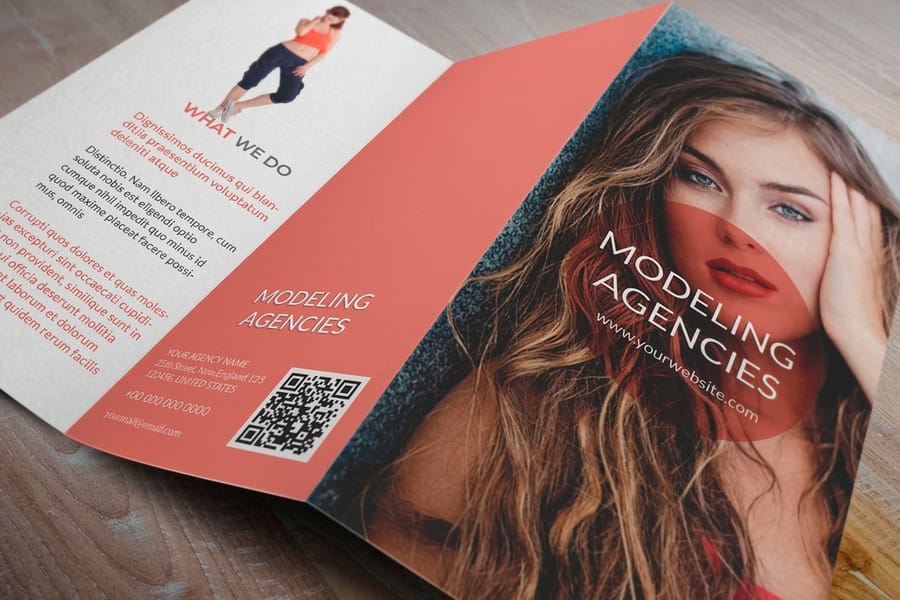
A brochure palette is a dominant color, a support color and an accent, in roughly a 60, 30 and 10 split. The dominant is usually paper white or a pale tint, because the headline needs somewhere quiet to sit. The support is normally your brand hue and carries the cover band and the section headers. The accent is the highest chroma color, appears least, and points at the one thing you want the reader to do. Convert all three to CMYK yourself and proof the accent, since the most saturated color in a palette is always the one that moves.
What Color Actually Does on a Brochure
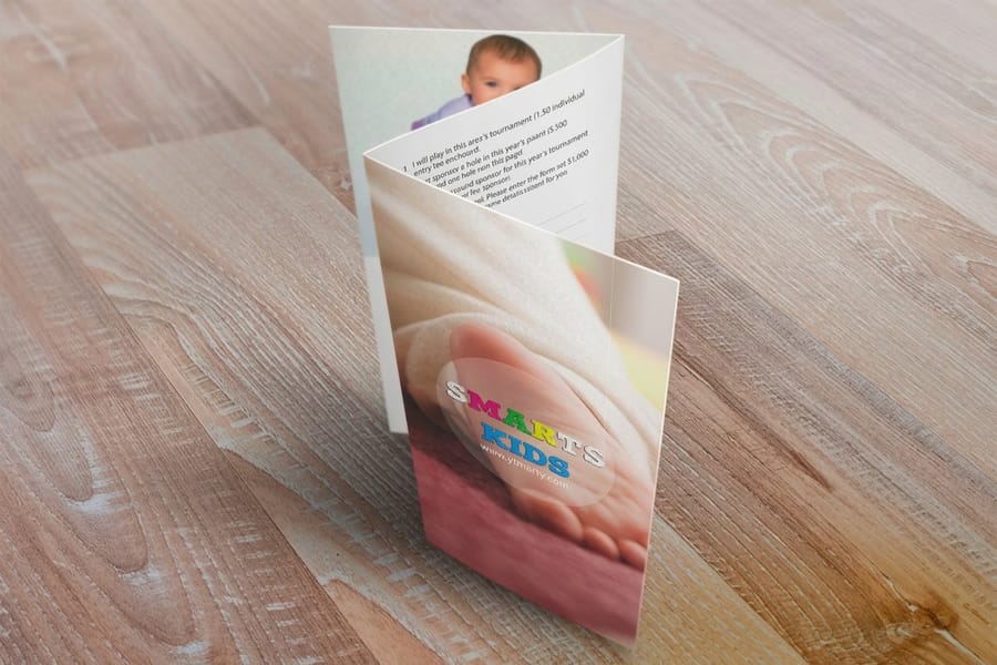
Color does one job before anyone reads a word: it decides whether the piece gets picked up. A brochure in a rack shows roughly its top four inches, a brochure on a table is judged from three or four feet away, and a mailed brochure competes with everything else in the stack. At that distance type is a grey texture. Only value and hue are legible.
That is why the useful question is not which colors look nice together. It is which colors survive being seen small, at an angle, under fluorescent light, next to a competitor. A pale sage cover with soft grey type can be beautiful on a monitor and completely invisible in a lobby rack.
The second job is recognition. When the same three colors run across your brochures, your flyers and your postcards, a customer who saw one piece recognizes the next one before reading the logo. That only works if the colors are pinned to real CMYK values rather than re-picked by eye each time, which is where a written palette earns its keep.
Building the Palette Out of Your Brand Colors
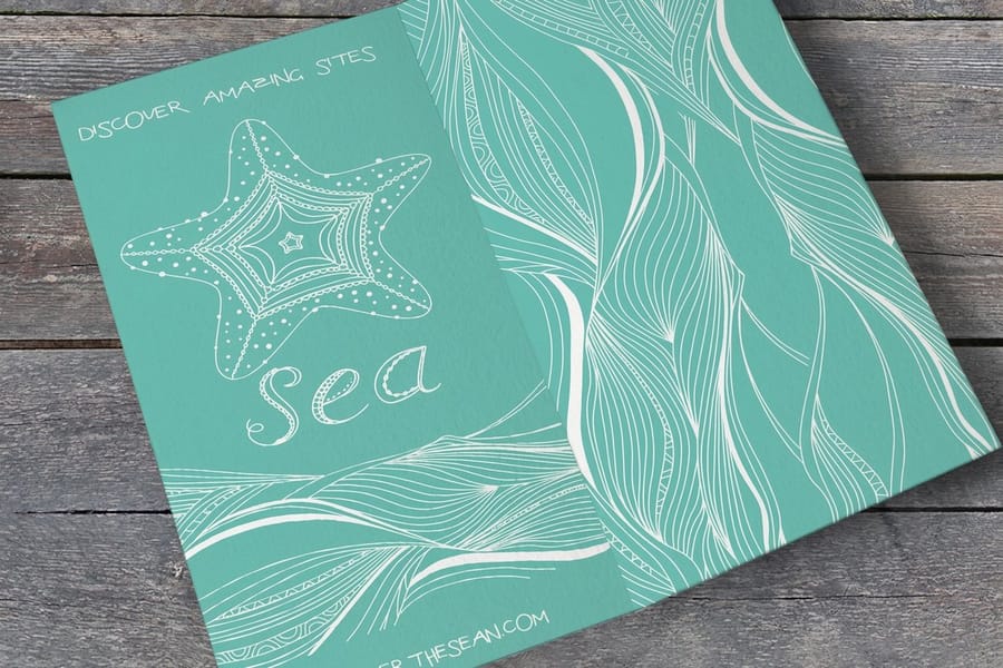
Start from what you already own. Pull the CMYK build of your logo color, not the hex value from your website, because the hex was made for a screen and converting it fresh in every file is how a brand ends up with four slightly different greens.
Then assign the three roles, and expect the logo color to move down the list. The dominant 60 percent is normally the paper itself or a pale tint of the brand hue, because a headline needs somewhere quiet to sit. The brand color usually becomes the 30 percent support: the cover band, the section headers, the panel rules. The 10 percent accent is a separate high chroma color reserved for the call to action, the phone number, or one arrow.
For the support and accent, two moves cover almost every brief. An analogous pick, one step around the wheel, gives a calm palette that reads as a single family. A complementary pick, straight across, gives energy and maximum separation between the accent and everything else. Skip the third option, the split of many hues, unless the brochure genuinely has unrelated sections that need coding.
Write the result down as a swatch card before you open the layout: color name, CMYK build, and exactly what it is allowed to touch. Our brand color palette guide covers the master palette in more depth, and ten pairings that work in print is a good place to steal a starting point.
Contrast Rules That Keep the Copy Readable
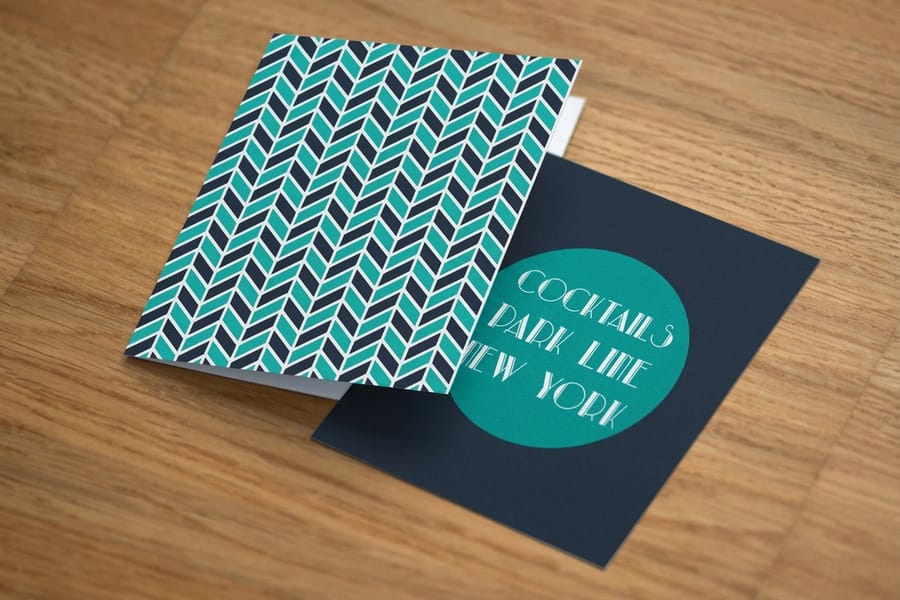
Contrast is measurable, so measure it. Hold body copy at a ratio of 4.5 to 1 against whatever sits behind it, and large display type at 3 to 1. Any contrast checker gives you the number in a second, and it removes the argument about whether the grey is too light.
Print needs more headroom than a screen. Paper is not pure white, ink spreads a little into the sheet, and a brochure gets read under whatever light the room has. A pair that squeaks past 4.5 to 1 on a calibrated monitor can be uncomfortable on uncoated stock. Aim a notch higher than the minimum and you will never think about it again.
- Reversed type needs weight. White copy out of a dark field wants roughly 9 point and up in a medium or semibold weight. Thin serifs at 7 point fill in as the ink spreads, and the fine strokes disappear.
- Never set body copy straight onto a photograph. Put it on a solid panel, or on the photo behind a flat block of color. Partial transparency over a busy image gives you a different contrast ratio in every square inch.
- Watch mid-tone on mid-tone. Two colors of similar lightness can look distinct at arm reach and merge into one grey at rack distance. Convert the pair to greyscale to test it.
- Coating changes the read. Gloss deepens the darks and adds glare, matte softens the darks and kills glare. The matte and gloss comparison covers which one suits which job.
Type size and color are one decision, not two, so set them together. The brochure font and size guide gives the sizes that hold up at the weights above.
What Readers Expect, Sector by Sector
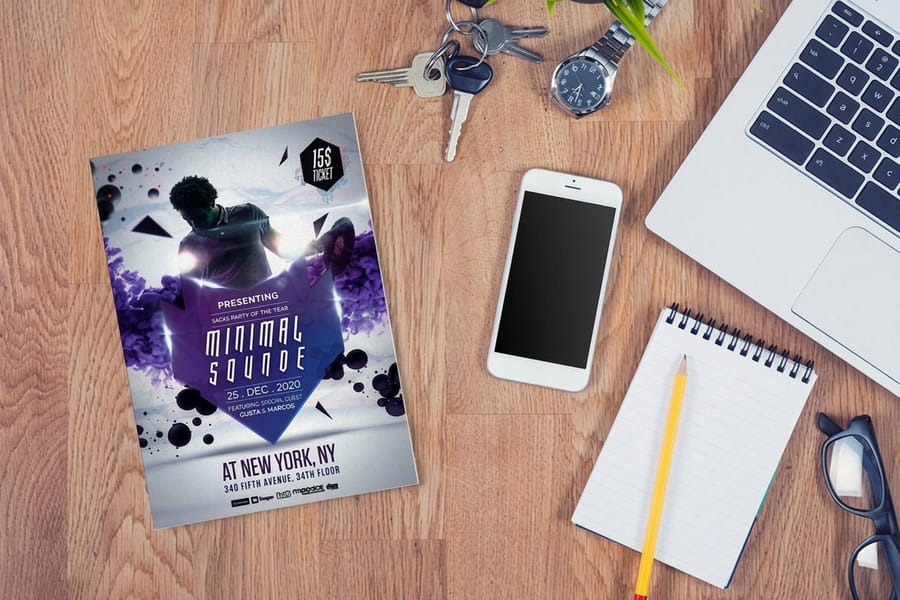
Color psychology gets oversold. Nobody buys a dental plan because the folder was blue. What is real is expectation: every sector has a visual convention, and breaking it costs you a second of confusion at exactly the moment you have the reader. Use the table as a starting point, then decide deliberately whether to follow the convention or break it for a reason.
| Sector | What the reader expects | Palette that holds up | What backfires |
|---|---|---|---|
| Healthcare and dental | Calm, clean, unhurried. | Blue or teal support on a white dominant, one warm accent. | Large fields of red, which read as warning rather than warmth. |
| Finance and legal | Stability and permanence. | Navy or deep green support, warm grey neutrals, a metallic or amber accent. | Neon accents and more than two hues, which read as improvised. |
| Restaurants and food | Appetite and freshness. | Cream dominant, warm red or terracotta support, photography doing the work. | Cool blue behind food photography, which makes the food look cold. |
| Real estate | Aspiration and trust. | Charcoal or navy support, white dominant, one warm accent on the contact block. | Patterned or tinted backgrounds behind listing photos. |
| Fitness and studios | Energy and momentum. | Near black dominant with a single saturated accent used hard. | Three competing accents, which flatten the urgency you were buying. |
| Nonprofit and education | Warmth and approachability. | Mid-tone blue or green support with a warm secondary and real photographs. | Corporate grey only, which reads as distant. |
| Trades and construction | Visibility and competence. | Dark neutral dominant with a high visibility yellow or orange accent. | Pastels, which lose the safety-color association the sector runs on. |
The pattern underneath the table is worth more than any single row. Sectors where the buyer is nervous reward cool, quiet palettes with lots of white. Sectors where the buyer is deciding fast reward high contrast and one loud accent. Match the palette to the reader, not to your own taste.
Why Three Colors Beat Seven
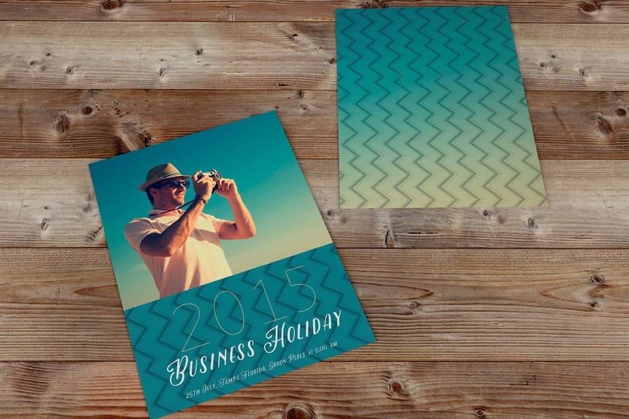
Every hue you add is another thing that has to survive the conversion to CMYK, another thing to check on the printed proof, and another decision the reader has to process in the second they give you. Restraint here is not minimalism for its own sake. It is fewer failure points.
When a layout genuinely needs more variety, take it from value rather than hue. A single support color at 20, 40, 70 and 100 percent gives you four distinct steps that stay perfectly on brand and stay in gamut, since a tint of an in-gamut color is always reproducible. Panel coding on a trifold works far better in tints of one hue than in three unrelated colors, and the piece still reads as one object rather than three pamphlets stapled together.
Two habits keep a palette honest through a long project. Cap the accent by counting it: if the accent appears more than four or five times on a spread, it stopped being an accent. And keep one color out entirely, usually a second warm hue, so there is somewhere to go when a future piece needs to feel different without leaving the system. The elements of brochure design shows how the restrained palette works alongside the grid and the type.
Designing in CMYK So the Color You Approve Is the Color You Get
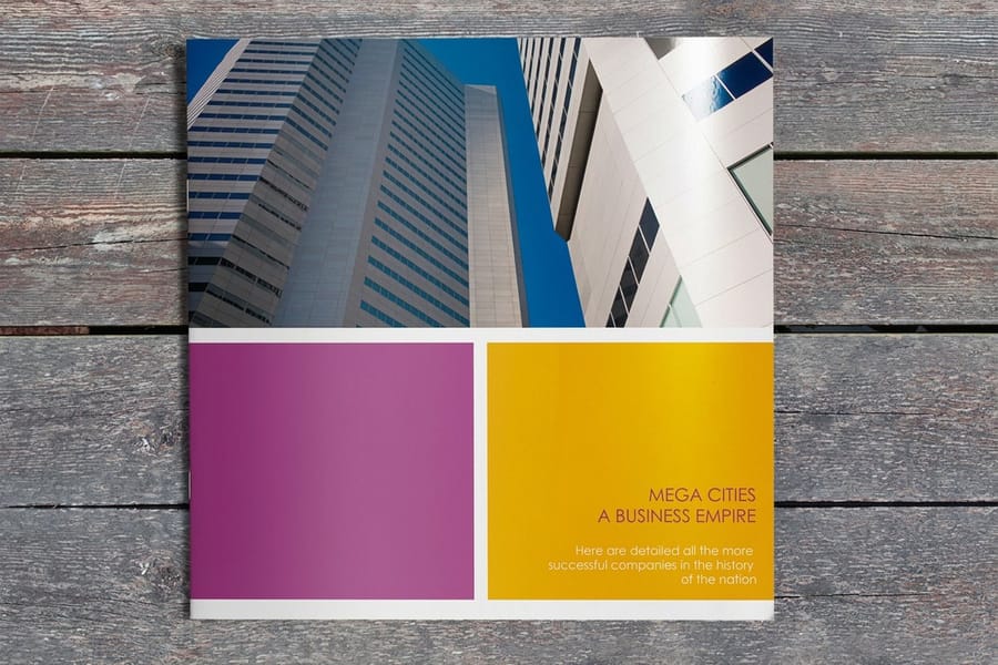
A monitor makes color by adding light and a press makes color by subtracting it with ink, so the two ranges do not overlap. Screens win on saturated blue, vivid green and bright orange. Those three regions are where an RGB file loses the most on the way to paper, and they are exactly where designers reach for an accent color.
Do the conversion yourself, early, and look at the result. If you convert on export you find out about the shift on the printed piece. Five checks handle almost everything:
- Set body text as 100K only. Black text built from all four inks needs perfect registration to stay sharp. One color slightly out and small type gets a colored fringe. Our note on rich black recipes explains when the four ink build is right and when it is not.
- Use rich black only for large fields. A build near 60C 40M 40Y 100K gives a deep, even black across a full cover panel. Flat 100K over a large area looks washed and grey next to it.
- Keep total ink coverage under about 300 percent on coated stock. Beyond that the sheet takes longer to dry and ink can transfer onto the back of the next sheet, which shows up as ghosting on a folded piece.
- Convert Pantones by hand. Look at the CMYK values your software proposes and adjust if the shift is wrong. The Pantone to CMYK matching guide covers the ones that convert badly.
- Proof the accent, not the dominant. The highest chroma color in the palette is the one that moved. Everything pale is fine.
If several people touch the file, agree on one working profile and stay in it. Color management in prepress covers the profile side, and RGB versus CMYK covers the conversion itself.
Color Across the Fold, Panel by Panel
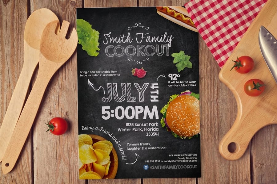
A brochure is not a flat rectangle. It is a set of panels the reader opens in a fixed order, and the palette has to work at each step: the cover alone, the first opening, then the full inside spread.
Give the cover panel the strongest statement. That is the panel the dominant and the support colors are really designed for, and it is the only panel that has to work in a rack. Then let the inside spread go quiet, with the pale dominant carrying most of it and the support color reduced to headers and rules. A brochure that shouts on every panel gives the reader nowhere to land.
- Anything colored that touches a fold or a trim edge needs full bleed. Extend it 0.125 inch past the trim so a small shift in cutting never leaves a white sliver along the edge.
- Do not run a thin colored stripe across a fold. Folding tolerance is around a sixteenth of an inch, so a two point rule that crosses the fold will visibly step. A thick band absorbs the same shift invisibly.
- Panel widths are not equal on a trifold. The panel that tucks inside is cut slightly narrower so the piece closes flat, which means a color block centered on the flat artboard sits off center once folded. Set up from a blank brochure template rather than dividing the page in three.
- Heavy ink can crack on the fold. A solid dark field folded across the grain on heavier cover stock can show a hairline of white paper. Scoring before folding is what prevents it, and it matters most on the darkest color in your palette.
- Leave the mailing panel light. If the brochure is going in the mail, the address area needs a pale background so the address scans cleanly. See mailing brochures for the panel layout.
Which panels you get depends on the fold, so pick the fold before you finalize the color map. The fold types guide lays out the options, and you can start the layout in our online designer or from a downloadable template.
Wally explains the 60, 30, 10 palette
One color to rest on, one to build with, one to point with
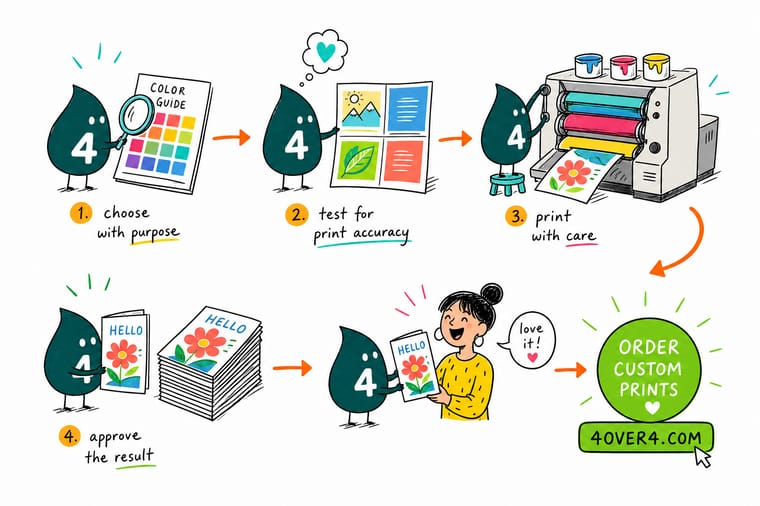
Wally gives every color a job. Sixty percent is the quiet one, usually the paper itself, and it is what the headline sits on. Thirty percent is the brand color, doing the cover band and the headers. Ten percent is the loud one, saved for the phone number and the button. Then he converts all three to CMYK and looks hard at the loud one, because the brightest color in any palette is the one that shifts when four inks try to mix it.
Print full color brochures →Specs and pricing
Sizes, stocks and starting prices for full color print
Full color both sides is the standard build, so a three color palette costs the same to print as a one color one. Configure the size, fold and stock and the price updates live.



Print it
Put the palette on paper


Explore more
Where to go next



By the numbers
Full color printing you can count on at 4OVER4
Common Questions
Your brochure color questions, answered
How many colors should a brochure use?
Three, plus black for text and the paper white. That is a dominant color across roughly 60 percent of the surface, a support color at 30 percent, and an accent at 10 percent. If you need more variety than three hues give you, build it from tints of the colors you already have. Twenty, forty and seventy percent of one hue read as four different values, stay inside the CMYK gamut, and cost nothing extra to print because full color both sides is already the standard on our brochures.
Why does my blue look purple when it prints?
Because the blue you picked lives outside the range four process inks can mix. Screens make blue with light, and pure RGB blue is far more saturated than cyan and magenta can reproduce together. The press builds the nearest match it can, which leans violet. The fix is to build the blue in CMYK yourself, drop the magenta, and check it on a printed sample. A build near 100C 60M 0Y 0K holds a clean blue on coated stock, and our guide on converting between RGB and CMYK walks through the conversion step by step.
Do I have to convert my brochure file to CMYK before uploading?
Yes. If you send an RGB file it still gets converted, but the conversion happens without you, using a generic profile, and you see the result for the first time on the printed piece. Converting yourself takes a minute and lets you fix the two or three colors that moved. Check the accent color first, since the highest chroma color in a palette is almost always the one that shifts.
What color palette works best on a brochure rack?
One that puts a strong value contrast in the top four inches, because that is roughly all a rack shows. A dark or fully saturated band across the top of the cover panel with light type reversed out of it reads from across a lobby. A mid-tone color behind mid-tone type disappears at three feet, no matter how nice the two colors look side by side on a monitor.
Does the paper change the colors?
Noticeably. Uncoated stock absorbs ink into the fiber, so the same build reads softer, slightly darker, and less saturated. Coated stock holds the ink on the surface, so colors stay bright and blacks stay deep. Gloss coating deepens dark areas further, while matte lifts them a little and cuts glare under office lighting. If the palette depends on one exact color, order a sample of the stock before you commit the run.
Can I use Pantone colors in a brochure?
You can specify them, but a full color digital or offset brochure prints in four process inks, so any Pantone you use is converted to its closest CMYK build. Some Pantones convert cleanly and some, particularly the bright oranges and the vivid blues, do not. Convert them in your design software, look at the CMYK values, and adjust by eye if the shift bothers you. A true spot ink is a separate plate and only makes economic sense on long offset runs.
Get Started
Ready to see your palette on paper?
Pick the size, the fold and the stock, upload a CMYK file, and we print full color on both sides with the accent color exactly where you put it.
Legal Disclaimer
Gold Standard guarantees apply to all standard orders placed through 4over4.com. Price match requires verifiable proof of a competitor's published price for an equivalent product with matching specifications and turnaround time. Satisfaction guarantee covers manufacturing defects and print quality issues. Contact support with order number and documentation. On-time delivery rate based on tracked orders 1999 to 2026. Individual results may vary based on shipping carrier performance.
