
The Elements of Brochure Design Explained


Sofia is our design and templates voice, built from the knowledge of our production team, with over 20 years in printing.
A brochure is only as strong as the elements inside it. Learn the physical parts, the folds, panels, and covers, and the five design principles that turn a flat sheet into a piece people actually read and keep.
The parts of a brochure are its panels, set by the folds: a front cover, the inside panels that carry your message, and a back panel for contact details and a call to action. Strong brochure design layers five elements on top of those parts, visual hierarchy, original branding, simplicity, quality images, and a tight color palette, then sets everything to print specs with a 0.125 inch bleed and a safe zone so nothing important gets trimmed off.
Quick answer
The parts of a brochure at a glance
A brochure is built from panels, and the folds decide how many you get. Every brochure shares three zones: a cover that earns attention, inside panels that carry the message and imagery, and a back panel with contact details and a call to action. Good design layers five elements on top of those parts, visual hierarchy, originality, simplicity, quality images, and color, then respects the print specs: a 0.125 inch bleed, a safe zone for your text, and clean fold lines. Get those right and your 4OVER4.COM brochure reads clearly and prints sharp.
In numbers: a tri-fold on an 8.5 x 11 sheet has six panels, three per side, each roughly 3.7 inches wide. A bi-fold on the same sheet has four 5.5 x 8.5 panels. Both run a 0.125 inch bleed on every edge, keep type 0.125 inch inside the trim, and take photos at 300 DPI at final size.
Why the parts of a brochure matter before you design
Most brochures fail for one reason: the design fights the format instead of working with it. A brochure is not a flyer or a poster. It is a folded sheet, and the folds break it into panels that a reader opens in a set order. When you understand the parts of a brochure first, every design decision, where the headline sits, where the photo goes, where the call to action lands, gets easier and clearer.
This guide walks through the physical parts and the five design elements that make them work: visual hierarchy, originality, simplicity, quality images, and color, plus the print specs that keep your artwork off the fold lines. Flat standard brochures or ready-scored folded brochures, the principles are the same. If your first question is how does a brochure work as a format, start there and come back for the design.
You do not need to be a designer to get this right. If you would rather skip the software, the 4OVER4.COM online designer builds the panels, margins, and bleed for you. Either way, knowing what each part does is what turns a flat sheet into a piece people actually read and keep.
The anatomy of a brochure: panels, folds, and covers
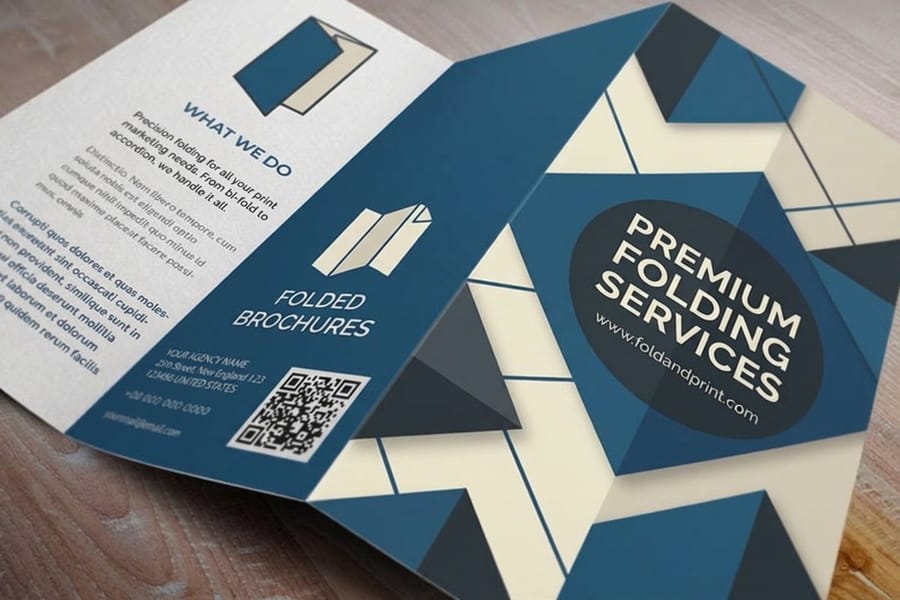
Start with the vocabulary, because every other choice depends on it. A panel is one face of the brochure between two folds or between a fold and an edge. The fold is the crease that separates panels and sets the reading order. The cover is the first panel a reader sees, and the back panel usually holds contact details and the call to action.
The fold decides how many panels you have. A tri-fold gives you six panels (three on each side), a bi-fold gives you four, and a gate-fold or z-fold changes both the panel count and the way the piece opens. Our guide on how to fold a brochure shows each style, and common brochure sizes and fold options pairs each fold with the job it does best.
Map your content to the panels before you touch a design tool. The cover earns the open, the inside panels carry the story and the images, and the closing panel asks for the action. If you are still deciding what a brochure even is versus a booklet or a flyer, what is a brochure lays out the differences in plain terms.
How a brochure works, from cover to back panel
A brochure works as a short sequence the reader controls with their hands. Each fold is a pause, and each panel you reveal after it has one job to do before the next one opens.
- The cover hooks. One headline and one image on the panel that faces out when the piece is closed. On a tri-fold that is the outside right panel.
- The first inside panel sets up the offer. On a tri-fold the inside flap swings out first, so it states the promise before the full spread appears.
- The inside spread explains. Two panels on a bi-fold, three on a tri-fold, carrying the proof, the images and the detail.
- The back panel closes. Contact details, the one action you want taken and, on a mailed piece, clear space for the address and postage.
Every one of those panels runs its color and images into a 0.125 inch bleed, and every photo goes in at 300 DPI at final size, so the sequence prints as cleanly as it reads.
The order of pages in a brochure

Brochure pages follow the order a reader opens them, which is not the order they sit on the flat sheet. Lay your file out by sheet side, then check it against the reading order below before you send it.
| Format | Reading order | How the flat sheet is set up |
|---|---|---|
| Tri-fold | Front cover, inside flap, the three inside panels left to right, back panel. | Outside of the sheet: inside flap, back panel, front cover. Inside of the sheet: the three inside panels. |
| Bi-fold | Front cover, the inside spread, back panel. | Outside of the sheet: back panel on the left half, front cover on the right. Inside: the two-panel spread. |
| Booklet | Cover, inside pages in sequence, back cover. | Pages come in multiples of 4, because every folded sheet adds four pages. |
The panel diagram at the top of this guide shows the tri-fold sheet both sides, with the folds, the 0.125 inch bleed and the safe zone marked. Match your file to it panel by panel and a reader meets the cover first and the call to action last.
How the parts map to each fold type
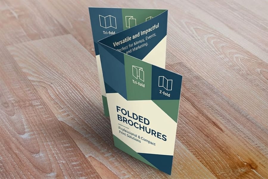
Same parts, different math. Fold an 8.5 x 11 sheet twice and you get six panels roughly 3.7 inches wide; fold it once and you get four 5.5 x 8.5 panels. The fold sets that panel count, decides which face a reader meets first, and fixes where the call to action has to sit so it is the last thing they see rather than the first thing they skip.
| Fold | Total panels | What lands on the front cover | What the first open shows | Where the call to action goes |
|---|---|---|---|---|
| Bi-fold | 4, two per side | The right-hand half of the outside sheet: one headline, one image. | Both inside panels at once, one wide spread, which is why a bi-fold works like a menu or a mini-catalog. | The back panel, the outside left half, with contact details. |
| Tri-fold | 6, three per side | The outside panel that wraps on top, carrying the hook that earns the open. | The inside flap swings out first and reveals one panel, then the full three-panel spread, so the story lands in two beats. | The last inside panel, repeated on the back panel with contact details. |
| Z-fold | 6, three per side | The top panel of the Z, with no panel tucked inside another. | One panel at a time as it concertinas out, then a flat three-panel spread, which suits a step-by-step or a timeline. | The final panel in the sequence, so the ask closes the reveal. |
Pick the row that matches how much you have to say, then write one message per panel before you open a design tool. How to fold a brochure shows each style folded, and common brochure sizes and fold options pairs the fold with the size it fits. For the paper and production side of the same decision, read professional brochure printing, from stock and fold to same day rush.
Visual hierarchy: guiding the reader through each panel
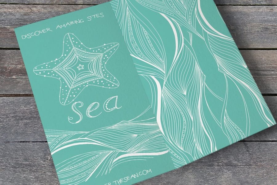
Visual hierarchy is the order your eye travels across a panel. Done well, the reader knows where to look first, second, and third without thinking about it. Done poorly, everything shouts at once and nothing gets read. On a tri-fold panel about 3.7 inches wide, that leaves room for a headline of a few words, one or two subheads and a short block of body copy.
Build hierarchy with three levels on every panel:
- The headline. The largest, boldest element. One idea, a few words, high contrast against the background.
- Subheads. Medium weight, used to break the panel into scannable chunks so a busy reader can skim.
- Body copy. The smallest and calmest text, kept short because a brochure is not a brochure if no one finishes it.
Size, weight, and spacing do the work here, not color alone. A reader should be able to squint at the panel and still see the headline first. If your cover has three competing headlines, you have no hierarchy, you have noise. Trim until one clear message leads.
Originality: a brochure that could only be yours

Originality is what separates a brochure that feels like your brand from one that looks pulled off a template shelf. It does not mean loud or experimental. It means the piece is unmistakably yours: your photography at 300 DPI, your palette, your voice, your layout choices, and a stock picked to match them, whether that is 100 lb gloss text for photo-led panels, 100 lb silk/matte or 70 lb uncoated text for a quieter feel, or 14 pt gloss cover for a stiffer piece.
The fastest way to look generic is to lean on stock imagery and default fonts that every competitor also uses. Swap in real photos of your product, your team, or your space, and the whole brochure gains credibility. Keep the design consistent with the rest of your marketing materials, so a customer who has seen your business cards or signage recognizes the brochure instantly.
Need a spark before you start? The company brochure examples article and the 4OVER4.COM brochure showcase are full of real designs you can learn from without copying. Originality is a remix of good ideas filtered through your own brand, not a blank-page act of genius.
Simplicity: one idea per panel
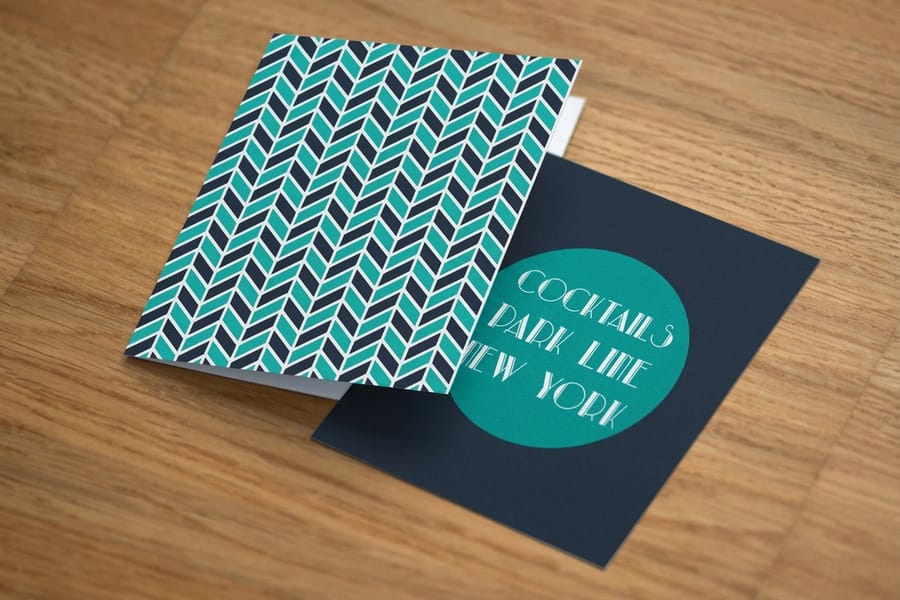
Simplicity is the hardest element to get right because the temptation is always to add more. More text, more images, more offers. But a brochure has limited panels and a reader with limited patience, so every element you add competes with the ones that matter.
Give each panel a single job, which on a tri-fold means six jobs at most and on a bi-fold four. The cover earns attention. This inside panel explains one benefit. That panel shows the product. The back panel closes with contact details and a call to action. When a panel tries to do three jobs at once, it does none of them well.
White space is not wasted space. The gaps around your headline and images are what make them feel considered and easy to read. If a panel feels cramped, the fix is almost never a smaller font, it is less content. Cut copy to the essentials, then design around the breathing room that is left. A simple brochure on the right stock, which you can compare in our best paper types for brochure printing guide, always outperforms a cluttered one.
Quality images: resolution, cropping, and mood
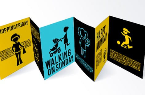
Images carry more of a brochure's message than most first-timers expect. A single strong photo can sell an idea faster than a paragraph, but only if it prints sharp. This is where a lot of brochures fall apart.
Three rules keep your imagery clean in print:
- Use 300 DPI at final size. A photo that looks crisp on screen can turn soft and pixelated once it is printed at full panel size. Always start with high-resolution originals.
- Crop with intent. Fill the panel, respect the fold, and never let a face or key detail land on a crease where it will bend.
- Keep the mood consistent. Photos that share lighting and color feel like a set. A mix of warm, cool, bright, and dark shots makes a brochure feel stitched together from scraps.
If a photo needs to run to the edge of the panel, it needs bleed, which we cover below. And if you are choosing between a glossy or matte finish for image-heavy panels, our matte vs glossy brochure guide explains how each coating changes the way photos read.
Color: palette, contrast, and consistency
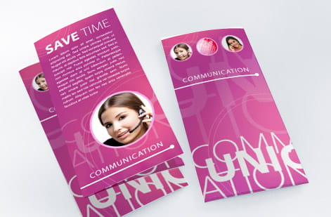
Color is the fastest way a reader connects a brochure to your brand, and the fastest way to make it look amateur if you overdo it. The elements above all depend on color being used with restraint.
Build around a tight palette. One or two brand colors, a neutral for backgrounds, and enough contrast between text and its background to stay readable in a reader's hands, not just on a bright screen. Dark text on a light panel is the safest choice for body copy. Save bold color blocks for covers and callouts where you want the eye to stop.
Consistency matters as much as the colors themselves. The same palette should run across every panel and match your other pieces, so your brochure, brochure printing orders, and wider marketing materials all look like one family. Remember that print color and screen color differ, so review a proof or order free paper samples before a large run to see how your palette actually lands on the stock you chose.
Bleed, safe zone, and fold marks: the print specs that save your design
This is the element that separates a design that looks great on screen from one that prints clean, and it is where most first brochures go wrong. Three terms do all the work.
Bleed is the extra artwork that extends 0.125 inch (one eighth inch) past every trim edge. Any color or image meant to reach the edge of a panel must run into the bleed. Without it, the cutting process leaves thin white slivers along the edges when the blade drifts even slightly.
The safe zone is the opposite margin: keep all text, logos, and anything you cannot afford to lose at least 0.125 inch inside the trim line. Cutting has a small tolerance, and the safe zone guarantees nothing important gets clipped.
Fold marks tell you where each crease lands. Never place a headline, a face, or a logo directly on a fold, because the crease will bend the ink and break the image. Design each panel as its own space with the folds as walls between them.
The good news: you do not have to set these by hand. The 4OVER4.COM online designer builds bleed, safe zone, and fold guides into every brochure template, and our standard brochure size and layout guide lists the exact document dimensions for each format.
Typography and a quick pre-print checklist

Typography is the quiet element that ties every panel together. Pick two typefaces at most, one for headlines and one for body, and let size and weight create hierarchy instead of adding a third font. Keep body copy at a comfortable reading size and give your lines enough spacing that a reader is not squinting on a folded panel.
Before you send a brochure to print, run this quick checklist:
- Hierarchy holds. Squint at each panel, the headline should still lead.
- Content maps to panels. One job per panel, nothing straddling a fold.
- Images are 300 DPI at final size and cropped clear of the creases.
- Palette is tight and consistent across every panel and your other materials.
- Bleed is 0.125 inch on all edges, with text safely inside the safe zone.
- Proof reviewed for spelling, phone numbers, and links, the details a reader will actually use.
When the checklist passes, you are ready. Learn the full production flow in how to make and print brochures, and if you plan to mail the finished piece, how to mail brochures covers the sizing and postage rules. Then configure your run on standard brochures or folded brochures at 4OVER4.COM. Every size and paper we print brochures on sits in one range, so you can compare them side by side first.
Wally explains brochure design
Design the parts first, and the whole piece reads itself
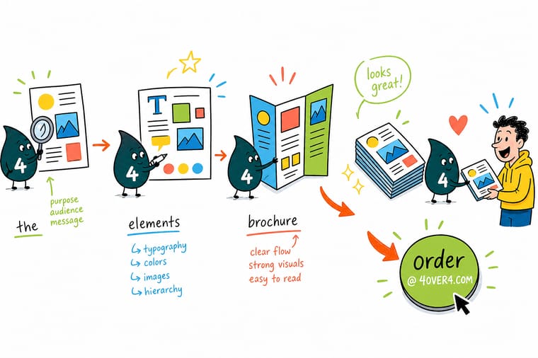
Wally treats a brochure like a tiny stage: the cover pulls people in, each inside panel plays one clear scene, and the back panel takes a bow with your contact details and call to action. Keep one idea per panel, let the images and color do the selling, and respect the bleed and fold lines so nothing gets cut off. Nail those parts and even a first-timer prints a brochure that looks made by a pro at 4OVER4.
Order brochures →
Specs and pricing
Standard brochure specs and pricing
Standard brochures come in six flat sizes from 5.5 x 8.5 to 11 x 25.5 inches, on 100 lb gloss text, 100 lb silk/matte text, 70 lb uncoated text or 14 pt gloss cover, printed on one side or both, with an optional high gloss UV coating, and runs start at 50 pieces. Once your layout is ready, the specs and price per unit below come straight from the configurator, so you never design around a guess.

| Quantity | Price Per Unit | Total |
|---|---|---|
| 50 | $1.14 | $57.11 |
| 100 | 82.4¢ | $82.38 |
| 200 | 53.3¢ | $106.55 |
| 300 | 41.0¢ | $123.02 |
| 400 | 34.9¢ | $139.49 |
| 500 | 31.2¢ | $155.97 |
| 600 | 26.7¢ | $160.36 |
| 700 | 23.5¢ | $164.75 |
Print it
Order brochures at 4OVER4

See it in use
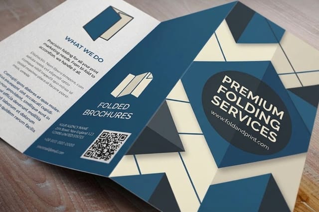
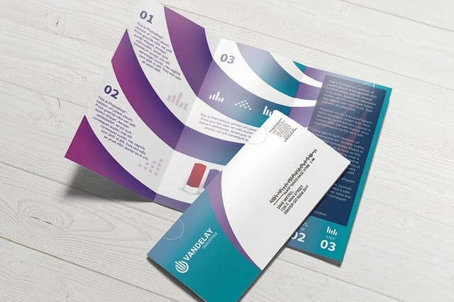
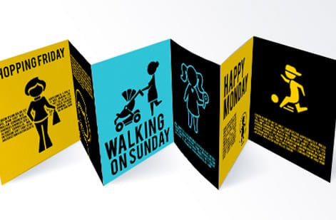
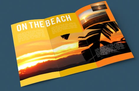
Brochure layouts we printed for clients



Explore more
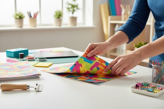
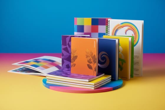
Where to go next



By the numbers
Flat at 50 for $57.11, direct mail at 500 for $238.73
Common Questions
Common questions about brochure design
What goes on the back panel of a brochure?
The back panel is where the reader finishes, so it carries the contact details and the call to action: business name, phone, email, website, and an address or a map if people have to find you, plus the one action you want taken. On a bi-fold it is the outside left half, on a tri-fold it is the panel that faces out when the piece is closed. If the brochure will be mailed, the back panel doubles as the address panel, so leave that area clear of artwork for the label and the postage, and keep the logo and brand colors on it so the piece is recognizable face down. Keep it to one action, stated plainly, and hold everything 0.125 inch inside the trim.
What is originality in brochure design?
Originality is designing a brochure that could only belong to your brand. It means using your own photography instead of stock filler, your real color palette, and a layout built around your message rather than a generic template. Originality does not mean loud or complicated. A clean, distinctive brochure that matches the rest of your marketing, from your business cards to your signage, is far more memorable than a busy one copied from a competitor.
What is simplicity in a brochure?
Simplicity is giving each panel a single job. One idea, one headline, and enough white space to let it breathe. A simple brochure guides the reader from the cover to the offer to the call to action without making them work for it. The most common design mistake is trying to say everything at once, which buries the one message that matters. Cut copy until only the essentials remain, then design around them.
What are the parts of a brochure?
The parts of a brochure are its panels, and the folds decide how many you have. A standard tri-fold has six panels: a front cover, a back panel, and four interior panels for your content. Every brochure shares the same core zones no matter the fold: a cover that earns attention, inside panels that carry the message and imagery, and a closing panel with contact details and a clear call to action. Learn how those panels change with each fold in our guide on how to fold a brochure.
Which panel does a reader actually see first?
Start with the fold, because it sets your panel count and reading order. A tri-fold suits a quick sales pitch, a bi-fold works like a menu or a mini-catalog, and a gate-fold builds a dramatic reveal. Match the fold to how much you need to say, then map one message to each panel. Our guide on common brochure sizes and fold options walks through which fold fits which job, and the free online designer lets you drop your content into a print-ready layout.
What is an example of a brochure?
A tri-fold on an 8.5 x 11 sheet of 100 lb gloss text is the classic example: six panels, a cover that hooks, an inside flap that sets up the offer, three inside panels that explain it, and a back panel with contact details. A bi-fold price list that opens like a menu is another. Standard brochures start at a run of 50 in six sizes up to 11 x 25.5 inches.
What does a brochure cost and how is the price set?
Brochure pricing is driven by four choices: size, paper stock, fold, and quantity, with finishing options like gloss or matte coating on top. Larger sheets, heavier stocks, and special coatings raise the unit cost, while higher quantities lower the price per piece. Rather than quote a fixed number, the price table and specs widget on this page pull live pricing straight from the configurator, so you always see the current rate for the exact brochure you build.
How much bleed does a brochure need?
A brochure needs a 0.125 inch (one eighth inch) bleed on every edge. Bleed is the extra artwork that extends past the trim line so that when the sheet is cut, the ink runs cleanly to the edge with no white slivers. Keep all text and logos at least 0.125 inch inside the trim line, inside the safe zone, so nothing important gets clipped. Our best paper types guide and the online designer both build these margins in for you.
What is the difference between a standard brochure and a folded brochure?
A standard brochure at 4OVER4.COM is a flat printed sheet, ideal when you want a single large layout or plan to fold in-house. A folded brochure arrives already scored and folded to your chosen style, tri-fold, bi-fold, or more, so it is ready to hand out. Both use the same design elements, hierarchy, imagery, color, and bleed. The choice is whether you want the fold done for you, and how you plan to distribute the piece.
Get Started
Drop your panels in and we handle the bleed and the safe zone
Pick your size and fold, drop your panels into a print-ready layout, and we print a crisp, professional brochure with the bleed and safe zone handled for you.
Legal Disclaimer
Gold Standard guarantees apply to all standard orders placed through 4over4.com. Price match requires verifiable proof of a competitor's published price for an equivalent product with matching specifications and turnaround time. Satisfaction guarantee covers manufacturing defects and print quality issues. Contact support with order number and documentation.
