
How to Choose the Right Fonts and Sizes for Your Brochure


Sofia is our design and templates voice, built from the knowledge of our production team, with over 20 years in printing.
Brochure fonts and sizes for a piece read in the hand, not on a screen: ten point body copy is the safe floor, and below eight nobody finishes a paragraph.
For a hand-held brochure, size type in tiers: cover title 28 to 40 pt, section headlines 16 to 24 pt, subheads 13 to 16 pt, body copy 9 to 11 pt, and captions or legal 7 to 8 pt. Keep at least a 1.5x jump between tiers, use two typefaces paired by contrast, and confirm it all on a printed, folded proof before you order. If you are sizing the pamphlet itself, brochures print flat at 5.5 by 8.5, 8.5 by 11, 8.5 by 14, 9 by 12, 11 by 17 or 11 by 25.5 inches, and an 8.5 by 11 sheet folded in three is the standard tri-fold pamphlet size.
Quick answer
The brochure type scale at a glance
Give every level of text its own point size and keep a clear gap between them: cover title 28 to 40 pt, section headlines 16 to 24 pt, subheads 13 to 16 pt, body copy 9 to 11 pt, and captions or legal 7 to 8 pt. Pair two typefaces by contrast, match their x-heights, set leading at 120 to 145 percent of the point size, and keep lines to 45 to 75 characters. Then prove it on a folded printed sample before the full run.
Why brochure typography decides whether anyone reads it
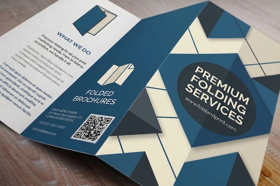
A brochure earns its first read in the space of a glance. Someone picks an 8.5 by 11 tri-fold off a counter, sees the cover panel, and decides in about a second whether to open it or set it back down. That decision is made almost entirely by type: a title at 28 to 40 pt or one that whispers, the confidence of the headline, the calm of the body copy underneath. Choose the fonts and sizes well and the panel invites the eye in. Choose them carelessly and even a great offer reads as noise.
Size is the part most people underestimate. A brochure is held in the hand at roughly a foot away, not scrolled on a screen, so the point sizes that look generous on your monitor can turn to gray mush on paper. This guide gives you the exact ranges for every tier of text, a panel-by-panel map for a fold, and the pairing rules that most quick tutorials skip. It ends where every layout ends, at the press, so your finished brochures read as sharply in a customer’s hand as they did in your design app.
None of it requires a design degree. It requires a scale you can trust and the discipline to test it. Let’s build that scale.
Brochure type terms, minus the jargon
Five words do most of the work, and knowing them saves you from expensive guesses at the printer. Point size is how tall the type is, measured in points where 72 points equals one inch. Leading is the vertical space from one line of text to the next, and loose leading is what keeps a paragraph from feeling cramped. x-height is the height of a lowercase letter, and a taller x-height reads better at small sizes. Measure is the length of a line of text, ideally 45 to 75 characters. Weight is stroke thickness, from hairline to black, and it is your main tool for contrast.
Typefaces sort into four working families. Serif faces have small feet on the letters and read as classic and trustworthy. Sans-serif faces drop the feet for a clean, modern look. Script faces mimic handwriting and add warmth or celebration. Display faces are the loud headliners built to be big and used sparingly. Get comfortable with those families and five measurements and you can judge any layout in seconds. If a term ever trips you up mid-project, the printing terms glossary keeps plain-English definitions one tab away.
These same ideas scale up and down. The point-size logic that governs a brochure panel is the identical logic behind our letterhead design tips on font size, style, and format, just applied to a different canvas.
Exact font sizes for every level of a brochure
Start from six tiers, largest to smallest, and write the point sizes into your style sheet before you place a word. Treat these as reliable defaults for a standard hand-held brochure, then nudge them to fit your content and paper. The one rule that matters most: keep a real gap between each tier, ideally a 1.5x jump, so the hierarchy is obvious before a single word is read.
- Cover title: 28 to 40 pt. The one line that has to work from across a table. On a small tri-fold panel, lean toward 28 to 32 pt. On a larger bi-fold cover you can push to 40 pt.
- Section headlines: 16 to 24 pt. The signposts inside the brochure that tell a skimmer what each block is about.
- Subheads: 13 to 16 pt. Optional second-level labels that break a long section into scannable chunks.
- Body copy: 9 to 11 pt. Ten point is the safe default. Drop to 9 only when space is tight, and never below 8 for anything you expect people to actually read.
- Captions and contact lines: 8 to 9 pt. Small but still legible, for photo captions and the address block.
- Legal and disclaimers: 7 to 8 pt. The floor. Below 7 pt, fine strokes can break up on press and older eyes give up entirely.
Notice the body copy sits at 9 to 11 pt, not the 11 to 12 pt you would use for a full letter-size document. A brochure is denser and read closer, so slightly smaller body text still reads comfortably while leaving room for images and white space. Want a matching flyer for the same campaign? The same scale drops straight onto flyers, with the headline sized up because a flyer is often read from a few feet further away.
Sizing type panel by panel across a fold
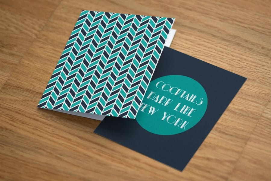
Fold a sheet of printer paper into three and you have the order a reader meets your type: cover, first inside panel, full spread, back. A brochure is a sequence of panels, not one page. Each panel has a job, and the type sizes should follow that job rather than staying flat across the whole piece. The map below shows where each tier belongs on a standard tri-fold.
Front cover panel: this is a billboard, not a paragraph. Give it a title at 30 to 40 pt and a single tagline at 14 to 18 pt, and resist the urge to add more. One strong line pulls the fold open.
Inside panels: this is where the reading happens. Set section headlines at 18 to 22 pt and body copy at a steady 10 pt, and keep each panel to one or two ideas so nothing feels crammed against the folds. Leave a few millimeters of breathing room on either side of every crease so no letter lands on a fold line.
Back panel: usually the contact and call-to-action panel. Contact details sit comfortably at 10 to 12 pt, and any legal text or disclaimers drop to 7 to 8 pt. If the brochure will be mailed, the back panel also carries the address area, so keep it clear. To see how the panels themselves are built, our guide on how to fold a brochure walks through the four common folds and how the panels relate.
How to pair two typefaces (the part most guides skip)
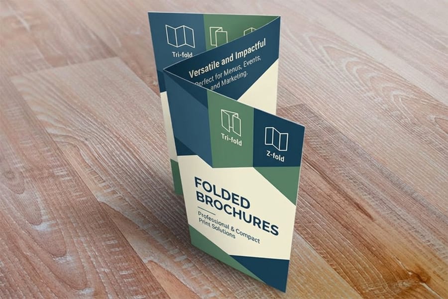
Two faces on one tri-fold is the working limit, and the choice of which two decides whether the scale above looks designed or accidental. Most tutorials stop at "use two fonts" and leave you to guess which two. These are the rules that make a pairing work on a printed panel.
- Pair by contrast, not similarity. A serif headline over a sans-serif body, or the reverse, reads as an intentional system. Two faces that are almost alike just look like a mistake.
- Match the x-heights. When two faces share a similar lowercase height, they sit at compatible sizes and the page feels balanced. Mismatched x-heights force you to fight the point sizes to make them agree.
- Let one face lead. The display or serif carries the cover and headlines. The clean face carries everything you read. Do not ask both to be the star.
- Steal contrast from weight and size before adding a third font. A bold and a regular of the same family often does everything a third typeface would, with none of the clutter.
- Borrow from your brand first. If your logo and website already use two faces, use those. Consistency is what makes the brochure feel like it came from a real company and not a template.
If you would rather not audition fonts from scratch, a starting layout gets you most of the way. Our free design templates already respect these pairing and sizing rules, so you can swap in your copy and stay on a safe path. And because a brochure is one piece of a bigger set, the pairing you choose here should echo your marketing materials so every touchpoint looks related.
Leading, line length, and spacing: the settings that make small type readable
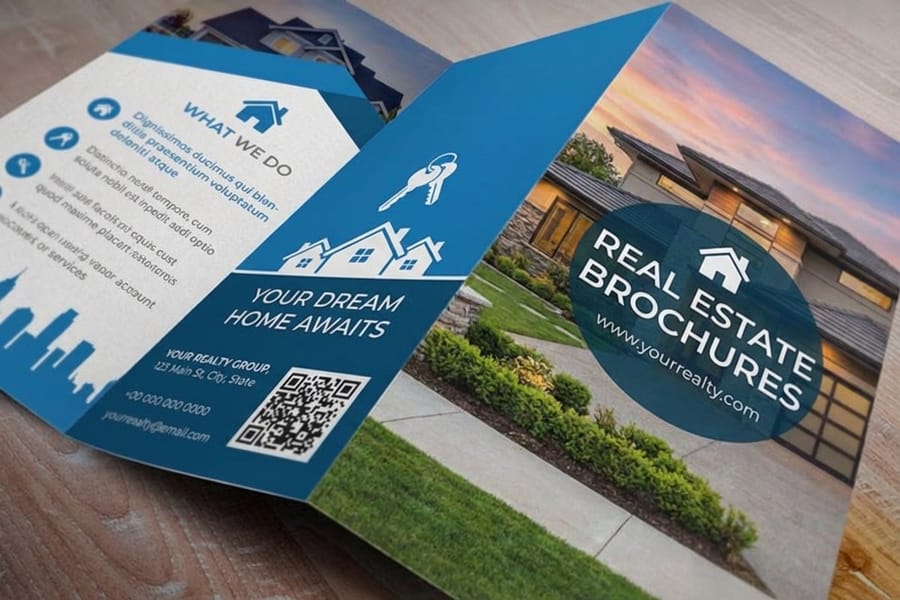
Set 10 pt body copy on 13 to 14 pt leading and it reads easily; set the same font on 11 pt leading and it reads like a contract. Size is only one setting. Leading and line length decide whether that 10 pt copy feels effortless or exhausting.
- Leading: set line spacing at roughly 120 to 145 percent of the point size. Ten point body copy reads well on about 13 to 14 pt leading. Too tight and the lines blur together. Too loose and the paragraph falls apart.
- Line length: aim for 45 to 75 characters per line. Brochure panels are narrow, so one column per panel is usually right. A line that runs the full width of a wide panel is tiring to track back to the start.
- Alignment: left-aligned body copy is the safest and most readable. Justified text can leave awkward rivers of white space in a narrow column, so use it only with careful hyphenation.
- Letter-spacing: leave body copy at its default. Add a touch of tracking only to short lines of all-caps, like a cover tagline, where tightly set capitals otherwise crowd together.
These settings matter even more on textured or coated stock, where ink behaves differently. If you are still deciding on paper, our guide to the best paper types for brochure printing pairs nicely with this one, since a heavier coated sheet holds fine type more crisply than a soft uncoated stock.
Match the typeface to the brochure’s job and your brand
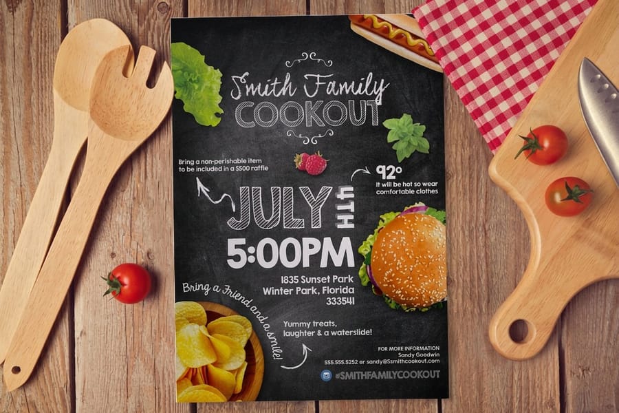
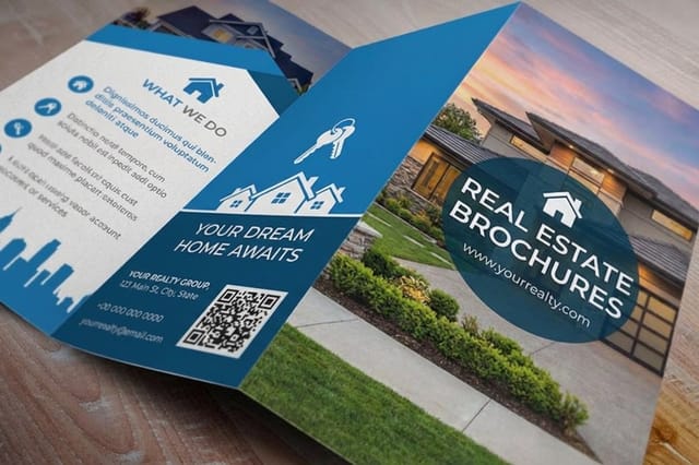
Before you lock a face, say the brochure’s job out loud. A real estate listing, a restaurant menu, a nonprofit appeal, and a product spec sheet all want different tones, and the type carries that tone before anyone reads a word. Every typeface has a personality, so make sure the letters agree with the message. The real estate brochures story shows a listing piece in print, and if you lay out in Word, try these brochure design ideas you can pull off in MS Word.
- Trust and expertise: classic serifs and steady humanist sans-serifs. Good for medical, legal, financial, and real estate brochures.
- Modern and clean: geometric sans-serifs. Good for tech, product, and startup brochures.
- Warm and personal: a restrained script for the cover only, paired with a plain body font. Good for weddings, salons, and hospitality.
- Bold and energetic: heavy display or condensed faces for the headline. Good for events, sales, and grand openings.
Your brand is the shortcut. Open your logo and website, use the type that already lives there, and the brochure instantly looks like part of the family. This is the same discipline behind good identity work, and the 6 key principles of logo design translate directly to how you handle type on a panel. When the brief leans playful, a font library helps, and roundups like our 15 retro fonts collection are a good place to pull one characterful display face.
Set your brochure type up to print clean
Type that looks perfect in your design app can still break at the press. A few habits keep the printed brochure matching your screen exactly.
- Outline or embed your fonts before you export the PDF, so the press renders the exact letters you chose instead of substituting a default.
- Keep type inside the safe zone and clear of the fold lines and the trim, so no letter gets clipped or lands on a crease.
- Set small text in a single solid color. Tiny type built from several ink layers can misregister and look fuzzy, so keep captions and legal text at 100 percent black rather than a rich-black mix.
- Mind the finish. Fine hairline type can lose contrast on a glossy or reflective stock, so give delicate faces a little more weight when the sheet is coated.
- Test at real size. Export a proof, fold it, and read it at arm’s length. If you squint at the body copy, size it up before you order.
When the file is ready, the online designer lets you lock the layout in the browser and send it straight to print, and free paper samples let you feel how your chosen stock holds fine type before you commit to the run. For the sizing side of the format itself, our common brochure sizes and fold options guide shows how the panel dimensions shape how much type you can fit.
Wally sizes up your brochure
One scale, every panel, always legible
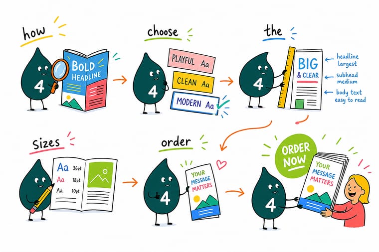
Wally treats a brochure like a stack of tiny billboards: the cover title shouts, the headlines guide, the body copy stays calm, and nothing fights the folds. His trick is a single type scale reused on every panel so the whole piece feels like one company talking. Build your scale, then print it on a brochure that holds fine type crisply at 4OVER4.
Order brochures →
Specs and pricing
Custom brochure specs and pricing
Once your type scale is set, here is what a printed brochure gives you at 4OVER4.COM, with live specs and price-per-unit straight from the configurator. Brochures start at 50 for $57.11 in six flat sizes from 5.5 by 8.5 to 11 by 25.5 inches, on 100# gloss or silk text, 70# uncoated text or 14pt gloss cover, with a half fold option and 3 business days of production.
| Quantity | Price Per Unit | Total |
|---|---|---|
| 50 | $1.14 | $57.11 |
| 100 | 82.4¢ | $82.38 |
| 200 | 53.3¢ | $106.55 |
| 300 | 41.0¢ | $123.02 |
| 400 | 34.9¢ | $139.49 |
| 500 | 31.2¢ | $155.97 |
| 600 | 26.7¢ | $160.36 |
| 700 | 23.5¢ | $164.75 |
Print it
Brochures and flyers to put your type on
Folded and real estate brochures share the same six sizes and four stocks from $57.11 for 50, so your 10 pt body copy lands on 100# gloss or silk text. Club flyers start at $16.48 for 50 on 14pt gloss cover, in 14 sizes for the campaign piece that carries the same headline face.

See it in use
Type we set and printed on folded panels
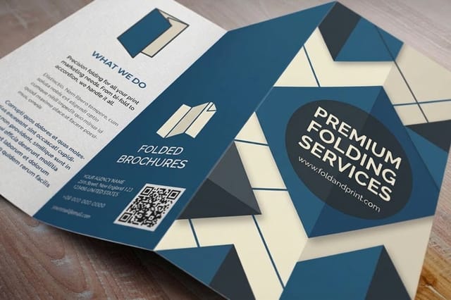
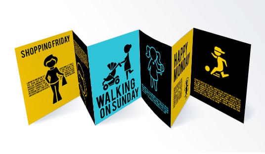
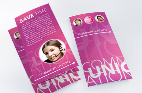
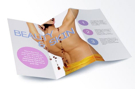
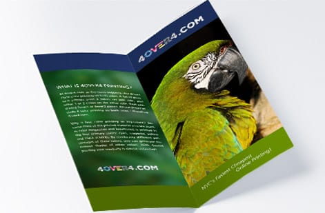
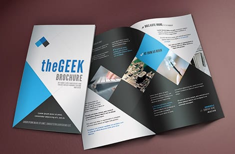
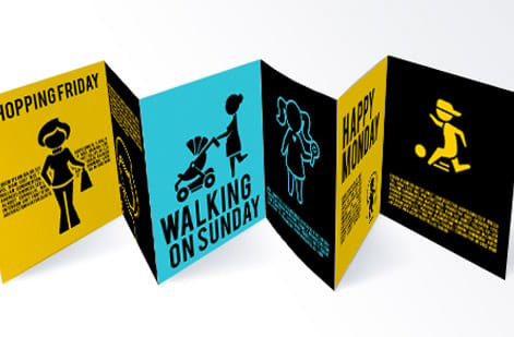
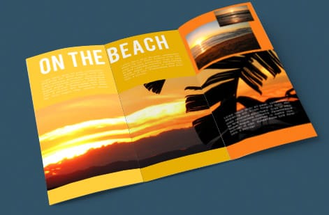
Check these finished jobs against the scale above: a cover title that reads from across a table, body copy at 9 to 11 pt inside, and legal lines no smaller than 7 pt on the back panel.


Explore more
Where to go next
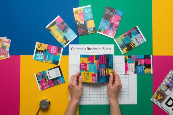


By the numbers
Brochures at $1.14, club flyers at $0.33
Common Questions
Common questions about brochure fonts and sizes
What font size should brochure body text be?
Set brochure body copy at 9 to 11 pt, with 10 pt as the safe default. A brochure is held at about a foot away, so this reads comfortably while leaving room for images and white space. Drop to 9 pt only when space is genuinely tight, and never go below 8 pt for anything you expect a reader to sit with. Captions and contact lines can run at 8 to 9 pt, and legal or disclaimer text at 7 to 8 pt, which is the practical floor for print.
What point size does a folded panel actually need?
Work down a scale and keep a real gap between tiers, ideally a 1.5x jump so the hierarchy is obvious at a glance. Cover titles run 28 to 40 pt, section headlines 16 to 24 pt, subheads 13 to 16 pt, body copy 9 to 11 pt, and captions or legal 7 to 8 pt. On a small tri-fold panel lean toward the lower end of each range. On a larger bi-fold you can push headlines higher. Always confirm the sizes on a printed, folded proof rather than on screen.
How many fonts should a brochure use?
Two is the sweet spot: one display or serif face for the cover and headlines, and one clean face for the body copy. Get any extra variety from weight, size, and color within those two families rather than adding a third typeface. Pair the two by contrast, a serif with a sans, and choose faces with similar x-heights so they sit at compatible sizes. More than two fonts on a brochure panel usually reads as clutter and pulls the eye away from your message.
What point size should the brochure cover title be?
A cover title carries the whole first impression, so size it to work from across a table. On a standard tri-fold panel, 28 to 32 pt is usually right. On a larger bi-fold cover you can push to 40 pt. Pair it with a single tagline at 14 to 18 pt and keep the rest of the cover clear. One strong, well-sized line is what pulls a reader to open the fold.
What does a custom brochure cost and how is the price set?
Price is driven by size, paper stock, quantity, fold, and turnaround, so a house-stock tri-fold and a premium coated bi-fold sit at very different points. At 4OVER4.COM, 50 brochures start at $57.11 and 100 cost $82.38, and a larger flat size such as 11 by 17 gives your body copy room to stay at 10 pt instead of dropping to 9. The live SpecsWidget and PriceTableWidget on this page pull real per-quantity pricing straight from the 4OVER4.COM configurator, and the per-unit cost drops as quantity rises. Bulk runs and daily deals lower the price further, and free paper samples let you compare stocks before you commit.
What sizes, stocks, and finishes are available for brochures?
Brochures print in standard sizes from 8.5x11 down to compact panels, on 60+ paper stocks, with folds including half-fold, tri-fold, and z-fold, plus finishes from uncoated matte to gloss and silk. Your type choices should follow the stock: fine hairline faces hold up better on a coated sheet, while a sturdier weight is safer on a soft uncoated stock. Browse the full range on the brochures printing category page to compare options side by side.
Get Started
Order 50 folded brochures at $1.14 each
Set your type scale, drop the layout into our online designer, and we print crisp, well-set brochures on the stock and fold you choose.
Legal Disclaimer
Gold Standard guarantees apply to all standard orders placed through 4over4.com. Price match requires verifiable proof of a competitor's published price for an equivalent product with matching specifications and turnaround time. Satisfaction guarantee covers manufacturing defects and print quality issues. Contact support with order number and documentation.
