
Graphic Design Terms Explained, From Bleed and CMYK to Bezier Curves


Emma is our prepress and print production voice, built from the knowledge of our production team, with over 20 years in printing.
Forty terms grouped by the job they do, with a plain definition and a note on what each one changes when your file reaches the press.
Graphic design terminology is the shared vocabulary designers and printers use for color, type, layout, press work and vector artwork. Most of it is descriptive, but a short list changes what physically happens to your order: bleed, trim, safe zone, CMYK, effective resolution, vector and spot color. Learn those seven and you can read a print spec, brief a designer, and catch the errors that cause reprints.
Quick answer
Bleed, trim and safe zone, drawn on a real card
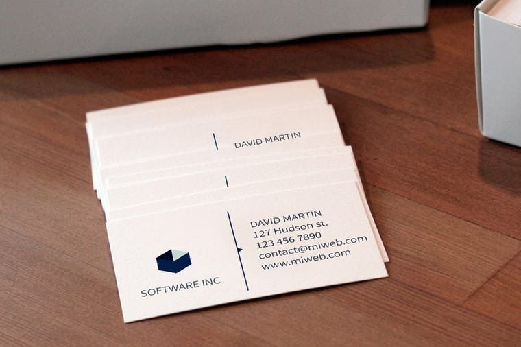
Three of the terms in this glossary have a measurement attached, and those three decide whether a file prints correctly. Bleed is artwork pushed 0.125 in past the cut. Trim is the finished size and the line the blade aims at. The safe zone is the 0.125 in margin inside the trim where type is allowed to live. On a 3.5 by 2 in business card that means a 3.75 by 2.25 in document with a 3.25 by 1.75 in area for anything you need people to read.
Why the Vocabulary Changes What You Pay

Reprints are almost never caused by a bad idea. They are caused by a file that met the design brief and missed the press requirement, and the gap between those two is usually one word nobody defined.
The pattern repeats. A logo supplied as a 600 pixel PNG looks fine in the email and prints soft at 3 in wide, because nobody said vector. A background stops dead at 3.5 by 2 in, and one card in the box shows a white sliver, because nobody said bleed. A brand blue that glowed on the monitor lands flat and grey, because nobody said CMYK. Each of those is a paid reprint plus a lost week.
So this glossary is grouped by the job the term does, not alphabetically by accident. Color words, layout words, type words, press words and vector words. The quick reference table further down is alphabetical for when you already know what you are looking for, and its third column tells you what each term actually does to your order. If you only read one group, read the print terms, then check your file against our bleed and trim guide before you upload.
Color Terms: CMYK, RGB, Spot and the Ones That Bite
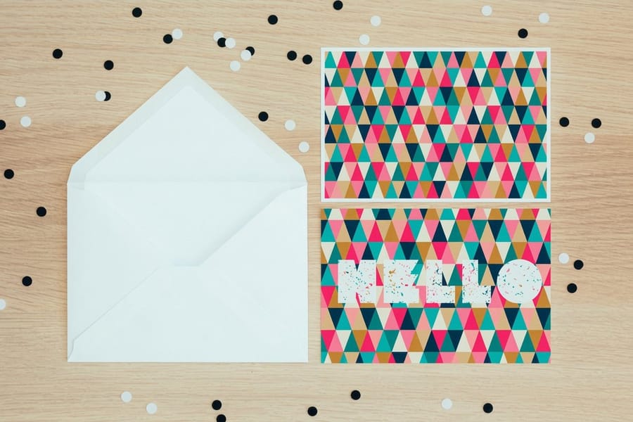
CMYK is the set of four process inks a press actually carries: cyan, magenta, yellow and key, which is black. Every other color on the sheet is those four laid in overlapping dot patterns. RGB is red, green and blue light, which is how a screen makes color by adding brightness rather than absorbing it.
That difference is not academic. The brightest RGB blues, greens and oranges have no four ink equivalent, so they arrive duller than the monitor promised. Convert your artwork to CMYK yourself and judge it there, rather than letting the conversion happen after you approve a proof. The CMYK and RGB comparison walks through which colors survive the trip.
A spot color is different again. It is a pre mixed ink, normally called out by a Pantone number, so it lands identical every run instead of being rebuilt from three inks each time. It costs an extra plate, which is why it earns its keep on packaging and stationery and rarely on a one time flyer. Our spot color explainer covers when to spend it.
Three more that come up constantly:
- Rich black is black built from several inks, commonly 60C 40M 40Y 100K. Use it for large solid panels so they read as true black instead of washed out charcoal. Use plain 100K for small text, because four inks on 8 point type will show every registration shift.
- Achromatic means no hue at all: black, white and grey. Worth knowing because grey mixed from four inks drifts warm or cool between runs, while grey built from black alone stays exactly where you put it.
- Analogous colors are three hues sitting next to each other on the wheel. They look harmonious on screen and can collapse into one another in CMYK, so separate them by lightness as well as by hue.
Layout and Balance Terms: Artboard, Grid, Alignment, Balance
Layout vocabulary is the least dangerous group, because getting it wrong makes a piece look mediocre rather than unprintable. It is still worth knowing, because the words come up in every set of revisions.
The artboard is the canvas in Illustrator or InDesign that becomes the printed piece. Set it to the finished trim size and add bleed in the document setup dialog, not by drawing a rectangle and hoping. Alignment is lining elements to a shared edge or center line, and the trap in print is aligning to the bleed edge rather than the trim edge, which pushes everything an eighth of an inch off center on the finished card.
Balance is how visual weight sits across the layout. Symmetrical balance mirrors weight around a center line and reads formal, which is why invitations lean on it. Asymmetrical balance spreads it unevenly and still holds, which is what lets one large photograph outweigh a block of text on a flyer. The full treatment is in our guide to balance in graphic design, and the wider set of principles sits in the principles of design.
Aspect ratio is the proportion of width to height, and it decides what happens when a 4:3 photograph has to fill a 2:1 space. Crop it deliberately in the file rather than letting layout software stretch it. Gutter is the gap between columns or between the panels of a fold, and on a folded piece it has to absorb the fold itself, so keep type well clear of it.
Typography Terms: Baseline, Ascender, Bowl, Bracket
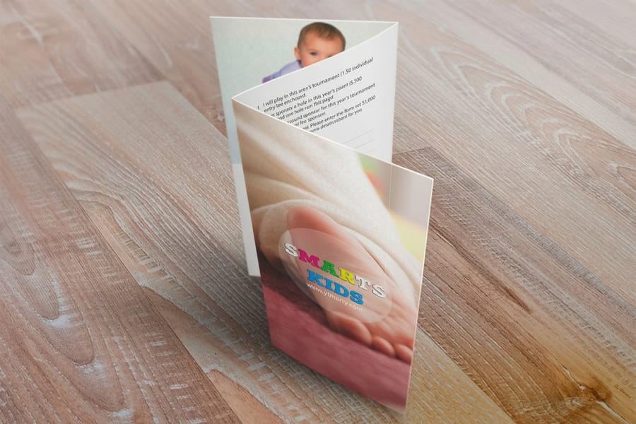
Type vocabulary sounds like anatomy because it is. Every part of a letter has a name, and the named parts are exactly the parts that fail at small sizes in ink.
The baseline is the invisible line the letters sit on. An ascender is the stroke that rises above the x-height in b, d, h and k, and a descender is the stroke that drops below it in g, p and y. The x-height is the height of a lowercase x, which is why two fonts set at the same point size can look a full size apart. The bowl is the closed round part of b, p and o. The bracket is the curved joint where a serif meets the stem.
Here is where it turns practical. Small bowls fill with ink on uncoated stock, so 6 point type with tight counters turns into grey mush that looks fine on your screen. Unbracketed hairline serifs are the first detail to vanish in small print. Tight leading, the distance from one baseline to the next, makes ascenders collide with the descenders above, and ink spread makes that collision worse than the screen suggests. For print body copy, leading around 120 to 145 percent of the type size is a safe working range.
Kerning is the spacing between one specific letter pair, tracking is uniform spacing across a run of letters, and bold should be a real drawn weight rather than a faux bold applied by software, which thickens strokes unevenly and closes up counters. Choosing sizes for a specific piece is covered in our letterhead design tips.
Print Terms: Bleed, Trim, Safe Zone, Crop Marks
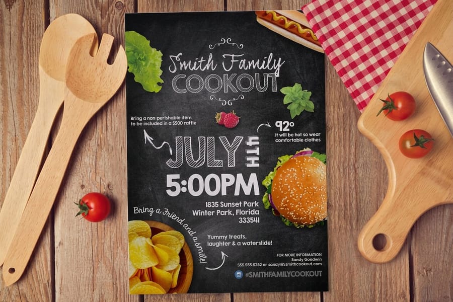
This is the group that decides whether a file prints correctly, so read it even if you skip the rest. Three terms, one measurement each.
Bleed is artwork extended past the cut, 0.125 in on every side. Trim is the finished size and the line the blade aims at. Safe zone is the margin inside the trim, again 0.125 in, where nothing important is allowed to sit. On a 3.5 by 2 in business card that means a 3.75 by 2.25 in document, a 3.5 by 2 in trim, and a 3.25 by 1.75 in area for anything you actually need people to read.
The reason all three exist is that sheets are cut in stacks and the stack moves. Drift of about a sixteenth of an inch is normal on any cutter, not a defect. Bleed absorbs the drift on the outside so no white hairline appears, and the safe zone absorbs it on the inside so no phone number gets shaved. A file built at exactly 3.5 by 2 in with a colored background has no margin for either.
Around those three sit the terms you meet at export. Crop marks are the short lines outside the bleed that show the cutter where the trim is, exported with an offset so they never print inside the piece. Registration is how precisely the four ink layers line up, which is why fine reversed type built from three inks is a bad idea and the same type in solid black is fine. Overprint means an ink prints on top of another instead of knocking it out, useful for small black text and disastrous if you accidentally set white to overprint, because it vanishes.
- Coating is the finish over the ink. Gloss deepens photographs and resists fingerprints but fights pen ink, so glossy cards are a poor choice if people write on the back. Matte kills glare and takes a pen. Soft touch changes how the card feels more than how it looks.
- Score is a pressed crease that lets heavy stock fold without cracking. Anything above 100 lb cover needs one, or the coating splits along the fold line.
- DPI and effective resolution are not the same number. Presses run far above 300 dpi. What you control is ppi at final size, and 300 ppi at the printed dimensions is the working target. The detail is in DPI vs PPI for designers and in our print resolution guide.
Every product page on 4OVER4.COM lists the exact bleed and safe zone for that size, and the blank template library hands you a file with all three edges already drawn. Both beat measuring by hand.
Vector and Shape Terms: Bezier Curves, Paths, Die Lines
Vector artwork is described by paths and points, so it has no fixed resolution and prints equally sharp at any size. Raster artwork is a fixed grid of pixels, so enlarging it forces software to invent pixels that were never captured. That single distinction settles most logo file arguments.
A Bezier curve is the shape a path takes between anchor points, controlled by direction handles. It is why vector curves stay smooth at any scale, and why a path with fewer, better placed anchor points cuts more cleanly than one with fifty. Outlines are what you get when live text is converted into those same shapes, which removes any chance of a font substitution on our end. Keep an editable copy before you outline, because outlined text cannot be edited or spell checked again.
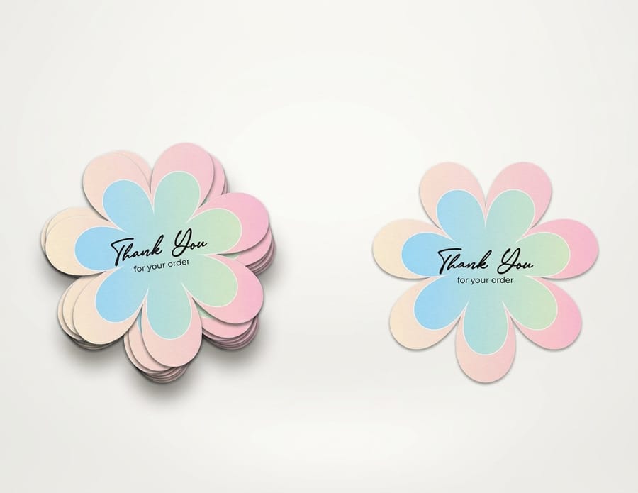
A die line is a vector path that tells a cutter what shape to cut rather than what to print. It belongs on its own layer, drawn as a spot color stroke, never as part of the artwork. Get that wrong and the line prints as a visible outline instead of guiding the blade. This is exactly how die-cut stickers at $93.37 are produced, and the setup is covered step by step in our sticker sheet design guide.
An abstract mark is a logo built from a non literal shape rather than a picture of what the business sells. It is the format that survives a quarter inch on a card and 6 ft on a banner, provided it is drawn simply. Our logo design best practices covers the print side of that decision. File formats follow the same logic: AI, EPS, SVG and vector PDF keep paths live, while JPG, PNG and TIFF flatten everything to pixels. The file type guide lays out which to send when.
Putting the Terms to Work on a Real Order
Vocabulary is only useful at the moment you upload. Here is the sequence that catches almost everything, in the order it saves you the most money.
Start from a correctly sized file rather than a blank canvas. The blank template library gives you a document with bleed, trim and safe zone already marked for the product and size you picked, which removes the three most common failures before you draw anything. If you would rather work in the browser, the online design templates handle the geometry for you, and the business card design tool walkthrough shows the whole flow.
Then run four checks. Is the document in CMYK. Is every placed image 300 ppi at the size it prints, not at its original size. Is every logo vector, or at least large enough that it never gets enlarged. Does the background reach the bleed line while all type sits inside the safe zone. Four questions, roughly two minutes, and they cover the overwhelming majority of reprints we see.
After that, order small before you order large. Standard business cards start at $17.57, standard postcards at $16.48 and standard flyers at $39.54, so a short run is a cheap way to see how your color and type behave in ink before you commit to a full print run of brochures at $57.11. Judging color from a physical piece under normal office light tells you more than any monitor will.
Quick reference
The print design glossary, sortable and searchable
Forty terms in one table. Type in the box to filter, or click the Term or Group heading to sort. The last column is the one that matters when you upload a file. Three rows carry a number you can check in your layout app: bleed at 0.125 in past the trim, the safe zone 0.125 in inside it, and images at 300 ppi at the size they print.
| What it means | Why it matters on a print order | ||
|---|---|---|---|
| Abstract mark | Brand | A logo built from a non literal shape rather than a picture of the thing it sells. | Simple marks survive being printed at a quarter inch on a card and blown up on a banner. Detailed ones do not. |
| Achromatic | Color | A palette with no hue at all, only black, white and greys. | Grey built from four inks shifts warm or cool between runs. Grey built from black alone stays put. |
| Alignment | Layout | Lining elements up to a shared edge, center line or baseline. | Align to the trim edge, never the bleed edge, or the finished piece looks off center by an eighth of an inch. |
| Analogous colors | Color | Three hues that sit next to each other on the color wheel. | Neighboring hues can collapse into one another in CMYK. Separate them by value, not only by hue. |
| Artboard | Layout | The defined canvas in Illustrator or InDesign that becomes the printed piece. | Set the artboard to the finished trim size and add bleed in document setup. Do not fake it with a drawn rectangle. |
| Ascender | Type | The stroke of a lowercase letter that rises above the x-height, as in b, d and h. | Tight leading makes ascenders touch the descenders of the line above, which reads worse in ink than on screen. |
| Aspect ratio | Layout | The proportion of width to height. | A 4:3 photo dropped into a 2:1 banner has to be cropped or stretched. Crop it deliberately in the file. |
| Asymmetrical balance | Layout | Visual weight spread unevenly but still stable. | Lets one large product photo outweigh a text block on a flyer without the page tipping over. |
| Balance | Layout | How visual weight is distributed across a layout. | A layout that leans left on screen leans left in a stack of 500 pieces. Print a single proof and look at it flat. |
| Baseline | Type | The invisible line the bodies of letters sit on. | Aligning logo and tagline on a shared baseline is what makes a lockup look professionally set. |
| Bezier curve | Vector | A curve defined by anchor points and direction handles rather than pixels. | It is the reason vector art has no fixed resolution. Fewer anchor points also means smoother cut paths. |
| Bleed | Artwork extended past the trim line, normally 0.125 in on every side. | Without it, any drift in the cutting stack leaves a white hairline along one edge of the finished piece. | |
| Body copy | Type | The main running text, as opposed to headings and captions. | Below 7 point, body copy on uncoated stock starts to fill in as ink spreads into the fibers. |
| Bold | Type | A heavier cut of a typeface, drawn rather than calculated. | Faux bold applied by software thickens strokes unevenly and can close up small counters on press. |
| Bowl | Type | The closed rounded part of letters such as b, p and o. | Small bowls fill with ink at tiny sizes on absorbent stock, which is how 6 point type turns to mush. |
| Bracket | Type | The curved joint between a serif and the stem of the letter. | Bracketed serifs hold up in small print. Unbracketed hairline serifs are the first thing to disappear. |
| Branding | Brand | The full system of marks, colors, type and tone that identifies a business. | A brand with locked ink values reprints the same way in March and in October. One without does not. |
| Clipping mask | Vector | A shape that hides everything outside its own outline. | Masks hide overflow but do not delete it, so masked artwork still has to reach the bleed line underneath. |
| CMYK | Color | The four process inks: cyan, magenta, yellow and key, which is black. | This is what the press actually lays down. Everything you supply gets converted to it, with or without your input. |
| Coating | A finish applied over the ink: gloss, matte, soft touch or UV. | Gloss deepens photos and fights pen ink. Matte kills glare. Soft touch changes the feel more than the look. | |
| Crop marks | Short lines outside the bleed that show the cutter where the trim sits. | Export with crop marks and a 0.125 in offset so the marks never print inside the finished piece. | |
| Die line | A vector path that tells the cutter what shape to cut. | Draw it as a spot color stroke on its own layer, never as artwork, or it gets printed instead of cut. | |
| DPI | Dots per inch, the density of ink dots the press puts down. | Presses run far higher than 300 dpi. Your images only need 300 ppi at final size, which is a different number. | |
| Gutter | Layout | The space between columns, or between two pages of a fold. | On a folded brochure the gutter has to absorb the fold, so keep type well clear of it. |
| Kerning | Type | The spacing between one specific pair of letters. | Bad kerning in a logo is permanent once it is printed on 1,000 cards. Fix it before you outline the type. |
| Leading | Type | The vertical distance from one baseline to the next. | Around 120 to 145 percent of type size keeps print body copy readable. Screen defaults are usually too tight. |
| Outlines | Vector | Text converted from live characters into editable shapes. | Outlined type can never substitute the wrong font on our end. It also can never be edited again, so keep a live copy. |
| Overprint | Setting an ink to print on top of another instead of knocking it out. | Small black text is usually set to overprint so it does not need perfect registration. White set to overprint disappears. | |
| PDF/X | File | A print specific PDF standard that embeds fonts and locks color handling. | PDF/X-1a or PDF/X-4 removes almost every guess from the handoff. A plain PDF from a browser does not. |
| Raster | Vector | An image built from a fixed grid of pixels, such as a JPG, PNG or TIFF. | Enlarging a raster invents pixels that were never captured, which is what soft, blocky print looks like. |
| Registration | How precisely the four ink layers line up with each other. | Fine reversed type in a color built from three inks shows every registration shift. Use one ink for it instead. | |
| Rich black | Color | Black built from several inks, commonly 60C 40M 40Y 100K. | Use it for large solid areas so they do not look washed out. Use plain 100K for small text so it stays crisp. |
| RGB | Color | Red, green and blue light, the way screens make color. | The brightest RGB blues, greens and oranges have no CMYK equivalent, so they arrive duller than your monitor promised. |
| Safe zone | The margin inside the trim where nothing important should sit, normally 0.125 in. | It is the buffer against cutting drift. Phone numbers parked on the trim line are the classic casualty. | |
| Score | A pressed crease that lets thick stock fold without cracking. | Anything above 100 lb cover needs a score before folding, or the coating splits along the fold. | |
| Spot color | Color | A pre mixed ink, usually specified by a Pantone number. | It matches the same way every run, which process color cannot promise. It also adds a plate and a cost. |
| Tracking | Type | Uniform spacing applied across a run of letters. | Loosening tracking slightly on small reversed type stops the ink from closing the gaps between letters. |
| Trim | The finished size of the piece, and where the blade is aimed. | It is an aim point, not a guarantee. The stack can shift up to about a sixteenth of an inch, which is why bleed exists. | |
| Vector | Vector | Artwork described by paths and points rather than pixels. | One vector logo covers a business card, a yard sign and a vehicle wrap. No other format does that. |
| x-height | Type | The height of a lowercase x, and so of most lowercase letters. | A large x-height stays legible at small print sizes. Two fonts at 9 point can look a size apart because of it. |
Wally explains the three edges
Bleed, trim and safe zone on one card
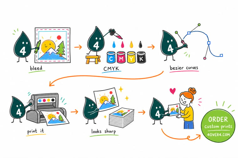
Wally draws three rectangles on a business card. The middle one is the trim, 3.5 by 2 inches, and that is where the blade aims. The outer one is the bleed, an eighth of an inch further out, and your background has to reach it because a stack of cards always shifts a little under the knife. The inner one is the safe zone, an eighth of an inch inside the trim, and your phone number belongs behind that line. Get those three right and most reprints never happen.
Start from a sized blank template →
Specs and pricing
The bleed and safe zone on the products people ask about most
Sizes, stocks and starting prices straight from the 4OVER4.COM configurator, so you can match the terms above to a real order. On a 3.5 by 2 in card the bleed makes a 3.75 by 2.25 in document; on an 8.5 by 11 in flyer it makes 8.75 by 11.25 in, with type kept 0.125 in inside each edge.


Print it
Put the vocabulary to work on a short run
Business cards start at 100 for $17.57, flyers at 50 for $39.54 and brochures at 50 for $57.11, each with 3 business days of standard production, so a short run is a cheap way to see your bleed and CMYK settings on paper.



Explore more
Where to go next
Each guide below takes one row of the table further: the 0.125 in bleed rule, what dulls when RGB turns into CMYK, and why 300 ppi is measured at final size.

By the numbers
Files we set right every day at 4OVER4
Common Questions
Design terminology questions, answered
What is bleed in printing?
Bleed is artwork deliberately extended past the trim line so that no white edge appears after cutting. At 4OVER4.COM the standard is 0.125 in on all four sides, so a 3.5 by 2 in business card is built on a 3.75 by 2.25 in document. The reason is mechanical: sheets are cut in stacks, and the stack can shift by up to about a sixteenth of an inch. If your background stops exactly at the trim line, one card in the stack gets a white hairline down one side. Extend any background color, photo or panel all the way to the bleed line, and keep text 0.125 in inside the trim instead.
What does CMYK stand for and why does the press use it?
Cyan, magenta, yellow and key, where key means black. A press lays those four transparent inks in overlapping dot patterns to build every other color. Screens work the opposite way, adding red, green and blue light, which is why an RGB file always has to be converted before it prints. The conversion is where surprises happen: the most saturated screen blues, greens and oranges sit outside what four inks can reproduce, so they come back noticeably duller. Convert your file to CMYK yourself and look at it on your own monitor before approving anything.
What resolution do print files need?
Aim for 300 ppi at the size the image actually prints. That last part is what trips people up, because resolution is not a property of the file on its own. A photo that is 300 ppi at 2 in wide becomes 75 ppi when you scale it to 8 in, and 75 ppi prints soft and blocky. Check the effective resolution in your layout software rather than the number in the file properties. Large format is the exception: a banner viewed from 10 ft away is fine at 100 to 150 ppi, because your eye is not close enough to resolve the difference.
What is the difference between vector and raster artwork?
Vector art is a set of mathematical paths, so it can be scaled to any size and stays perfectly sharp. Raster art is a fixed grid of pixels, so enlarging it forces the software to invent pixels that were never captured. Logos, type, line art and die lines should be vector, saved as AI, EPS, SVG or a vector PDF. Photographs are always raster and that is correct, they just need enough pixels at final size. The practical rule: if it has hard edges and you might print it bigger later, keep a vector master.
Do I need to convert text to outlines before sending a file?
It removes a real risk, so yes for the final print file, as long as you keep an editable copy. Converting type to outlines turns each character into a shape, which means our system can never substitute a font it does not have, and no font licensing gap can change your layout. The trade off is that outlined text cannot be edited or spell checked afterward, so a typo means going back to your working file. Save a live version, outline a copy, then export. An embedded PDF/X export achieves much the same thing if you would rather keep the text live.
When is a spot color worth paying for over process color?
When the exact color is the brand, and you reprint often. A spot color is a pre mixed ink, so a Pantone red arrives identical in January and in July, while the same red built from cyan, magenta and yellow can drift slightly between runs and between stocks. That consistency costs an extra plate, so it usually earns its place on packaging, stationery and identity work rather than on a one time flyer. Full color photography still has to run as process, so a job with photographs plus one locked brand color runs as five inks, not one.
Get Started
Ready to send a file that prints the way you drew it?
Start from a template with bleed, trim and safe zone already marked, pick your stock, and see your color in ink on a short run before you commit.
Legal Disclaimer
Gold Standard guarantees apply to all standard orders placed through 4over4.com. Price match requires verifiable proof of a competitor's published price for an equivalent product with matching specifications and turnaround time. Satisfaction guarantee covers manufacturing defects and print quality issues. Contact support with order number and documentation.
