
The 9 Key Elements of Design


Sofia is our design and templates voice, built from the knowledge of our production team, with over 20 years in printing.
Line, color, shape, texture, framing, type, form, space, and value are the building blocks of every layout. Here is what each one does, with a real print example you can hold, so a design lesson turns into something you can actually order.
The nine elements of design are line, color, shape, texture, framing, type, form, space, and value. They are the building blocks every layout is assembled from, separate from the principles of design like balance and contrast that govern how you arrange them. In print, each element becomes a physical choice: color is CMYK ink, texture is the paper stock and coating, and value is a finish such as spot gloss or foil that plays with light. The print examples below are soft touch business cards, die-cut business cards, folded thank-you cards, posters and pillow boxes, each matched to the element it shows best.

Start here
What the elements of design actually are
The elements of design are the raw materials every layout is built from: line, color, shape, texture, framing, type, form, space, and value. On a 2 x 3.5 inch business card that list turns into numbers: a rule of 0.25pt or heavier, four CMYK inks, a die-cut outline, a stock from 14 pt up to 80 pt, a 1/8 inch margin inside the trim, and a finish such as spot UV or foil. Think of them as the ingredients, and the principles of design like balance, contrast, and hierarchy as the recipe that tells you how to combine them. What makes print special is that these elements stop being abstract. Color becomes CMYK ink, texture becomes the stock in your hand, and value becomes a spot gloss that catches the light. At 4OVER4.COM, every element on this page maps to a real production choice you can order.
Before you order
Pick the piece and the stock for the element that leads
Decide which element carries the design, then order the piece built to show it. Each row pairs an element with a product from this guide, its size and the stock or finish that makes the element physical. Send vector art with every line at 0.25pt or heavier and every word 1/8 inch inside the trim.
| Leading element | Piece to order | Size | Stock or finish |
|---|---|---|---|
| Texture | Soft touch business cards | 2 x 3.5, 2 x 2 or 1.5 x 3.5 inches | 32 pt, 48 pt, 64 pt or 80 pt soft touch uncoated |
| Shape | Die-cut business cards | 2 x 3.5 inch leaf, oval or half circle side, or a 2 or 2.5 inch circle | 14 pt gloss to 18 pt premium white linen |
| Value | Spot UV business cards | 2 x 3.5 inches | Spot UV on 14 pt gloss, 16 pt gloss or 16 pt silk laminated cover |
| Framing | Folded thank-you cards | 8.5 x 5.5 folding to 4.25 x 5.5, 10 x 7 to 5 x 7, or 12 x 6 to 6 x 6 inches | 14 pt gloss to 18 pt premium white linen or metallic pearl |
| Space | Posters | 11 x 17 up to 22 x 28 inches | 100 lb gloss or silk text, 14 pt cover or synthetic plastic |
| Form | Pillow boxes | 3.625 x 1.5 x 7.25 inches | 14 pt uncoated or 18 pt cover gloss one side |
Watch it printed
See soft touch business cards on the press, in 141 seconds
Line: the invisible track your eye rides
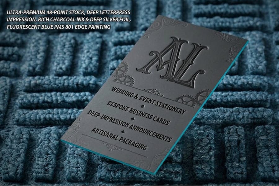
Line is the most basic mark in design, and also the most underrated. A single rule under a headline, the stem of a letter, the edge where two colors meet: all of it is line, and all of it tells the eye where to go next. Straight lines feel steady and corporate. Curved lines feel human and relaxed. Diagonals add motion. Used well, a line is a set of directions nobody notices they are following.
In print, line stops being theoretical the moment it is pressed into paper. Letterpress business cards push a metal plate into thick cotton stock, so every rule and serif sits in a shallow trench you can feel with a thumbnail. That is line you can touch. If you want proof of how far a single confident line can carry a layout, the most striking business card designs almost always lean on one strong line rather than a dozen timid ones.
Look at the card in the photo above. The hairline rules are the thinnest marks on it and they are still the first thing your eye follows. Three rules keep a line that thin alive on press: draw it as vector rather than a flattened image, hold it at 0.25pt or heavier so the plate can carry it, and keep it at least 1/8 inch in from the trim so a normal cutting tolerance never shaves one in half. If you want the line to catch light instead of sinking into the sheet, the same rule printed as raised gloss on spot UV business cards does the opposite job with the same geometry.
Color: the element people feel before they read
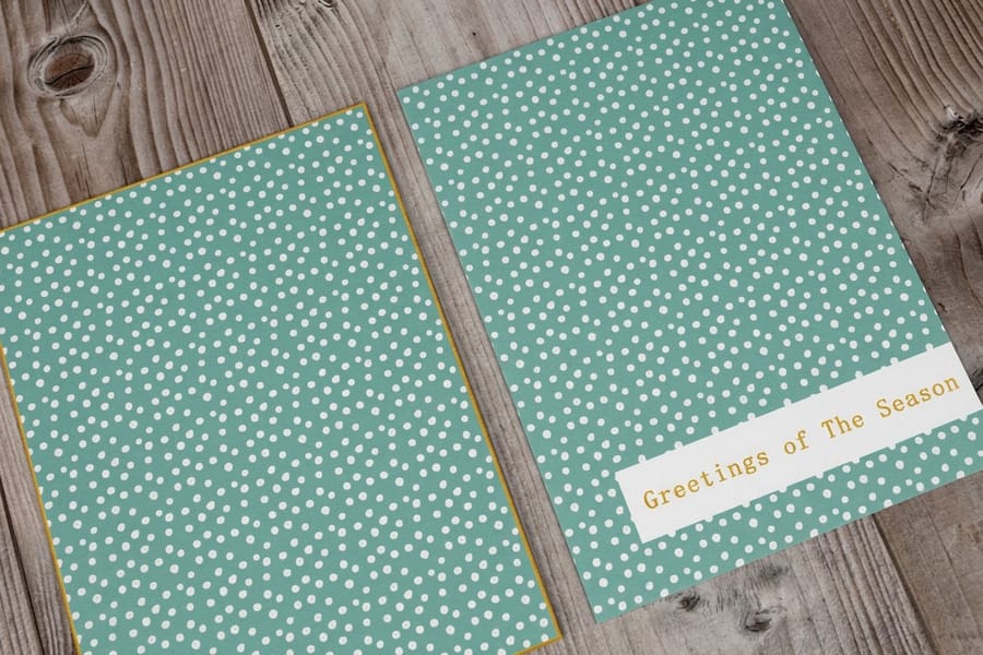
Color lands before a single word does. It sets mood, signals a brand, and decides whether a piece feels premium or cheap in about the time it takes to blink. The usual trap is reaching for too much of it. Two or three colors with a clear job almost always beat a rainbow that competes with itself.
Here is the catch that surprises people moving from screen to print: monitors mix light in RGB, but paper mixes ink in CMYK, so a color that glows on a display can land flat on a press if the file is not built for print. Full-color pieces like standard postcards run on a four-ink CMYK press, which is why a print-ready file and a soft proof matter so much. When you are locking in a palette for something people will hold, our walkthrough on how to make postcards covers the color setup step by step.
The postcard in the photo is a fair test of what survives that conversion. Large flat solids and warm tones come across almost unchanged, while a bright screen blue, a neon green and a pure RGB orange all sit a shade quieter once they are ink. Build your deep black as a rich mix rather than 100 percent black alone so it does not look grey next to a photo, note any brand color that must match exactly so it can be checked against a printed reference, and judge the proof under the light your reader will actually be standing in, because office fluorescents and daylight pull the same sheet in two directions.
Shape: the silhouette that reads from across the room
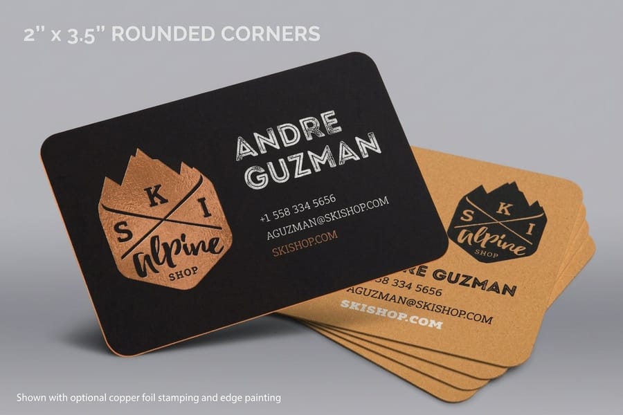
Shape is what is left when you squint. Long before anyone processes your headline, they register the outline of the thing in their hand: a 2 x 3.5 inch rectangle, a 2 inch circle, a card with rounded corners, a leaf or an oval cut. A shape that breaks the expected rectangle grabs attention simply by being different in a stack of same, and difference is attention.
Print turns shape into a production decision through die-cutting. Die-cut business cards can be cut to a rounded, angled, or fully custom outline, so the card itself becomes part of the logo instead of just a frame for it. The standard cuts run from rounded corners, a leaf, a half circle side and an oval at 2 x 3.5 inches to 2 and 2.5 inch circles, on stocks from 14 pt gloss cover to 18 pt premium white linen. If shape is central to your idea, the die-cutting collection shows how far a cut line can be pushed across cards, stickers, and signage before it stops being practical.
Texture: the element your fingertips judge first
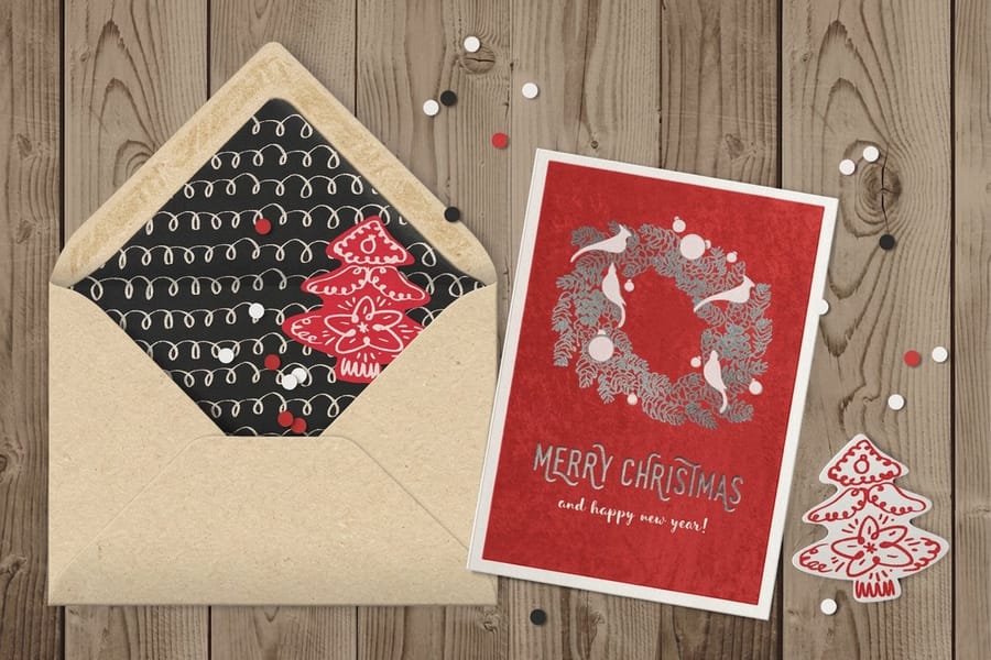
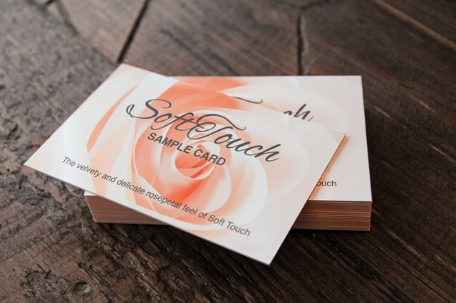
Texture is the one element a screen can only pretend to have. It is the difference between a card that feels like a receipt and one that feels like a decision was made. Visual texture, a pattern or a grain, lives in the artwork. Tactile texture lives in the stock and the coating, and it does quiet, powerful work, because people trust what feels solid. Soft touch business cards come in 32 pt, 48 pt, 64 pt and 80 pt uncoated stock under a soft touch finish, and suede greeting cards print on a 16 point suede laminated sheet.
This is where paper choice becomes design. A soft-touch coating gives a velvety, almost suede finish, while genuine suede greeting cards take that plush feel to its extreme, and the suede greeting cards video shows that surface up close. Uncoated and cotton stocks read warm and handmade. Gloss reads sharp and modern. If you are unsure how a finish will feel, our rundown of the best paper for printing is a smart place to start, and free samples let you feel the difference before you commit to a run.
Framing: where you decide to draw the edge
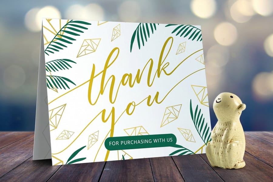
Framing is the boundary you build around content, plus the negative space you leave between that boundary and the important stuff. A generous margin makes a piece feel calm and expensive. A tight border feels urgent and packed. On a folded thank-you card the frame is small: an 8.5 x 5.5 inch sheet folds to a 4.25 x 5.5 inch panel, and every word belongs at least 1/8 inch inside the trim. Both are valid, but only when the choice is deliberate rather than an accident of where the type happened to stop.
Folded formats make framing physical. A folded thank-you card frames a single message inside its own panel, so the cover, the fold, and the inside each become a separate frame you reveal in sequence. Print framing also means respecting bleed and safe margins so nothing important gets trimmed off at the guillotine. Our guide on how to make greeting cards shows how those frames and margins get set up before a file ever reaches the press.
Type: the voice of the whole layout
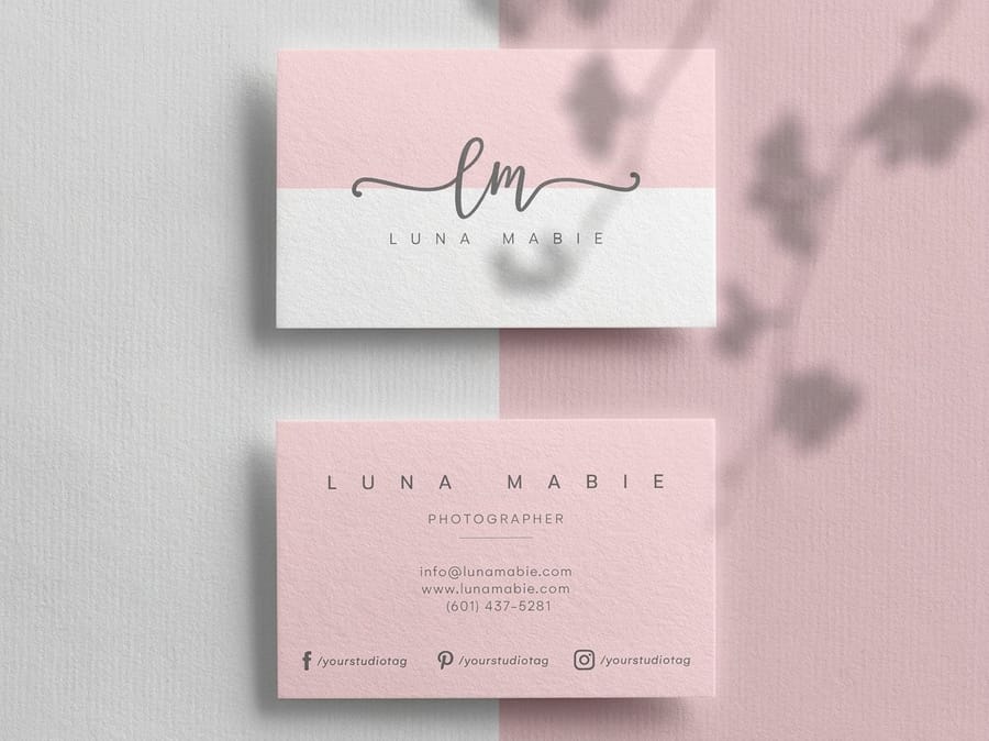
Typography is design doing most of its talking. The typeface you pick carries a tone before the words register, and the way you size and space it decides what gets read first, second, and never. A clean pairing, one characterful display face plus one quiet workhorse for body copy, does more for a layout than any filter or effect. A premium business card gives that pairing 2 x 3.5, 2 x 2, 1.5 x 3.5 or 2.125 x 3.375 inches to work in, on stocks from 14 pt gloss to 80 pt UltraWhite, so print one line at actual size before you commit to a face.
On something as small as a premium business card, every point size counts, because there is nowhere to hide a weak font choice. Type also has real history worth borrowing from, and the story behind Helvetica and Arial is a quick lesson in how much a single typeface shapes perception. For softer, occasion-led pieces, our roundup of the best wedding fonts shows how the whole mood shifts with the letterforms.
Form: when a flat design gains a third dimension
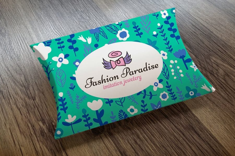
Shape is a two-dimensional outline. Form is what happens when that shape gains depth and becomes an object you can turn over in your hands. Packaging, folders, and boxes are pure form, and form changes the whole experience, because now the design has weight, sides, and an inside to discover. A pillow box starts as a flat sheet of 14 pt uncoated cover or 18 pt cover gloss one side and closes to 3.625 x 1.5 x 7.25 inches, held with an edge lock or glue.
A pillow box takes a flat printed sheet and curves it into a shape with real volume and a satisfying snap when it closes. Suddenly your artwork wraps around edges and rewards a second look from a new angle. Form is also where structure and material meet, so a little planning goes a long way, and hands-on ideas like a kraft packaging box show how form and texture reinforce each other in the same object.
Space: the element made of everything you leave out
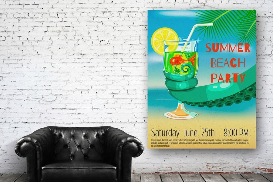
Space, often called white space, is neither empty nor wasted. It is the breathing room that makes everything else legible. Crowd a layout and every element fights for attention, so nothing wins. Give the same elements room and a clear hierarchy appears almost on its own, without you adding a single new thing. A poster at 18 x 24 or 22 x 28 inches gives one headline room to win from across a room, and on a 2 x 3.5 inch card the same rule means keeping every word 1/8 inch in from the trim.
Large formats make space impossible to ignore. A poster read from across a room only works when one message dominates and the rest of the surface stays quiet. Even on small pieces, space is a measurable decision, which is why getting dimensions and margins right matters, and our note on business card sizes and dimensions is a handy reference. There is hard evidence that clean, confident print earns attention, gathered in our print advertising statistics.
Value: the contrast between light and dark
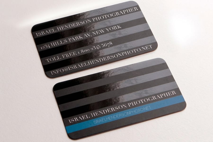
Value is how light or dark something is, independent of its color. It is the element that creates contrast, and contrast is what makes a design readable and gives it drama. Dark type on a light field is high value contrast, which is exactly why it is easy to read. A design with no value contrast reads as a flat gray blur, no matter how lovely the colors are up close.
Print has a trick screens do not: it can build value contrast with finish, not just ink. Spot UV business cards lay glossy varnish over a matte surface, so the same black ink reads two different ways as light moves across it. They print at 2 x 3.5 inches on 14 pt gloss, 16 pt gloss or 16 pt silk laminated cover, with spot UV on the front, the back or both sides. Metallic foil and metallic finishes push that light-and-dark play even further, turning contrast into something that catches the eye at an angle before anyone reads a word.
Why some lists count seven elements and others count ten
Search this and you will find sevens, nines and tens. The lists are not contradicting each other, they are drawing the boundary in different places.
Every version contains the same core: line, shape, color, texture, type, space and value. That core is the seven quoted most often in art classes.
The nine used here adds two that matter more in print than on a screen. Form, because a folded card or a printed box gains real depth and sides. And framing, because a printed piece has a physical edge, and deciding where to draw it is a design act rather than an accident of the page. A 12 x 6 inch card folded to 6 x 6 and a 3.625 x 1.5 x 7.25 inch pillow box both have sides and edges you design, which a seven element list leaves out.
Lists of ten usually split one of these, most often pulling scale or movement out as its own item. None of that changes the work. What matters is whether you can point at each element in something you have printed, which is what the sections above give you.
Putting all nine elements to work on one piece
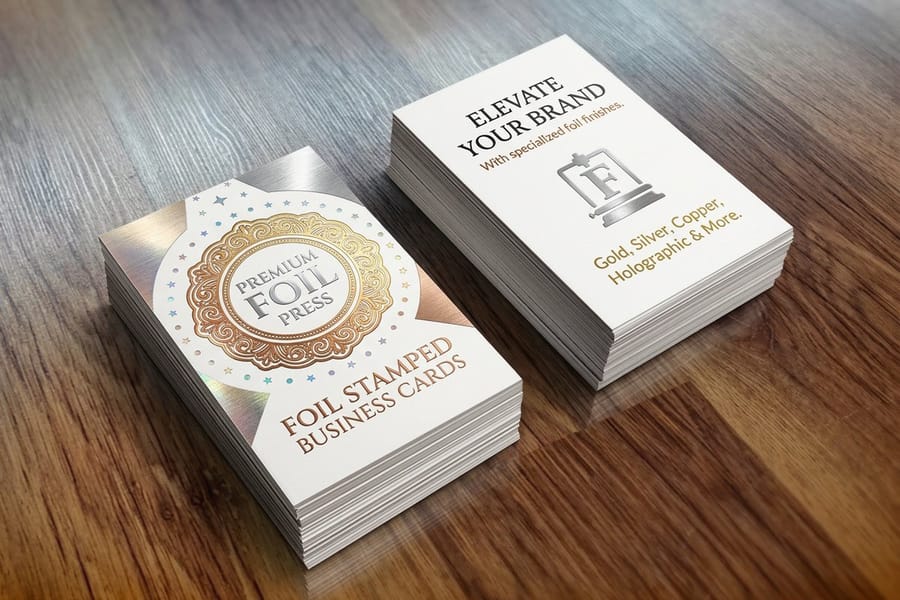
No good design uses all nine elements at equal volume. The craft is choosing which two or three lead and letting the rest support. A minimalist business card might lean on type, space, and value and barely touch color. A festival poster might lead with color, shape, and line and let type play backup. Decide what should be loudest, then turn everything else down until the hierarchy is obvious at a glance. On a foil-stamped card that means choosing one of seven foils, gold, silver, copper, rose gold, red, black or blue, on 16 point silk laminated or 14 pt uncoated cover, and letting the foil carry value while type and space support it.
The fastest way to learn the interplay is to see the elements combined at full strength. Foil-stamped business cards stack line, type, texture, and value into one small object, which makes them a useful study piece to hold and pick apart. When you are ready to build your own, start from a free design template, refine it in the online designer, and lock it in with a free proof before anything prints.
The principles that arrange the nine elements
An element is a thing you put on the page. A principle is a rule for arranging those things. Mixing the two words up is the most common error in this whole subject, and the nine principles usually named are these.
- Balance. Weight distributed so the piece does not tip.
- Contrast. Difference large enough to be seen at a glance.
- Hierarchy. A deliberate first, second and third thing to read.
- Alignment. Edges that line up, so nothing looks placed by accident.
- Repetition. The same treatment reused until it reads as a system.
- Proportion. Relative size used to signal importance.
- Movement. A path the eye follows through the layout.
- Emphasis. One thing allowed to win.
- White space. Room left deliberately empty.
On paper each one becomes a production choice. Balance is where the logo sits against the trim. Contrast can come from a finish as easily as from ink, since spot gloss over matte separates two areas printed in the same black. Emphasis is which single element gets the foil.
Wally breaks down the nine elements
The building blocks are simple. The magic is in how you combine them.
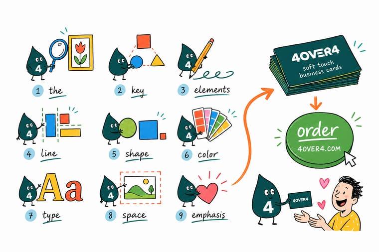
Wally treats the nine elements like a toolbox: line, color, shape, texture, framing, type, form, space, and value. You rarely need all nine turned up at once. Pick the two or three that carry your message, let the rest support, and print it on a stock that makes those choices physical. When your design is ready, 4OVER4 turns the lesson into something people can actually hold.
Order business cards →%22%2F%3E%3Ccircle%20cx%3D%2235%22%20cy%3D%2219%22%20r%3D%2230%22%20fill%3D%22%23f59e0b%22%20opacity%3D%220.15%22%2F%3E%3Ccircle%20cx%3D%2233%22%20cy%3D%2229%22%20r%3D%229%22%20fill%3D%22%23f59e0b%22%20opacity%3D%220.1%22%2F%3E%3Crect%20x%3D%2275%22%20y%3D%229%22%20width%3D%2220%22%20height%3D%2219%22%20rx%3D%224%22%20fill%3D%22%23f59e0b%22%20opacity%3D%220.08%22%20transform%3D%22rotate(15%2080%2030)%22%2F%3E%3C%2Fsvg%3E)
Specs and pricing
Live specs and pricing for soft touch business cards
Design lessons are easier to trust when you can price the result. Here are live specs and price-per-unit for our soft touch business cards, a stock that puts texture, value, and type to work at once, straight from the configurator.

| Quantity | Price Per Unit | Total |
|---|---|---|
| 50 | 80.6¢ | $40.28 |
| 100 | 76.7¢ | $76.65 |
| 200 | 59.9¢ | $119.74 |
| 300 | 53.9¢ | $161.67 |
| 400 | 44.9¢ | $179.65 |
| 500 | 38.3¢ | $191.60 |
| 600 | 33.9¢ | $203.60 |
| 700 | 30.8¢ | $215.58 |
Print it
Order print that shows the elements off


See it in use
Design work we printed on soft touch stock









Explore more
Where to go next



By the numbers
Print you can build on at 4OVER4
Common Questions
Common questions about the elements of design
What are the 9 design principles?
The nine usually named are balance, contrast, hierarchy, alignment, repetition, proportion, movement, emphasis and white space. They are rules for arranging elements rather than elements themselves, so they answer a different question from the nine on this page. A quick way to hold the two apart: line, color and texture are things you put down, while balance and hierarchy are decisions about where you put them.
What are the 9 principles of art?
Art courses generally teach balance, contrast, emphasis, movement, pattern, rhythm, proportion, unity and variety. They overlap heavily with the design principles, since both describe how you arrange the same raw elements. The difference is mostly purpose. Art principles are taught to help you compose and read a picture, and design principles are taught to make a message land quickly.
What are the 9 types of graphic design with examples?
Visual identity such as a logo and the business card it lands on, marketing and advertising such as a flyer or a poster, publication design such as a booklet or a catalog, packaging design such as a printed box, environmental design such as signage and wayfinding, user interface design, motion design, art and illustration, and product graphics. The nine elements on this page are the raw materials behind every one of them.
What are the 9 elements of design?
The nine elements of design are line, color, shape, texture, framing, type, form, space, and value. Line directs the eye, color sets the mood, shape gives an outline, texture adds feel, framing controls the edges, type carries the message, form adds depth, space provides breathing room, and value creates light-and-dark contrast. Together they are the raw materials behind every layout, on a screen or on paper.
What is an element of design, and how is it different from a principle?
An element is a building block you put on the page, like a line, a color, or a block of type. A principle is a rule for arranging those blocks, such as balance, contrast, hierarchy, and rhythm. Put simply, the elements are the ingredients and the principles are the recipe. You need both, but they are not the same thing, and mixing up the two terms is one of the most common design mistakes.
How do I choose the right elements of design for my project?
Start with your message and your medium, then pick the two or three elements that should lead. A minimalist business card might lean on type, space, and value. A bold event poster might lead with color, shape, and line. Let the rest support instead of competing. When it prints, choose a stock and finish that make your strongest elements physical, and order free samples so you can judge texture and value in your hand before committing. The print half of that decision is the part most design articles skip: value flattens on uncoated stock because the fibers drink ink and the shadows fill in, so open your darks slightly; texture is a stock and lamination choice long before it is a Photoshop choice; and line and shape only stay crisp if they are vector, 0.25pt or heavier, and held 1/8 inch clear of the trim.
What does it cost to bring these design elements to life in print?
Price comes down to four things, size, stock, finish, and quantity, plus how fast you need it. A textured piece like our soft touch business cards starts around $40, full-color standard postcards start near $16, and specialty finishes like foil or suede cost more because of the extra materials and press passes. The live configurator on every product page prices your exact choices instantly, so you can see how each design decision moves the total before you order. The reason finishing moves the number is mechanical: each element you make physical is its own step, a die-cut needs a custom die cut to your outline, foil and embossing each need tooling and a separate press pass, and spot UV needs a second mask file so the press knows where the gloss goes. Quantity is the lever that moves the per-piece price the most, so once the design is settled, one larger run beats two small ones.
What sizes, stocks, and finishes are available for these elements?
A wide range. 4OVER4.COM prints on more than 60 paper stocks, from uncoated cotton to soft-touch and metallic, in dozens of standard and custom sizes, with finishes that include spot UV, foil, embossing, and die-cutting. That range is exactly what turns an abstract element into a real choice: texture becomes a stock, value becomes a finish, and shape becomes a die-cut line. The specs widget on each product page lists the exact options for that item. Ink behaves differently on each of those stocks, and that changes the design: coated and soft-touch hold fine type and deep solids cleanly, uncoated and cotton soften an edge a hair and warm every color slightly, and metallic bounces light back up through the ink so your light and dark values shift with the viewing angle. Ask for a stock by weight as well as by name, because a 14pt card and a 16pt card in the same finish feel like two different products in the hand.
Do I need to learn the principles of design too?
Yes, if you want the elements to actually work together. The elements give you the pieces, and the principles, balance, contrast, hierarchy, alignment, repetition, and white space, tell you how to arrange them so the result reads clearly. A good next step is to see the elements combined in real work, then build your own from a free design template and refine it in the online designer before you print. On paper those principles turn physical: hierarchy becomes the one element you give the raised finish to, contrast becomes coated against uncoated as much as black against white, alignment becomes a grid that survives the cut, and white space becomes the margin the trim can never eat into.
What are the 9 elements of design with examples?
Every one of them has a printed example you can hold. Line: the pressed rules on a letterpress business card, driven into thick cotton stock so you feel them with a thumbnail. Color: a full-bleed CMYK postcard, where four inks build the whole palette. Shape: a die-cut business card whose outline is cut to your own drawing instead of a rectangle. Texture: a soft touch business card, where the laminate is the design decision. Framing: the margin on a poster that decides how much wall the artwork borrows. Type: the headline on that poster, which has to read at ten feet and at ten inches. Form: the depth an embossed or letterpressed mark adds to a flat sheet. Space: the empty half of a minimalist card, which is what makes the printed half look expensive. Value: spot UV gloss against a matte background, light and dark created by finish rather than by ink.
How do the elements of design change in print versus on screen?
Four of them change enough to break a file. Color changes because a screen mixes light in RGB and a press mixes ink in CMYK, so bright blues, neon greens and pure RGB oranges all land a shade quieter on paper. Value changes because a monitor is backlit and paper is not, so shadows that read as detail on screen can fill in solid on an uncoated sheet. Texture becomes real: on screen it is a picture of a surface, in print it is the stock and the lamination you paid for. And framing gets a hard rule, since everything is trimmed with a tolerance, so keep type and rules 1/8 inch inside the trim and run backgrounds past it. Resolution follows the same logic, artwork built at 72 dpi for a screen has to be 300 dpi at final size for a press, and lines and logos are safest as vector.
Get Started
Ready to turn these elements into print?
Start from a free template or your own file, pick the stock and finish that bring your strongest elements to life, and we print it sharp and on time.
Legal Disclaimer
Gold Standard guarantees apply to all standard orders placed through 4over4.com. Price match requires verifiable proof of a competitor's published price for an equivalent product with matching specifications and turnaround time. Satisfaction guarantee covers manufacturing defects and print quality issues. Contact support with order number and documentation.
