
The Principles of Design and How to Use Them (With Infographic)


Sofia is our design and templates voice, built from the knowledge of our production team, with over 20 years in printing.
Emphasis, balance, contrast, repetition, proportion, movement, and white space. These seven principles are what separate a layout people read from one they scroll past. Emphasis comes first, because a page with two focal points has none.
The principles of design are the rules that arrange type, color, image, and space into a clear layout. The seven core principles are emphasis, balance, contrast, repetition, proportion, movement, and white space. Emphasis sets the focal point, contrast and proportion build the hierarchy, repetition ties it together, balance keeps it stable, movement guides the eye, and white space gives it room to breathe. Use them together and your printed piece communicates before anyone reads a word.

Start here
Emphasis first, white space last
The principles of design are the rules that organize type, color, image, and space into a layout people can actually read. The seven that matter most are emphasis, balance, contrast, repetition, proportion, movement, and white space. Set emphasis first, one focal point sized to read when the page shrinks to a thumbnail, and check white space last, with live text clear of the trim edge. Every rule here applies to a piece you can order: a folded flyer, a postcard, a poster or a booklet. Learn what each one does, use them together on purpose, and even a simple printed piece from 4OVER4.COM looks intentional instead of accidental. The infographic further down sums all seven up at a glance.
Why the principles of design decide whether your print gets read
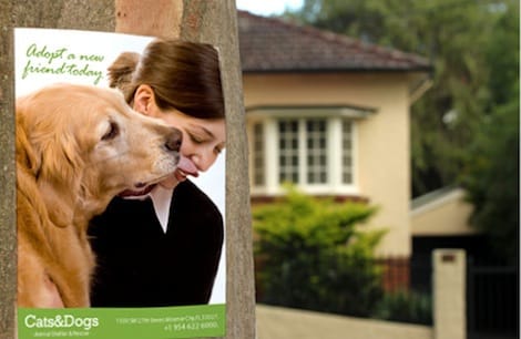
A stack of 8.5 x 11 in flyers lands on a reception counter. Within a second or two, people either lean in or look away, and they are not judging your product yet. They are reacting to how the piece is arranged. That first reaction is the principles of design doing their quiet work, whether you planned for them or not.
The principles of design are the small set of rules that turn raw ingredients (type, color, images, shapes, and empty space) into a layout the eye can follow. Ignore them and even expensive printing looks amateur. Use them on purpose and a simple one-color folded flyer can read as confidently as a big brand campaign.
This guide walks through the seven principles one at a time, shows how each behaves on a real printed page, and ends with an infographic you can keep on hand. If you would rather skip straight to making something, our online designer and design templates already bake most of these rules in for you. For finished layouts to study, our roundup of one page infographic examples shows the same rules at work on business pieces.
What are the principles of design?

The principles of design are the guidelines a designer uses to organize the elements of a layout into a composition that communicates clearly. If the elements (line, shape, color, type, texture, and space) are the ingredients, the principles are the recipe that tells you how much of each to use and where to put it. On a 5.5 x 8.5 in handout, that recipe comes down to four placements: one headline, one image, one body block and one call to action, with a clear margin on all four sides.
Most designers work from seven core principles: emphasis, balance, contrast, repetition, proportion, movement, and white space. You will see longer lists that add alignment, unity, or rhythm, and shorter ones that fold several together. The exact number matters less than the habit of asking, for every layout, where does the eye go first and how does it travel from there.
These same principles govern a postcard, a wall poster, and a multi-page booklet alike. The canvas changes, the physics of attention do not. For the technical side of getting a design onto paper cleanly, pair this guide with our notes on bleed and trim and image resolution for printing.
Emphasis: give the eye one place to land first

Emphasis is the principle that decides what a viewer sees before anything else. Every strong layout has a clear focal point, usually the headline, the offer, or a single hero image, and everything else is deliberately turned down so that focal point can win. On an 8.5 x 11 in flyer that usually means one headline set about three times the size of the body copy, and nothing else on the page at that size.
You create emphasis through difference. Make one element bigger, bolder, brighter, or more isolated than its neighbors and it becomes the star. The classic mistake is emphasizing everything: three competing headlines, five colors, and a starburst on top. When every element shouts, the reader hears nothing and moves on.
On a promotional flyer, pick the one thing you need people to remember (a date, a discount, a name) and build the page around it. Our guide on how to design flyers shows this focal-point approach in action, and the article on business card font size makes the same case on a much smaller canvas.
Balance: distribute visual weight so nothing tips over

Balance is the sense that the visual weight of a layout is evenly distributed, so the page feels stable rather than lopsided. Weight comes from size, color, and density: a large dark block pulls harder than a small pale one, and your eye notices when one side of a page is heavy and the other is empty for no reason. On a trifold you judge it twice: each of the six panels has to hold its own weight, and then the three inside panels have to balance as one open spread.
Symmetrical balance mirrors elements around a center line and reads as formal, calm, and trustworthy, which is why it suits wedding invitations and law-firm letterhead. Asymmetrical balance offsets one big element with several smaller ones and feels more modern and energetic. Both work. What does not work is accidental imbalance, where the design simply drifts into a corner.
Fold-based formats make balance concrete, because each panel has to hold its own. If you are laying out a multi-panel piece, read how to fold a brochure and the guide to common brochure sizes and fold options so your balance survives the fold lines.
Contrast: make the important parts unmissable

Contrast is difference you can see at a glance: light against dark, thick against thin, a serif headline over sans-serif body copy. It is the fastest way to create hierarchy, and it is what makes a page legible from across a room. Low contrast is the number one reason print looks muddy.
The contrast most worth getting right is type against background. Dark text on a light field, or crisp white on a deep color, keeps copy readable. Pale gray on white can look elegant on a bright screen and then vanish on paper. Because screens and presses render color differently, check your contrast in print terms, not just on your monitor. Our CMYK vs RGB guide explains why the shift happens. Test it on the stock you will order: folded flyers print on 100# Gloss Text, 100# Silk/Matte Text or 70# Uncoated Text, and free paper samples let you check your palest gray and your darkest block on each before the run.
Color contrast also carries meaning and mood. If you are choosing a palette, the piece on what business card colors mean and the history behind Pantone colors are useful primers before you commit ink to stock.
Repetition: repeat elements to build a system
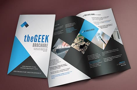
Repetition is the deliberate reuse of an element (a color, a font, a shape, an icon style) across a design. It is what makes a piece feel like one coherent voice instead of a collage assembled by committee. Repetition is also the engine of branding: repeat the same three brand colors and one type pairing everywhere and people start to recognize you before they read a word. Hold that system at every size you print, from a 4 x 6 in postcard to an 18 x 24 in poster, and the logo, colors and type pairing keep the same relationship to each other.
Inside a single layout, repetition creates rhythm. Bullet points that share an icon, headings that share a weight and color, panels that share a margin: each repeated detail tells the reader the layout is organized and safe to scan. Repetition and consistency are close cousins, and consistency is exactly what a good logo design depends on.
The real payoff shows up across a whole print kit. When your business cards, flyers, and marketing materials repeat the same visual system, every piece reinforces the others. A shared set of design templates is the easiest way to keep that repetition honest.
Proportion and scale: size tells the reader what matters
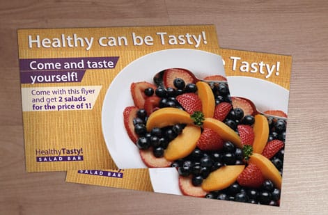
Proportion is the relationship in size between the parts of a design, and scale is how big those parts are relative to the page and to each other. Together they set the pecking order. A headline three times the size of the body copy announces itself as the most important line without anyone having to think about it. The poster example further down puts numbers on it: about 2 inch caps for a headline read at 20 feet on an 18 x 24 in sheet, with the date and venue sized to read at 6 feet.
Good proportion often follows simple ratios. Designers lean on grids and classic proportions because our eyes find them comfortable, and because a consistent ratio between heading, subhead, and body keeps a page from feeling random. When proportion breaks (a tiny logo lost above a giant photo, or body text nearly as large as the headline) the hierarchy collapses and the reader has to work to find the point.
Scale also has to respect the physical size of the finished piece. Type that reads well on a poster seen from ten feet is very different from type on a pocket-sized card. Matching your proportions to the format, and to the correct flyer dimensions, keeps the design working at its real size.
Movement: guide the eye along a deliberate path
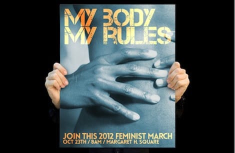
Movement is the path a design sets for the viewer's eye, from the first thing they notice to the last. Strong layouts are choreographed: headline, then supporting image, then the details, then the call to action. Nothing is left to chance, and nothing important sits where the eye never travels.
You direct movement with the other principles. A high-contrast focal point starts the journey (emphasis), size and position carry it forward (proportion and balance), and repeated cues like arrows, numbered steps, or a shared alignment keep it on track. Most readers in western markets scan in a Z or an F pattern, so placing your most important message along that natural route means people see it without effort.
The end of the path should always be the action you want. On a promotional piece, that is the offer and how to redeem it. Plan the route so the reader arrives at your call to action just as they finish reading, then make ordering the printed piece itself effortless with our online designer.
White space: the most underused principle in print

White space, also called negative space, is the empty area around and between elements. It is the breathing room that makes everything else readable, and on a printed piece the outer margin does a second job: it keeps live text clear of the trim edge. Beginners tend to fear it and fill every corner. Experienced designers protect it on purpose, because space is what gives a focal point its power.
White space works at every scale: the margin around the page, the gap between a headline and the paragraph below it, even the spacing between letters. Generous, consistent spacing signals quality and confidence. Cramped spacing signals a coupon. If a design feels busy or cheap and you cannot say why, the answer is almost always more space, not more stuff.
Minimal, space-forward layouts have become a hallmark of premium brands for exactly this reason. If that is the direction you want, our guide on building a minimal brand identity shows how to do a lot with a little, and it pairs naturally with a clean postcard or brochure.
How to use the principles together (and what printing them costs)
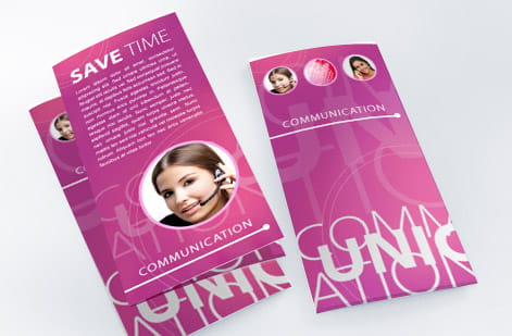
You rarely apply one principle in isolation. A good layout stacks them: emphasis picks the hero, contrast makes it pop, white space frames it, proportion sets the hierarchy under it, repetition ties the supporting elements together, balance keeps the page stable, and movement walks the reader to the call to action. Start with emphasis and contrast, because they do the most work, then layer the rest until the page feels effortless.
When the design is ready, printing is where those choices become real, and the cost is easy to reason about. Price scales with a few simple levers: quantity (more pieces lower the unit price), size, paper stock, and finish. A run of folded flyers starts around $68 and the per-unit price drops as the quantity climbs, and you can watch the number change live in the configurator as you adjust each option.
For flyers alone you can choose standard sizes and fold styles, stocks from everyday text weight to heavier premium paper, and coatings from matte to high gloss, all of which change how your design reads in the hand. To see the exact combinations, use the specs and pricing panel below, or order free paper samples first so you can feel the stock before you commit.
Before you order, settle the three choices the layout depends on. Size first: 5.5 x 8.5 in for a handout, 8.5 x 11 in folded into a trifold when each panel needs its own focal point, 18 x 24 in when the piece hangs on a wall and has to read at 20 feet. Stock second: 100# Gloss Text, 100# Silk/Matte Text or 70# Uncoated Text, with matte where store lighting would put glare on gloss. File last: set the document at the finished trim size with bleed, following the bleed and trim notes, and keep live text clear of the edge.
Applying the principles to poster design
A poster is the strictest test of the principles, because it gets read from across a room by someone who is walking, and only then, if it earned the walk, from arm's length. Take one worked example: an 18 x 24 in poster for a Saturday concert. Before you place a single element, split the content by viewing distance. The band name has to land at 20 feet. The date and the venue have to land at 6 feet, once the poster has stopped someone. The support acts, the ticket link and the fine print only have to land at arm's length. That one decision settles emphasis, proportion and hierarchy in a single move, and everything below is just executing it.
Emphasis on a poster means one hero, sized for the far distance rather than for your monitor. The old signage rule of thumb still works: allow roughly one inch of cap height for every 10 feet of viewing distance, so a band name meant to read at 20 feet wants around 2 inch caps, which on an 18 x 24 sheet is a headline running most of the width of the page. Contrast has to survive that same 20 feet, and at that range it is value contrast, dark against light, that carries the message. Hue contrast on its own, red type on a green field at the same brightness, turns to mush from the far side of a room, and hairline type or a pale gray caption simply vanishes. The cheap test: squint at the layout, or step back from the screen until the thumbnail is the size of a stamp. Whatever you can still read is what the poster actually says.
White space is what stops the hero from being ambushed by everything else. Keep live text well clear of the trim edge, hold a real margin on all four sides, and resist filling a corner just because it looks empty, because that empty corner is doing the work of pushing the eye back to the focal point. Movement is the route from the hero down through the date to the call to action, so the ticket link, the QR code and the phone number belong at the end of that path, not floating in the middle. Balance decides the tone: symmetrical and centered reads formal and calm, asymmetrical with one heavy element offset by several small ones reads energetic, and a poster gets away with far more asymmetry than a letterhead ever could. Repetition ties multiple dates or multiple acts into one family so the reader stops re-learning the layout at every line.
Then print it and judge it on a wall, not on a screen. This is the same focal-point approach as how to design flyers, scaled up: what a flyer can say in the hand, a poster has to say across a room, and the small print that works on a business card, as covered in business card font size, is exactly what disappears at 20 feet. Stock and coating matter here too, because a heavier sheet holds its shape on a wall and the choice between matte and gloss decides how much glare you fight under store lighting. Order free paper samples, tape a proof up where the poster will actually hang, then walk the room at 20 feet, 6 feet and arm's length before you commit to a quantity.
Wally explains the principles
Good design is just attention, directed on purpose
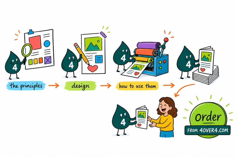
Wally treats every layout like a little guided tour: emphasis decides where the eye starts, contrast and proportion keep it moving, and white space gives the whole thing room to breathe. Get those working together and your message lands before anyone reads a word. Sketch it with the principles in mind, then let 4OVER4 print it sharp on the size and stock you choose.
Design and print flyers →
Infographic
The 7 principles of design at a glance
One frame, seven rules. Save it, share it, and use it as a checklist the next time you lay out a flyer, poster, or brochure.
The seven principles rarely work alone. Emphasis and contrast set the focal point, proportion and white space build the hierarchy, and repetition, balance, and movement carry the reader to your call to action.
Specs and pricing
Folded flyer specs and live pricing
When the design is ready, the printing decisions come down to size, stock, and finish. Folded flyers run 50 for $68.54 in 3 business days, with live specs and price-per-unit below.
| Quantity | Price Per Unit | Total |
|---|---|---|
| 50 | $1.37 | $68.54 |
| 100 | 98.9¢ | $98.86 |
| 200 | 63.9¢ | $127.84 |
| 300 | 49.2¢ | $147.62 |
| 400 | 41.9¢ | $167.40 |
| 500 | 37.4¢ | $187.17 |
| 600 | 32.1¢ | $192.43 |
| 700 | 28.2¢ | $197.71 |
Print it
Put the principles into print at 4OVER4


See it in use
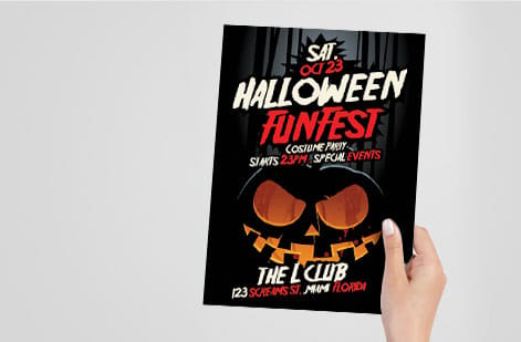
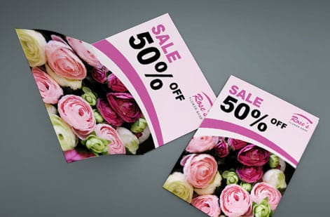
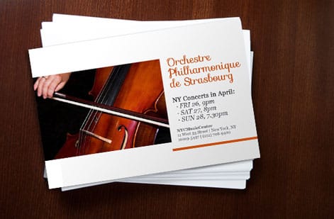
Layouts we printed for customer campaigns


Explore more
Where to go next




By the numbers
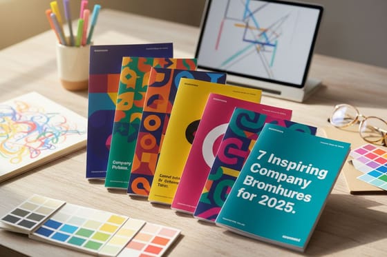
Postcards at $0.33, booklets at $9.62
Common Questions
Common questions about the principles of design
What are the principles of design?
The principles of design are the guidelines a designer uses to arrange the visual elements of a layout into a clear composition. The seven that matter most are emphasis, balance, contrast, repetition, proportion, movement, and white space. If the elements (line, shape, color, type, and space) are the ingredients, the principles are the recipe that tells you how much of each to use and where to put it.
What is an infographic?
An infographic is a visual that presents information or a set of ideas as graphics rather than plain text, using icons, color, and layout so the whole thing can be understood at a glance. The infographic on this page sums up all seven principles of design in one frame, which is a working example of the principles themselves: emphasis on each name, repetition of the card format, and white space between them.
How many principles of design are there?
Most designers work from seven core principles: emphasis, balance, contrast, repetition, proportion, movement, and white space. You will also see longer lists that add alignment, unity, or rhythm, and shorter ones that combine several. The exact count matters less than the habit itself: for every layout, ask where the eye goes first and how it travels from there.
What is the difference between the elements and the principles of design?
The elements of design are the raw building blocks: line, shape, color, type, texture, and space. The principles of design are the rules for combining those elements into something that communicates. Put simply, the elements are what you use and the principles are how you use them.
How do I choose which principles of design to use?
You use all of them together, but you can prioritize. Start with emphasis and contrast because they do the most work: pick your focal point and make it unmissable. Then layer proportion and white space to build hierarchy, and finally repetition, balance, and movement to tie the layout together and guide the reader to your call to action.
What are the design principles for a poster?
The same seven principles apply, but a poster weights them for distance, because it is read from across a room before it is read up close. Emphasis comes first: one hero element, usually the name or the offer, sized to be read at 15 to 20 feet. Proportion sorts the rest into three tiers by viewing distance, the hero at 20 feet, the date and place at about 6 feet, the fine print at arm's length. Contrast has to be value contrast, dark against light, since color difference alone collapses at distance. White space keeps a real margin on all four sides so the hero is not crowded. Movement runs the eye from the hero down to the call to action at the bottom, repetition keeps multiple dates or acts in one family, and balance sets the tone, symmetrical for formal and asymmetrical for energetic.
How big should the headline be on a poster?
Size it by viewing distance, not by what looks right on your monitor. The signage rule of thumb is roughly one inch of cap height for every 10 feet of viewing distance, so a headline meant to stop someone at 20 feet wants about 2 inch caps, which on an 18 x 24 in poster is a line running most of the width of the sheet. Supporting information such as the date and venue can drop to a size that reads at about 6 feet, and details like a ticket link or fine print only need to read at arm's length. Check it before you order: shrink the layout to a thumbnail on screen or step back from the monitor, and whatever is still legible is what the poster will actually say from across the room.
What does it cost to print a design, and how are prices set?
The price of a printed design comes from four settings: quantity, size, paper stock and finish. At 4OVER4.COM you set each option in the configurator and the price updates live as you go. Folded flyers start around $68, 50 for $68.54 or about $1.37 each, and 100 cost $98.86, so the per-unit price drops as the quantity climbs. Postcards start at 50 for $16.48 and booklets at 25 for $240.55.
What sizes, stocks, and finishes are available for flyers?
Folded flyers come in six sizes, from 5.5 x 8.5 in up to 11 x 25.5 in, printed flat or as a half fold, trifold, Z-fold or gate fold. The stocks are 100# Gloss Text, 100# Silk/Matte Text and 70# Uncoated Text, with a standard finish or High Gloss UV coating, so you can go from matte to high gloss. Each choice changes how your design reads in the hand. Use the specs and pricing panel on this page to see the exact combinations, or order free paper samples first so you can feel the stock before you commit.
Get Started
Print 50 folded flyers for $68.54, $1.37 each
Bring your design to 4OVER4.COM and print it on the size, stock, and finish that makes it shine. Folded flyers start at 50 for $68.54, which is $1.37 each.
Legal Disclaimer
Gold Standard guarantees apply to all standard orders placed through 4over4.com. Price match requires verifiable proof of a competitor's published price for an equivalent product with matching specifications and turnaround time. Satisfaction guarantee covers manufacturing defects and print quality issues. Contact support with order number and documentation.
