
Best Google Fonts for Print Design and the Sizes They Hold At


Sofia is our design and templates voice, built from the knowledge of our production team, with over 20 years in printing.
The Google Fonts that print well are the ones with low stroke contrast and open counters: Source Serif 4, Literata, Newsreader, Inter, Libre Franklin, Work Sans, Manrope, and the IBM Plex family, with Playfair Display, Fraunces, Space Grotesk, and Bricolage Grotesque reserved for headlines. Every one of them is licensed for commercial print and embedding, so the only real decision left is the size you set each one at, and that is decided by ink, not by taste.
Google Fonts and the sizes they hold at
| Font | Classification | Axes worth using | Best print use | Smallest I would set it |
|---|---|---|---|---|
| Inter | Grotesque sans | Weight | Flyer body copy, forms, price lists | 8 pt |
| Source Serif 4 | Text serif | Weight, optical size | Brochure and booklet body | 8 pt |
| EB Garamond | Old-style serif | Weight | Menus, invitations, long reading | 9 pt |
| Libre Franklin | Gothic sans | Weight | Headlines, posters, signage | 7 pt at bold |
| Playfair Display | High-contrast display serif | Weight, italic | Headlines only | 18 pt |
| Fraunces | Soft display serif | Weight, optical size, soft, wonk | Covers, packaging, logotypes | 14 pt |
| IBM Plex Mono | Monospace | Static weights | Codes, spec panels, event tickets | 7 pt |
| Space Grotesk | Geometric grotesque | Weight | Business cards, technical brands | 9 pt |
The size floors assume uncoated stock and black ink on white. On coated gloss you can usually go half a point smaller; on kraft or in reverse, go up instead. Proof it on the paper you are ordering, not on the paper you have. You can order Premium Business Cards in a short run purely as a type test.
Why font choice matters more in print than on screen
A screen redraws type every time you zoom. Paper gets one pass, at one size, in one ink, and then it is finished. That single fact decides which Google Fonts belong in a print file and which ones only look good in a browser tab.
Two things change when type meets paper. Ink spreads a little where it lands, so the thin parts of a letter close up before the thick parts do. And resolution stops being your problem: a press holds detail far finer than a monitor, which is why a hairline that looked crisp at 100 percent zoom can print as a broken thread.
Hinting, the instruction set that snaps a letter to a pixel grid, is the other thing that stops mattering. Many popular Google families were drawn and hinted for interfaces. On a press the hinting is ignored, so you are judging the raw outline: how heavy the thin strokes are, how open the counters are, how tall the x-height sits. Our guide to choosing and setting up fonts for printing walks the same ground from the file-setup side.
The licensing question, answered once
Every family in the Google Fonts catalog is released under the SIL Open Font License or the Apache License. Both permit commercial use, embedding in a PDF, and converting the type to outlines. You do not need to buy anything, and a print shop opening your file is not committing an infringement on your behalf. We covered the fine print in are Google Fonts free for commercial and print use.
What the licenses do not allow is selling the font file, or renaming a modified version and shipping it as an original. Neither comes up in a normal print job. The practical takeaway is that a Google font removes the one blocker that stops a lot of small brands from sending a file at all.
What breaks first when ink hits paper
The counters go first. A counter is the enclosed space inside an e, an a, or an 8. As ink spreads, those spaces fill, and a paragraph set in a high-contrast serif at 7 pt turns into a gray band with no letterforms in it. Uncoated stock absorbs more ink than coated, so the same file prints heavier on a letterhead than on a gloss postcard.
Reverse type is the harder case. White letters knocked out of a solid area get squeezed from all four sides at once, so a weight that reads fine as black on white can close up completely when reversed. Add half a point of size, step up one weight, and keep hairline serifs out of it.
The modern Google Fonts worth printing

These twelve hold their shape in ink. They are grouped by the job they do, because the useful question is never which font is best, it is which font survives at the size you need it.
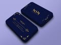
Test any of them on real stock before a big run. Standard Business Cards at $17.57 and Standard Postcards at $16.48 make a type proof cheap, and a proof on the actual paper tells you more than any screen preview.
Text faces, for anything you actually read
Source Serif 4. An optical size axis, which means the design gets sturdier as you set it smaller instead of just shrinking. It has real drawn italics rather than a slant, and it holds at 8 pt on uncoated. This is the safest serif in the catalog for body copy.
Literata. Drawn for e-readers, which meant surviving low contrast and bad rendering. That same robustness translates to cheap paper. Sturdy slab-ish serifs, open counters, and a calm rhythm across a long paragraph.
Newsreader. Newspaper ancestry, so it is built for narrow columns and tight leading. It carries an optical size axis too. Good for a brochure spread with three columns where a wider face would run out of room.
Inter. The most common sans in the catalog for a reason: enormous x-height, open apertures, and numerals that stay distinct. The catch is that the tall x-height makes solid paragraphs feel dense, so give it a point more leading than you would give a traditional sans.
Working sans faces, for headlines and hard-working small type
Libre Franklin. A Franklin Gothic revival with a full weight range. The heavy weights have the density a poster headline needs, and the regular still functions at small sizes on a form.
Work Sans. The optical adjustments differ across the range, so the light weights suit display and the darker weights suit text. Read that as a hint: use it at the ends of the range, not everywhere at once.
Manrope. Semi-geometric, slightly narrow, and it sets a headline tightly without looking condensed. Useful when a Premium Business Card has more words on it than the layout wants.
IBM Plex Sans. The whole superfamily, sans, serif, and mono, is drawn to work together under one license. For a price list or a spec sheet where you need aligned columns and a matching text face, it saves the pairing decision entirely.
Display faces, for the first thing someone sees
Playfair Display. High contrast, sharp hairlines, and unmistakably editorial. It is a headline face and nothing else. Below 18 pt in print the thin strokes start to break, and on uncoated stock that threshold is higher still.
Fraunces. Four axes, including a soft axis that rounds the terminals and a wonk axis that swaps in stranger letterforms. It is the most flexible display serif in the catalog and it can be tuned to feel warm or severe from the same file.
Space Grotesk. Odd, mechanical details in the middle of an otherwise neutral sans. It gives a technical brand a voice without going near a novelty font.
Bricolage Grotesque. Deliberately irregular, with a width axis that lets a headline fill a fixed measure exactly. Handy on a Standard Flyer where the headline has to hit a column edge.
Serif or sans, and what the ink does to each

The old rule that serifs read better in print is not what decides this. Both classes read fine. What decides it is stroke contrast: the difference between the thickest and thinnest part of a letter. Low contrast survives ink spread. High contrast does not.
That is why EB Garamond, which has moderate contrast and generous counters, holds at 9 pt on uncoated letterhead, while Playfair Display, which has extreme contrast, needs display sizes to keep its hairlines intact. Both are serifs. The category told you nothing; the drawing told you everything. There is more on the identity side of the choice in serif versus sans serif and which fits your brand.
Sans faces are usually safer at small sizes because they are drawn at nearly uniform weight. The trade-off is that a long passage of sans on paper offers fewer distinguishing details per word, so readers slow down slightly across a page of it. On a flyer nobody reads a full page, which is why sans dominates there. In a booklet they do, which is why serif still dominates in books.
How the paper changes the answer
Coated gloss stock holds ink on the surface, so fine detail stays fine. That is the stock where a high-contrast serif can be pushed a little smaller than usual. Uncoated stock absorbs, and the absorption thickens every stroke a fraction, which flatters a sturdy text serif and punishes a delicate one.
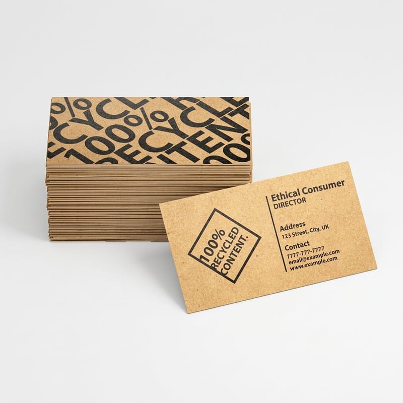
Kraft and other unbleached stocks go further still, because the ink also shifts in color against a brown ground. If your layout depends on a fine hairline, either move up a weight or move the design to a coated stock. How color prints on kraft paper covers what else changes on that surface.
Pairings that do not fight

A pairing works when the two faces agree on proportion and disagree on everything else. Same apparent x-height, similar width, clearly different structure. Two faces that are almost the same look like a mistake; two faces from opposite worlds look deliberate.
Four combinations that hold up on printed pieces, each with the job it suits:
Four that work, and why
Fraunces headline with Inter body. A warm, characterful serif over a neutral sans. Good for a food, wellness, or hospitality brochure where the headline carries the personality and the body just has to get read.
Playfair Display headline with Libre Franklin body. The editorial pairing. Fashion, property, and events all use some version of it. Keep Playfair at 24 pt and above and let Franklin do everything small.
EB Garamond with Work Sans. A classical text serif under a modern sans for labels and captions. This is the pairing for a menu, a program, or an invitation that needs to feel considered rather than new.
Space Grotesk with IBM Plex Mono. Both mechanical, one proportional and one fixed width. It suits technical products, ticketing, and anything with a reference number that should look like a reference number.
The single-family shortcut
You do not need two fonts. A superfamily such as IBM Plex, or a variable font with a wide weight range such as Inter, gives you enough contrast between a black headline and a regular body to build a whole piece. Fewer files, no pairing risk, and nothing to substitute at the RIP.
When you do pair, cap it at two families and three weights across the whole job. Every extra file is another chance for something to go missing on upload.
What it costs to print your type choice
A typeface decision is worth exactly as much as the proof that confirms it. A test run of 100 premium business cards starts at $17.57 and prints in 3 business days, enough to see a face at 8pt on the real stock before you set a whole letterhead or brochure in it. The table below comes from the live configurator and shows how the price steps down as the run grows.
Quantity and price
Business card pricing and specs
Real configurator numbers, where the per unit cost drops as the run grows. A short first run is the cheapest way to see your type on the actual stock.
| Quantity | Price Per Unit | Total |
|---|---|---|
| 100 | 17.6¢ | $17.57 |
| 200 | 11.5¢ | $23.07 |
| 300 | 9.15¢ | $27.46 |
| 400 | 7.96¢ | $31.86 |
| 500 | 7.25¢ | $36.26 |
| 600 | 6.77¢ | $40.64 |
You can also earn coins on every order and put them against the next run, which softens the cost of proofing two type options instead of one.
Sizing and legibility on paper
Point size is not a fixed measure of how big type looks. Two fonts set at 10 pt can differ by a fifth in apparent size, because what you see is the x-height, not the point body. Inter at 9 pt looks larger than EB Garamond at 10 pt. Set by eye on a printed proof, then record the numbers that worked.
Print it
Flyers, ready for a headline
Full-bleed sizes with enough surface for a display face and body copy that still reads at arm’s length.

Working ranges that hold up in practice: body copy on a brochure or booklet at 9 to 11 pt, flyer body at 10 to 12 pt because it is read standing up, business card details at 7 to 9 pt, and disclaimers no smaller than 6 pt on coated stock. Headlines have no upper limit, but a display serif has a lower one, and Playfair Display below 18 pt is where most print files go wrong. There is more on the floor itself in the smallest font size you can print.
Leading matters as much as size. A tall x-height fills the line, so Inter, Work Sans, and Manrope all want more space between lines than their point size suggests. Set the leading, print it, and look at whether the paragraph reads as lines or as a block. Line length belongs in the same check: between 45 and 75 characters, measured on the printed piece rather than the artboard.
Embedding fonts before you upload
Two ways to hand off a file safely. Embed the fonts in the PDF, or convert the text to outlines. Outlining is the one that never fails, because after it there is no font left to substitute, only vector shapes. The cost is that the text stops being editable, so keep a live copy before you outline anything.
- Export as PDF/X-4 or PDF/X-1a with fonts embedded. Both standards require full embedding, which is why print shops ask for them.
- Flatten variable fonts first. Export a static instance at the exact weight you used. A RIP that does not read the axis will fall back to the default weight, and you will not see it until the sheet comes off the press.
- Outline the type when you are handing the file to someone else. Converting text to outlines takes one command in Illustrator or InDesign.
- Check the embedded list in Acrobat before you upload. If a font is listed as subset embedded, it is fine. If it is missing, the export did not do what you asked.
- Keep the file count low. Two families and three weights across the whole job means three chances for something to go wrong instead of nine.
If you work in Illustrator specifically, embedding fonts in Adobe Illustrator covers the export dialog settings, and creating commercial print-ready files puts font handling in the context of bleed, color mode, and resolution.
Font choices by industry
The same font behaves differently depending on how the piece gets read, so here is where each pairing earns its place.
- Restaurants and cafes. EB Garamond or Literata for dish names and descriptions, at 10 pt or larger because menus get read in low light. Keep prices in the same face, aligned, with no dot leaders smaller than the type.
- Law, finance, and consulting. Source Serif 4 for text and Libre Franklin for headings. Both hold at the small sizes disclaimers demand, and neither reads as fashionable enough to date the piece.
- Fitness, beauty, and wellness. Fraunces or Playfair Display for the headline, Inter underneath. The display serif carries the warmth, the sans keeps the class times and prices readable at a glance.
- Trades and home services. Libre Franklin bold throughout. Phone numbers and service lists on a door hanger or a flyer get scanned from a distance, and weight beats elegance every time.
- Technology and startups. Space Grotesk with IBM Plex Mono for anything with codes, versions, or specifications. The mono keeps columns aligned without a table.
Blanks that keep type inside the safe area
Starting from a sized template removes the two errors that font decisions usually cause: type sitting outside the safe margin, and a headline crossing a fold. On a 3.5" x 2" card the blank marks the safe area 0.125 inch inside the trim, and on an 8.5" x 11" tri-fold brochure it marks both fold lines, about 3.67 inches apart, so keep every line of type inside the safe area and every headline inside one panel. Pull a print-ready blank from the blank template library with bleed and trim already marked, or start from a layout in the design template library.
Start fast
Blanks that keep type inside the safe area
Card and flyer templates plus exact size blanks, so your type lands inside the safe area on the first try.














Wally checks the type before the run, not after
Stroke contrast decides the smallest size, not the font name
Set your smallest line first, print one piece on the real stock, and read it at arm’s length in normal light. Keep body copy at 9 to 11 pt, hold display serifs like Playfair Display at 18 pt and up, add half a point and one weight for reverse type, and flatten any variable font to a fixed instance before upload. 4OVER4.COM prints short proof runs so the test costs less than the reprint.
Print a type proof →What to remember about printing Google Fonts
Typesetting habits that hold up on paper
- Set the smallest type first. Start with the disclaimer, the address block, or the footnote. If that reads on the real stock, everything above it will. Building down from the headline is how a layout ends up with a 6 pt line nobody can read.
- Give a tall x-height more leading. Inter, Work Sans, and Manrope all sit tall in the line. Add a point of leading beyond your habit or the paragraph turns into a solid block.
- Reverse type gains half a point and a weight. White on a solid gets squeezed from every side. Step up, and keep high-contrast serifs out of reversed panels entirely.
- Keep the line length between 45 and 75 characters. It is the same on paper as on screen. Wider than that and the eye loses the return; narrower and the rag turns ugly and the hyphenation multiplies.
- Two families, three weights, and stop. Every additional file is another thing to embed, another thing to substitute, and another thing to explain to whoever picks up the artwork after you.
Explore more
More on type, files and what to print it on
Standard letterheads run 50 for $99.95 on 70# uncoated text, the stock that closes a hairline first.
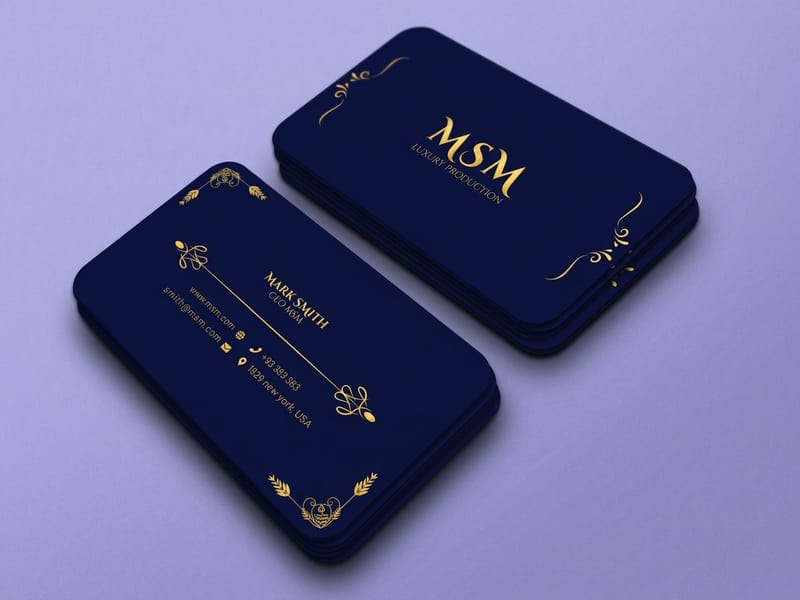 Product Premium Business Cards Heavier stock that holds fine type from $17.57. Product Standard Flyers Headline space and body copy from $39.54. Product Standard Brochures Multi-column layouts from $57.11. Product Standard Postcards The cheapest way to proof a typeface, from $16.48.
  Guide Are Google Fonts Free for Print Use What the OFL and Apache licenses actually permit. Guide The Smallest Font Size You Can Print Where legibility ends and ink takes over.
 For more reading on the type side, see 12 easy to read fonts for brands and print, the Jost font in print and branding, and top fonts for print design. If the job is a mailer rather than a handout, Letterheads start at $99.95 and use the same rules at smaller sizes.
Ready to see your type on paper?
Pick a size, drop in your design or a free template, and 4OVER4.COM prints it sharp on premium stock, as fast as your deadline needs.
Common questions about Google Fonts in print
Which Google Font is the safest choice for printed body copy?
Source Serif 4 if you want a serif, Inter if you want a sans. Source Serif 4 carries an optical size axis, so the design thickens slightly as you set it smaller instead of simply scaling down, and it stays readable at 8 pt on uncoated stock. Inter has a large x-height and open apertures, which keeps small type legible, though you should add a point of leading because that tall x-height makes paragraphs feel dense. Both have weight ranges wide enough that you can build a full piece from one family and skip the pairing decision.
Can I legally use Google Fonts on a product I sell?
Yes. Every family in the Google Fonts catalog ships under the SIL Open Font License or the Apache License, and both allow commercial use, embedding in a print PDF, and converting type to outlines. That covers packaging, business cards, signage, and merchandise. The restrictions are on the font file itself: you cannot sell the file, and you cannot rename a modified version and present it as your own work. Neither comes up in a normal print job.
How do I stop my font from changing when the printer opens my file?
Convert the text to outlines, or export a PDF with the fonts fully embedded. Outlining turns every letter into a vector shape, so there is no font to substitute and nothing to go wrong, which is why it is the safer choice for a file you are handing off. The cost is that outlined text cannot be edited, so always keep a live version for the next revision. Our walkthrough on converting text to outlines before sending files to print covers the steps in Illustrator and InDesign.
Do variable fonts cause problems in print files?
They can, and the fix is simple. A variable font carries a range of weights or widths in one file, and some RIPs handle a non-default instance badly, substituting the default weight instead of the one you set. Before uploading, either export a fixed instance of the exact weight you used, or convert the text to outlines. Do this even when the on-screen proof looks correct, because the substitution usually happens at the press, not in the preview.
What is the smallest I can set a Google Font on a business card?
Around 7 pt for a sturdy sans such as Libre Franklin or IBM Plex Sans, and around 8 pt for most serifs. Below that, the counters inside letters like e and a start filling with ink, and on uncoated stock they fill sooner. The practical test is to print one card on the stock you intend to use and read it at arm’s length in normal room light. That single proof settles the argument faster than any rule, and a short run of Standard Business Cards from $17.57 makes it cheap to run.
