
Top Fonts for Print Design, Picked by What You Are Printing


Sofia is our design and templates voice, built from the knowledge of our production team, with over 20 years in printing.
For print, the shortlist is EB Garamond or Caslon for body copy, Bodoni or Didot for luxury cards at display size, Futura or Jost for modern headlines, Oswald or Montserrat Bold for signage read at distance, and one script held to a single line. Which one wins is settled by stroke weight against the process, not by taste: the hairline serif that looks razor sharp on a coated business card disappears on a vinyl banner seen from thirty feet.
Top print fonts at a glance
| Font | Class | Where it shines | Where it fails | Print it on |
|---|---|---|---|---|
| EB Garamond, Caslon, Bembo | Old style serif | Body copy on flyers, menus and brochures, down to 9pt | Too polite at poster size, and it leaves a lot of air | Standard Flyers |
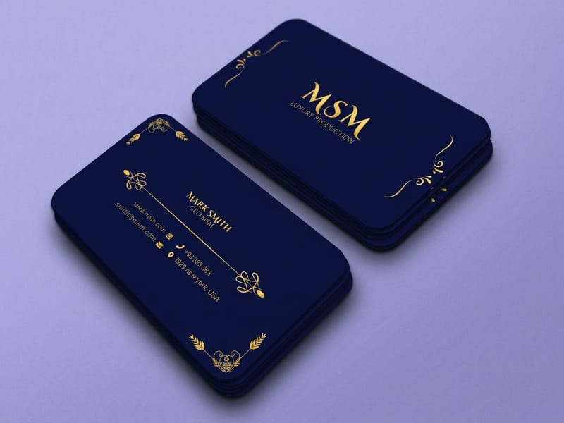
| Bodoni, Didot | High contrast serif | Luxury cards and fashion display type, 18pt and up | Hairlines break up below about 12pt on uncoated stock | Premium Business Cards |
| Futura, Jost | Geometric sans | Short modern headlines with generous letterspacing | Small x-height, so set it a point larger than a grotesque | Standard Posters |
| Inter, Helvetica Now, Archivo | Neo grotesque sans | Anything that has to be neutral and read fast | Light weights blur at distance and in reverse type | Standard Flyers |
| Oswald, Montserrat Bold | Display sans | Banners and yard signs read from across a parking lot | Nothing in the family works as body copy | Vinyl Banners |
| Archer, Roboto Slab | Slab serif | Warm headlines that still carry a heavy ink load | Slabs clog in reverse type at small sizes | Standard Posters |
| Sacramento, Tangerine | Script | One line on an invitation or a pressed card | Illegible small, and worse in all caps | Letterpress Business Cards |
Print one page of the shortlist at final size on the stock you intend to order, then read it at the distance the piece will be read from. It costs one sheet and it settles arguments that mood boards never will. You can order premium business cards in any of these settings straight from the configurator.
What makes a typeface survive the press
Screen type has one enemy, the pixel grid, and modern rendering solved most of it. Print has three: ink spread, stock absorbency, and the distance the reader is standing away. A font that looks immaculate at 400 percent zoom in Illustrator can arrive with its thin strokes fattened, its counters filled, and its personality gone.
Ink spread is the first one to plan around. Wet ink pushes sideways into the fibres, so uncoated stock thickens every stroke slightly and closes small counters, the enclosed white shapes in letters like a, e and g. Coated stock holds the ink on the surface and keeps the thin strokes thin. That single difference decides whether Didot is a good idea or an expensive mistake.
The second is stroke weight against process. Offset holds a fine line comfortably, letterpress pushes the ink out at the edge of the impression, and foil needs enough stroke width to grip. Our guide to choosing and setting up fonts for printing walks through the file side of it, and the smallest printable font size covers the floor for each process.
The four checks before you commit a typeface
Check the x-height, because it decides real readability more than the point size does. Futura at 9pt reads smaller than Inter at 9pt, and the fix is a point size, not a new font. Check the counters next: if the bowl of the a is nearly closed on screen, it will be fully closed after ink spread on uncoated paper.
Check the weight range. A family with four or more weights lets you build a whole hierarchy without ever reaching for a second font, which is why so many good print jobs use exactly one family. And check the license, before the artwork gets approved rather than after. Google Fonts and commercial print use explains where the free ones actually stand. For a longer shelf of good print fonts sorted by how they pair and how their strokes take ink spread, start with the designer fonts guide.
Reverse type changes every rule
White type on a solid field is the setting that catches people out. The ink closes in from all sides, so thin strokes shrink and small counters vanish. Go up one weight, add a point or two, and open the tracking slightly. A serif that is elegant in black on white can be unreadable knocked out of a dark panel at the same size.
If the design depends on reversed type, ask for a hard copy proof rather than a PDF proof. It is the one case where a screen tells you nothing useful.
The picks, by what you are printing
Grouping fonts by mood produces pretty mood boards and bad print jobs. Grouping them by what the piece has to do produces something you can order. This is how the shortlist splits.
Every one of these is cheap to test. Premium business cards start at $17.57 and standard flyers at $39.54, which is a small price for finding out that your headline font loses its serifs at 8pt.
Luxury cards: high contrast serifs and one script
Bodoni and Didot are the reason expensive things look expensive. The hairline strokes against thick stems read as precision, and on a coated or a soft cotton stock at 18pt and above they hold beautifully. Below roughly 12pt on uncoated paper the hairlines start to break, so keep them for the name and set the contact details in something sturdier.
Bembo, Garamond and Caslon are the safer luxury route. Lower stroke contrast means they take ink spread without complaining, which is why they still turn up on letterpress work four centuries after Garamond cut the originals. The classic print fonts explained goes into where each one came from and how it behaves.
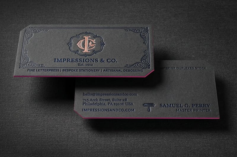
On letterpress business cards from $251.36 the impression itself spreads the ink at the edge of every stroke, so avoid anything with hairlines under about half a point and skip light weights entirely. A script is fine for one line, never for a paragraph. For more on card typography specifically, typographic business cards that actually work shows the layouts that survive contact with a wallet.
Bold signage: heavy sans, nothing clever
Signage has one job and distance is the whole brief. Work out where the reader stands, apply about one inch of cap height per ten feet of viewing distance, then pick a font that still exists at that weight. Oswald, Montserrat Bold, DIN and Gotham Bold all qualify. Condensed faces such as Oswald buy you more characters per foot of banner, which matters when the copy will not shrink.
What fails on a banner is the light weight, the tight aperture and the high contrast serif. From thirty feet a Didot hairline is not thin, it is missing. Keep to two type sizes, one headline and one line of detail, and leave the rest of the surface empty. The banner fonts guide has the size chart, and vinyl banners start at $79.
Posters sit between the two. A reader at six feet can handle a display serif and a real headline hierarchy, so this is where Futura and Jost earn their place. See the best fonts for posters for more picks, and poster typography tips for the layout side.
Clean flyers: readability first, one accent second
A flyer gets read at arm length, held, and thrown away in under ten seconds. Body copy wants a plain face: Inter, Source Sans, Archivo, Lora or EB Garamond, set 9pt to 10.5pt with generous leading. Anything smaller and the piece stops being read at all, whatever the design does.
Save the personality for the headline and hold it to one accent face. Twelve easy to read fonts for brands and print lists the ones that stay legible under a heavy ink load, and the flyer fonts guide covers sizes per flyer format. If you are still deciding between the two broad camps, serif versus sans serif is the shorter version of that argument.
Pairing two fonts without a clash

Two fonts on a page either look deliberate or look like an accident, and the difference is contrast. Pairs fail when the two faces are similar enough that the reader cannot tell whether it was a choice. Garamond with Caslon is a muddle. Garamond with Oswald is a decision.
The reliable method is to change the skeleton, not the flavour. Pair a serif with a sans, or a geometric with a humanist, and keep one thing constant between them, usually a similar x-height so the two sit level on a line. Then let weight and size do the hierarchy rather than adding a third font.
Three pairs that hold up in print: Jost headline with EB Garamond body for something modern that still reads warm, Playfair Display headline with Source Sans body for editorial work, and Oswald headline with Inter body for anything that has to shout then explain. The Jost font in print and branding covers the first one in detail.
When one family beats any pair
A superfamily with both a serif and a sans, or simply a sans with six weights, gives you a full hierarchy that can never clash. It is the boring answer and it is usually the right one for a brochure, a price list or a menu, where the reader needs structure rather than surprise.
Two fonts is a working maximum for a single piece, three is where it starts looking accidental. If a third is genuinely needed, make it a monospace for numbers, codes or a table, where the shift is doing an actual job.
Slab, humanist and monospace styles for print
The shortlist above covers most print jobs. Four more styles earn a place when a piece has a specific job, and each behaves in its own way once ink meets paper.
- Humanist sans. Source Sans, Gill Sans and Frutiger have open apertures drawn from handwriting, so the letters stay distinct at 9pt on uncoated flyer stock. A safe body face for standard flyers when Inter feels too cold.
- Transitional serif. Baskerville and Times sit between Garamond and Bodoni. They carry more contrast than an old style face and still hold at 9pt on coated or uncoated brochure paper.
- Slab serif. Archer and Roboto Slab have thick, even serifs that take a heavy ink load on posters and menus. Avoid them in small reverse type, where the slabs fill in.
- Monospace. IBM Plex Mono and Courier give every character the same width, so prices, part codes and table figures line up in a column without tab stops.
Condensed, rounded and stencil faces for special jobs
Some styles belong on one kind of piece and nowhere else. Proof each at final size before the run, because each one breaks in its own place.
- Condensed sans. Bebas Neue and Roboto Condensed fit more letters per foot of banner. Their narrow counters close on uncoated stock, so keep them above the 8pt floor and out of body copy.
- Rounded sans. Nunito and VAG Rounded soften the corners that ink spread would round off anyway, which suits bakery labels, children’s brands and school flyers. On a law firm card the same face reads as casual.
- Stencil. One word on a label, a crate sign or a card front. Thick even strokes make a heavy stencil one of the few display styles that suits letterpress business cards from $251.36, where the impression needs weight to hold.
- Brush and handwritten. Treat them like a script: one line on a thank you card or a price tag, never a paragraph, and never in all caps.
Card pricing and specs at 4OVER4.COM
Typography is free. The stock it sits on is not, and stock is the part that decides whether a thin stroke stays thin. Premium business cards run from 14pt gloss cover up to 80pt UltraWhite, with uncoated, soft touch, linen and ultra thick gloss stocks in between, a run of 100 prints in 3 business days, and you can pick a next day hardcopy proof when the design leans on reversed or hairline type. The numbers below come from the live configurator, so you can weigh a coated premium card against a cheaper uncoated one before you commit the design.
Quantity and price
Business card pricing and specs
Real configurator numbers across stocks and finishes, where the per unit cost drops as the run grows.
| Quantity | Price Per Unit | Total |
|---|---|---|
| 100 | 17.6¢ | $17.57 |
| 200 | 11.5¢ | $23.07 |
| 300 | 9.15¢ | $27.46 |
| 400 | 7.96¢ | $31.86 |
| 500 | 7.25¢ | $36.26 |
| 600 | 6.77¢ | $40.64 |
You can also earn coins on every order and spend them on the next run, which makes proofing two typefaces instead of one easier to justify.
Stock and finish decide how your type looks
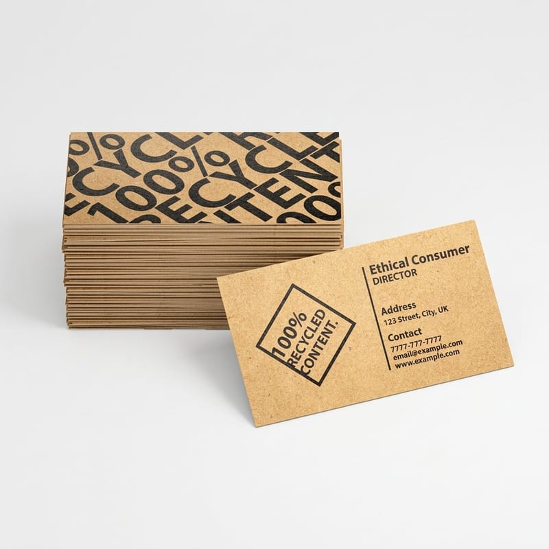
The same font is a different font on two stocks. Coated stock holds ink on the surface, so hairlines stay hairlines and small type stays open, which is why high contrast serifs belong there. Uncoated stock absorbs ink into the fiber, thickening every stroke slightly and closing counters, which flatters old style serifs and punishes Didot. Soft cotton stock exaggerates both effects, so it rewards a sturdy face and a deep impression. On premium business cards the choice is concrete: 14pt or 16pt gloss cover for a Didot or Bodoni name, 16pt or 18pt uncoated cover for Garamond and Caslon, 16pt uncoated with soft touch for a medium weight sans, and 18pt Kraft uncoated for a slab or stencil face heavy enough to sit on the brown fiber.
Print it
Premium business cards
Coated and uncoated stocks with free proofs, so you can see the typeface before the run.
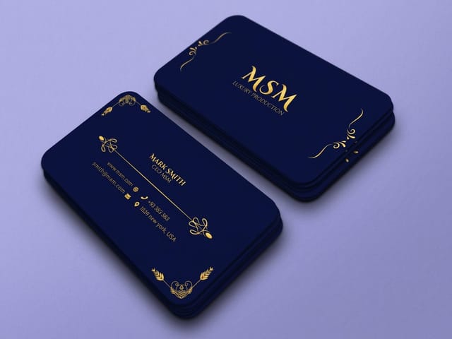
Finish adds another layer. Gloss lifts color but throws glare across small type under a spotlight, matte reads calmer and keeps long copy comfortable, and soft touch mutes contrast slightly, so go up a weight if the type is already delicate. Spot gloss or foil on the lettering itself is the one case where the font choice is a production decision: raised foil business cards from $86.78 need strokes with enough width to hold the foil, so a hairline script registers poorly while a medium weight serif looks superb. The explanation of pt in printing is worth reading, because the same abbreviation means paper thickness, line weight and font size in three different sentences.
Font choices by business type
The right answer changes with what you print most often, so the shortlist changes by business type.
- Studios and agencies. Buy a licensed family with a wide weight range and use it everywhere. One family across cards, decks and flyers reads as a brand faster than any clever pairing.
- Restaurants and bars. A high contrast serif for the name, a humanist sans at 10pt for the dishes. Menus are read in low light, which punishes thin strokes harder than any press does.
- Real estate and trades. Oswald or Montserrat Bold on the signage so it reads from the road, and the same sans in a lighter weight on the cards so both pieces match.
- Weddings and events. A script for one line only, a Garamond or Bembo for everything else, and letterpress if the budget allows. Test the script at final size before you order the run.
- Retail and product brands. Pick for the smallest thing you print, usually the label or the hang tag. A font that survives 6pt on a tag will handle every larger piece you own.
Blanks that settle the margin argument
A template saves the argument about margins so you can spend the time on type. 4OVER4.COM sizes its blanks to exact product specs, with bleed and trim already marked, so your baseline grid lines up with the cut. On a standard 3.5 by 2 inch card the blank opens at 3.75 by 2.25 inches with the bleed included, and the safe area sits 0.125 inch inside the trim, which is where your smallest line of type belongs. Grab one from the blank template library, or start from a finished layout in the design template collection and swap the fonts. Before you upload, read how to convert text to outlines and how to embed fonts in Illustrator, because a substituted font undoes every decision on this page.
Start fast
Blanks that settle the margin argument
Card design templates and exact size blanks so your type lands inside the safe area.









Wally sizes the type before he picks the font
Distance first, stock second, personality last
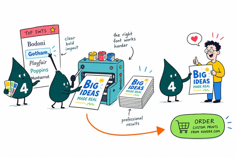
Work out how far away the reader stands, then set about one inch of cap height for every ten feet. Keep body copy at 9pt or above, treat 8pt as the floor on uncoated stock, and add a size and a weight to anything reversed out of a dark field. Save the high contrast serifs for coated stock at display size, and 4OVER4.COM proofs it before the run.
Order premium business cards →What to remember about print fonts
Typography tips that hold at every size
- Set the size before you pick the font. Reading distance decides cap height. Choose a typeface that still works at that size instead of shrinking a favorite until it stops functioning.
- Two fonts, not four. One face for headlines, one for body, hierarchy built from weight and size. A third is a monospace for numbers, if anything at all.
- Open the tracking on reverse type. Ink closes in from every side on a knocked out setting. Add a point, add a weight, and add a little letterspacing.
- Check the license before the client approves the artwork. Free for personal use is not free for a print run of ten thousand. Confirm it while changing the font still costs nothing.
- Outline or embed, every time. Send outlined text or a PDF with the fonts embedded so the RIP prints your typeface rather than a substitute that reflows the whole layout.
Explore more
More ways to print and promote
Vinyl banners print in 3 business days and letterpress cards 250 for $251.36 in 15.
 Product Premium Business Cards Coated stock that keeps a hairline serif sharp. Product Letterpress Business Cards Deep impression on cotton stock, for sturdy type. Product Standard Flyers Body copy at 9pt to 10.5pt, read at arm length.
  Product Standard Posters Display type read from about six feet back.
  Product Vinyl Banners Heavy sans at three inch cap height and up.
  Category Business Card Printing Every stock and finish your typography can sit on.
 Ready to see your type on paper?
Pick the stock, drop in your design or a free template, and 4OVER4.COM prints it sharp enough to judge the typeface properly, as fast as your deadline needs.
Common questions about print fonts
What is the smallest font size that still prints cleanly?
On coated stock with a sturdy sans, 6pt is workable for legal lines and disclaimers. On uncoated stock, or with any serif that has thin strokes, treat 8pt as the floor for anything a customer is expected to read. The number moves with the typeface rather than the press: a face with a large x-height and open counters holds at a size where a high contrast serif has already closed up. Reverse type needs one to two points more than the same setting in black on white, because ink spread eats into the letterform from every side.
Do I need to buy a font license to print with it?
It depends on the license, and the phrase to look for is the specific grant rather than the word free. Google Fonts are released under the SIL Open Font License, which covers commercial print use, so a Google Fonts pick is the simplest safe answer for most small businesses. Many other free downloads are personal use only, which means a print run for a client is a breach even though the file downloaded without payment. Commercial foundries usually sell a desktop license that covers print, with web and app use sold separately. Sort this out before the artwork is approved rather than after the plates are made.
How many fonts should one printed piece use?
Two is the working maximum for most jobs, and one good family is often better. Use one face for headlines and one for body copy, then build the rest of the hierarchy from weight, size and spacing instead of adding another typeface. A family with four or more weights gives you more usable combinations than three unrelated fonts ever will, and it will never clash with itself. The one honest exception is a monospace for numbers, part codes or a table, where the switch is doing a real job rather than adding decoration.
Should I outline the type or embed the font?
Either works, and they fail differently. Outlining converts every letter to a vector shape, so nothing can substitute, but the text is no longer editable and very small type can look slightly heavier once it becomes artwork. Embedding keeps the text live inside the PDF and keeps the file smaller, which matters on a long document. Whichever you pick, do not send a file that merely references a font installed on your machine, because the RIP will swap in something else and reflow the layout. Our guides on converting text to outlines and embedding fonts in Illustrator cover the exact steps for each application. Type set to fill a shape needs the same care, and fitting text into a shape in Illustrator walks through the warp before you outline it.
Which font holds up best on a banner read from across a parking lot?
A heavy or bold sans with open counters, set at roughly one inch of cap height for every ten feet of viewing distance. Oswald, Montserrat Bold, DIN Bold and Gotham Bold all work, and a condensed face buys extra characters per foot when the copy will not shrink. What fails at that distance is anything light, anything with a hairline, and anything with tight apertures. Keep the banner to two type sizes, one headline and one supporting line, and leave the remaining space empty so the message survives being read at speed.
What are the top 10 font styles?
The ten styles print designers reach for are old style serif, transitional serif, high contrast serif, slab serif, geometric sans, neo grotesque sans, humanist sans, display sans, monospace and script. Each one suits a different job: a high contrast serif such as Didot wants coated stock at 18pt and up, while an old style serif such as EB Garamond holds flyer body copy at 9pt.
What are the four main types of fonts?
The four main types are serif, sans serif, script and display. Serifs such as Garamond carry body copy on flyers and brochures from 9pt, sans serifs such as Inter stay neutral and read fast, scripts belong on one line of an invitation or a letterpress card, and display faces such as Oswald are drawn for headlines and banners read from a distance.
