
12 Easiest Fonts to Read for Brands, Print and Signage


Marcus is our print marketing voice, built from the knowledge of our production team, with over 20 years in printing.
What Actually Makes a Font Easy to Read

The easiest fonts to read on printed paper are Verdana for small print and Georgia for longer text, followed by Open Sans, Lato, PT Serif and Rooney for body copy on business cards, flyers and brochures. Legibility has little to do with taste or beauty: a face is easy to read when the eye can tell one letter from the next without slowing down, and that comes from measurable things: how tall the lowercase letters stand, how open the curves are, how much air sits between characters. Any typeface can look good in a logo. Only some hold up in a paragraph.
The second half of the answer is size and surface. The same font that reads perfectly on a screen at 16 pixels can close up and turn muddy at 7 points on uncoated paper, because ink spreads into the fiber and fills the small openings inside letters. Print asks more of a typeface than a website does, and it never gives you a zoom control.
Two type mistakes send a piece back to press: a phone number set in a hairline weight at 6 points, or a banner headline sized for a desk instead of a sidewalk. The twelve fonts in this article survive that trip from screen to press.
A tall x-height
The x-height is the height of a lowercase x against the capitals. Faces with a tall x-height look bigger at the same point size, which is why Verdana at 8 points reads more easily than Futura at 9. When you compare two fonts, set them side by side at the same size rather than trusting the name of the size.
Open apertures and clean counters
The aperture is the gap where a curve almost closes, as in c, s and a. The counter is the enclosed hole in e, o and p. Open apertures and roomy counters keep letters distinct after ink spread. Tightly drawn grotesques look sharp at 30 points and turn into a gray fence at 7.
Characters you cannot confuse
Set a capital I, a lowercase l, the numeral 1, a capital O and a zero next to each other in the font you are considering. If you cannot tell them apart in two seconds, neither can the person reading your address block, your order number or your price list.
Spacing that does the quiet work
Half of perceived legibility comes from the space around the letters, not the letters themselves. Well spaced type gives even color across a paragraph with no rivers of white running down the block. Tracking a face out slightly helps small print and reversed type. Tracking it out too far breaks words into loose beads.
The Easiest Font to Read on Printed Paper, by Job
The right pick depends on the piece and on how close the reader stands to it. Here is the short answer by job; the exact point sizes for each piece sit further down, under Point Sizes and Settings.
- Contact lines and fine print. Verdana on a business card, where its tall x-height keeps a phone number readable.
- Body copy on flyers and brochures. Georgia, Open Sans or Lato on a flyer or brochure.
- Postcards and mailers. Open Sans or PT Sans, whose plain shapes hold up on a coated postcard stock.
- Headlines and banners. Helvetica, or Roboto Condensed when a long company name has to fit across the width.
A free online proof shows the layout on screen; only a print on the real stock shows how the counters hold.
Why Legible Fonts Matter More for a Business Than a Blog
A brand pays for every unreadable character twice: once when the reader gives up, and again when you reprint the piece. Printed material has no zoom. A customer squinting at a business card in a dim restaurant either reads the phone number or puts the card away.
Type choice is also the cheapest consistency you can buy. One well chosen family across cards, flyers, banners and packaging makes a small company look established, because the eye recognizes the shapes long before it reads the logo. If you are building that system from scratch, our roundup of free fonts for business cards is a practical place to start.
- Comprehension speed. Open, familiar letterforms let people scan a flyer quickly and decide to keep it.
- Trust. Clear, evenly spaced type reads as competence. Cramped or novelty type reads as improvised, fairly or not.
- Accessibility. Readers with low vision, or anyone reading without their glasses, need open shapes and honest sizes to read the piece at all.
- Reproduction cost. Fonts that hold up at small sizes let you fit the same information on a smaller, cheaper piece.
- Licensing safety. A family with a real commercial license will not force a redesign the week your packaging goes to print.
There is a copy angle here too. Readable type gives copy room to work, and tight copy makes readable type look effortless. If your printed material is fighting for space, trimming the words is usually easier than shrinking the font, and our notes on how to improve your brochure copy pair well with everything below.
Print picks
Three surfaces where font choice shows immediately
Live prices, ready to customize with your own type system.
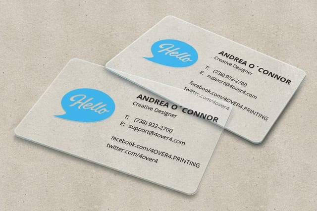 30mil Clear Plastic Cards 500 for $529.26 Transparent stock where every letterform is exposed, so type choice decides the whole card.
 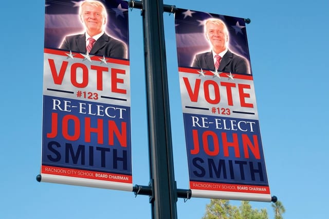 2 Sided Blockout Banners $108.75 each Two readable faces with an opaque core, so the message on the back never ghosts through.
 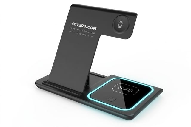 3 in 1 Foldable Wireless Charger $15.00 each A ready-made desk gift to pair with a card that carries your clean, wide logotype.
 Six Easy-to-Read Fonts That Can Carry Body Copy
These are the workhorses. Each one has a tall x-height, open shapes and enough weights to build a hierarchy, and each holds together at the sizes where print gets difficult. The specimen next to each name shows the face itself where your device has it, and a close relative where it does not.
- Georgia A serif drawn for screens that turned out to be excellent on paper. Sturdy, slightly slabbed serifs survive ink spread, and the tall x-height means 9 points still reads like 10. Note that the numerals are old style and sit below the cap line, which looks elegant in prose and slightly odd in a price table. Best for long copy, brochures and any brand that wants warmth without looking antique.
- PT Serif and PT Sans A matched superfamily with unusually broad language coverage, which matters the moment you print a bilingual menu or a Cyrillic name correctly. The sans is neutral without being cold, the serif is quiet enough for a full page, and using them together gives you contrast that still reads as one voice.
- Open Sans The humanist sans that ended up everywhere for good reason. Wide apertures, upright stress and a generous set of weights make it the safest choice for forms, captions, spec sheets and anything a customer has to fill in by hand. It is not exciting. That is the job.
- Verdana The most legible face on this list at very small sizes, thanks to an enormous x-height and deliberately loose spacing. Set a legal line, a disclaimer or a 7 point address block in Verdana and it stays readable when everything else closes up. The cost is width, so it eats space fast in headlines.
- Rooney A contemporary slab-ish serif with rounded terminals and low contrast, which is exactly the recipe for comfortable long reading. It has more personality than Georgia and less formality than a traditional book face, so it suits health, education and family brands that want to feel approachable in print.
- Lato Semi-rounded humanist letters that look neutral at a glance and warm up when you set them large. The lighter weights are beautiful on a business card at 8 points and above, and the family is wide enough to carry a whole identity on its own. A reliable default when a client says modern but friendly.
Quantity and price
Clear plastic card pricing and specs
The quantity ladder and every option on the clear card, from foil stamping to a magnetic stripe.
| Quantity | Price Per Unit | Total |
|---|---|---|
| 500 | $1.06 | $529.26 |
| 1,000 | 63.0¢ | $630.31 |
| 2,000 | 56.8¢ | $1,135.55 |
| 2,500 | 53.0¢ | $1,325.02 |
| 3,000 | 50.5¢ | $1,514.49 |
| 3,500 | 48.7¢ | $1,703.96 |
Six More Easy-to-Read Fonts for Headlines and Brand Marks
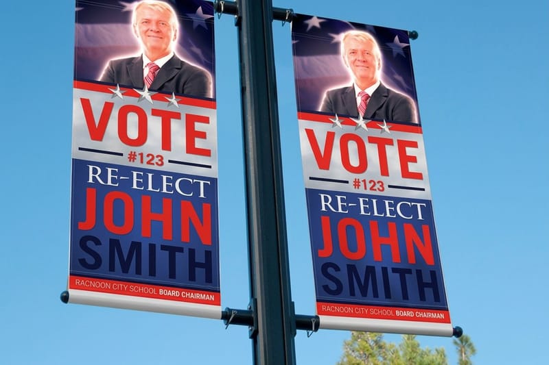
The second six lean toward display use. They are legible, but some of them are legible at 14 points and unforgiving at 7, which is worth knowing before you set a footer in one.
- Helvetica The neutral standard, and neutral is genuinely useful when the product should do the talking. Its apertures are tight, so it wants 10 points and up in print. Above that it is clean, tight and endlessly reliable, especially for signage and packaging where a single strong word carries the frame.
- Roboto A grotesque with humanist curves and a tall x-height, plus condensed widths that solve the problem of a long company name on a narrow banner. Condensed cuts always cost some legibility, so use them for headlines and keep the body in the regular width.
- Karla A grotesque with quirks in the a, the g and the terminals that give a brand a fingerprint without wandering into novelty. Excellent for labels, short callouts and category headers. Keep paragraphs short, since the personality that reads as fresh at three lines reads as busy at twelve.
- Ubuntu Distinct curves and slightly angled terminals make it recognizable at a glance while staying perfectly readable. It is one of the few faces that gives you brand character and clean small text in the same family, which is why it holds up across a deck, a flyer and a trade show banner.
- Quicksand Geometric shapes with rounded ends and a soft, friendly voice. Beautiful in headlines and on packaging for anything aimed at kids, wellness or food. The low stroke contrast and circular counters get fragile under 12 points, so treat it as a display face and pair it with a sturdier body font.
- Futura The geometric classic, with a low x-height that makes it look smaller than its point size suggests. Gorgeous as a logotype and in large headlines, difficult below 11 points. If you use it small, add a little tracking and never go lighter than the book weight.
Notice the pattern. The faces with the most personality are the ones with the tightest size limits, and that is a fair trade as long as you know where the limit is.
Large format
Double sided blockout banners
15oz blockout vinyl in 13 sizes, from 2 x 3 feet up to 4 x 10 feet.

The Characteristics Every Legible Typeface Shares
Once you know what to look for, you can judge a font in about a minute without reading a single review. Open the character set, set a test line and run down this list.
- Tall x-height. Lowercase letters that reach at least halfway up the capitals. This is the single strongest predictor of small size legibility.
- Open apertures. The gaps in c, s, e and a stay open rather than curling closed on themselves.
- Clear counters. The holes in e, o, a and g stay open at the smallest size you plan to print.
- Unambiguous characters. Capital I, lowercase l and the numeral 1 are visibly different, and the zero is distinguishable from a capital O.
- Moderate stroke contrast. Thick and thin strokes are close in weight, so the thin parts do not vanish on press or on textured stock.
- Even spacing. No sudden gaps or collisions in common pairs such as Av, To, We and rn.
- A real weight range. At least regular, medium, bold and matching italics, so hierarchy comes from the family instead of from four unrelated fonts.
- Proper kerning tables and lining figures. A serious family kerns its pairs and offers lining numerals for prices, phone numbers and dates.
- A commercial license. Free for personal use is not free for your packaging run. Confirm the license before the file goes to press.
A quick field test: print the candidate at 7, 9 and 12 points on the actual stock, then read it at arm's length in ordinary indoor light. Screens flatter type. Paper tells the truth, and so does a dim room.
Point Sizes and Settings That Stay Readable on Press
Choosing the font is half the job. Setting it correctly is the half that gets skipped, and skipping it is what sends a piece back to press. These numbers are the practical floor for commercial printing, not the theoretical minimum.
Sizes by piece
- Business cards. Name at 10 to 12 points, title at 8 to 9, contact lines at 7 to 8. Below 6 points nothing is reliably readable, no matter how good the font is.
- Flyers and brochures. Body at 10 to 12 points, subheads at 14 to 18, headline at 24 and up. Keep the line length between 45 and 75 characters.
- Postcards and mailers. Body at 10 points minimum, because the piece gets read while standing over a recycling bin.
- Plastic cards and badges. Add one point over paper equivalents. Glossy plastic reflects light and steals contrast at small sizes.
- Banners and signage. Roughly one inch of cap height for every ten feet of viewing distance. A banner read from thirty feet needs letters about three inches tall.
Settings that protect the type
- Set small text in 100 percent K only. Text built from four colors goes soft if registration drifts by a hair.
- Avoid strokes thinner than 0.25 points. Hairlines either disappear or fill in, depending on the stock.
- Bump reversed type up one weight. White type on a dark field always looks lighter than it measures, and the ink closes in around it.
- Give uncoated stock more air. Add a touch of tracking and leading, since fiber spreads ink and closes counters.
- Keep type 0.125 inches inside the trim. Cutting is accurate, not perfect, and a clipped descender ruins an otherwise clean card.
- Embed or outline your fonts in the PDF. An unembedded font substitutes silently and reflows the whole layout.
- Keep the same font versions everywhere. A variable font update can shift your layout between orders.
Compare formats
Popular card formats, side by side
Stock, finish, size, quantity and turnaround, so you can match the type size to the piece.
 free business cards |  Standard Business Cards |  3D Lenticular Business Cards |  Metallic Foil Business Cards | |
|---|---|---|---|---|
| Min price | Free | $17.57 | $690.88 | $222.13 |
| Paper / stock | 14pt Gloss Cover | 14pt Gloss Cover | 31pt Lenticular Lens | 16 Point Silk Laminated |
| Finish | - | Standard Finish | - | - |
| Size | 2" x 3.5" | 2" x 3.5" | 2" x 3.5" - Vertical | 2" x 3.5" |
| Default qty | 200 | 100 | 500 | 500 |
| Turnaround | 5 business days | 3 business days | 22 business days | 7 business days |
| Rating | ||||
| View & customize | View & customize | View & customize | View & customize |
Matching the Font to the Surface You Are Printing On
The right font for a brochure is often the wrong font for a banner, and the mark that looks perfect on a business card can disappear on a promotional item. Surface, size and viewing distance decide more than style does.
On a transparent stock such as our 30mil Clear Plastic Cards, there is no paper fiber to spread the ink, so fine strokes hold beautifully and a face like Lato or Georgia keeps its detail. What you lose is background contrast: type sits against whatever is behind the card, so print a white ink panel behind the block, an option on these cards, and set it a weight heavier than you would on white paper.
Large format flips every rule. On 2 Sided Blockout Banners, cap height beats typeface every time. A condensed grotesque such as Roboto Condensed fits a long name across the width, and the blockout layer stops the reverse side from ghosting through and muddying your letters. Keep the headline to six words, and put the detail where people can walk up to it.
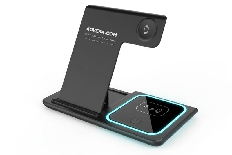
Small branded objects are the hardest case of all. On small promo surfaces the print area is tiny and the surface is not paper, so thin strokes and tight counters do not survive; the 3 in 1 Foldable Wireless Charger sidesteps that, since it ships as it comes. Use a single-weight logotype, add tracking, drop the tagline, and let the object carry the brand rather than the sentence.
Packaging sits between those extremes and behaves like uncoated paper with a texture penalty: on kraft or another natural stock, choose a face with heavier stems than you would use on coated sheets.
Pairing Your Fonts and Sending a Print-Ready File
Two families are enough for almost any brand, and one is enough for most. Pick a display face for headlines and a body face that stays clear at 8 points, then make sure the two differ in structure rather than in mood. Georgia with Open Sans, Futura with PT Serif, Lato on its own across every weight: all three work because the contrast is obvious at a glance.
When the pairing is set, lock it into a one-page rule sheet with the exact sizes, weights and letter spacing for each piece you print. That sheet is what keeps a flyer designed in March matching a banner ordered in November, and it saves the argument every time someone new touches the artwork. Seasonal work is the usual exception, and free display faces like these Easter inspired fonts belong in a campaign layer that sits on top of the system rather than replacing it.
Start fast
Blank business card press files
Start a card from a blank at the exact size, then set your type system on it.






Wally helps you pick type that still reads on paper
The right font, then the right size for the surface
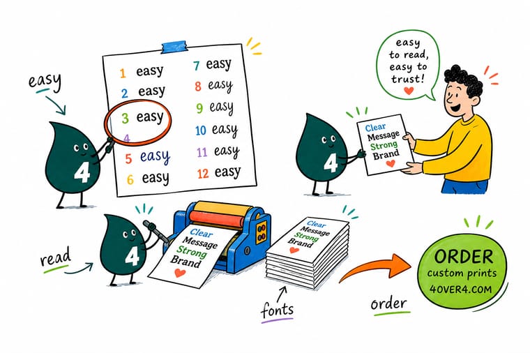
Not sure which of the twelve to use? Start from the smallest thing you print. If your phone number has to sit at 7 points, choose Verdana or Open Sans and stop there. If the piece is mostly reading, Georgia or Rooney will be kinder to the eye. Then set small text in solid black, keep it inside the safe margin, embed your fonts, and send the file. Wally will flag anything that will not survive the press.
Order clear plastic cards →Explore more
More on type, design and getting it printed
Products where type choice shows, plus font and design articles worth reading next.
Product 30mil Clear Plastic Cards One credit card size, in runs from 500 to 10,000 cards. Product 2 Sided Blockout Banners Large format, where cap height matters more than the face. Product 3 in 1 Foldable Wireless Charger A 7 x 6.75 inch promotional item, sold from a single piece. 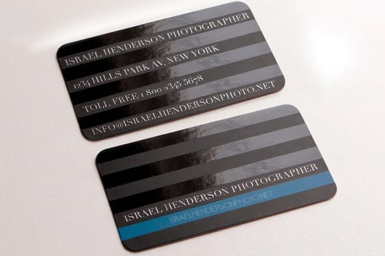 Article 20 Free Fonts for Business Cards Free faces that stay readable at card sizes.
 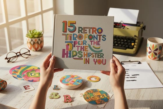 Article 15 Retro Fonts Display type with character for headlines.
 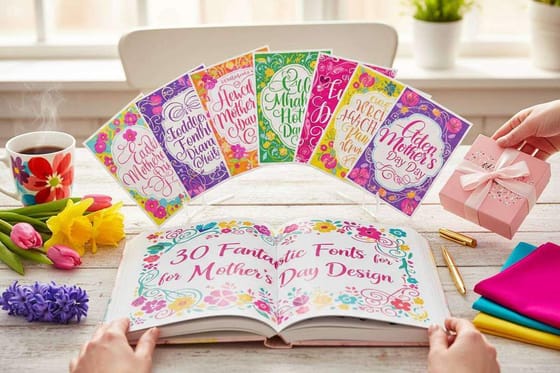 Article 30 Fonts for Seasonal Campaigns Seasonal faces for a temporary campaign layer.
 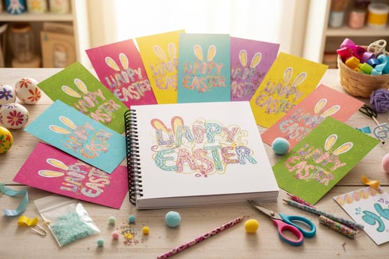 Article 15 Easter Inspired Free Fonts Free display type for spring promotions. Article 5 Free Business Card Design Tools Lay out your type before it goes to press.
  Article 10 Ways to Improve Brochure Copy Shorter copy makes readable type look effortless.
  Article DIY Kraft Packaging Box Setting type on a rough natural stock.
  Article 25 Social Media Content Ideas Carry the same type system into your feed.
 Ready to print something people can actually read?
Choose your font, set the sizes from the list above, then upload the file and let our prepress team confirm every line clears the safe margin before it goes to press.
Easy-to-Read Font FAQs
What is the easiest font to read?
Verdana wins at small print sizes, because its tall x-height and loose spacing keep a contact line open. Georgia is the most comfortable for long passages, since its sturdy serifs guide the eye along the line. For a neutral sans that works on almost any piece, pick Open Sans or Lato.
How do I choose one brand font from the twelve?
Start with the smallest line you will ever print, usually a phone number or a legal line, and drop every face that fails there. From the survivors, pick the one that matches your voice: a humanist sans such as Lato or Ubuntu for warmth, a grotesque such as Helvetica or Roboto for neutrality, a serif such as Georgia or Rooney for authority. Then run it through the characteristics checklist above before you commit.
Does the typeface change what the job costs?
No. The print price comes from the product, the quantity and the options you add, never from the font. A type choice can still cost money afterwards: thin type on a clear card may need the optional white ink layer to read, and small text that closed up on press means paying for the run again.
Which stocks hold a fine stroke, and which spread it?
Coated stocks hold fine strokes best, so a delicate face keeps its detail on gloss or silk. Uncoated and kraft stocks let the ink soak in and spread. Matte and soft touch surfaces cut glare, which helps small text under bright store lighting, while high gloss can bounce light straight off it.
When does the turnaround clock actually start?
The clock starts when your file passes prepress, not when you place the order, so a missing font or a line past the safe margin delays the start. From there each product runs on its own schedule: the ready-made wireless charger ships in 1 business day, 2 Sided Blockout Banners 2 to 4 business days, and 30mil Clear Plastic Cards 15 business days.
