
The Smallest Font Size You Can Print and Still Read


Sofia is our design and templates voice, built from the knowledge of our production team, with over 20 years in printing.
Three numbers to remember: 4 point is what a press can hold, 6 point is what fine print survives at, and 8 point is where people actually read. Here is what moves each one.
A commercial press holds a clean sans-serif down to about 4 point on coated stock, but the smallest size most people can comfortably read is 8 point, with 6 point reserved for fine print they only scan. The number shifts with the typeface: x-height and stroke weight matter more than the point size on the menu, and a 7 point face with a tall x-height beats a 9 point serif set light. Set anything under 8 point in 100% black, keep it as live vector text, and add a point on uncoated stock or when the type is reversed out of a dark background.
Quick answer
4 point prints, 6 point is fine print, 8 point gets read
The mechanical floor and the readable floor are different numbers, and confusing them is what produces unreadable cards. Coated stock and a solid sans will image at 4 point. Fine print holds at 6 point and needs 7 on uncoated. Anything a customer must read starts at 8 point, and 10 point if the audience includes older eyes. Below 8 point, build the type in 100% black only, keep it as vector text rather than a rasterized image, and add a point plus a weight whenever it is reversed out of a dark field.
There Are Three Different Minimums, Not One

Ask a pressman and a proofreader the same question and you get two different numbers, because they are answering about two different limits. The press has a mechanical floor. Your reader has a comfort floor. Between them sits the size you are legally allowed to use for the boring parts.
| Size | Does the press hold it | Can a person read it | Where it belongs |
|---|---|---|---|
| 4 pt | Yes on coated stock, in a solid sans. Counters start closing. | Only with effort and strong light. | Microprint, security marks, filler nobody reads. |
| 6 pt | Yes, reliably, on coated. Add a point on uncoated. | Scanned once, not read twice. | Disclaimers, credits, expiry dates, legal lines. |
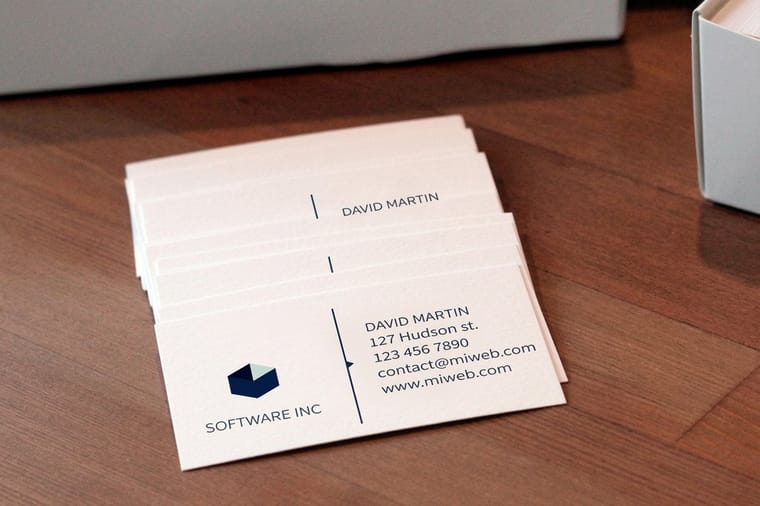
| 8 pt | Comfortably, on any stock we run. | Yes, at normal holding distance. | Business card contact blocks, captions, spec lists. |
| 10 pt | Yes. | Easily, including most older readers. | Brochure and booklet body copy. |
| 12 pt | Yes. | At arm's length, in poor light. | Forms, instructions, anything aimed at every eye. |
The trap is treating the first column as permission. A file with 5 point body copy will print, we will not reject it, and the box will arrive looking exactly as specified. It will simply go unread. If your content only fits at 5 point, the honest fix is a bigger piece: move from a standard business card to a postcard at $16.48, or from a flyer to a folded brochure at $57.11.
The smallest size Word and Google Docs will set, and why the press ignores it
The size menu in your writing app is not the limit. In Word the dropdown starts at 8 point, but the size box accepts any value from 1 to 1638 in half point steps, so typing 3 into it gives you 3 point type. Google Docs behaves the same way: the menu bottoms out at 6, and typing a smaller number into the box is allowed. Both will happily set text no press can hold and no reader can see.
That is the gap this page is about. A 2 point line looks fine on a screen at 400 percent zoom, and the app never warns you. On press it lands below the 4 point floor and the counters close. Two more things happen on the way out of a word processor. The text is usually built as RGB black, which converts to a four ink mix at the printer and fringes at small sizes, and any text placed inside a picture or a text box effect can be flattened to an image when the PDF is exported.
So the app number and the print number are different questions. Use the box to set whatever size the layout needs, then hold small type at 6 point or above for fine print and 8 point for anything read, set it to 100 percent black, and export with the Standard PDF option so the type stays vector. Our Word to print ready PDF guide walks the export, and the serif versus sans serif comparison picks the face that survives the size.
The Same Point Size Is Not the Same Size
Point size measures the em box, not the letters. Two faces set at 9 point can differ by a third in how large they actually look, which is why "minimum 8 point" is a rule of thumb rather than a spec.
What decides real legibility is x-height, the height of a lowercase x relative to the cap height. Faces built for small sizes carry a tall x-height, open counters, and generous spacing between letters. Faces built for headlines carry a small x-height and delicate joins that disappear the moment you shrink them. A 7 point face with a tall x-height genuinely outreads a 9 point old-style serif, and you can prove it on any proof sheet in ten seconds.
Weight matters just as much in the other direction. Light and thin cuts were drawn for large sizes; at 7 point their strokes fall below the thickness a press can lay down consistently and the letters go patchy. Regular or medium is the floor for small text. Italics lose more than roman does, because the thin diagonal joins are the first thing to break.
Two more habits pay off at small sizes. Add a little letter spacing, roughly 10 to 25 thousandths of an em, because tight tracking that looks elegant at 24 point closes up gaps at 7 point. And increase line spacing: 7 point type on 9 point leading is cramped, on 10.5 it reads. Our serif versus sans serif comparison covers which families hold up, and the brochure font and size guide works the same logic across folded panels.
What Actually Destroys Small Type on Press
Most ruined fine print is not a size problem at all. It is one of four setup problems, and each one has a specific fix.
- Four-color small type. Black text built as a mix of cyan, magenta, yellow and black needs all four plates to land on top of each other perfectly. They never do, quite. At 24 point nobody notices; at 6 point you get a magenta shadow on one side and a cyan one on the other. Set every piece of small text to 100% K and nothing else. One ink cannot misregister against itself.
- Reversed type. White letters knocked out of a dark field get squeezed from every side as ink spreads inward. Reversed fine print needs about 1 to 2 extra points and one extra weight, and hairline serifs should be swapped out entirely.
- Rasterized text. Type flattened into a Photoshop layer is a picture of letters, and even at 300 DPI a 6 point picture of a letter has soft edges. Keep text live and vector all the way to the PDF. Our print-ready file guide covers the export settings that preserve it.
- Uncoated stock. Ink wicks into the fibre and every stroke gains weight, closing counters. On uncoated, move the fine-print floor from 6 point to 7 and pick a face with open shapes.
There is a fifth one worth naming because it is invisible until the job is cut: type too close to the trim. Small text set 2 mm from the edge can end up 1 mm from it, or clipped, once the cutter has done its work with normal tolerance. Keep all type at least an eighth of an inch inside the trim line, which is what the safety margin in our bleed, cut line and safety checklist exists for, and what the blank templates already lay out for you.
Minimum Sizes by Product, and Why They Differ
The floor moves with reading distance and with how long somebody holds the piece. A card is read for four seconds at arm's length. A booklet is read for ten minutes at desk distance. Those are not the same job.
| Product | Fine print floor | Body copy | Why |
|---|---|---|---|
| Business cards | 7 pt | 8 to 9 pt | Held briefly, often in poor light, by someone not wearing reading glasses. |
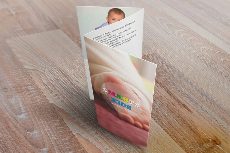
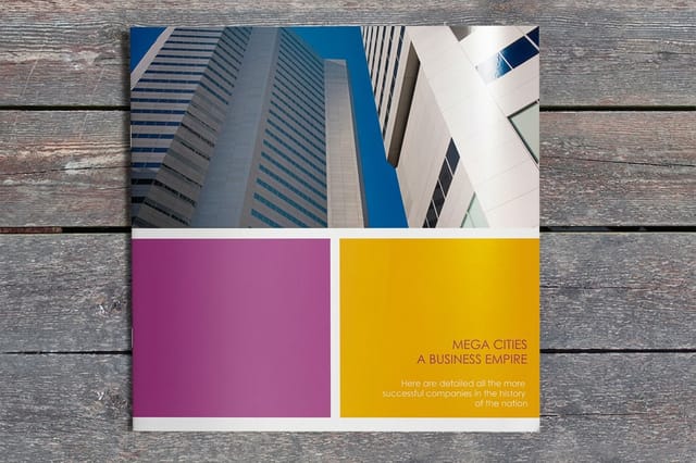
| Brochures | 7 pt | 9 to 11 pt | Read across folded panels, so each panel behaves like a small page. |
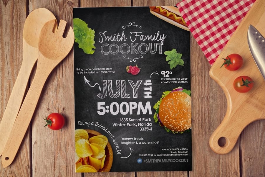
| Flyers | 8 pt | 10 to 12 pt | Scanned fast, sometimes pinned on a wall and read from a step back. |
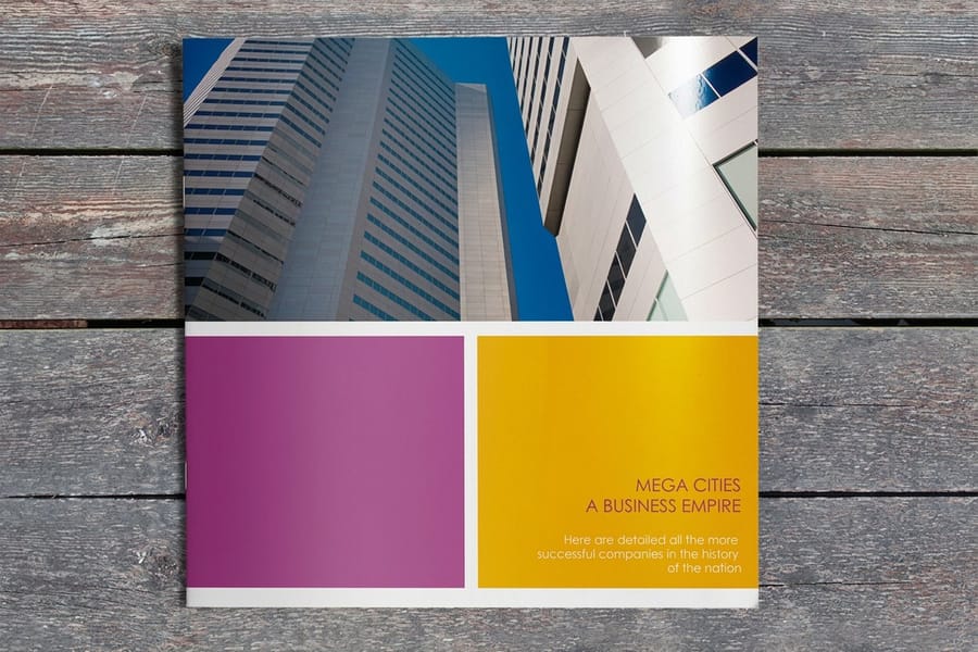
| Booklets | 7 pt | 9 to 11 pt | Sustained reading, where anything smaller becomes tiring after a page. |
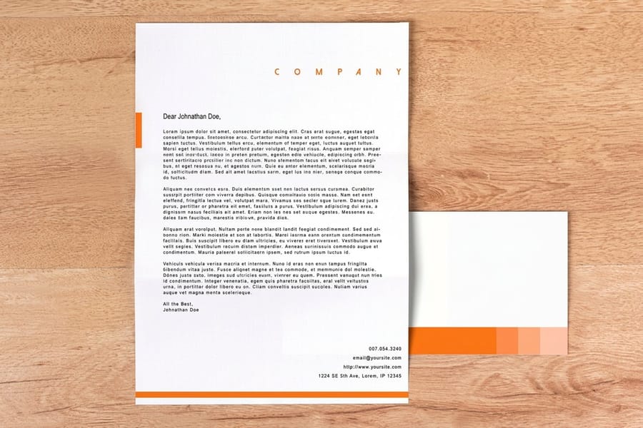
| Letterheads | 7 pt | 10 to 12 pt | Often scanned, photocopied or faxed, and every generation thickens strokes. |
Letterheads deserve the extra note. A 6 point footer of registration numbers looks tidy on the printed sheet and turns into a grey band the first time somebody scans the page at 200 DPI and emails it. If a sheet is going to be copied, print the small stuff a point larger than looks necessary. Standard letterheads start at $99.95, and the letterhead design guide works through the rest of the layout.
How to Check Your Smallest Type Before You Upload
Five minutes here saves a reprint. Do these in order.
- Find the smallest thing in the file. In InDesign, Type then Find or Change with a character format search on point size finds every instance below 8 point. In Illustrator, select all and open the Character panel to see whether the size field goes blank, which means mixed sizes. Do not trust your memory of what you set.
- Check its color build. Select the small text and read the swatch. If it shows C, M and Y values above zero, restyle it to 100% K. Rich black belongs in large solids, never in 6 point text.
- Confirm the text is still text. Zoom to 1600% in your PDF viewer. Vector type keeps razor edges at any zoom; rasterized type goes soft. If it goes soft, go back to the source file and rebuild that block.
- Print at 100% on your office printer. Not fit-to-page, not scaled. Hold it at the distance the finished piece will be held. A desktop laser is coarser than our press, so anything readable on that sheet will be readable in the final job.
- Check the trim clearance. Measure from the smallest type to the trim line. Under an eighth of an inch, move it in.
If the piece is important and the type is genuinely tight, order a small run first, or request a hard-copy proof before the full quantity goes down. The CMYK and RGB conversion guide covers the color side of the same handoff, and the file prep guides collect the rest of the pre-upload checks in one place.
Wally sizes the fine print
4 point prints, 6 point warns, 8 point reads
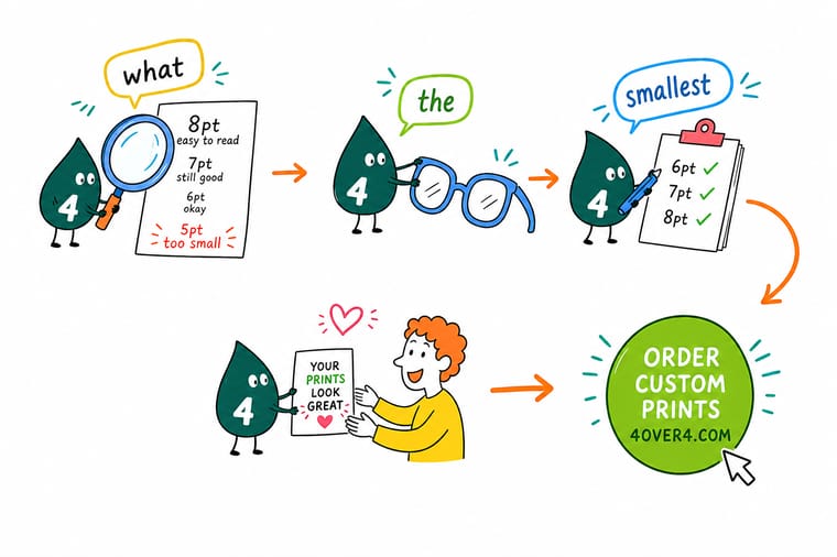
Wally can put 4 point type on a sheet all day. Getting somebody to read it is the hard part. He keeps three sizes in his head: 4 point for the microprint nobody looks at, 6 point for disclaimers and credits, 8 point for the contact block on a card. Then he checks two things every single time. Is the small text 100% black rather than a four-ink mix, and is it still live vector text rather than a flattened picture. Those two checks fix most of the fuzzy fine print he sees.
Order standard business cards →
Specs and pricing
Sizes, stocks and starting prices for the pieces that carry small type
Coated or uncoated changes your fine-print floor by about a point, so pick the stock first. Business cards run on 14pt gloss or 14pt and 16pt uncoated from 100 cards, flyers on 100# gloss text or 70# uncoated text in 9 sizes from 50, and brochures on the same text stocks in 6 sizes from 50. These configure live, with starting prices straight from the 4OVER4.COM configurator.



Print it
Print it at a size people will actually read
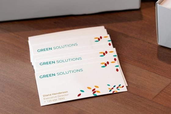
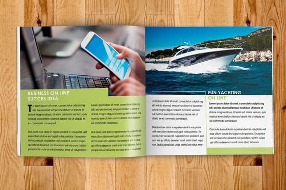
Match the piece to its reading distance: a 2 by 3.5 inch business card with 8 point contact lines, a folded brochure with body text at 8 point or larger, or a booklet of 8 to 60 pages at 5.5 by 8.5 or 8.5 by 11 inches for long copy.


Explore more
Where to go next
The brochure fonts guide sets sizes panel by panel, the serif guide explains which letterforms hold detail at 6 point, and the resolution guide shows what rasterizing does to small type.


By the numbers
Print files checked by people who read proofs for a living
Common Questions
Your small type questions, answered
What are the smallest fonts?
No typeface is smaller than another at the same point size, since the point size measures the em box they all share. What changes is how small they look and how much room they take. Faces with a low x-height and light strokes, like a classic old style serif, look smallest at a given size, and condensed sans serifs take the least width per line. For print, the face that reads smallest is the one you want to avoid below 8 point: pick a tall x-height and a regular weight instead.
What font is smaller than Arial?
Arial Narrow sets the same letters in less width, so a line that needs 12 characters of Arial fits in about 10 characters worth of space. Faces with a smaller x-height than Arial, such as Garamond or Times New Roman, look smaller at the same point size even though the em box is identical. On a printed card the narrow face is the useful one, because it saves width without dropping the size below the 8 point reading floor.
How to get a tiny font?
Type the number straight into the font size box instead of picking from the menu. Word accepts 1 point and Google Docs accepts values below its 6 point menu floor. For something that will be printed, stop at 6 point for fine print and 4 point for microprint, set the text to 100 percent black, and keep it as live text rather than an image, or the tiny type comes back as a gray smudge.
Is 12px too small for web?
For body text, yes by most current guidance. 12 pixels is about 9 point, and the usual web floor for paragraphs is 16 pixels, with 12 to 14 reserved for captions and labels. Screens and paper fail differently: a screen renders 12 pixel type sharp but small, while a press at the equivalent size holds the shape and the reader still leans in. Either way, the fix is the same, a larger size for anything a person has to read rather than glance at.
What is the smallest font size you can print?
On a commercial offset or high-end digital press printing to coated stock, a clean sans-serif holds its shape down to about 4 point. That is the mechanical limit, the point at which the counters inside letters like e and a start to close up and the strokes begin to break. Readability is a different limit and it sits higher: 6 point for fine print somebody scans once, 8 point for anything they actually have to read. If your design depends on type below 6 point, the problem is usually the layout, not the press.
What is the smallest readable font size for print?
8 point for continuous text, 6 point for a line or two of fine print. At 8 point a person with average vision reads a card at normal holding distance without leaning in. At 6 point they can still get through a disclaimer but will not enjoy it, and at 5 point most readers under good light are guessing at words from their shape. Anything intended for older readers should start at 10 point, and 12 point if it is a form somebody fills in.
Why did my small text come out fuzzy or filled in?
Three causes, in order of how often we see them. The type was built from all four inks, so tiny registration movement on press smeared the edges into color fringes. The type was rasterized in Photoshop rather than kept as live vector text, so the press printed a low-resolution picture of letters. Or the stock was uncoated and ink spread into the fibres, thickening every stroke until the counters closed. Set small type as vector text in 100% K and the first two disappear.
Does reversed white type need to be bigger?
Yes, add about 1 to 2 point and one weight. White type on a dark background suffers from ink spreading inward from all sides, so a 6 point light serif reversed out of a solid fills in and reads as a grey smudge. A 8 point medium-weight sans reversed out survives. Hairline serifs and thin strokes are the first to vanish, which is why reversed fine print is usually reset in a sturdier face rather than just made larger.
What is the smallest font size on a business card?
Keep the name and title at 9 to 12 point and the contact block at 7 to 8 point. A card is read at arm's length in a handshake, in whatever light the room has, often by someone who did not bring their glasses. 6 point contact details technically print on standard business cards at $17.57 per box, but they turn a card into a chore. If the information will not fit at 8 point, cut a line rather than shrink the type.
Do coated and uncoated paper change the minimum size?
They do, by roughly a point. Coated stock keeps ink sitting on the surface, so fine strokes stay fine and 6 point holds crisply. Uncoated stock absorbs ink into the fibre and every stroke gains a little weight, which closes counters and softens edges. On uncoated, treat 7 point as the fine-print floor and choose a face with open counters. Order a free sample pack and hold the same 6 point line on both to see the difference for yourself.
Get Started
Ready to print something people can read?
Pick your stock, set the fine print in 100% black at 8 point or above, and we print it clean. Not sure how a size will land on coated versus uncoated? Get the samples first.
Legal Disclaimer
Gold Standard guarantees apply to all standard orders placed through 4over4.com. Price match requires verifiable proof of a competitor's published price for an equivalent product with matching specifications and turnaround time. Satisfaction guarantee covers manufacturing defects and print quality issues. Contact support with order number and documentation.
