
A Guide to Creating Commercial Print-Ready Files


Emma is our prepress and print production voice, built from the knowledge of our production team, with over 20 years in printing.
A press-ready file prints exactly as you designed it, with no fixes needed on our end. Six things have to be true before export, and bleed is the easiest one to forget.
Print file preparation is the work of getting a design ready to print with no fixes needed on press. Set the file to CMYK color, place images at 300 DPI at final size, add 0.125 in of bleed past the trim, keep text inside a safe margin, outline or embed every font, and export a flattened, press-ready PDF (PDF/X-1a). Do those six things and your file prints predictably, from the first piece to the last.

Start here
CMYK, resolution, bleed, fonts, flatten
A print-ready file is a design that needs zero fixes before it goes on press. Work in this order: color, resolution, bleed and trim, fonts, folds, then the export. Each section below takes one step, and the table further down sums them up.
Why a print-ready file decides how your job turns out

The difference between a print job that lands exactly as you pictured it and one that comes back slightly off almost always traces to the file, not the press. Color that dulls, an edge that gets sliced, a logo that prints soft: those are file problems that happened long before the ink did.
A print-ready file, sometimes called a press-ready file, is one that needs no fixes before it goes on press. The color is already in CMYK, the images are at full resolution, the artwork runs past the trim, the fonts are locked in, and the whole thing is exported as a flattened PDF. Prepare it that way once and every piece matches, at fifty commercial brochures or five thousand.
This guide walks the full process in the order you would actually do it: color first, then resolution, bleed and trim, fonts, folds, and finally the press-ready PDF export. If you would rather not build a file from scratch, our online design tool bakes most of these rules in for you, and our design templates give you a finished layout to start from.
What is print file preparation?

Print file preparation is the set of steps that turn a finished design into a file a commercial press can print without editing. If the design is the idea, file prep is the handoff: it translates what you see on screen into something a printing press can reproduce faithfully on paper.
There are really only six things to get right, and they are the same for a business card, a flyer, or a multi-panel brochure. Every rule in this guide fits under one of those six headings.
Because the rules stay constant while the canvas changes, the same discipline covers a stack of cards, a set of postcards, and a folded piece alike. For the deeper mechanics behind two of these steps, pair this page with our guides on bleed and trim and choosing the right file type for printing.
Color: design in CMYK, and mind your spot colors
Screens make color with light in red, green, and blue, while a press makes it with cyan, magenta, yellow, and black ink. Those two systems do not cover the exact same range, so a color that glows on your monitor can print a shade duller or warmer on paper. The fix is simple: build your file in CMYK from the start so your preview reflects how the ink will actually look.
If your art came from a camera or the web, it is almost certainly RGB. Convert it to CMYK before you export, then look hard at the colors that shift the most: bright blues can drift toward purple, and vivid greens and oranges tend to lose punch. For a large area of black, use a rich black build rather than plain 100 percent K so the ink lays down deep and even instead of looking washed and streaky.
Spot colors are a separate tool. Instead of mixing a color from four inks, a spot color is a single pre-mixed ink matched to a standard, which is how brands keep one exact color consistent across every job. If your identity depends on a precise color, note the spot reference and confirm it against a printed sample. When color accuracy is critical, order free paper samples or a proof so you can judge the ink on the real stock before a full run.
Resolution: keep every image sharp at its printed size
A common reason a print comes back blurry is low-resolution art. Presses reproduce detail at roughly 300 DPI, meaning 300 dots of ink per inch, and they need that resolution at the size the image actually prints, not the size it happened to be saved at.
The trap is that a screen forgives what a press will not. An image can look perfectly crisp at a small size on your monitor and then fall apart the moment it is scaled up to fill a panel. To catch this before it prints, view each image at 100 percent zoom in your layout. If it looks soft there, it will look soft on paper, and no setting can add detail that was never captured.
So source art at or above the final size, and never enlarge a small file to fit a bigger space, because scaling up only stretches the pixels you already have. Logos and line art are the exception: keep those as vectors, which stay razor-sharp at any size. Photoshop tricks like filling text with images and building duotones also depend on starting from full-resolution source files.
Bleed, trim, and safe margin: three lines that protect your design
Printing does not happen on a single sheet the exact size of your card. Pieces print on larger sheets and get cut down, and the blade can shift by a hair from one cut to the next. Three lines account for that movement, and understanding them is the heart of file prep.
The trim line is where the blade cuts, at your final size. The bleed is 0.125 in of extra artwork past the trim on every side, so any color or photo that reaches the edge keeps going a little further. That way a slight shift in the cut never leaves a thin unprinted sliver. The safe margin is 0.125 in inside the trim, and it is where all your text, logos, and anything you cannot afford to lose must stay, well clear of the blade.
Get those three right and cropping stops being a gamble. Backgrounds run to the bleed, cuts land on the trim, and nothing important lives close enough to the edge to get clipped. Our dedicated guide on bleed and trim shows exactly how to set these in your design software, and the same rules underpin specialized setups like EDDM file setup.
Fonts and text: lock your type before it travels

A font that lives on your computer does not automatically live inside your file. If you hand off a design that only references a font, and the press does not have that exact typeface, it can substitute a different one and quietly wreck your layout. There are two clean ways to prevent that.
The first is to outline your type, which converts the letters into vector shapes. Once outlined, the text is no longer editable as text, but it is now artwork that prints exactly as drawn on any system. The second is to embed the fonts when you export, which packs the actual typefaces inside the PDF so they travel with the file. A proper press-ready PDF export embeds fonts by default.
Either approach works. The rule is simply that no font can be left loose. While you are checking type, confirm your point sizes read cleanly at print scale and keep small text a true black rather than a four-color mix, so fine letters stay crisp instead of fuzzy at the edges. Type discipline is also central to a strong, reproducible logo design.
Designing for folds and special finishes
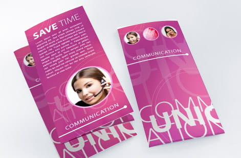
The moment a piece folds, your flat file has to think in panels. A tri-fold brochure is not three equal thirds: the panel that tucks inside is slightly narrower so it does not buckle against the others. If you design every panel the same width, your carefully centered art can end up creeping across a fold. Measure each panel to the product's real fold layout and set guides on the fold lines before you place anything.
Keep important text and logos away from the folds themselves, treat each panel almost like its own small page with its own safe margin, and remember the reading order changes as the piece opens. Our companion guide on preparing print files for packaging products takes this panel-by-panel thinking even further, into three-dimensional structures.
Special finishes add their own file layer. Foil, for instance, needs a separate spot layer that tells the press exactly where the metallic goes, which is why we keep a dedicated guide on setting up files for foil. Whenever a product offers a finish beyond standard ink, check whether it needs its own layer before you export.
The press-ready PDF: your finished, portable file

Once color, resolution, bleed, and fonts are handled, the last move is packaging it all into one file the press can print without touching. That file is a press-ready PDF. It is self-contained, meaning every image and font travels inside it, so nothing has to be relinked or interpreted on our end.
Export to PDF with the artwork flattened, the color in CMYK, images at full resolution, fonts embedded, and bleed plus crop marks included. The industry-standard preset for this is PDF/X-1a, which is built specifically for commercial printing and strips out anything a press cannot use. Choosing it removes most of the ways a file can go wrong before it ever leaves your computer.
Why a single PDF over sending native files? Native design files depend on the same software, fonts, and linked images being present wherever they open, and any one of those going missing changes the result. A flattened PDF freezes the design in place. If you are weighing formats for a specific job, our guide on choosing the right file type for printing lays out when each one fits.
A final pre-flight, and what printing actually costs

Before you upload, run one last pre-flight pass against the seven settings in the quick reference table below. When you order with us, that artwork also runs through a free file check, so a second set of eyes catches anything before the press does.
With the file settled, cost is easy to reason about. Printing price scales with a few simple levers: quantity, where more pieces lower the unit price, plus size, paper stock, and finish. You set each option in the configurator and the total updates live as you adjust it, so you can see exactly what a heavier stock or a bigger run does to the number before you commit.
Commercial brochures come in six trim sizes from 5.5 x 8.5 to 11 x 25.5 inches, so build the file at one of those sizes with 0.125 in of bleed around it. The stock choice sits between 100# gloss text, 100# silk text, 70# uncoated text and 14pt gloss cover, and you can order free paper samples first so you can feel the stock in hand before your file goes to press.
Wally checks your file before the press does
Print-ready just means nothing is left to guess
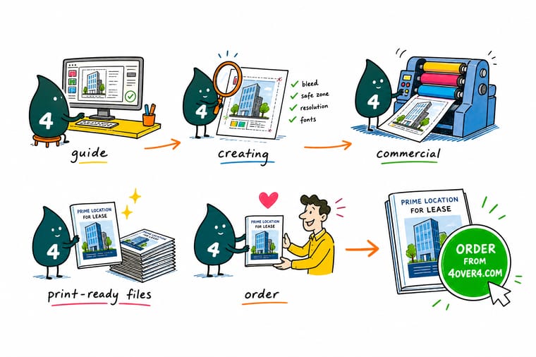
Wally treats every file like a pre-flight walk-around: color set to CMYK, images sharp at full size, art running past the trim, text tucked inside the safe margin, and fonts locked in. Clear those checks, export one flattened press-ready PDF, and there is nothing left for the press to interpret. Build it clean, upload it, and 4OVER4 prints it exactly as you drew it.
Print your commercial files →Quick reference
The commercial print file setup, at a glance
Seven settings make a file press ready. The table gives the target for each and the reason behind it.
| Setting | Get it to | Why it matters |
|---|---|---|
| Color mode | CMYK | Presses print with process inks, so convert from RGB before export to avoid color shifts. |
| Resolution | 300 DPI at final size | Full-resolution art at the printed dimensions keeps photos and logos sharp, never pixelated. |
| Bleed | 0.125 in past every edge | Extra art beyond the trim line means no thin white slivers if the cut drifts. |
| Safe margin | 0.125 in inside the trim | Keep text and logos off the edge so nothing important gets trimmed away. |
| Fonts | Outlined or fully embedded | Locks your typefaces into the file so they never reflow or substitute on our system. |
| Rich black | C60 M40 Y40 K100 | Large solid blacks print deeper and more even than 100 percent K alone. |
| File format | Flattened PDF (PDF/X-1a) | A single self-contained PDF is the most predictable format to send to press. |
Step by step
Export a press-ready PDF in 7 steps
- Set the document up correctly first Start a new file at the final trim size, add 0.125 in of bleed on every side, and pull your margins in 0.125 in for the safe zone before you place a single element.
- Work in CMYK from the start Set the color mode to CMYK so what you see approximates what prints. If you built in RGB, convert now and re-check any bright blues, greens, and oranges.
- Place images at full resolution Use art that is 300 DPI at the size it appears on the page. Never enlarge a small image to fill a space, since scaling up only stretches the pixels you already have.
- Run art off the edge to the bleed Any background, photo, or color block that touches an edge should extend to the bleed line, not stop at the trim.
- Outline or embed every font Convert type to outlines or embed the fonts so your typefaces travel inside the file and cannot be substituted.
- Flatten and proof one last time Flatten transparency, zoom to 100 percent, and read every line of copy. Small typos are far cheaper to fix now than after a full run prints.
- Export a press-ready PDF Export to a flattened PDF with bleed and crop marks included, then upload it in the configurator or run it through our free file check.

Infographic
The print-ready file checklist
Seven checks, one file. Save it and run down the list every time before you export and upload your artwork.
A file that clears all seven checks needs no edits before it prints. Every piece run through our free file check gets a second look, so nothing slips past on its way to press.
Specs and pricing
Commercial brochure specs and live pricing
Once your file is ready, size, stock and finish are what is left. Commercial brochures run 50 for $57.11, which is $1.14 each.

| Quantity | Price Per Unit | Total |
|---|---|---|
| 50 | $1.14 | $57.11 |
| 100 | 82.4¢ | $82.38 |
| 200 | 53.3¢ | $106.55 |
| 300 | 41.0¢ | $123.02 |
| 400 | 34.9¢ | $139.49 |
| 500 | 31.2¢ | $155.97 |
| 600 | 26.7¢ | $160.36 |
| 700 | 23.5¢ | $164.75 |
Print it
Bring your print-ready files to 4OVER4



See it in use
Files that needed no prepress fixes
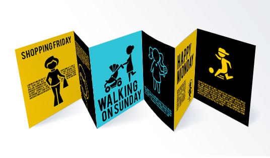
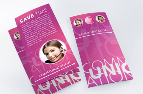


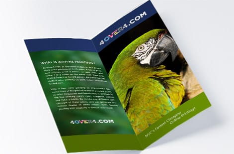

Explore more
Where to go next




By the numbers
The press your file goes to
Common Questions
Common questions about print-ready files
What is print file preparation?
Print file preparation is the work of getting a design ready to print exactly as intended, with no fixes needed once it reaches the press. That means setting the file to CMYK color, placing images at 300 DPI at their final size, adding bleed past the trim line, keeping text inside a safe margin, outlining or embedding fonts, and exporting a flattened, press-ready PDF. A properly prepared file removes the guesswork, which is what keeps color, sharpness, and cropping consistent from the first piece to the last.
What does press-ready PDF mean?
A press-ready PDF is a single, self-contained file that a commercial printer can send straight to press without editing. It has the artwork flattened, the color in CMYK, images at full resolution, bleed and trim marks included, and all fonts either embedded or converted to outlines. The industry-standard flavor is PDF/X-1a, which strips out anything a press cannot use. When you upload one of these, nothing on your design has to be interpreted or rebuilt on our end.
How do I plan for perfect color printing?
Set the document to CMYK before you place art, and convert every RGB photo before export, because vivid blues, greens and oranges shift most on press. Build large solid blacks as C60 M40 Y40 K100 instead of plain K. Pull brand colors from a printed reference, not a monitor. If exact color matters, order free paper samples or a proof first, such as the free online proof or the next day hardcopy proof on commercial brochures, before a full run.
How do I plan image quality for professional printing?
It is making sure every image in your file is sharp at the size it will actually print. Presses need about 300 DPI at the final dimensions, so an image that looks fine on a screen can still be too low-resolution once it is placed and scaled. The safe habit is to check each image at 100 percent zoom, source art at or above the size you need, and never enlarge a small file to fit a bigger space, since that only stretches the existing pixels and produces a soft or blocky result.
What has to be true before I export the PDF?
Match the setup to the finished piece. Start from the exact trim size of the product, add the standard 0.125 in bleed and safe margin, and pick a file format the press can read directly, which for almost every job is a flattened PDF. Folded pieces need their panels measured and their folds accounted for, and stocks or finishes like foil have their own file rules. When in doubt, follow the product-specific setup notes and use the live specs on the product page so your file matches what the press expects.
What does it cost to prepare and print commercial files, and how are prices set?
Preparing the file yourself costs nothing beyond your design time, and running your artwork through our free file check before you order is included. Printing cost then scales with quantity, size, paper stock and finish. Commercial brochures show the curve: 50 cost $57.11, 100 cost $82.38 and 500 cost $155.97. You set each option in the configurator and the price updates live before you commit.
Do I need bleed if my design has a white border?
If the border is genuinely white and part of your design, you can build to the trim without full-bleed art, but it is still safer to add bleed and keep the border even by watching the safe margin. The moment any color, photo, or background touches an edge, bleed becomes mandatory, because without it a slight cutting shift can leave a thin unprinted sliver along the edge.
Get Started
Order commercial brochures from $57.11 for 50
Bring your press-ready PDF to 4OVER4.COM and print it on the size, stock, and finish your project calls for. Adjust every option and watch your price update live.
Legal Disclaimer
Gold Standard guarantees apply to all standard orders placed through 4over4.com. Price match requires verifiable proof of a competitor's published price for an equivalent product with matching specifications and turnaround time. Satisfaction guarantee covers manufacturing defects and print quality issues. Contact support with order number and documentation.
